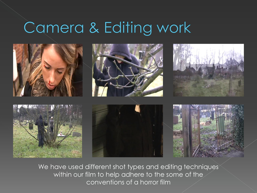
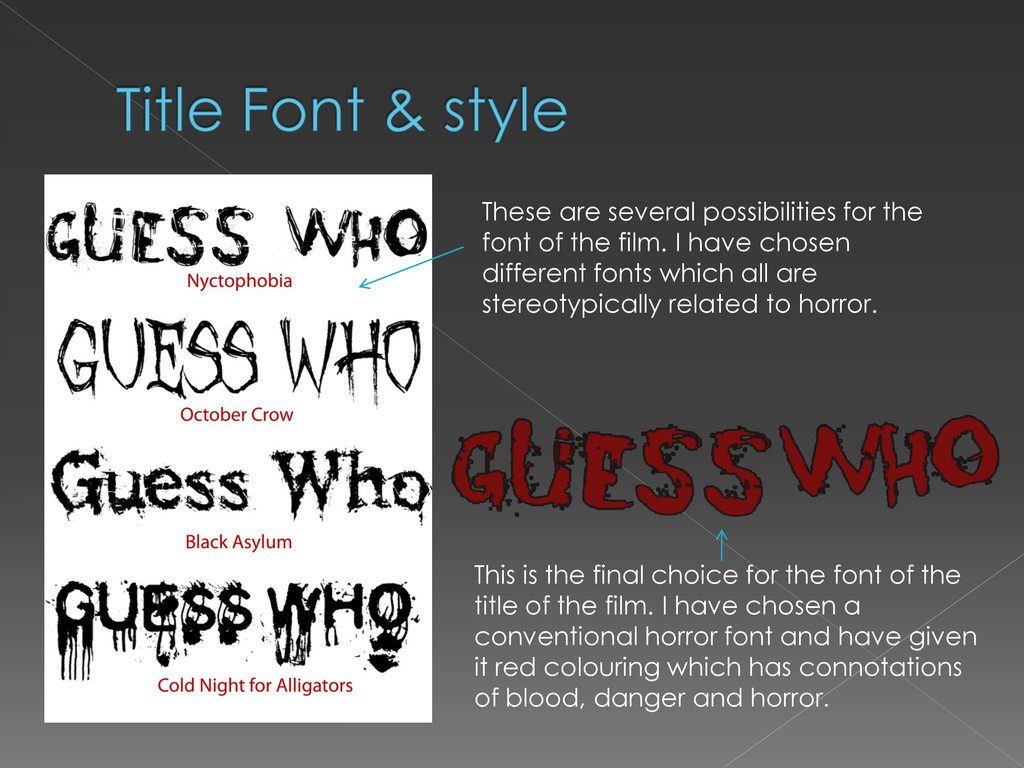
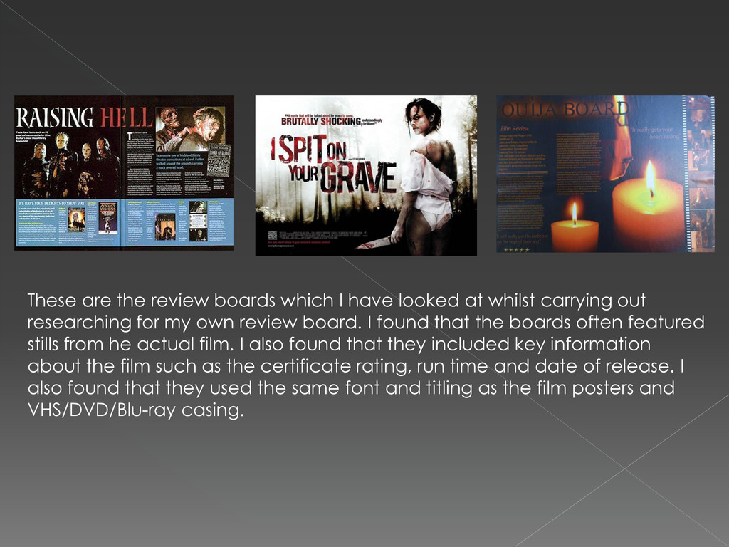
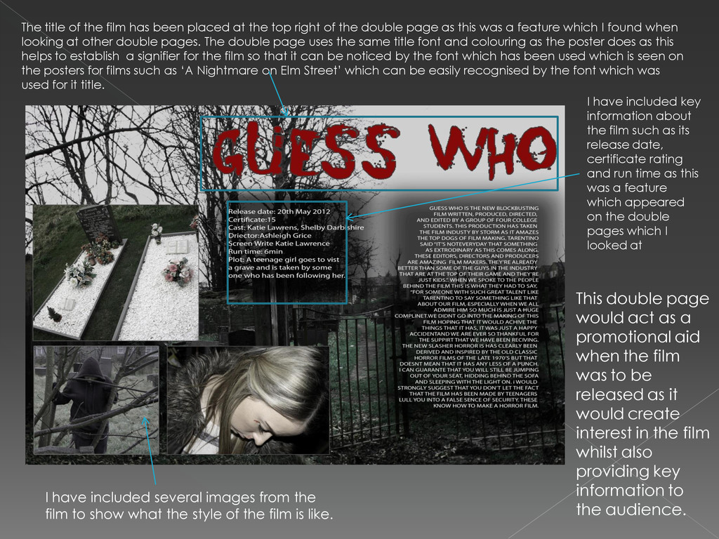
top right of the double page as this was a feature which I found when looking at other double pages. The double page uses the same title font and colouring as the poster does as this helps to establish a signifier for the film so that it can be noticed by the font which has been used which is seen on the posters for films such as ‘A Nightmare on Elm Street’ which can be easily recognised by the font which was used for it title. I have included key information about the film such as its release date, certificate rating and run time as this was a feature which appeared on the double pages which I looked at I have included several images from the film to show what the style of the film is like. This double page would act as a promotional aid when the film was to be released as it would create interest in the film whilst also providing key information to the audience.