Upgrade to Pro — share decks privately, control downloads, hide ads and more …

Object-Oriented CSS 從 OOCSS, SMACSS, BEM 到 AMCSS

bblurock
November 04, 2014

Object-Oriented CSS 從 OOCSS, SMACSS, BEM 到 AMCSS

我們都同意,其實 CSS 並不難。但是很快的你發現,當專案開始變大,你的 CSS 變得越來越難維護 — tag、id 還有 class 交錯使用,選擇器越組越長,這段 CSS 看起來好眼熟?

為什麼你需要 Object Oriented CSS Methodology?什麼是 OOCSS、SMACSS 還有 BEM (甚至是最新的 AMCSS)?如何寫出具有可預測性、可重複使用且易於維護的架構?

bblurock

November 04, 2014
Tweet

More Decks by bblurock

Other Decks in Programming

Transcript

  1. – http://cssguidelin.es/ Harry Roberts CSS is not a pretty language.

    While it is simple to learn and get started with, it soon becomes problematic at any reasonable scale.
  2. http://philipwalton.com/articles/css-architecture/ http://philipwalton.com/articles/css-architecture/ <div class=”widget”> Featured Items </div> <div id=”sidebar”> <div

    class=”widget”> Featured Items </div> </div> #sidebar .widget { background: yellow; border: 1px solid black; color: black; width: 50%; padding: 7px; } COMMON MISTAKES
  3. COMMON MISTAKES http://philipwalton.com/articles/css-architecture/ http://philipwalton.com/articles/css-architecture/ #sidebar .widget { background: yellow; border:

    1px solid black; color: black; width: 50%; padding: 7px; } #sidebar .widget { width: 200px; } <div class=”widget”> Featured Items </div> <div id=”sidebar”> <div class=”widget”> Featured Items </div> </div>
  4. COMMON MISTAKES http://philipwalton.com/articles/css-architecture/ http://philipwalton.com/articles/css-architecture/ <div class=”widget”> Featured Items </div> <div

    id=”sidebar”> <div class=”widget”> Featured Items </div> </div> .widget { background: yellow; border: 1px solid black; color: black; width: 50%; padding: 7px; } #sidebar .widget { width: 200px; } home
  5. COMMON MISTAKES http://philipwalton.com/articles/css-architecture/ http://philipwalton.com/articles/css-architecture/ <div class=”widget”> Featured Items </div> <div

    id=”sidebar”> <div class=”widget”> Featured Items </div> </div> .widget { background: yellow; border: 1px solid black; color: black; width: 50%; padding: 7px; } #sidebar .widget { width: 200px; } body.homepage .widget { backgorund: white; } home
  6. COMMON MISTAKES #main-nav ul li ul li div .widget {}

    #content atticle h1:first-child {} #sidebar > div > h3 + p {} • Overly Complicated Selectors
  7. Good CSS Architecture • 預測 - Predictable • 複⽤用 -

    Reusable • 維護 - Maintainable • 延展 - Scalable http://philipwalton.com/articles/css-architecture/ http://philipwalton.com/articles/css-architecture/
  8. CSS Methodology • OOCSS • SMACSS • BEM • AMCSS

    http://philipwalton.com/articles/css-architecture/ http://philipwalton.com/articles/css-architecture/
  9. Principles • Separate Container and Content • break the dependency

    between the container module and the content objects it contains.
  10. Some Guidelines for OOCSS • Avoid the descendent selector (i.e.

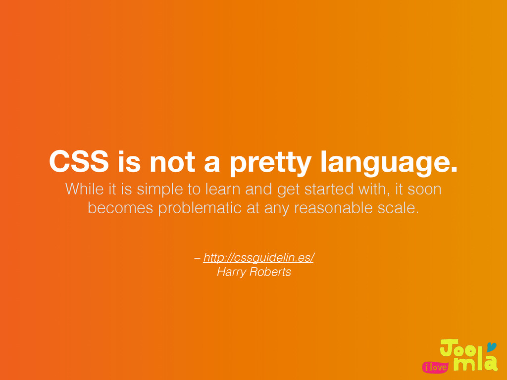
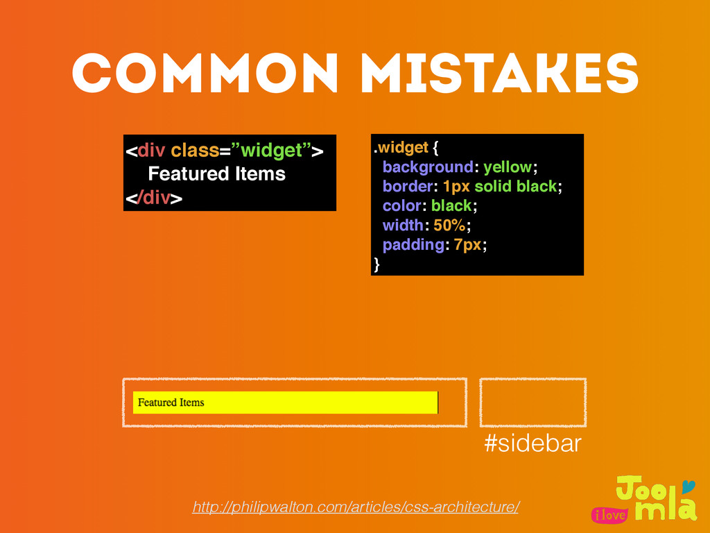
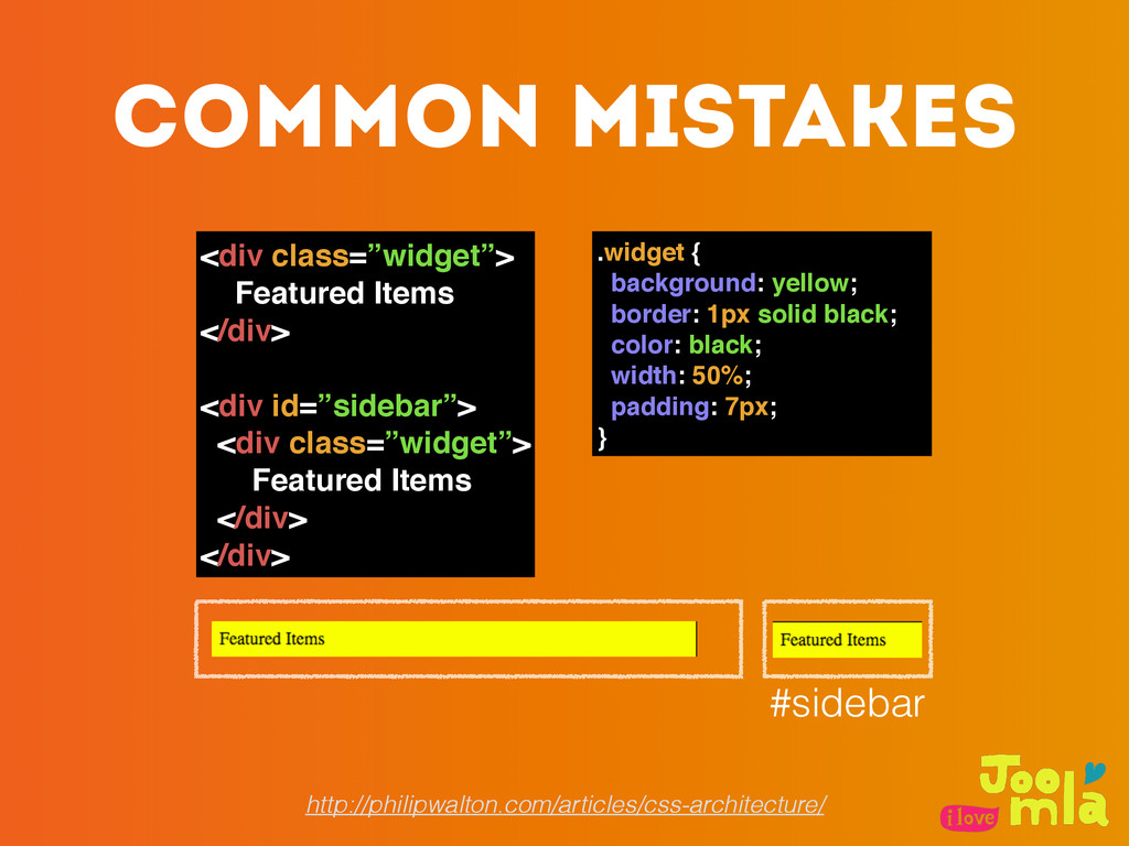
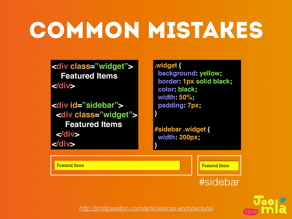
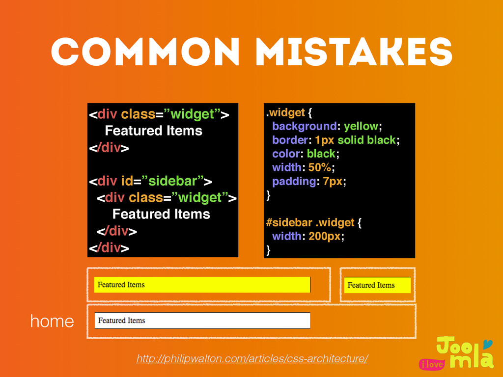
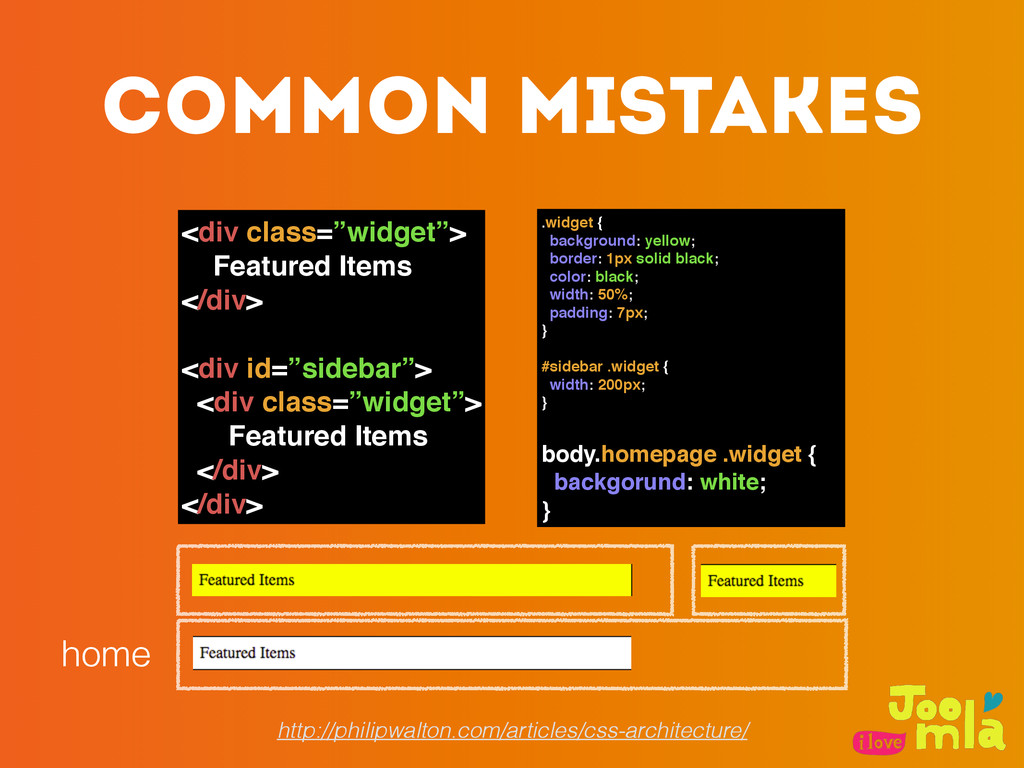
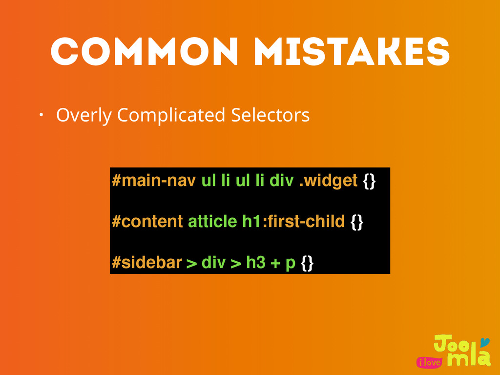
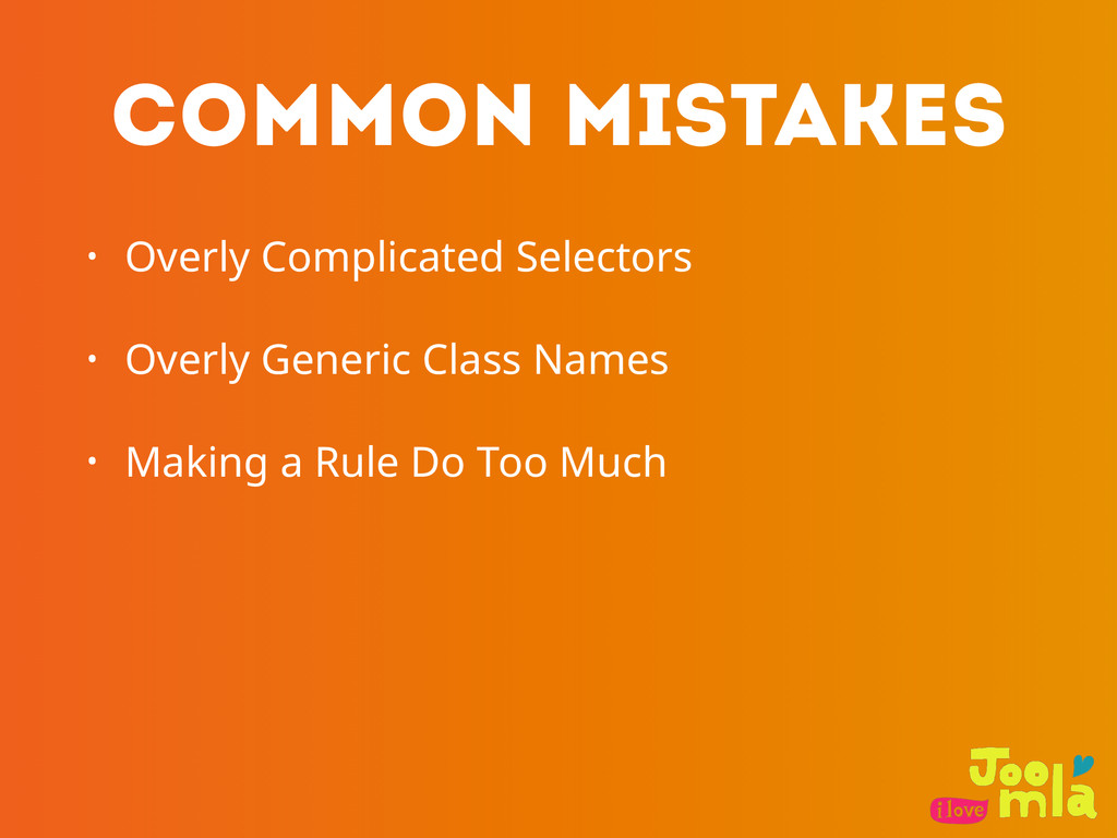
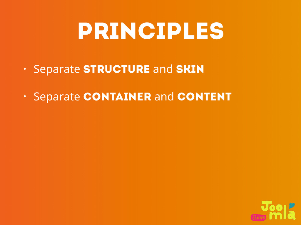
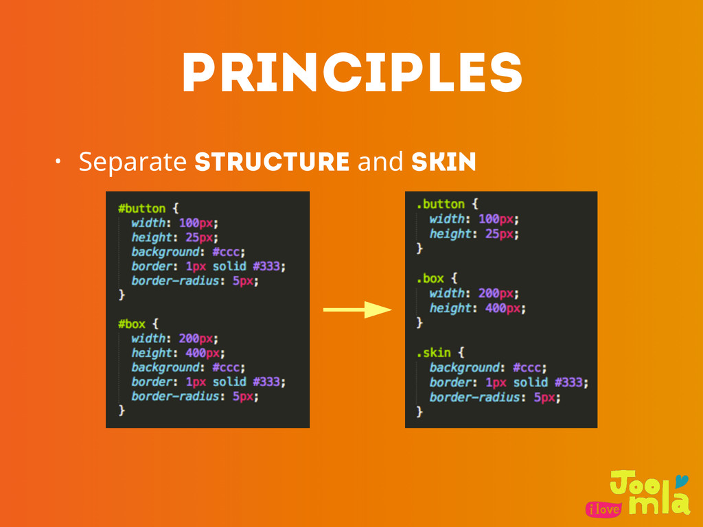
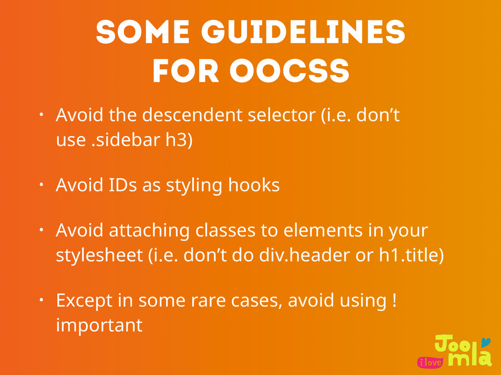
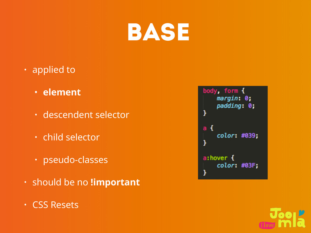
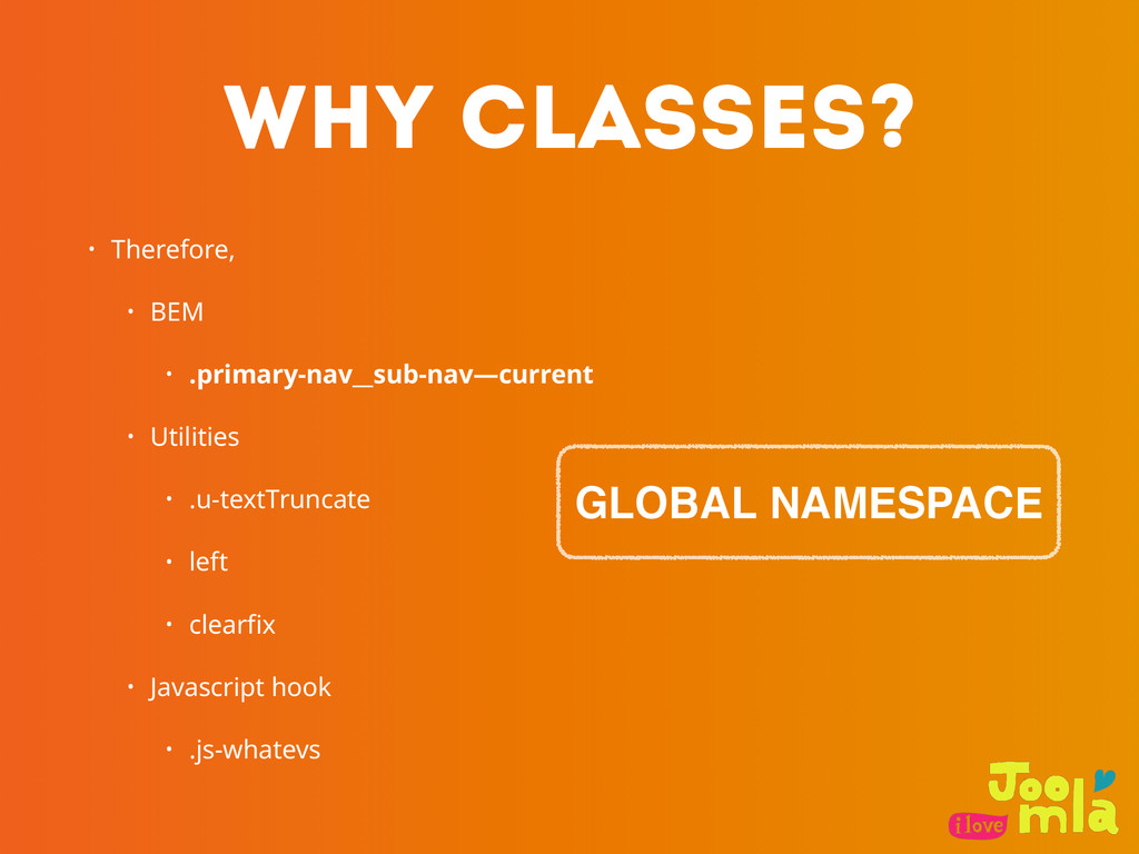
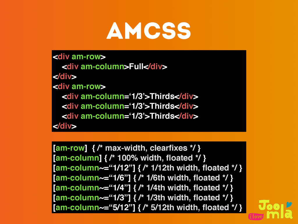
    don’t use .sidebar h3) • Avoid IDs as styling hooks • Avoid attaching classes to elements in your stylesheet (i.e. don’t do div.header or h1.title) • Except in some rare cases, avoid using ! important
  11. PRinciples • Categorizing CSS Rules • 將 CSS 結構分類 •

    Naming Rules • 命名規則 • Minimizing the Depth of Applicability • 減少 CSS 與 HTML 的相依程度
  12. BASE • applied to • element • descendent selector •

    child selector • pseudo-classes • should be no !important • CSS Resets
  13. LAYOUT <style> #header {…} .l-main {…} .l-secondary {…} .l-featured {…}

    .l-featured > li {…} </style> <div id=”header”></div> <div class=”l-main”></div> <div class=”l-secondary”></div> <div class=”l-featured”></div>
  14. MODULE • Modules 存在於 Layout components 下. • Modules 也可存在於

    Modules 下. • 每個 Module 應該被設計成獨⽴立存在的 • 避免使⽤用 IDs 還有 element 當作 selector
  15. BLOCK • 在⾴頁⾯面上獨⽴立存在, i.e. 可以在⾴頁⾯面之中任意更動 位置 • 是 Web Application

    的 “building block” • 可重複使⽤用 • Block 可以是 簡單⽽而單⼀一的 或是含有其他的 blocks
  16. ELEMENT • An internal part of BLOCK • 只能存在於 BLOCK

    內,沒有獨⽴立出來的意義 • BLOCK 不⼀一定要包含 ELEMENT(S)
  17. MODIFIER • 定義 BLOCK 或 ELEMENT 的狀態或屬性 • 多組 MODIFIERS

    可以共同作⽤用於⼀一個 BLOCK/ ELEMENT 上
  18. MODIFIER • 在 MODIFIER 之前加上兩個 —(dash) 當作 prefix - MindBEMding

    - http://csswizardry.com/2013/01/mindbemding-getting-your-head-round-bem-syntax/
  19. Why CLASSES? • 3.2.5.7 The class attribute • https://html.spec.whatwg.org/multipage/dom.html#classes •

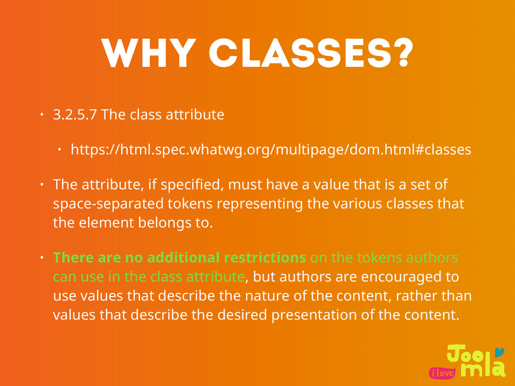
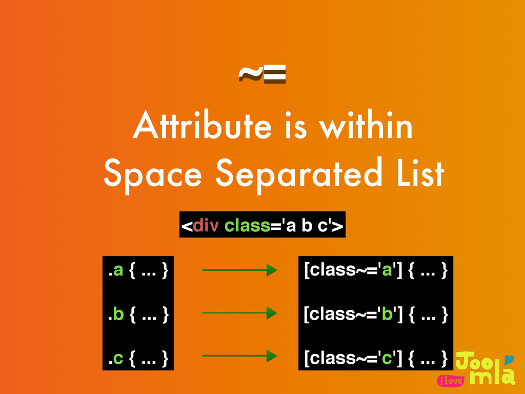
    The attribute, if specified, must have a value that is a set of space-separated tokens representing the various classes that the element belongs to. • There are no additional restrictions on the tokens authors can use in the class attribute, but authors are encouraged to use values that describe the nature of the content, rather than values that describe the desired presentation of the content.
  20. Why CLASSES? • Therefore, • BEM • .primary-nav__sub-nav—current • Utilities

    • .u-textTruncate • left • clearfix • Javascript hook • .js-whatevs GLOBAL NAMESPACE
  21. ~= Attribute is within Space Separated List <div class='a b

    c'> .a { ... } .b { ... } .c { ... } [class~='a'] { ... } [class~='b'] { ... } [class~='c'] { ... }
  22. <div class=‘row’> <div class=‘column-12’>Full</div> </div> <div class=‘row’> <div class=‘column-4’>Thirds</div> <div

    class=‘column-4’>Thirds</div> <div class=‘column-4’>Thirds</div> </div> .row { /* max-width, clearfixes */ } .column-1 { /* 1/12th width, floated */ } .column-2 { /* 1/6th width, floated */ } .column-3 { /* 1/4th width, floated */ } .column-4 { /* 1/3th width, floated */ } .column-5 { /* 5/12th width, floated */ } /* etc */ .column-12 { /* 100% width, floated */ } Normally we do
  23. <div am-row> <div am-column=‘12’>Full</div> </div> <div am-row> <div am-column=‘4’>Thirds</div> <div

    am-column=‘4’>Thirds</div> <div am-column=‘4’>Thirds</div> </div> [am-row] { /* max-width, clearfixes */ } [am-column~=“1”] { /* 1/12th width, floated */ } [am-column~=“2”] { /* 1/6th width, floated */ } [am-column~=“3”] { /* 1/4th width, floated */ } [am-column~=“4”] { /* 1/3th width, floated */ } [am-column~=“5”] { /* 5/12th width, floated */ } [am-column~=“12”] { /* 100% width, floated */ } AMCSS
  24. <div am-row> <div am-column>Full</div> </div> <div am-row> <div am-column=‘1/3’>Thirds</div> <div

    am-column=‘1/3’>Thirds</div> <div am-column=‘1/3’>Thirds</div> </div> [am-row] { /* max-width, clearfixes */ } [am-column] { /* 100% width, floated */ } [am-column~=“1/12”] { /* 1/12th width, floated */ } [am-column~=“1/6”] { /* 1/6th width, floated */ } [am-column~=“1/4”] { /* 1/4th width, floated */ } [am-column~=“1/3”] { /* 1/3th width, floated */ } [am-column~=“5/12”] { /* 5/12th width, floated */ } AMCSS
  25. Styling both attributes and values • attribute 可以⽽而且應該要被 styled •

    屬性的 Value 可以改變與繼承 Base styles(也就是 attribute) • namespace 的概念
  26. Good CSS Architecture • 預測 - Predictable • 複⽤用 -

    Reusable • 維護 - Maintainable • 延展 - Scalable http://philipwalton.com/articles/css-architecture/ http://philipwalton.com/articles/css-architecture/