Upgrade to Pro
— share decks privately, control downloads, hide ads and more …
Speaker Deck
Features
Speaker Deck
PRO
Sign in
Sign up for free
Search
Search
Research and Design in Government 4
Search
Beverley Smith
March 06, 2018
0
38
Research and Design in Government 4
Designing simpler services
Prototypes
Beverley Smith
March 06, 2018
Tweet
Share
More Decks by Beverley Smith
See All by Beverley Smith
Research and Design in Government 1
bevsmith30
0
56
Research and Design in Government 2
bevsmith30
0
56
Research and Design in Government 3
bevsmith30
0
32
Featured
See All Featured
Designing Powerful Visuals for Engaging Learning
tmiket
0
280
Practical Orchestrator
shlominoach
191
11k
Designing Experiences People Love
moore
143
24k
Are puppies a ranking factor?
jonoalderson
1
3.1k
First, design no harm
axbom
PRO
2
1.1k
Optimizing for Happiness
mojombo
378
71k
Everyday Curiosity
cassininazir
0
160
From Legacy to Launchpad: Building Startup-Ready Communities
dugsong
0
180
[Rails World 2023 - Day 1 Closing Keynote] - The Magic of Rails
eileencodes
38
2.8k
How to Get Subject Matter Experts Bought In and Actively Contributing to SEO & PR Initiatives.
livdayseo
0
85
Making the Leap to Tech Lead
cromwellryan
135
9.8k
Balancing Empowerment & Direction
lara
5
950
Transcript
Chris Taylor Interaction Design Lead Home Office
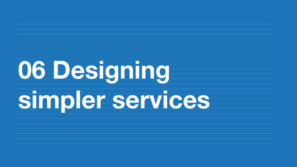
06 Designing simpler services
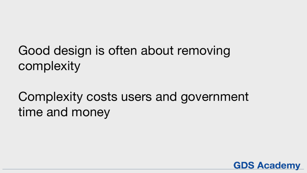
Good design is often about removing complexity Complexity costs users
and government time and money
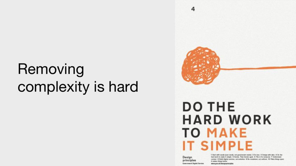
Removing complexity is hard
Examples of complexity in government
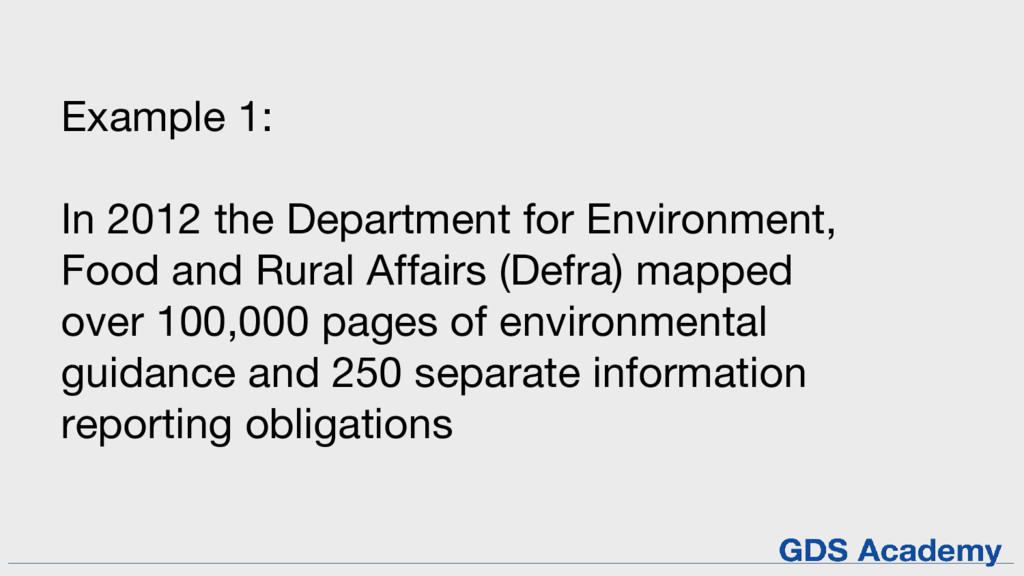
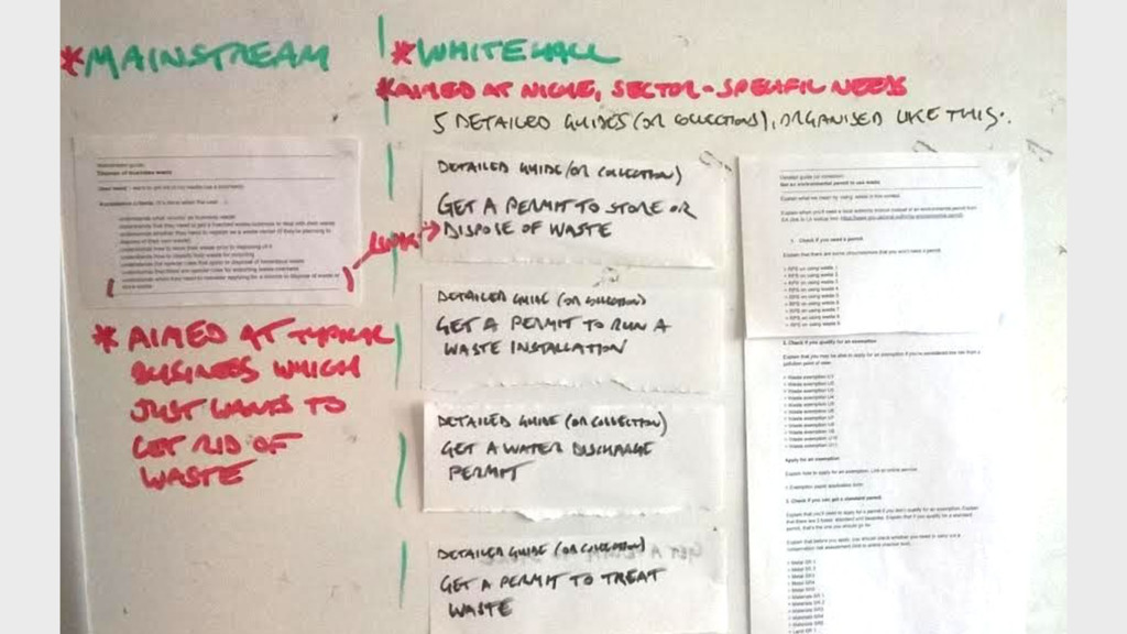
Example 1: In 2012 the Department for Environment, Food and
Rural Affairs (Defra) mapped over 100,000 pages of environmental guidance and 250 separate information reporting obligations
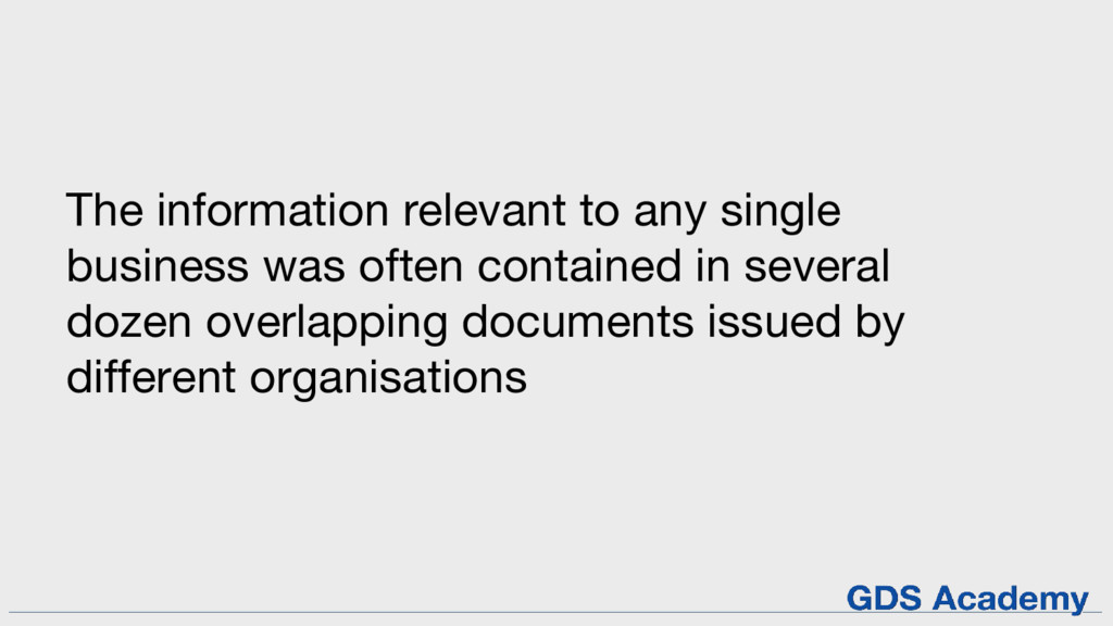
The information relevant to any single business was often contained
in several dozen overlapping documents issued by different organisations
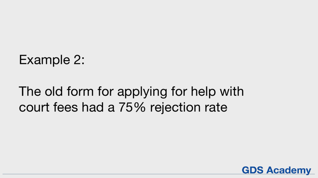
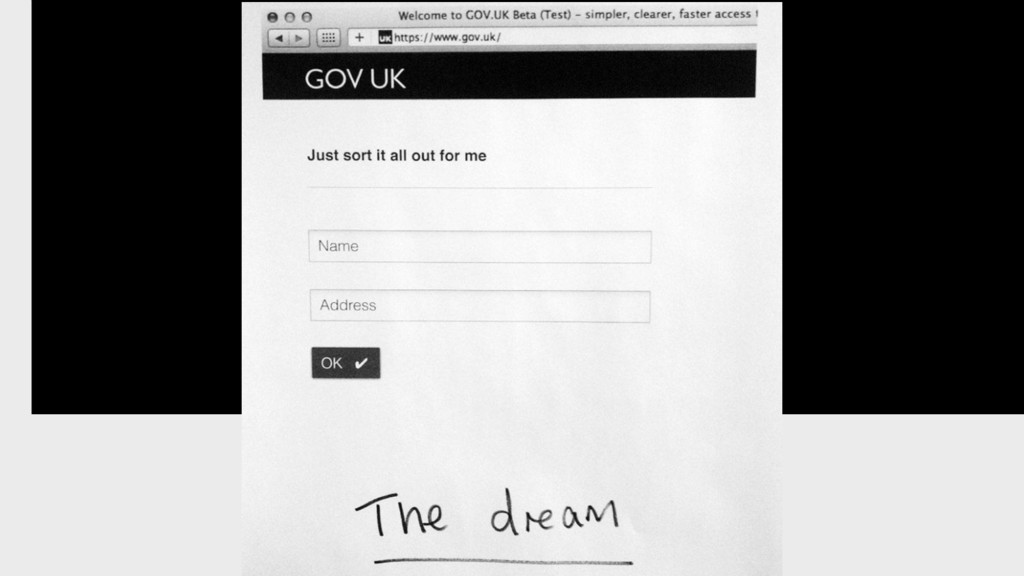
Example 2: The old form for applying for help with
court fees had a 75% rejection rate
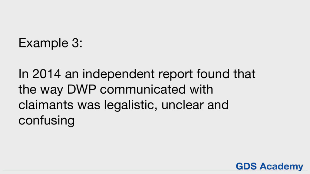
Example 3: In 2014 an independent report found that the
way DWP communicated with claimants was legalistic, unclear and confusing
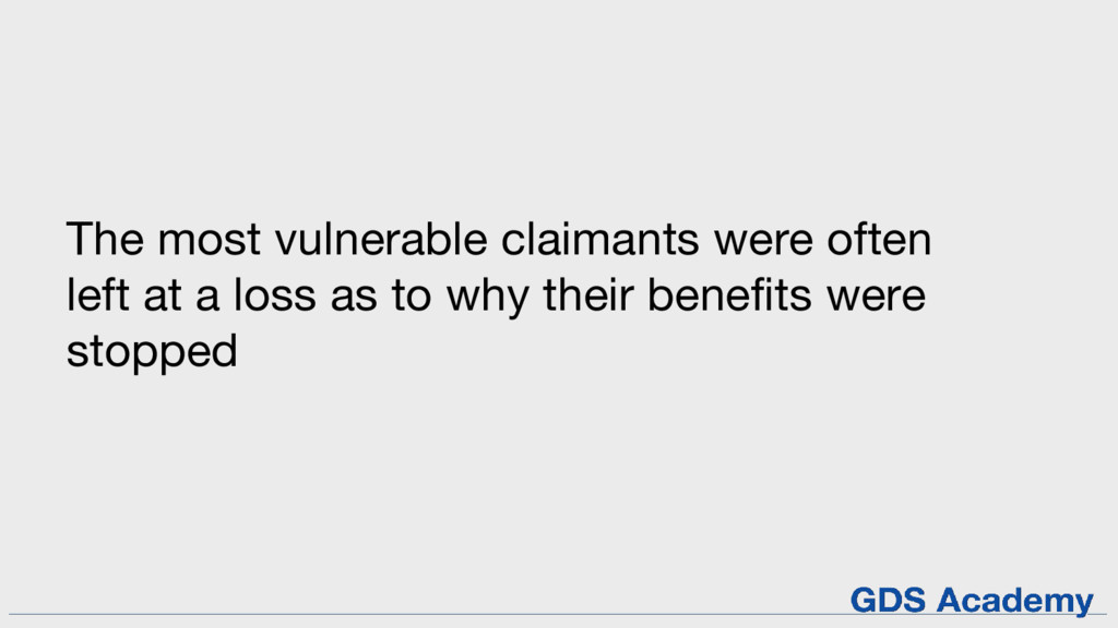
The most vulnerable claimants were often left at a loss
as to why their benefits were stopped
None
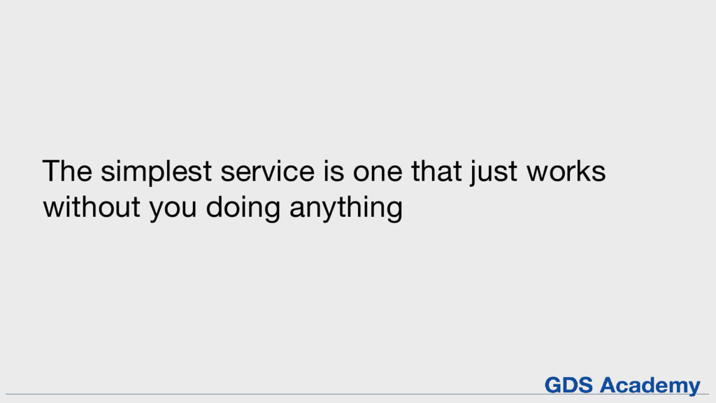
The simplest service is one that just works without you
doing anything
Tips for removing complexity from services
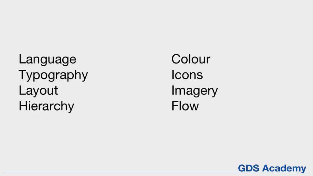
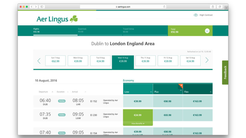
Language Typography Layout Hierarchy Colour Icons Imagery Flow
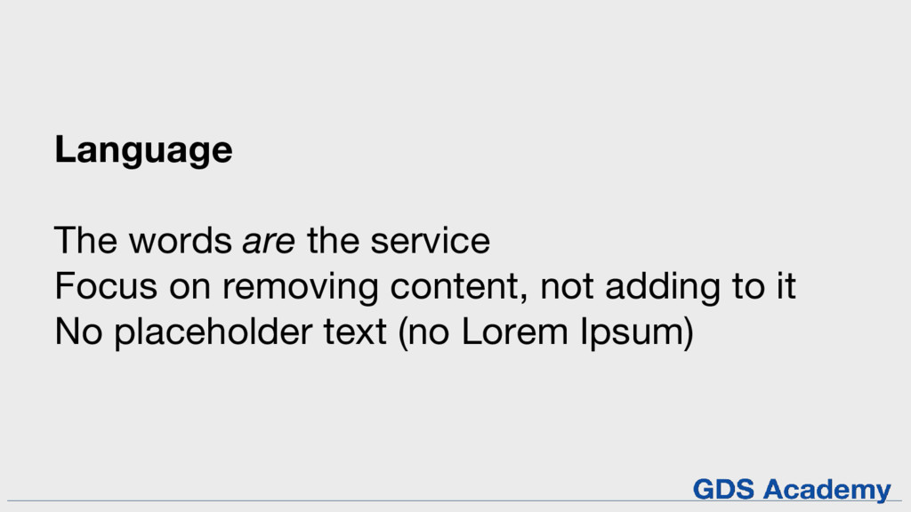
Language The words are the service Focus on removing content,
not adding to it No placeholder text (no Lorem Ipsum)
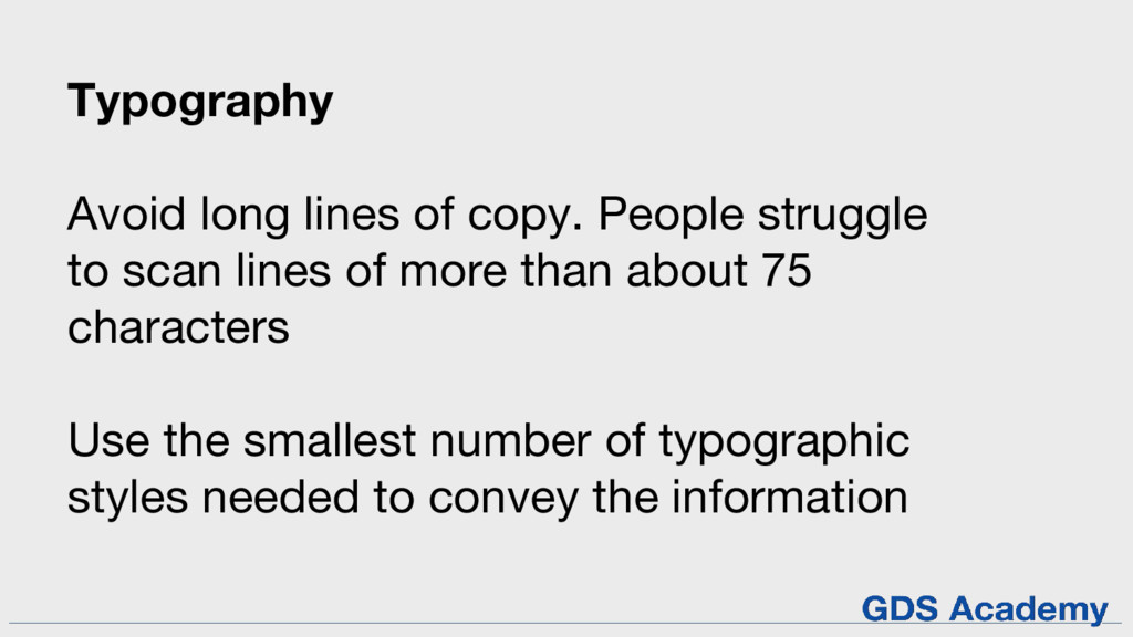
Typography Avoid long lines of copy. People struggle to scan
lines of more than about 75 characters Use the smallest number of typographic styles needed to convey the information
None
None
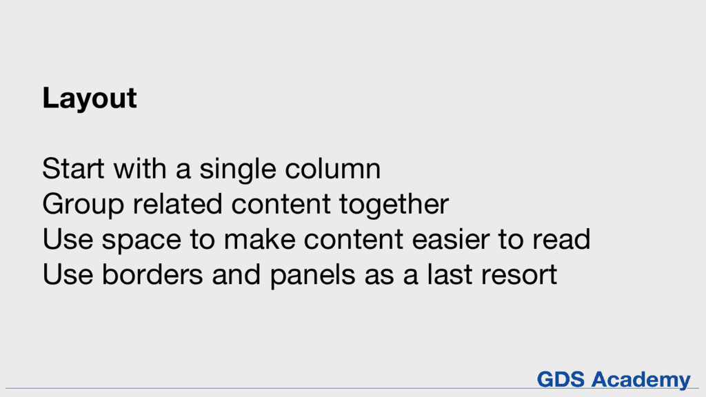
Layout Start with a single column Group related content together
Use space to make content easier to read Use borders and panels as a last resort
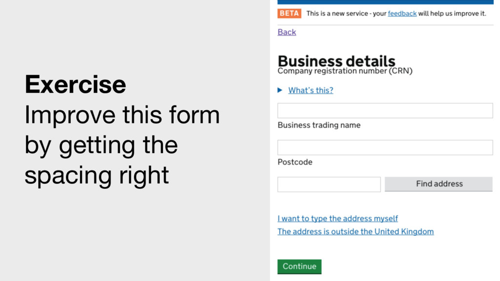
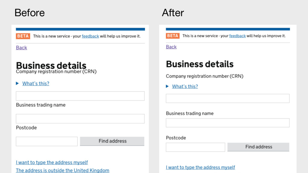
Exercise Improve this form by getting the spacing right
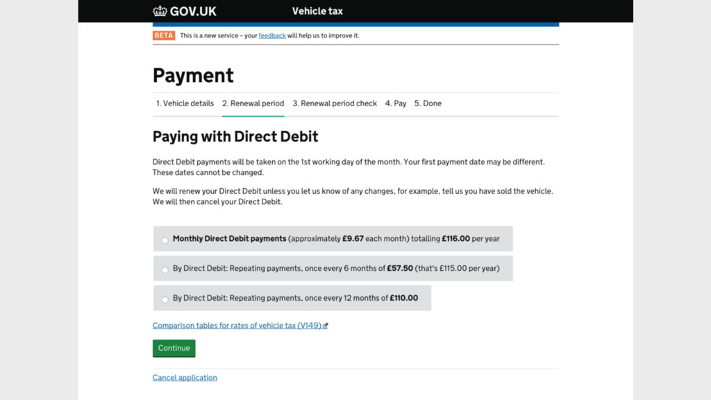
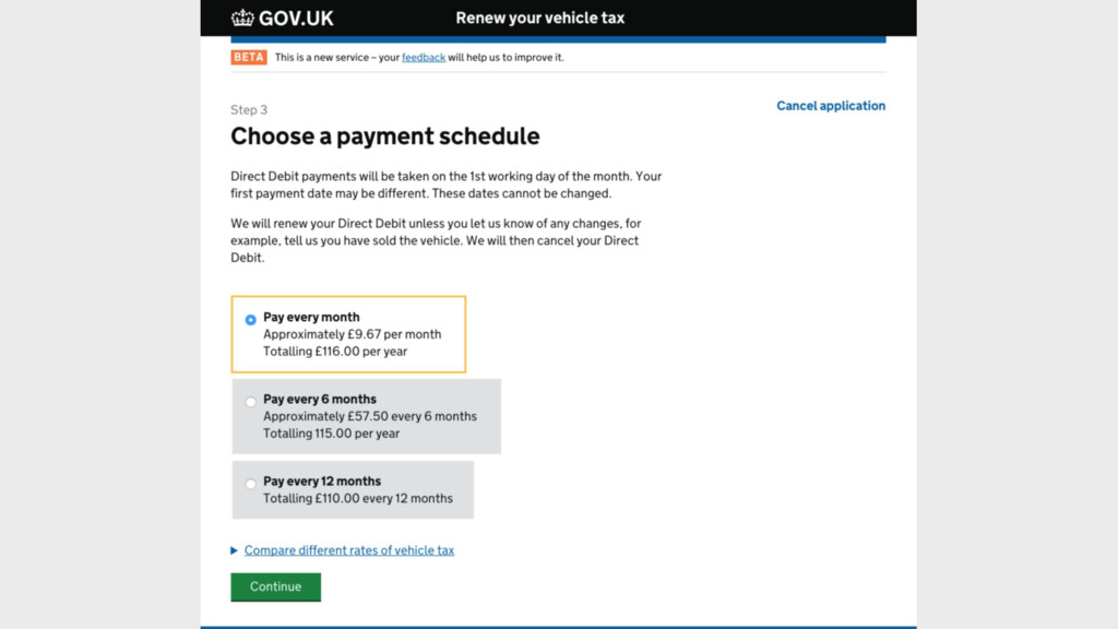
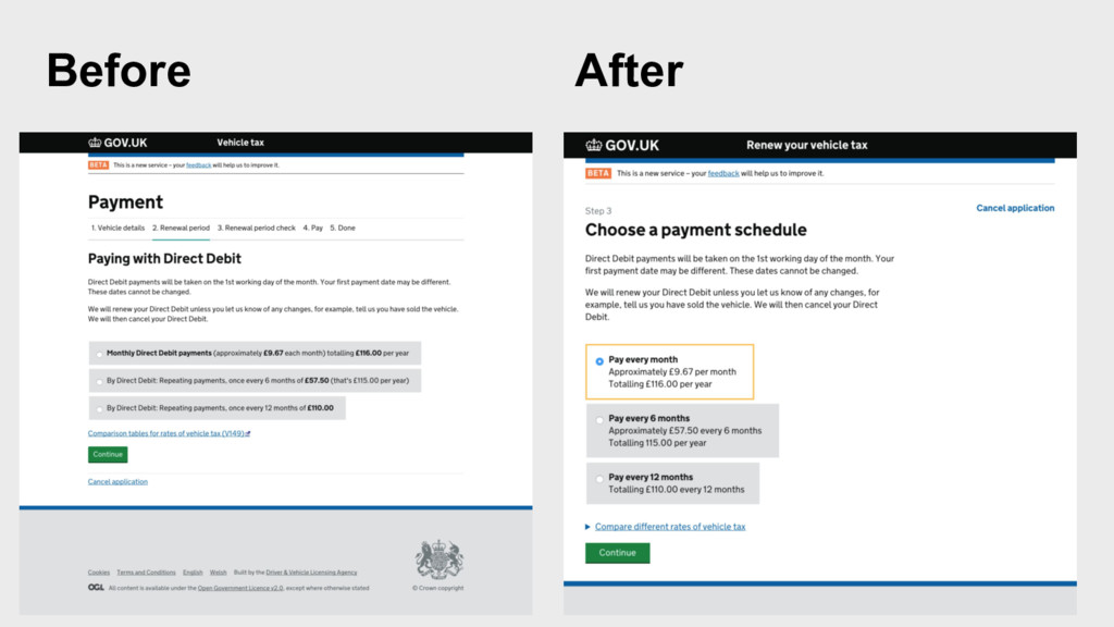
Before After
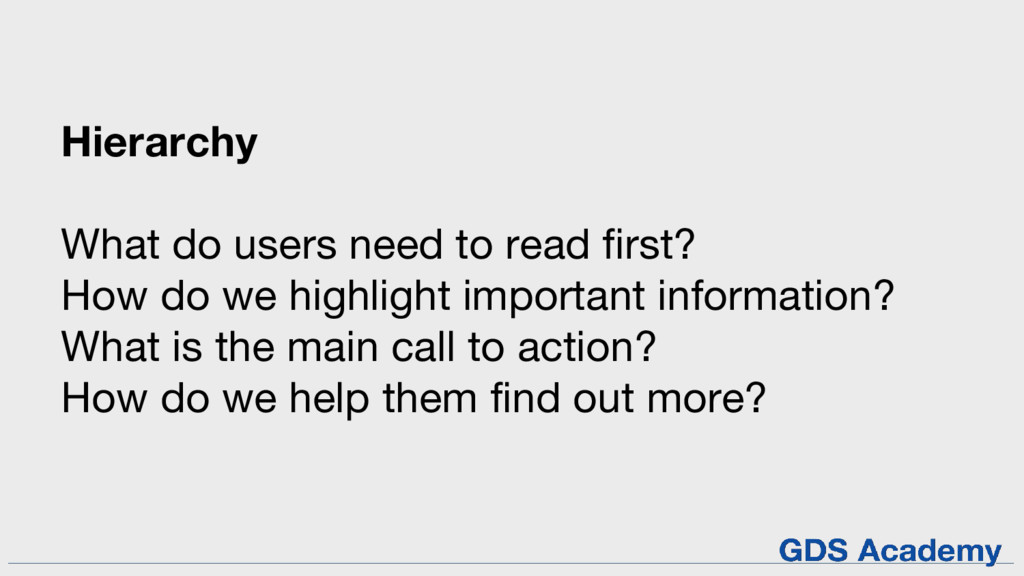
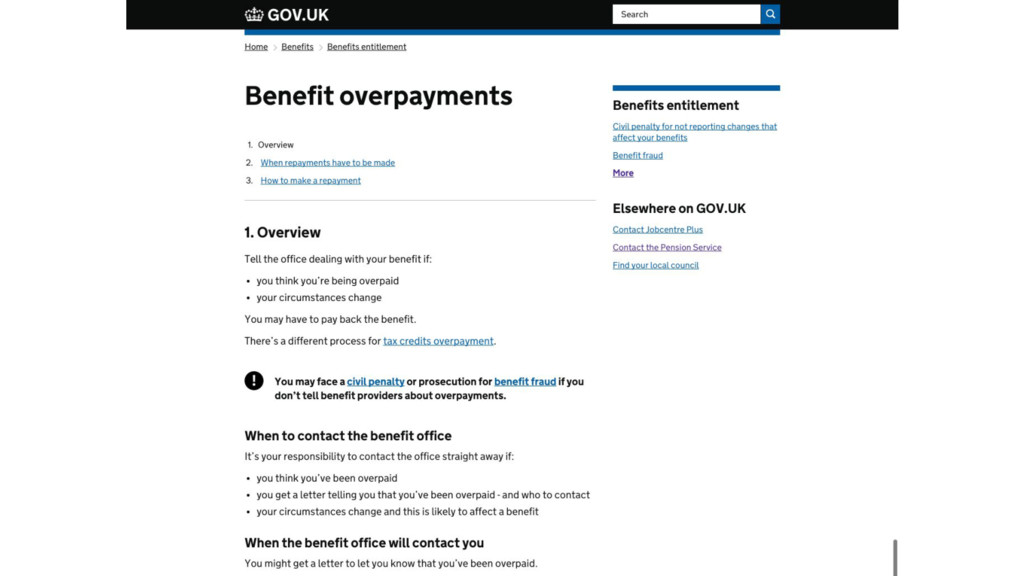
Hierarchy What do users need to read first? How do
we highlight important information? What is the main call to action? How do we help them find out more?
None
None
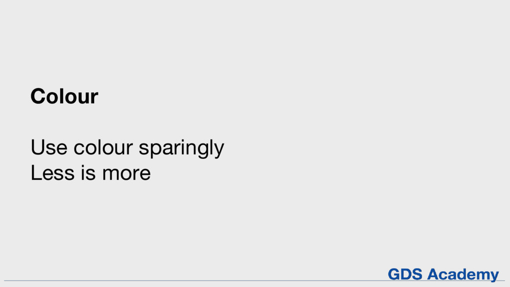
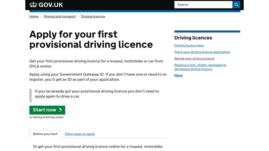
Colour Use colour sparingly Less is more
None
None
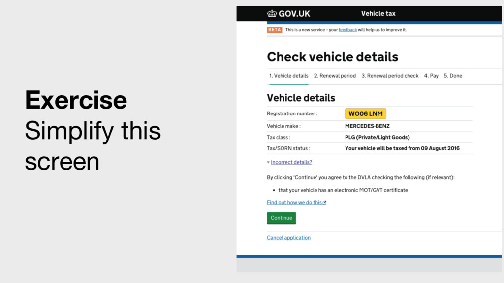
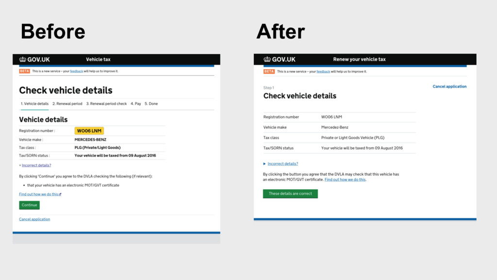
Exercise Simplify this screen
Before After
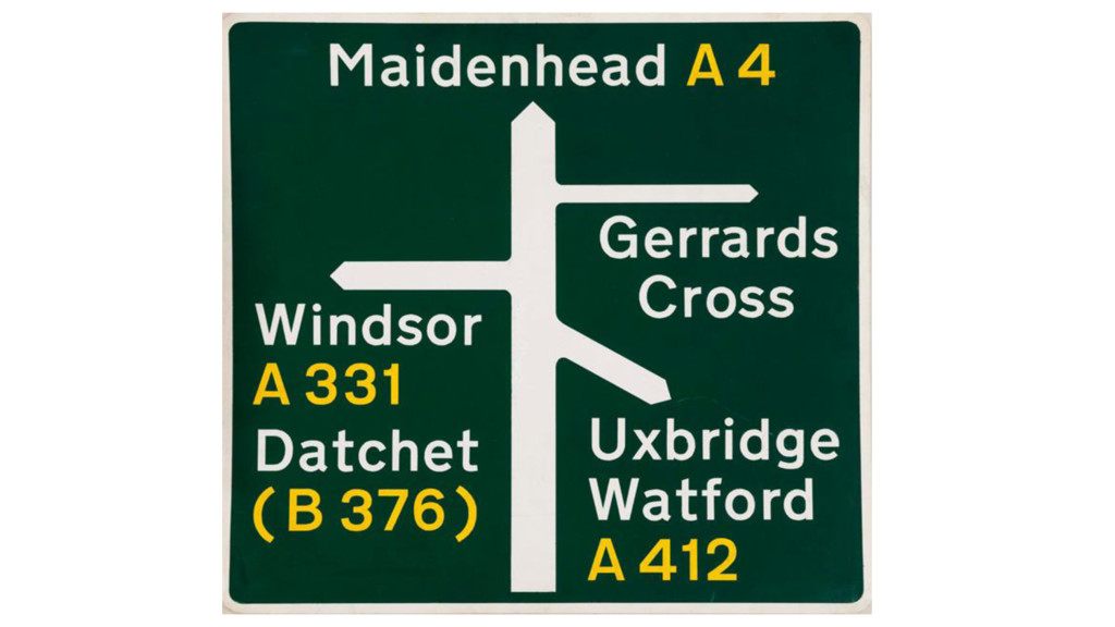
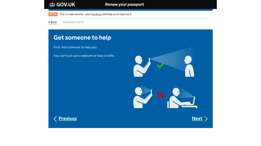
Icons and imagery Only use them when there is a
need Badly used images and icons can confuse and distract people
None
None
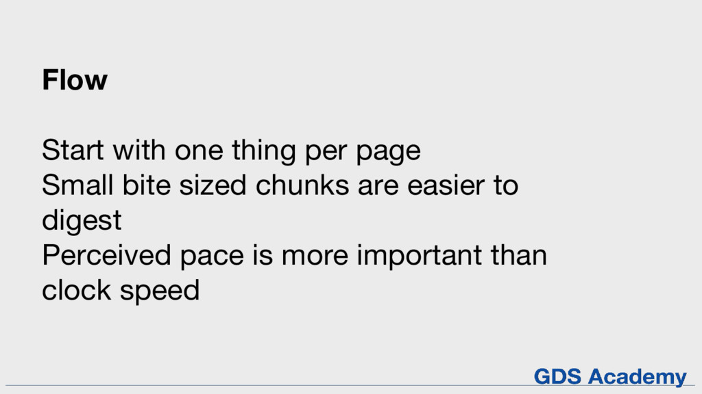
Flow Start with one thing per page Small bite sized
chunks are easier to digest Perceived pace is more important than clock speed
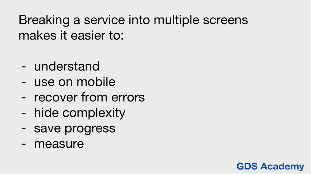
Breaking a service into multiple screens makes it easier to:
- understand - use on mobile - recover from errors - hide complexity - save progress - measure
Before and after
None
None
Before After GDS
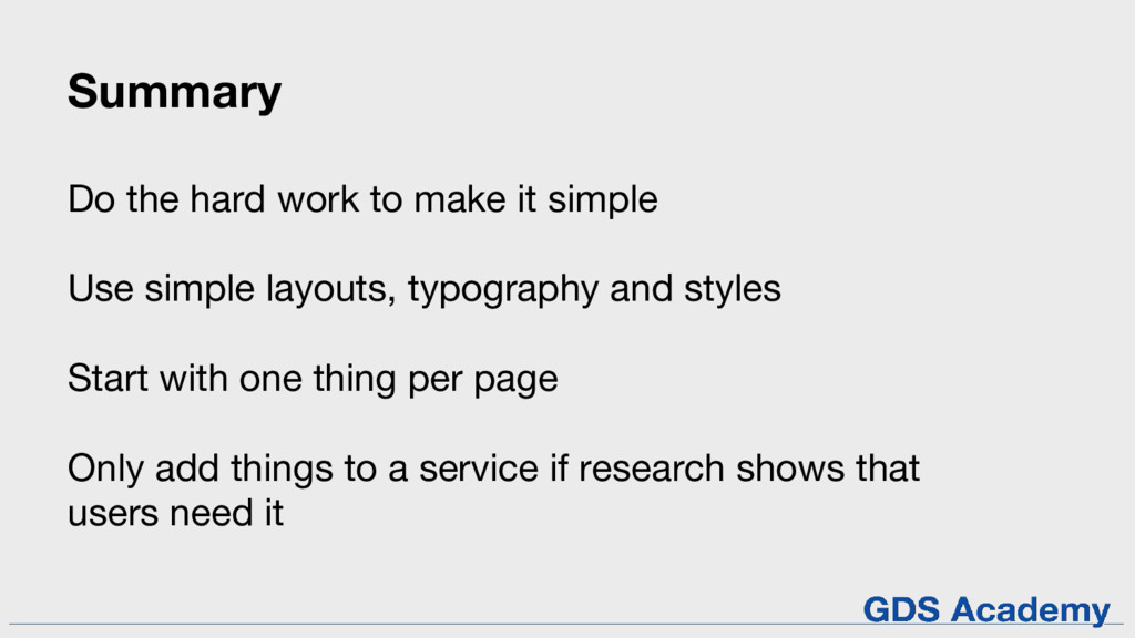
Summary Do the hard work to make it simple Use
simple layouts, typography and styles Start with one thing per page Only add things to a service if research shows that users need it
Any questions?
07 Prototyping
Prototypes are fake versions of the things that you’re thinking
about making
Why make prototypes?
To explore different ideas To communicate those ideas To test
ideas with users
Prototypes let you do all of these things quickly, without
wasting developer time
design research develop User-centred design involves regularly iterating a product
or service
What kinds of prototype are there?
Paper sketches Lo-fi wireframes Hi-fi wireframes HTML prototype
Choose the level of fidelity that gets the job done
Paper prototyping
None
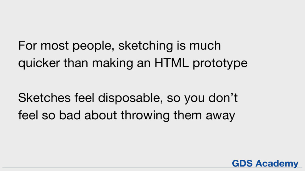
For most people, sketching is much quicker than making an
HTML prototype Sketches feel disposable, so you don’t feel so bad about throwing them away
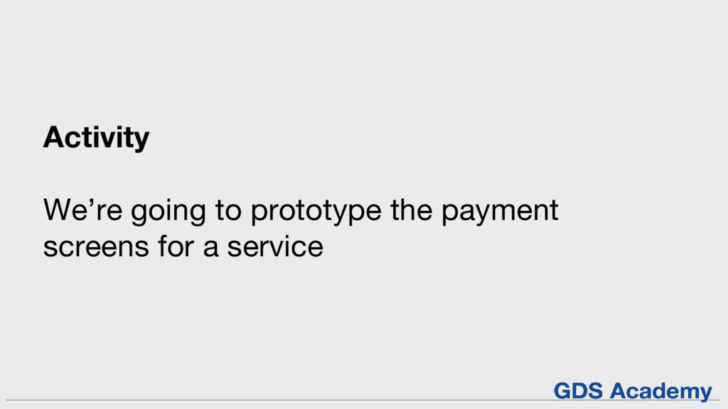
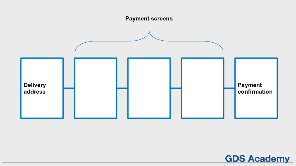
Activity We’re going to prototype the payment screens for a
service
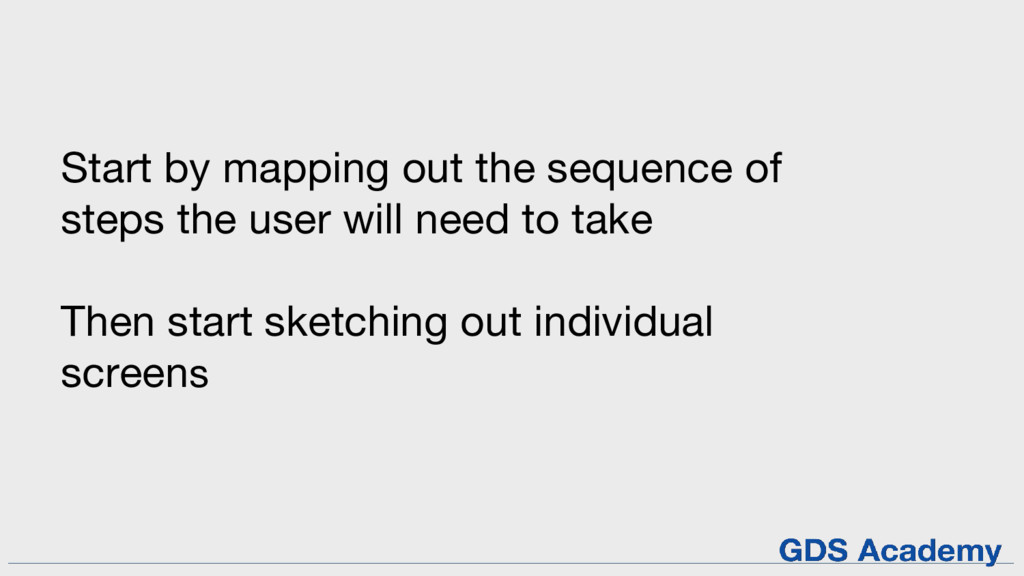
Start by mapping out the sequence of steps the user
will need to take Then start sketching out individual screens
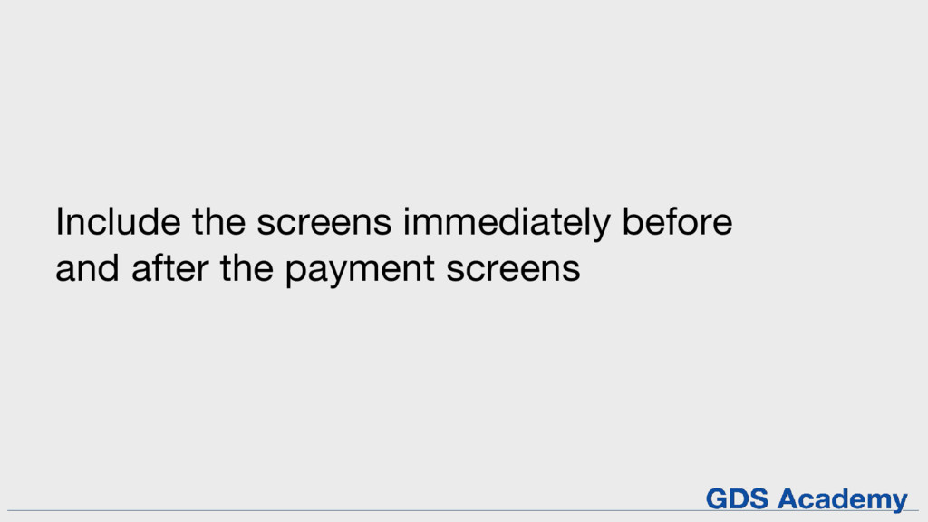
Include the screens immediately before and after the payment screens
Delivery address Payment confirmation Payment screens
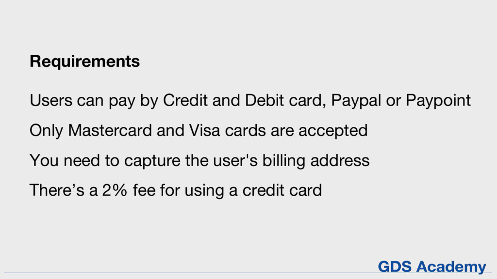
Requirements Users can pay by Credit and Debit card, Paypal
or Paypoint Only Mastercard and Visa cards are accepted You need to capture the user's billing address There’s a 2% fee for using a credit card
Let’s critique (crit) your prototypes Talk us through what you
did and why. 3 minutes per team. Rules for a design crit: 1. Critique the product, not the people 2. Constructive criticism only 3. There’s no need to defend your position
Prototyping in code
There are lots of ways to prototype in code We’re
going to talk about 2
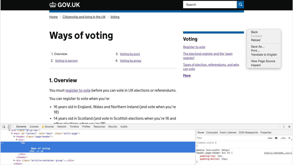
Prototyping in the browser
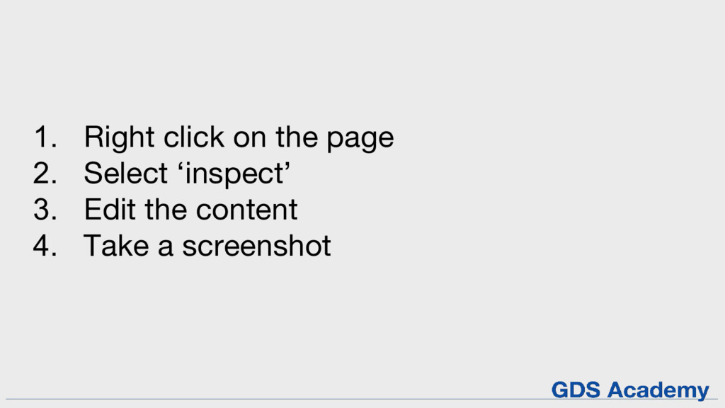
1. Right click on the page 2. Select ‘inspect’ 3.
Edit the content 4. Take a screenshot
None
None
It’s quick and relatively easy You don’t need any special
software No good for building interactive prototypes
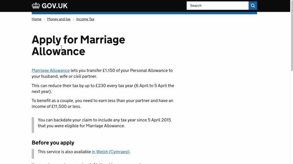
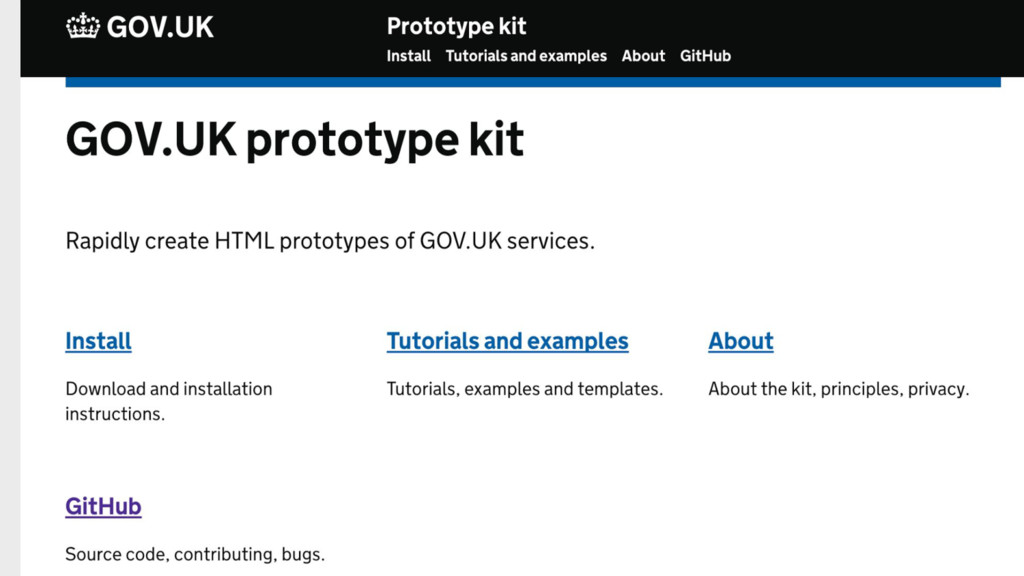
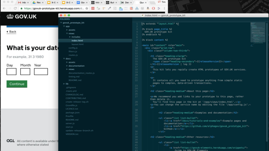
Using the GOV.UK Prototype Kit
None
None
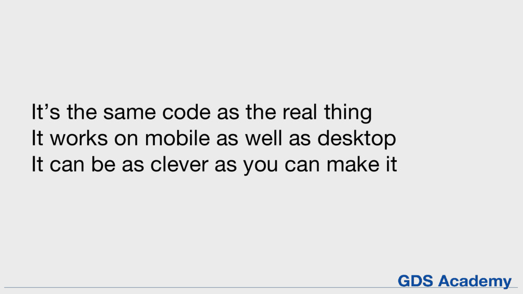
It’s the same code as the real thing It works
on mobile as well as desktop It can be as clever as you can make it
www.gov.uk/service-toolkit
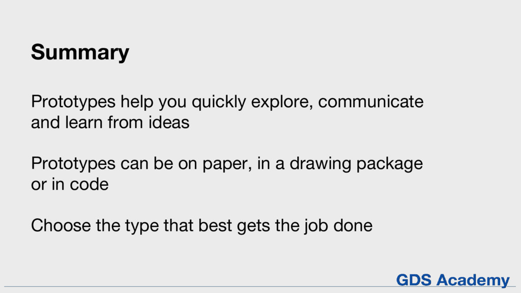
Summary Prototypes help you quickly explore, communicate and learn from
ideas Prototypes can be on paper, in a drawing package or in code Choose the type that best gets the job done
Any questions?
If you want to know more: Service Manual Design Principles
Digital Service Standard GDS Academy courses Communities
Thanks!