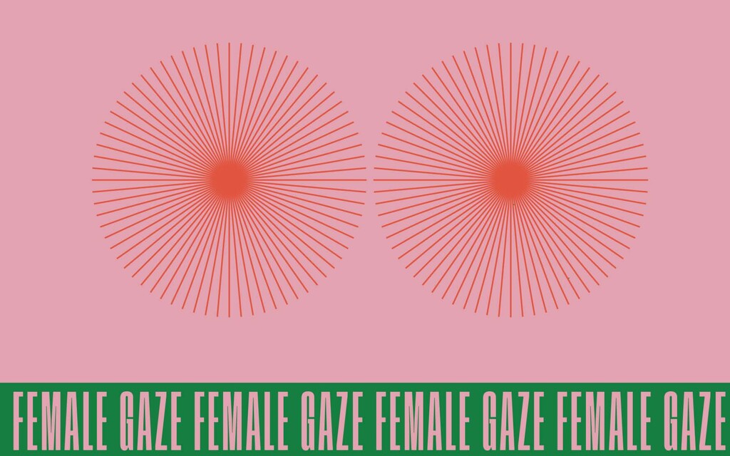
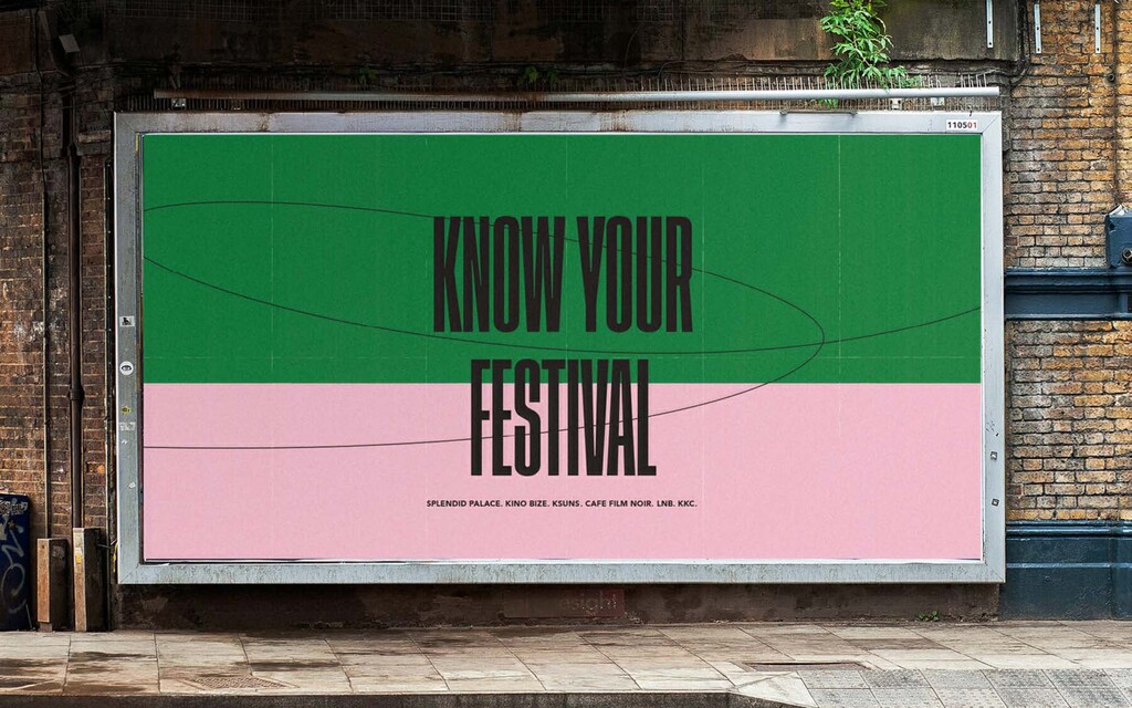
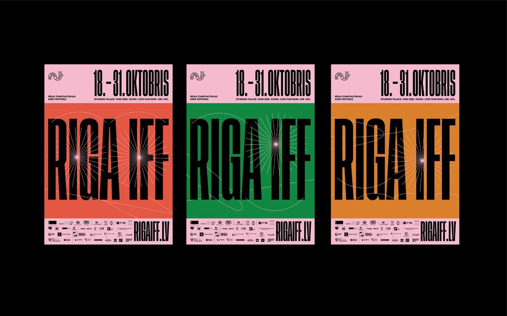
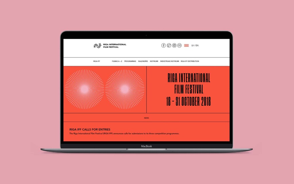
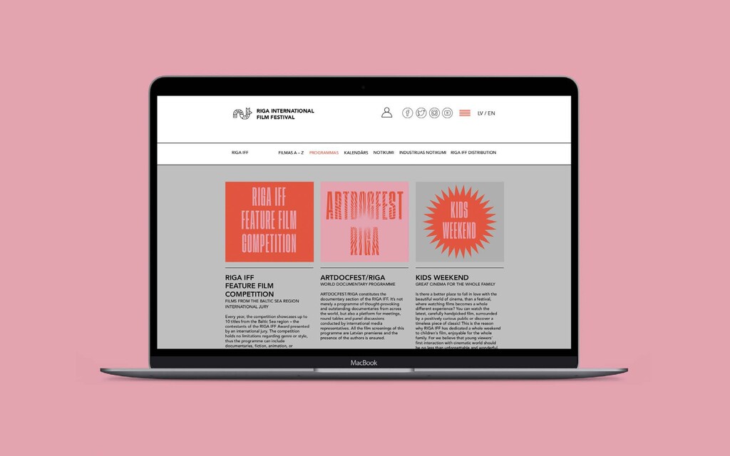
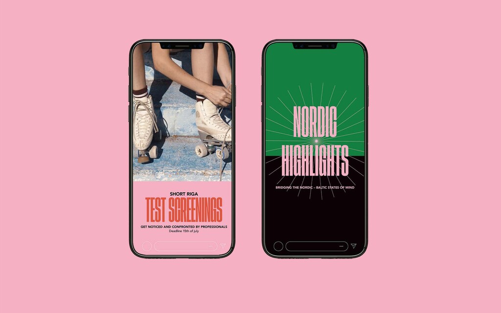
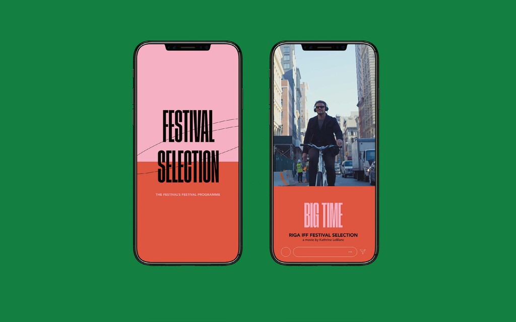
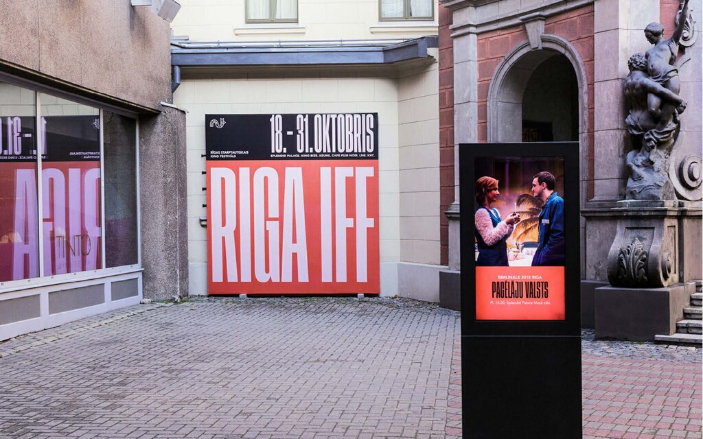
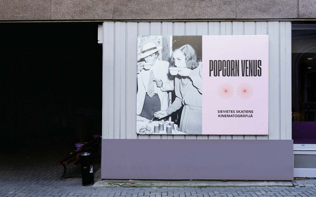
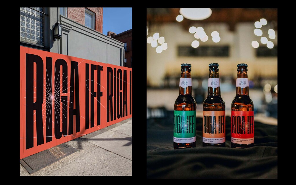
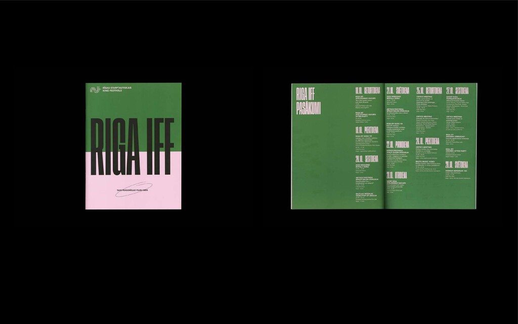
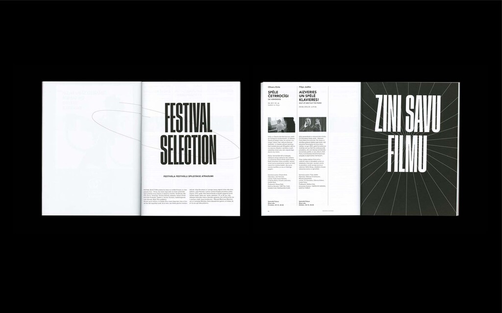
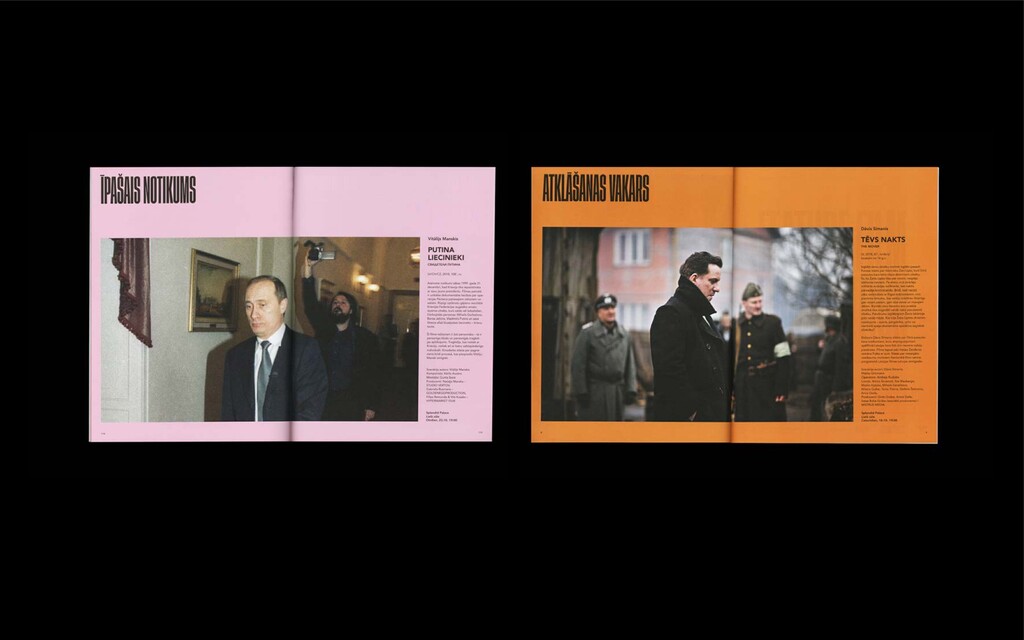
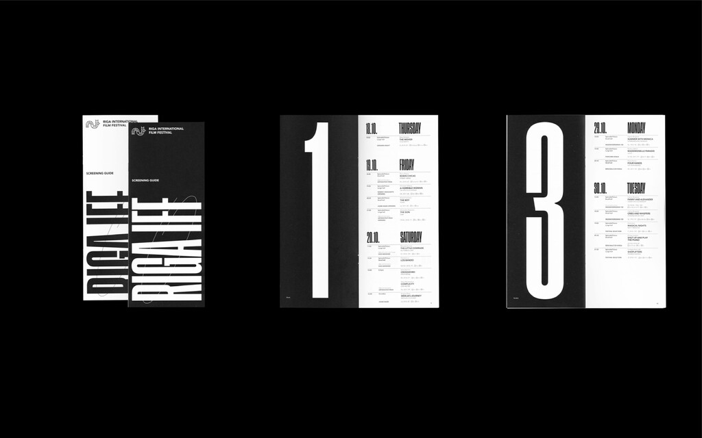
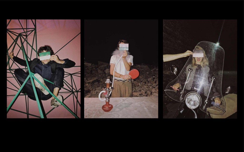
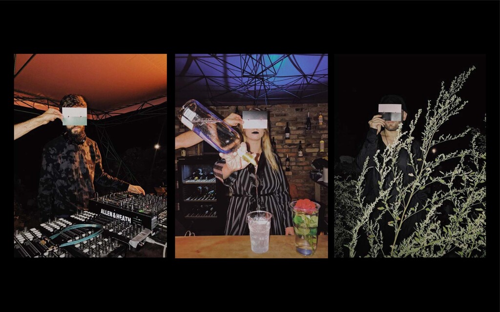
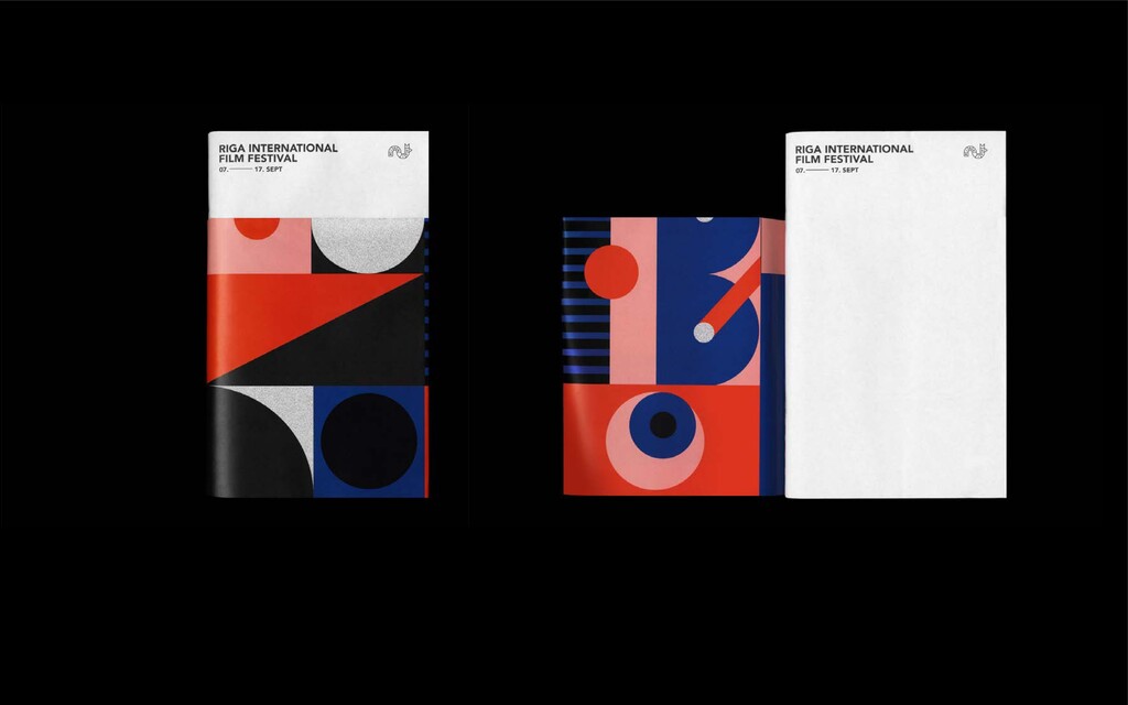
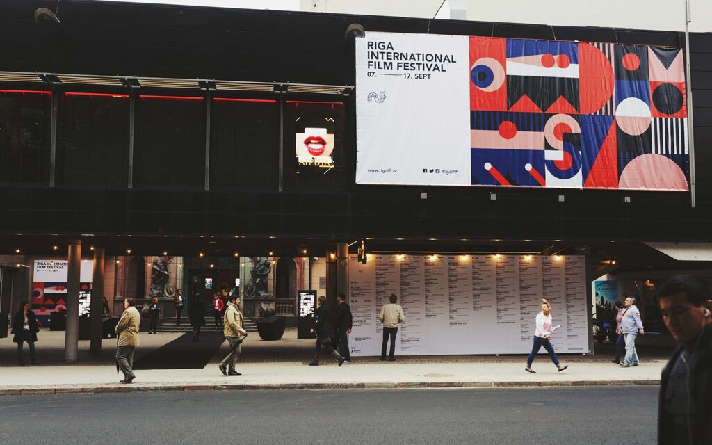
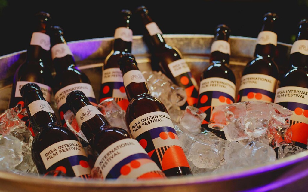
design, illustration, scenography / 2018 Riga IFF is a two week international film festival held in the Lat- vian capital. It mixes competition and industry events with an extensive programme of screenings open to the general public. This year my assignment was to develop a visual identity for 2018 that celebrates the female gaze and female film-directors in cin- ema, while highlighting the current Zeitgeist – the post-truth and post-trump era – with subtle hints of propaganda aesthetics and calls for exploration of self. The brand identity builds upon the previous years identity, which received Latvian Design Awards Grand Prix in 2018, continuing with a colourful and vibrant visual language. Yet paying homage to continuity hasn’t become self-centred, leaving enough room for new experiments and flexibility in communication of the cur- rent theme. Bold typography and fine line abstract illustrations formed foun- dation for dozens of layouts, objects and digital experiences. While visually appealing, it is also grounded in the intentions of the festival and its programme, one of cinematic diversity yet a shared philosophy.
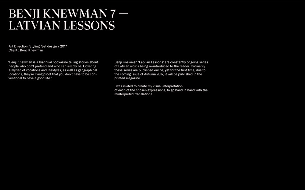
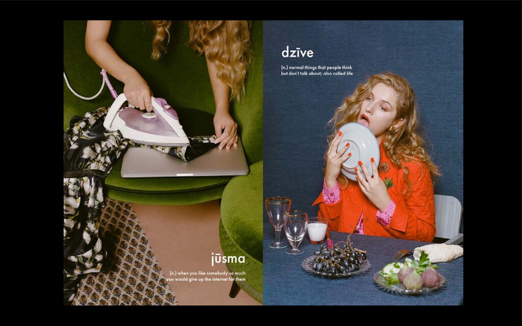
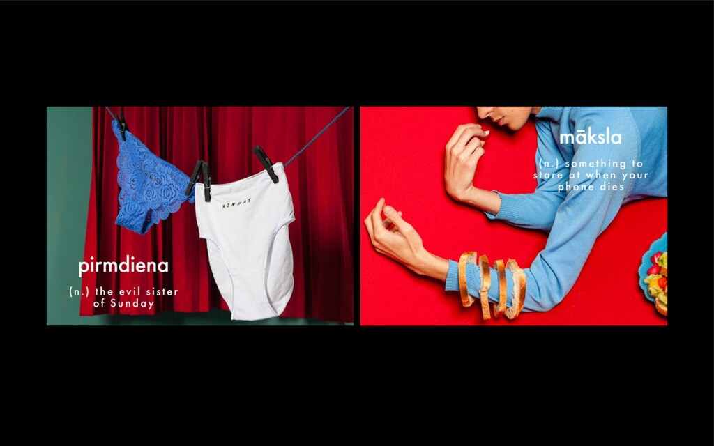
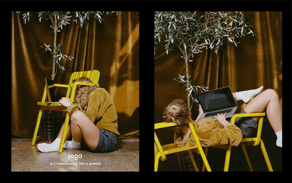
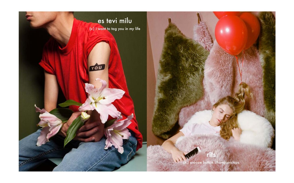
who don’t pretend and who can simply be. Covering a myriad of vocations and lifestyles, as well as geographical locations, they’re living proof that you don’t have to be con- ventional to have a good life.” BENJI KNEWMAN 7 — LATVIAN LESSONS Art Direction, Styling, Set design / 2017 Client : Benji Knewman Benji Knewman ‘Latvian Lessons’ are constantly ongoing series of Latvian words being re-introduced to the reader. Ordinarily these series are published online, yet for the first time, due to the coming issue of Autumn 2017, it will be published in the printed magazine. I was invited to create my visual interpretation of each of the chosen expressions, to go hand in hand with the reinterpreted translations.
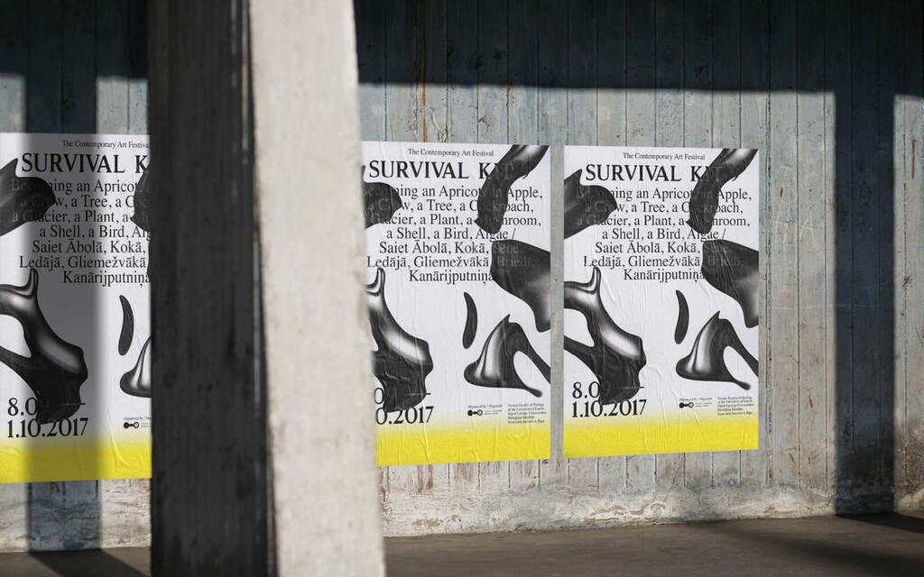
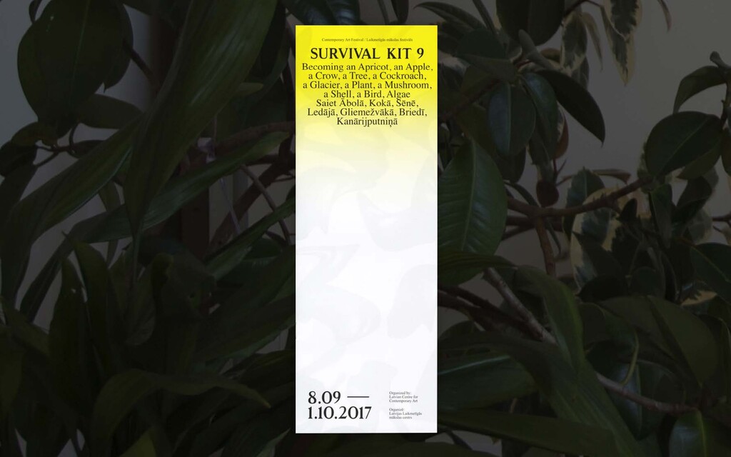
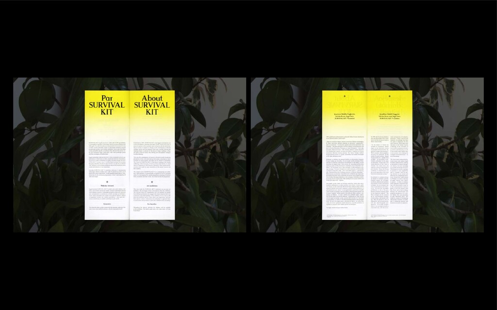
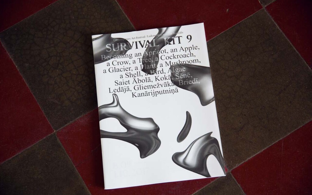
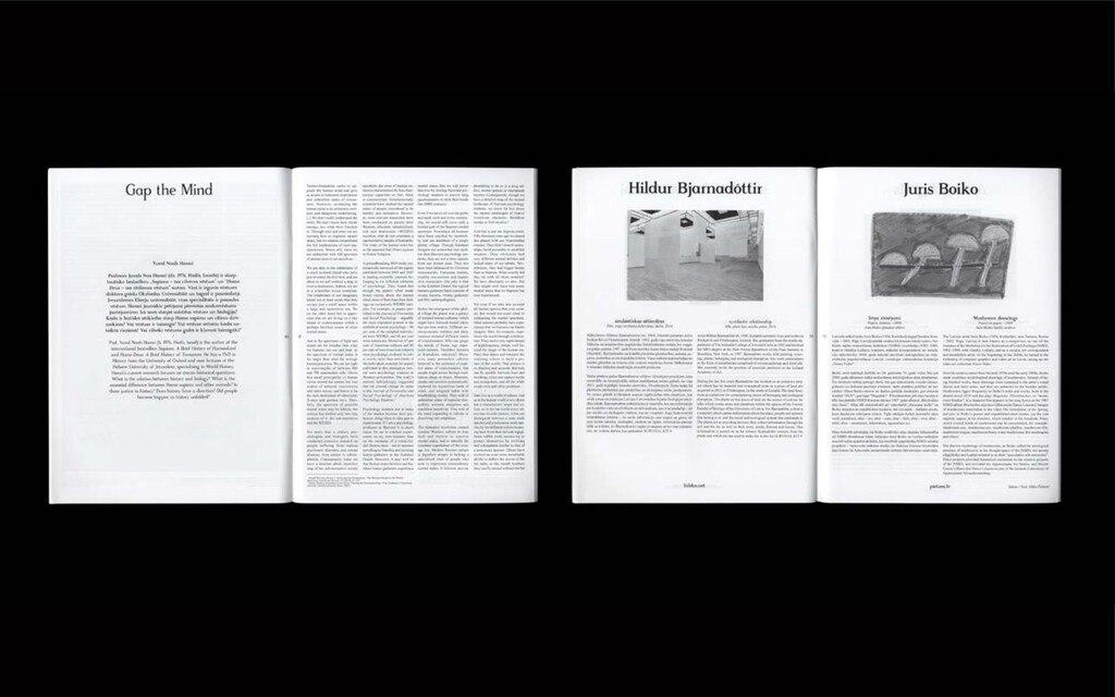
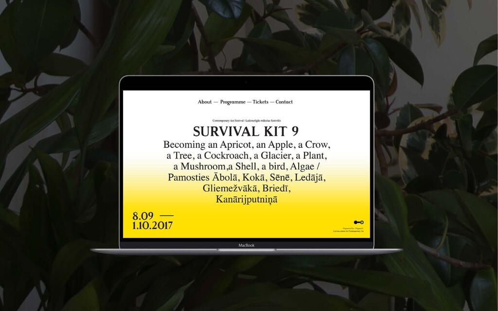
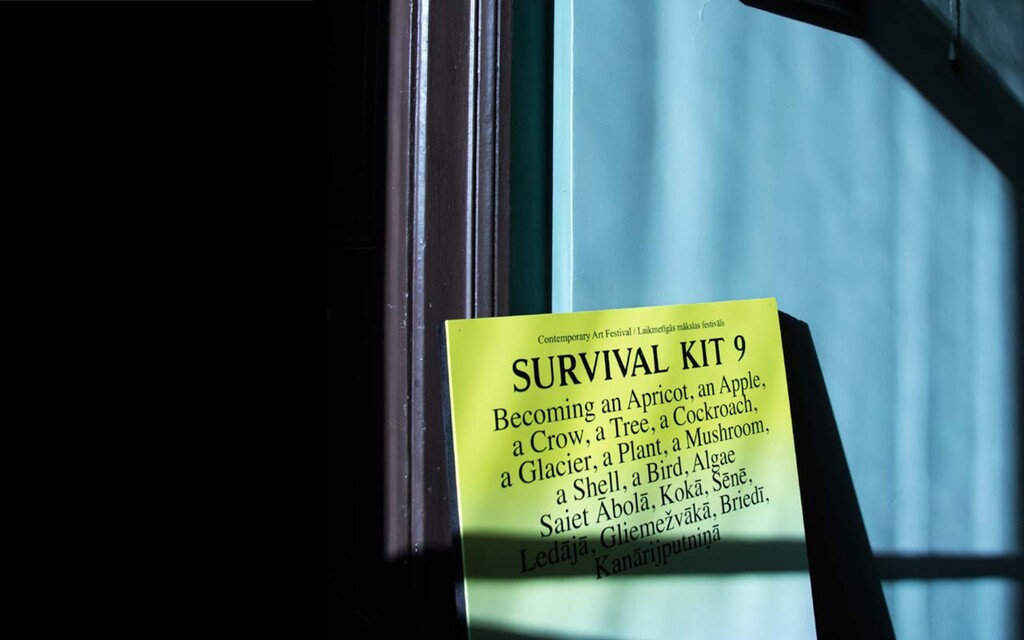
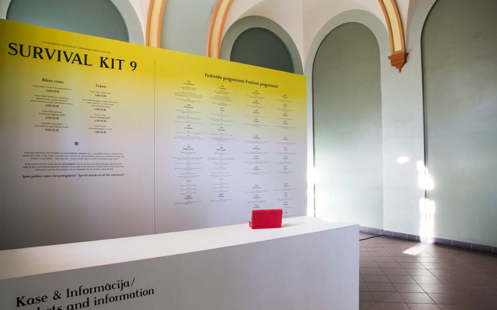
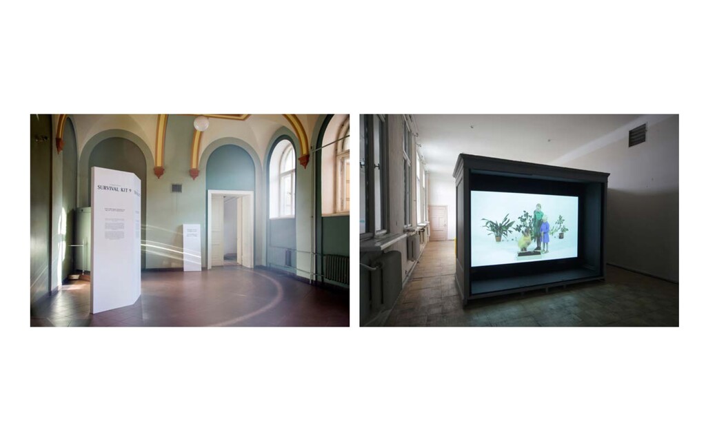
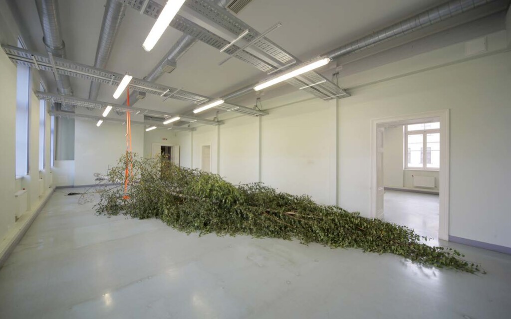
annual contemporary art event in the Baltics. It was founded as a reaction to the austerity caused by the eco- nomic crisis and encourages public to respond to changes taking place in the modern-day world. SURVIVAL KIT 9 — BECOMING AN APRICOT * AN APPLE * A CROW * A TREE * A COCKROACH * A GLACIER * A PLANT * A MUSHROOM * A SHELL * A BIRD * ALGAE Exhibition visual identity, Creative direction / 2017 Client : Latvian Centre for Contemporary Art In 2017 the festival encouraged to step out of the traditional worldview and observe the planet from the perspective of na- ture. Could viable alternatives to the conditions of the present day be found by embracing the embodied knowledge of other species or types of being? Encompassing mushroom growing laboratories and paintings which have been created by swamps or insects as well as voices of seals in the empty staircases of the exhibition. This year, my visual response on the theme emerged from visu- alising the act of “becoming”. My aim was to depict change and transformation. By turning elements of nature (apricots in partic- ular) into synthetic, chromatic objects, and later again distorting them in order to symbolise the “modification”, I gained aesthetic abstract shapes that con- structed the main image of festivals identity. This visual identity encompassed the design of all collateral – campaigns, advertisements, exhibition design and the exhibition publications.
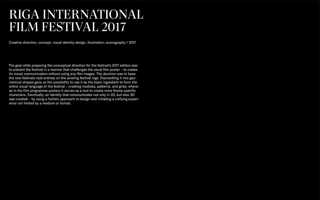
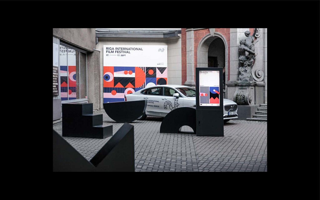
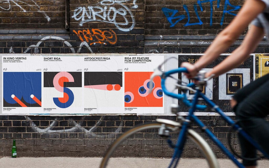
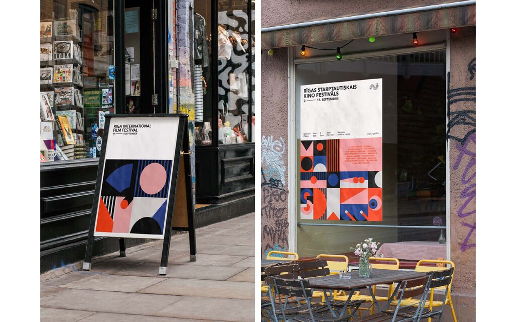
design, illustration, scenography / 2017 The goal while preparing the conceptual direction for the festival’s 2017 edition was to present the festival in a manner that challenges the usual film poster – to create its visual communication without using any film images. The decision was to base the new festivals look entirely on the existing festival logo. Dismantling it into geo- metrical shapes gave us the possibility to use it as the basic ingredient to form the entire visual language of the festival – creating modules, patterns, and grids, where- as in the film programme posters it serves as a tool to create more theme specific characters. Eventually, an identity that communicates not only in 2D, but also 3D was created – by using a holistic approach to design and initiating a unifying experi- ence not limited by a medium or format.
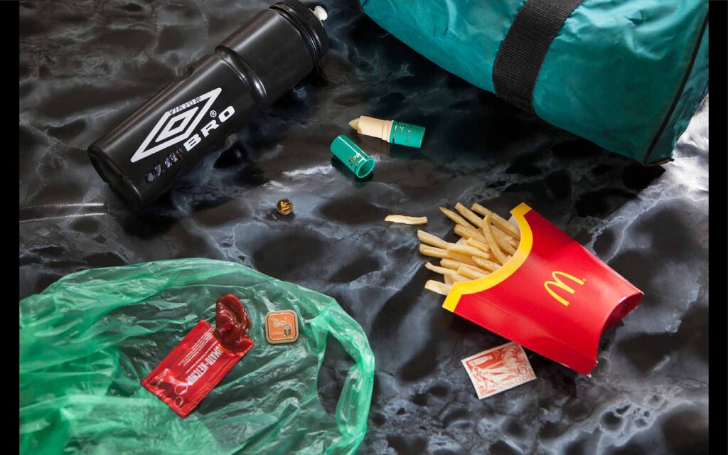
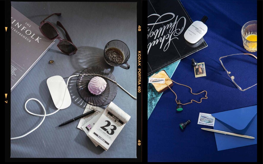
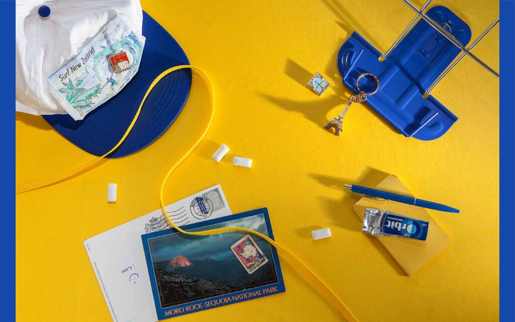
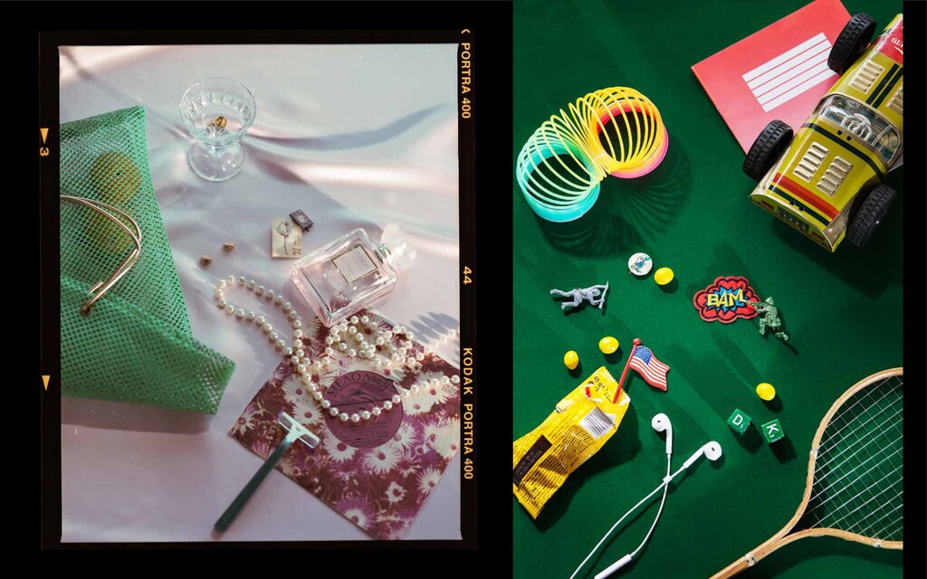
who don’t pretend and who can simply be. Covering a myriad of vocations and lifestyles, as well as geographical locations, they’re living proof that you don’t have to be con- ventional to have a good life.” BENJI KNEWMAN 8 —POST SOVIET MAN. A YEAR OF UNDERSTANDING Art Direction, Styling, Set design / 2018 Client : Benji Knewman Photo series for Benji Knewman 8 article “Post Soviet Man. A year of understanding” illustrating a conversation between Benji Knewman Editor-in-Chief, Agnese Kleina, and Writer, Oleg Sivun about coming to terms with their post-soviet identities.
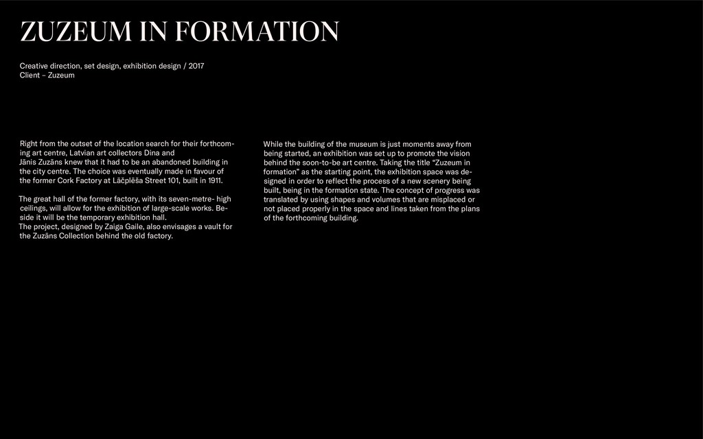
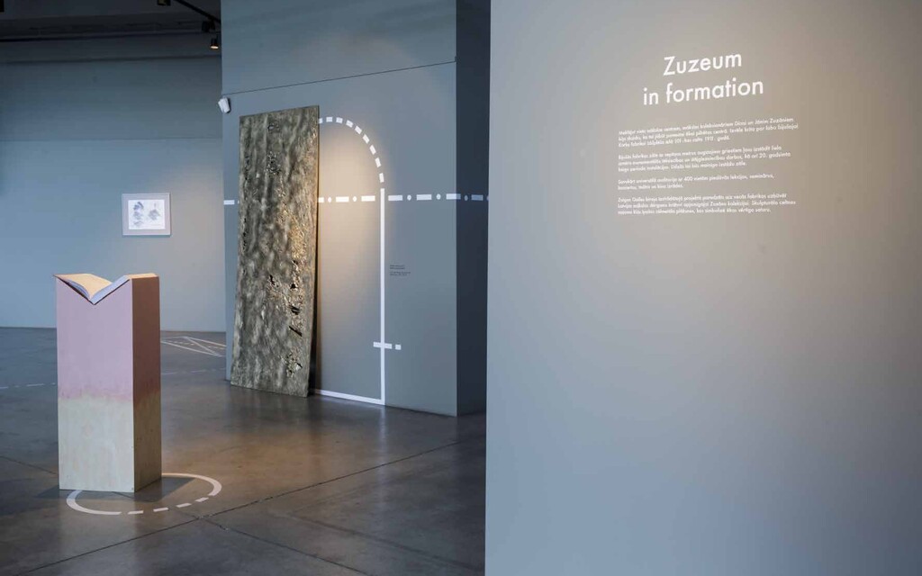
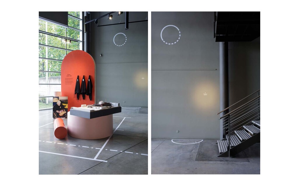
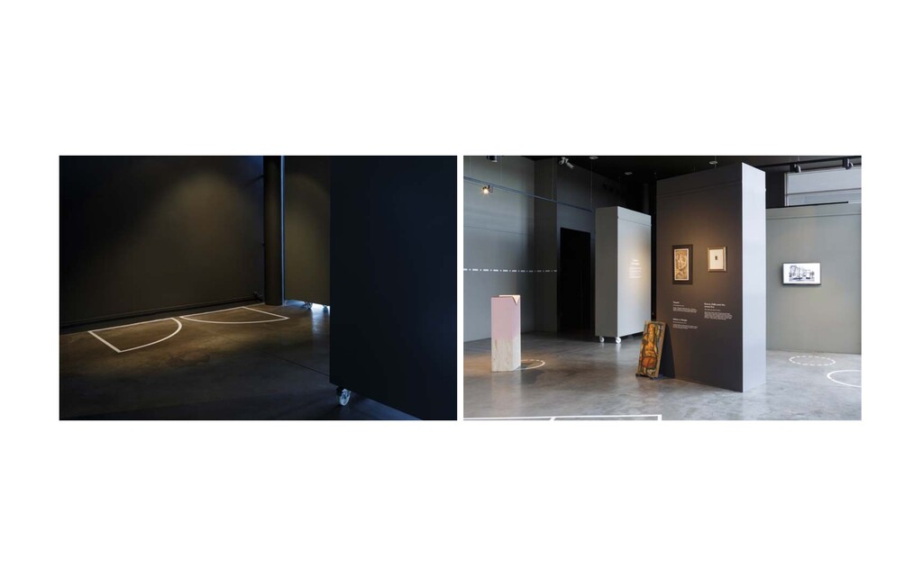
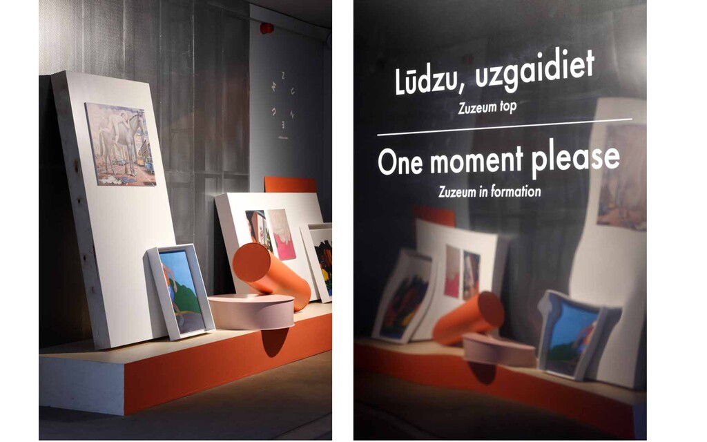
forthcom- ing art centre, Latvian art collectors Dina and Jānis Zuzāns knew that it had to be an abandoned building in the city centre. The choice was eventually made in favour of the former Cork Factory at Lāčplēša Street 101, built in 1911. The great hall of the former factory, with its seven-metre- high ceilings, will allow for the exhibition of large-scale works. Be- side it will be the temporary exhibition hall. The project, designed by Zaiga Gaile, also envisages a vault for the Zuzāns Collection behind the old factory. ZUZEUM IN FORMATION Creative direction, set design, exhibition design / 2017 Client – Zuzeum While the building of the museum is just moments away from being started, an exhibition was set up to promote the vision behind the soon-to-be art centre. Taking the title “Zuzeum in formation” as the starting point, the exhibition space was de- signed in order to reflect the process of a new scenery being built, being in the formation state. The concept of progress was translated by using shapes and volumes that are misplaced or not placed properly in the space and lines taken from the plans of the forthcoming building.
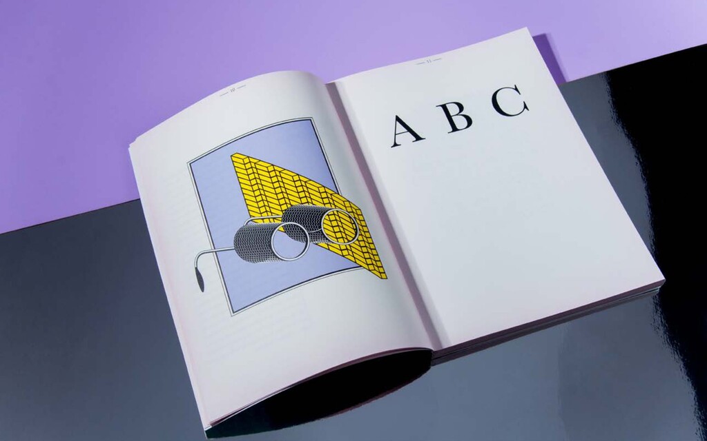
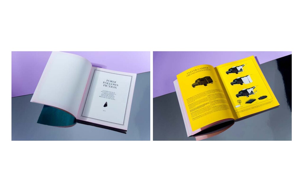
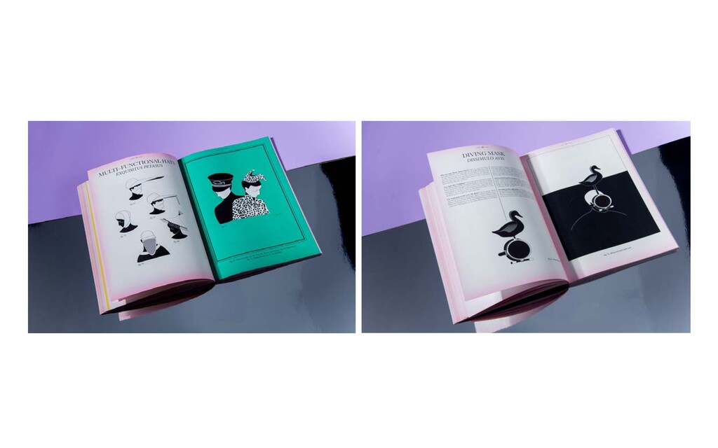
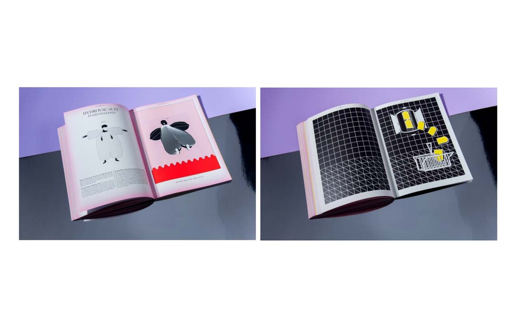
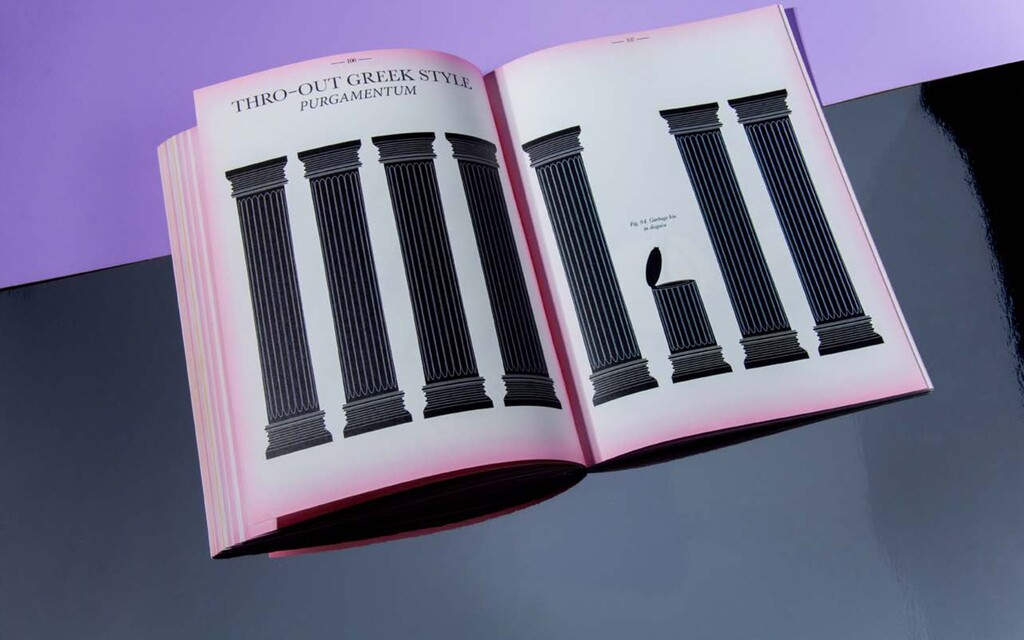
Eindhoven, The Netherlands. FORM FOLLOWS FICTION I Concept, design, illustrations / 2015 Design fiction is a practice used as a guideline for possible future scenarios and design ideas, assuming that every fiction- al artifact - literary or cinematic - has the potential to become a valid design idea and a cornerstone for further speculations. Using narrative elements to envision new possibilities within the field of design. Throughout history there have been numerous examples of fictional predictions influencing the design industry, and designs that have lived only in imagination and fantasy take a tangible shape in the physical world. “Form fol- lows fiction” is an attempt to revive and introduce you to imag- inary designs and functions found in movies and books. An encyclopedia of the imaginary. A reference manual on how to use fiction in reality and your guide to design speculation.
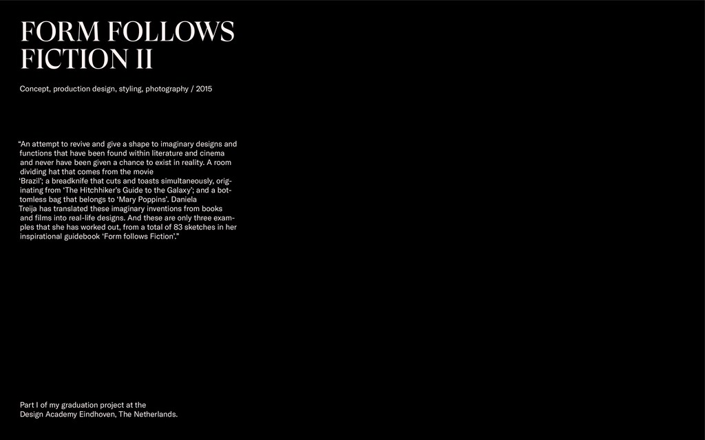
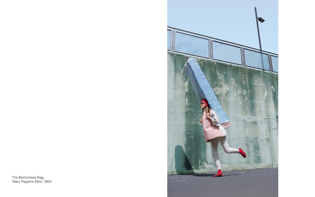
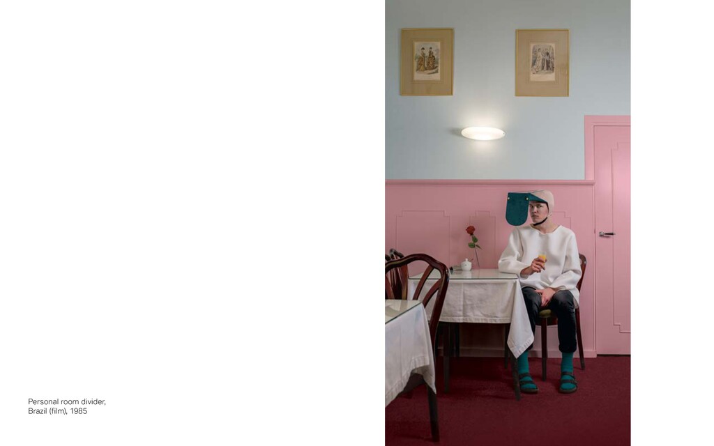
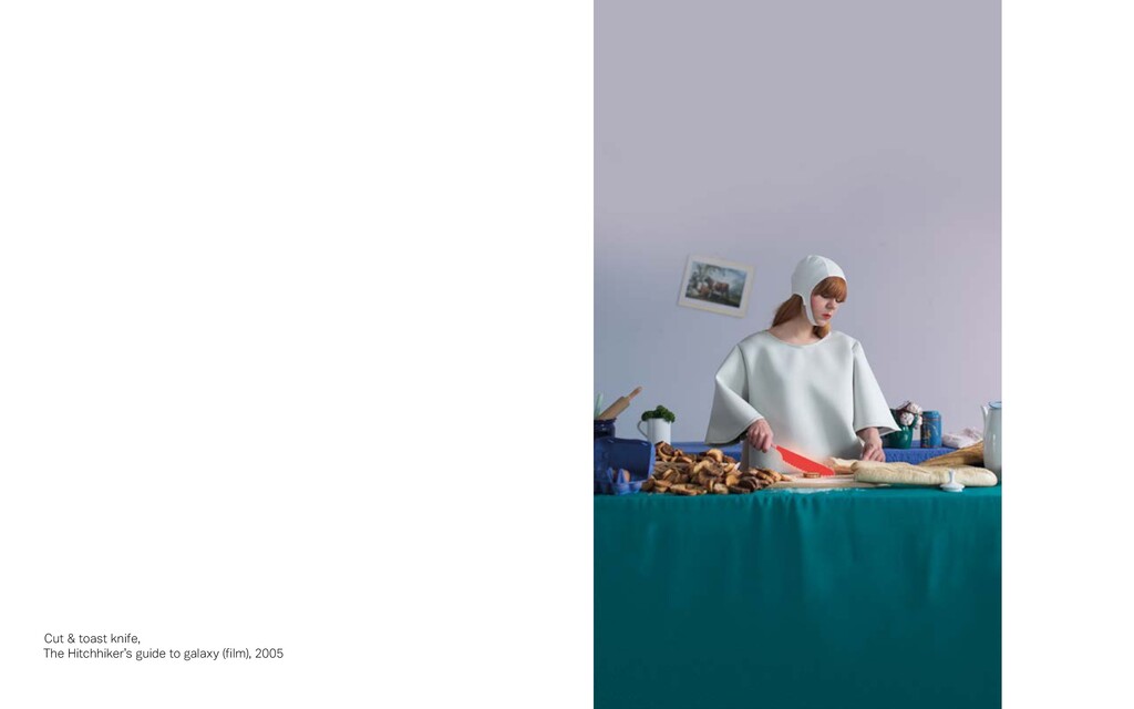
Eindhoven, The Netherlands. FORM FOLLOWS FICTION II Concept, production design, styling, photography / 2015 “An attempt to revive and give a shape to imaginary designs and functions that have been found within literature and cinema and never have been given a chance to exist in reality. A room dividing hat that comes from the movie ‘Brazil’; a breadknife that cuts and toasts simultaneously, orig- inating from ‘The Hitchhiker’s Guide to the Galaxy’; and a bot- tomless bag that belongs to ‘Mary Poppins’. Daniela Treija has translated these imaginary inventions from books and films into real-life designs. And these are only three exam- ples that she has worked out, from a total of 83 sketches in her inspirational guidebook ‘Form follows Fiction’.”


 sferik
 aki_iinuma
 reverentgeek
 wayneb77
 tamaranovitovic
 techseoconnect
 inesmontani
 akademiya2063
 pauljervisheath
 eileencodes
 bkeepers