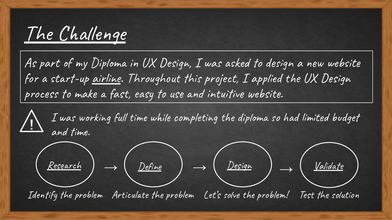
I was asked to design a new website for a start-up airline. Throughout this project, I applied the UX Design process to make a fast, easy to use and intuitive website. Research Design Validate → → → Identify the problem Articulate the problem Let’s solve the problem! Test the solution Define I was working full time while completing the diploma so had limited budget and time.
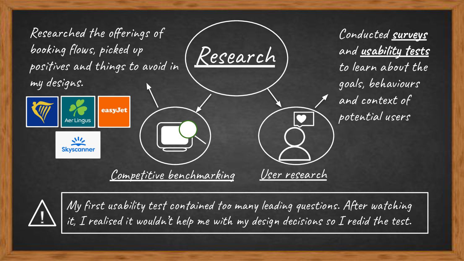
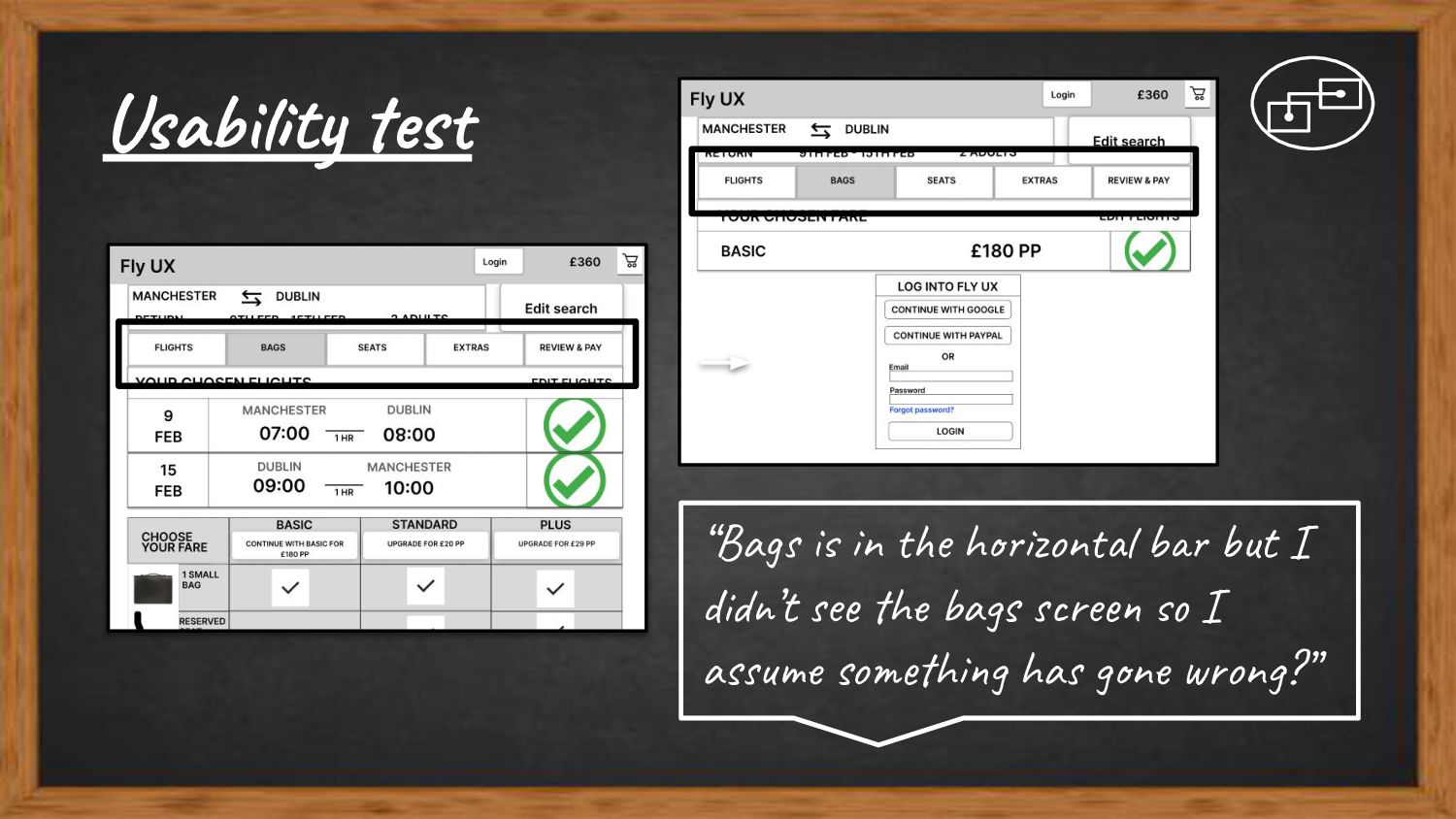
things to avoid in my designs. Research Competitive benchmarking User research Conducted surveys and usability tests to learn about the goals, behaviours and context of potential users My first usability test contained too many leading questions. After watching it, I realised it wouldn’t help me with my design decisions so I redid the test.
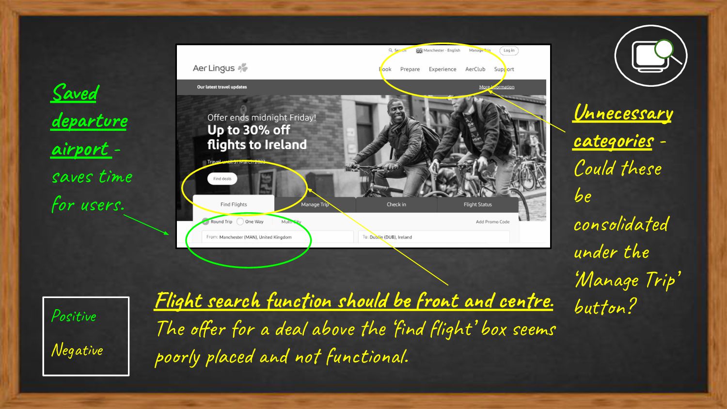
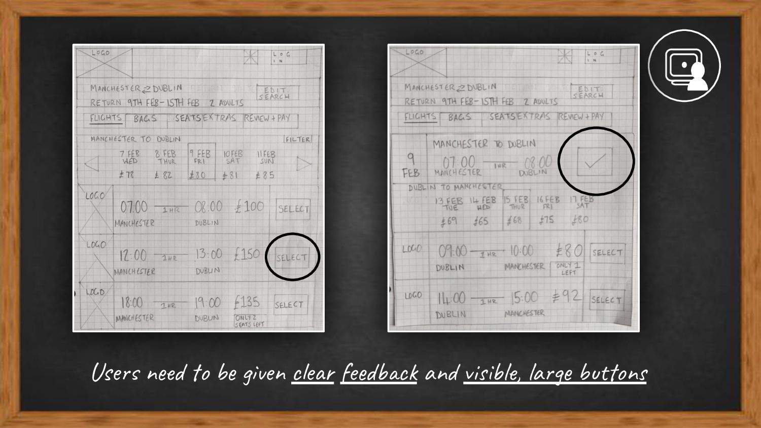
Unnecessary categories - Could these be consolidated under the ‘Manage Trip’ button? Flight search function should be front and centre. The offer for a deal above the ‘find flight’ box seems poorly placed and not functional.
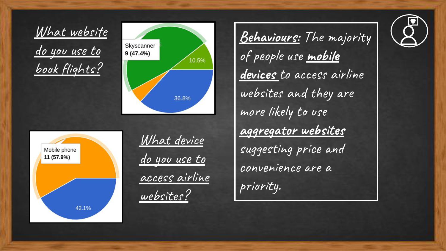
do you use to access airline websites? Behaviours: The majority of people use mobile devices to access airline websites and they are more likely to use aggregator websites suggesting price and convenience are a priority.
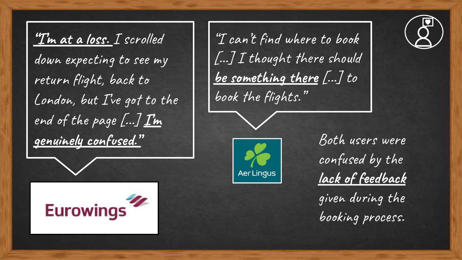
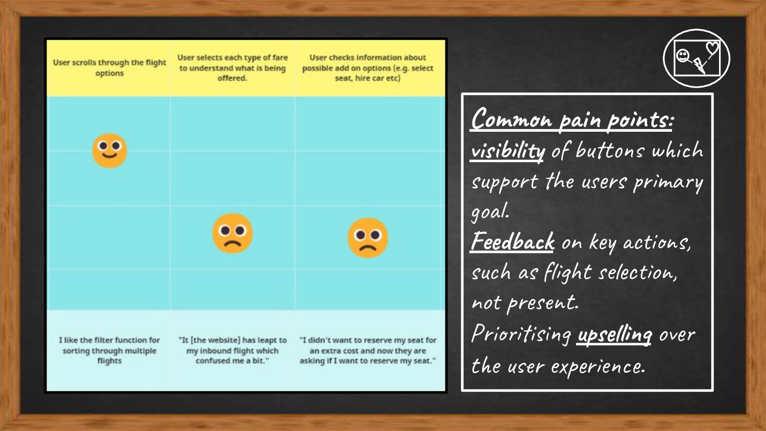
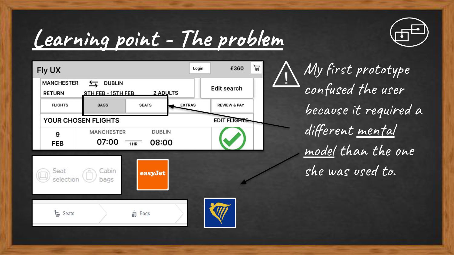
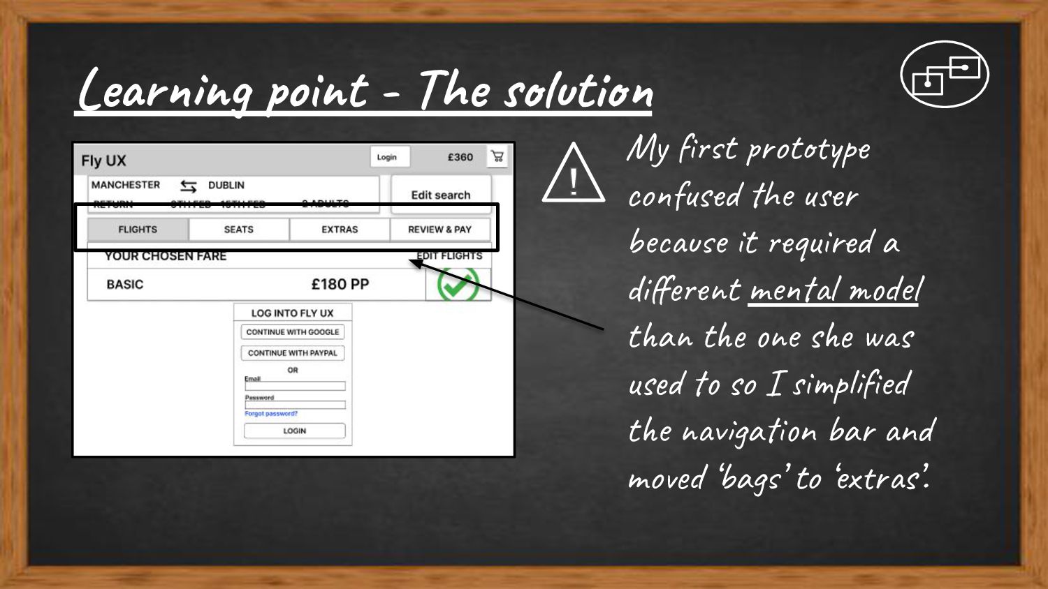
my return flight, back to London, but I’ve got to the end of the page [...] I’m genuinely confused.” “I can’t find where to book [...] I thought there should be something there [...] to book the flights.” Both users were confused by the lack of feedback given during the booking process.
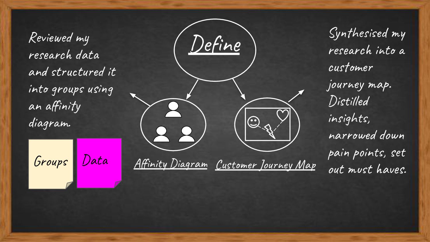
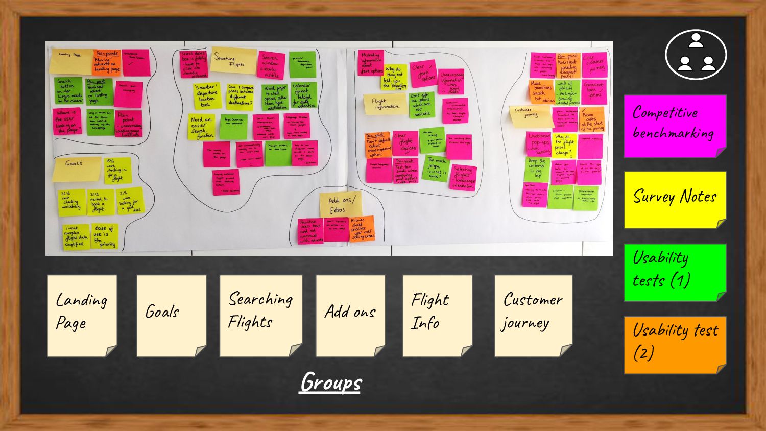
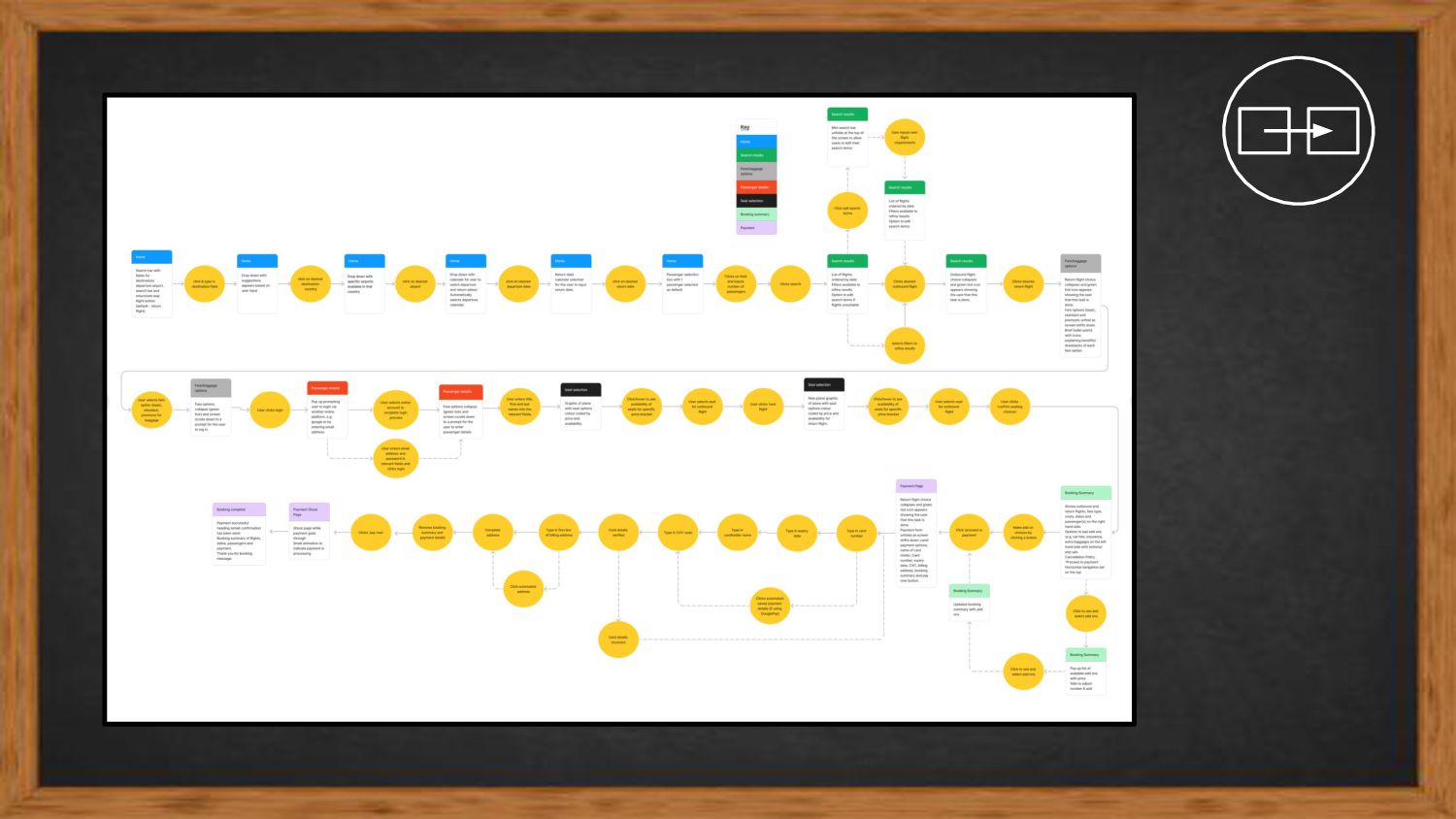
and structured it into groups using an affinity diagram. Synthesised my research into a customer journey map. Distilled insights, narrowed down pain points, set out must haves. Groups Data