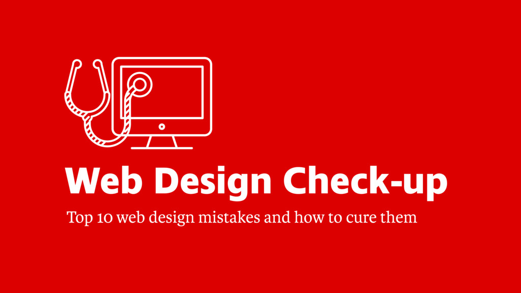
When you’re just starting out with your business, you often don’t have the budget to hire a professional designer to structure your content, craft a message and create your website. So you do it on your own, feeling a bit uncertain about the quality of the result and wondering what you could do better to gain more impact and stand out from the competition.
If you feel this way, this talk is just right for you. It will guide you through the top ten mistakes in web design and teach you how to avoid them, giving you the skills to improve your next project.
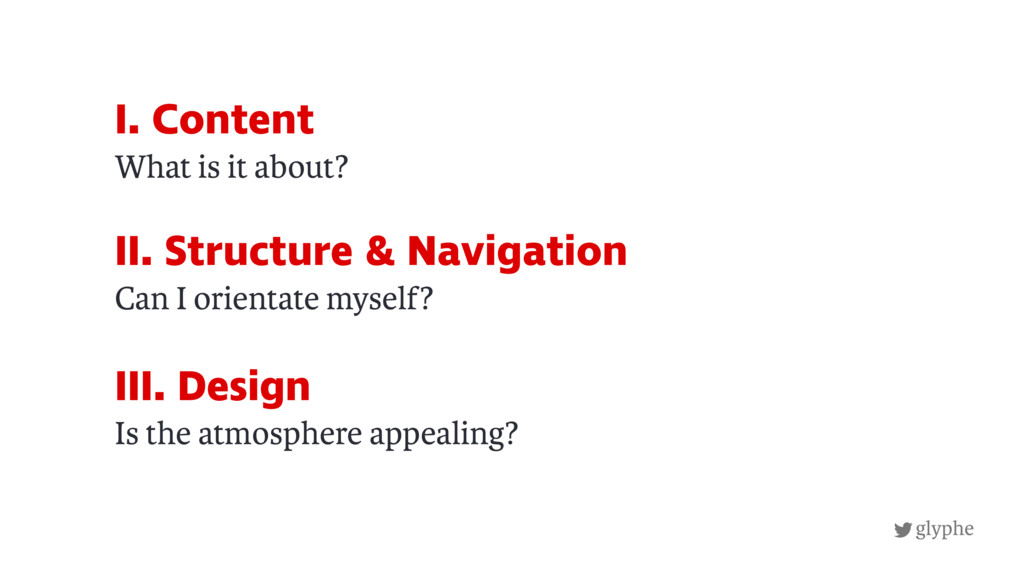
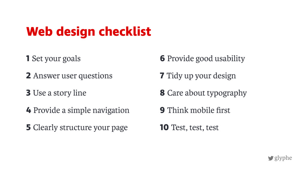
Top 10 web design mistakes:
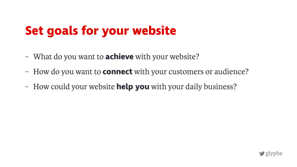
1. No goals set
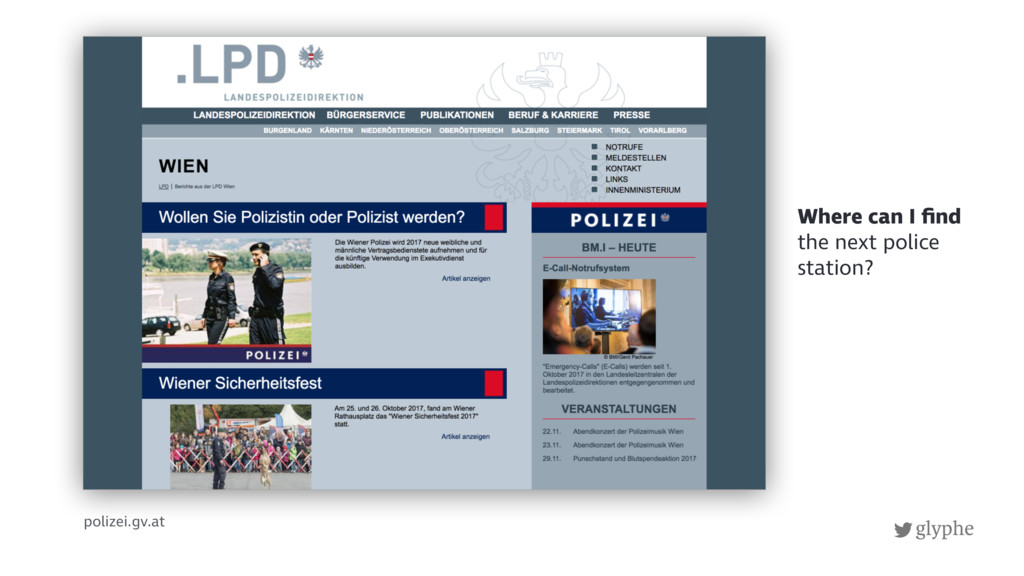
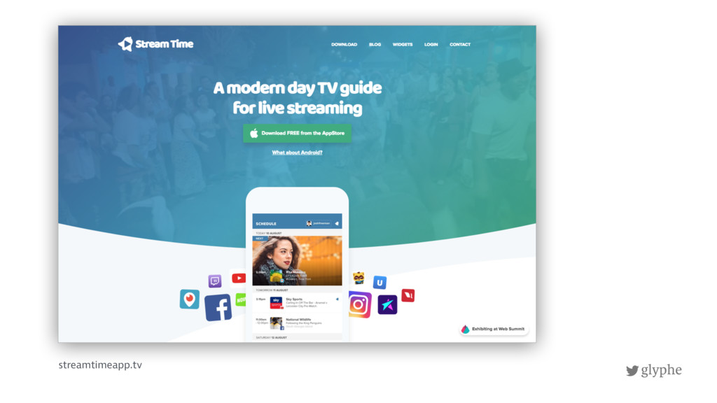
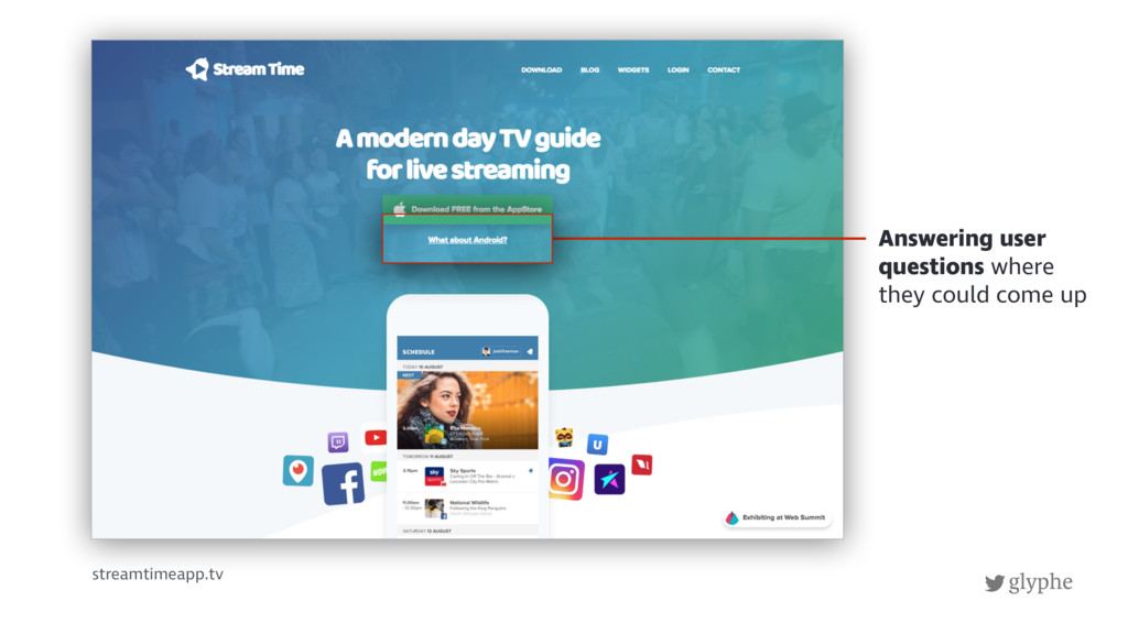
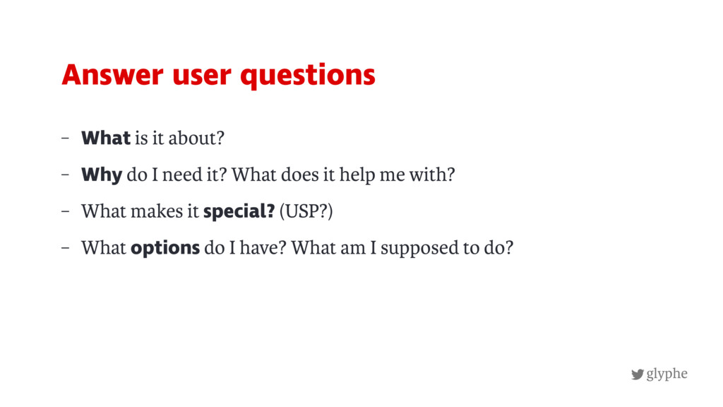
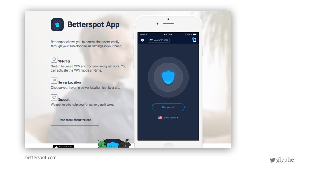
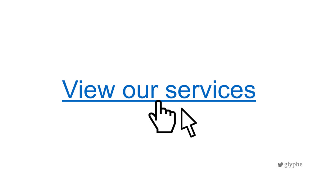
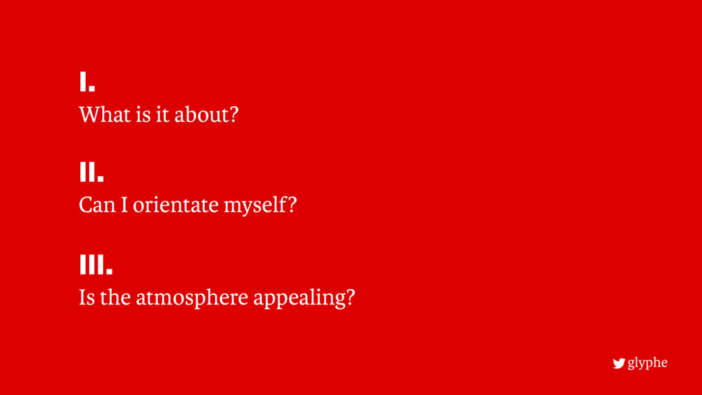
2. Not answering user questions
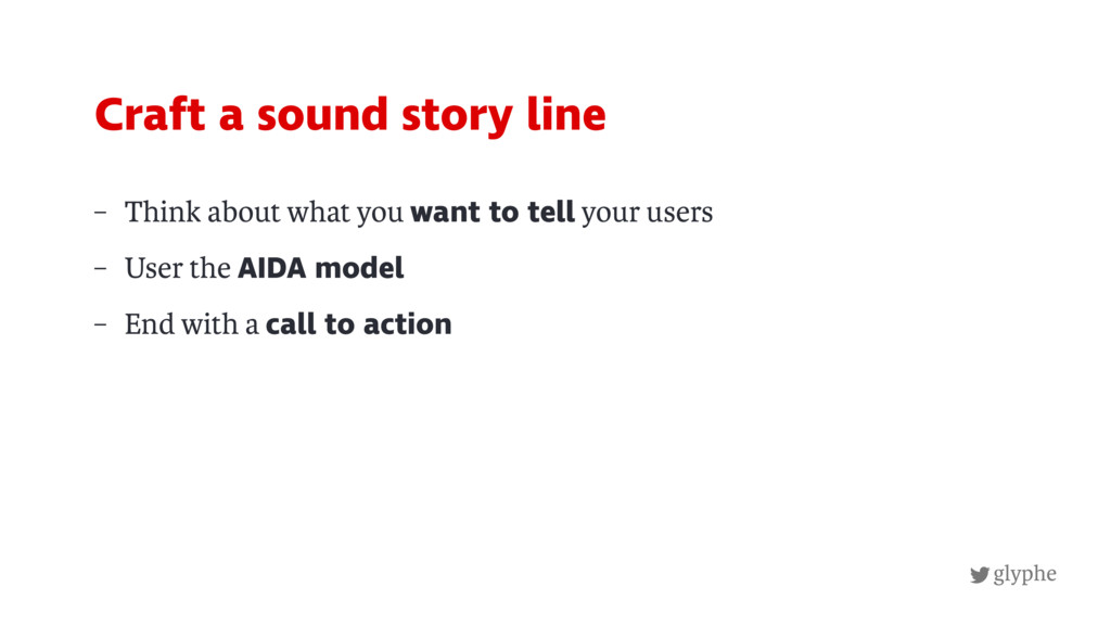
3. Missing story line
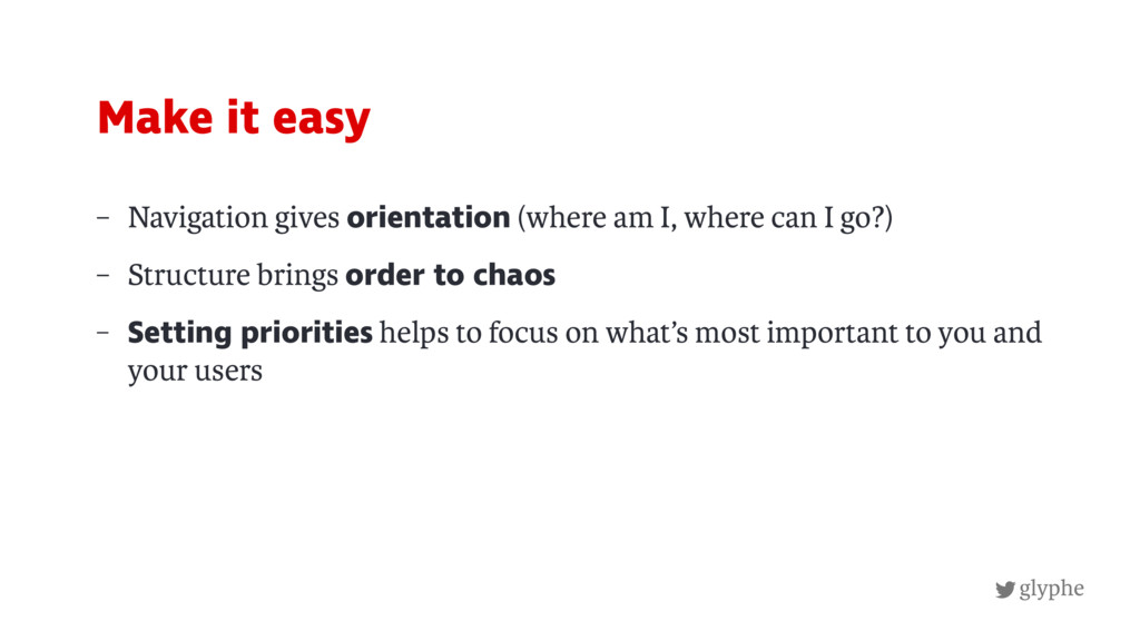
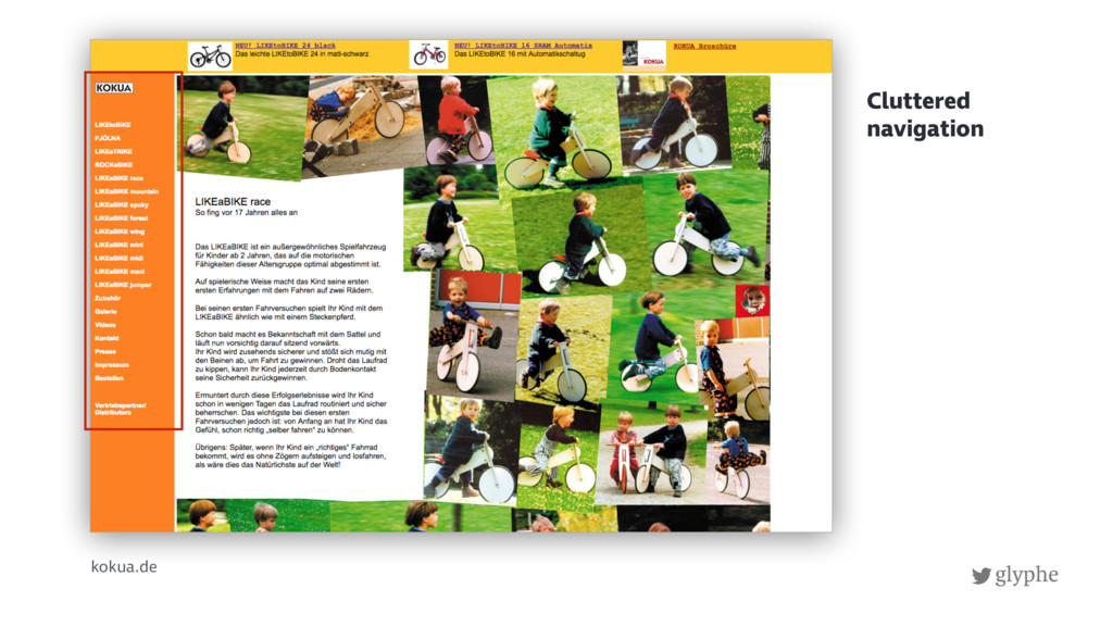
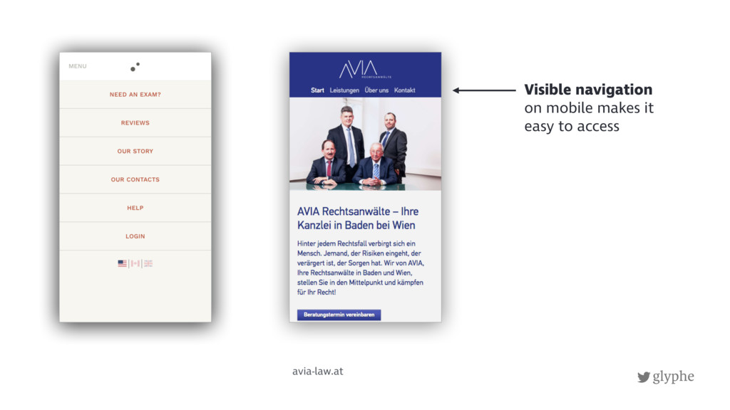
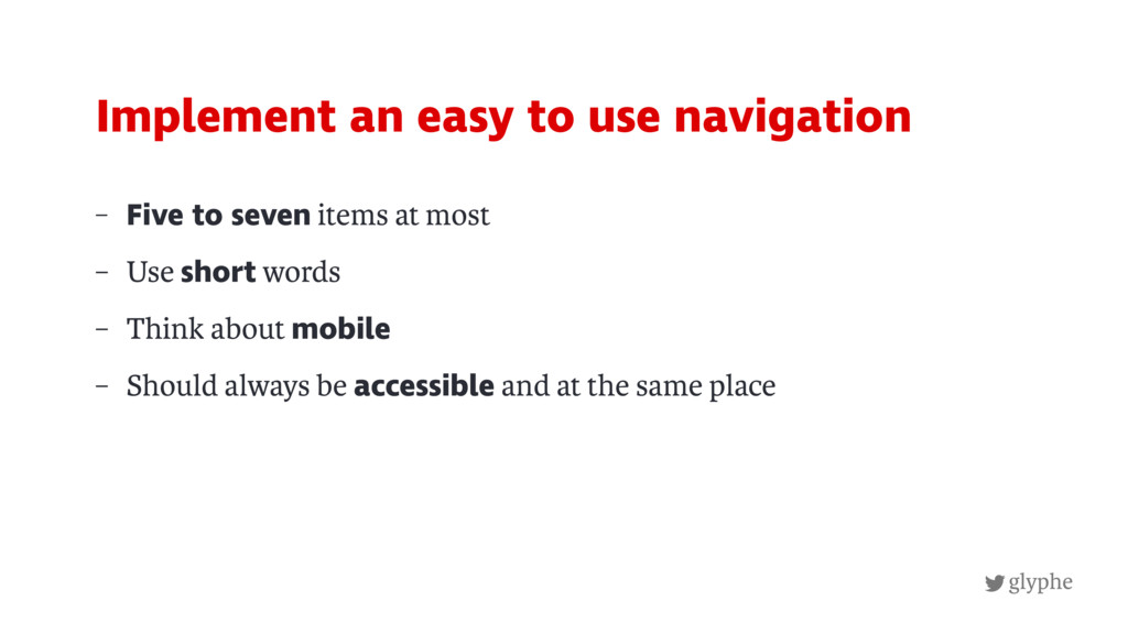
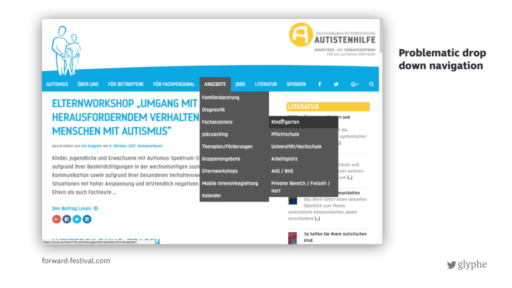
4. Confusing navigation
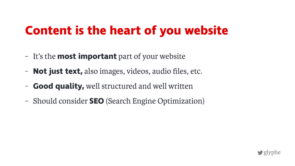
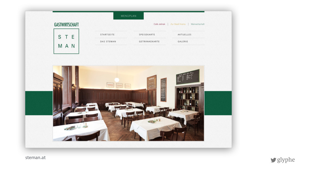
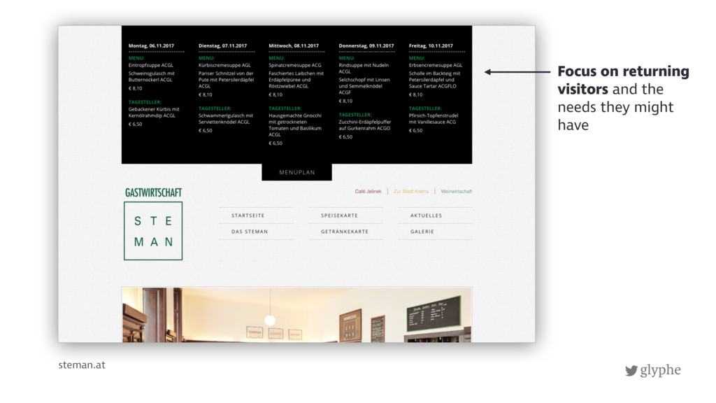
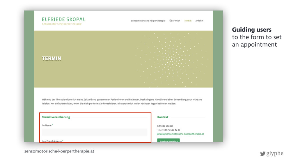
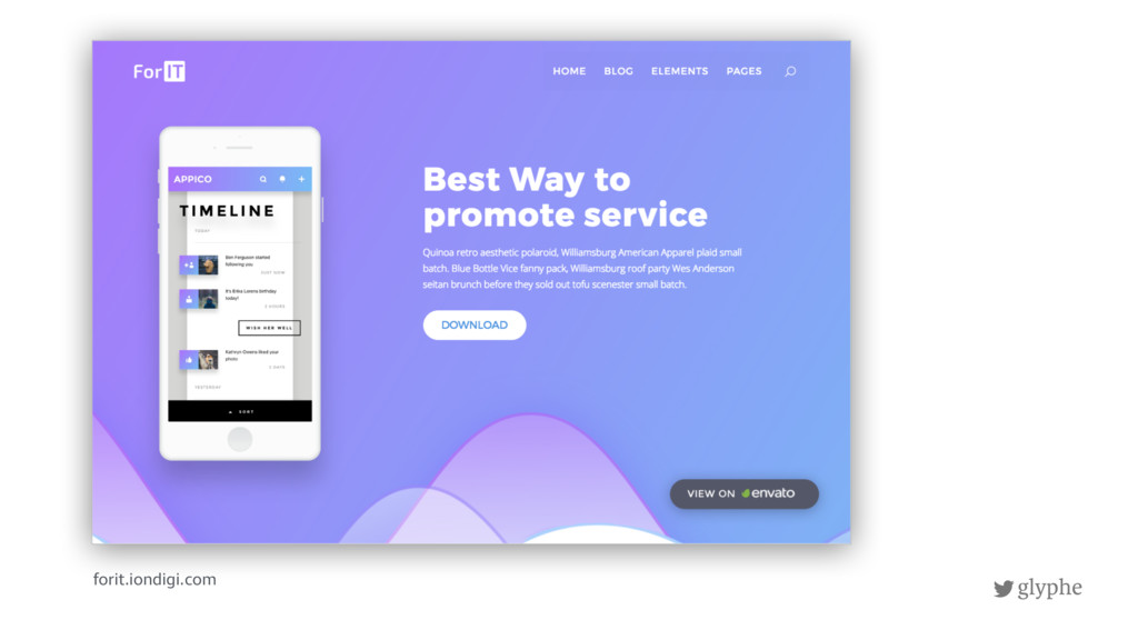
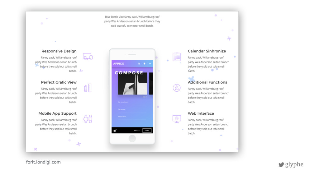
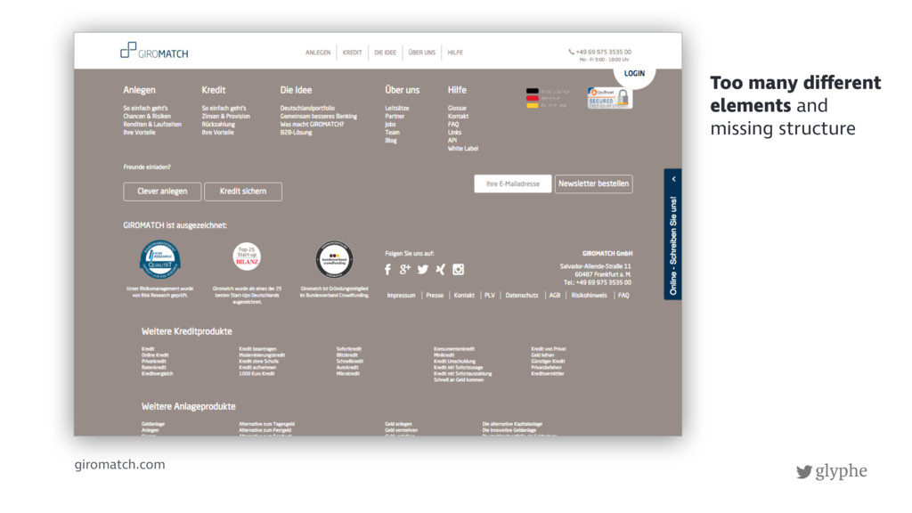
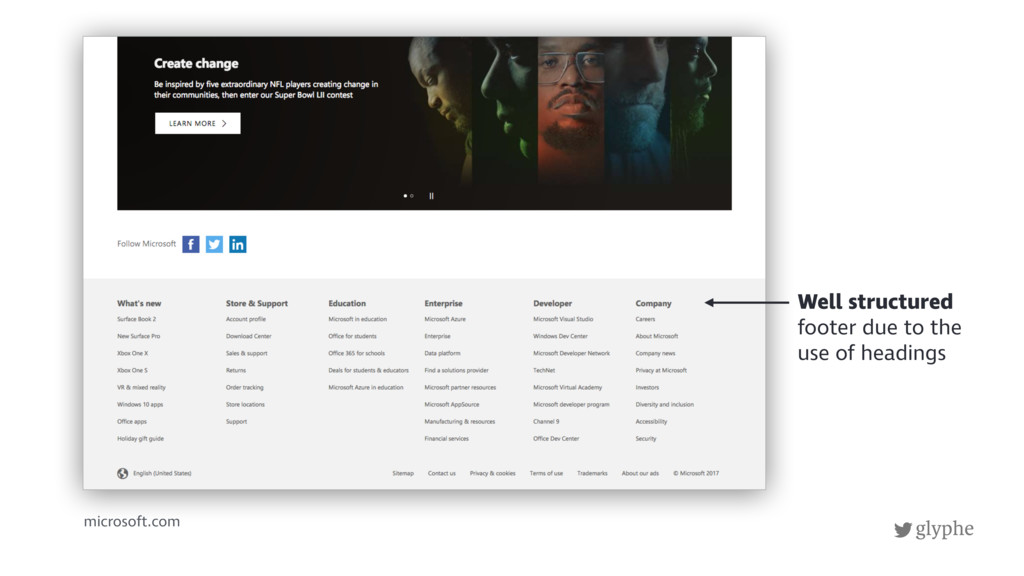
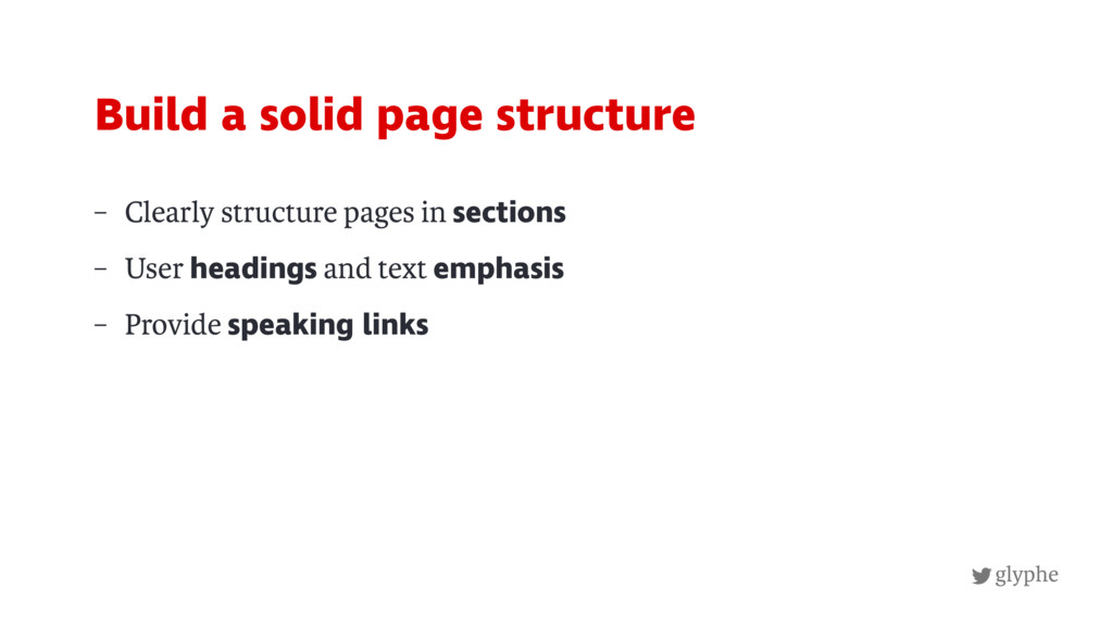
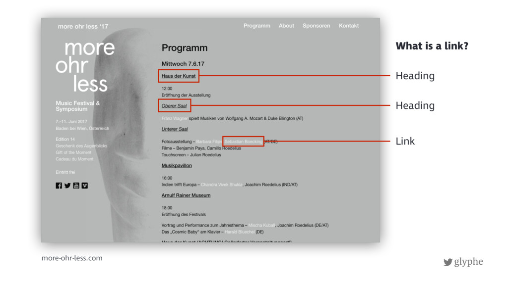
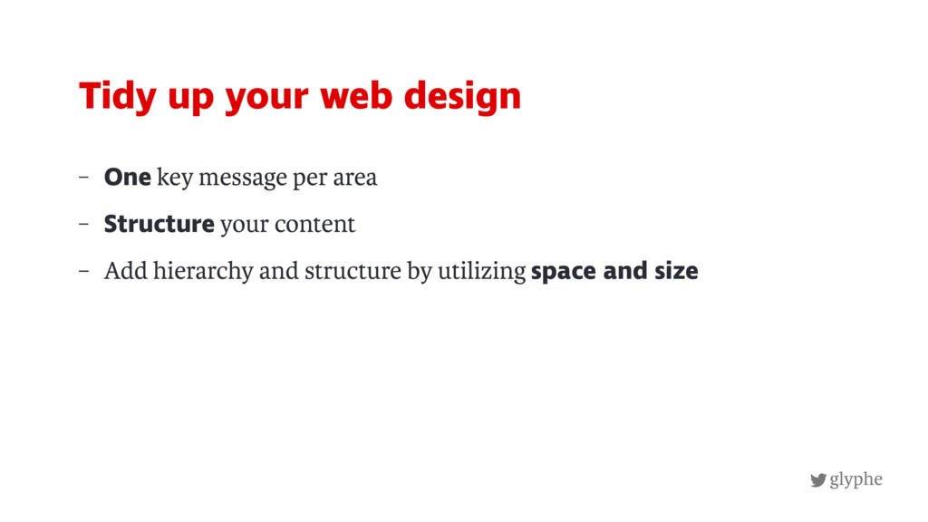
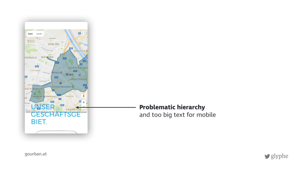
5. Poor structure
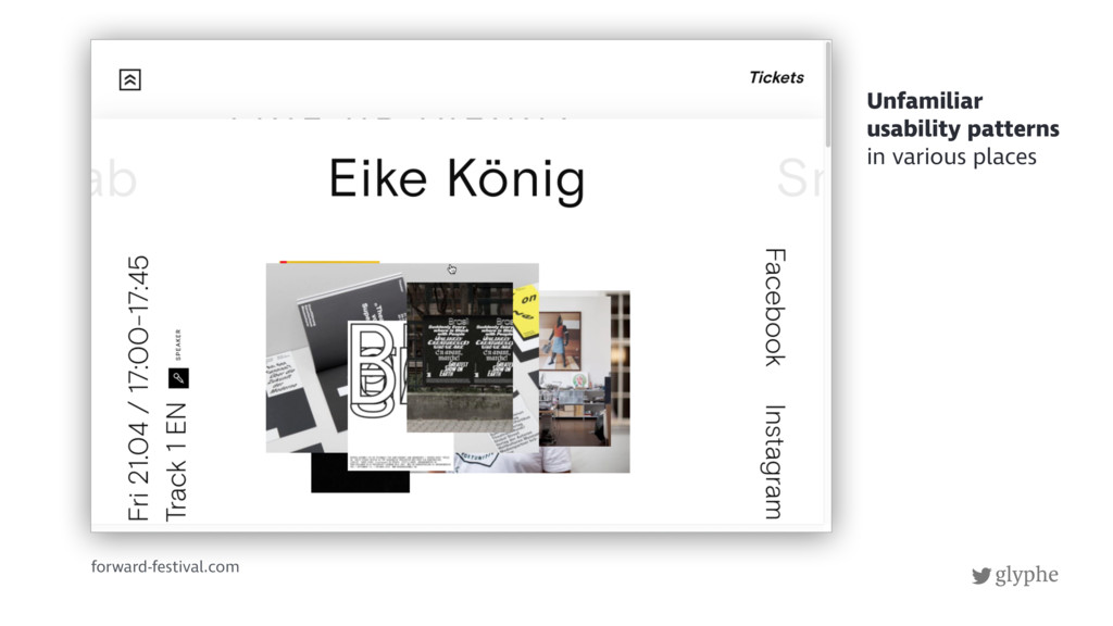
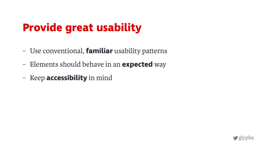
6. Bad usability
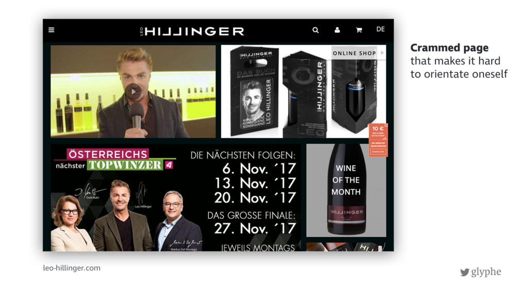
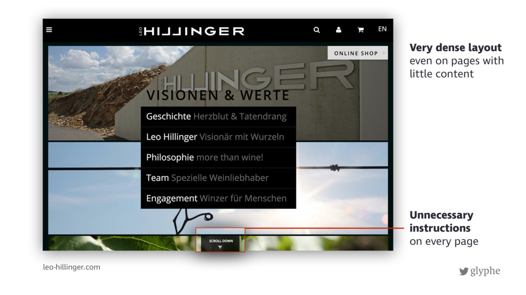
7. Cluttered pages
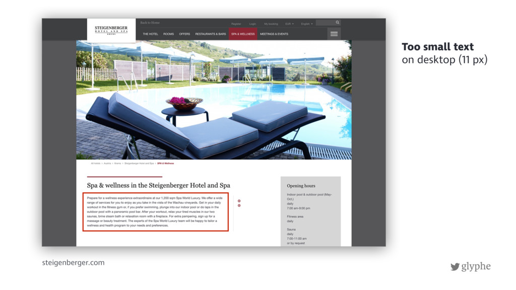
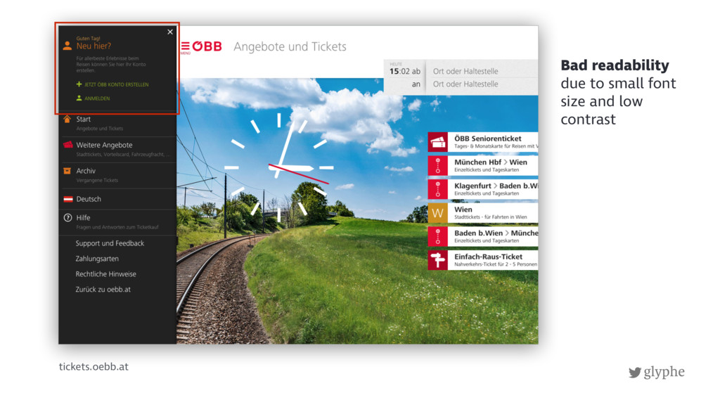
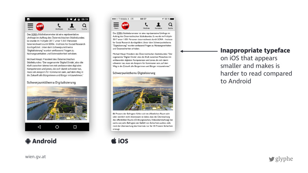
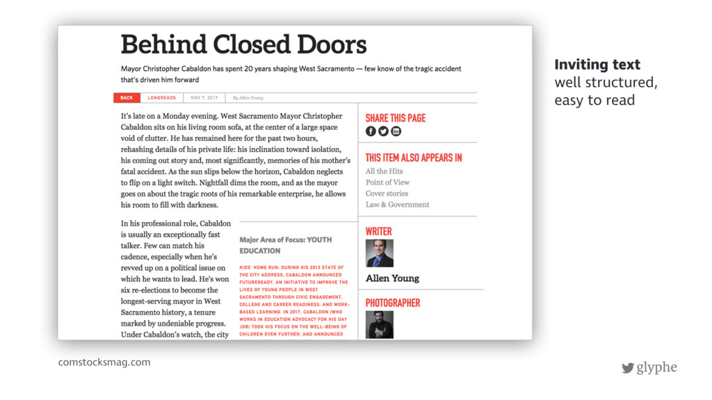
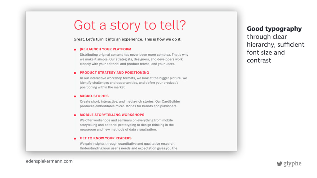
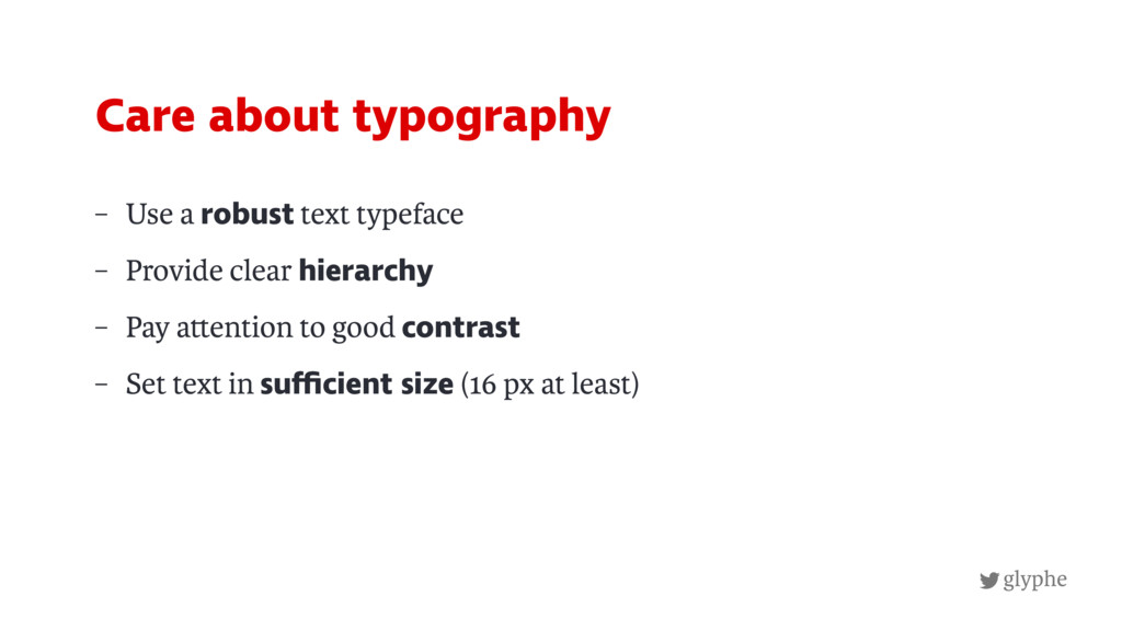
8. Bad Typography
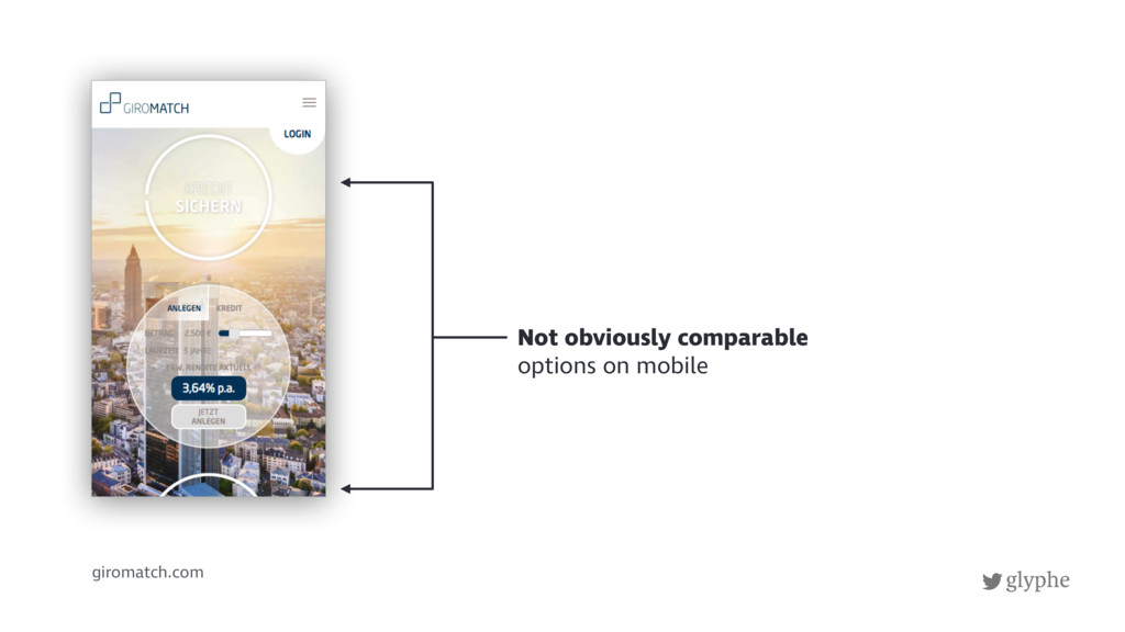
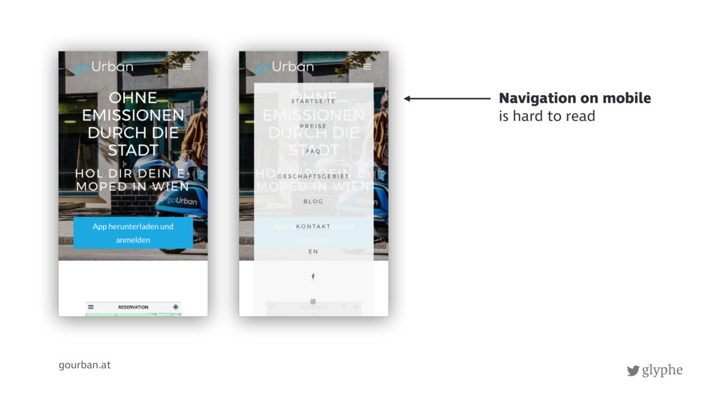
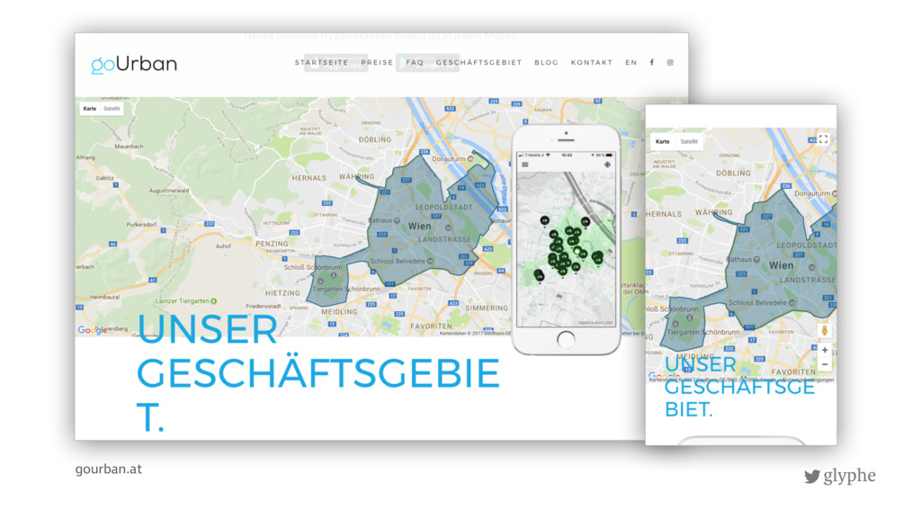
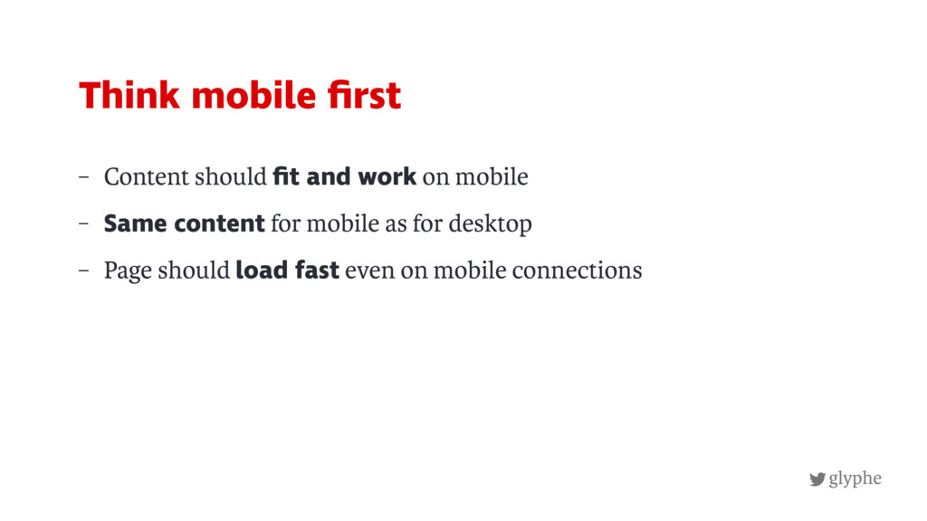
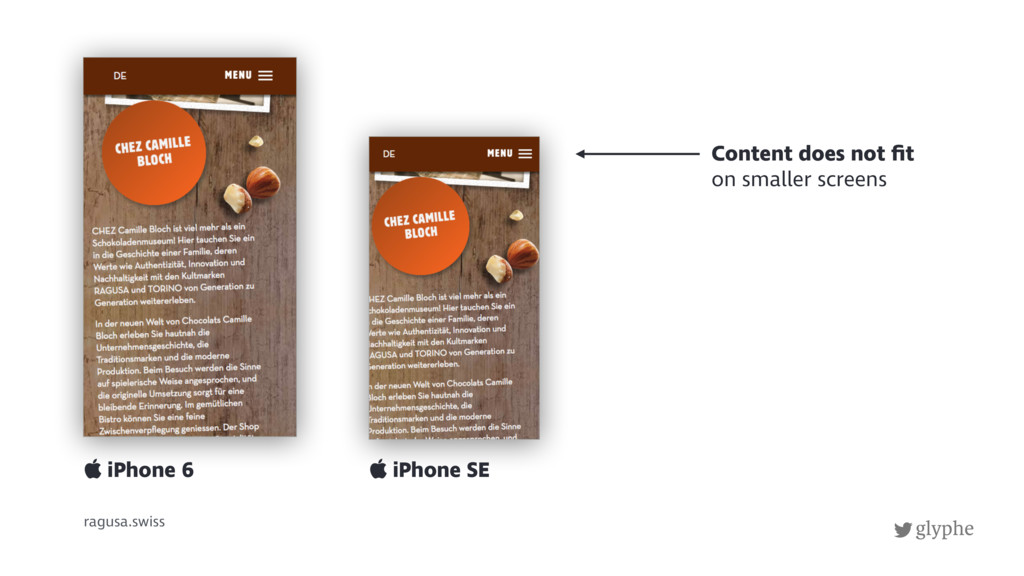
9. No optimization for mobile
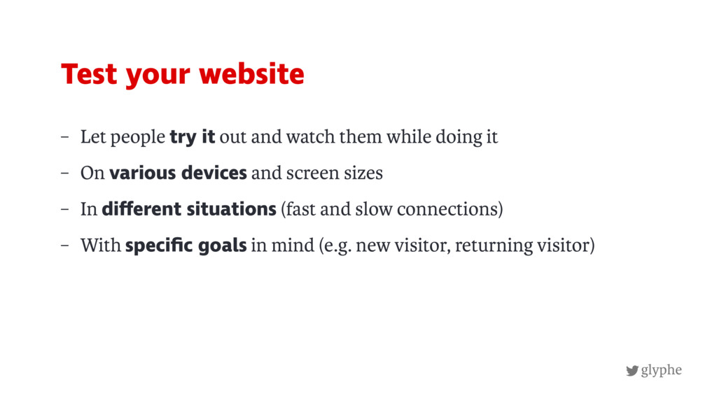
10. Forgetting to test