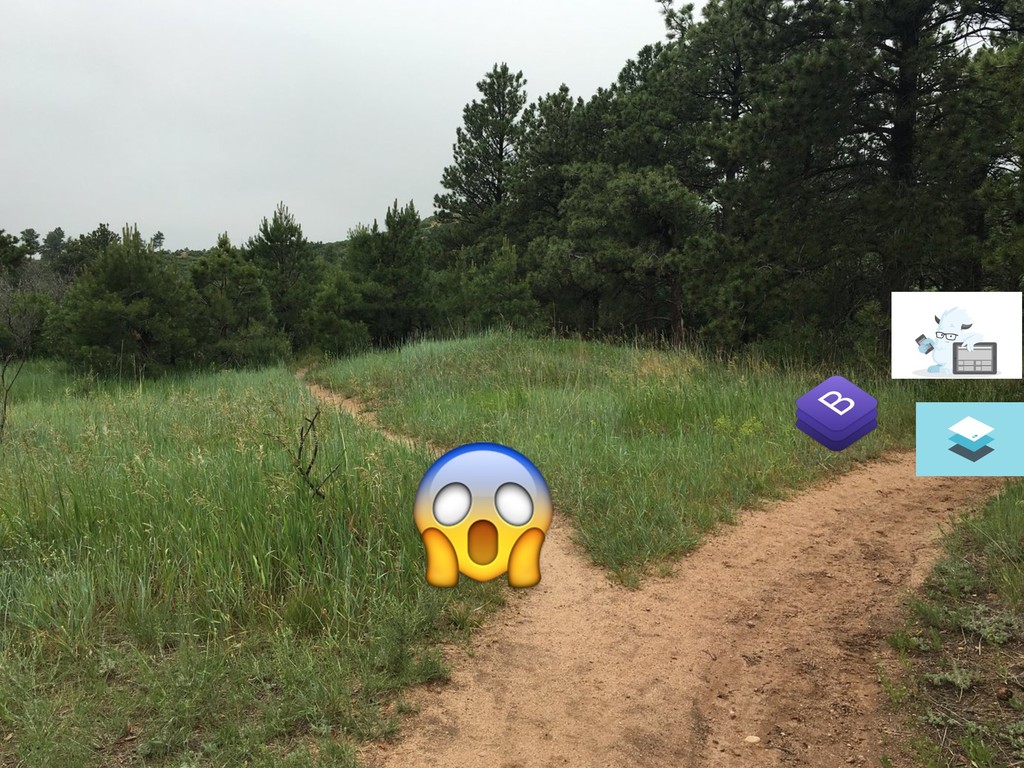
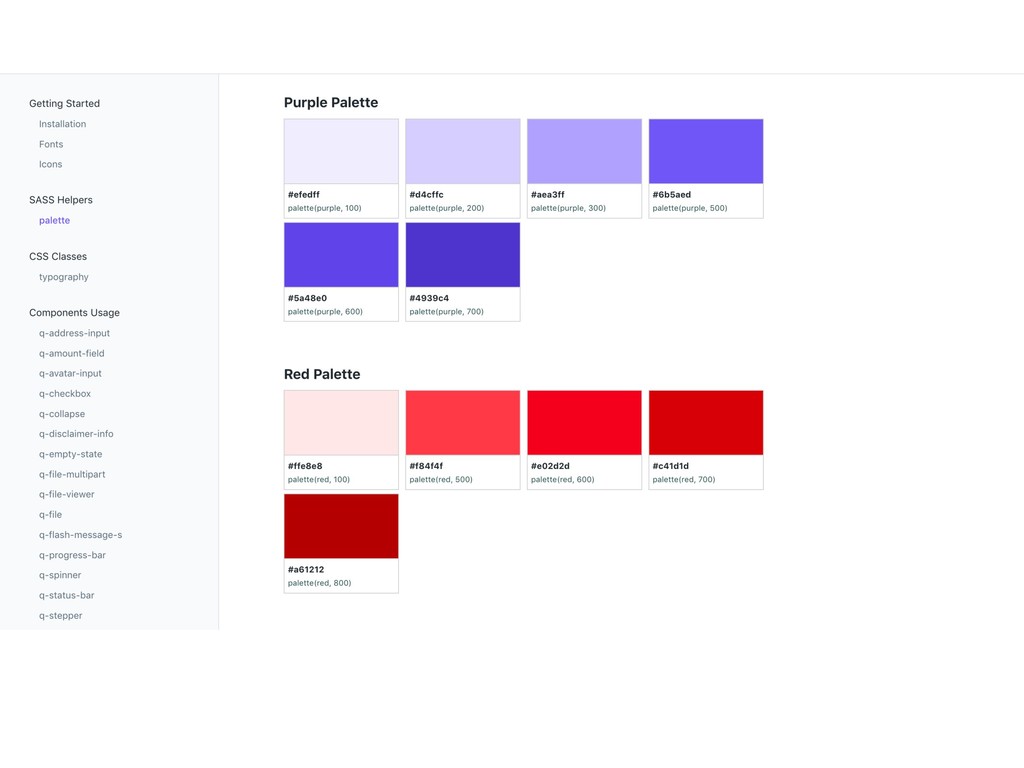
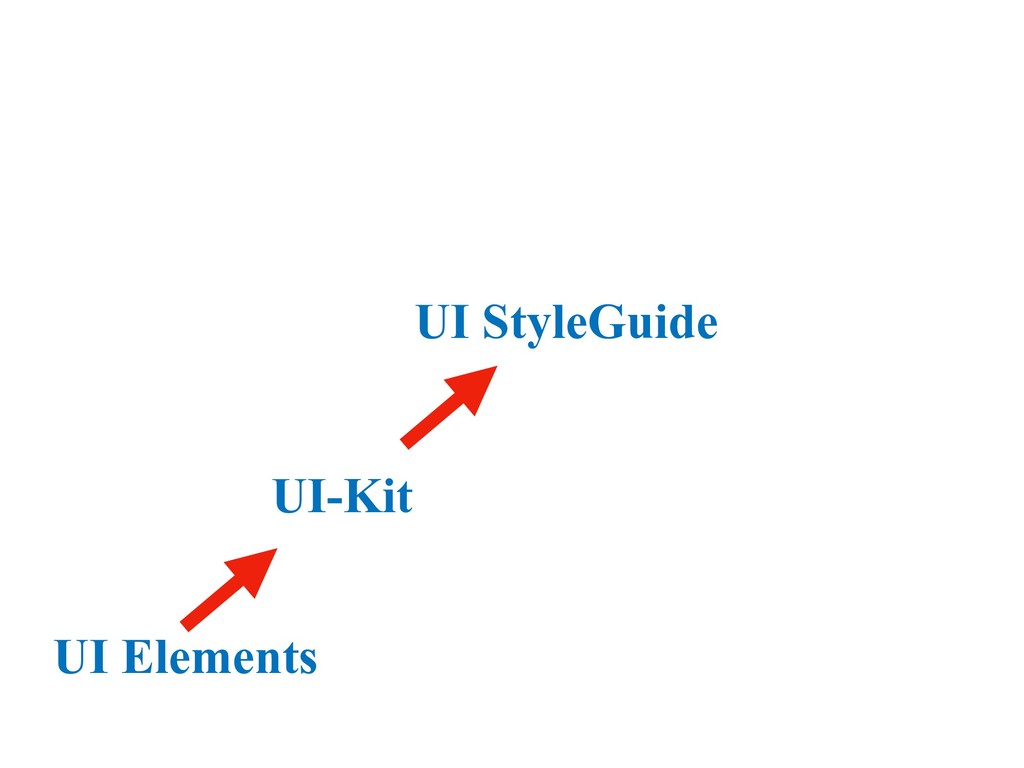
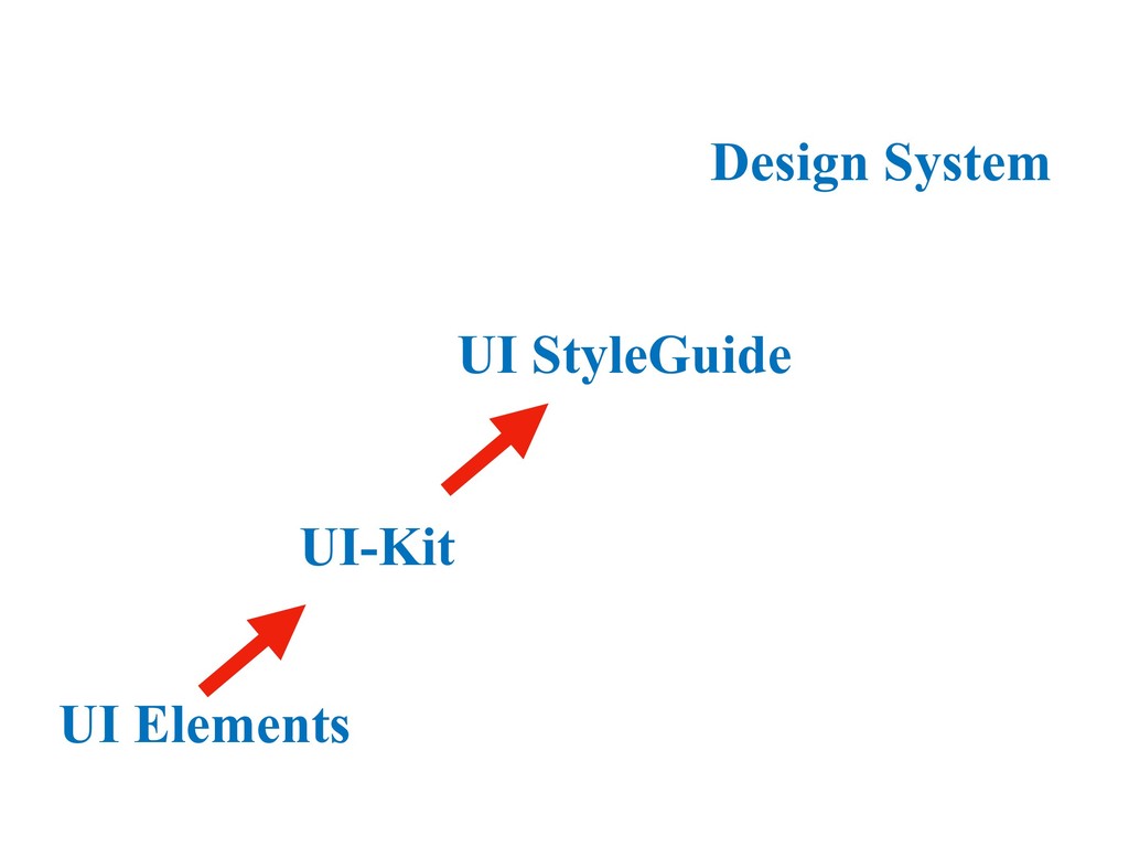
How big should we make our buttons? What’s the colour code of our logo? How do we display error states on our forms?
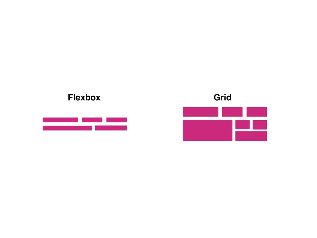
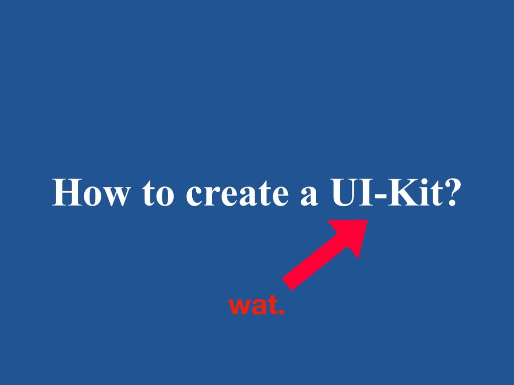
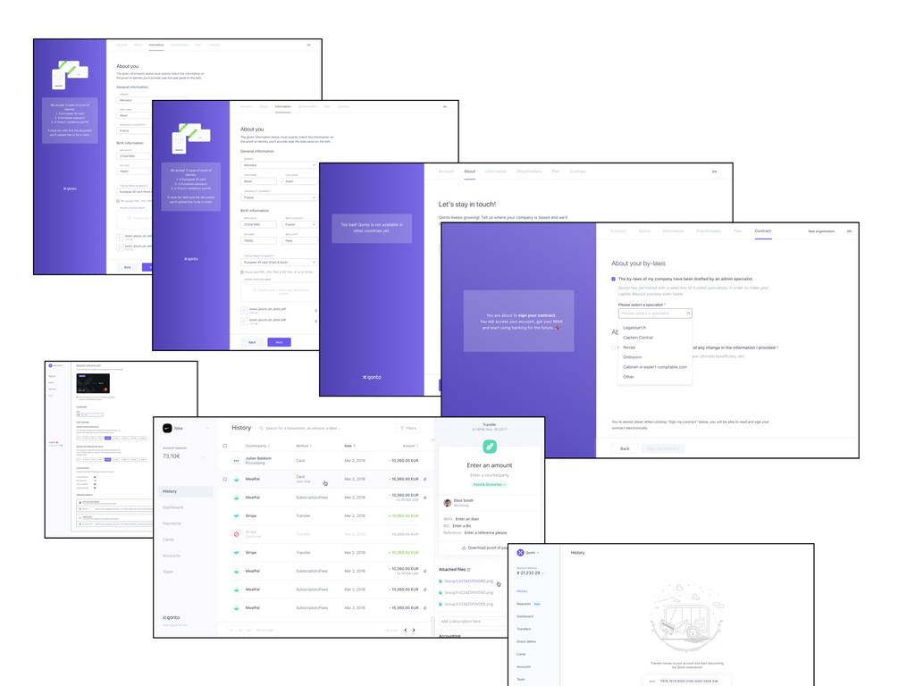
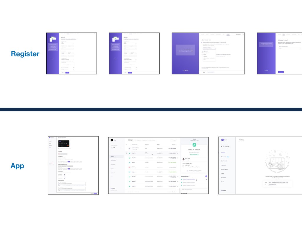
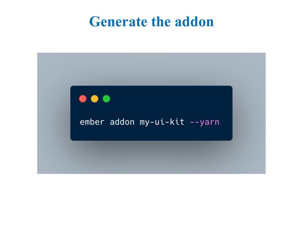
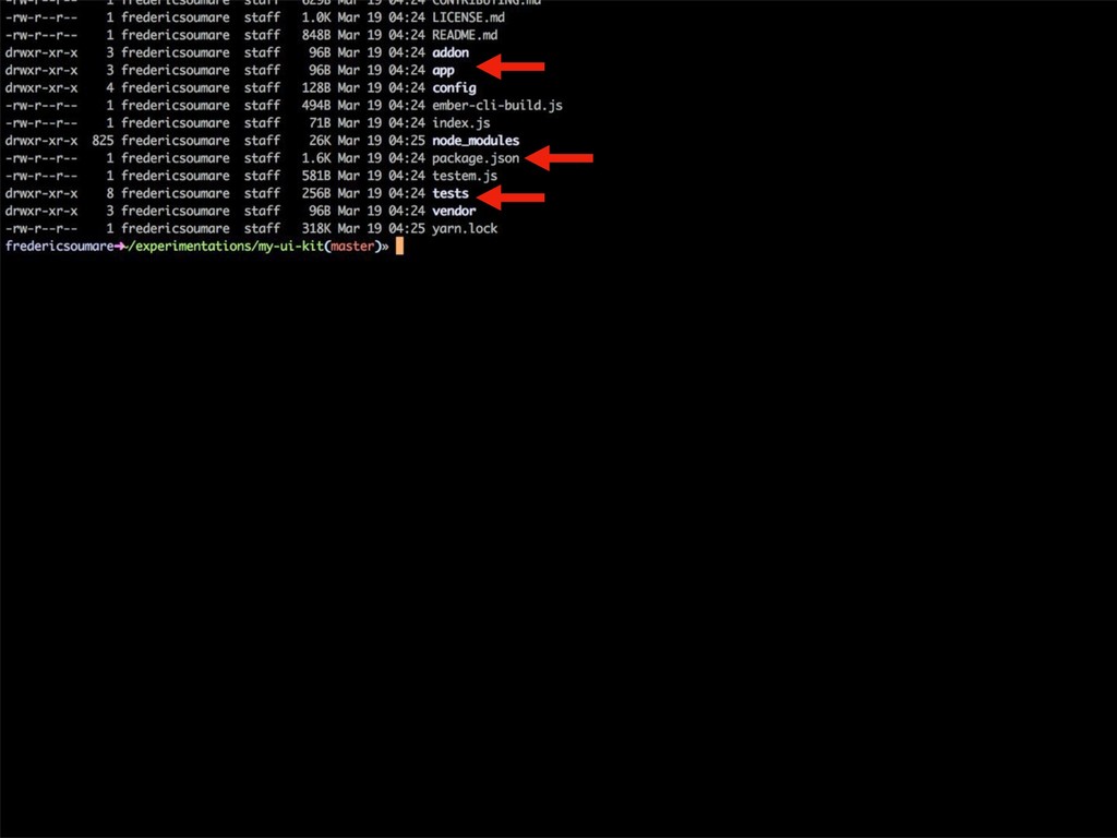
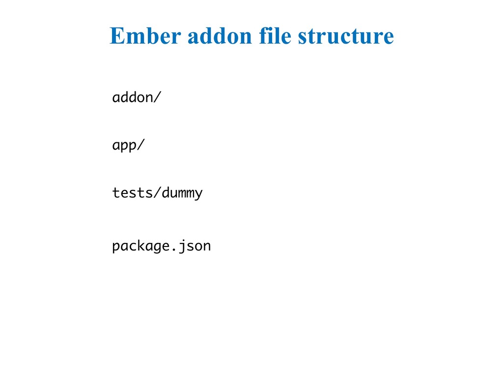
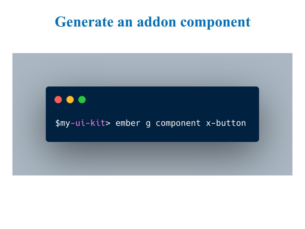
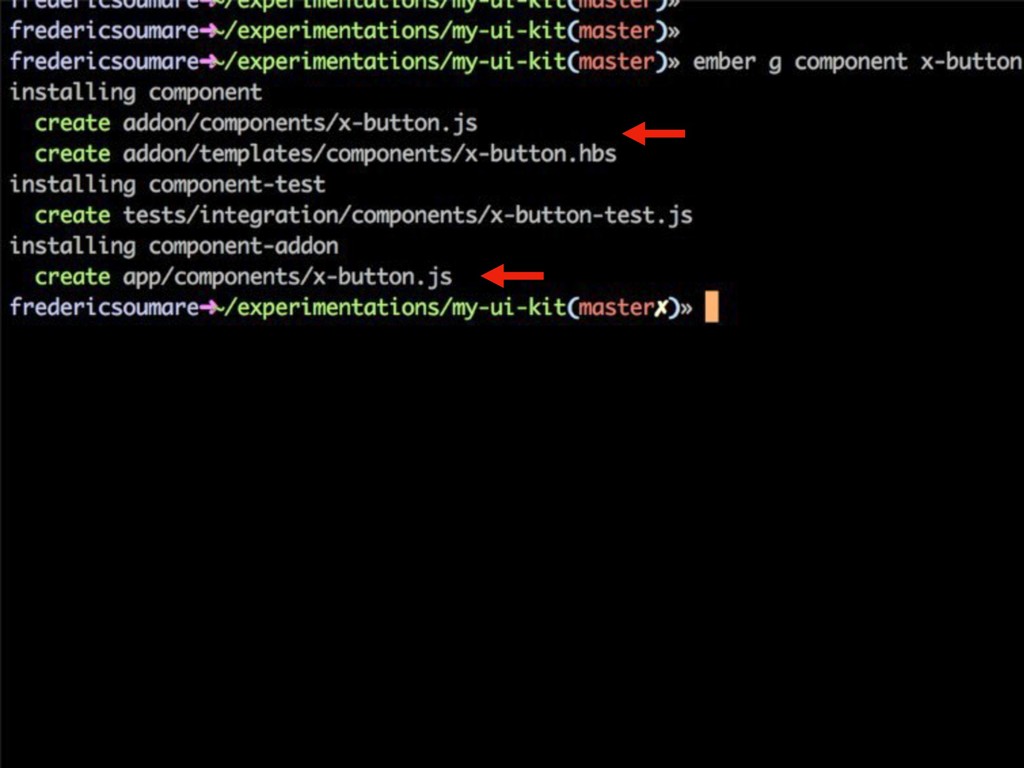
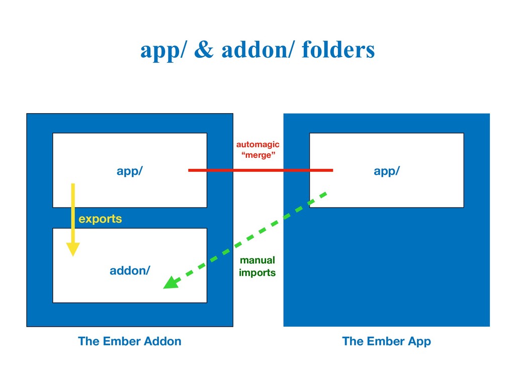
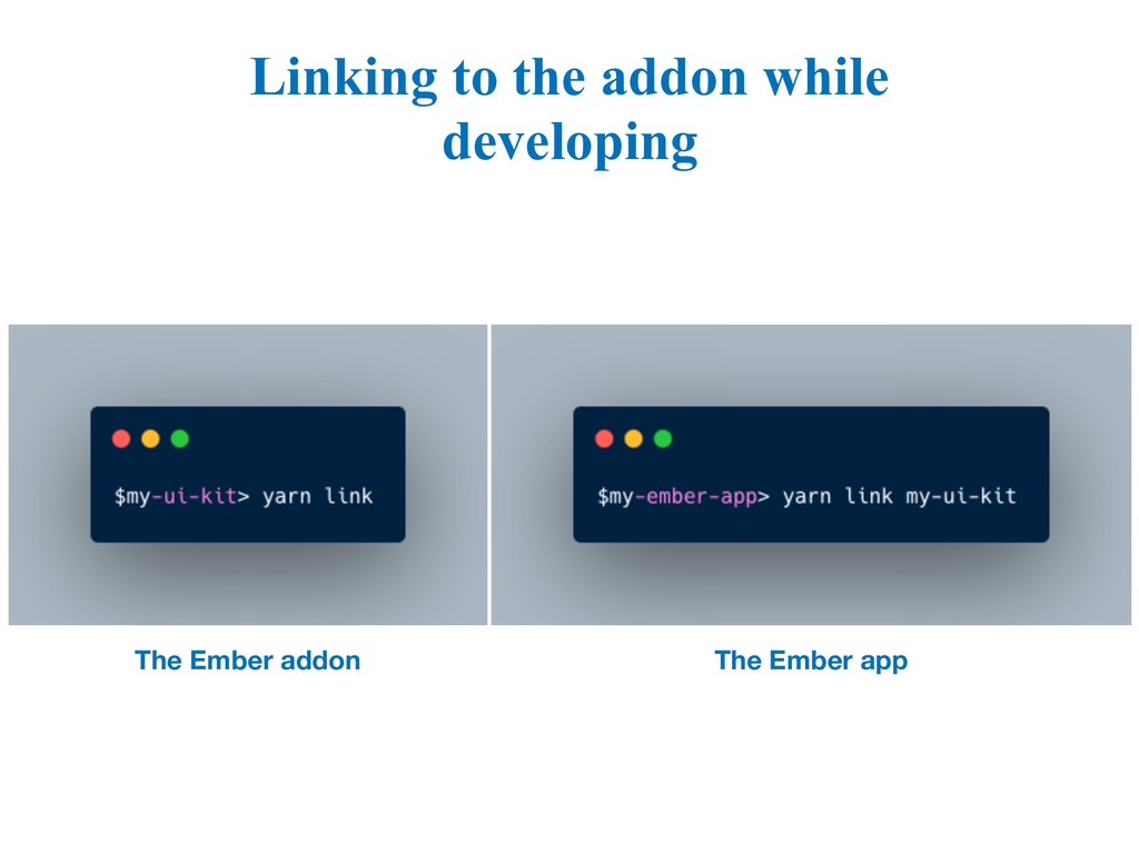
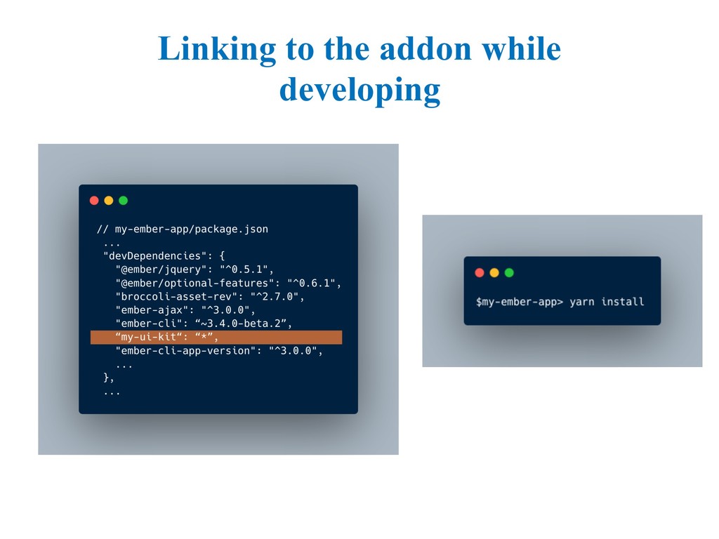
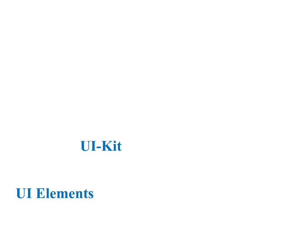
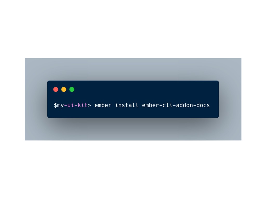
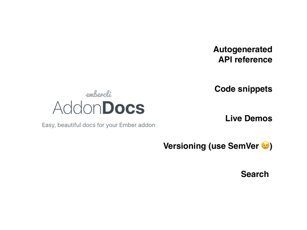
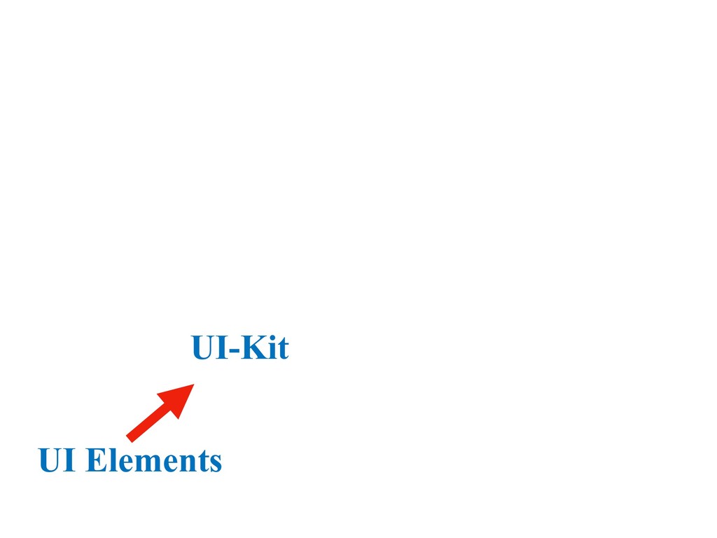
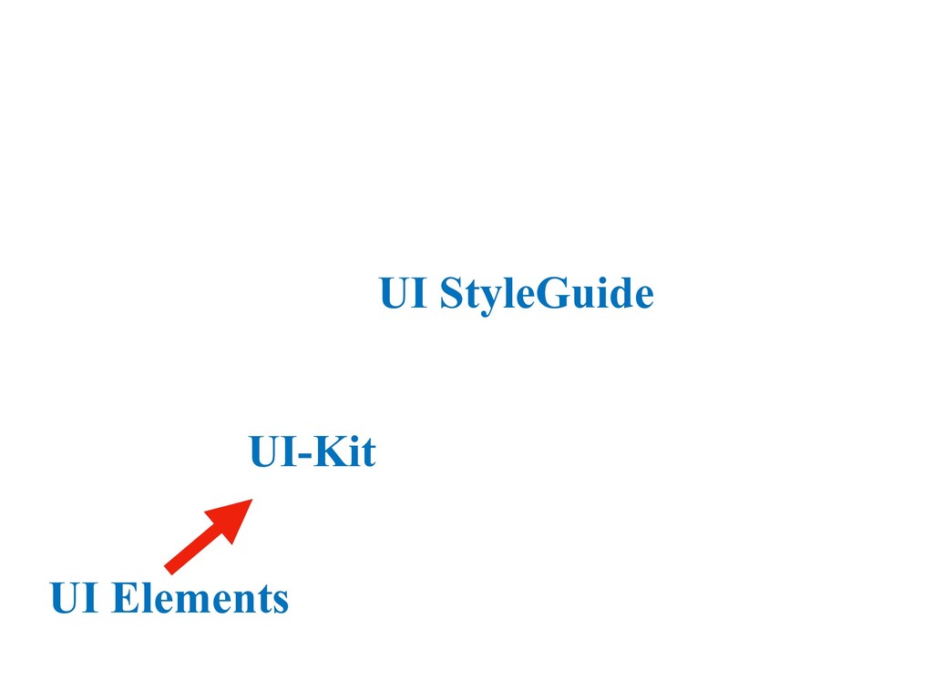
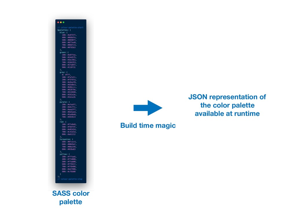
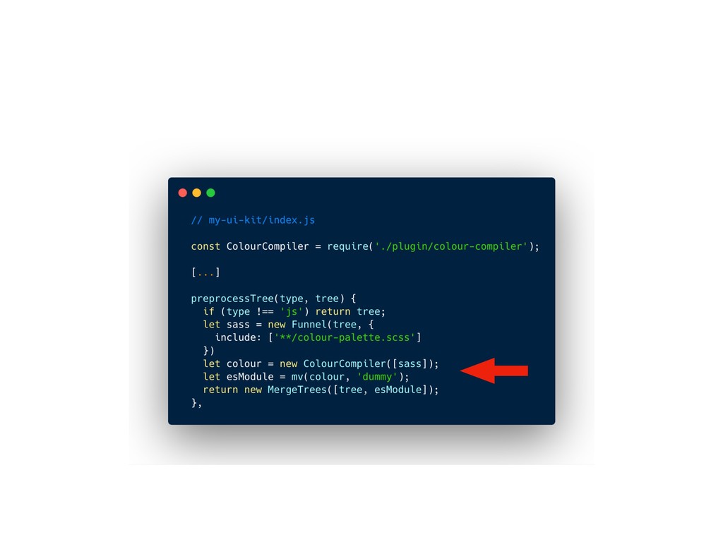
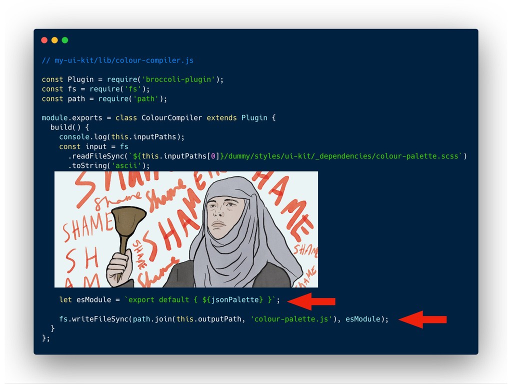
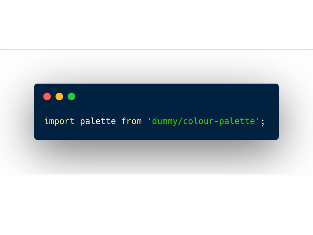
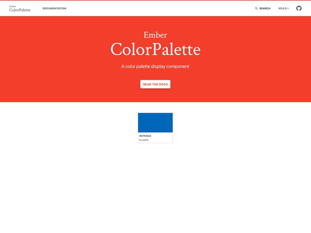
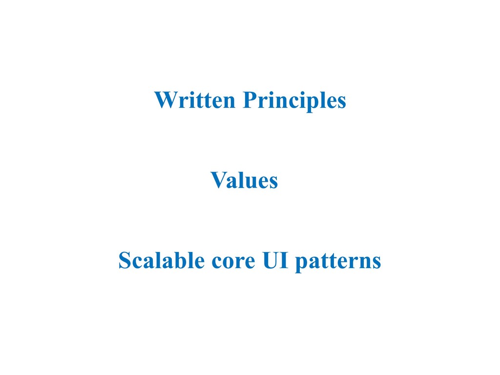
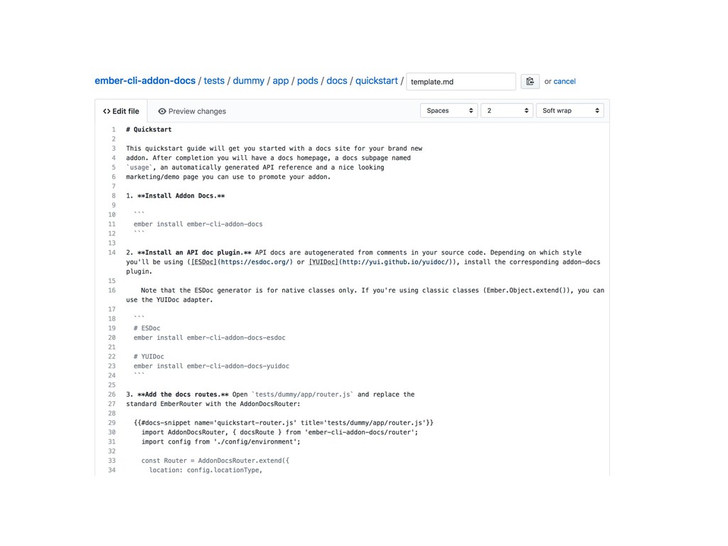
Did you know that Ember-CLI’s powerful addon system can be used to build a kit of reusable UI components? In this talk, you will learn how to build your own styleguide addon and how to use it to keep your UI consistent across apps.
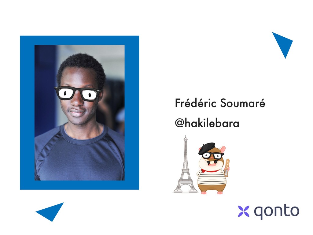
 hakilebara
 ivargrimstad
 panda728
 ryugen04
 elenatanasoiu
 philipschwarz
 wakana0222
 uyuki234
 konokenj
 kazumax55
 hananouchi
 manfredsteyer
 _fhhmm
 tmiket
 tessaabrams
 garrettdimon
 reverentgeek
 marketingsoph
 shpigford
 tammielis
 lara
lara
 cassininazir
 tammyeverts
 jdejongh