Upgrade to Pro — share decks privately, control downloads, hide ads and more …

When an AI handwriting font needs a second look

Avatar for arvin liu arvin liu
October 03, 2026

When an AI handwriting font needs a second look

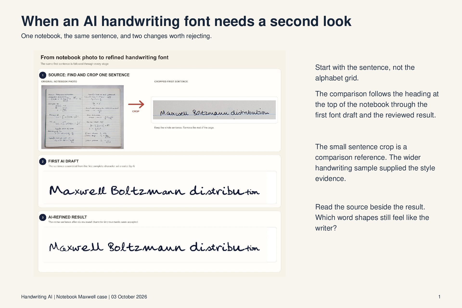
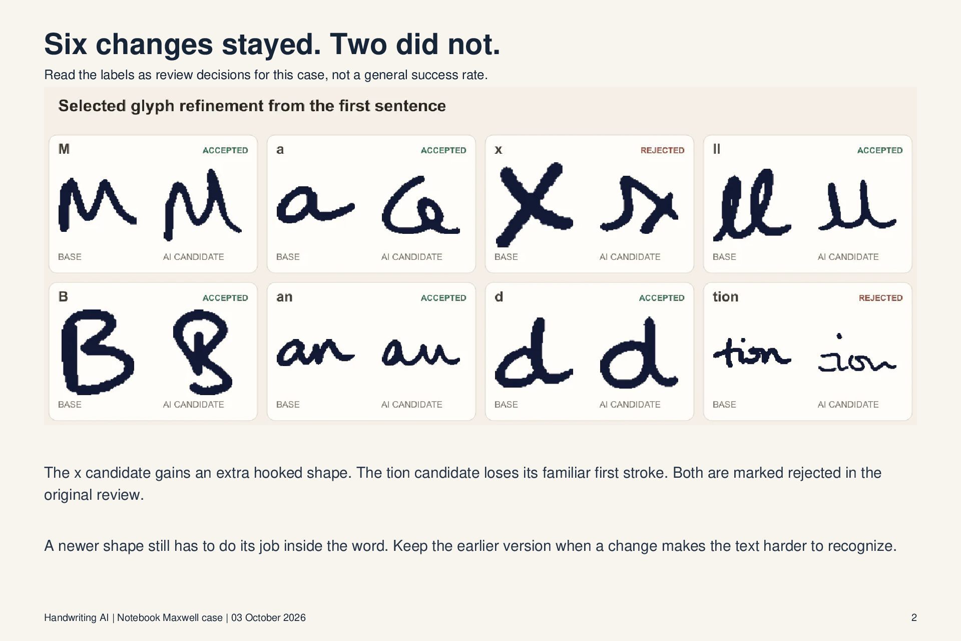
A four-page visual review of one Handwriting AI notebook case. The same sentence is shown beside the source photo, the first font draft and the reviewed result. Eight glyph changes were considered: six were kept, while x and tion were rejected. This is one case, not an accuracy benchmark.

Source and full walkthrough: https://handwriting-ai.com/guides/how-to-turn-your-handwriting-into-a-font

These slides concern our own product. The explanatory text was generated with AI and checked against the published case; the comparison images come from that case.

Avatar for arvin liu

arvin liu

October 03, 2026

Other Decks in Design

Transcript

  1. When an AI handwriting font needs a second look One

    notebook, the same sentence, and two changes worth rejecting. Start with the sentence, not the alphabet grid. The comparison follows the heading at the top of the notebook through the first font draft and the reviewed result. The small sentence crop is a comparison reference. The wider handwriting sample supplied the style evidence. Read the source beside the result. Which word shapes still feel like the writer? Handwriting AI | Notebook Maxwell case | 03 October 2026 1
  2. Six changes stayed. Two did not. Read the labels as

    review decisions for this case, not a general success rate. The x candidate gains an extra hooked shape. The tion candidate loses its familiar first stroke. Both are marked rejected in the original review. A newer shape still has to do its job inside the word. Keep the earlier version when a change makes the text harder to recognize. Handwriting AI | Notebook Maxwell case | 03 October 2026 2
  3. Make the comparison fair A simple review card for a

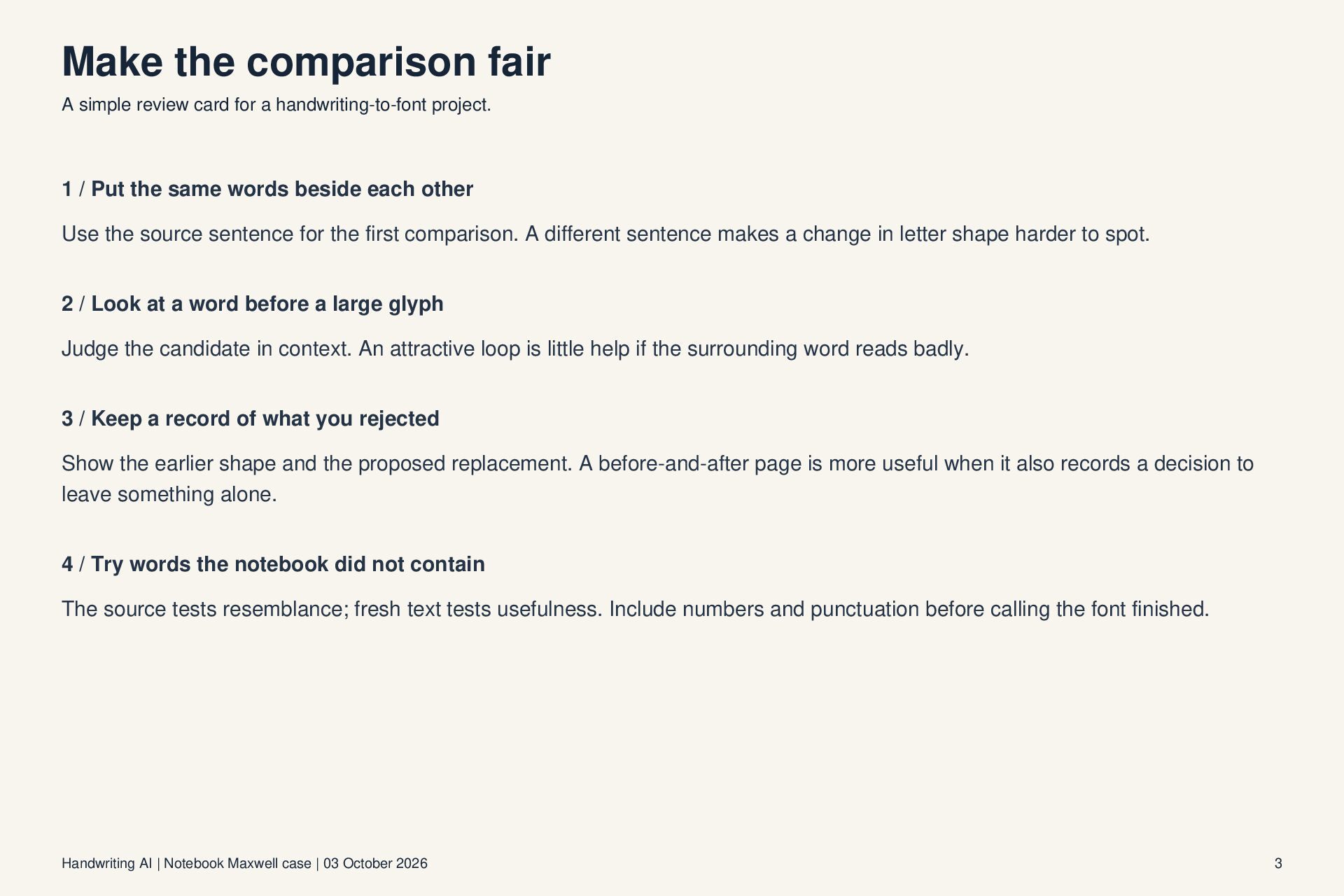
    handwriting-to-font project. 1 / Put the same words beside each other Use the source sentence for the first comparison. A different sentence makes a change in letter shape harder to spot. 2 / Look at a word before a large glyph Judge the candidate in context. An attractive loop is little help if the surrounding word reads badly. 3 / Keep a record of what you rejected Show the earlier shape and the proposed replacement. A before-and-after page is more useful when it also records a decision to leave something alone. 4 / Try words the notebook did not contain The source tests resemblance; fresh text tests usefulness. Include numbers and punctuation before calling the font finished. Handwriting AI | Notebook Maxwell case | 03 October 2026 3
  4. The source is part of the case Follow the photographed

    notebook through the complete workflow. The original guide includes the notebook photo, sentence comparisons, individual crop examples, and the review decisions shown here. Open the full handwriting-to-font case study Explore the font editor Free accounts can create and preview one custom font. Downloads using it require Starter or higher; TTF downloads require Pro or Premium. Check the current plan and AI-credit requirements before starting. Prepared by Handwriting AI with AI-generated text. This is a product case study using our published example, not an independent review. The comparison images are reproduced unchanged from that case. Handwriting AI | Notebook Maxwell case | 03 October 2026 4