Upgrade to Pro
— share decks privately, control downloads, hide ads and more …
Speaker Deck
Features
Speaker Deck
PRO
Sign in
Sign up for free
Search
Search
CSS Layout - Mobile First Design
Search
Sponsored
·
Ship Features Fearlessly
Turn features on and off without deploys. Used by thousands of Ruby developers.
→
Heri Risnanto
April 22, 2020
Technology
73
0
Share
Embed
Copy iframe code
Copy JS code
Copy link
Start on current slide
CSS Layout - Mobile First Design
Basic of CSS relative units & mobile-first design strategy.
Heri Risnanto
April 22, 2020
Other Decks in Technology
See All in Technology
型は壁、Rustでもバグを直すな、表現できなくせよ
nwiizo
12
1.9k
GuardrailからGovernanceへ~AIエージェント運用の次の課題~
sbspsy
1
230
AI Driven AI Governance
pict3
0
300
AIペネトレーションテスト・ セキュリティ検証「AgenticSec」紹介資料
laysakura
2
8.1k
小さいから、全部わかる。— 常駐AI "xangi" のすすめ
sugupoko
0
280
生成AI活用によるODC欠陥分析の分類高速化の実践と導入効果 / 20260703 Suguru Ishii
shift_evolve
PRO
2
110
Zoom2Youtube.Claude
kawaguti
PRO
3
470
Amazon EVS で VCF 9.0 / 9.1 のサポート開始まとめ
mtoyoda
0
280
Claude Code 珍プレー好プレー
shinyasaita
0
300
Road to SRE NEXTの今までとこれから
hiroyaonoe
0
250
人を動かすのは時間ではなく、納得感 〜新任EMが入社3ヶ月、組織を2回変えた話〜
kakehashi
PRO
3
190
SRE Next 2026 何でも屋からの脱却
bto
0
190
Featured
See All Featured
[RailsConf 2023 Opening Keynote] The Magic of Rails
eileencodes
31
10k
Stop Working from a Prison Cell
hatefulcrawdad
274
21k
XXLCSS - How to scale CSS and keep your sanity
sugarenia
249
1.3M
Pawsitive SEO: Lessons from My Dog (and Many Mistakes) on Thriving as a Consultant in the Age of AI
davidcarrasco
0
180
CSS Pre-Processors: Stylus, Less & Sass
bermonpainter
360
30k
Future Trends and Review - Lecture 12 - Web Technologies (1019888BNR)
signer
PRO
0
3.6k
Optimizing for Happiness
mojombo
378
71k
SEO for Brand Visibility & Recognition
aleyda
0
4.6k
Evolution of real-time – Irina Nazarova, EuRuKo, 2024
irinanazarova
9
1.4k
Measuring Dark Social's Impact On Conversion and Attribution
stephenakadiri
2
230
A better future with KSS
kneath
240
18k
Responsive Adventures: Dirty Tricks From The Dark Corners of Front-End
smashingmag
254
22k
Transcript
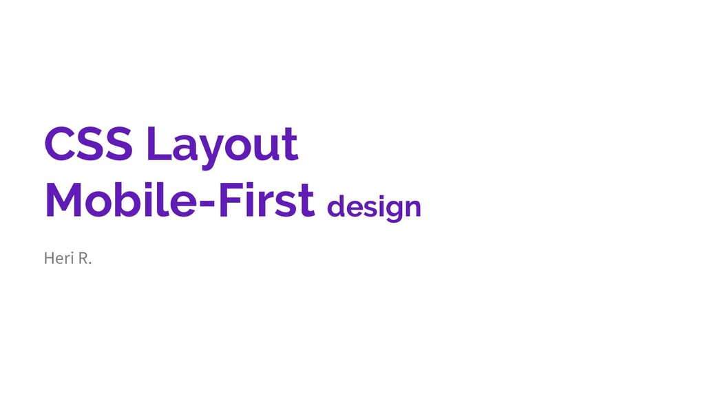
CSS Layout Mobile-First design Heri R.
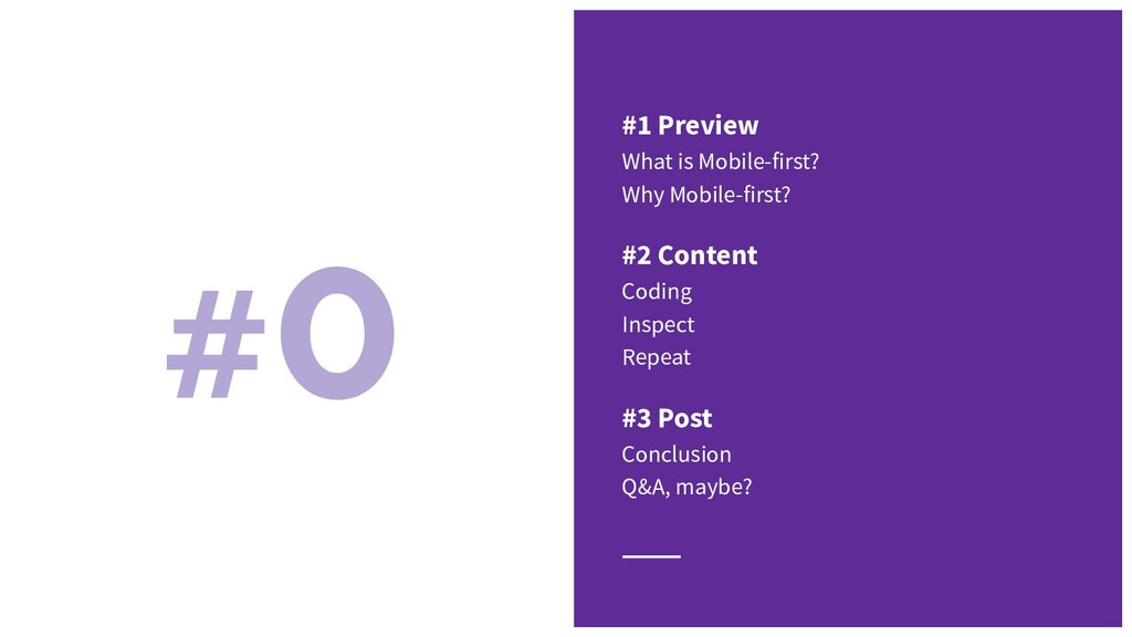
#0 #1 Preview What is Mobile-first? Why Mobile-first? #2 Content
Coding Inspect Repeat #3 Post Conclusion Q&A, maybe?
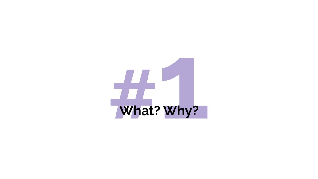
#1 What? Why?
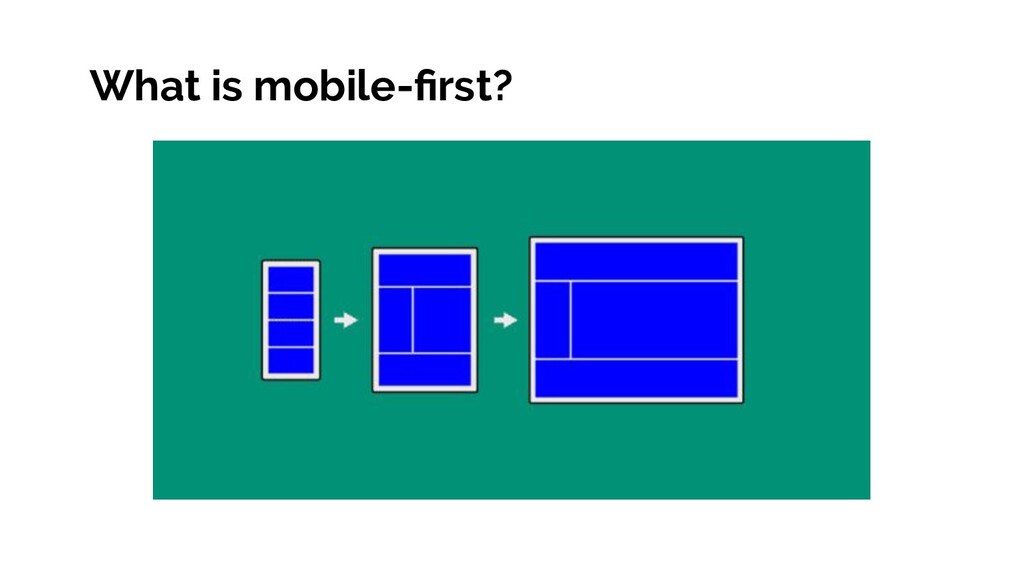
What is mobile-first?
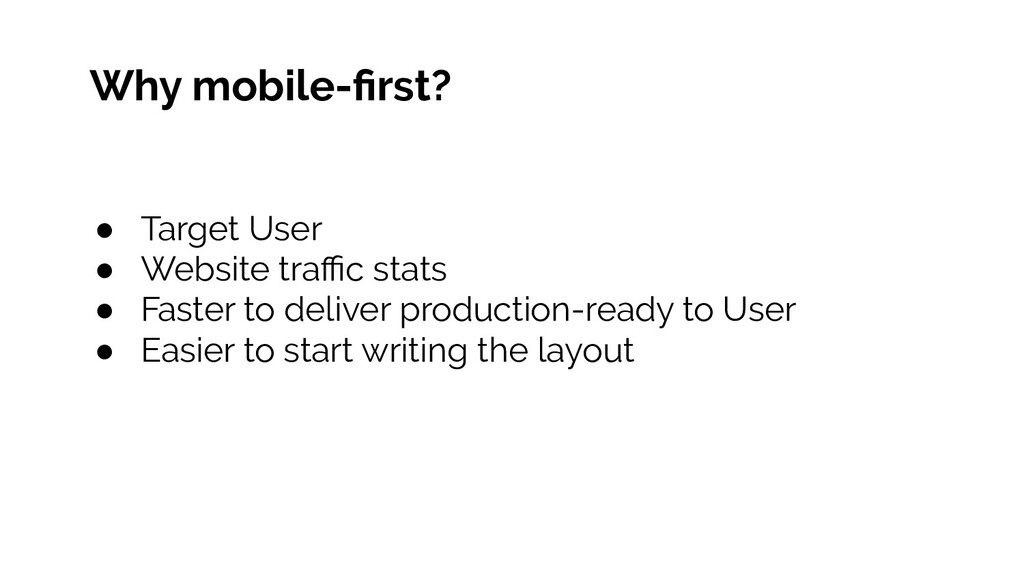
Why mobile-first? • Target User • Website traffic stats •
Faster to deliver production-ready to User • Easier to start writing the layout
#2 Coding + Inspect
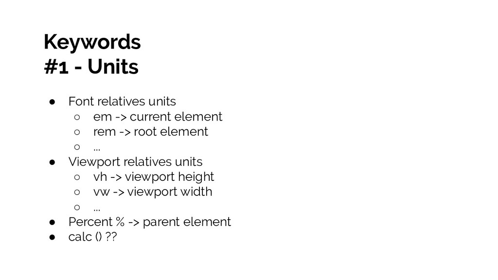
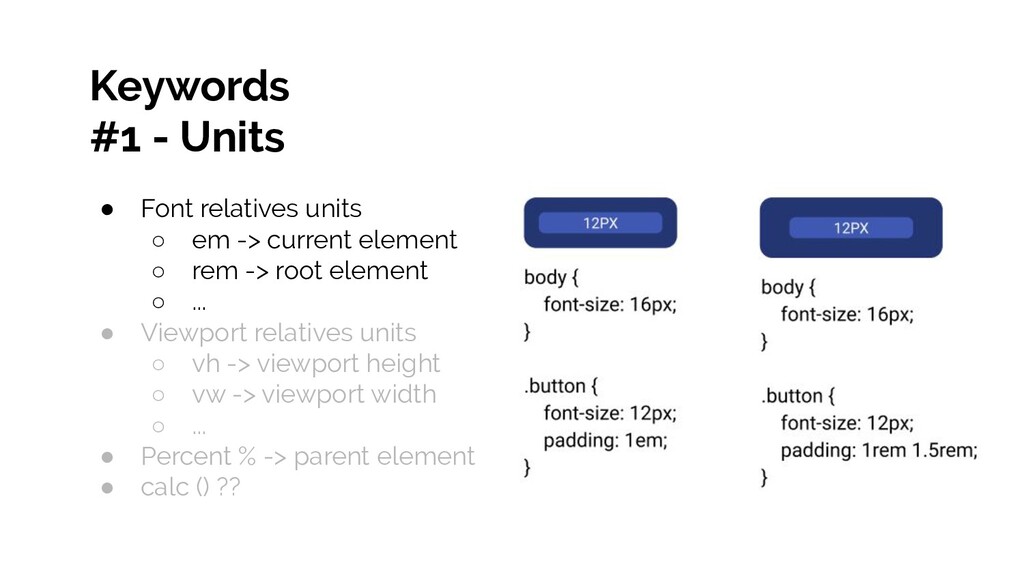
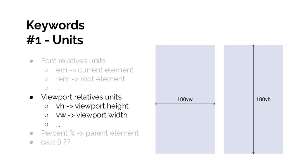
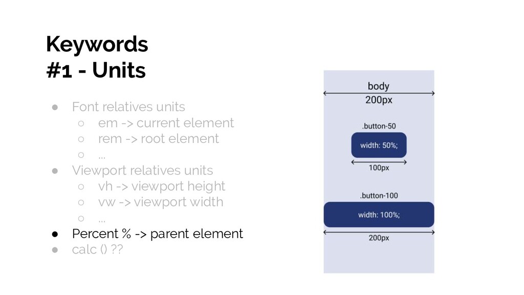
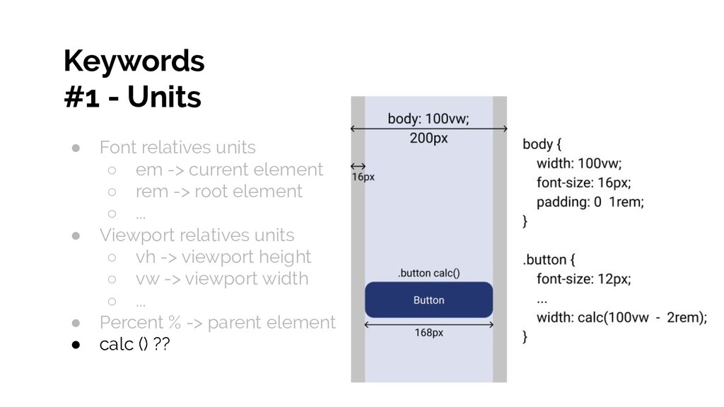
Keywords #1 - Units • Font relatives units ◦ em
-> current element ◦ rem -> root element ◦ ... • Viewport relatives units ◦ vh -> viewport height ◦ vw -> viewport width ◦ ... • Percent % -> parent element • calc () ??
Keywords #1 - Units • Font relatives units ◦ em
-> current element ◦ rem -> root element ◦ ... • Viewport relatives units ◦ vh -> viewport height ◦ vw -> viewport width ◦ ... • Percent % -> parent element • calc () ??
Keywords #1 - Units • Font relatives units ◦ em
-> current element ◦ rem -> root element ◦ ... • Viewport relatives units ◦ vh -> viewport height ◦ vw -> viewport width ◦ ... • Percent % -> parent element • calc () ??
Keywords #1 - Units • Font relatives units ◦ em
-> current element ◦ rem -> root element ◦ ... • Viewport relatives units ◦ vh -> viewport height ◦ vw -> viewport width ◦ ... • Percent % -> parent element • calc () ??
Keywords #1 - Units • Font relatives units ◦ em
-> current element ◦ rem -> root element ◦ ... • Viewport relatives units ◦ vh -> viewport height ◦ vw -> viewport width ◦ ... • Percent % -> parent element • calc () ??
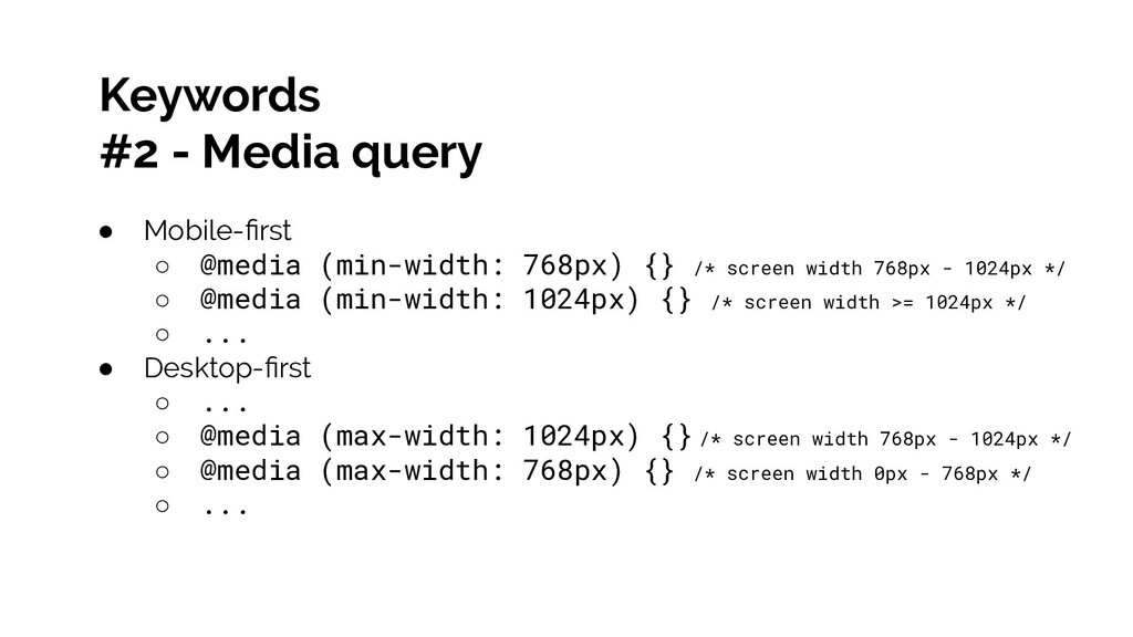
Keywords #2 - Media query • Mobile-first ◦ @media (min-width:
768px) {} /* screen width 768px - 1024px */ ◦ @media (min-width: 1024px) {} /* screen width >= 1024px */ ◦ ... • Desktop-first ◦ ... ◦ @media (max-width: 1024px) {} /* screen width 768px - 1024px */ ◦ @media (max-width: 768px) {} /* screen width 0px - 768px */ ◦ ...
#3 So....
Frontend Dev & UI/UX Designer risnanto.web.id
 nwiizo
 sbspsy
 pict3
pict3
 laysakura
 sugupoko
 shift_evolve
 kawaguti
 mtoyoda
 shinyasaita
 hiroyaonoe
 kakehashi
 bto
bto
 eileencodes
 hatefulcrawdad
 sugarenia
 davidcarrasco
 bermonpainter
 signer
 mojombo
 aleyda
 irinanazarova
 stephenakadiri
 kneath
 smashingmag