Upgrade to Pro — share decks privately, control downloads, hide ads and more …

Unit 3: Display lists and use Material Design

Avatar for Anna Karenina Anna Karenina
October 13, 2023
42

Unit 3: Display lists and use Material Design

Juara Android Online Session #2

Avatar for Anna Karenina

Anna Karenina

October 13, 2023
Tweet

Transcript

  1. This work is licensed under the Apache 2.0 License Anna

    Karenina Jusuf Android Developer, BRI Insurance Hello, everyone! https://github.com/itsannazzle https://www.linkedin.com/in/annkarenina/
  2. This work is licensed under the Apache 2.0 License Unit

    3: Display lists and use Material Design
  3. Compose ways to display collections of items This work is

    licensed under the Apache 2.0 License
  4. This work is licensed under the Apache 2.0 License @Composable

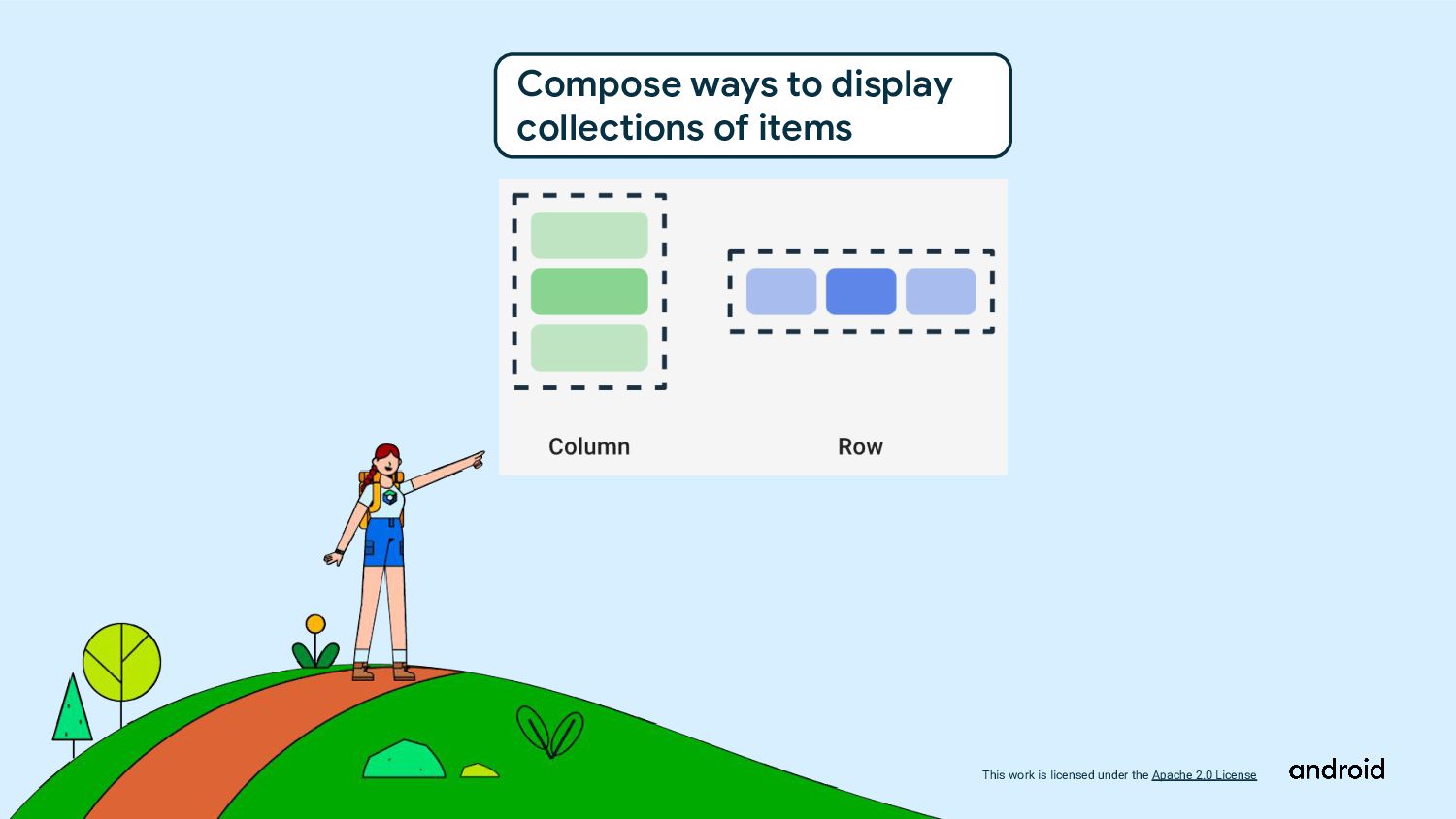
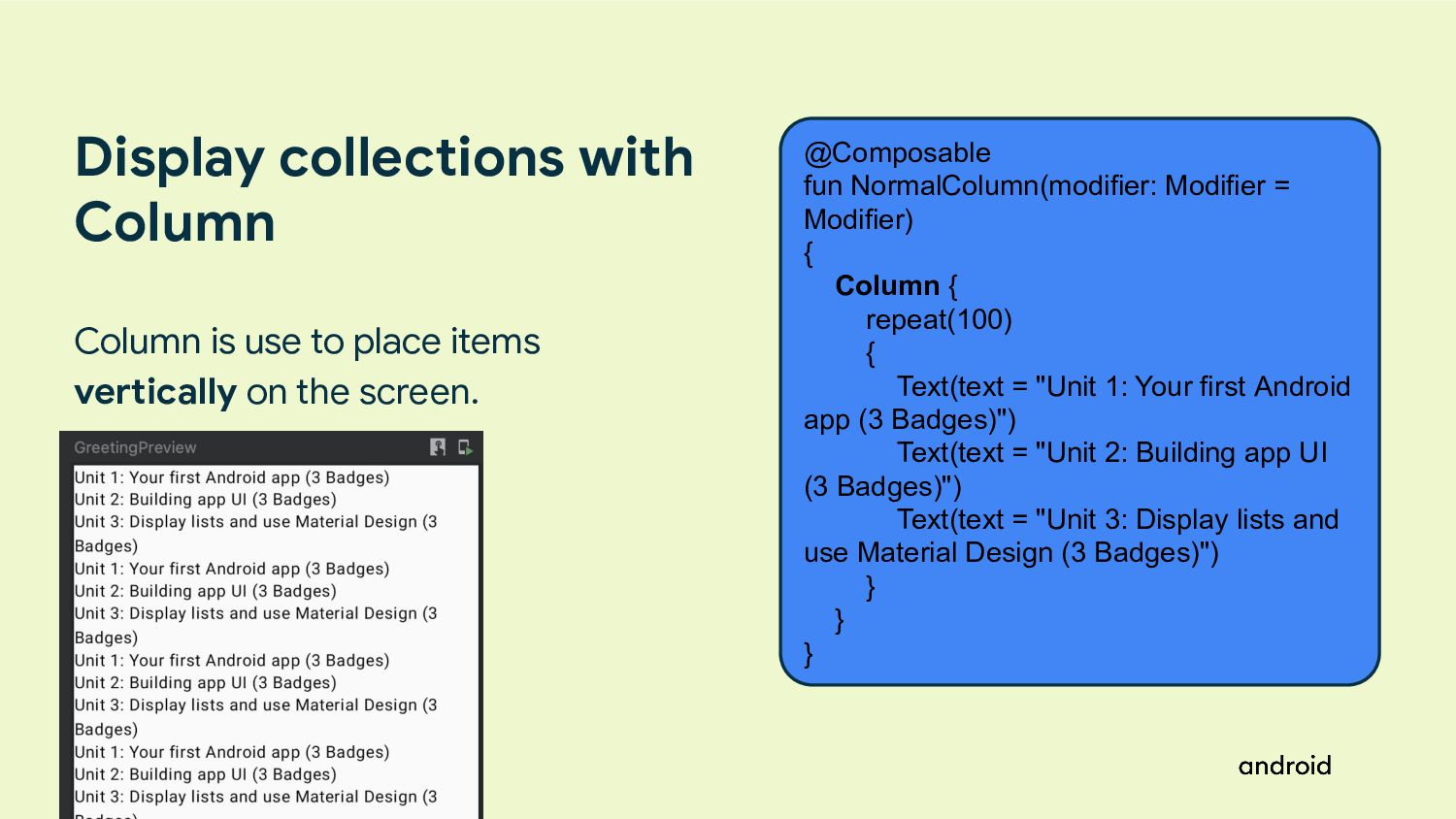
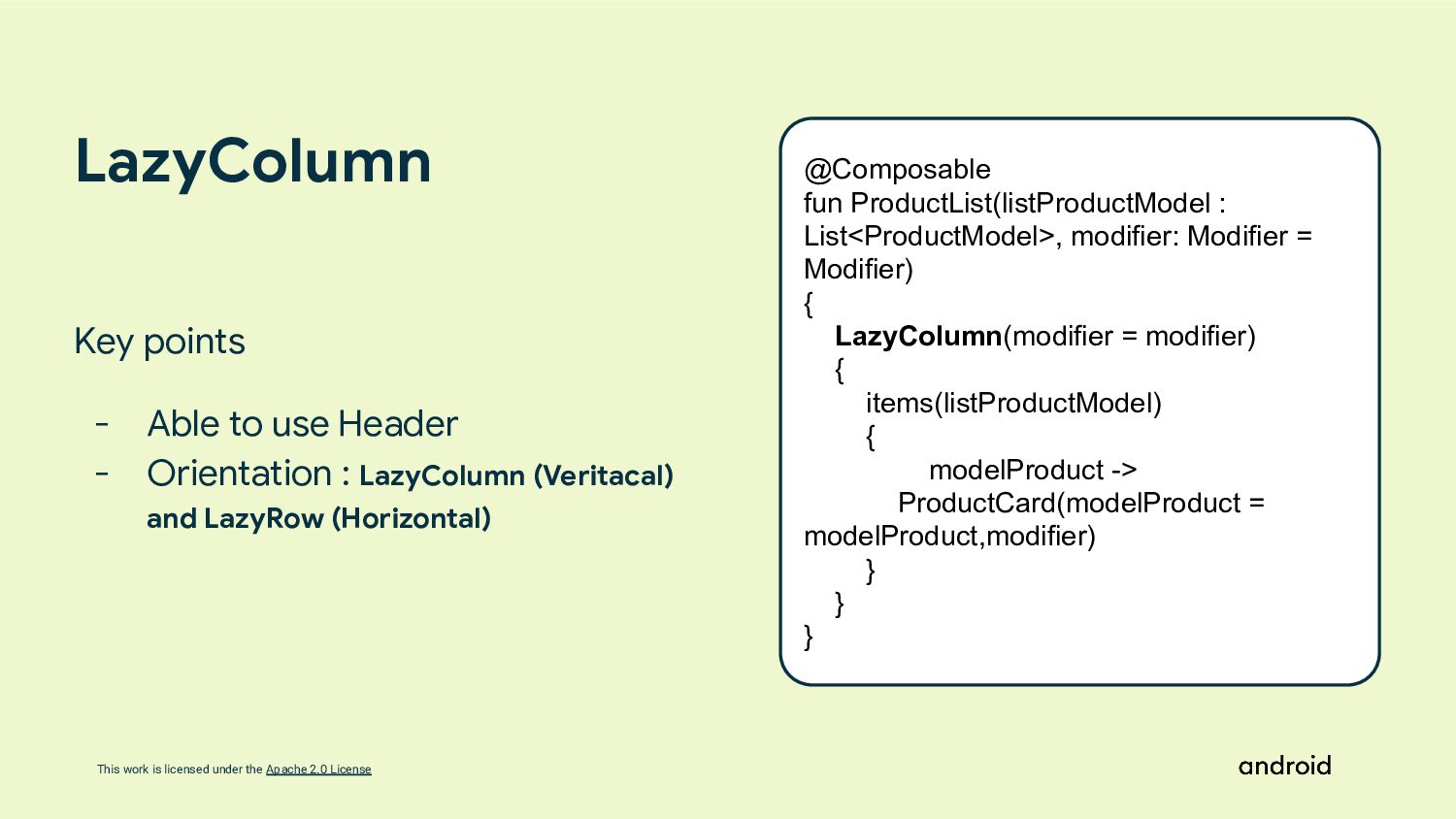
    fun NormalColumn(modifier: Modifier = Modifier) { Column { repeat(100) { Text(text = "Unit 1: Your first Android app (3 Badges)") Text(text = "Unit 2: Building app UI (3 Badges)") Text(text = "Unit 3: Display lists and use Material Design (3 Badges)") } } } Display collections with Column Column is use to place items vertically on the screen.
  5. This work is licensed under the Apache 2.0 License By

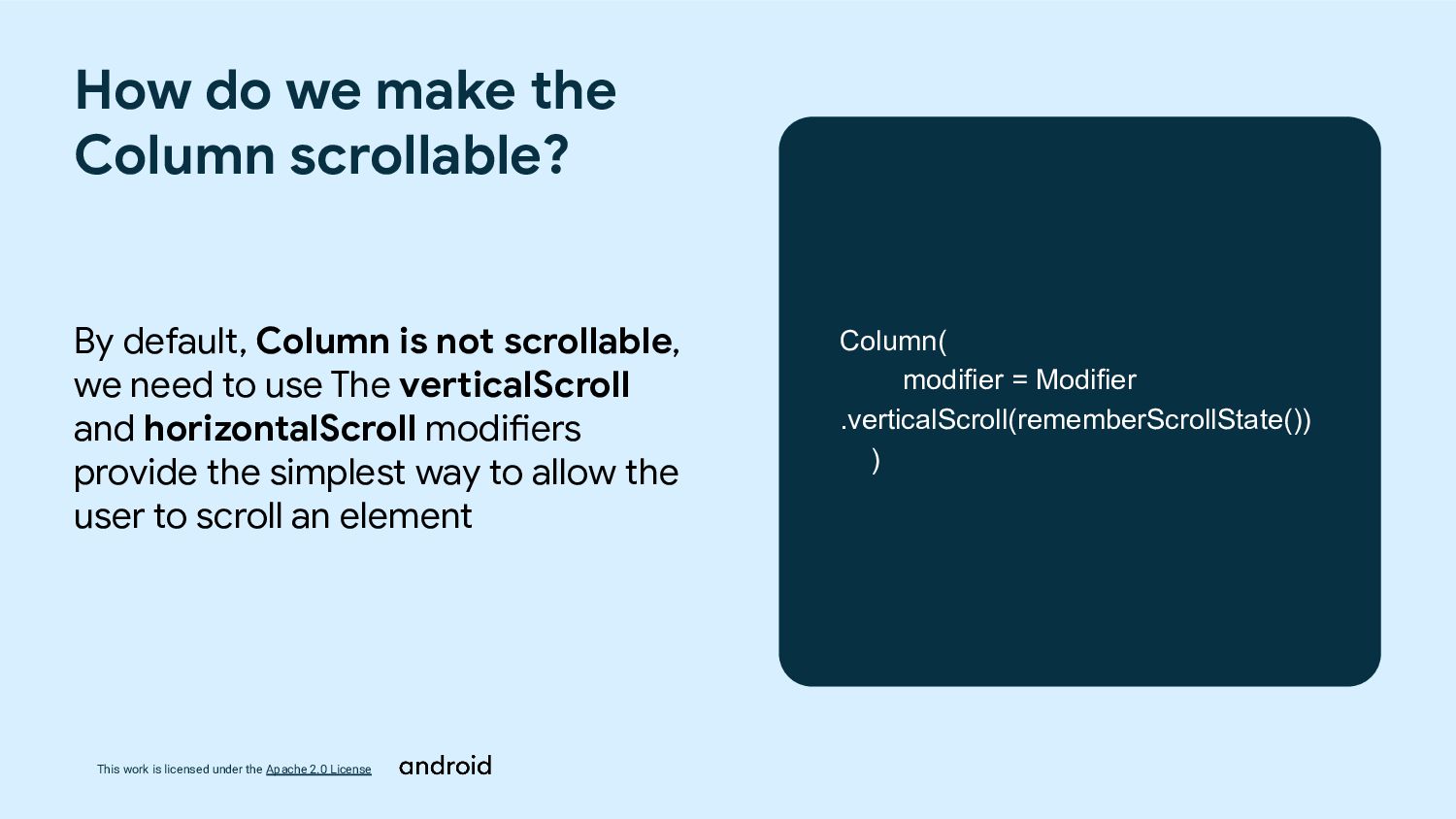
    default, Column is not scrollable, we need to use The verticalScroll and horizontalScroll modifiers provide the simplest way to allow the user to scroll an element How do we make the Column scrollable? Column( modifier = Modifier .verticalScroll(rememberScrollState()) )
  6. This work is licensed under the Apache 2.0 License @Composable

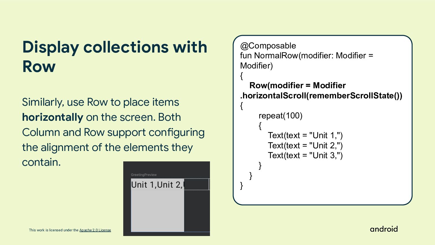
    fun NormalRow(modifier: Modifier = Modifier) { Row(modifier = Modifier .horizontalScroll(rememberScrollState()) { repeat(100) { Text(text = "Unit 1,") Text(text = "Unit 2,") Text(text = "Unit 3,") } } } Display collections with Row Similarly, use Row to place items horizontally on the screen. Both Column and Row support configuring the alignment of the elements they contain.
  7. This work is licensed under the Apache 2.0 License Why

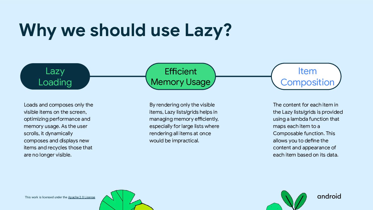
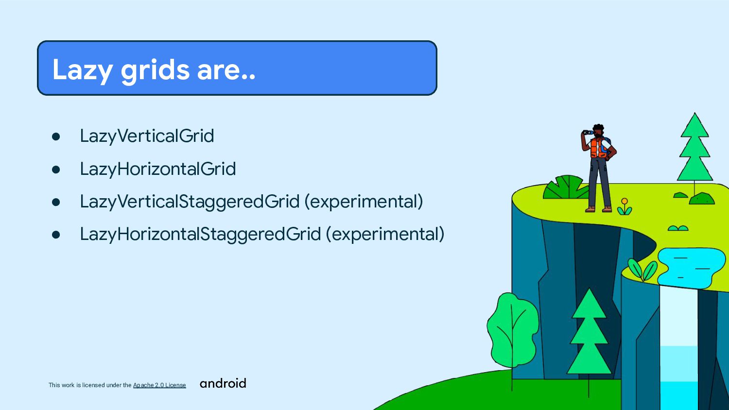
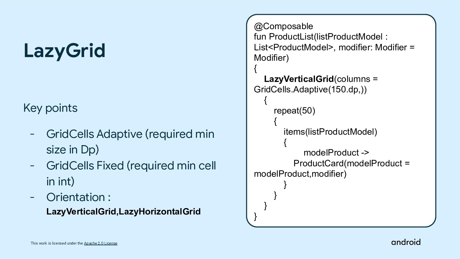
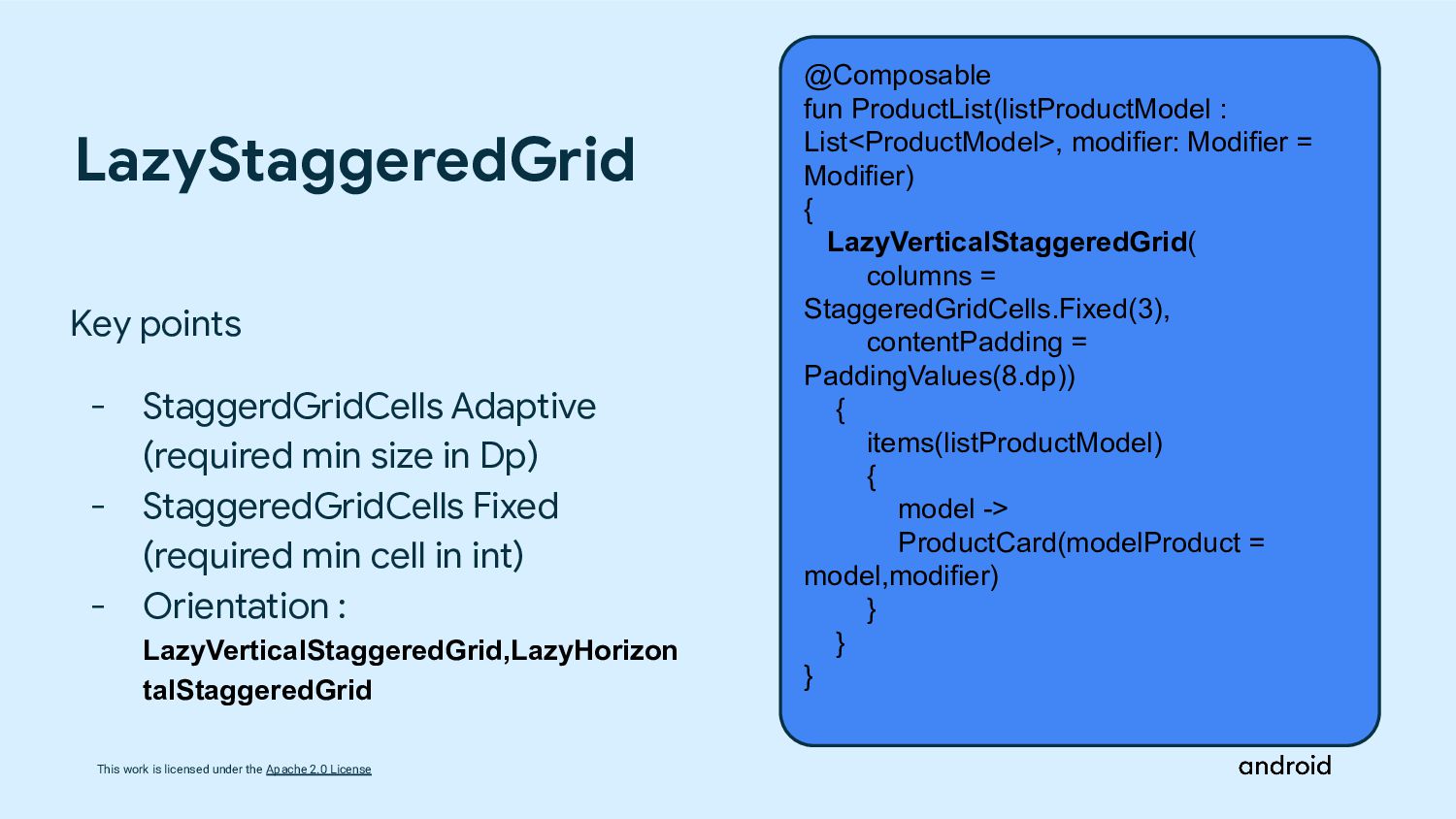
    we should use Lazy? The content for each item in the Lazy lists/grids is provided using a lambda function that maps each item to a Composable function. This allows you to define the content and appearance of each item based on its data. By rendering only the visible items, Lazy lists/grids helps in managing memory efficiently, especially for large lists where rendering all items at once would be impractical. Loads and composes only the visible items on the screen, optimizing performance and memory usage. As the user scrolls, it dynamically composes and displays new items and recycles those that are no longer visible. Lazy Loading Efficient Memory Usage Item Composition
  8. This work is licensed under the Apache 2.0 License •

    LazyColumn • LazyRow Lazy lists are..
  9. This work is licensed under the Apache 2.0 License •

    LazyVerticalGrid • LazyHorizontalGrid • LazyVerticalStaggeredGrid (experimental) • LazyHorizontalStaggeredGrid (experimental) Lazy grids are..
  10. This work is licensed under the Apache 2.0 License @Composable

    fun ProductList(listProductModel : List<ProductModel>, modifier: Modifier = Modifier) { LazyColumn(modifier = modifier) { items(listProductModel) { modelProduct -> ProductCard(modelProduct = modelProduct,modifier) } } } LazyColumn Key points - Able to use Header - Orientation : LazyColumn (Veritacal) and LazyRow (Horizontal)
  11. This work is licensed under the Apache 2.0 License @Composable

    fun ProductList(listProductModel : List<ProductModel>, modifier: Modifier = Modifier) { LazyVerticalGrid(columns = GridCells.Adaptive(150.dp,)) { repeat(50) { items(listProductModel) { modelProduct -> ProductCard(modelProduct = modelProduct,modifier) } } } } Key points - GridCells Adaptive (required min size in Dp) - GridCells Fixed (required min cell in int) - Orientation : LazyVerticalGrid,LazyHorizontalGrid LazyGrid
  12. This work is licensed under the Apache 2.0 License @Composable

    fun ProductList(listProductModel : List<ProductModel>, modifier: Modifier = Modifier) { LazyVerticalStaggeredGrid( columns = StaggeredGridCells.Fixed(3), contentPadding = PaddingValues(8.dp)) { items(listProductModel) { model -> ProductCard(modelProduct = model,modifier) } } } LazyStaggeredGrid Key points - StaggerdGridCells Adaptive (required min size in Dp) - StaggeredGridCells Fixed (required min cell in int) - Orientation : LazyVerticalStaggeredGrid,LazyHorizon talStaggeredGrid
  13. This work is licensed under the Apache 2.0 License @Composable

    fun BRINSMobileTheme( useDarkTheme: Boolean = isSystemInDarkTheme(), dynamicColor : Boolean = true, content: @Composable() () -> Unit, ) { val colorScheme = when { dynamicColor && Build.VERSION.SDK_INT >= Build.VERSION_CODES.S -> { val context = LocalContext.current if (useDarkTheme) dynamicDarkColorScheme(context) else dynamicLightColorScheme(context)} useDarkTheme -> DarkColors else -> LightColors } val view = LocalView.current if (!view.isInEditMode) { SideEffect() { val window = (view.context as Activity).window window.statusBarColor = colorScheme.primary.toArgb() WindowCompat.getInsetsController(window, view).isAppearanceLightStatusBars = useDarkTheme }} Theme and Adaptive App Theme Key points - Dynamic color based on the phone wallpaper - Android 12 and above
  14. This work is licensed under the Apache 2.0 License Key

    points - Still in experimental @OptIn(ExperimentalFoundationApi::class) @Composable fun ProductList(listProductModel : List<ProductModel>, modifier: Modifier = Modifier) { val productPeriod = remember { listProductModel.groupBy { it.PeriodType } } LazyColumn(modifier = modifier .fillMaxWidth()) { productPeriod.forEach() { (period, listModelProduct) -> stickyHeader { ProductHeader(s = period.name) } items(listModelProduct) { modelProduct -> ProductCard(modelProduct = modelProduct,modifier) } } Display List with Sticky Header
  15. This work is licensed under the Apache 2.0 License Thank

    you, Happy composing! Find the slides here or https://speakerdeck.com/itsannazzle