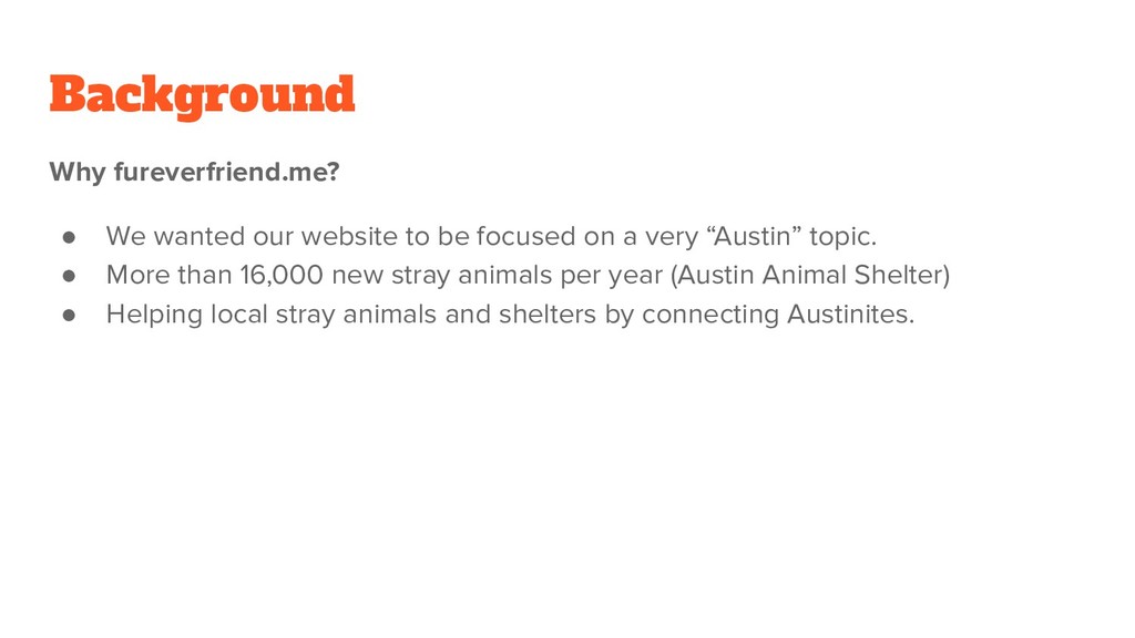
focused on a very “Austin” topic. • More than 16,000 new stray animals per year (Austin Animal Shelter) • Helping local stray animals and shelters by connecting Austinites.
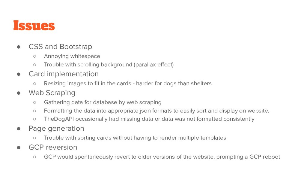
with scrolling background (parallax effect) • Card implementation ◦ Resizing images to fit in the cards - harder for dogs than shelters • Web Scraping ◦ Gathering data for database by web scraping ◦ Formatting the data into appropriate json formats to easily sort and display on website. ◦ TheDogAPI occasionally had missing data or data was not formatted consistently • Page generation ◦ Trouble with sorting cards without having to render multiple templates • GCP reversion ◦ GCP would spontaneously revert to older versions of the website, prompting a GCP reboot
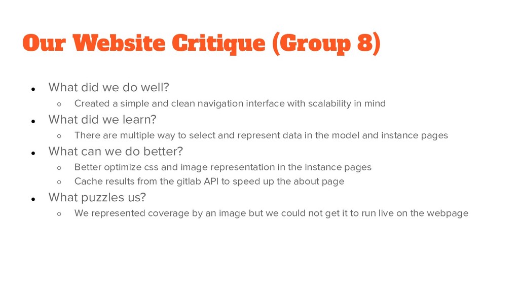
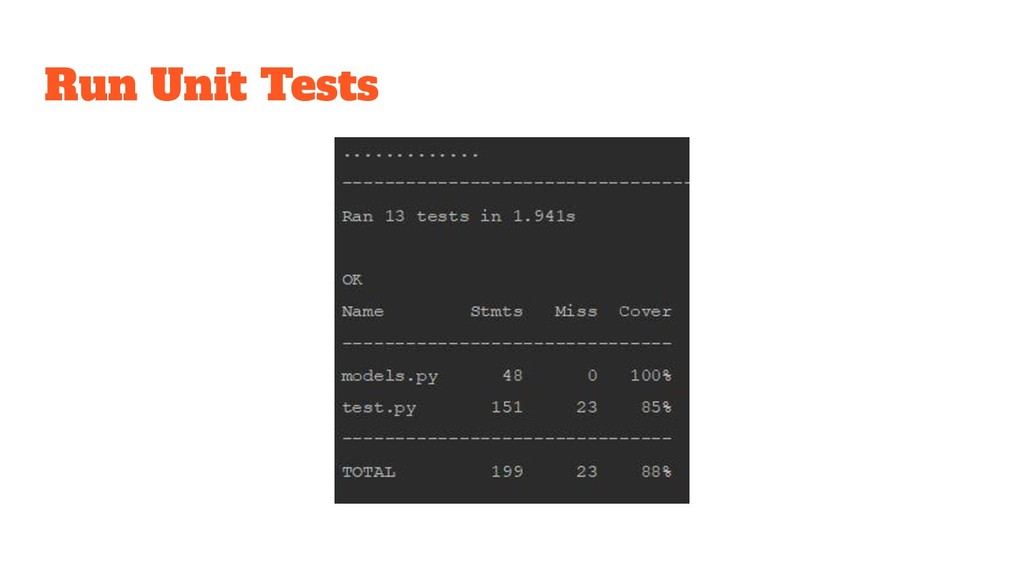
well? ◦ Created a simple and clean navigation interface with scalability in mind • What did we learn? ◦ There are multiple way to select and represent data in the model and instance pages • What can we do better? ◦ Better optimize css and image representation in the instance pages ◦ Cache results from the gitlab API to speed up the about page • What puzzles us? ◦ We represented coverage by an image but we could not get it to run live on the webpage
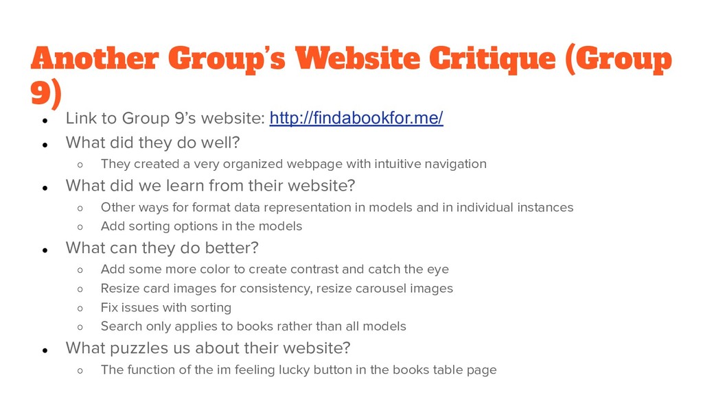
9’s website: http://findabookfor.me/ • What did they do well? ◦ They created a very organized webpage with intuitive navigation • What did we learn from their website? ◦ Other ways for format data representation in models and in individual instances ◦ Add sorting options in the models • What can they do better? ◦ Add some more color to create contrast and catch the eye ◦ Resize card images for consistency, resize carousel images ◦ Fix issues with sorting ◦ Search only applies to books rather than all models • What puzzles us about their website? ◦ The function of the im feeling lucky button in the books table page


 soudai
 oripsolob
 rabernat
 smashingmag
 axbom
 apolaine
 scottboms
 mraible
 sugarenia
 shlominoach
 danielanewman
 mfonobong