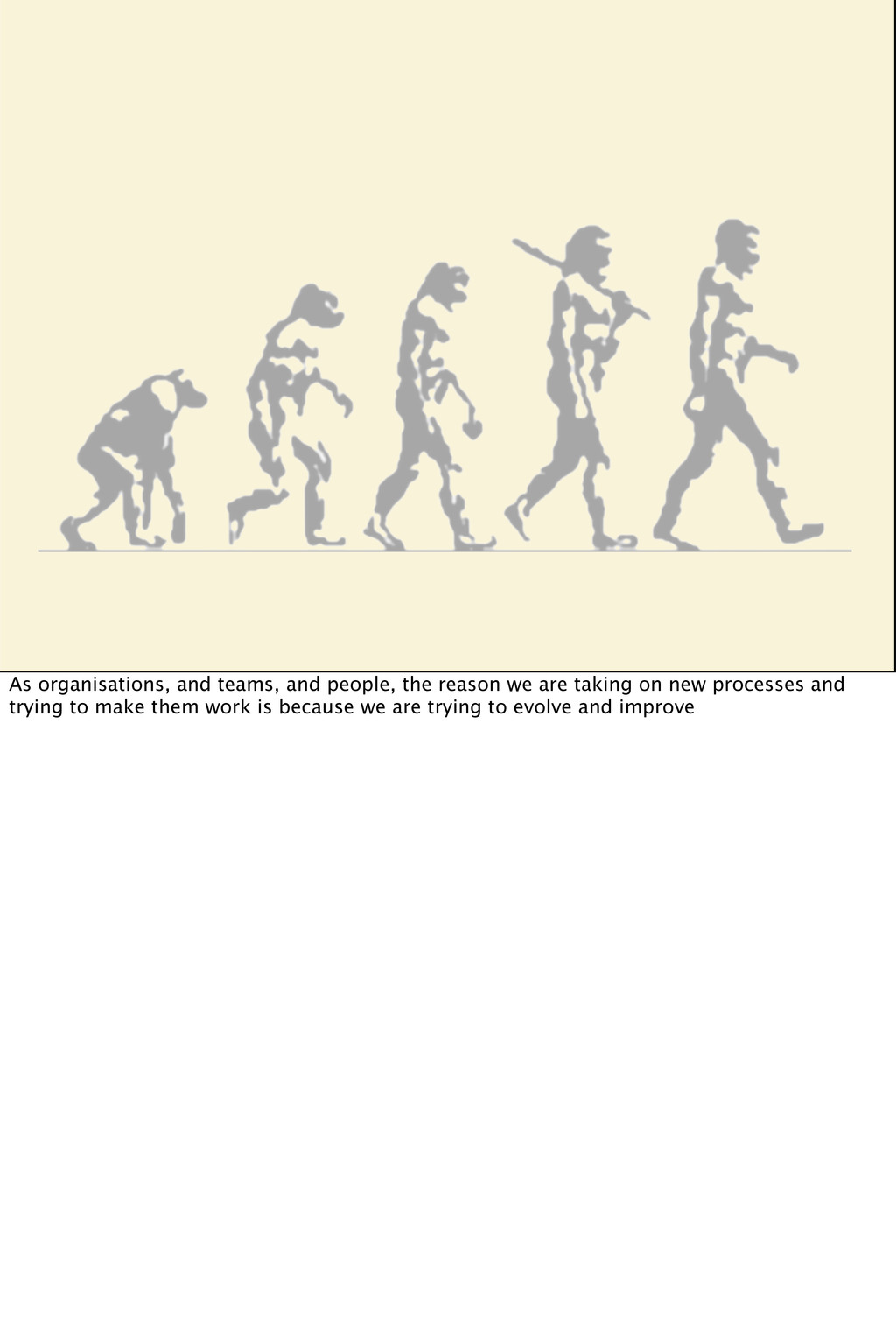
of my talk is that Agile is a Culture, not a process. I've been seeing a lot of UX folks deconstructing the Agile Process and spending time trying to gene-splice the hallowed UX processes into them. And there's nothing wrong with that, but over the last several years its become clearer to me that cultural changes have had the most influence on Agile UX. Process-based questions and solutions for Agile UX need to be supplemented with consideration of what the priorities, mythologies and sometimes nonverbal messages of the organisational culture are telling people. And cultural change is sometime large, slow moving, and painful. I'm going to pick out some pivotal projects and crises for some of the Atlassian products, and look at them from a pattern angle, so that you might recognise or identify some similarities with things that happen in your practice. There's a constellation of negative patterns that caused us some problems, some response patterns that you are probably familiar with, but then I'll also show the cultural lesson and change that we took on.
of who's in the audience and what your individual experiences with agile are. 1. First of all, I'd like to see how many here are NOT UX professionals, maybe you came here to learn about the UX angle, rather than the agile angle 2. Second, if you are a consultant or work at an agency, in other words, have clients, raise your hand. I think this is a very important factor as a UX professional dealing with agile. If you're client-side working in-house, the decision to go agile is pretty much made for you. As a consultant, you're pretty much going to use whatever process your client uses. As I'll point out later, embarking on an agile product requires a lot of trust as well, and with a client sometimes its hard to say - "Well we're not going to really tell you what we're building for you until we finish"! 3. I ask this because I think this affects your take on Agile processes, but what Agile process were you first exposed to: 3a: Scrum? 3b: What else? Holler it out? 4. How many of you are working on software products 4a. How many are working on websites? 4b. Service design? 4c. Hardware? 4d. What else? Anything? 5e do any of you go to purely agile development conferences or meet ups?
with Agile. In 2006 Vignette, which made content management software in Austin, got a new VP, and as a combo package: new VP and new process. Has this ever happened to you? Also, for UX peeps: have you ever noticed that when a new VP appears, if the UX team has been centralised, the VP noob distributes them, or if you were distributed, the VP will centralise you? So Vignette started down the Scrum path, and took it very seriously. We had scrum training for every team, we got a slew of people certified as scrum masters, and we set up a Program Management Office to monitor and advise everyone on the process. It gave me fits. Our UX team had really started making progress because we'd experienced a Wake Up Call… huge multimillion dollar clients were dropping us and moving to competitors because they were "simpler". We had this huge powerful product that was more flexible and more powerful than any of our competitors could touch, but it was a bear to use. We'd done some really nice user research and built a set of research-based personas. We'd started doing task-based design and building user-centered user interfaces into the product. And suddenly it looked like we were never going to do that again. There was no time. In those first iterations we were all flat out designing as fast as we could, and there was precious little time for validation or soak time for the designs. So mostly my first tangle with Agile processes were laced with resentment and confusion. Years later, I found myself living and working in Australia for Atlassian, who has a huge powerful product that is more flexible and powerful than any of our competitors can touch, but some people find it a bear to use. Atlassian is still tuning our Agile processes, but what we definitely have going for us is that the culture is Agile. And working with, and against that in bringing a UX practice into play is what I'll be talking about today.
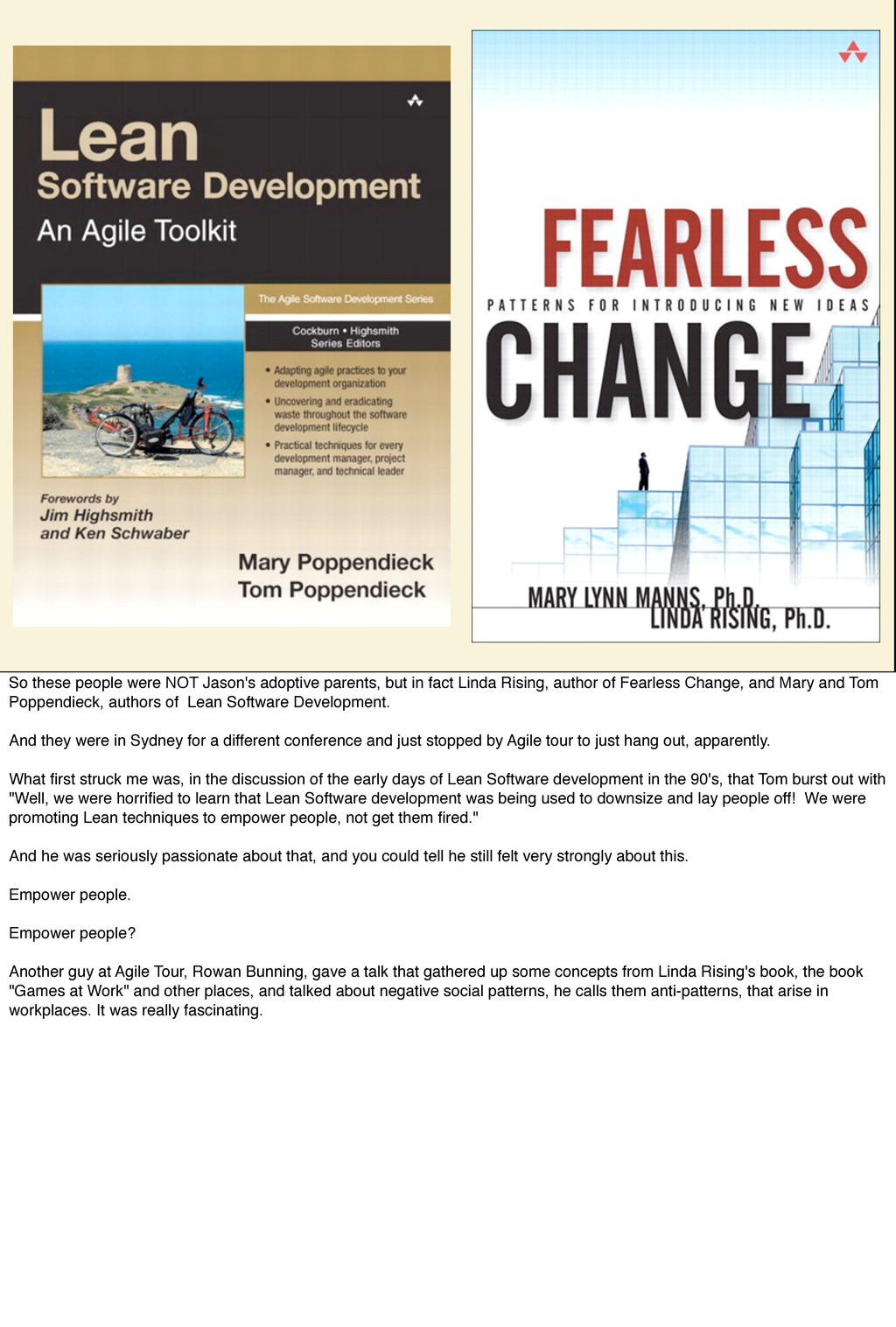
Sydney to check out the local agilists and also see if there were any UXers in that community. I did meet Elizabeth Pek, who you've just heard speak. But not many other UXers were there. At one point I decided that I had to have some real coffee, so I ducked out and started walking around the UTS buildings looking for a real coffee shop. As I was walking, I saw one of the event organisers, Jason Yip, walking with some baby boomers, who were laden with roller board suitcases and backpacks. I thought maybe they were Jason's parents, although he's Asian and they're Anglo. I was thinking "I didn't know Jason was adopted!" So I got back to the venue with my delicious coffee and lunch has been served, and I notice that Jason's parents have been served lunch as well, and I'm thinking, well that's no problem, we have plenty, after all. And then after lunch I go into the lecture hall and what do you know, Jason's parents are sitting there in front of all of us. WTF?
fact Linda Rising, author of Fearless Change, and Mary and Tom Poppendieck, authors of Lean Software Development. And they were in Sydney for a different conference and just stopped by Agile tour to just hang out, apparently. What first struck me was, in the discussion of the early days of Lean Software development in the 90's, that Tom burst out with "Well, we were horrified to learn that Lean Software development was being used to downsize and lay people off! We were promoting Lean techniques to empower people, not get them fired." And he was seriously passionate about that, and you could tell he still felt very strongly about this. Empower people. Empower people? Another guy at Agile Tour, Rowan Bunning, gave a talk that gathered up some concepts from Linda Rising's book, the book "Games at Work" and other places, and talked about negative social patterns, he calls them anti-patterns, that arise in workplaces. It was really fascinating.
in to Agile through Scrum, and I have that whole series of Scrum books at home, and I've read… parts of them… most of them actually, and they've talked about scrum processes and software development, but it wasn't until I started reading Tom and Mary's book that I actually connected Agile Development up with the Industrial Revolution and some interesting comments made by Alan Cooper at his keynote to the very first Interaction Design conference in Savannah in 2008. I'm not sure that video is still available online, but contact me and I can help you get ahold of it. If you're doing UX design, this talk makes you want to go out and slay dragons. So when we're talking about interactive products, web or software, we're talking about creating a completely different kind of thing than when we create hardware. But for a long time, we were using pretty much the same processes for software that we'd used for a century in hardware development. And Hardware development is very constrained by inventory and production. You've got to design your widget, then you have to build a factory to produce your widget, and you have to make sure you've got all the raw materials to produce your widget, and all of this involves a lot of planning. You have to nail the design because of the tremendous cost of retooling your factory when you have a design change. It's about managing risk. Developing software is completely different. You aren't doing materials science. It's less predictable - you're often exploring whether something can even be done or not. And software engineers were tired of taking the heat for impossible requirements from product managers, and impossible designs from designers, and they said "You know what, we're NOT going to accept a big upfront design from you that does not take into account ANY idea of whether or not your feature set is doable within the time you say it is". So the Agile Manifesto dudes got together and came up with a way to cautiously explore the "realm of the possible" in software development in a way that made sense to them. And it does make sense. And the business people loved it, because suddenly they were getting working, quality software in a somewhat predictable fashion, and giant mega-year long projects weren't suddenly sliding off the cliff into the ocean any more. So the engineers have really upped their game, and they've come back with an approach to engineering that makes a tonne of sense for software development.
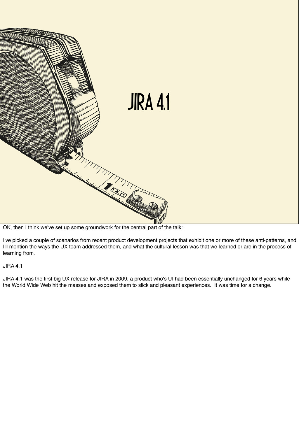
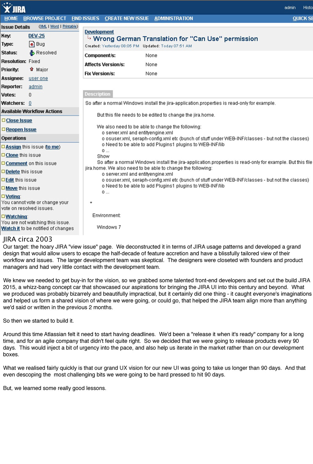
groundwork for the central part of the talk: I've picked a couple of scenarios from recent product development projects that exhibit one or more of these anti-patterns, and I'll mention the ways the UX team addressed them, and what the cultural lesson was that we learned or are in the process of learning from. JIRA 4.1 JIRA 4.1 was the first big UX release for JIRA in 2009, a product who's UI had been essentially unchanged for 6 years while the World Wide Web hit the masses and exposed them to slick and pleasant experiences. It was time for a change.
page. We deconstructed it in terms of JIRA usage patterns and developed a grand design that would allow users to escape the half-decade of feature accretion and have a blissfully tailored view of their workflow and issues. The larger development team was skeptical. The designers were closeted with founders and product managers and had very little contact with the development team. We knew we needed to get buy-in for the vision, so we grabbed some talented front-end developers and set out the build JIRA 2015, a whizz-bang concept car that showcased our aspirations for bringing the JIRA UI into this century and beyond. What we produced was probably bizarrely and beautifully impractical, but it certainly did one thing - it caught everyone's imaginations and helped us form a shared vision of where we were going, or could go, that helped the JIRA team align more than anything we'd said or written in the previous 2 months. So then we started to build it. Around this time Atlassian felt it need to start having deadlines. We'd been a "release it when it's ready" company for a long time, and for an agile company that didn't feel quite right. So we decided that we were going to release products every 90 days. This would inject a bit of urgency into the pace, and also help us iterate in the market rather than on our development boxes. What we realised fairly quickly is that our grand UX vision for our new UI was going to take us longer than 90 days. And that even descoping the most challenging bits we were going to be hard pressed to hit 90 days. But, we learned some really good lessons.
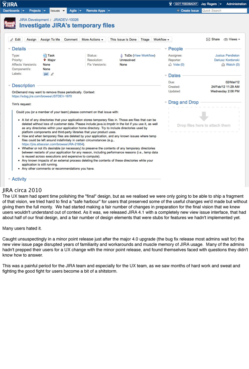
the "final" design, but as we realised we were only going to be able to ship a fragment of that vision, we tried hard to find a "safe harbour" for users that preserved some of the useful changes we'd made but without giving them the full monty. We had started making a fair number of changes in preparation for the final vision that we knew users wouldn't understand out of context. As it was, we released JIRA 4.1 with a completely new view issue interface, that had about half of our final design, and a fair number of design elements that were stubs for features we hadn't implemented yet. Many users hated it. Caught unsuspectingly in a minor point release just after the major 4.0 upgrade (the bug fix release most admins wait for) the new view issue page disrupted years of familiarity and workarounds and muscle memory of JIRA usage. Many of the admins hadn't prepped their users for a UX change with the minor point release, and found themselves faced with questions they didn't know how to answer. This was a painful period for the JIRA team and especially for the UX team, as we saw months of hard work and sweat and fighting the good fight for users become a bit of a shitstorm.
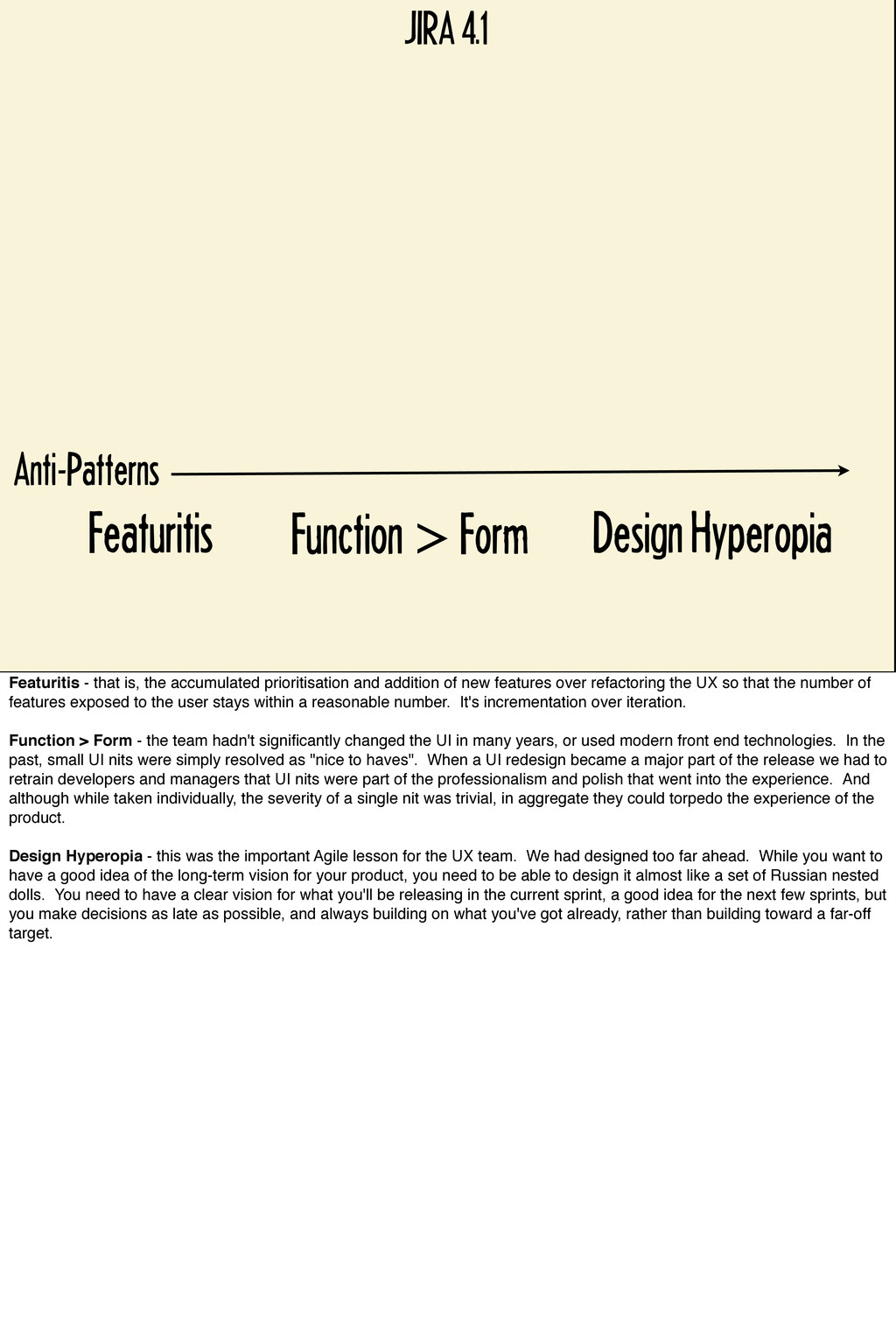
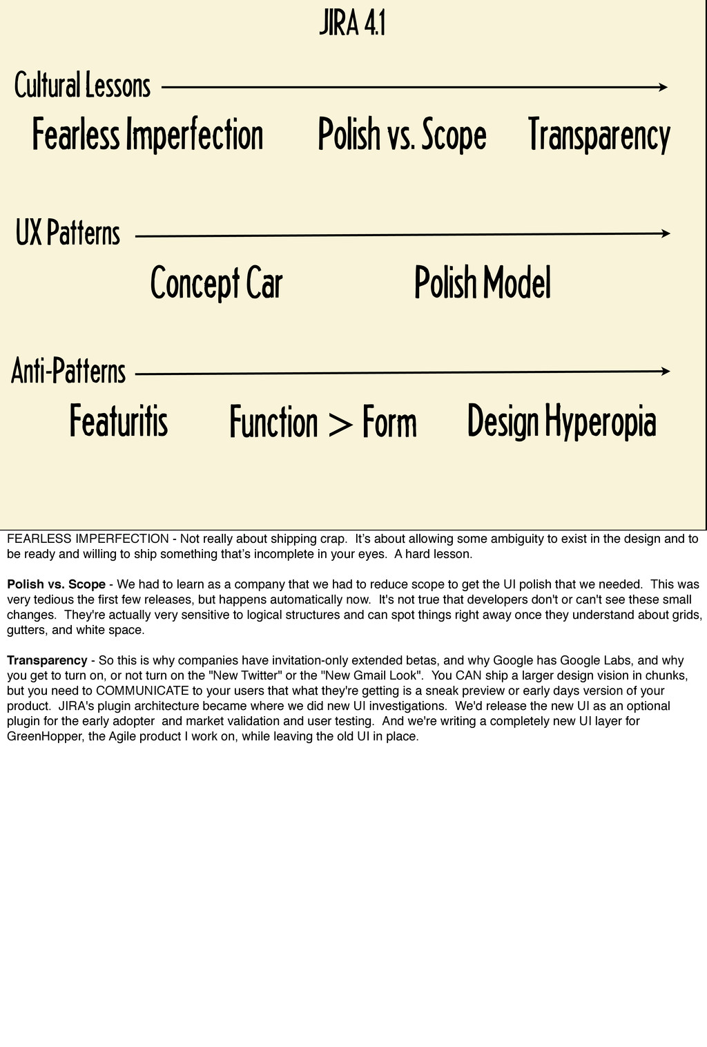
- that is, the accumulated prioritisation and addition of new features over refactoring the UX so that the number of features exposed to the user stays within a reasonable number. It's incrementation over iteration. Function > Form - the team hadn't significantly changed the UI in many years, or used modern front end technologies. In the past, small UI nits were simply resolved as "nice to haves". When a UI redesign became a major part of the release we had to retrain developers and managers that UI nits were part of the professionalism and polish that went into the experience. And although while taken individually, the severity of a single nit was trivial, in aggregate they could torpedo the experience of the product. Design Hyperopia - this was the important Agile lesson for the UX team. We had designed too far ahead. While you want to have a good idea of the long-term vision for your product, you need to be able to design it almost like a set of Russian nested dolls. You need to have a clear vision for what you'll be releasing in the current sprint, a good idea for the next few sprints, but you make decisions as late as possible, and always building on what you've got already, rather than building toward a far-off target.
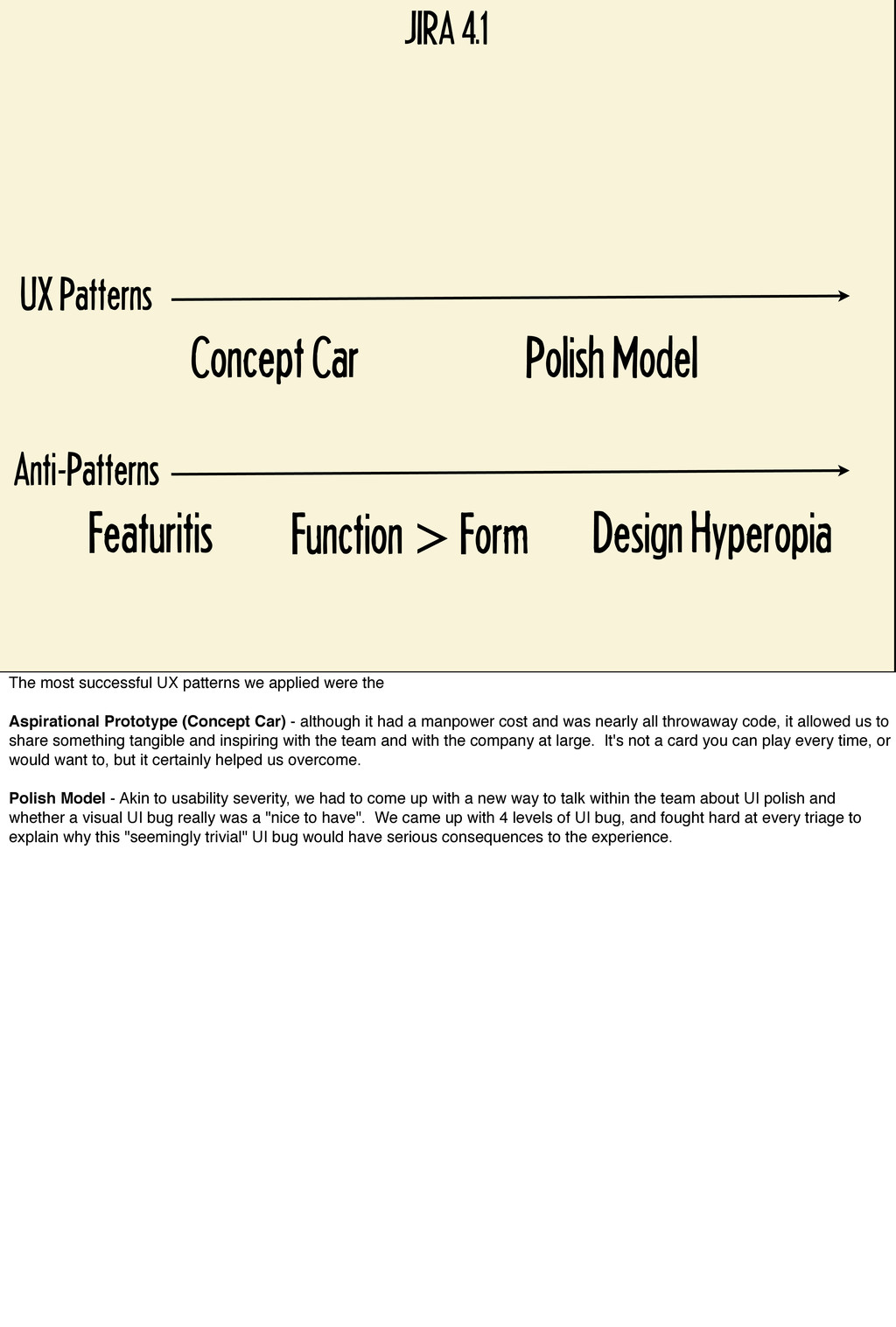
Car Polish Model JIRA 4.1 The most successful UX patterns we applied were the Aspirational Prototype (Concept Car) - although it had a manpower cost and was nearly all throwaway code, it allowed us to share something tangible and inspiring with the team and with the company at large. It's not a card you can play every time, or would want to, but it certainly helped us overcome. Polish Model - Akin to usability severity, we had to come up with a new way to talk within the team about UI polish and whether a visual UI bug really was a "nice to have". We came up with 4 levels of UI bug, and fought hard at every triage to explain why this "seemingly trivial" UI bug would have serious consequences to the experience.
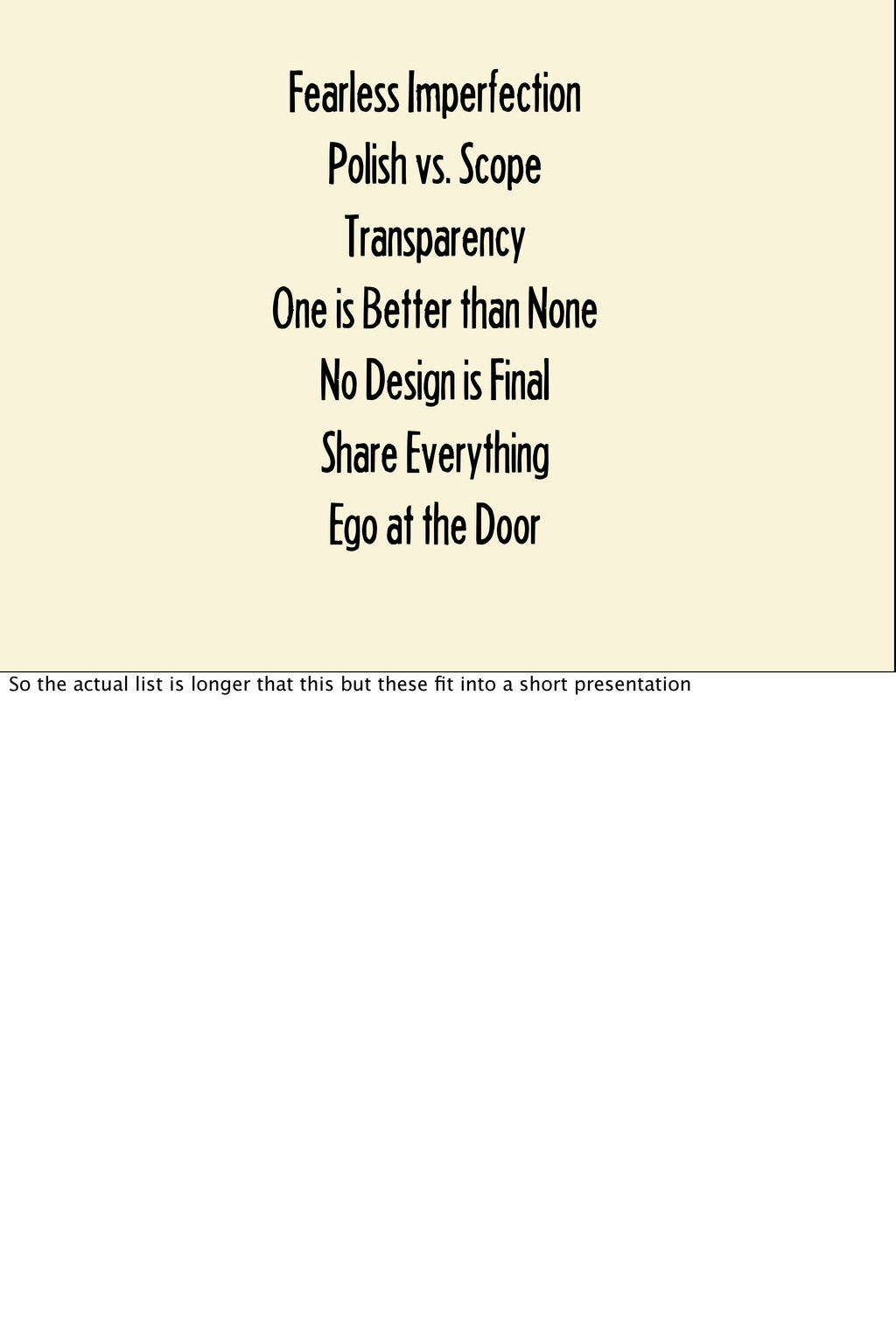
Patterns Concept Car Polish Model Cultural Lessons Fearless Imperfection Polish vs. Scope Transparency FEARLESS IMPERFECTION - Not really about shipping crap. It’s about allowing some ambiguity to exist in the design and to be ready and willing to ship something that’s incomplete in your eyes. A hard lesson. Polish vs. Scope - We had to learn as a company that we had to reduce scope to get the UI polish that we needed. This was very tedious the first few releases, but happens automatically now. It's not true that developers don't or can't see these small changes. They're actually very sensitive to logical structures and can spot things right away once they understand about grids, gutters, and white space. Transparency - So this is why companies have invitation-only extended betas, and why Google has Google Labs, and why you get to turn on, or not turn on the "New Twitter" or the "New Gmail Look". You CAN ship a larger design vision in chunks, but you need to COMMUNICATE to your users that what they're getting is a sneak preview or early days version of your product. JIRA's plugin architecture became where we did new UI investigations. We'd release the new UI as an optional plugin for the early adopter and market validation and user testing. And we're writing a completely new UI layer for GreenHopper, the Agile product I work on, while leaving the old UI in place.
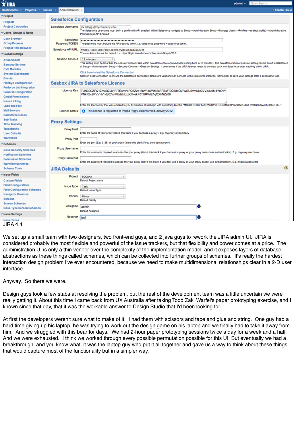
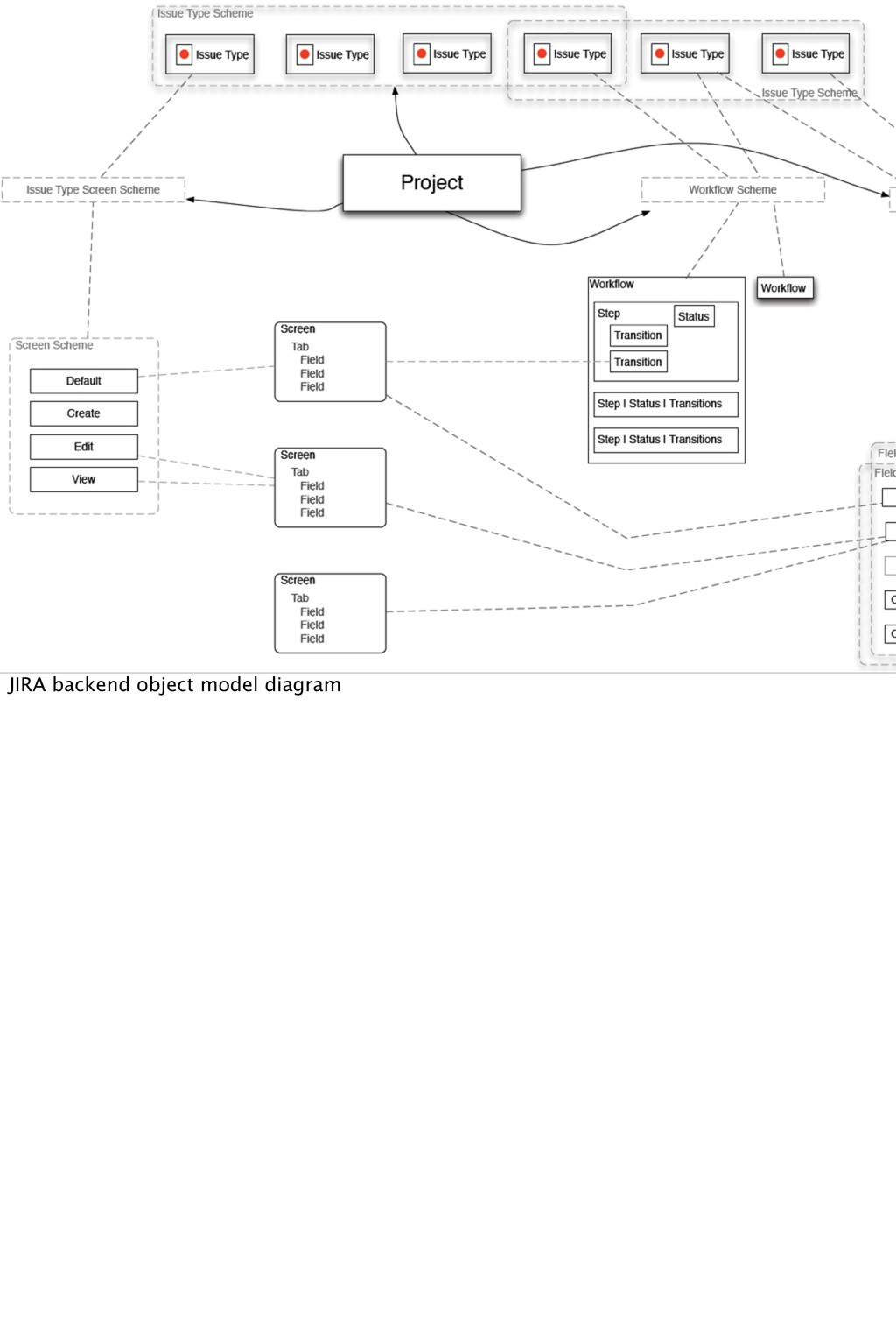
designers, two front-end guys, and 2 java guys to rework the JIRA admin UI. JIRA is considered probably the most flexible and powerful of the issue trackers, but that flexibility and power comes at a price. The administration UI is only a thin veneer over the complexity of the implementation model, and it exposes layers of database abstractions as these things called schemes, which can be collected into further groups of schemes. It's really the hardest interaction design problem I've ever encountered, because we need to make multidimensional relationships clear in a 2-D user interface. Anyway. So there we were. Design guys took a few stabs at resolving the problem, but the rest of the development team was a little uncertain we were really getting it. About this time I came back from UX Australia after taking Todd Zaki Warfel's paper prototyping exercise, and I known since that day, that it was the workable answer to Design Studio that I'd been looking for. At first the developers weren't sure what to make of it. I had them with scissors and tape and glue and string. One guy had a hard time giving up his laptop, he was trying to work out the design game on his laptop and we finally had to take it away from him. And we struggled with this bear for days. We had 2-hour paper prototyping sessions twice a day for a week and a half. And we were exhausted. I think we worked through every possible permutation possible for this UI. But eventually we had a breakthrough, and you know what, it was the laptop guy who put it all together and gave us a way to think about these things that would capture most of the functionality but in a simpler way.
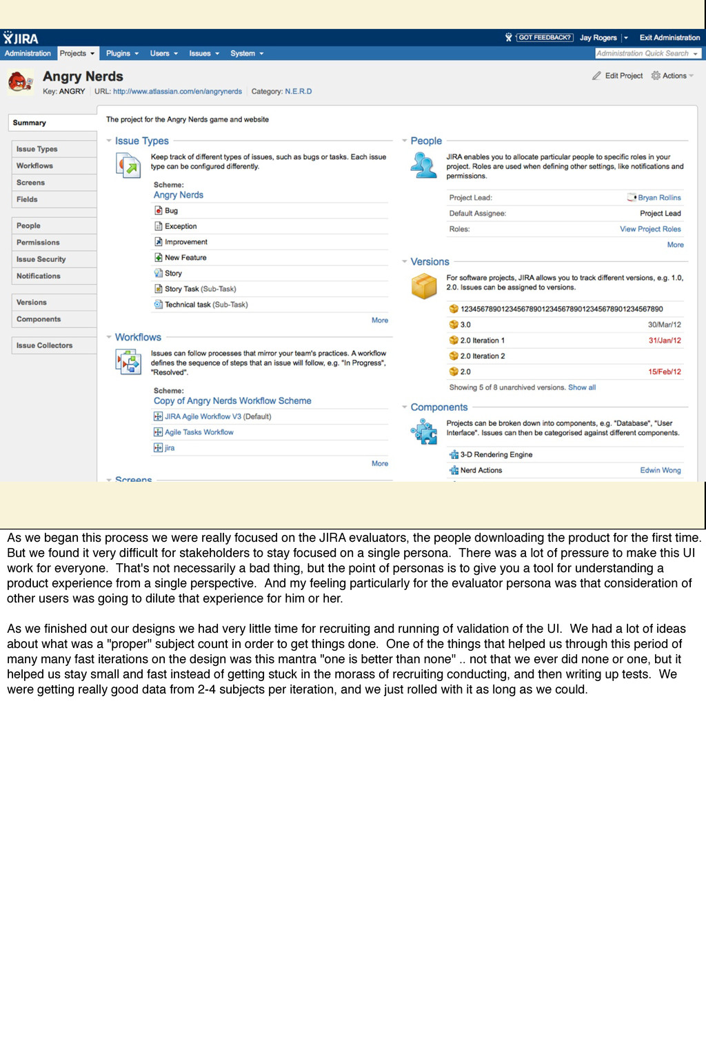
the JIRA evaluators, the people downloading the product for the first time. But we found it very difficult for stakeholders to stay focused on a single persona. There was a lot of pressure to make this UI work for everyone. That's not necessarily a bad thing, but the point of personas is to give you a tool for understanding a product experience from a single perspective. And my feeling particularly for the evaluator persona was that consideration of other users was going to dilute that experience for him or her. As we finished out our designs we had very little time for recruiting and running of validation of the UI. We had a lot of ideas about what was a "proper" subject count in order to get things done. One of the things that helped us through this period of many many fast iterations on the design was this mantra "one is better than none" .. not that we ever did none or one, but it helped us stay small and fast instead of getting stuck in the morass of recruiting conducting, and then writing up tests. We were getting really good data from 2-4 subjects per iteration, and we just rolled with it as long as we could.
point of personas is to understand what differing user needs are. If you’re not actually designing to meet those needs, then you’re kind of wasting the effort you put into the personas. It was difficult for stakeholders not to want to simultaneously please the evaluator and expert user personas... and trying to please both can sometimes dilute the experience for both. Implementation Model-itis You’ll recognise this in a lot of enterprise software: if you find that to accomplish a task, you have to jump around in the UI setting up various precursors in different parts of the application before you can accomplish your task, then it’s clear the UI was designed around the implementation model, not a user task model. This occurs very naturally because when the work is partitioned to different engineers, they each do their part, and when its time to ship, they bolt 4 separate user interfaces together.
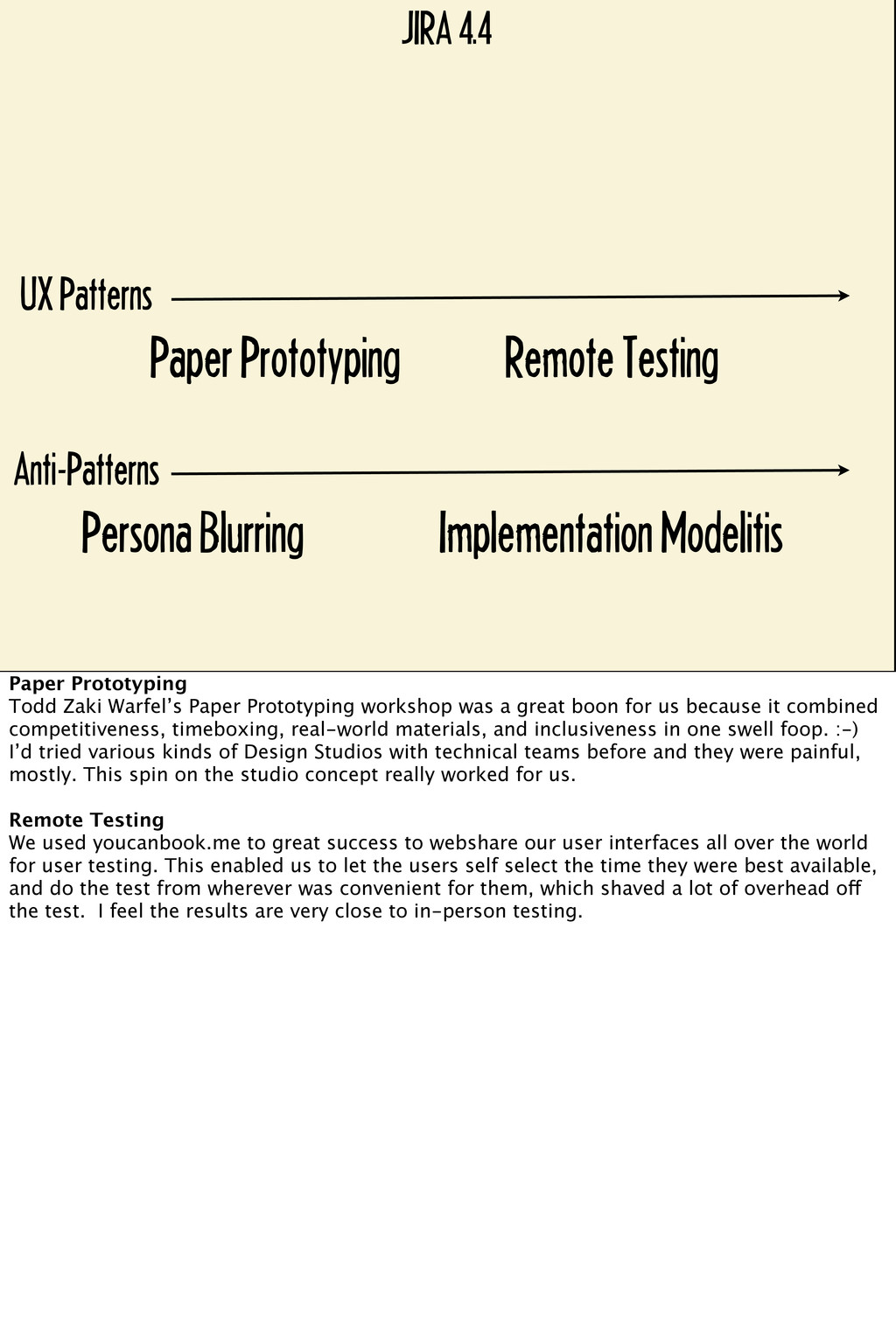
Blurring Implementation Modelitis Paper Prototyping Todd Zaki Warfel’s Paper Prototyping workshop was a great boon for us because it combined competitiveness, timeboxing, real-world materials, and inclusiveness in one swell foop. :-) I’d tried various kinds of Design Studios with technical teams before and they were painful, mostly. This spin on the studio concept really worked for us. Remote Testing We used youcanbook.me to great success to webshare our user interfaces all over the world for user testing. This enabled us to let the users self select the time they were best available, and do the test from wherever was convenient for them, which shaved a lot of overhead off the test. I feel the results are very close to in-person testing.
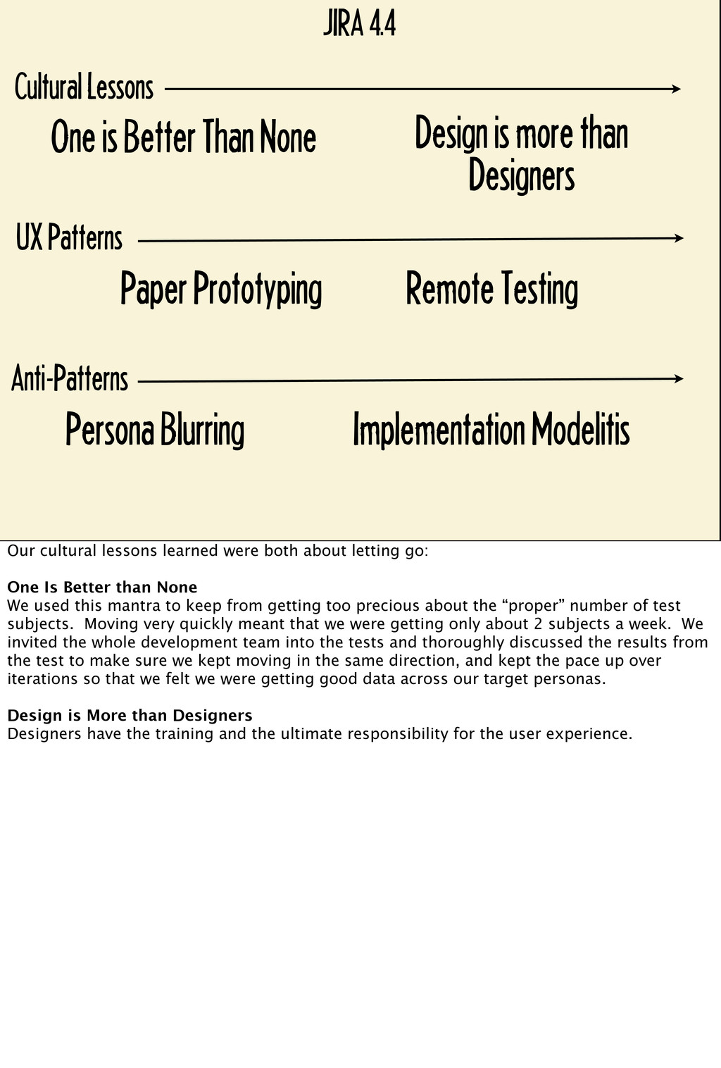
Than None Persona Blurring Implementation Modelitis Paper Prototyping Remote Testing Design is more than Designers Our cultural lessons learned were both about letting go: One Is Better than None We used this mantra to keep from getting too precious about the “proper” number of test subjects. Moving very quickly meant that we were getting only about 2 subjects a week. We invited the whole development team into the tests and thoroughly discussed the results from the test to make sure we kept moving in the same direction, and kept the pace up over iterations so that we felt we were getting good data across our target personas. Design is More than Designers Designers have the training and the ultimate responsibility for the user experience.
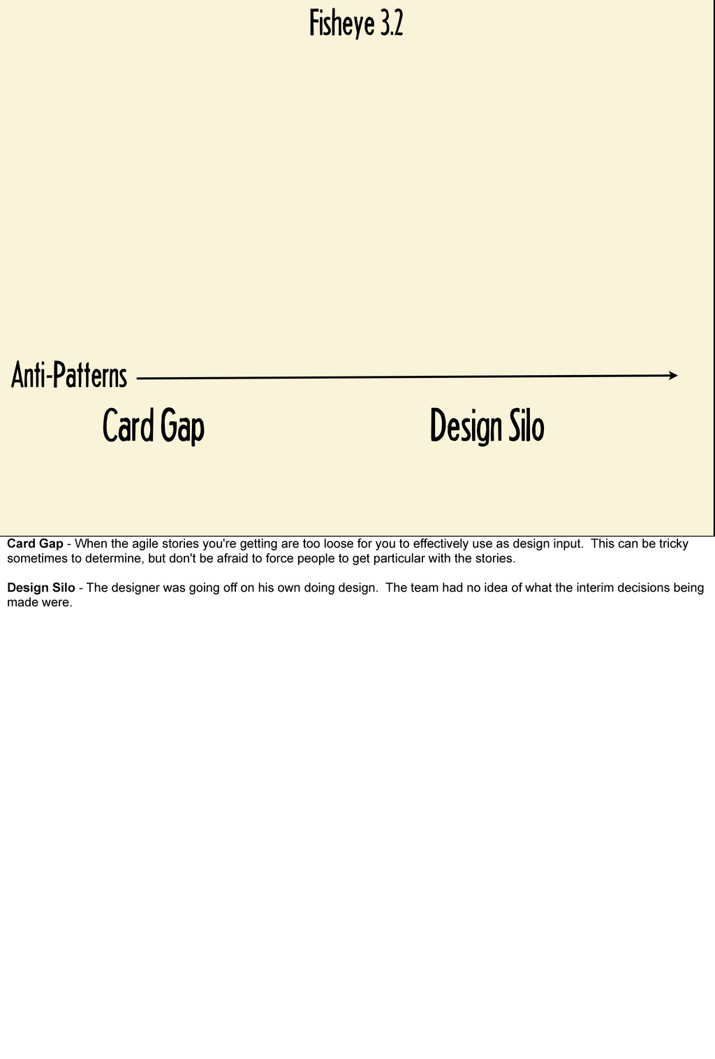
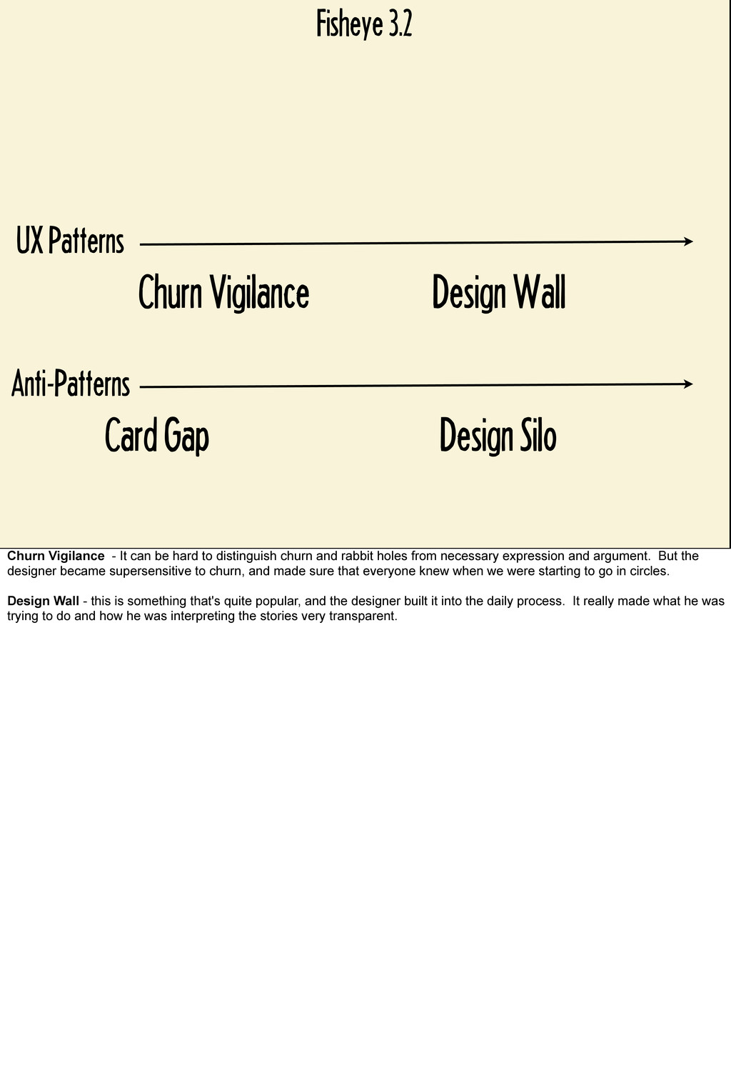
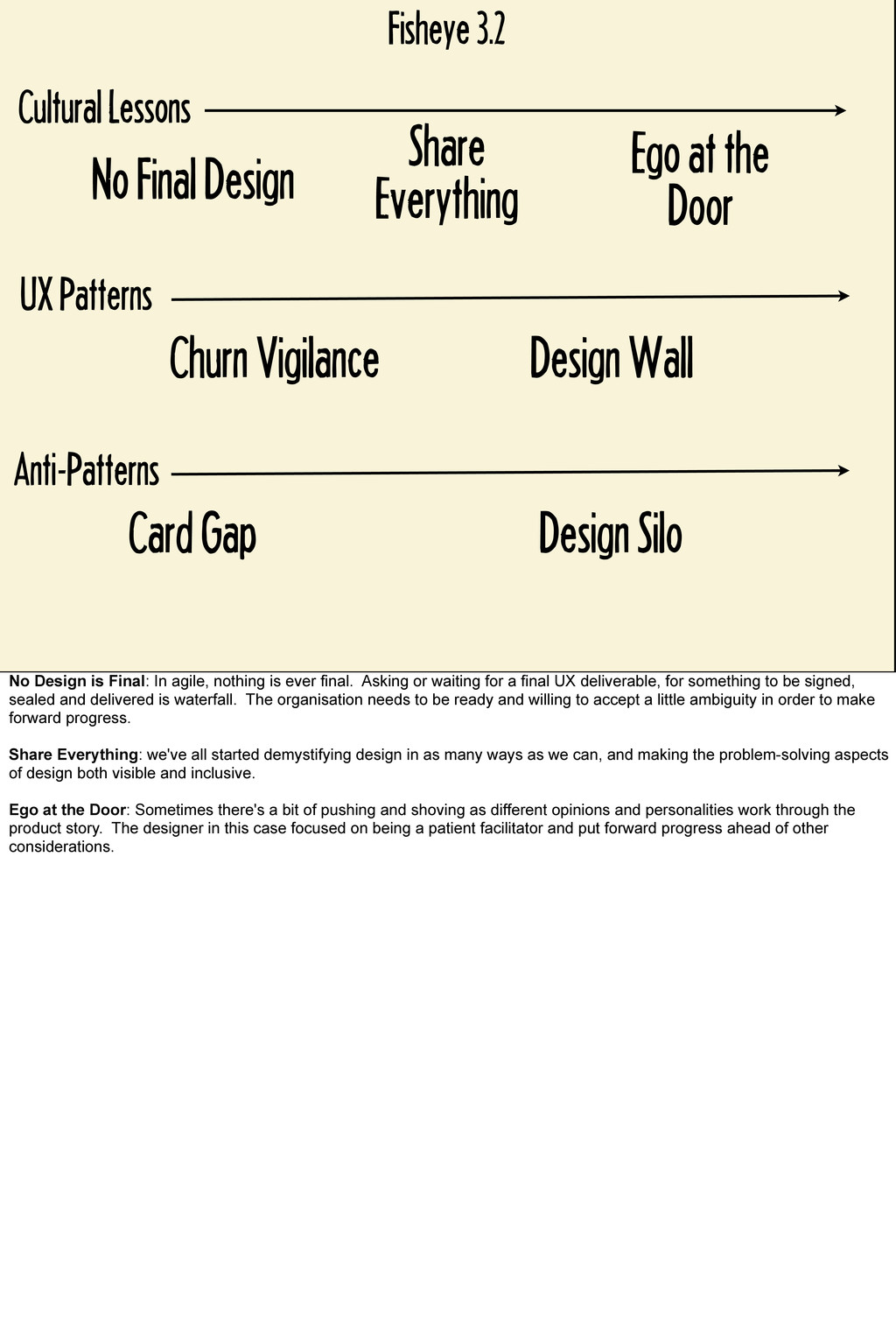
to be a little less colourful on this one. But at a certain point last year we found ourselves in a design bottleneck with the fisheye product. We were going around and around on the design, and the designer was starting to catch some heat for slowing up the process. When we talked to the team however, it was clear that there was no clear agreement from the stakeholders and team on what the direction forward was. The requirements, the stories were open to a little too much interpretation, which I felt was part of the churn. And also the designer and his approaches were a little opaque to the team. They'd have a meeting, the designer would go off, and a few days later they'd meet again and have some more churn. The developers were asking for a final design so that they could get on with coding, but it seemed that no final design that made everyone happy was possible. That designer is a pretty cluey guy, and he stopped in his tracks and started working a different way. First of all, he started working to convince the developers that asking for a final design was waterfall, not agile, and that they needed to move forward with their best guess. Second, he opened up his design process to everyone and put a big design wall right in the main walkway to the first floor. The team would gather there a couple times a week and he'd walk through with paper and markers where the design was going, and the devs would often grab the markers and start drawing solutions themselves. That designer was able to really become a facilitator and provide a great service to the team in order to move forward.
When the agile stories you're getting are too loose for you to effectively use as design input. This can be tricky sometimes to determine, but don't be afraid to force people to get particular with the stories. Design Silo - The designer was going off on his own doing design. The team had no idea of what the interim decisions being made were.
Gap Design Silo Churn Vigilance - It can be hard to distinguish churn and rabbit holes from necessary expression and argument. But the designer became supersensitive to churn, and made sure that everyone knew when we were starting to go in circles. Design Wall - this is something that's quite popular, and the designer built it into the daily process. It really made what he was trying to do and how he was interpreting the stories very transparent.
Card Gap Design Silo Churn Vigilance Design Wall Share Everything Ego at the Door No Design is Final: In agile, nothing is ever final. Asking or waiting for a final UX deliverable, for something to be signed, sealed and delivered is waterfall. The organisation needs to be ready and willing to accept a little ambiguity in order to make forward progress. Share Everything: we've all started demystifying design in as many ways as we can, and making the problem-solving aspects of design both visible and inclusive. Ego at the Door: Sometimes there's a bit of pushing and shoving as different opinions and personalities work through the product story. The designer in this case focused on being a patient facilitator and put forward progress ahead of other considerations.
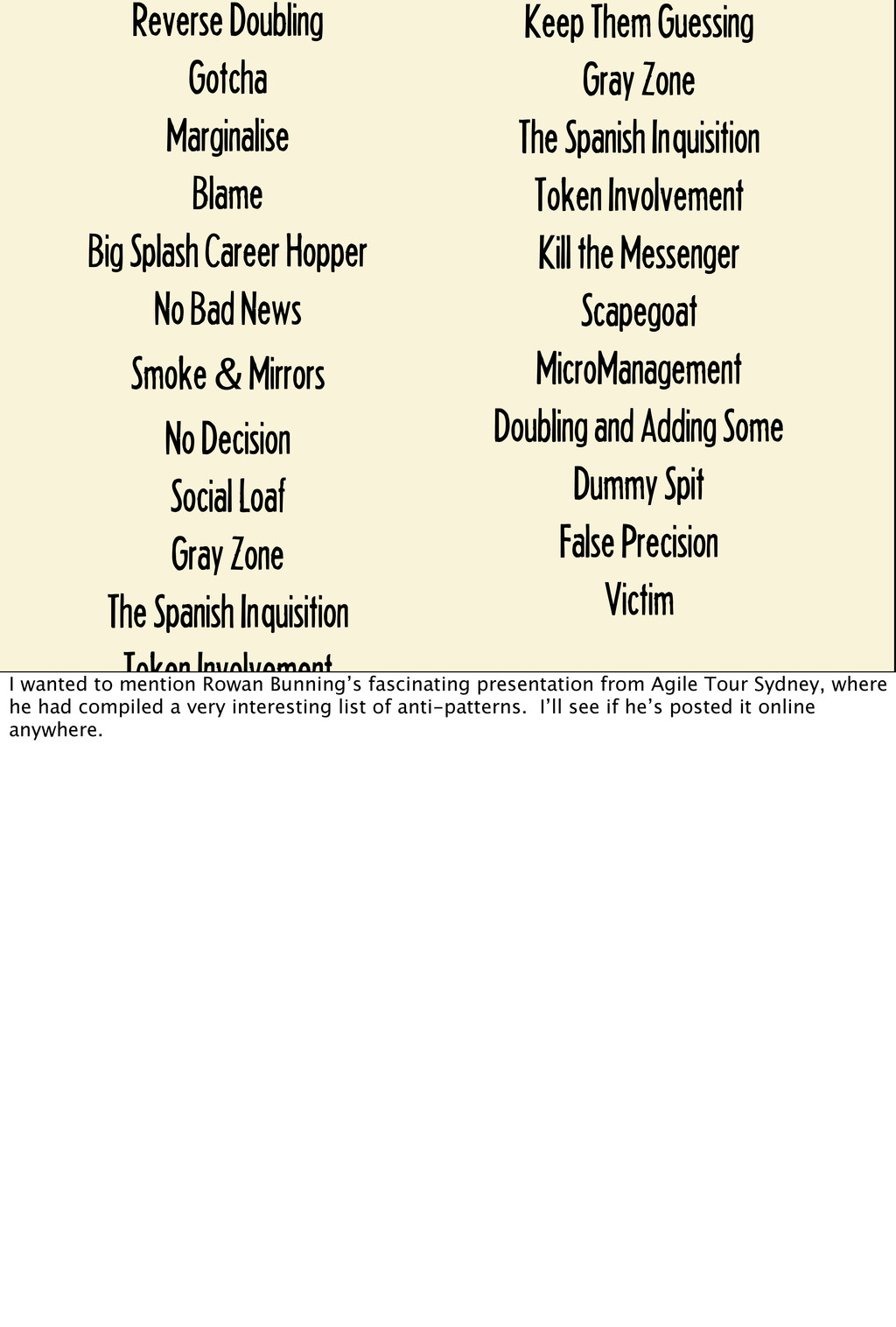
Bad News Smoke & Mirrors No Decision Social Loaf Gray Zone The Spanish Inquisition Token Involvement Kill the Messenger Scapegoat MicroManagement Doubling and Adding Some Dummy Spit False Precision Victim Keep Them Guessing Gray Zone The Spanish Inquisition Token Involvement Kill the Messenger Scapegoat MicroManagement Doubling and Adding Some Dummy Spit False Precision Victim I wanted to mention Rowan Bunning’s fascinating presentation from Agile Tour Sydney, where he had compiled a very interesting list of anti-patterns. I’ll see if he’s posted it online anywhere.