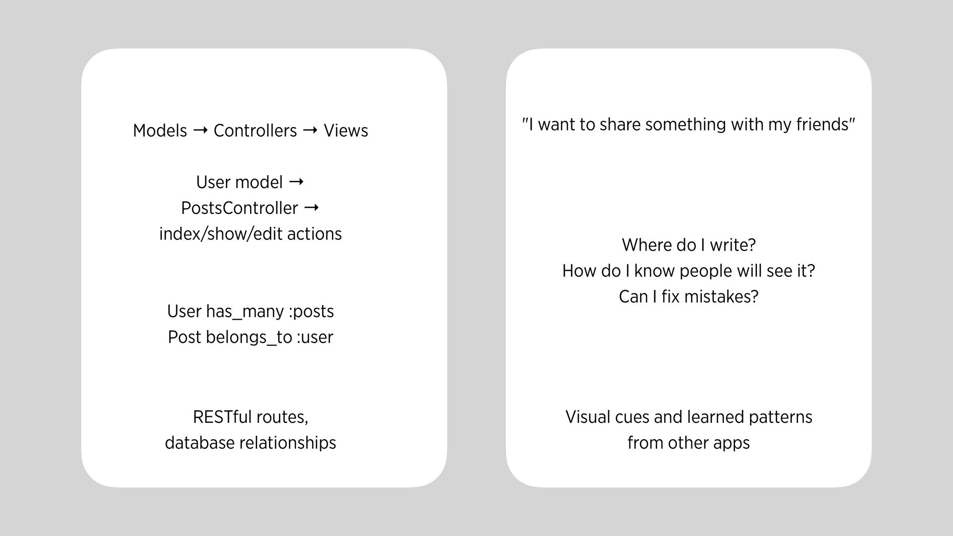
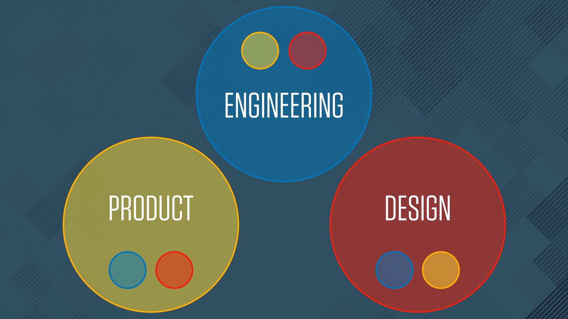
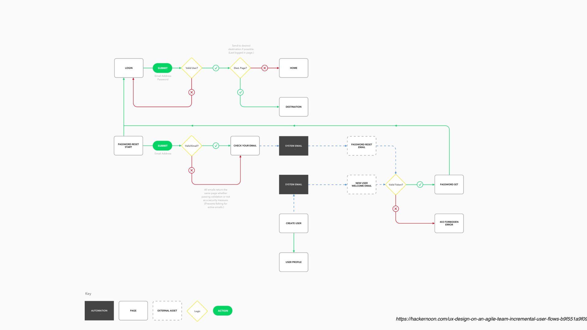
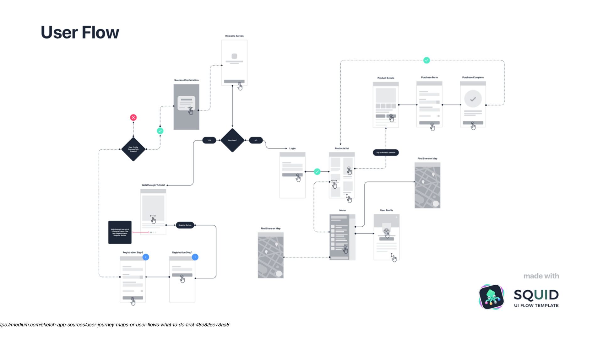
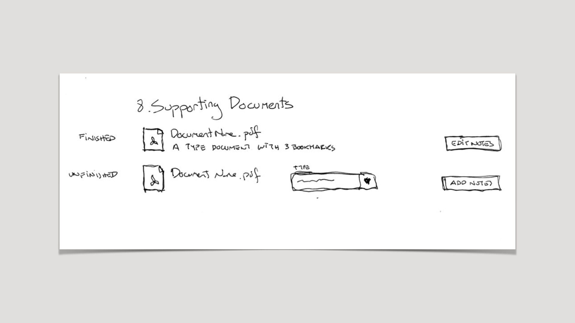
index/show/edit actions "I want to share something with my friends" User has_many :posts Post belongs_to :user Where do I write? How do I know people will see it? Can I fi x mistakes? RESTful routes, database relationships Visual cues and learned patterns from other apps
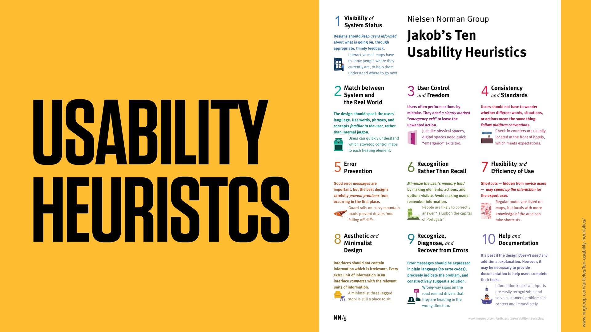
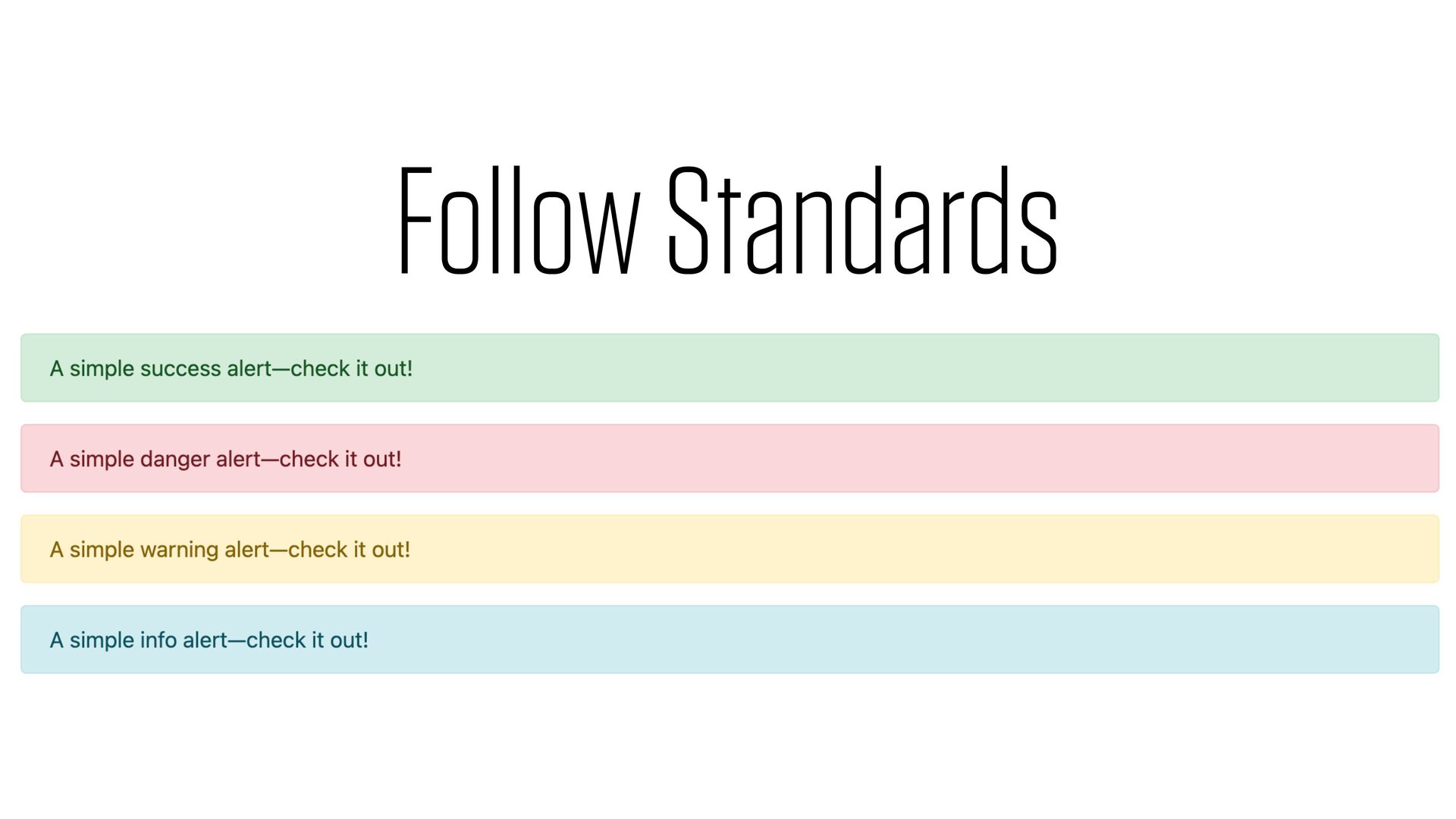
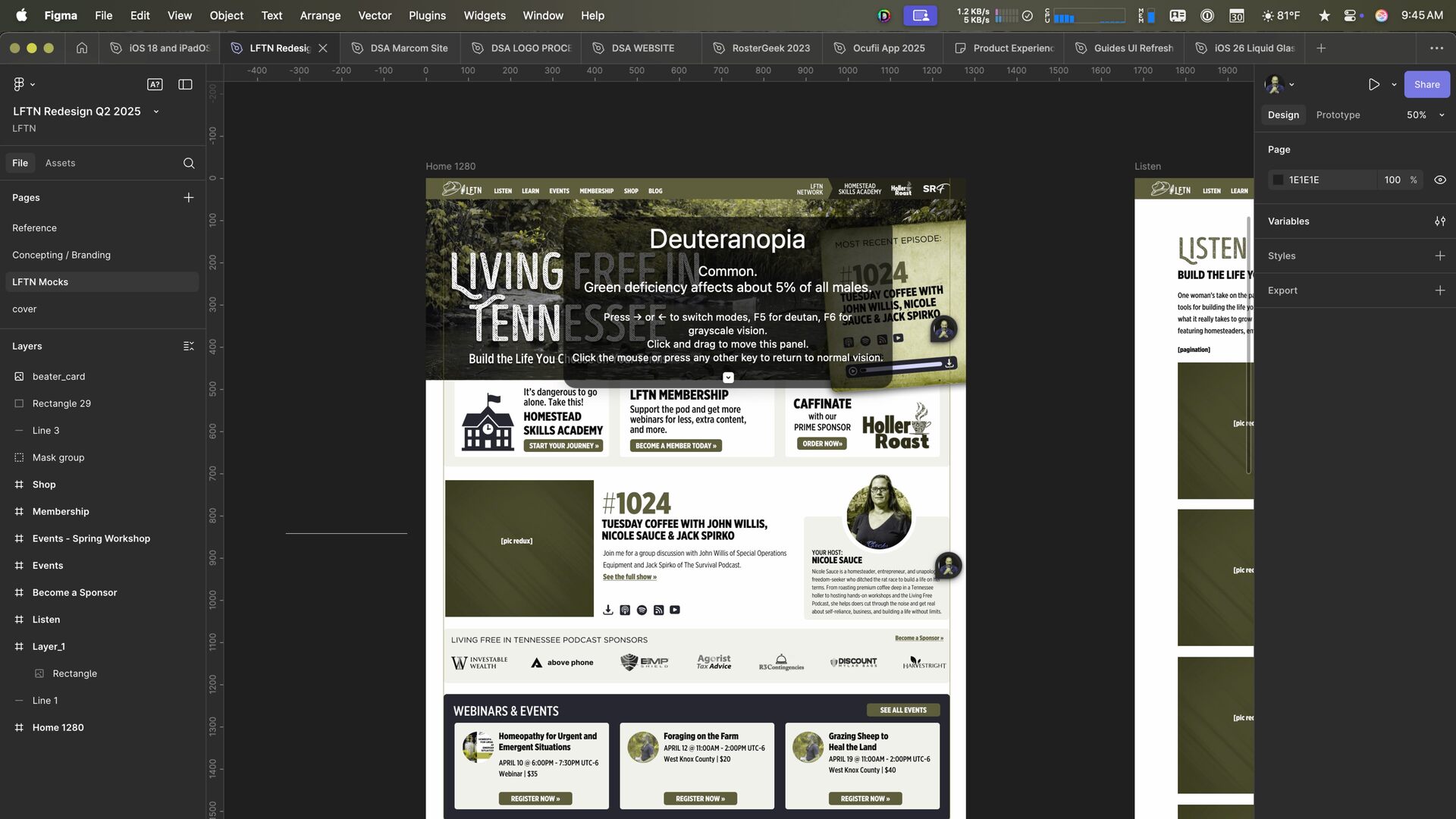
users informed about what is going on, through appropriate, timely feedback. Visibility of System Status 1 The design should speak the users' language. Use words, phrases, and concepts familiar to the user, rather than internal jargon. Match between System and the Real World 2 Users often perform actions by mistake. They need a clearly marked "emergency exit" to leave the unwanted action. User Control and Freedom 3 Users should not have to wonder whether different words, situations, or actions mean the same thing. Follow platform conventions. Consistency and Standards 4 Good error messages are important, but the best designs carefully prevent problems from occurring in the first place. Error Prevention 5 Minimize the user's memory load by making elements, actions, and options visible. Avoid making users remember information. Recognition Rather Than Recall 6 Shortcuts — hidden from novice users — may speed up the interaction for the expert user. Flexibility and Efficiency of Use 7 Interfaces should not contain information which is irrelevant. Every extra unit of information in an interface competes with the relevant units of information. Aesthetic and Minimalist Design 8 It’s best if the design doesn’t need any additional explanation. However, it may be necessary to provide documentation to help users complete their tasks. Help and Documentation 10 Error messages should be expressed in plain language (no error codes), precisely indicate the problem, and constructively suggest a solution. Recognize, Diagnose, and Recover from Errors 9 Nielsen Norman Group Interactive mall maps have to show people where they currently are, to help them understand where to go next. Users can quickly understand which stovetop control maps to each heating element. Just like physical spaces, digital spaces need quick “emergency” exits too. Check-in counters are usually located at the front of hotels, which meets expectations. Guard rails on curvy mountain roads prevent drivers from falling off cliffs. Regular routes are listed on maps, but locals with more knowledge of the area can take shortcuts. People are likely to correctly answer “Is Lisbon the capital of Portugal?”. A minimalist three-legged stool is still a place to sit. Wrong-way signs on the road remind drivers that they are heading in the wrong direction. Information kiosks at airports are easily recognizable and solve customers' problems in context and immediately. 1 EXIT WRONG WAY CHECK IN i www.nngroup.com/articles/ten-usability-heuristics/
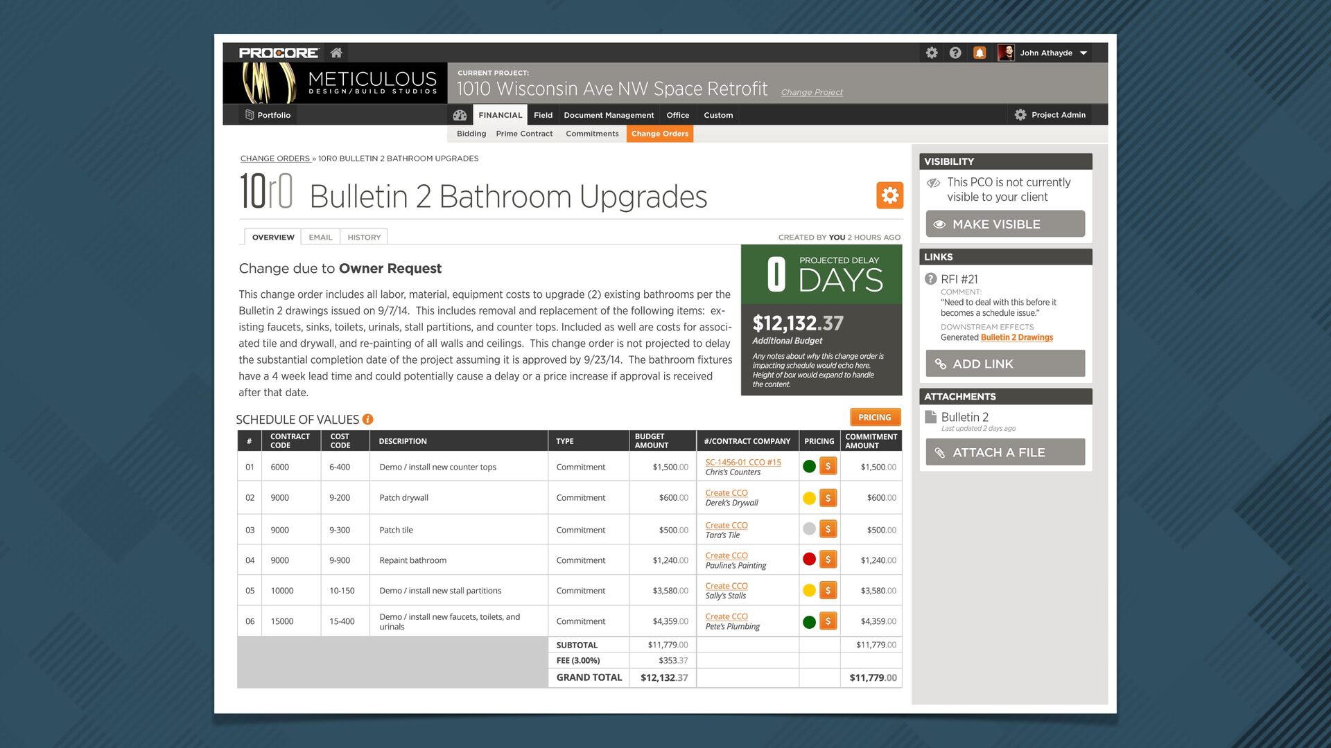
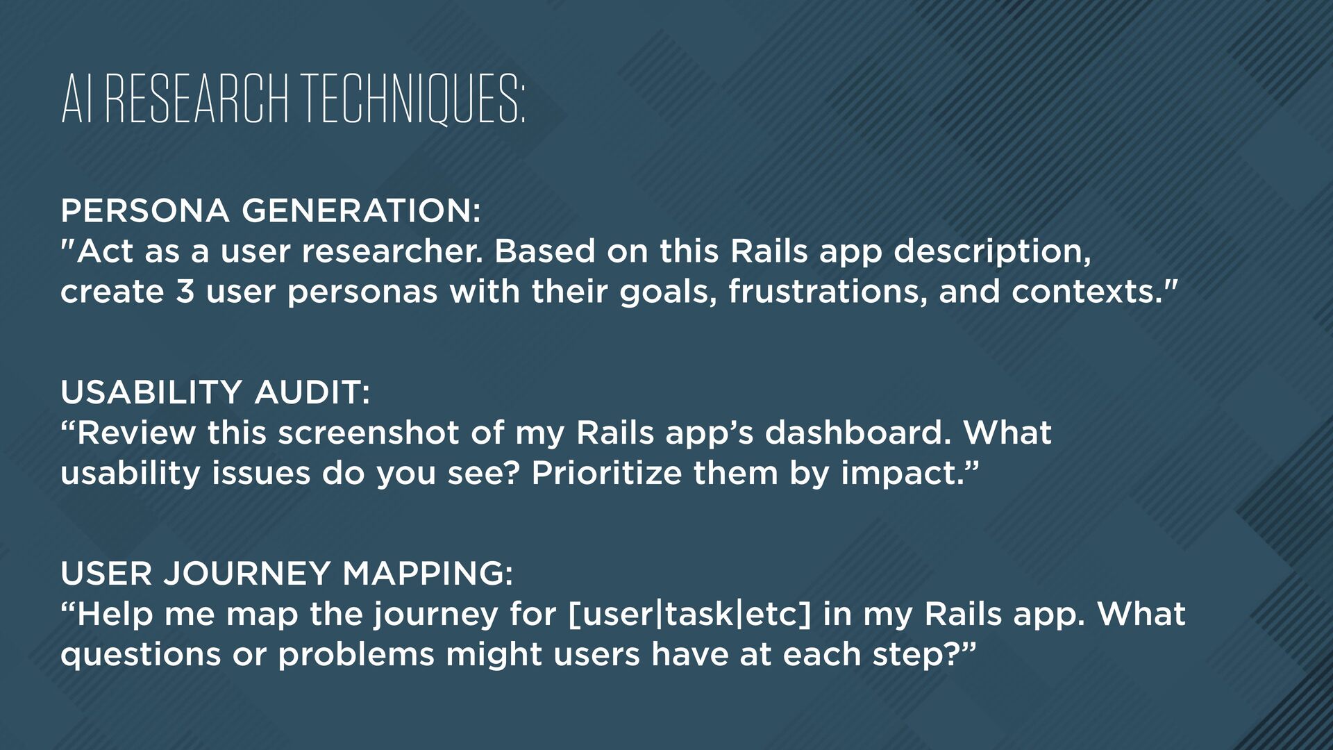
Based on this Rails app description, create 3 user personas with their goals, frustrations, and contexts." USABILITY AUDIT: “Review this screenshot of my Rails app’s dashboard. What usability issues do you see? Prioritize them by impact.” USER JOURNEY MAPPING: “Help me map the journey for [user|task|etc] in my Rails app. What questions or problems might users have at each step?”
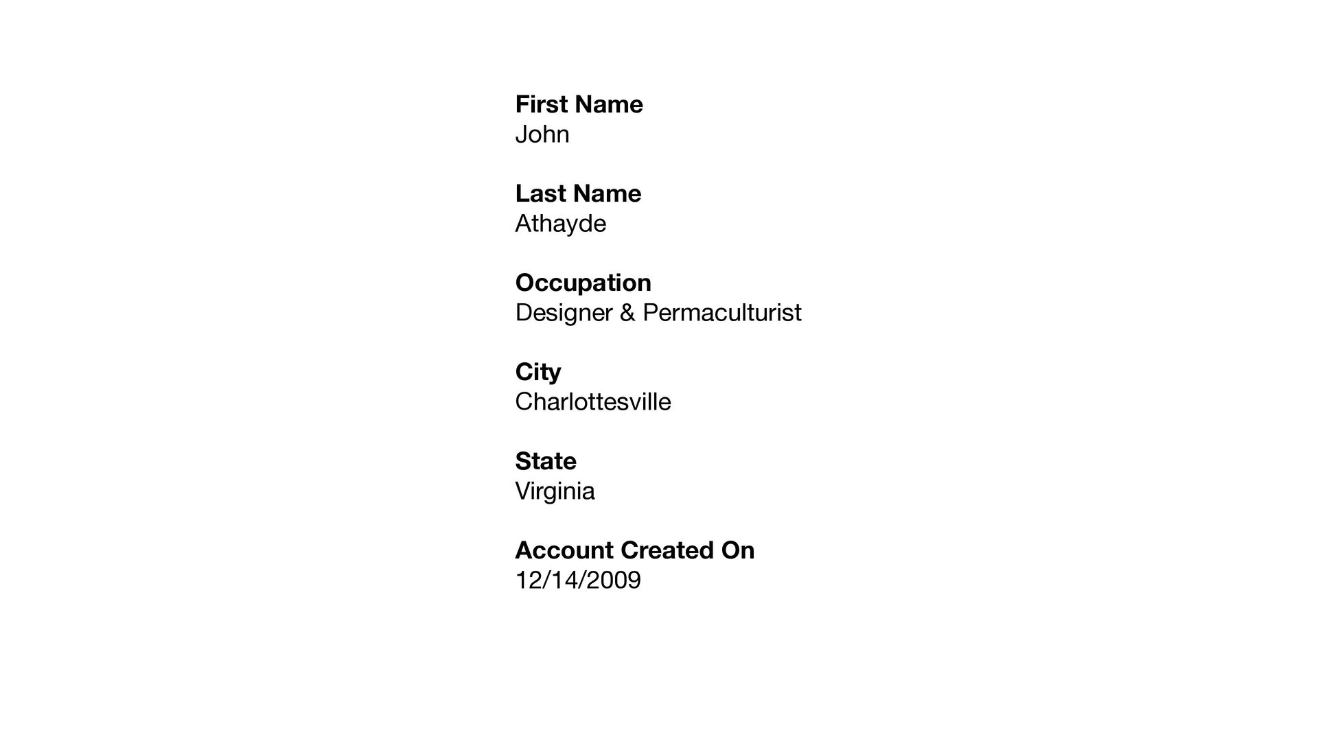
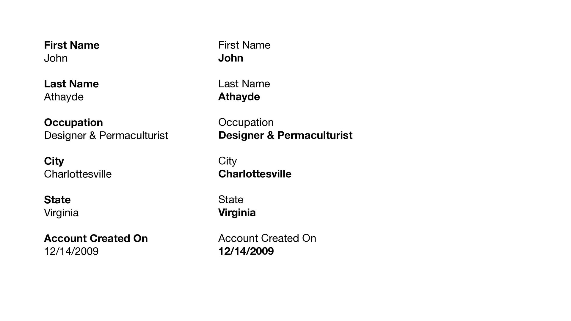
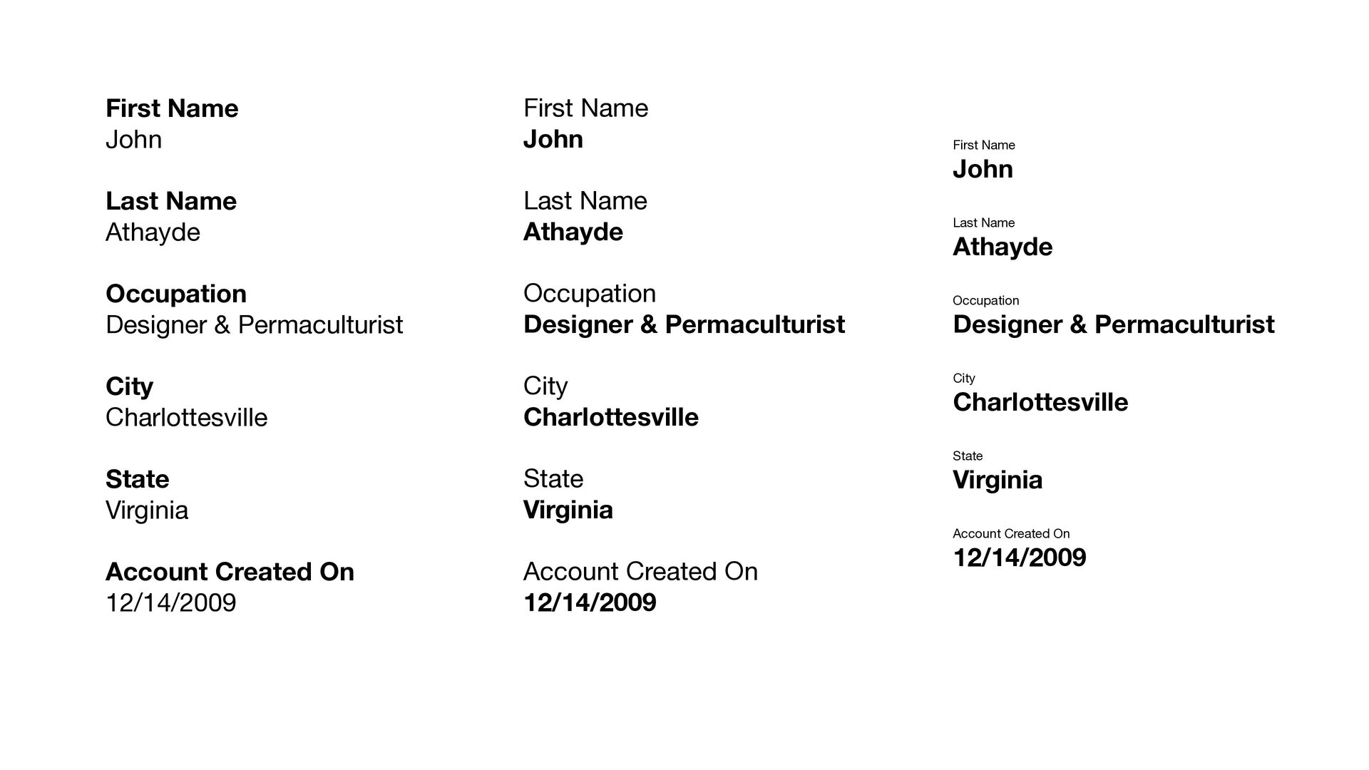
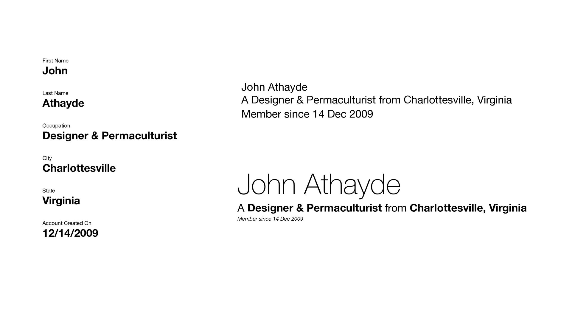
City Charlottesville State Virginia Account Created On 12/14/2009 First Name John Last Name Athayde Occupation Designer & Permaculturist City Charlottesville State Virginia Account Created On 12/14/2009
City Charlottesville State Virginia Account Created On 12/14/2009 First Name John Last Name Athayde Occupation Designer & Permaculturist City Charlottesville State Virginia Account Created On 12/14/2009 First Name John Last Name Athayde Occupation Designer & Permaculturist City Charlottesville State Virginia Account Created On 12/14/2009
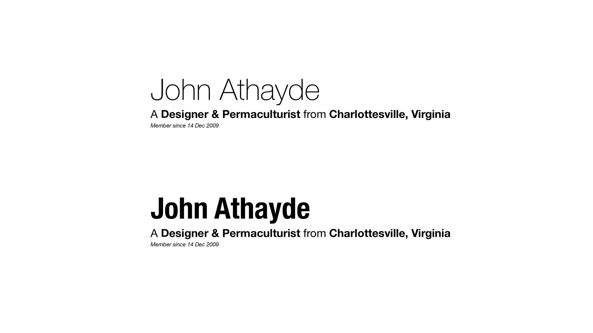
City Charlottesville State Virginia Account Created On 12/14/2009 John Athayde A Designer & Permaculturist from Charlottesville, Virginia Member since 14 Dec 2009 John Athayde A Designer & Permaculturist from Charlottesville, Virginia Member since 14 Dec 2009
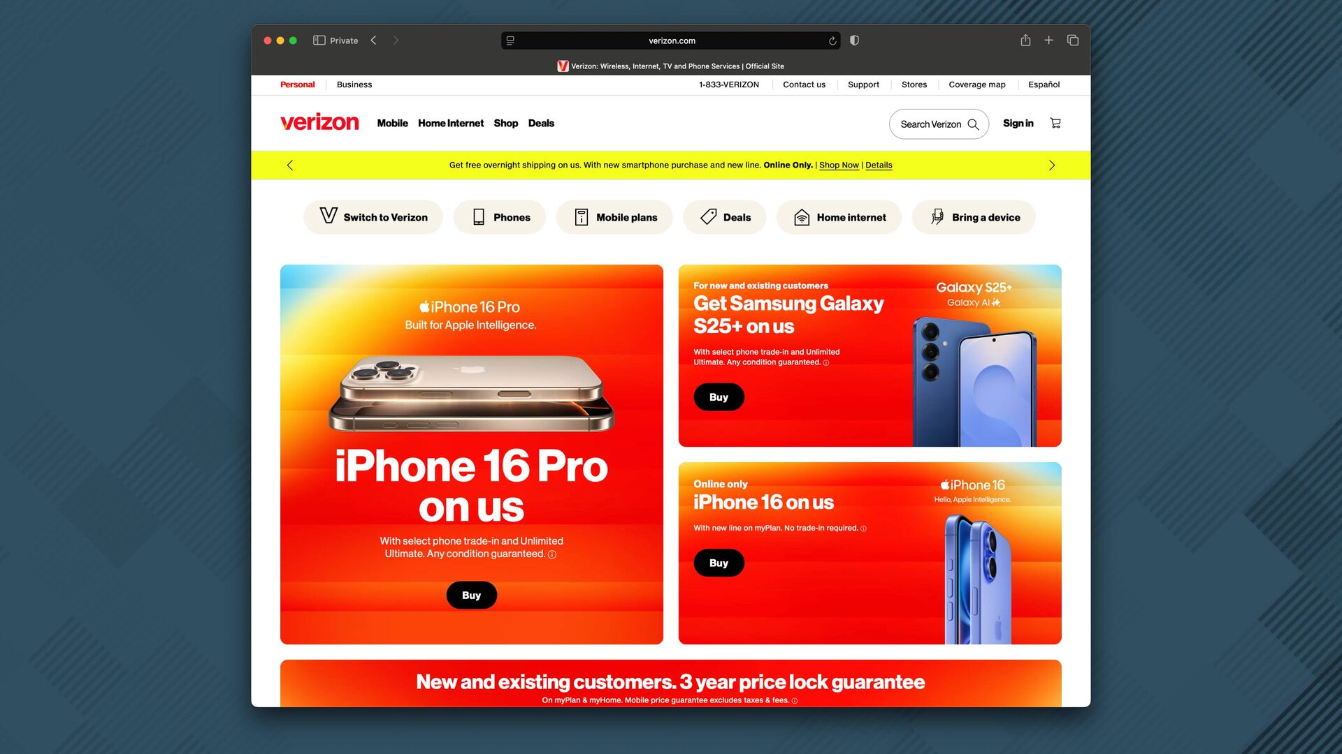
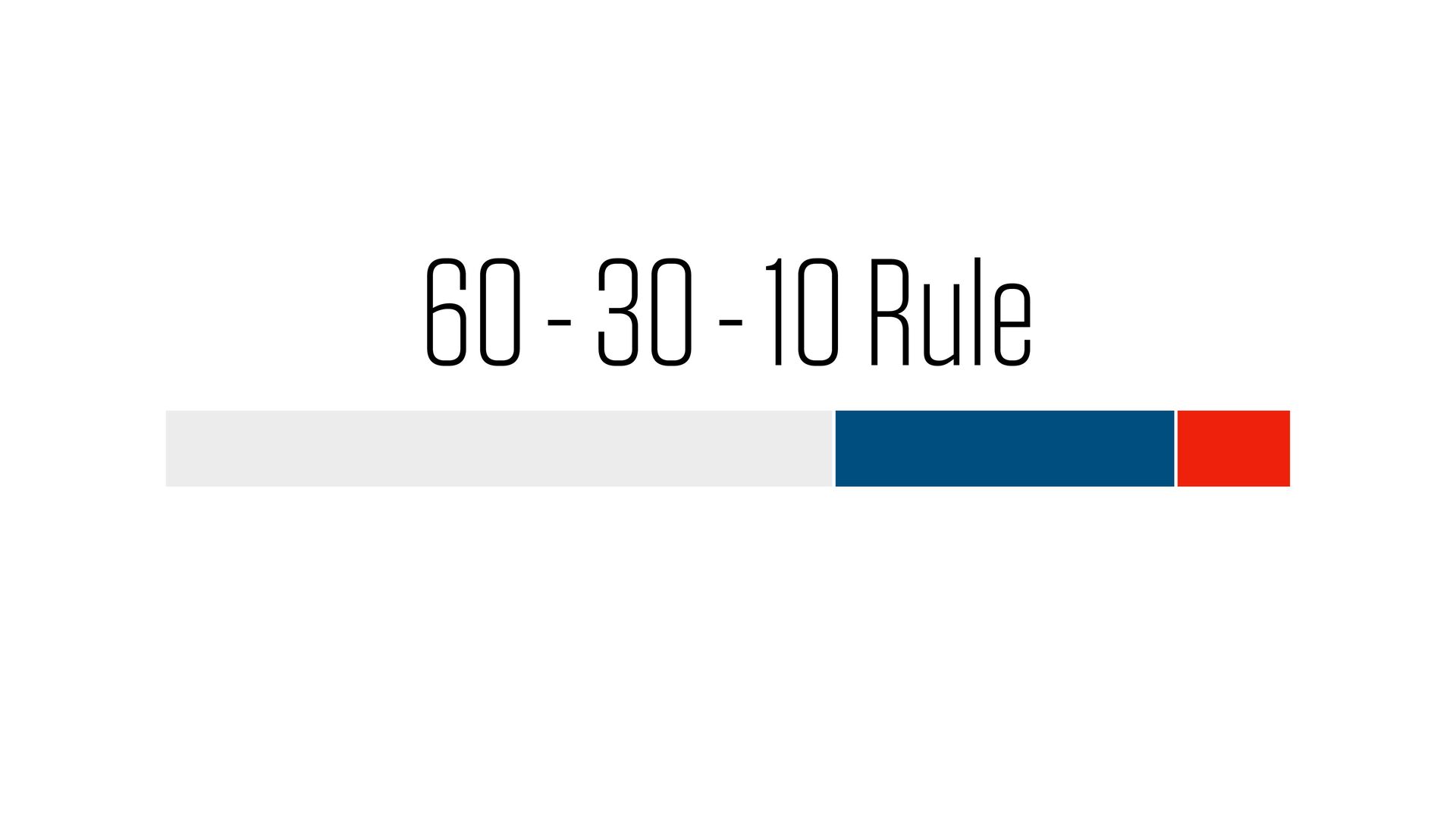
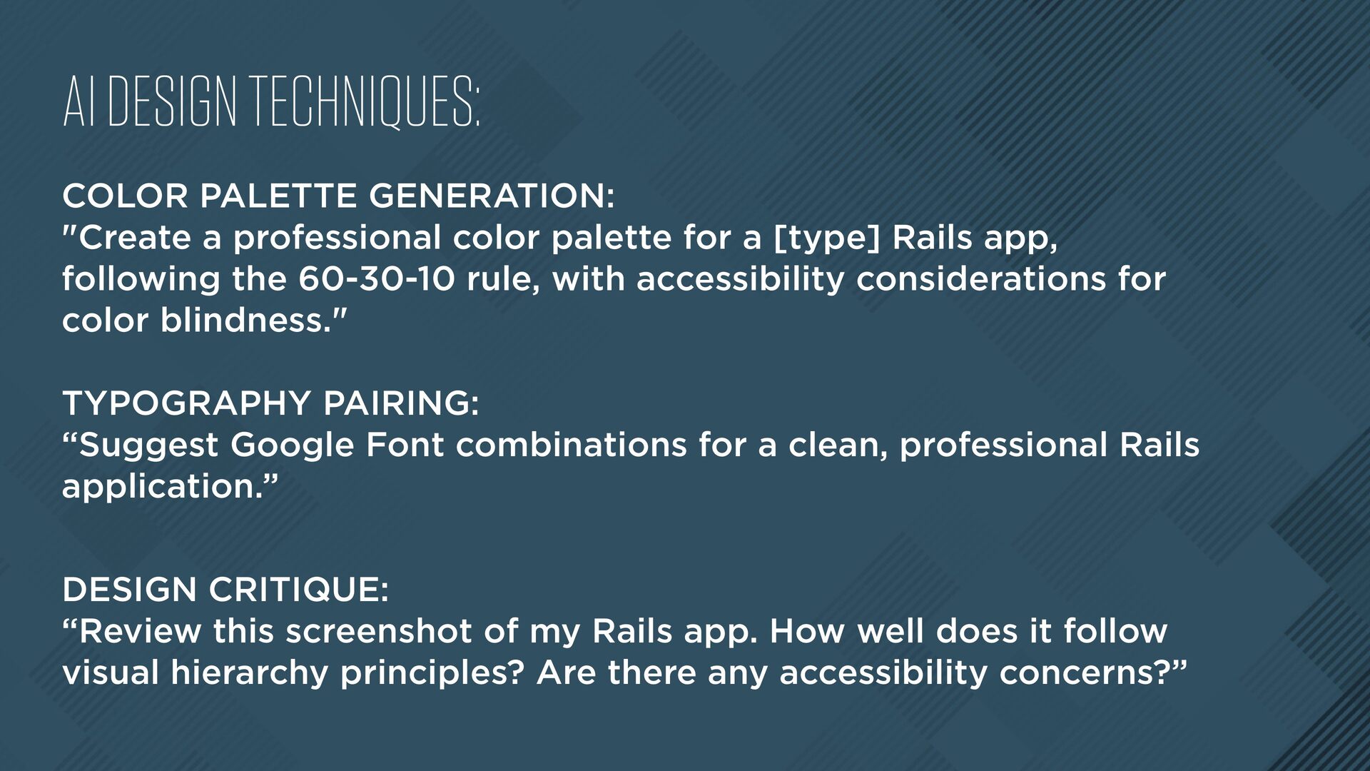
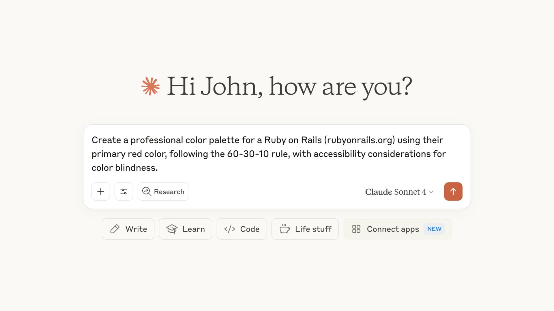
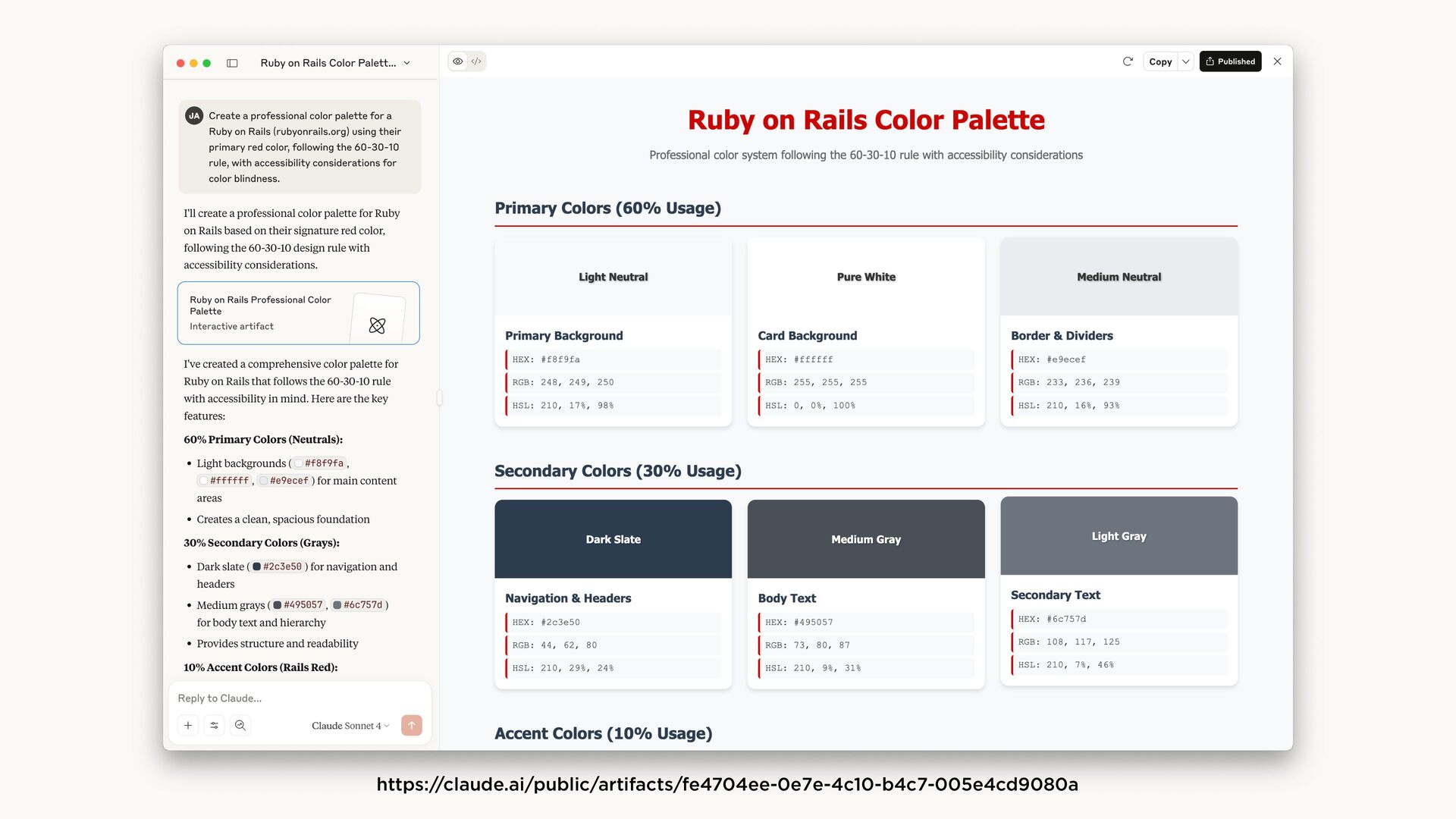
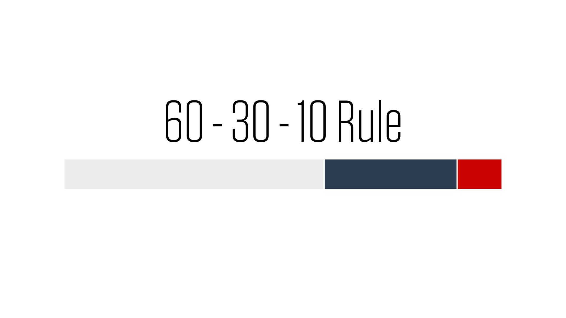
palette for a [type] Rails app, following the 60-30-10 rule, with accessibility considerations for color blindness." TYPOGRAPHY PAIRING: “Suggest Google Font combinations for a clean, professional Rails application.” DESIGN CRITIQUE: “Review this screenshot of my Rails app. How well does it follow visual hierarchy principles? Are there any accessibility concerns?”
![TO THE [FIGMA|SKETCH|CODE]!](https://files.speakerdeck.com/presentations/6d00e30073f04ed4830b490eee979849/slide_73.jpg)