Upgrade to Pro — share decks privately, control downloads, hide ads and more …

Responsive Images

Responsive Images

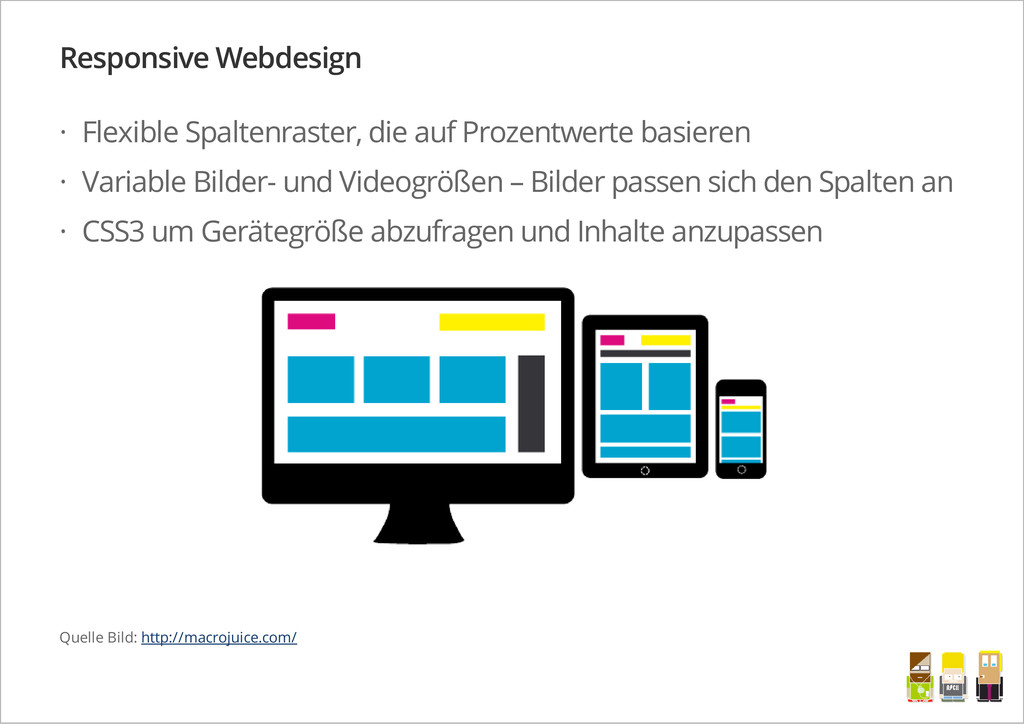
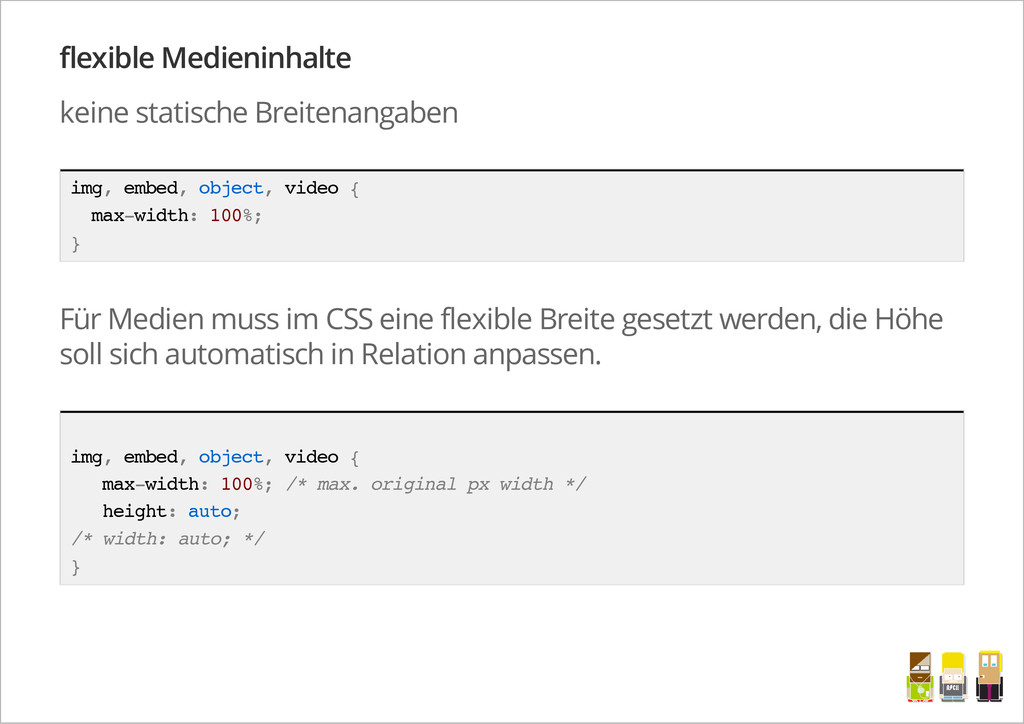
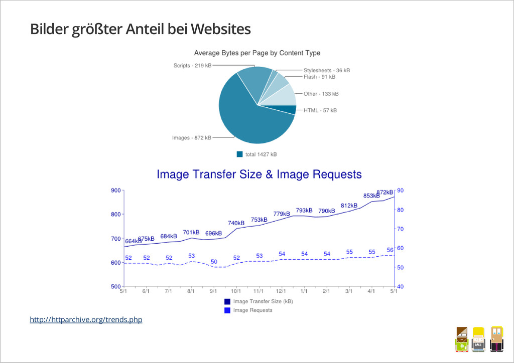
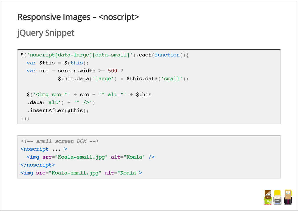
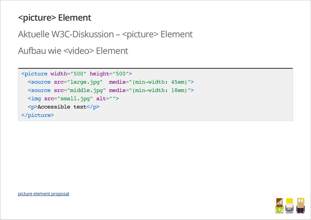
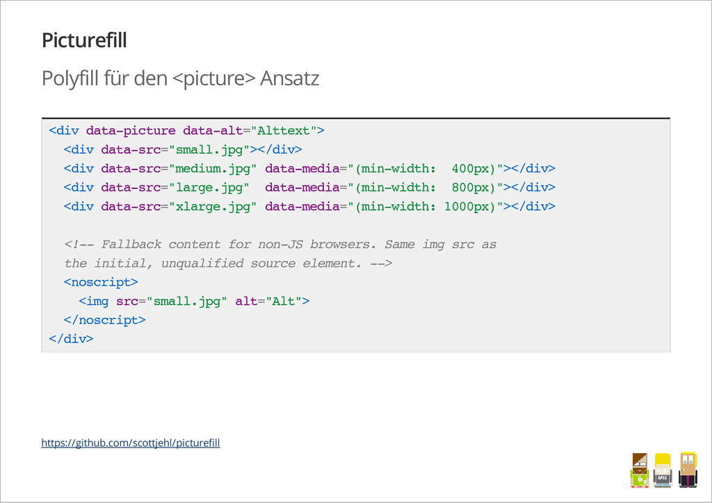
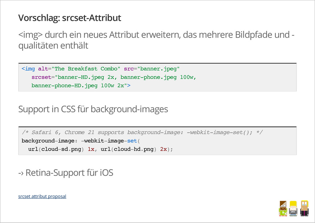
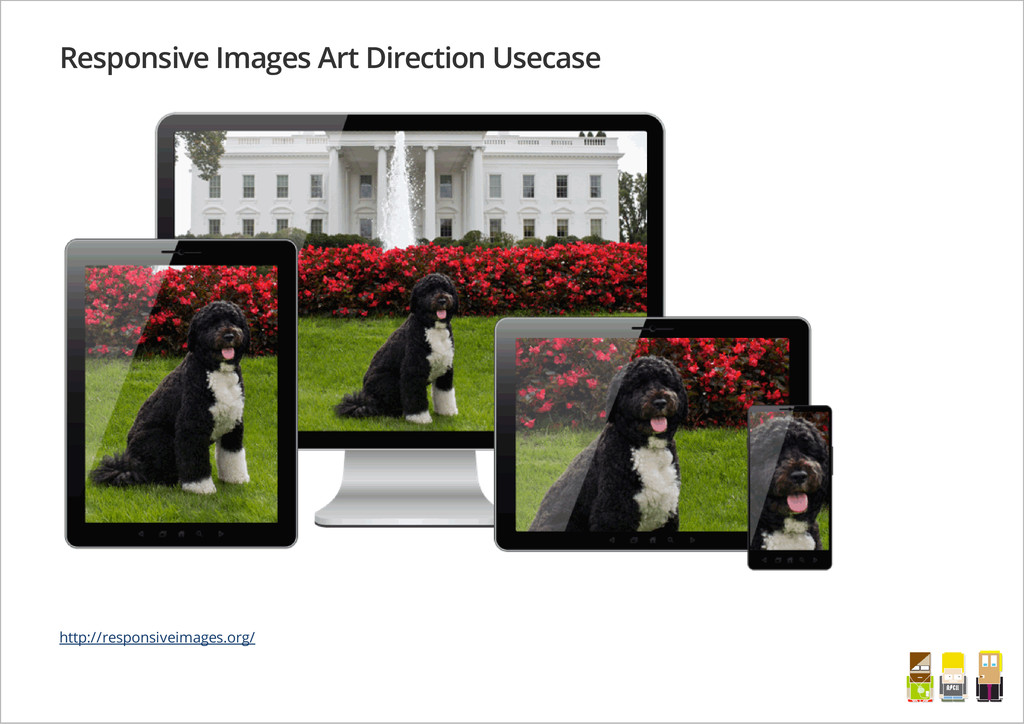
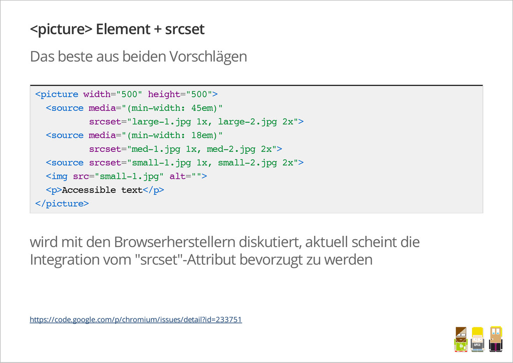
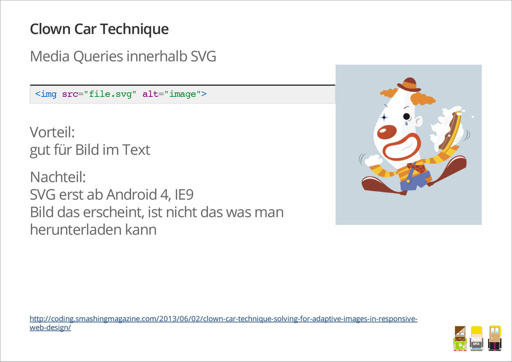
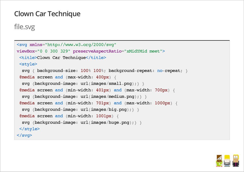
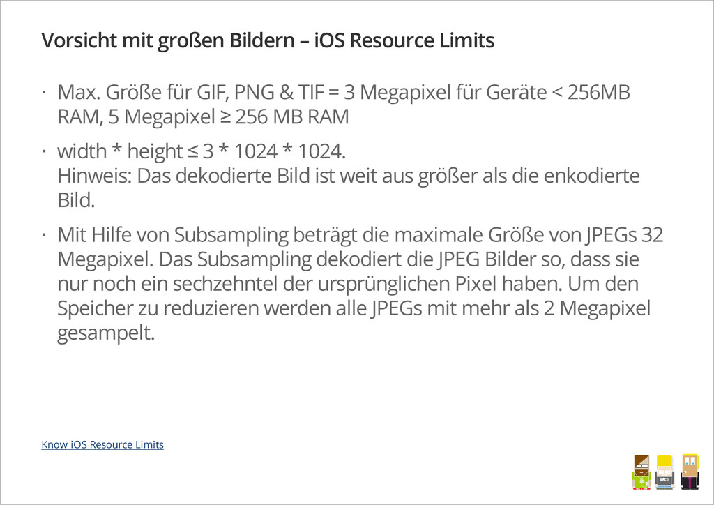
Mittlerweile als moderne Technik etabliert, beschreiben zahlreiche Tutorials Umsetzungsvorschläge für Responsive Webdesign; dennoch stößt man in Projekten mit einem skalierbaren Layout auf immer gleiche Schwierigkeiten. Häufig haben mobile Geräte eine deutlich schwächere technische Ausstattung als der heimische Desktoprechner, sodass Fragen der Performance auf unterschiedlichen Devices in den Vordergrund gerückt werden. Gerade bei Bildern tauchen Begriffe wie "Responsive Images" oder "Adaptive Images" immer wieder auf. Welche Lösungen wann Sinn ergeben und wie man mit Retina-Screens umgeht, wie der aktuelle Stand des HTML5-Responsive-Image-Elements ist und wie man eine performante Responsive Website erstellt, zeigt uns Sven Wolfermann an interessanten Beispielen.

Sven Wolfermann

June 04, 2013
Tweet

More Decks by Sven Wolfermann

Other Decks in Programming

Transcript

  1. Sven Wolfermann (35) Freelancer für moderne Webentwicklung (HTML5, CSS3, Responsive

    Webdesign) aus Berlin CSS3 Adventskalender 2010/2011 schreibt Artikel für das T3N-, PHP- und Webstandards-Magazin (new: Screengui.de) mobile Geek Wer ist die Flitzpiepe da überhaupt? Twitter: @maddesigns Web: http://maddesigns.de · · · · · /
  2. Responsive Webdesign Flexible Spaltenraster, die auf Prozentwerte basieren Variable Bilder-

    und Videogrößen – Bilder passen sich den Spalten an CSS3 um Gerätegröße abzufragen und Inhalte anzupassen · · · Quelle Bild: http://macrojuice.com/ /
  3. flexible Medieninhalte keine statische Breitenangaben i m g , e

    m b e d , o b j e c t , v i d e o { m a x - w i d t h : 1 0 0 % ; } Für Medien muss im CSS eine flexible Breite gesetzt werden, die Höhe soll sich automatisch in Relation anpassen. i m g , e m b e d , o b j e c t , v i d e o { m a x - w i d t h : 1 0 0 % ; / * m a x . o r i g i n a l p x w i d t h * / h e i g h t : a u t o ; / * w i d t h : a u t o ; * / } /
  4. Responsive Images Problem ist, dass sich Bilddatenmengen nicht dynamisch anpassen

    Große Bilder werden zwar verkleinert dargestellt, laden aber unnötige Datenmengen <img>-Tag ist nicht dafür ausgelegt ein responsives Bildformat gibt es nicht Polyfills müssen helfen · · · · · /
  5. Asset Loading Tests von Tim Kadlec Tests des Ladeverhalten mobiler

    Browser Beispiel: Test CSS-Hintergrundbilder < d i v c l a s s = " t e s t 5 " > < / d i v > @ m e d i a a l l a n d ( m i n - w i d t h : 6 0 1 p x ) { . t e s t 5 { b a c k g r o u n d - i m a g e : u r l ( " i m g / t e s t 5 - d e s k t o p . p n g " ) ; } } @ m e d i a a l l a n d ( m a x - w i d t h : 6 0 0 p x ) { . t e s t 5 { b a c k g r o u n d - i m a g e : u r l ( " i m g / t e s t 5 - m o b i l e . p n g " ) ; } } /
  6. Asset Loading Tests von Tim Kadlec nur das passende Bild

    wird geladen, gut! Tim Kadlec – Media Query & Asset Downloading Results /
  7. Lösungsansätze für Responsive Images CSS3-Ansatz von Nicolas Gallagher < i

    m g s r c = " i m a g e . j p g " a l t = " " d a t a - s r c - 6 0 0 p x = " i m a g e - 6 0 0 p x . j p g " > Umsetzung auf CSS-Basis @ m e d i a ( m i n - d e v i c e - w i d t h : 6 0 0 p x ) { i m g [ d a t a - s r c - 6 0 0 p x ] { c o n t e n t : a t t r ( d a t a - s r c - 6 0 0 p x , u r l ) ; } } @ m e d i a ( m i n - d e v i c e - w i d t h : 8 0 0 p x ) { i m g [ d a t a - s r c - 8 0 0 p x ] { c o n t e n t : a t t r ( d a t a - s r c - 8 0 0 p x , u r l ) ; } } Nachteil: 2 Bilder werden geladen, keine Browserunterstützung http://nicolasgallagher.com/responsive-images-using-css3/ /
  8. Responsive Images alter Ansatz der Filament Group < i m

    g s r c = " s m a l l . j p g ? f u l l = l a r g e . j p g " > https://github.com/filamentgroup/Responsive-Images Nachteil: nicht immer kann man "src" verändern (CMS) wird von der Filament Group nicht mehr empfohlen und nicht weiterentwickelt! Responsive Media - Blog Post von @drublic /
  9. Responsive Images Eine einfache und gute Lösung meiner Meinung nach,

    ist die <noscript>-Lösung mit HTML5 d a t a -Attributen < n o s c r i p t d a t a - l a r g e = " K o a l a - l a r g e . j p g " d a t a - s m a l l = " K o a l a - s m a l l . j p g " d a t a - a l t = " K o a l a " > < i m g s r c = " K o a l a - s m a l l . j p g " a l t = " K o a l a " / > < / n o s c r i p t > Vorteil: Assets die im <noscript>-Tag eingebunden sind, werden nicht vom Browser in den DOM eingefügt (und nicht geladen), wenn JavaScript aktiviert ist. Ressourcen werden also nicht doppelt geladen. JavaScript notwendig http://www.monoliitti.com/images/ /
  10. Responsive Images – <noscript> jQuery Snippet $ ( ' n

    o s c r i p t [ d a t a - l a r g e ] [ d a t a - s m a l l ] ' ) . e a c h ( f u n c t i o n ( ) { v a r $ t h i s = $ ( t h i s ) ; v a r s r c = s c r e e n . w i d t h > = 5 0 0 ? $ t h i s . d a t a ( ' l a r g e ' ) : $ t h i s . d a t a ( ' s m a l l ' ) ; $ ( ' < i m g s r c = " ' + s r c + ' " a l t = " ' + $ t h i s . d a t a ( ' a l t ' ) + ' " / > ' ) . i n s e r t A f t e r ( $ t h i s ) ; } ) ; < ! - - s m a l l s c r e e n D O M - - > < n o s c r i p t . . . > < i m g s r c = " K o a l a - s m a l l . j p g " a l t = " K o a l a " / > < / n o s c r i p t > < i m g s r c = " K o a l a - s m a l l . j p g " a l t = " K o a l a " > /
  11. <picture> Element Aktuelle W3C-Diskussion – <picture> Element Aufbau wie <video>

    Element < p i c t u r e w i d t h = " 5 0 0 " h e i g h t = " 5 0 0 " > < s o u r c e s r c = " l a r g e . j p g " m e d i a = " ( m i n - w i d t h : 4 5 e m ) " > < s o u r c e s r c = " m i d d l e . j p g " m e d i a = " ( m i n - w i d t h : 1 8 e m ) " > < i m g s r c = " s m a l l . j p g " a l t = " " > < p > A c c e s s i b l e t e x t < / p > < / p i c t u r e > picture element proposal /
  12. Picturefill Polyfill für den <picture> Ansatz < d i v

    d a t a - p i c t u r e d a t a - a l t = " A l t t e x t " > < d i v d a t a - s r c = " s m a l l . j p g " > < / d i v > < d i v d a t a - s r c = " m e d i u m . j p g " d a t a - m e d i a = " ( m i n - w i d t h : 4 0 0 p x ) " > < / d i v > < d i v d a t a - s r c = " l a r g e . j p g " d a t a - m e d i a = " ( m i n - w i d t h : 8 0 0 p x ) " > < / d i v > < d i v d a t a - s r c = " x l a r g e . j p g " d a t a - m e d i a = " ( m i n - w i d t h : 1 0 0 0 p x ) " > < / d i v > < ! - - F a l l b a c k c o n t e n t f o r n o n - J S b r o w s e r s . S a m e i m g s r c a s t h e i n i t i a l , u n q u a l i f i e d s o u r c e e l e m e n t . - - > < n o s c r i p t > < i m g s r c = " s m a l l . j p g " a l t = " A l t " > < / n o s c r i p t > < / d i v > https://github.com/scottjehl/picturefill /
  13. Vorschlag: srcset-Attribut <img> durch ein neues Attribut erweitern, das mehrere

    Bildpfade und - qualitäten enthält < i m g a l t = " T h e B r e a k f a s t C o m b o " s r c = " b a n n e r . j p e g " s r c s e t = " b a n n e r - H D . j p e g 2 x , b a n n e r - p h o n e . j p e g 1 0 0 w , b a n n e r - p h o n e - H D . j p e g 1 0 0 w 2 x " > Support in CSS für background-images / * S a f a r i 6 , C h r o m e 2 1 s u p p o r t s b a c k g r o u n d - i m a g e : - w e b k i t - i m a g e - s e t ( ) ; * / b a c k g r o u n d - i m a g e : - w e b k i t - i m a g e - s e t ( u r l ( c l o u d - s d . p n g ) 1 x , u r l ( c l o u d - h d . p n g ) 2 x ) ; -› Retina-Support für iOS srcset attribut proposal /
  14. <picture> Element + srcset Das beste aus beiden Vorschlägen <

    p i c t u r e w i d t h = " 5 0 0 " h e i g h t = " 5 0 0 " > < s o u r c e m e d i a = " ( m i n - w i d t h : 4 5 e m ) " s r c s e t = " l a r g e - 1 . j p g 1 x , l a r g e - 2 . j p g 2 x " > < s o u r c e m e d i a = " ( m i n - w i d t h : 1 8 e m ) " s r c s e t = " m e d - 1 . j p g 1 x , m e d - 2 . j p g 2 x " > < s o u r c e s r c s e t = " s m a l l - 1 . j p g 1 x , s m a l l - 2 . j p g 2 x " > < i m g s r c = " s m a l l - 1 . j p g " a l t = " " > < p > A c c e s s i b l e t e x t < / p > < / p i c t u r e > wird mit den Browserherstellern diskutiert, aktuell scheint die Integration vom "srcset"-Attribut bevorzugt zu werden https://code.google.com/p/chromium/issues/detail?id=233751 /
  15. Clown Car Technique Media Queries innerhalb SVG < i m

    g s r c = " f i l e . s v g " a l t = " i m a g e " > Vorteil: gut für Bild im Text Nachteil: SVG erst ab Android 4, IE9 Bild das erscheint, ist nicht das was man herunterladen kann http://coding.smashingmagazine.com/2013/06/02/clown-car-technique-solving-for-adaptive-images-in-responsive- web-design/ /
  16. Clown Car Technique file.svg < s v g x m

    l n s = " h t t p : / / w w w . w 3 . o r g / 2 0 0 0 / s v g " v i e w B o x = " 0 0 3 0 0 3 2 9 " p r e s e r v e A s p e c t R a t i o = " x M i d Y M i d m e e t " > < t i t l e > C l o w n C a r T e c h n i q u e < / t i t l e > < s t y l e > s v g { b a c k g r o u n d - s i z e : 1 0 0 % 1 0 0 % ; b a c k g r o u n d - r e p e a t : n o - r e p e a t ; } @ m e d i a s c r e e n a n d ( m a x - w i d t h : 4 0 0 p x ) { s v g { b a c k g r o u n d - i m a g e : u r l ( i m a g e s / s m a l l . p n g ) ; } } @ m e d i a s c r e e n a n d ( m i n - w i d t h : 4 0 1 p x ) a n d ( m a x - w i d t h : 7 0 0 p x ) { s v g { b a c k g r o u n d - i m a g e : u r l ( i m a g e s / m e d i u m . p n g ) ; } } @ m e d i a s c r e e n a n d ( m i n - w i d t h : 7 0 1 p x ) a n d ( m a x - w i d t h : 1 0 0 0 p x ) { s v g { b a c k g r o u n d - i m a g e : u r l ( i m a g e s / b i g . p n g ) ; } } @ m e d i a s c r e e n a n d ( m i n - w i d t h : 1 0 0 1 p x ) { s v g { b a c k g r o u n d - i m a g e : u r l ( i m a g e s / h u g e . p n g ) ; } } < / s t y l e > < / s v g > /
  17. adaptive-images.com Script einbinden Cookie-Snippet so früh wie möglich im <head>

    < h e a d > < s c r i p t > d o c u m e n t . c o o k i e = ' r e s o l u t i o n = ' + M a t h . m a x ( s c r e e n . w i d t h , s c r e e n . h e i g h t ) + ' ; p a t h = / ' ; < / s c r i p t > … < / h e a d > PHP-Script anpassen (global Breakpoints) $ r e s o l u t i o n s = a r r a y ( 1 3 8 2 , 9 9 2 , 7 6 8 , 4 8 0 , 3 2 0 ) ; /
  18. .htaccess anpassen < I f M o d u l

    e m o d _ r e w r i t e . c > # E n a b l e U R L r e w r i t i n g R e w r i t e E n g i n e O n O p t i o n s + F o l l o w S y m l i n k s # A d a p t i v e I m a g e s # d o n ' t a p p l y t h e A I b e h a v i o u r t o i m a g e s i n s i d e A I ' s c a c h e f o l d e r : R e w r i t e C o n d % { R E Q U E S T _ U R I } ! a i - c a c h e # f u r t h e r d i r e c t o r i e s t h a t s h o u l d n ' t u s e A I R e w r i t e C o n d % { R E Q U E S T _ U R I } ! c s s i m a g e s # S e n d a n y G I F , J P G , o r P N G r e q u e s t t h a t I S N O T s t o r e d i n s i d e o n e o f t h e a b o v e d i r e c t o r i e s R e w r i t e R u l e ^ . * \ . ( j p g | j p e g | p n g | g i f ) $ a d a p t i v e - i m a g e s . p h p [ L ] . . . < / I f M o d u l e > jQuery Variante – http://responsiveimg.com/ /
  19. Rumor: Apple to double 'iPhone 5S' Retina resolution to 1.5M

    pixels “ ” http://appleinsider.com/articles/13/05/28/rumor-apple-to-double-iphone-5s-retina-resolution-to-15m-pixels /
  20. Android Screen Vielfalt viele Android-Screens sind bereits HiDPI-Screen mit 1,5-facher

    Pixeldichte mittlerweile sogar Smartphones mit 3.0 Pixel-Desity -› HTC One viele Low DPI-Screens (0.75 Pixel-Desity) gibt es ebenfalls Samsung Android Screen Sizes: 2.8, 3.14, 3.2, 3.4, 3.5, 3.6, 3.65, 3.7, 3.97, 4, 4.2, 4.27, 4.3, 4.5, 4.52, 4.65, 4.8, 5, 5.3, 5.5, 5.8, 6.3, 7, 7.7, 8, 10, 10.1 (Tweet von @dkdsgn) · · · /
  21. „Retina“ Problem: hochgezogene Pixel mehrere optimierte Grafiken müssen bereit gestellt

    werden Lösung wäre „image-set()“ b a c k g r o u n d - i m a g e : - w e b k i t - i m a g e - s e t ( u r l ( c l o u d - s d . p n g ) 1 x , u r l ( c l o u d - h d . p n g ) 2 x ) ; /
  22. CSS Media Queries CSS abhängig von der Pixeldichte @ m

    e d i a o n l y s c r e e n a n d ( - w e b k i t - m a x - d e v i c e - p i x e l - r a t i o : 0 . 7 5 ) , o n l y s c r e e n a n d ( m a x - r e s o l u t i o n : 9 0 d p i ) { / * L o w D P I C S S * / } @ m e d i a o n l y s c r e e n a n d ( - w e b k i t - m i n - d e v i c e - p i x e l - r a t i o : 1 . 5 ) , o n l y s c r e e n a n d ( m i n - r e s o l u t i o n : 1 4 4 d p i ) { / * H i D P I C S S * / } @ m e d i a o n l y s c r e e n a n d ( - w e b k i t - m i n - d e v i c e - p i x e l - r a t i o : 2 ) , o n l y s c r e e n a n d ( m i n - r e s o l u t i o n : 1 9 2 d p i ) { / * R e t i n a s p e c i f i c C S S * / } http://www.brettjankord.com/2012/11/28/cross-browser-retinahigh-resolution-media-queries/ /
  23. Bildgröße: 400x400px Qualität: 60 Größe: 49.161 Byte Bildgröße: 800x800px Qualität:

    15 Größe: 51.289 Byte < i m g w i d t h = " 4 0 0 " s r c = " n o r m a l . j p g " a l t = " " > < i m g w i d t h = " 4 0 0 " s r c = " r e t i n a . j p g " a l t = " " > Retina JPGs http://retinafy.me/jpgs/ /
  24. SVG – Scalable Vector Graphic optimal für Logos & Icons

    < i m g s r c = " i m g / S V G - l o g o . s v g " w i d t h = " 1 0 0 " a l t = " " > < i m g s r c = " i m g / S V G - l o g o . s v g " w i d t h = " 2 0 0 " a l t = " " > < i m g s r c = " i m g / S V G - l o g o . s v g " w i d t h = " 3 0 0 " a l t = " " > /
  25. SVG vs. PNG SVG 7,57 KB 51,50 KB 4,50 KB

    PNG 200px 6,50 KB 11,10 KB 4,18 KB PNG 400px 11,80 KB 27,60 KB 8,32 KB PNG 800px 18,50 KB 72,70 KB 14,80 KB fett = PNG kleiner als SVG die Datenmenge für kleine PNG-Bilder ist häufig kleiner als eine SVG- Grafik super WPO Slides von Christian @derSchepp Schäfer /
  26. Classic CSS Sprites – Image-Requests sparen kleine Grafiken oder Icons

    zu großen Sprite-Grafiken zusammenfassen mit CSS background-position den richtigen Ausschnitt anzeigen · · CSS Sprite [DE] /
  27. SVG-Sprites funktionieren wie normale Image-Sprites . s v g .

    c l o u d { b a c k g r o u n d : u r l ( i m g / S V G _ s p r i t e s . s v g ) ; } . n o - s v g . c l o u d { b a c k g r o u n d : u r l ( i m g / S V G _ s p r i t e s . p n g ) ; } . c l o u d { b a c k g r o u n d - p o s i t i o n : 0 p x 0 p x ; } . c l o u d - a c t i v e { b a c k g r o u n d - p o s i t i o n : - 6 4 p x 0 p x ; } /
  28. Icon Fonts == Dingbats on dope Vorteil: Farben und Größe

    der Icons kann leicht mit CSS angepasst werden zusätzlich können CSS-Effekte wie text-shadow oder animation für die Darstellung genutzt werden · · /
  29. Font Custom Command Line Tool $ b r e w

    i n s t a l l f o n t f o r g e t t f a u t o h i n t $ g e m i n s t a l l f o n t c u s t o m $ f o n t c u s t o m w a t c h / p a t h / t o / v e c t o r s http://fontcustom.com/ /
  30. Data URI HTML < i m g s r c

    = " l o g o - m a d d e s i g n s . p n g " a l t = " L o g o m a d d e s i g n s " > < i m g s r c = " d a t a : i m a g e / p n g ; b a s e 6 4 , i V B O R w 0 K G g o A A A A N S U h E . . . " > CSS < s t y l e > . l o g o { b a c k g r o u n d - i m a g e : u r l ( " l o g o - m a d d e s i g n s . p n g " ) } < / s t y l e > < s t y l e > . l o g o { b a c k g r o u n d - i m a g e : u r l ( " d a t a : i m a g e / p n g ; b a s e 6 4 , i V B O R w . . . " ) } < / s t y l e > http://en.wikipedia.org/wiki/Data_URI_scheme /
  31. Data URI super für kleine Grafiken, die nicht für Sprite-Image

    geeignet sind (Twitter nutzt diese Technik für die Timeline Profilbilder) optimal wenn Grafiken nur 1x vorkommen reduziert die HTTP-Requests Nachteile nicht cachebar (cachebar in externen CSS Dateien) IE8+ (IE8 Data-URI limitation < 24kb) · · · · · /
  32. Vorsicht mit großen Bildern – iOS Resource Limits Max. Größe

    für GIF, PNG & TIF = 3 Megapixel für Geräte < 256MB RAM, 5 Megapixel ≥ 256 MB RAM width * height ≤ 3 * 1024 * 1024. Hinweis: Das dekodierte Bild ist weit aus größer als die enkodierte Bild. Mit Hilfe von Subsampling beträgt die maximale Größe von JPEGs 32 Megapixel. Das Subsampling dekodiert die JPEG Bilder so, dass sie nur noch ein sechzehntel der ursprünglichen Pixel haben. Um den Speicher zu reduzieren werden alle JPEGs mit mehr als 2 Megapixel gesampelt. · · · Know iOS Resource Limits /
  33. Bildoptimierung kann Kosten sparen Beispiel: Amazon Web Service (AWS) –

    jedes gesparte Byte kann helfen Kosten zu sparen https://twitter.com/andmag/status/339987087531057153 /
  34. Bildformat das richtige Bildformat je Bildinhalt verwenden! lieber PNG als

    GIF (besser komprimierbar) PNG8 für einen limitierten Farbraum PNG24 für Bilder mit Alphatransparenz 8bit PNG mit Alphatransparenz: http://pngmini.com/ zusätzlich PNGs crushen! Bestes Tool: http://imageoptim.com/ (Mac) RIOT http://luci.criosweb.ro/riot/ (Win) · · · · · · Alpha Transparency in PNG-8 Images Without Using Fireworks /
  35. kleinere Bilddaten bei vergleichbarer Qualität neues Bildformat durch Google entwickelt

    (Ursprung in der WebM- Videokompression) komprimiert verlustbehaftet oder verlustfrei statische oder animierte Bilder unterstützt Alphatransparenzen kann also PNG und JPG ersetzen nur Chrome (und Opera) Problematisch: Facebook testete WebP-Bilder, User waren unzufrieden · · · · · Video und Slides zum WebP-Status /
  36. Caching Apache Modul „Expires Header“ zum Caching verwenden < I

    f M o d u l e m o d _ e x p i r e s . c > E x p i r e s A c t i v e O n E x p i r e s B y T y p e t e x t / c s s " a c c e s s p l u s 1 w e e k " E x p i r e s B y T y p e a p p l i c a t i o n / j a v a s c r i p t " a c c e s s p l u s 1 m o n t h " E x p i r e s B y T y p e a p p l i c a t i o n / x - j a v a s c r i p t " a c c e s s p l u s 1 m o n t h " E x p i r e s B y T y p e i m a g e / g i f " a c c e s s p l u s 1 m o n t h " E x p i r e s B y T y p e i m a g e / j p e g " a c c e s s p l u s 1 m o n t h " E x p i r e s B y T y p e i m a g e / p n g " a c c e s s p l u s 1 m o n t h " < / I f M o d u l e > /
  37. weitere interessante Links 8 Guidelines and 1 Rule for Responsive

    Images Sensible jumps in responsive image file sizes Responsive Images for Ruby on Rails Riloadr – cross-browser framework-independent responsive images loader Squeezr – Device-aware Adaptive Images and more Adept JPG Compressor /