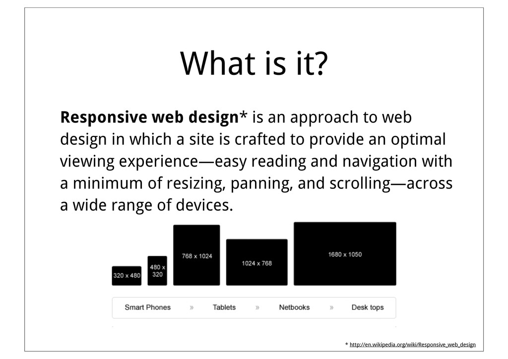
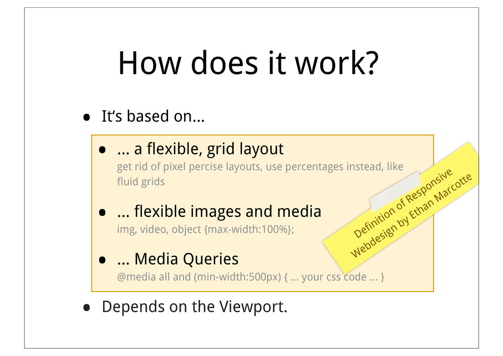
web design in which a site is crafted to provide an optimal viewing experience—easy reading and navigation with a minimum of resizing, panning, and scrolling—across a wide range of devices. * http://en.wikipedia.org/wiki/Responsive_web_design
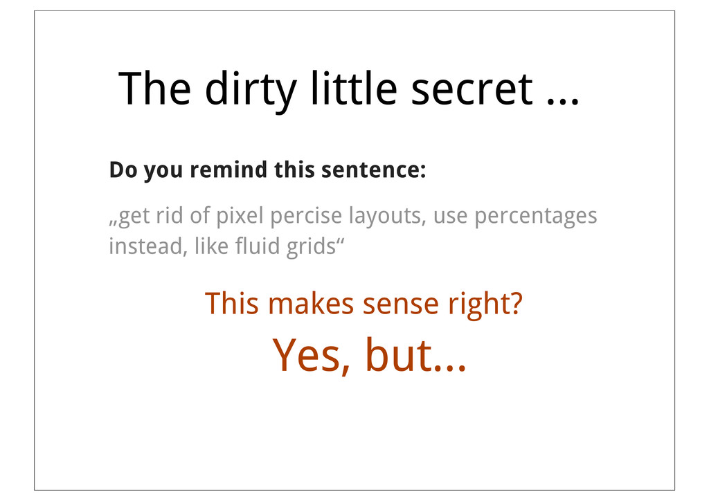
a flexible, grid layout get rid of pixel percise layouts, use percentages instead, like fluid grids • ... flexible images and media img, video, object {max-width:100%}; • ... Media Queries @media all and (min-width:500px) { ... your css code ... } • Depends on the Viewport. Definition of Responsive Webdesign by Ethan Marcotte
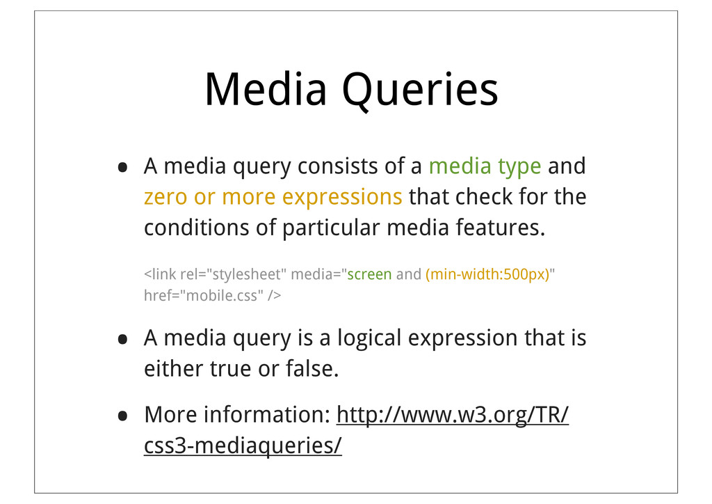
type and zero or more expressions that check for the conditions of particular media features. <link rel="stylesheet" media="screen and (min-width:500px)" href="mobile.css" /> • A media query is a logical expression that is either true or false. • More information: http://www.w3.org/TR/ css3-mediaqueries/
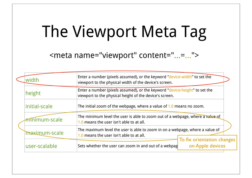
number (pixels assumed), or the keyword "device-width" to set the viewport to the physical width of the device's screen. height Enter a number (pixels assumed), or the keyword "device-height" to set the viewport to the physical height of the device's screen. initial-scale The initial zoom of the webpage, where a value of 1.0 means no zoom. minimum-scale The minimum level the user is able to zoom out of a webpage, where a value of 1.0 means the user isn't able to at all. maximum-scale The maximum level the user is able to zoom in on a webpage, where a value of 1.0 means the user isn't able to at all. user-scalable Sets whether the user can zoom in and out of a webpage. Set to yes or no. To fix orientation changes on Apple devices
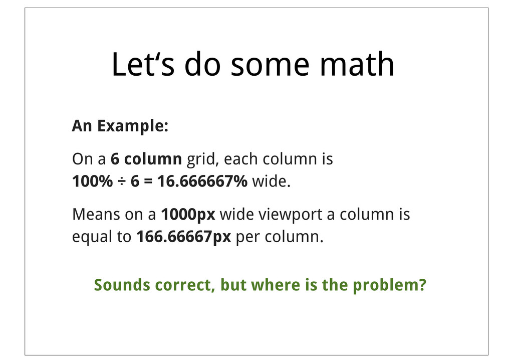
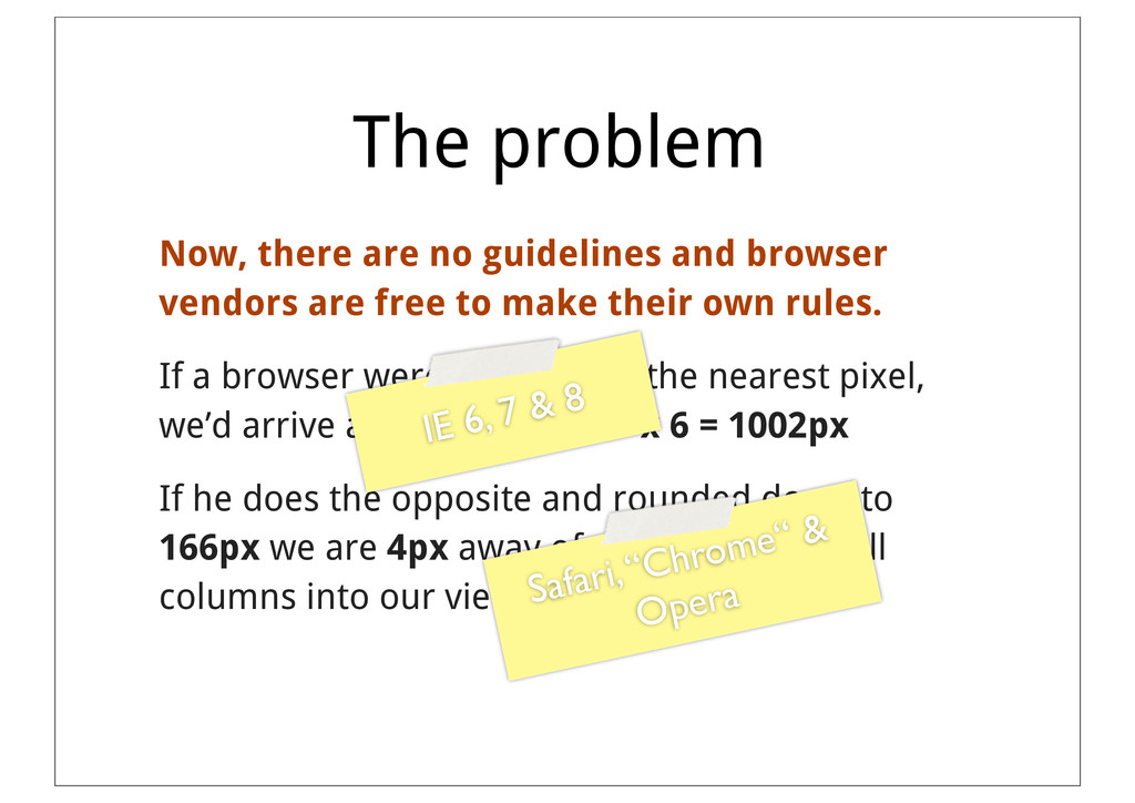
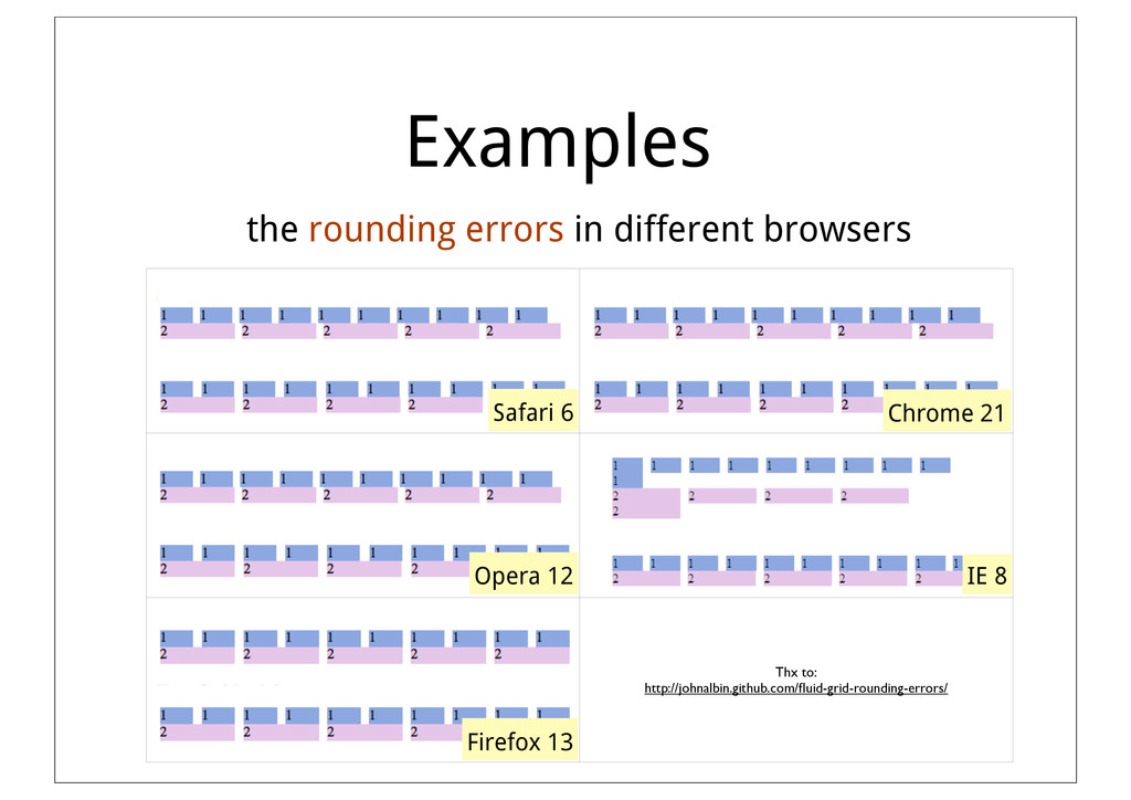
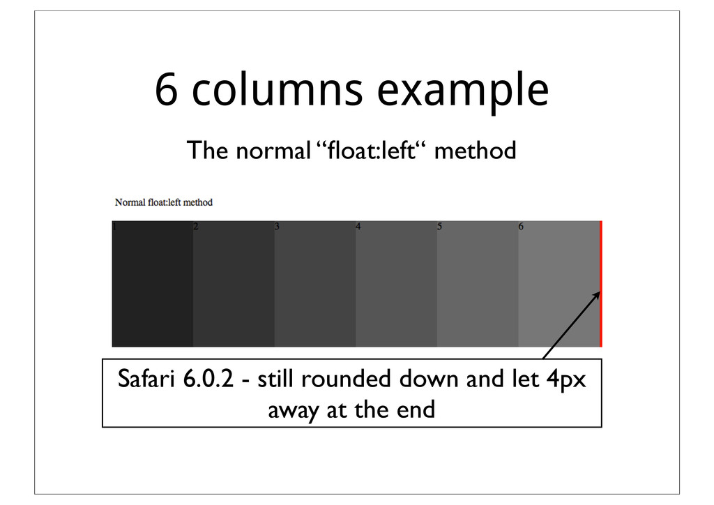
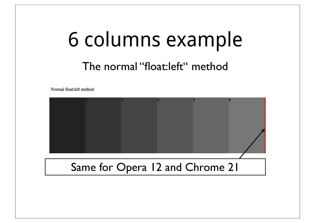
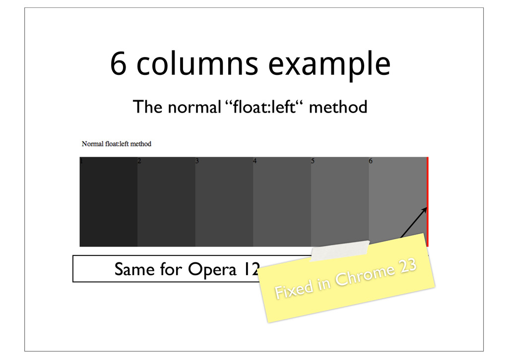
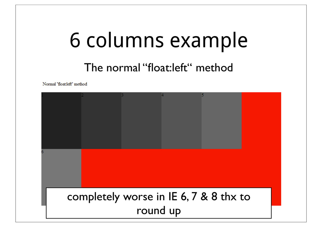
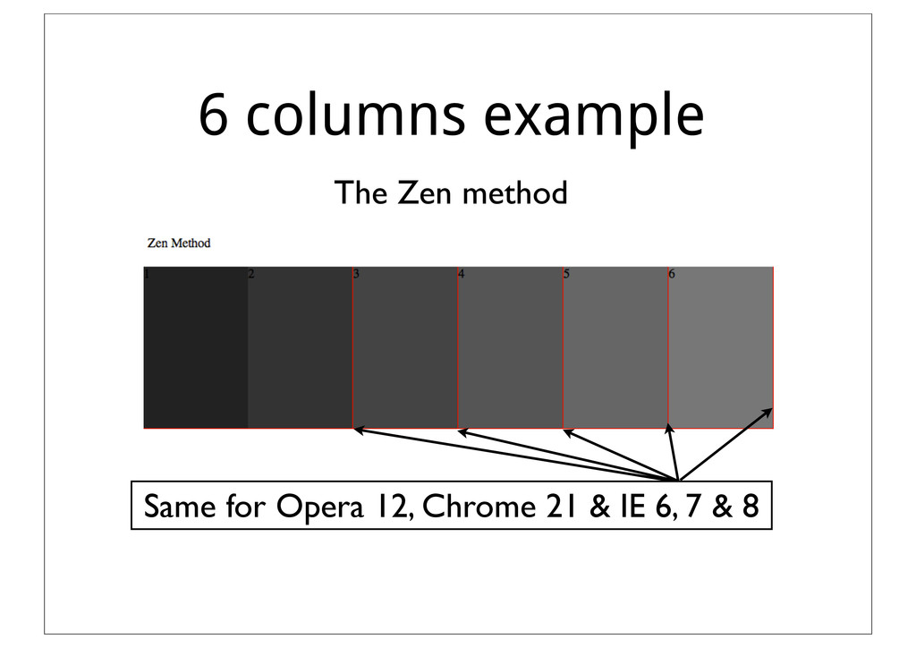
grid, each column is 100% ÷ 6 = 16.666667% wide. Means on a 1000px wide viewport a column is equal to 166.66667px per column. Sounds correct, but where is the problem?
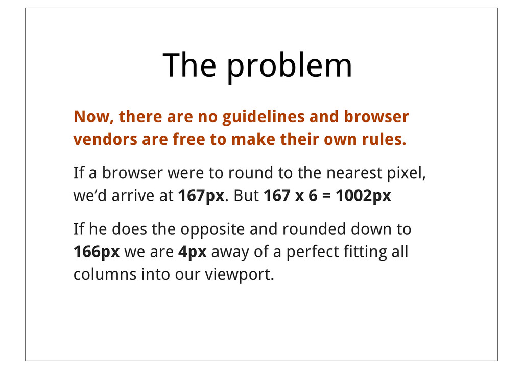
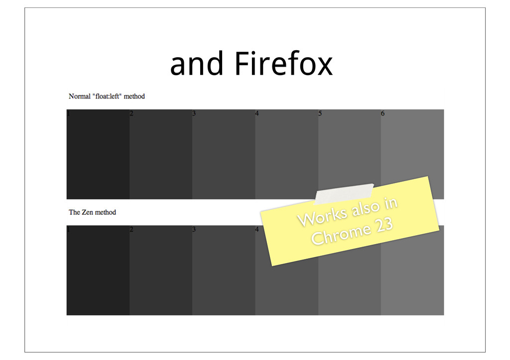
are free to make their own rules. If a browser were to round to the nearest pixel, we’d arrive at 167px. But 167 x 6 = 1002px If he does the opposite and rounded down to 166px we are 4px away of a perfect fitting all columns into our viewport.
are free to make their own rules. If a browser were to round to the nearest pixel, we’d arrive at 167px. But 167 x 6 = 1002px If he does the opposite and rounded down to 166px we are 4px away of a perfect fitting all columns into our viewport. IE 6, 7 & 8 Safari, “Chrome“ & Opera
sub-pixel rendering. This will retain the sub-pixel values for all CSS properties. When an element's positioning depends on the properties of previous elements, the sub-pixel values will be used in the calculations.
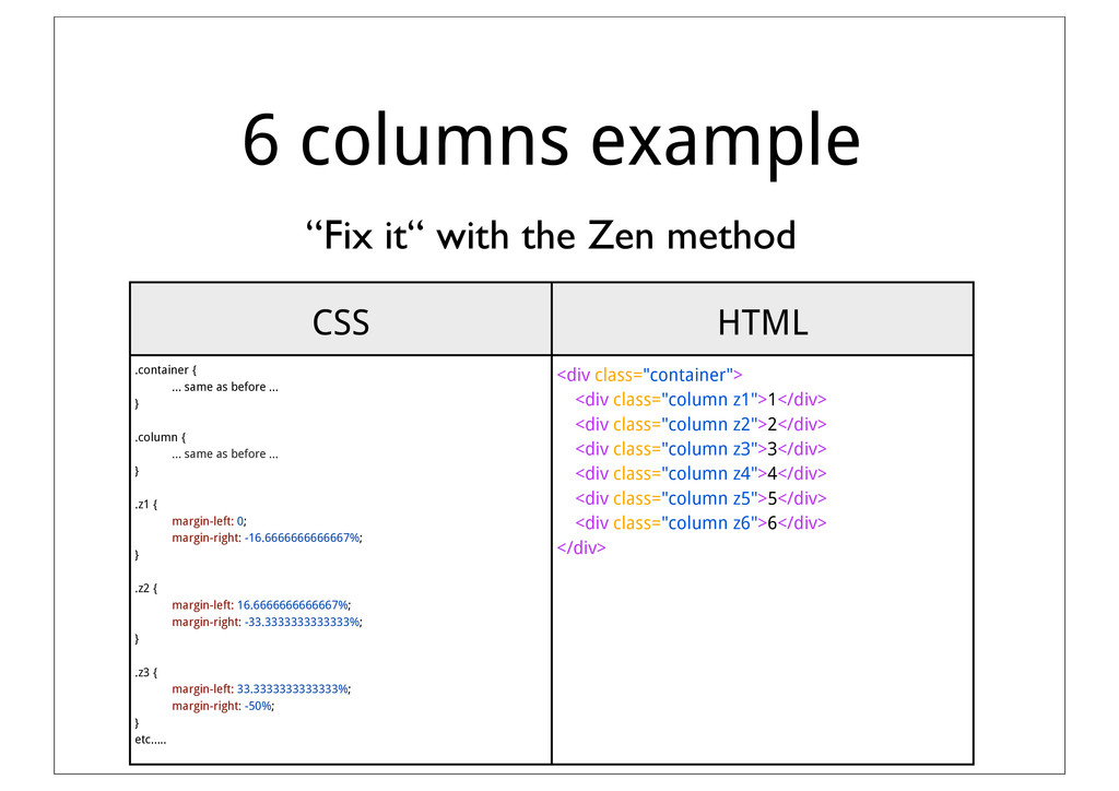
responsive webdesign (mostly thx to designers) don‘t forget this rounding error in browsers and how you can solve it. If you start a new project and you have the option to use a Framework like Twitter‘s Bootstrap, Foundation, CSS grid etc. use it! It already solves these kind of problems for you.
 mhauri
 kakehashi
 miyukki
 vtryo
vtryo
 rryz09
 coco_se
 yud0uhu
 torumakabe
 shibuiwilliam
 sansantech
 spatial_ai_network
 azukiazusa1
 mhrtech
 palkan
 paigeccino
 akademiya2063
 portentint
 rasmusluckow
 aleyda
 szymonslowik
 panda_program
 inesmontani
 jdejongh
 tammyeverts
 michielstock