Upgrade to Pro — share decks privately, control downloads, hide ads and more …

ViewComponent による コンポーネント指向 UI 開発

ViewComponent による コンポーネント指向 UI 開発

Avatar for Tatsuya Miyamae

Tatsuya Miyamae

July 14, 2023
Tweet

More Decks by Tatsuya Miyamae

Other Decks in Programming

Transcript

  1. まず、最近の宮前の個人開発の技術スタック アプリケーションフレームワークはRails → Next.js, NestJS, Go界隈とか色々試したけど、Railsの生産性が再現できず結局戻ってきました Hotwireを活用(Turbo Drive有効)SPA風 → モダンなフロントエンドアプリと同等のUXの実現は必要

    ViewComponentを使ってコンポーネント指向でUI実装 → フロントエンド界隈でメジャーな手法になっているので取り入れたい CSSフレームワークはTailwind CSS → コンポーネント指向との相性 ◎ テンプレートエンジンはSlimではなくERB → コンポーネント指向によりHTMLの実装単位が小さくなるのでERBで十分 jsフレームワークはAlpine.js → Railsとの相性 ◎ コンポーネント指向との相性 ◎
  2. Railsでコンポーネント指向UI開発するには パーシャルテンプレートで実装する? 近いことはできそうだが、不完全 スコープ化が不完全、性能が悪い、単体テストが難しい <%# _search_box.html.erb %> <% content_for :head

    do %> <style> // CSS... </style> <% end %> <% # Ruby のコード... %> <script> // JavaScript のコード... </script> <form> <%= render 'text_input', name: 'q', placeholder: placeholder %> <%= render 'submit_button', label: ' 検索' %> </form>
  3. ViewComponentとは Railsでコンポーネント指向UIを実装でできる (GitHub謹製、github.comのために作られたライブラリ) こんなふうにコンポーネントを実装できます 使いかた # app/components/search_box_component.rb class SearchBoxComponent <

    ViewComponent::Base def initialize(placeholder:) @placeholder = placeholder end end <%# app/components/search_box_component.html.erb %> <form> <%= render(TextInputComponent.new(name: 'q', placeholder: @placeholder)) %> <%= render(SubmitButtonComponent.new(label: ' 検索') %> </form> <%= render(SearchBoxComponent.new(placeholder: ' キーワードを入力')) %>
  4. 基本的な使い方 使い方 結果 # app/components/example_component.rb class ExampleComponent < ViewComponent::Base def

    initialize(title:) @title = title end end <%# app/components/example_component.html.erb %> <span title="<%= @title %>"><%= content %></span> <%= render(ExampleComponent.new(title: 'my title')) do %> Hello, World! <% end %> <span title="my title">Hello, World!</span>
  5. 応用機能(1/3): スロット 複数のコンテンツブロックを渡せる 使い方 # app/components/article_component.rb class ArticleComponent < ViewComponent::Base

    renders_one :heading renders_one :body end <%# app/components/article_component.html.erb %> <h1><%= heading %></h1> <p><%= body %></p> <%= render(ArticleComponent.new) do |component| %> <% component.with_heading do %> My Title <% end %> <% component.with_body do %> Hello, World! <% end %> <% end %>
  6. View実装例 最終的にviewの中身はHTMLがなくなってコンポーネントがたくさん置かれるだけのものになる edit.html.erbの例 <%= form_with model: [:admin, @record] do |f|

    %> <%= render(FormComponent.new(model: @record) do %> <%= render(FormFieldTextComponent.new(form: f, attribute: :email) %> <%= render(FormFieldTextComponent.new(form: f, attribute: :nick_name) %> <%= render(FormFieldPasswordComponent.new(form: f, attribute: :password, autocomplete: 'new-password') %> <%= render(FormFieldPasswordComponent.new(form: f, attribute: :password_confirmation) %> <% end %> <% end %>
  7. ちょっと改善 ヘルパーを作ると少し可読性が良くなるかも module ApplicationHelper def component(name, *args, **kwargs, &) component

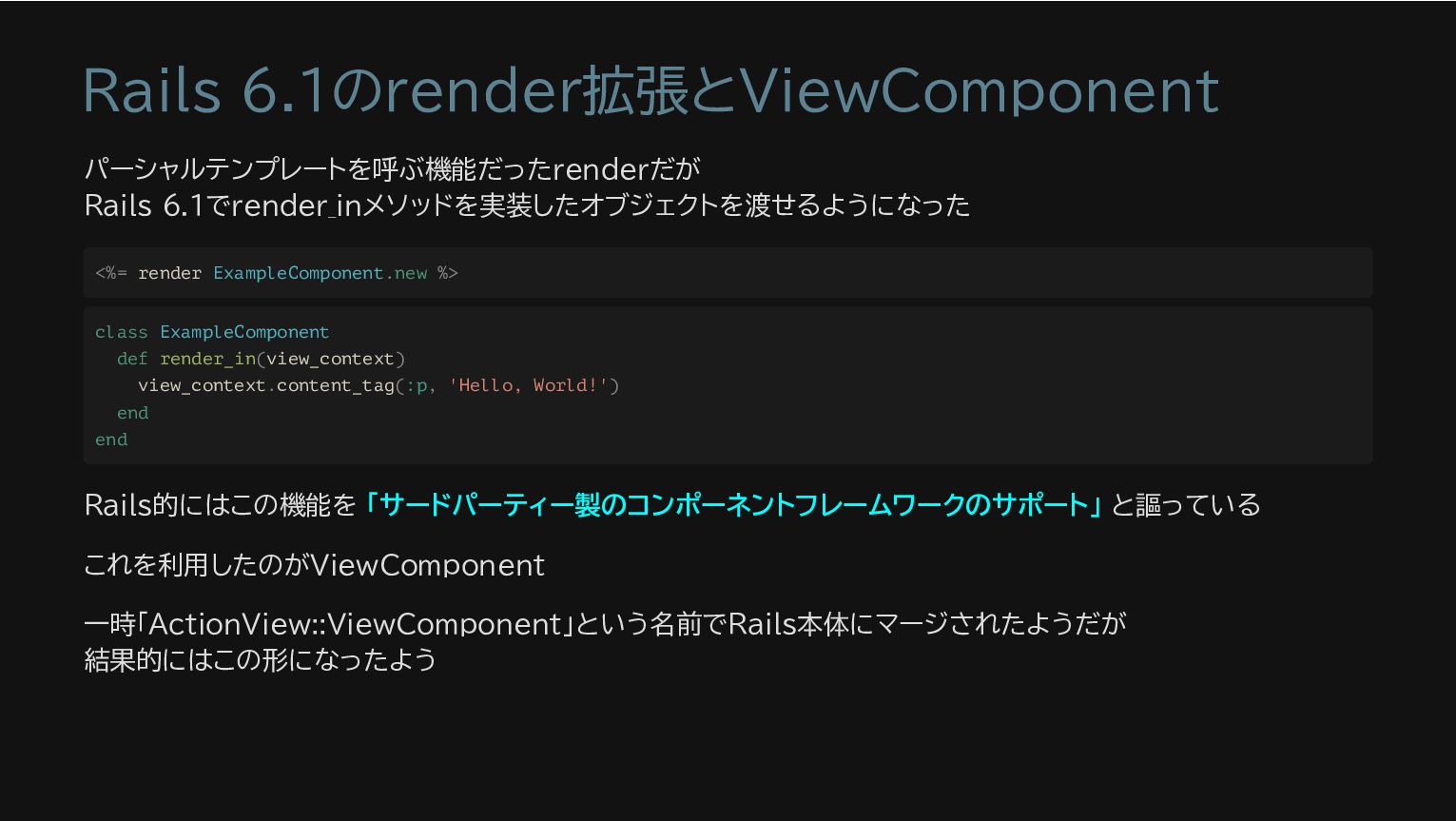
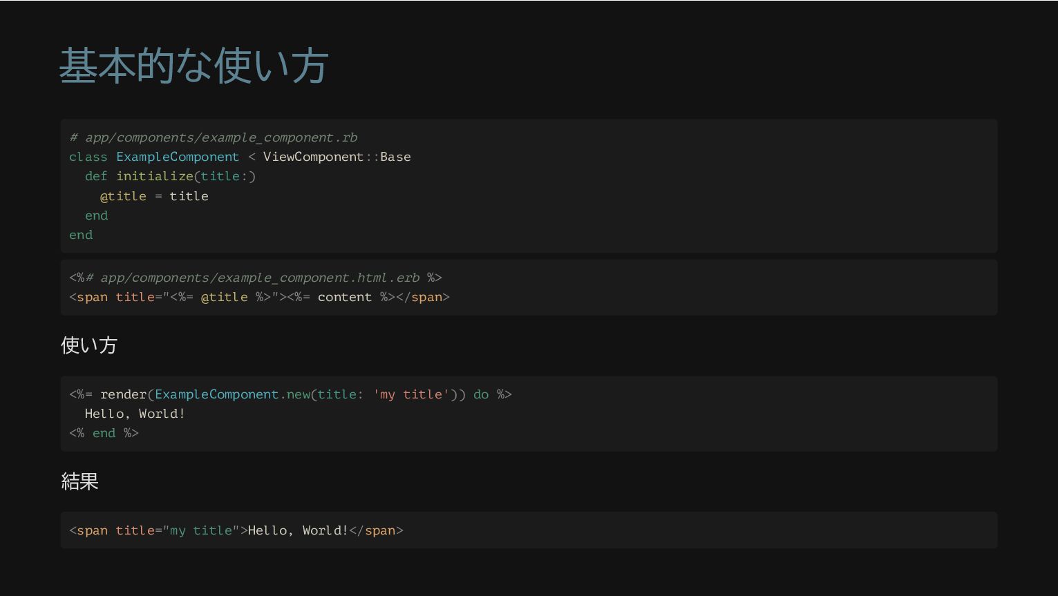
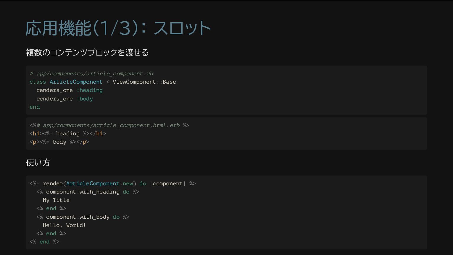
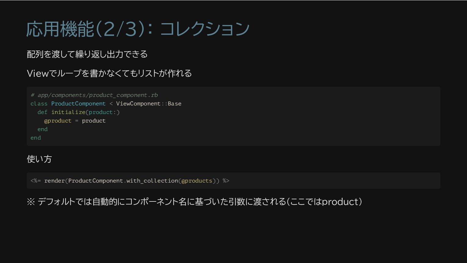
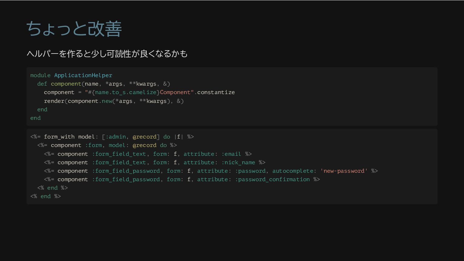
    = "#{name.to_s.camelize}Component".constantize render(component.new(*args, **kwargs), &) end end <%= form_with model: [:admin, @record] do |f| %> <%= component :form, model: @record do %> <%= component :form_field_text, form: f, attribute: :email %> <%= component :form_field_text, form: f, attribute: :nick_name %> <%= component :form_field_password, form: f, attribute: :password, autocomplete: 'new-password' %> <%= component :form_field_password, form: f, attribute: :password_confirmation %> <% end %> <% end %>
  8. Helper? Decorator? Partial? Component? かくして、共通的にデータを整形して表示する主な手段は以下の4つとなる Helper Decorator (ViewModel) Partial ViewComponent

    GitHub的には全部Component推しのよう <%= put_datetime user.created_at %> <%= user.decorate.created_at %> <%= render 'partial/datetime', user.created_at %> <%= render(DateTimeFormatComponent(datetime: user.created_at)) %>
  9. JavaScriptコードのカプセル化(Stimulus編) StimulusはHTML要素とJavaScriptコードを1:1でマッピングできる <%# counter_component.html.erb %> <div data-controller="counter"> <h1 data-counter-target="display">0</h1> <button

    data-action="click->counter#increment">Count Up!</button> </div> // counter_component.js import { Controller } from '@hotwired/stimulus'; export default class extends Controller { static targets = ['display']; connect() { this.count = 0; } increment() { this.count++; this.displayTarget.textContent = this.count; } }
  10. CSSのカプセル化(Tailwind CSS) Tailwind CSS 一押し! class属性でスタイルを埋め込みで指定していく、ユーティリティーファーストのCSSフレームワーク 本来のCSSの思想を尊重したらあり得ない設計です 💦 しかしコンポーネントにデザインを閉じ込めたいというニーズには大変適している コンポーネント指向を採用していない場合は保守性を損なうので使わないほうがいいと思いますが

    <div class="flex justify-center items-center h-screen bg-gray-200"> <div class="bg-white p-8 rounded shadow-lg text-center"> <h2 class="text-2xl mb-4 text-blue-500">Hello, Tailwind CSS!</h2> <p class="text-gray-700">This is a simple example of using Tailwind CSS.</p> <button class="mt-4 px-4 py-2 bg-blue-500 text-white rounded hover:bg-blue-400"> Click me </button> </div> </div>
  11. コンポーネントのテスト コンポーネントは独立したオブジェクトなので単体テストが書きやすい 従来のViewはほとんど単体テスト不可能でした # search_box_component_spec.rb RSpec.describe SearchBoxComponent, type: :component do

    let(:component) { described_class.new(placeholder: ' キーワードを入力') } it 'renders the message' do html = render_inline(component) expect(html.text).to include(' キーワードを入力') end end