Upgrade to Pro — share decks privately, control downloads, hide ads and more …

One day I… (╯°□°)╯( ┻━┻ and started to code SASS like an engineer

One day I… (╯°□°)╯( ┻━┻ and started to code SASS like an engineer

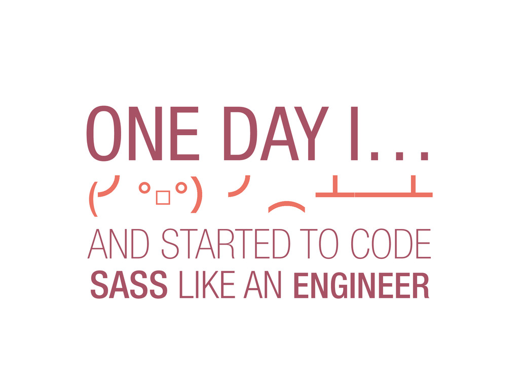
The aim of this talk is to share the experience of using and experimenting with SASS helped us create, scale and maintain our best ever CSS.

We'll explore with practical examples the existing tension between Object Oriented SASS, site performance and the speed of development and design expected in a start-up.

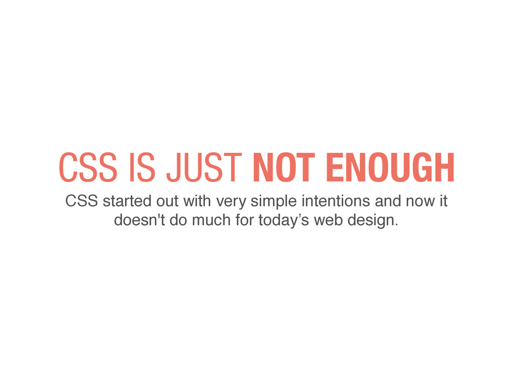
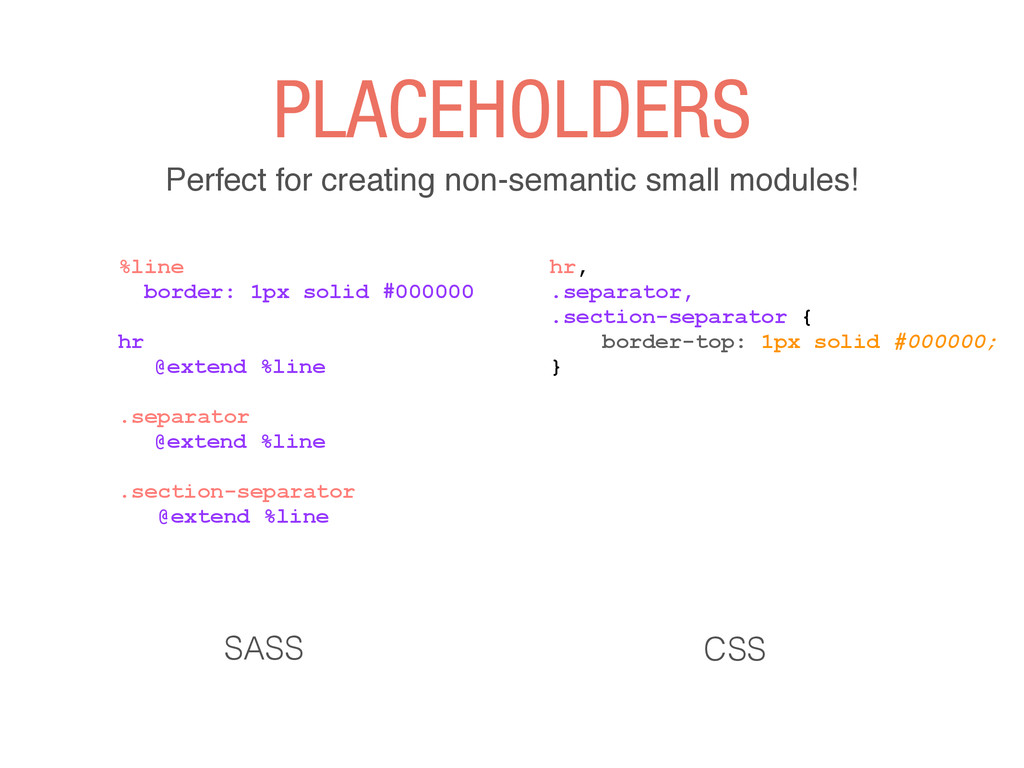
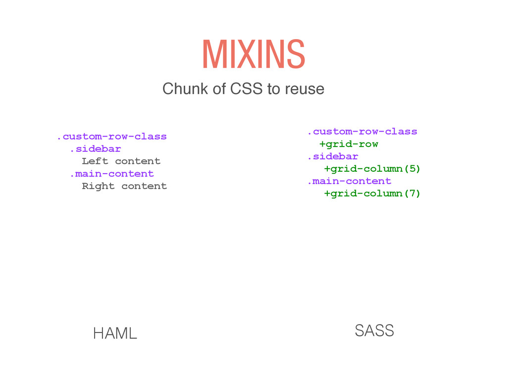
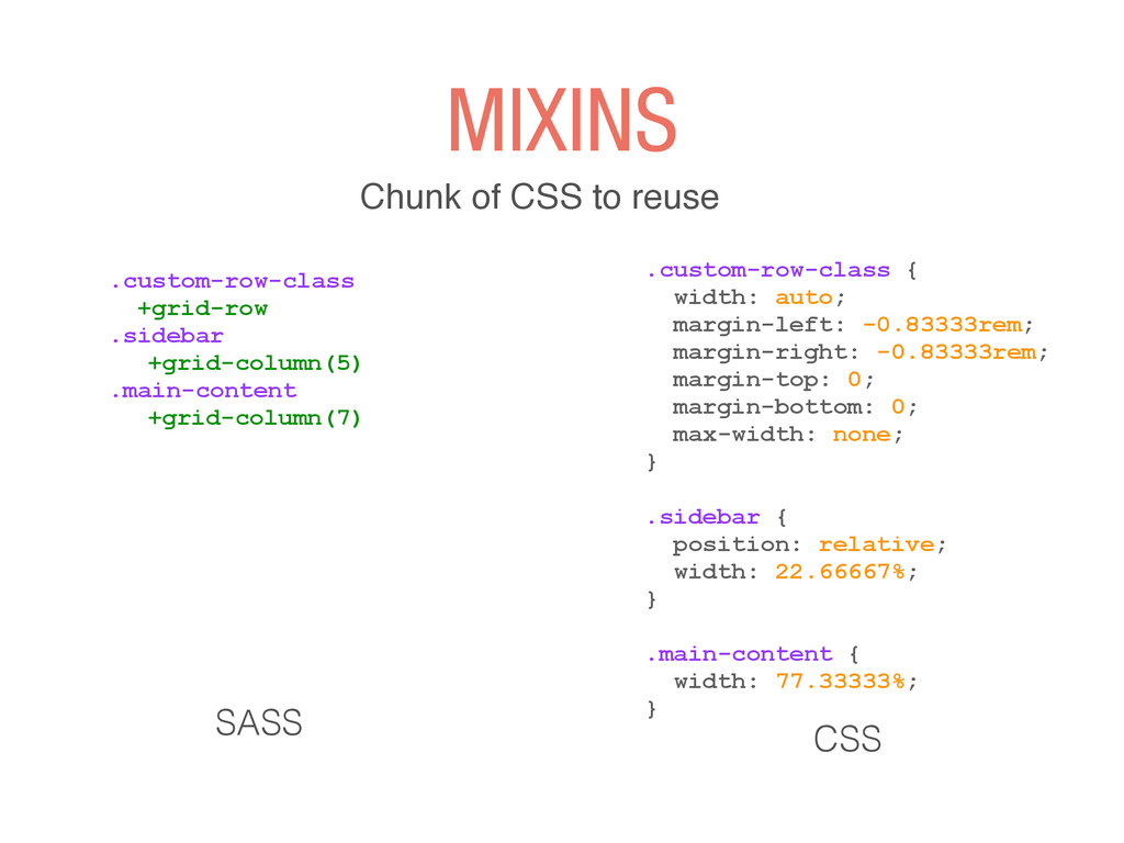
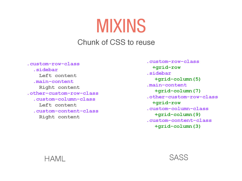
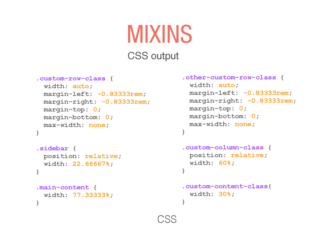
This is not just about SASS, it's about mixins and variables nor about how it compares to LESS or which is the better framework, but about showing how the use of a certain set of practices helped us change our workflow for the better.

Noelia Cabane

May 23, 2014
Tweet

Other Decks in Programming

Transcript

  1. CSS IS JUST NOT ENOUGH CSS started out with very

    simple intentions and now it doesn't do much for today’s web design.
  2. NOT NECESSARILY Sometimes we get really exited with so many

    features that we disconnect from the CSS output
  3. NESTING you are doing it wrong %nav.top-bar %ul.right %li.name %h1

    %a{href: "#"} Restorando %ul.left %li %a{href: "#"} About %li %a{href: "#"} Contact ! HAML .top-bar .right margin: 0 padding: 0 list-style: none .name display: inline-block h1 a display: block padding: 5px 10px text-decoration: none SASS
  4. NESTING you are doing it wrong .top-bar .right margin: 0

    padding: 0 list-style: none .name display: inline-block h1 a display: block padding: 5px 10px text-decoration: none SASS .top-bar .right { margin: 0; padding: 0; list-style: none; } .top-bar .right .name { display: inline-block; } .top-bar .right .name h1 a { display: block; padding: 5px 10px; text-decoration: none; } CSS
  5. VARIABLES It’s all about the names $blue: #1769ff $base-font: Helvetica,

    sans-serif $padding: 20px $margin: 20px $border-radius: 4px ! .svg-logo color: $blue font-size: 36px margin-top: $margin margin-bottom: $margin/2 ! SASS ! ! #ff5721
  6. SEMANTIC HTML Non-semantic classes aren’t needed to describe a component,

    which means they will change. .row .column-5.columns Left content .column-7.columns Right content HAML .custom-row-class .sidebar Left content .main-content Right content ! HAML
  7. Share a set of CSS properties from one selector to

    another .custom-row-class .sidebar Left content .main-content Right content ! HAML .custom-row-class @extend .row .sidebar @extend .column-5 @extend .columns .main-content @extend .column-7 @extend .columns ! ! ! ! ! SASS EXTENDS
  8. Share a set of CSS properties from one selector to

    another .custom-row-class @extend .row .sidebar @extend .column-5 @extend .columns .main-content @extend .column-7 @extend .columns ! ! ! ! ! SASS .columns, .sidebar .main-content, .someting-with-columns, .footer, .header, .semantic-class, .super-semantic, .custom-class, .another-custom-class, .action-bar { position: relative; padding-left: 0.9375rem; padding-right: 0.9375rem; float: left; } CSS EXTENDS
  9. AND THAT'S JUST A COUPLE OF CLASSES… I'M SURE A

    WHOLE BIG PROJECT THAT LIST COULD GET WAY BIGGER.
  10. keeps HTML with nice and semantic classes but… .custom-row-class .sidebar

    Left content .main-content Right content ! ! HAML .custom-row-class @extend .row .sidebar @extend .column-5 @extend .columns .main-content @extend .column-7 @extend .columns ! ! ! ! ! SASS USING MORE THAN ONE EXTEND
  11. keeps HTML with nice and semantic classes but… .custom-row-class @extend

    .row .sidebar @extend .column-5 @extend .columns .main-content @extend .column-7 @extend .columns ! ! ! ! ! SASS .column-5, .sidebar { position: relative; width: 55.55556%; } ! .columns, .sidebar { position: relative; padding-left: 0.9375rem; padding-right: 0.9375rem; float: left; } ! ! USING MORE THAN ONE EXTEND CSS
  12. PLACEHOLDERS Selectors that output nothing unless they are extended .custom-row-class

    .sidebar Left content .main-content Right content ! HAML %columns position: relative; padding-left: 0.9375rem; padding-right: 0.9375rem; float: left; ! .custom-row-class @extend %row .sidebar @extend %column-5 @extend %columns .main-content @extend %column-7 @extend %columns ! ! ! ! ! SASS
  13. PLACEHOLDERS Selectors that output nothing unless they are extended %columns

    position: relative; padding-left: 0.9375rem; padding-right: 0.9375rem; float: left; ! .custom-row-class @extend %row .sidebar @extend %column-5 @extend %columns .main-content @extend %column-7 @extend %columns ! ! ! ! ! SASS .sidebar .main-content, .someting-with-columns, .footer, .header, .semantic-class, .super-semantic, .custom-class, .another-custom-class, .action-bar { position: relative; padding-left: 0.9375rem; padding-right: 0.9375rem; float: left; } CSS
  14. PLACEHOLDERS Perfect for creating non-semantic small modules! %line border: 1px

    solid #000000 ! hr @extend %line ! .separator @extend %line ! .section-separator @extend %line SASS hr, .separator, .section-separator { border-top: 1px solid #000000; } CSS
  15. GREAT FOR VISUAL PATTERNS Little bits of style that you

    can mix and match throughout your stylesheets.
  16. MIXINS Chunk of CSS to reuse .custom-row-class .sidebar Left content

    .main-content Right content ! ! HAML .custom-row-class +grid-row .sidebar +grid-column(5) .main-content +grid-column(7) ! ! ! ! SASS
  17. MIXINS Chunk of CSS to reuse CSS .custom-row-class +grid-row .sidebar

    +grid-column(5) .main-content +grid-column(7) ! ! ! ! SASS .custom-row-class { width: auto; margin-left: -0.83333rem; margin-right: -0.83333rem; margin-top: 0; margin-bottom: 0; max-width: none; } ! .sidebar { position: relative; width: 22.66667%; } ! .main-content { width: 77.33333%; }
  18. MIXINS Chunk of CSS to reuse .custom-row-class .sidebar Left content

    .main-content Right content .other-custom-row-class .custom-column-class Left content .custom-content-class Right content ! ! ! HAML .custom-row-class +grid-row .sidebar +grid-column(5) .main-content +grid-column(7) .other-custom-row-class +grid-row .custom-column-class +grid-column(9) .custom-content-class +grid-column(3) ! ! ! ! SASS
  19. MIXINS CSS output .custom-row-class { width: auto; margin-left: -0.83333rem; margin-right:

    -0.83333rem; margin-top: 0; margin-bottom: 0; max-width: none; } ! .sidebar { position: relative; width: 22.66667%; } ! .main-content { width: 77.33333%; } CSS .other-custom-row-class { width: auto; margin-left: -0.83333rem; margin-right: -0.83333rem; margin-top: 0; margin-bottom: 0; max-width: none; } ! .custom-column-class { position: relative; width: 60%; } ! .custom-content-class{ width: 30%; }
  20. MIXINS They make your CSS bloat but if you chose

    wisely a couple of semantic selectors that you can reuse they are a lot of help
  21. PROJECT STRUCTURE stylesheets/ | |-- modules/ | |-- _mixin.sass |

    |-- _variables.sass | |-- _patterns.sass | ... ! | |-- partials/ | |-- _screen.sass | |-- _buttons.sass | |-- _base.sass | |-- _grid.sass | |-- _typography.sass | |-- _navigation.sass | ... | |-- vendor/ | |-- _foundation-grid.sass | ... | `-- main.sass