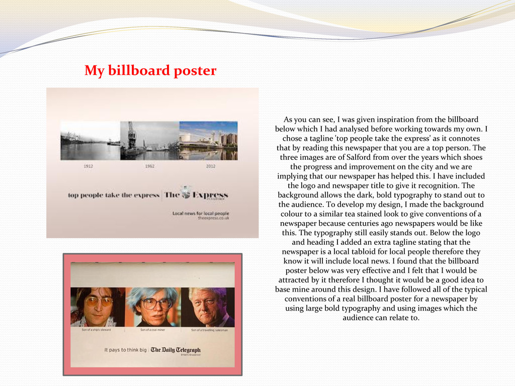
inspiration from the billboard below which I had analysed before working towards my own. I chose a tagline 'top people take the express' as it connotes that by reading this newspaper that you are a top person. The three images are of Salford from over the years which shoes the progress and improvement on the city and we are implying that our newspaper has helped this. I have included the logo and newspaper title to give it recognition. The background allows the dark, bold typography to stand out to the audience. To develop my design, I made the background colour to a similar tea stained look to give conventions of a newspaper because centuries ago newspapers would be like this. The typography still easily stands out. Below the logo and heading I added an extra tagline stating that the newspaper is a local tabloid for local people therefore they know it will include local news. I found that the billboard poster below was very effective and I felt that I would be attracted by it therefore I thought it would be a good idea to base mine around this design. I have followed all of the typical conventions of a real billboard poster for a newspaper by using large bold typography and using images which the audience can relate to.