Upgrade to Pro — share decks privately, control downloads, hide ads and more …

Adventures of Responsive Web-Design

Adventures of Responsive Web-Design

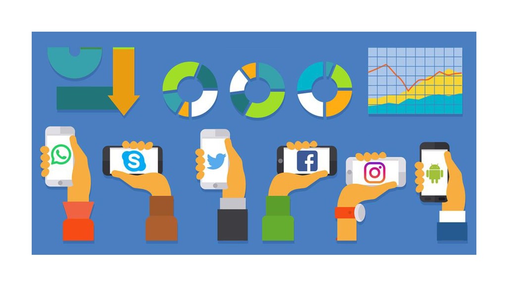
There are over 644 Million websites in the world today and 4.5 Billion people have mobile phones which they carry along with them all the time. Giving this mobile phone users an awesome user experience should be the priority of every good web developer and am going to be speaking on how developers can use Media queries,responsive Images and typography,understanding pixels,ems,rems and percentage,Bootstrap 4,CSS Grid and Flexbox and also sharing tips and tricks for responsive design.

Avatar for Ololade Dammie

Ololade Dammie

December 08, 2018
Tweet

Other Decks in Technology

Transcript

  1. Super Teens Code Club: Our 2019 goal is to train

    500 kids Including 200 deaf and dumb students how to code for free. Join Us: @S_teenscodeclub
  2. Responsive Web-Design: Responsive Web-Design (RWD) is an approach to web

    design that makes web-pages render well on a variety of on a variety of devices or screen sizes.
  3. Overview:  Viewport meta tag  Media Queries  Responsive

    Typography  Responsive Images  CSS Grid and Flexbox  Tips and Tricks
  4. Viewport Meta Tag: . The viewport is the user's visible

    area of a web page, It varies with the device, i.e it will be smaller on a mobile phone than on a computer screen.
  5. IN HTML: IN CSS: <meta name="viewport" content="width=device-width, initial-scale=1.0 user-scalable=’no’> A

    <meta> viewport element gives the browser instructions on how to control the page's dimensions and scaling. The (width=device-width) part sets the width of the page to follow the screen-width of the device. The (initial-scale=1.0) part sets the initial zoom level when the page is first loaded by the browser. @-ms-viewport{ width: device-width; }
  6. Media Queries: Media queries is a CSS3 module allowing content

    rendering to adapt to conditions such as screen resolution (e.g. smartphone screen vs. computer screen).
  7. /* Extra small devices (phones, 600px and down) */ @media

    only screen and (max-width: 600px) {...} /* Small devices (portrait tablets and large phones, 600px and up) */ @media only screen and (min-width: 600px) {...} /* Medium devices (landscape tablets, 768px and up) */ @media only screen and (min-width: 768px) {...} /* Large devices (laptops/desktops, 992px and up) */ @media only screen and (min-width: 992px) {...} /* Extra large devices (large laptops and desktops, 1200px and up) */ @media only screen and (min-width: 1200px) {...} @media only screen and (orientation: landscape) { body { background-color: blue; } } Extra small devices = 600px; Small devices = less than 600px; Medium devices = less than 768px; Large devices = less than 992px;
  8. Responsive Typography? This simply means responsive text. There are 15

    CSS units currently supported by browsers; but our focus is Pixels, percentages and viewport dimensions (vh and vw)
  9. Responsive Images: This simply means that images can scale according

    to screen sizes. Units of measurement like percentages can be very helpful. <img src=”phto.png” scrset=”photo.png 1x, photo 2x” >
  10. Flexbox cheat sheet: Display: flex| inline-flex Flex-direction: row| column Flex-wrap:

    wrap| nowrap| wrapreverse Flex-basis: 100px; Justify-content: flex-start | flex-end | center Align-self: flex-start | flex-end | center Align-items: flex-start | flex-end | center Align content: flex-start | flex-end | center Flex-grow: 100px; Flex-shrink: 100px; Flex: 1; Order: 2;
  11. CSS Grid Cheat Sheet: Display: grid | inline-grid; grid-template-columns: 12px

    12px 12px | (repeat(3, 12px) (repeat(3, auto) | (22% auto 22%;) | (1fr, 2fr) grid-row-gap: 1px; (grid-column-gap) grid-gap: 6px; justify-items, (align-self): start |end |center | stretch; align-items (justify-self): start |end |center | stretch; justify-content: start | end | center | stretch | space-around| space-between |space-evenly align-content: start | end | center | stretch | space-around| space-between |space-evenly grid-column : 2; grid-row: 1/3;
  12. Tips and Tricks: * Box model (padding and margin) *

    Absolute and Relative Positioning * Bootstrap 4 features * Min-height and Min-width * Have a responsive design to work with (build step by step)