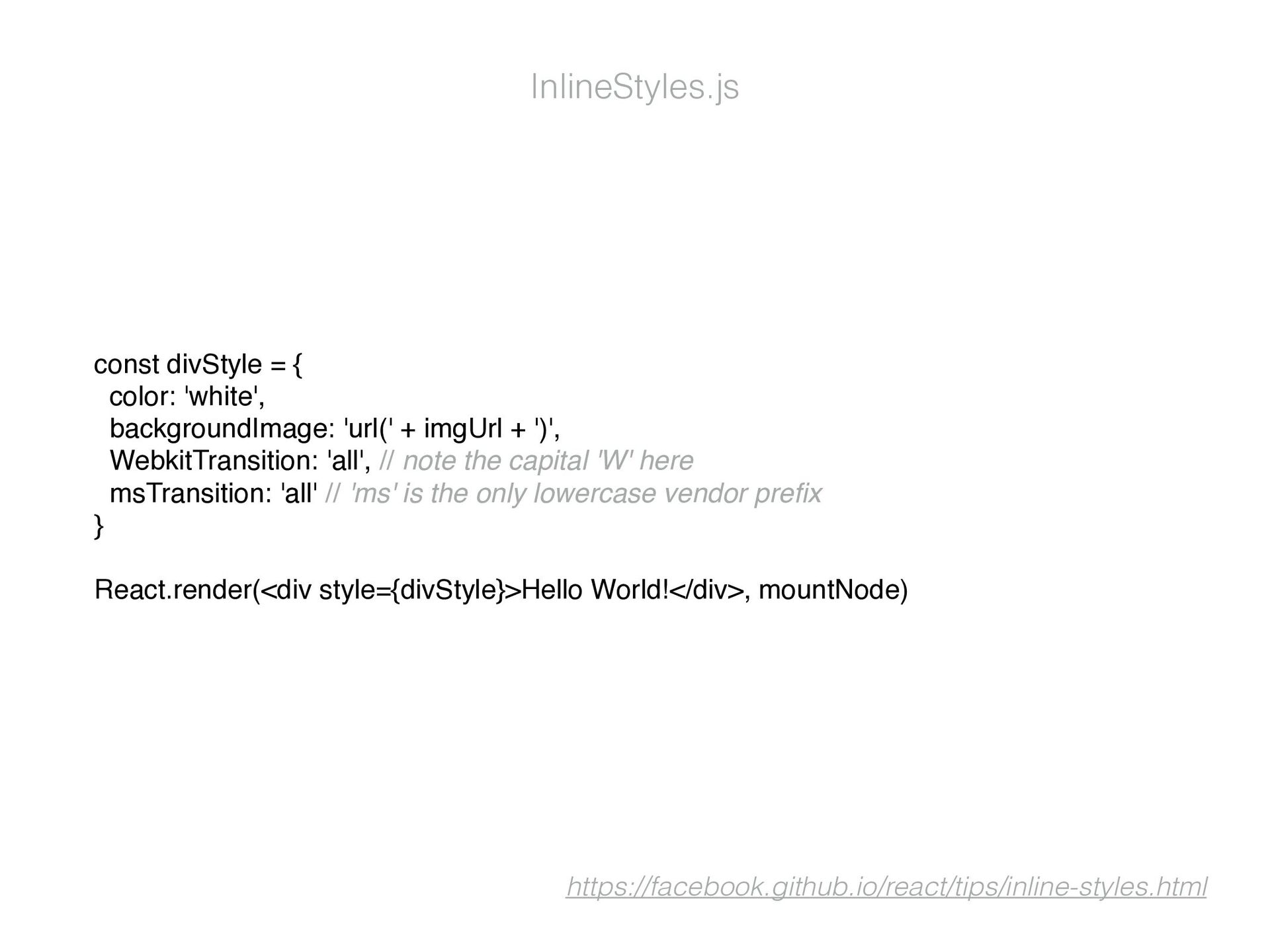
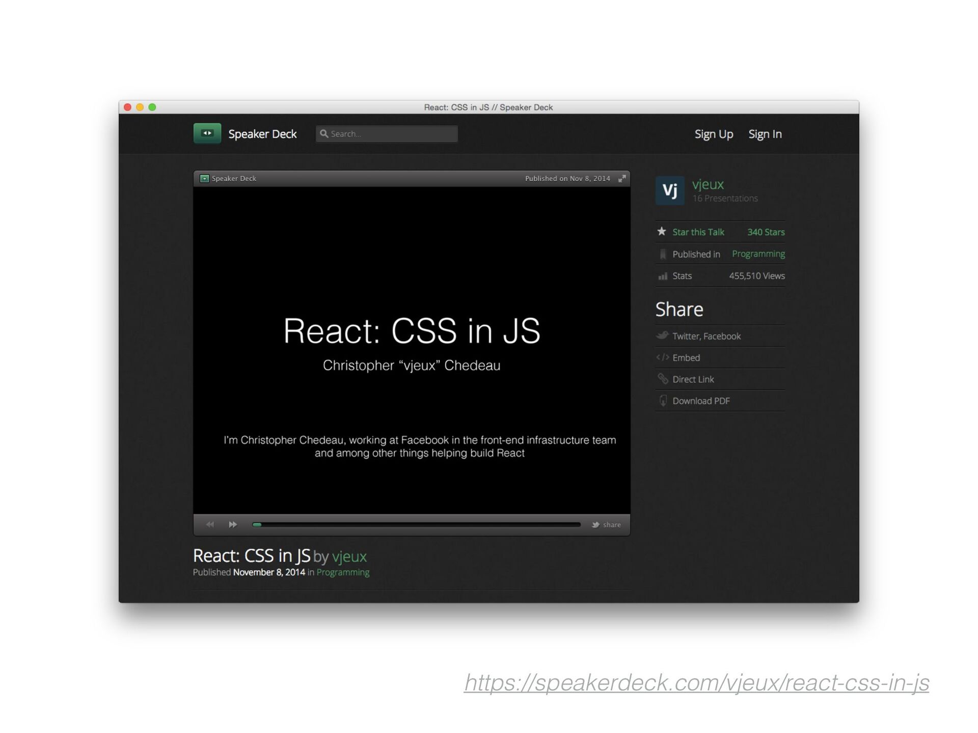
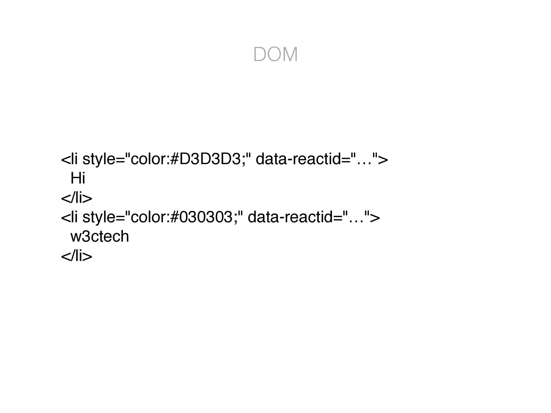
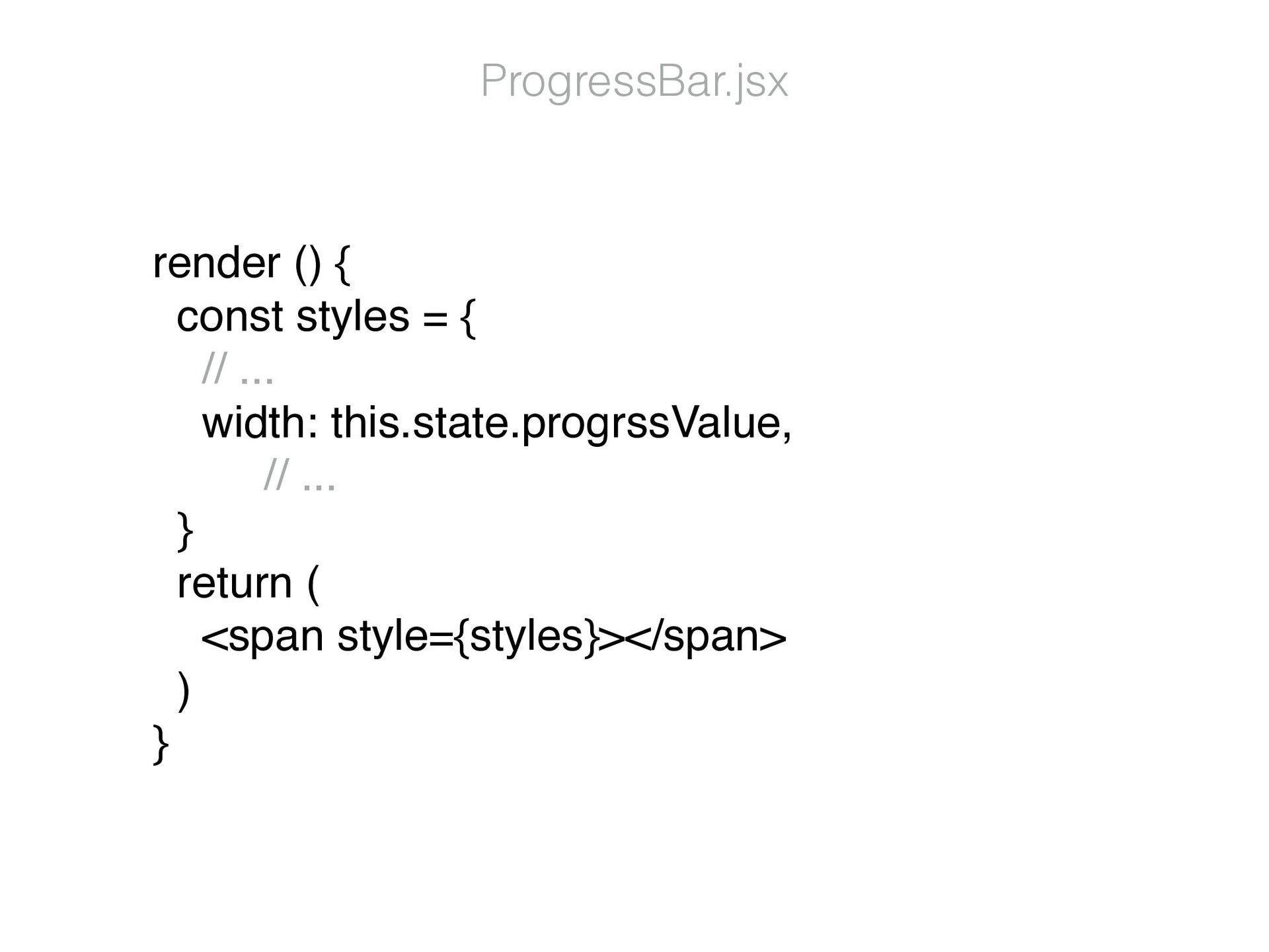
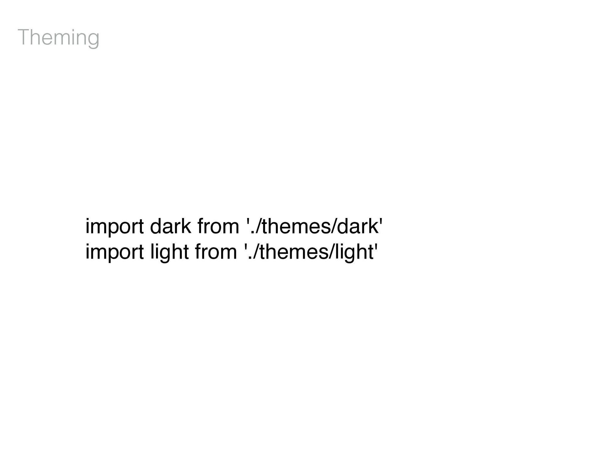
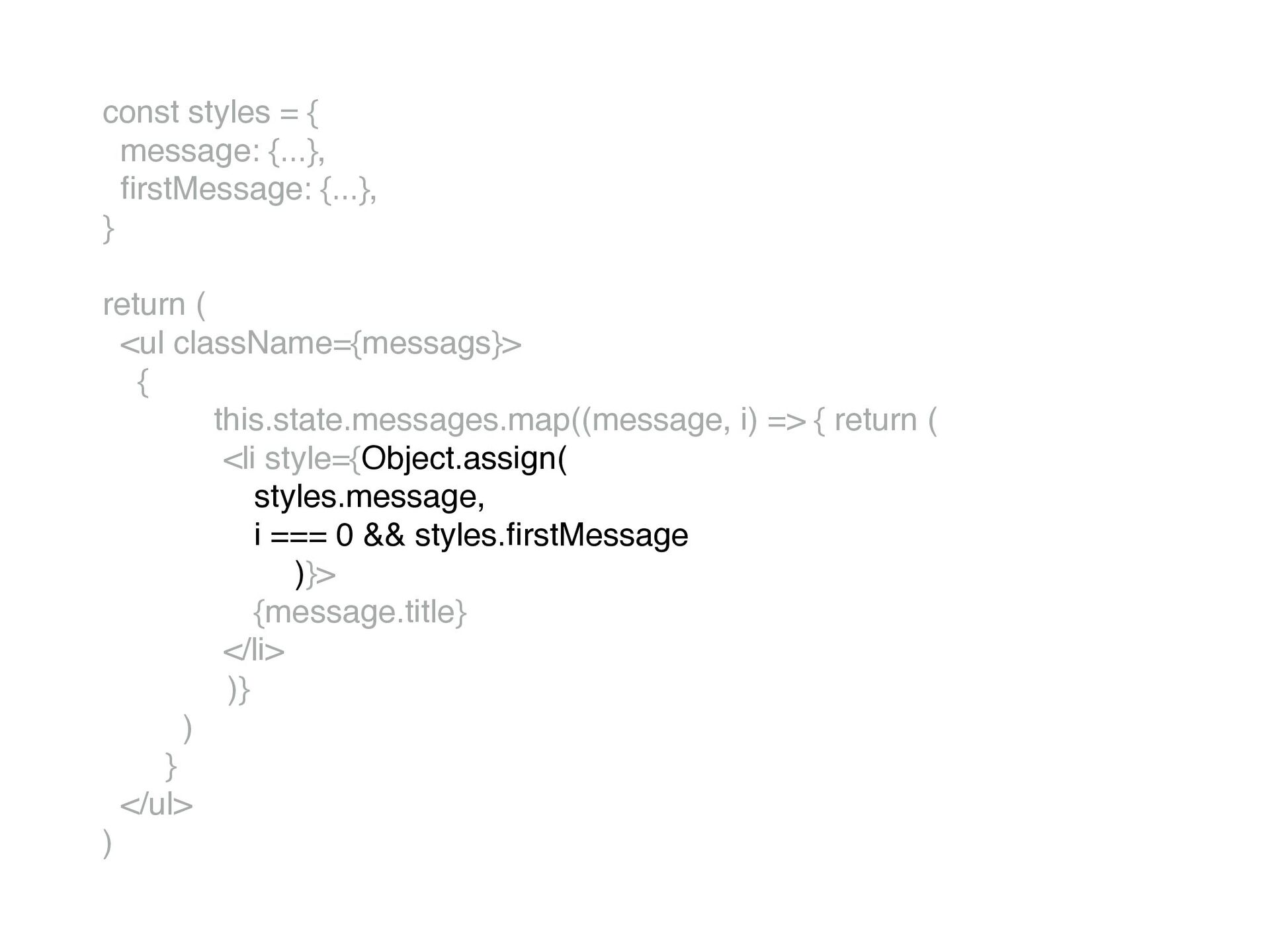
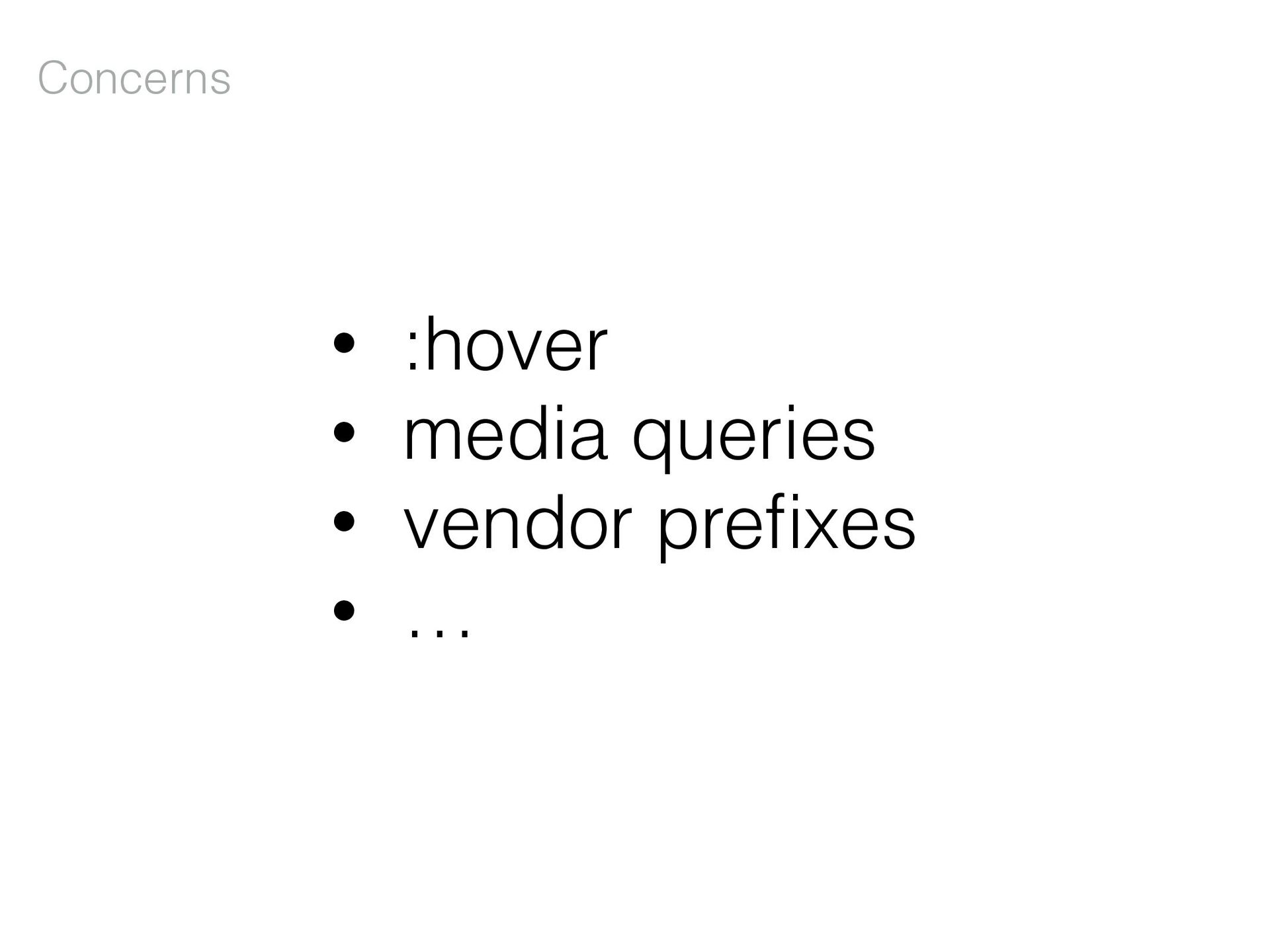
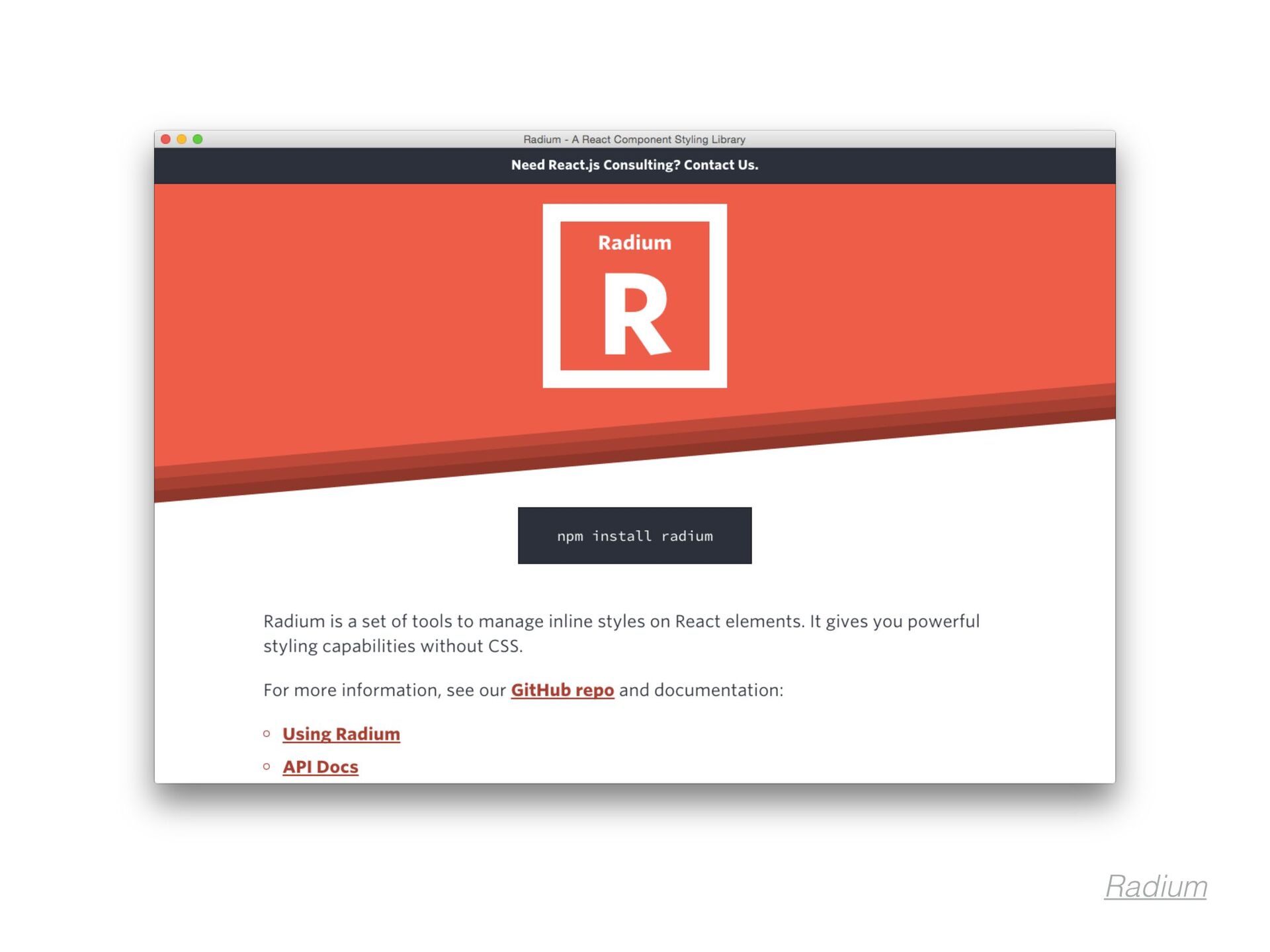
+ ')', WebkitTransition: 'all', // note the capital 'W' here msTransition: 'all' // 'ms' is the only lowercase vendor pre fi x } React.render(<div style={divStyle}>Hello World!</div>, mountNode) InlineStyles.js https://facebook.github.io/react/tips/inline-styles.html
 plrthink
 lynnandtonic
 morganepeng
 szymonslowik
 eileencodes
 holman
 dougneiner
 sabderemane
 inesmontani
 danielanewman
 michaelherold
 kimpetersen
 cassininazir