Upgrade to Pro
— share decks privately, control downloads, hide ads and more …
Speaker Deck
Features
Speaker Deck
PRO
Sign in
Sign up for free
Search
Search
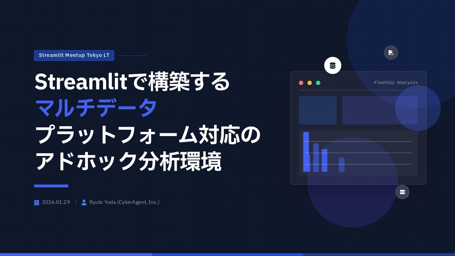
Streamlitで構築する マルチデータ プラットフォーム対応の アドホック分析環境
Search
RyutoYoda
January 29, 2026
620
0
Share
Embed
Copy iframe code
Copy JS code
Copy link
Start on current slide
Streamlitで構築する マルチデータ プラットフォーム対応の アドホック分析環境
RyutoYoda
January 29, 2026
More Decks by RyutoYoda
See All by RyutoYoda
AIエージェント多すぎて迷子になっていませんか
ryutoyoda
0
42
databricks,dbt,AWS S3を使ったデータパイプラインレシピ
ryutoyoda
0
110
dbtで作るデータ分析基盤
ryutoyoda
0
93
EmoEcho
ryutoyoda
0
70
Featured
See All Featured
The Mindset for Success: Future Career Progression
greggifford
PRO
0
410
The Illustrated Guide to Node.js - THAT Conference 2024
reverentgeek
1
410
The browser strikes back
jonoalderson
0
1.4k
Beyond borders and beyond the search box: How to win the global "messy middle" with AI-driven SEO
davidcarrasco
3
180
The #1 spot is gone: here's how to win anyway
tamaranovitovic
3
1.1k
RailsConf & Balkan Ruby 2019: The Past, Present, and Future of Rails at GitHub
eileencodes
141
35k
Chasing Engaging Ingredients in Design
codingconduct
0
230
Kristin Tynski - Automating Marketing Tasks With AI
techseoconnect
PRO
0
280
Reality Check: Gamification 10 Years Later
codingconduct
0
2.2k
Leveraging Curiosity to Care for An Aging Population
cassininazir
1
310
Noah Learner - AI + Me: how we built a GSC Bulk Export data pipeline
techseoconnect
PRO
0
210
Building a Scalable Design System with Sketch
lauravandoore
463
34k
Transcript
FlashViz Analysis Streamlit Meetup Tokyo LT Streamlitで構築する
マルチデータ プラットフォーム対応の アドホック分析環境 2026.01.29 Ryuto Yoda (CyberAgent, Inc.)
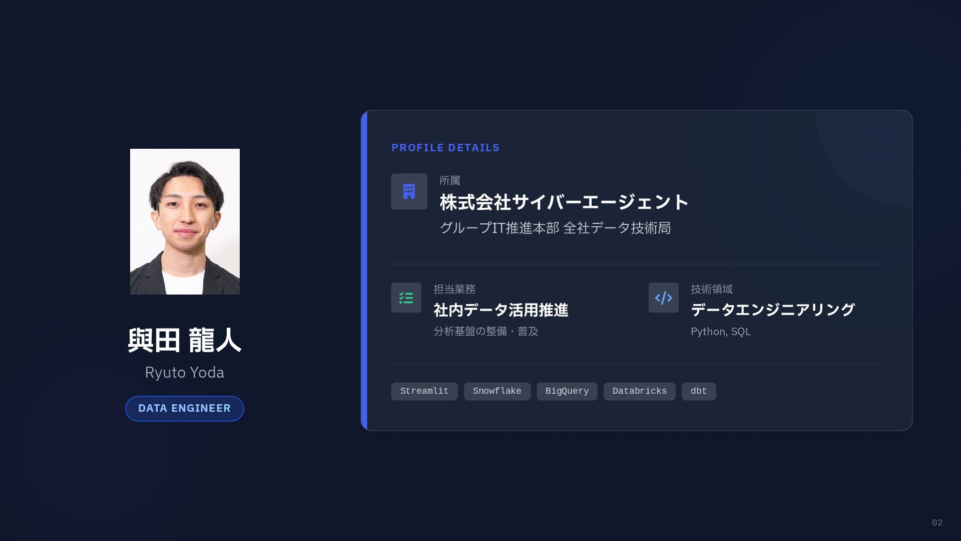
02 與田 龍人 Ryuto Yoda DATA ENGINEER PROFILE DETAILS
所属 株式会社サイバーエージェント グループIT推進本部 全社データ技術局 担当業務 社内データ活用推進 分析基盤の整備・普及 技術領域 データエンジニアリング Python, SQL Streamlit Snowflake BigQuery Databricks dbt
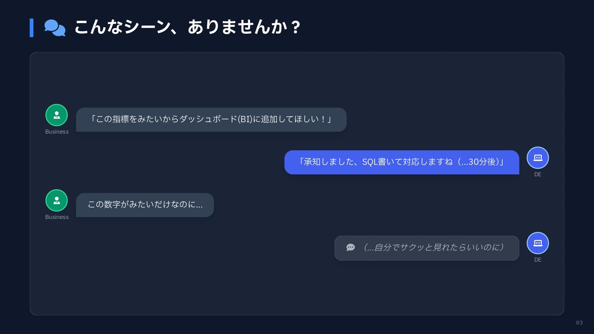
03 こんなシーン、ありませんか? Business DE Business
DE 「この指標をみたいからダッシュボード(BI)に追加してほしい!」 「承知しました、SQL書いて対応しますね(...30分後) 」 この数字がみたいだけなのに... (...自分でサクッと見れたらいいのに)
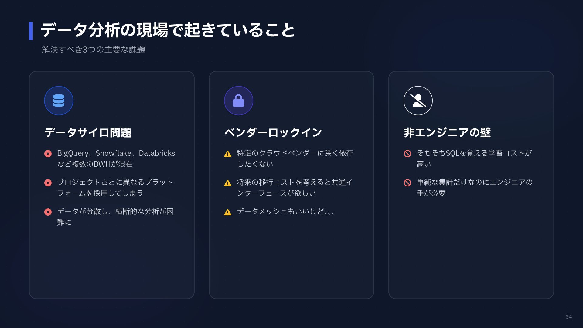
04 データ分析の現場で起きていること 解決すべき3つの主要な課題 データサイロ問題 BigQuery、Snowflake、Databricks など複数のDWHが混在 プロジェクトごとに異なるプラット
フォームを採用してしまう データが分散し、横断的な分析が困 難に ベンダーロックイン 特定のクラウドベンダーに深く依存 したくない 将来の移行コストを考えると共通イ ンターフェースが欲しい データメッシュもいいけど、 、 、 非エンジニアの壁 そもそもSQLを覚える学習コストが 高い 単純な集計だけなのにエンジニアの 手が必要
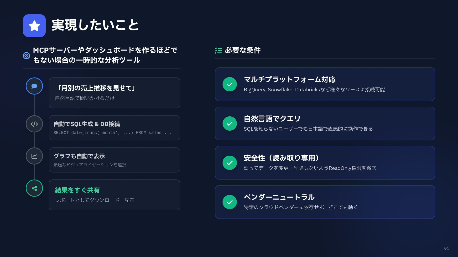
05 実現したいこと MCPサーバーやダッシュボードを作るほどで もない場合の一時的な分析ツール 必要な条件 マルチプラットフォーム対応
BigQuery, Snowflake, Databricksなど様々なソースに接続可能 自然言語でクエリ SQLを知らないユーザーでも日本語で直感的に操作できる 安全性(読み取り専用) 誤ってデータを変更・削除しないようReadOnly権限を徹底 ベンダーニュートラル 特定のクラウドベンダーに依存せず、どこでも動く 「月別の売上推移を見せて」 自然言語で問いかけるだけ 自動でSQL生成 & DB接続 SELECT date_trunc('month', ...) FROM sales ... グラフも自動で表示 最適なビジュアライゼーションを選択 結果をすぐ共有 レポートとしてダウンロード・配布
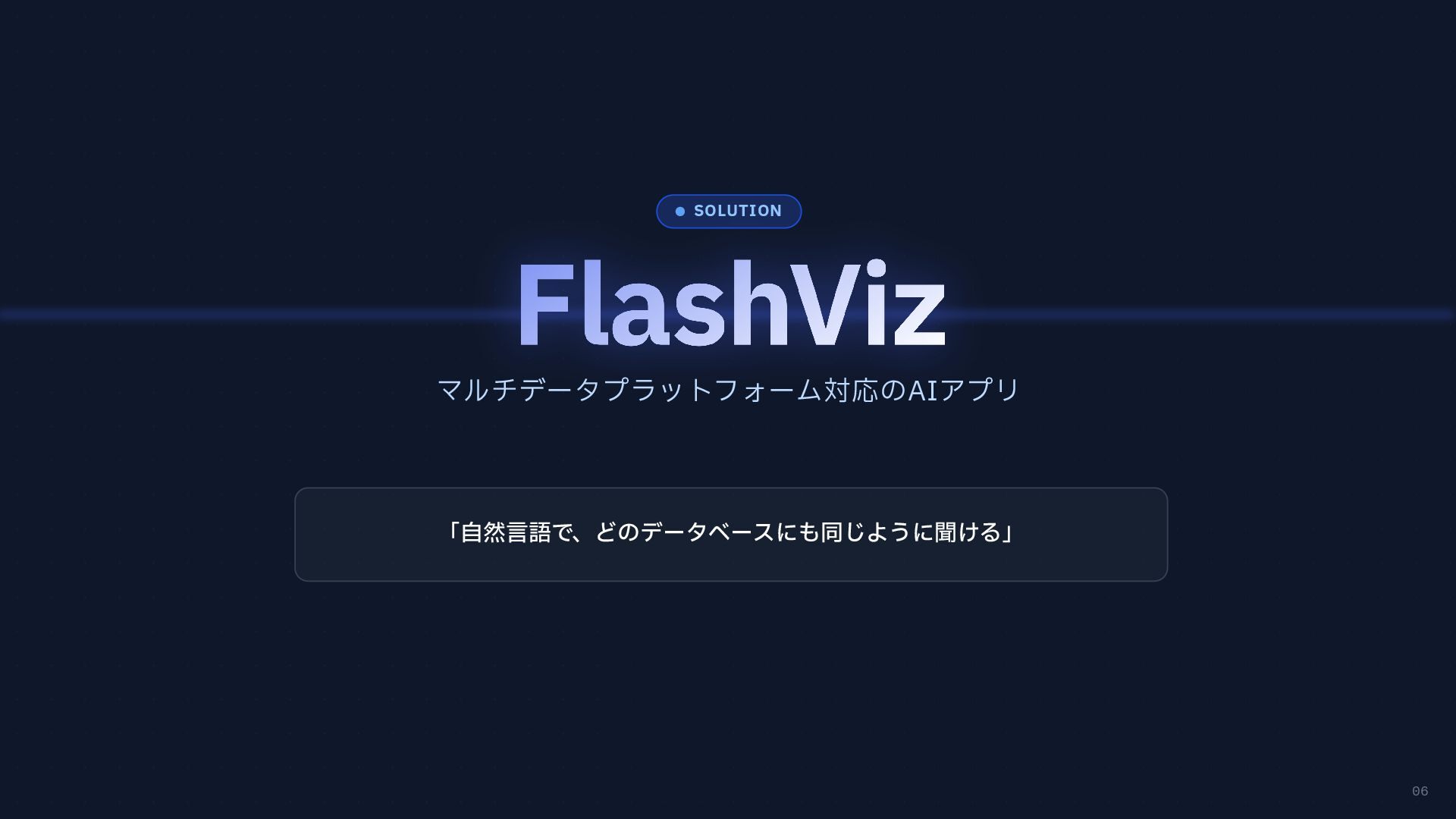
06 SOLUTION マルチデータプラットフォーム対応のAIアプリ 「自然言語で、どのデータベースにも同じように聞ける」
07 デモ 実際の画面を見せながら紹介
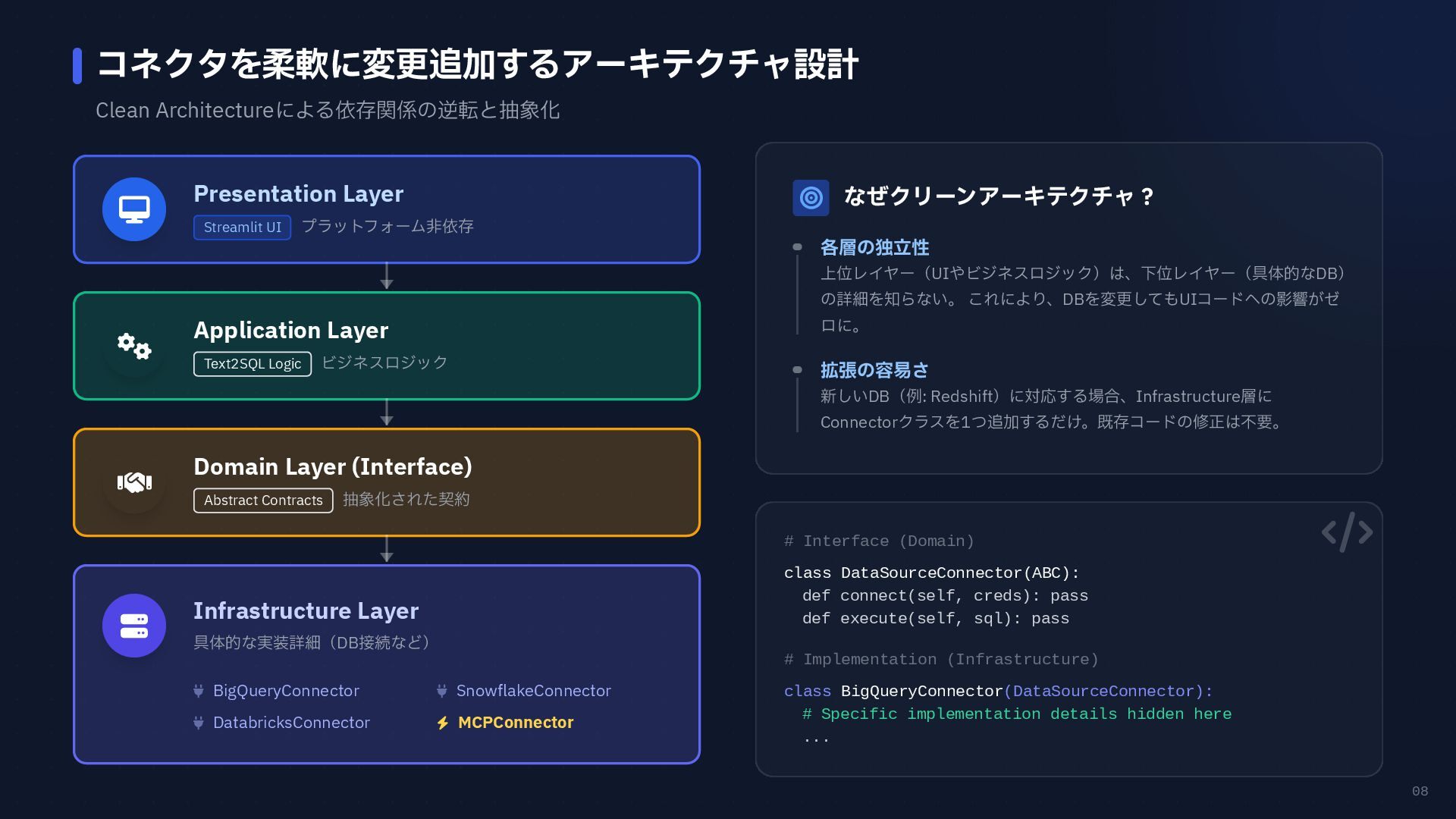
08 コネクタを柔軟に変更追加するアーキテクチャ設計 Clean Architectureによる依存関係の逆転と抽象化 Presentation Layer Streamlit UI プラットフォーム非依存
Application Layer Text2SQL Logic ビジネスロジック Domain Layer (Interface) Abstract Contracts 抽象化された契約 Infrastructure Layer 具体的な実装詳細(DB接続など) BigQueryConnector SnowflakeConnector DatabricksConnector MCPConnector なぜクリーンアーキテクチャ? 各層の独立性 上位レイヤー(UIやビジネスロジック)は、下位レイヤー(具体的なDB) の詳細を知らない。 これにより、DBを変更してもUIコードへの影響がゼ ロに。 拡張の容易さ 新しいDB(例: Redshift)に対応する場合、Infrastructure層に Connectorクラスを1つ追加するだけ。既存コードの修正は不要。 # Interface (Domain) class DataSourceConnector(ABC): def connect(self, creds): pass def execute(self, sql): pass # Implementation (Infrastructure) class BigQueryConnector(DataSourceConnector): # Specific implementation details hidden here ...
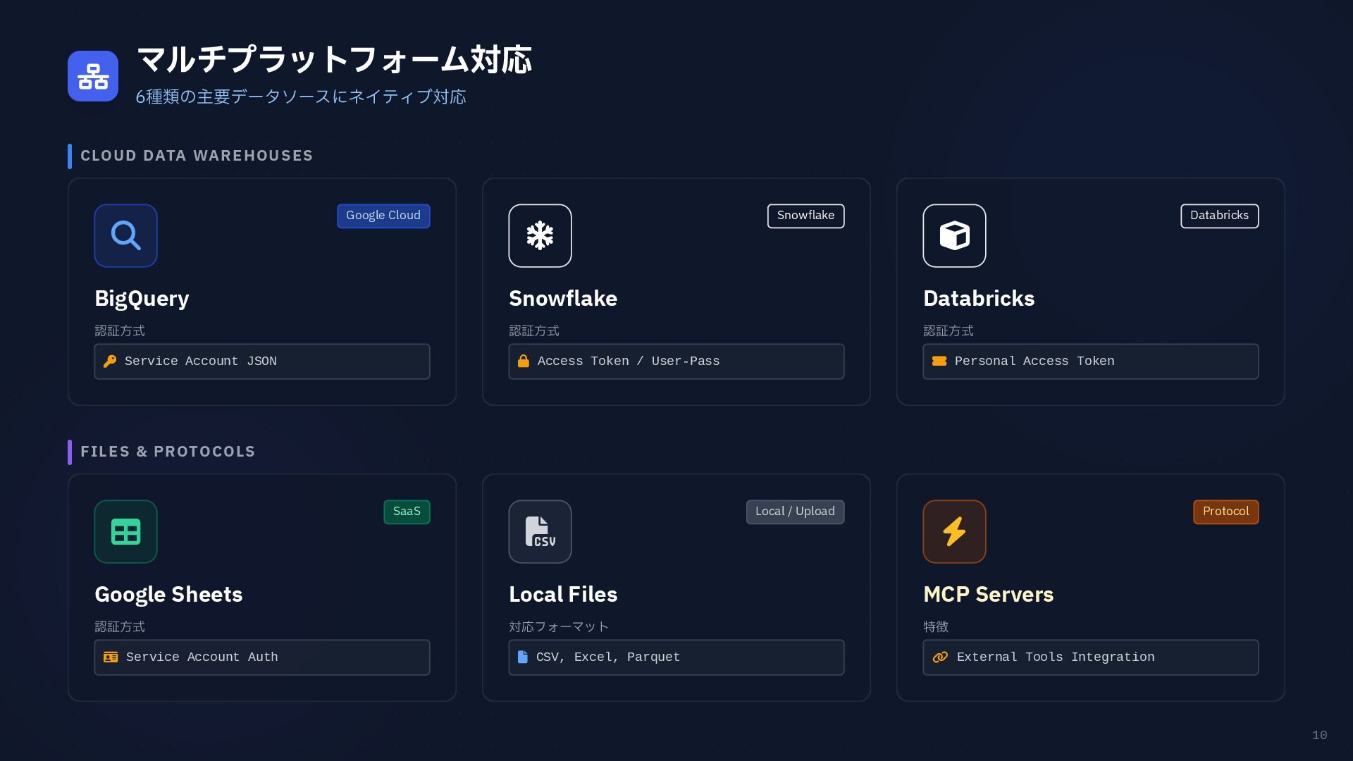
10 マルチプラットフォーム対応 6種類の主要データソースにネイティブ対応 CLOUD DATA WAREHOUSES FILES & PROTOCOLS
Google Cloud BigQuery 認証方式 Service Account JSON Snowflake Snowflake 認証方式 Access Token / User-Pass Databricks Databricks 認証方式 Personal Access Token SaaS Google Sheets 認証方式 Service Account Auth Local / Upload Local Files 対応フォーマット CSV, Excel, Parquet Protocol MCP Servers 特徴 External Tools Integration
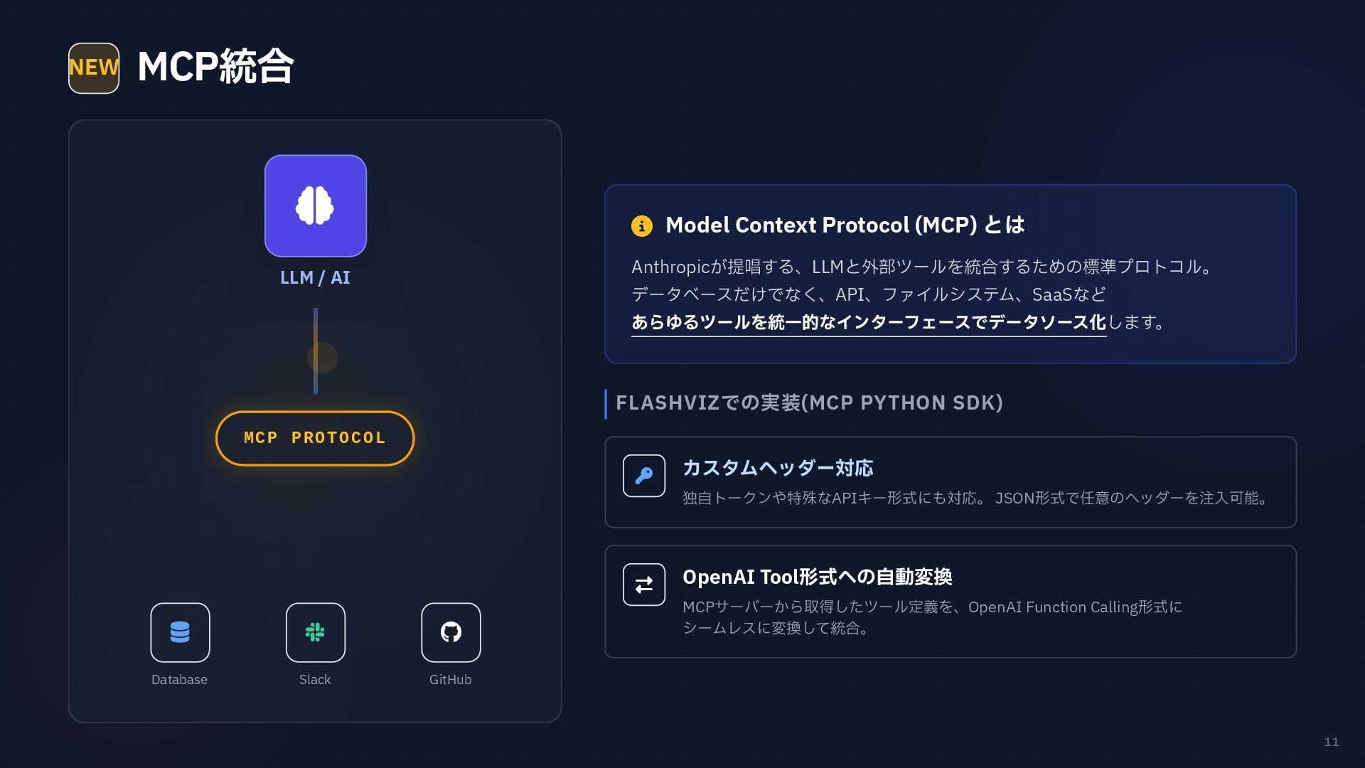
11 NEW MCP統合 FLASHVIZでの実装(MCP PYTHON SDK) カスタムヘッダー対応 独自トークンや特殊なAPIキー形式にも対応。 JSON形式で任意のヘッダーを注入可能。
OpenAI Tool形式への自動変換 MCPサーバーから取得したツール定義を、OpenAI Function Calling形式に シームレスに変換して統合。 LLM / AI MCP PROTOCOL Database Slack GitHub Model Context Protocol (MCP) とは Anthropicが提唱する、LLMと外部ツールを統合するための標準プロトコル。 データベースだけでなく、API、ファイルシステム、SaaSなど あらゆるツールを統一的なインターフェースでデータソース化します。
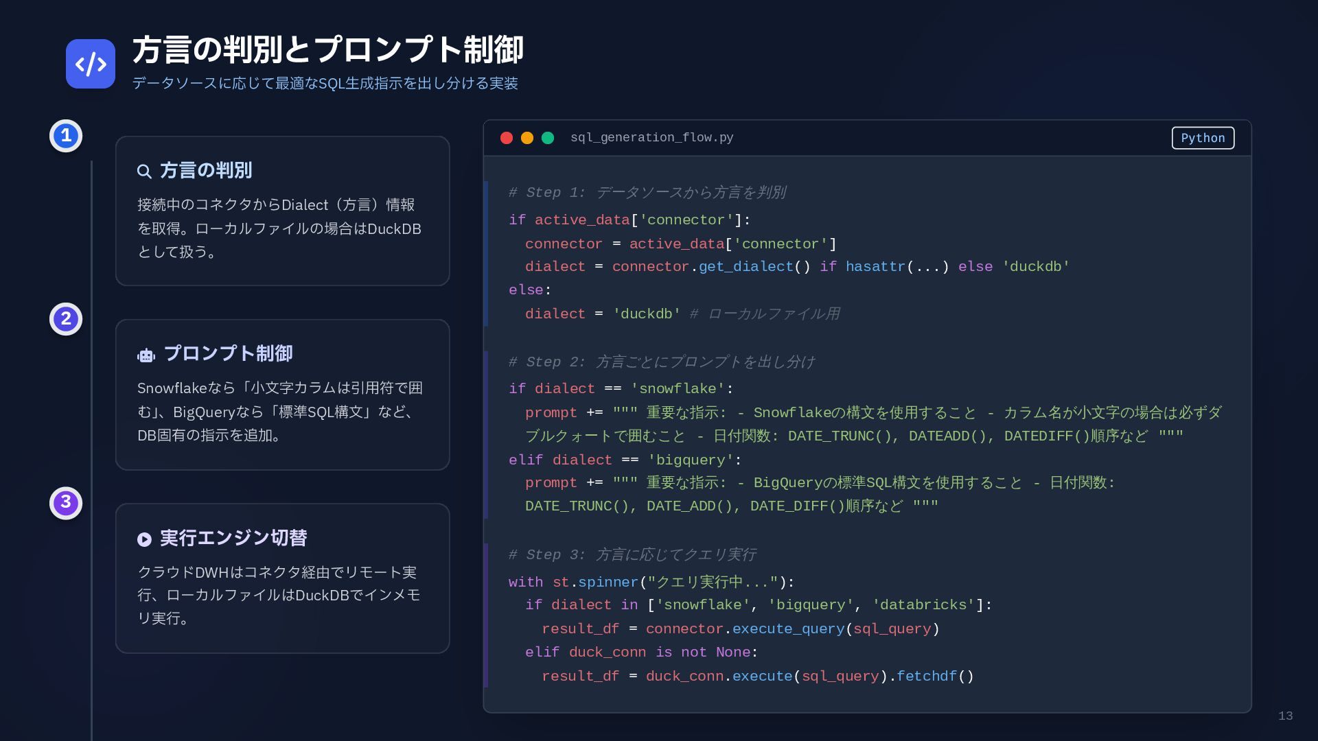
13 方言の判別とプロンプト制御 データソースに応じて最適なSQL生成指示を出し分ける実装 方言の判別 接続中のコネクタからDialect(方言)情報 を取得。ローカルファイルの場合はDuckDB として扱う。
プロンプト制御 Snowflakeなら「小文字カラムは引用符で囲 む」 、BigQueryなら「標準SQL構文」など、 DB固有の指示を追加。 実行エンジン切替 クラウドDWHはコネクタ経由でリモート実 行、ローカルファイルはDuckDBでインメモ リ実行。 sql_generation_flow.py Python # Step 1: データソースから方言を判別 if active_data['connector']: connector = active_data['connector'] dialect = connector.get_dialect() if hasattr(...) else 'duckdb' else: dialect = 'duckdb' # ローカルファイル用 # Step 2: 方言ごとにプロンプトを出し分け if dialect == 'snowflake': prompt += """ 重要な指示: - Snowflakeの構文を使用すること - カラム名が小文字の場合は必ずダ ブルクォートで囲むこと - 日付関数: DATE_TRUNC(), DATEADD(), DATEDIFF()順序など """ elif dialect == 'bigquery': prompt += """ 重要な指示: - BigQueryの標準SQL構文を使用すること - 日付関数: DATE_TRUNC(), DATE_ADD(), DATE_DIFF()順序など """ # Step 3: 方言に応じてクエリ実行 with st.spinner("クエリ実行中..."): if dialect in ['snowflake', 'bigquery', 'databricks']: result_df = connector.execute_query(sql_query) elif duck_conn is not None: result_df = duck_conn.execute(sql_query).fetchdf() 1 2 3
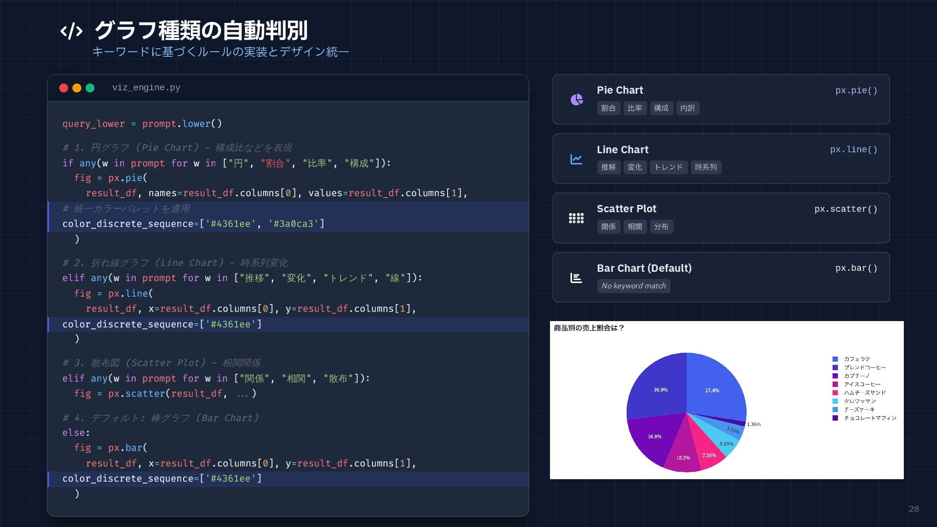
28 グラフ種類の自動判別 キーワードに基づくルールの実装とデザイン統一 viz_engine.py query_lower = prompt.lower() # 1.
円グラフ (Pie Chart) - 構成比などを表現 if any(w in prompt for w in ["円", "割合", "比率", "構成"]): fig = px.pie( result_df, names=result_df.columns[0], values=result_df.columns[1], # 統一カラーパレットを適用 color_discrete_sequence=['#4361ee', '#3a0ca3'] ) # 2. 折れ線グラフ (Line Chart) - 時系列変化 elif any(w in prompt for w in ["推移", "変化", "トレンド", "線"]): fig = px.line( result_df, x=result_df.columns[0], y=result_df.columns[1], color_discrete_sequence=['#4361ee'] ) # 3. 散布図 (Scatter Plot) - 相関関係 elif any(w in prompt for w in ["関係", "相関", "散布"]): fig = px.scatter(result_df, ...) # 4. デフォルト: 棒グラフ (Bar Chart) else: fig = px.bar( result_df, x=result_df.columns[0], y=result_df.columns[1], color_discrete_sequence=['#4361ee'] ) Pie Chart px.pie() 割合 比率 構成 内訳 Line Chart px.line() 推移 変化 トレンド 時系列 Scatter Plot px.scatter() 関係 相関 分布 Bar Chart (Default) px.bar() No keyword match
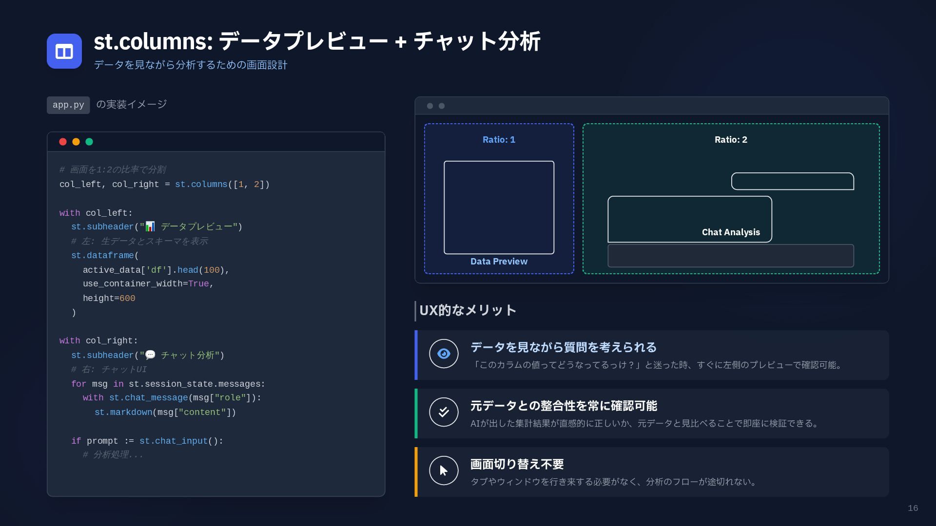
16 st.columns: データプレビュー + チャット分析 データを見ながら分析するための画面設計 app.py の実装イメージ #
画面を1:2の比率で分割 col_left, col_right = st.columns([1, 2]) with col_left: st.subheader(" 📊 データプレビュー") # 左: 生データとスキーマを表示 st.dataframe( active_data['df'].head(100), use_container_width=True, height=600 ) with col_right: st.subheader(" 💬 チャット分析") # 右: チャットUI for msg in st.session_state.messages: with st.chat_message(msg["role"]): st.markdown(msg["content"]) if prompt := st.chat_input(): # 分析処理... UX的なメリット データを見ながら質問を考えられる 「このカラムの値ってどうなってるっけ?」と迷った時、すぐに左側のプレビューで確認可能。 元データとの整合性を常に確認可能 AIが出した集計結果が直感的に正しいか、元データと見比べることで即座に検証できる。 画面切り替え不要 タブやウィンドウを行き来する必要がなく、分析のフローが途切れない。 Ratio: 1 Data Preview Ratio: 2 Chat Analysis
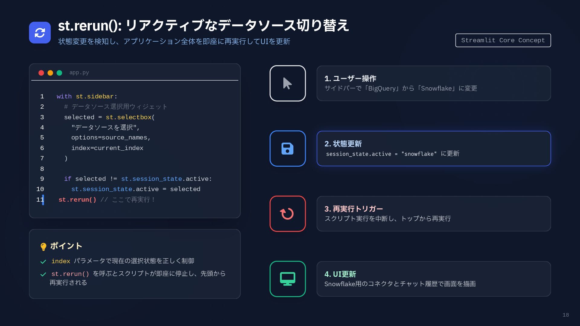
18 st.rerun(): リアクティブなデータソース切り替え 状態変更を検知し、アプリケーション全体を即座に再実行してUIを更新 Streamlit Core Concept app.py with
st.sidebar: # データソース選択用ウィジェット selected = st.selectbox( "データソースを選択", options=source_names, index=current_index ) if selected != st.session_state.active: st.session_state.active = selected st.rerun() // ここで再実行! 1 2 3 4 5 6 7 8 9 10 11 ポイント index パラメータで現在の選択状態を正しく制御 st.rerun() を呼ぶとスクリプトが即座に停止し、先頭から 再実行される 1. ユーザー操作 サイドバーで「BigQuery」から「Snowflake」に変更 2. 状態更新 session_state.active = "snowflake" に更新 3. 再実行トリガー スクリプト実行を中断し、トップから再実行 4. UI更新 Snowflake用のコネクタとチャット履歴で画面を描画
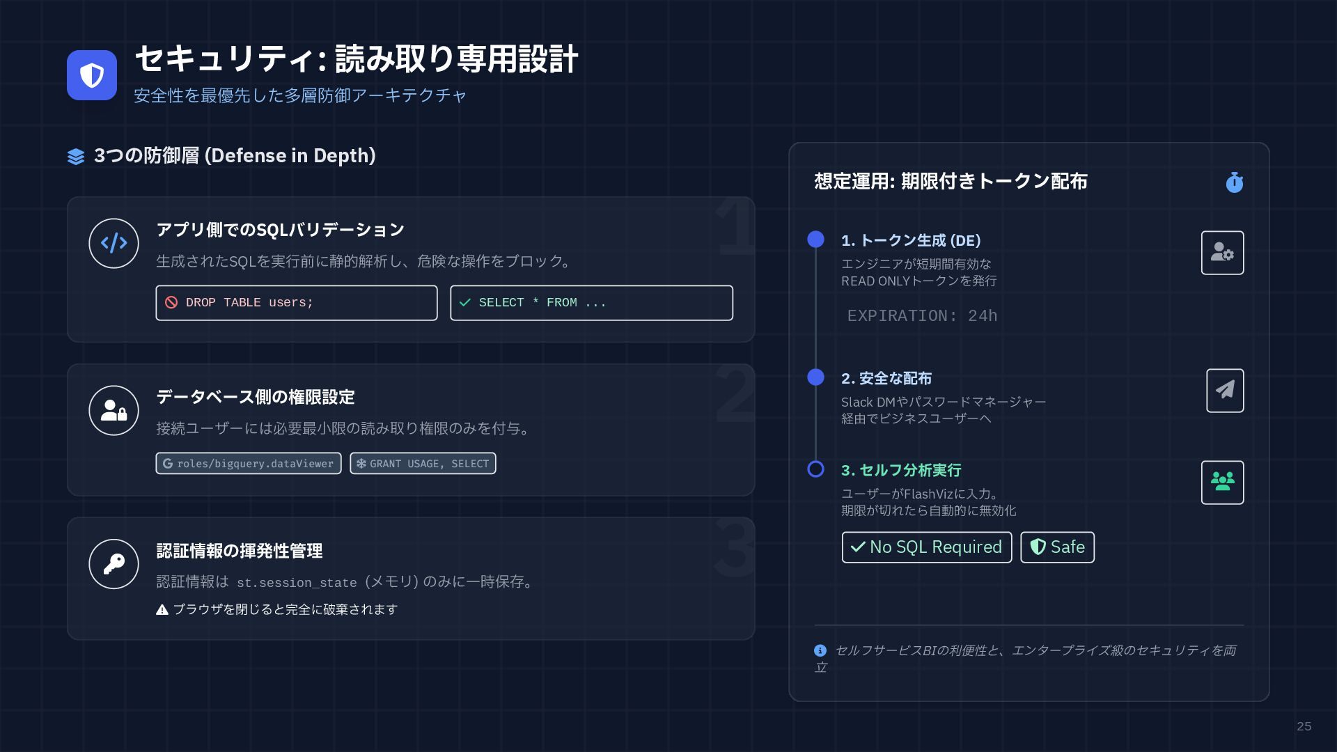
25 セキュリティ: 読み取り専用設計 安全性を最優先した多層防御アーキテクチャ 3つの防御層 (Defense in Depth)
アプリ側でのSQLバリデーション 生成されたSQLを実行前に静的解析し、危険な操作をブロック。 DROP TABLE users; SELECT * FROM ... 1 データベース側の権限設定 接続ユーザーには必要最小限の読み取り権限のみを付与。 roles/bigquery.dataViewer GRANT USAGE, SELECT 2 認証情報の揮発性管理 認証情報は st.session_state (メモリ) のみに一時保存。 ブラウザを閉じると完全に破棄されます 3 想定運用: 期限付きトークン配布 セルフサービスBIの利便性と、エンタープライズ級のセキュリティを両 立 1. トークン生成 (DE) エンジニアが短期間有効な READ ONLYトークンを発行 EXPIRATION: 24h 2. 安全な配布 Slack DMやパスワードマネージャー 経由でビジネスユーザーへ 3. セルフ分析実行 ユーザーがFlashVizに入力。 期限が切れたら自動的に無効化 No SQL Required Safe
LEAD TIME Days → Minutes ENGINEER RESOURCE Minimally
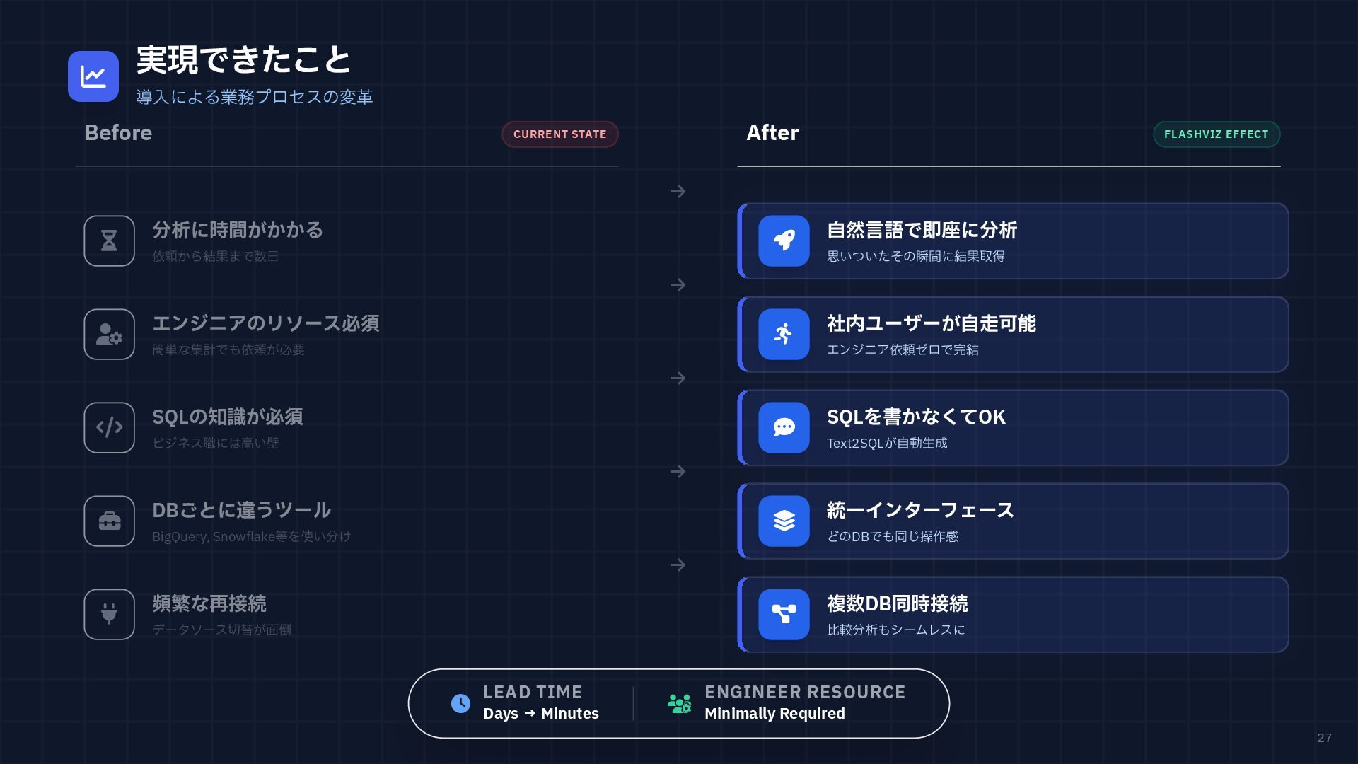
Required 27 実現できたこと 導入による業務プロセスの変革 Before CURRENT STATE After FLASHVIZ EFFECT 分析に時間がかかる 依頼から結果まで数日 エンジニアのリソース必須 簡単な集計でも依頼が必要 SQLの知識が必須 ビジネス職には高い壁 DBごとに違うツール BigQuery, Snowflake等を使い分け 頻繁な再接続 データソース切替が面倒 自然言語で即座に分析 思いついたその瞬間に結果取得 社内ユーザーが自走可能 エンジニア依頼ゼロで完結 SQLを書かなくてOK Text2SQLが自動生成 統一インターフェース どのDBでも同じ操作感 複数DB同時接続 比較分析もシームレスに
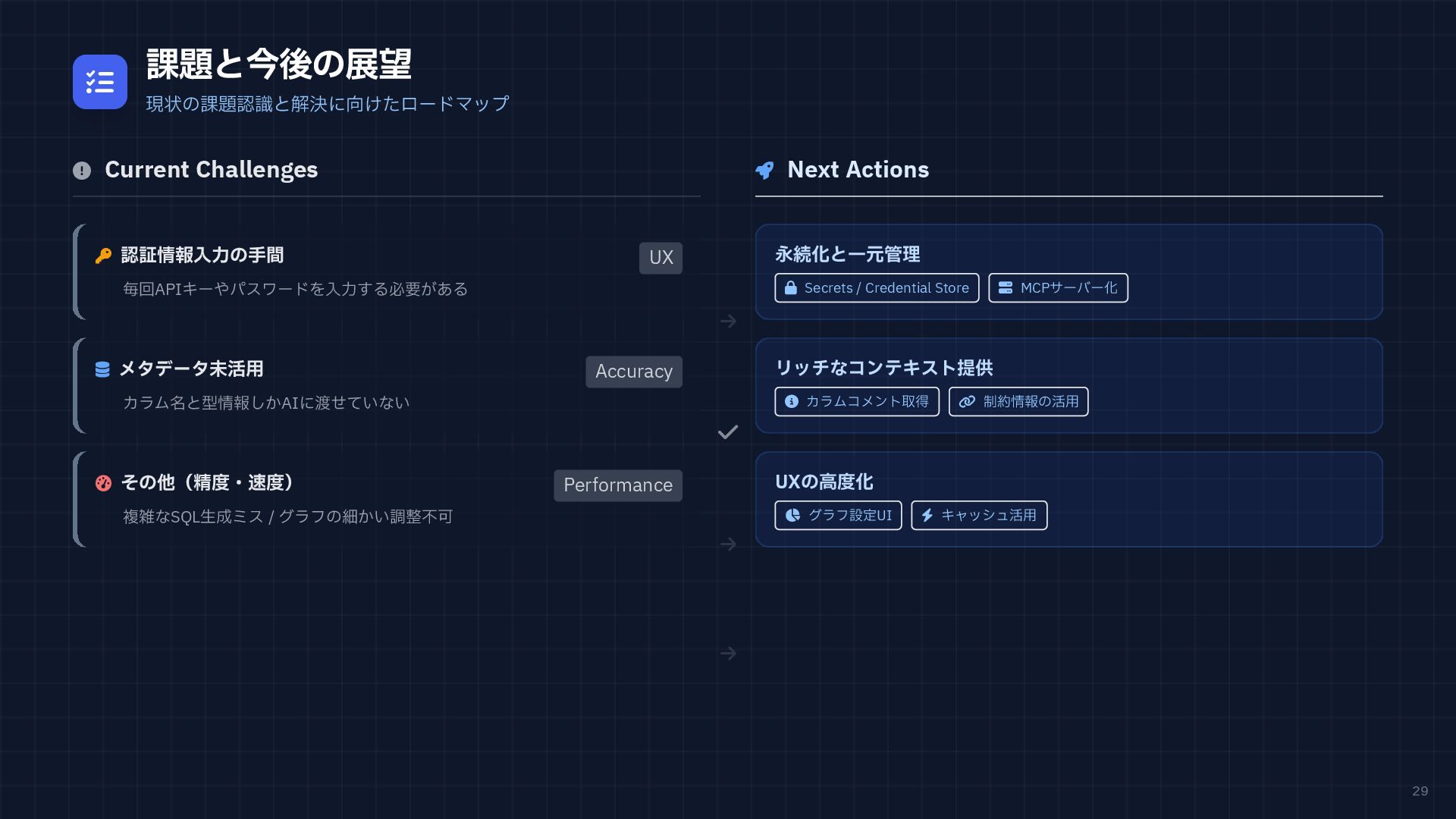
29 課題と今後の展望 現状の課題認識と解決に向けたロードマップ Current
Challenges 認証情報入力の手間 UX 毎回APIキーやパスワードを入力する必要がある メタデータ未活用 Accuracy カラム名と型情報しかAIに渡せていない その他(精度・速度) Performance 複雑なSQL生成ミス / グラフの細かい調整不可 Next Actions 永続化と一元管理 Secrets / Credential Store MCPサーバー化 リッチなコンテキスト提供 カラムコメント取得 制約情報の活用 UXの高度化 グラフ設定UI キャッシュ活用
ご清聴ありがとう ご清聴ありがとう ございました ございました Q &
A / FEEDBACK WELCOME Streamlit Meetup Tokyo LT | 2026.01.25 | FlashViz Project