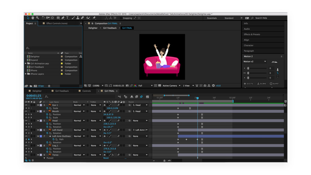
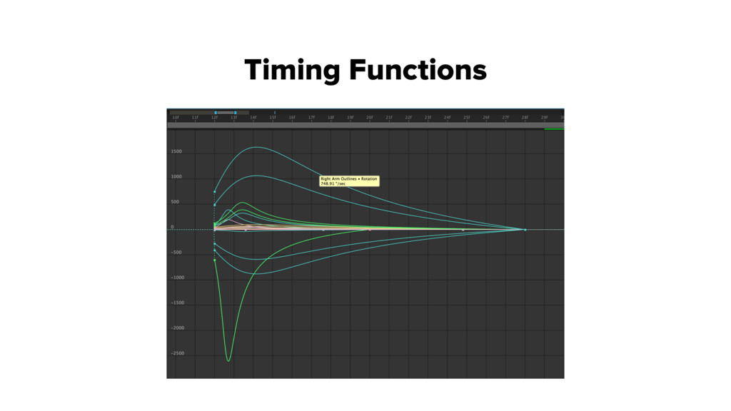
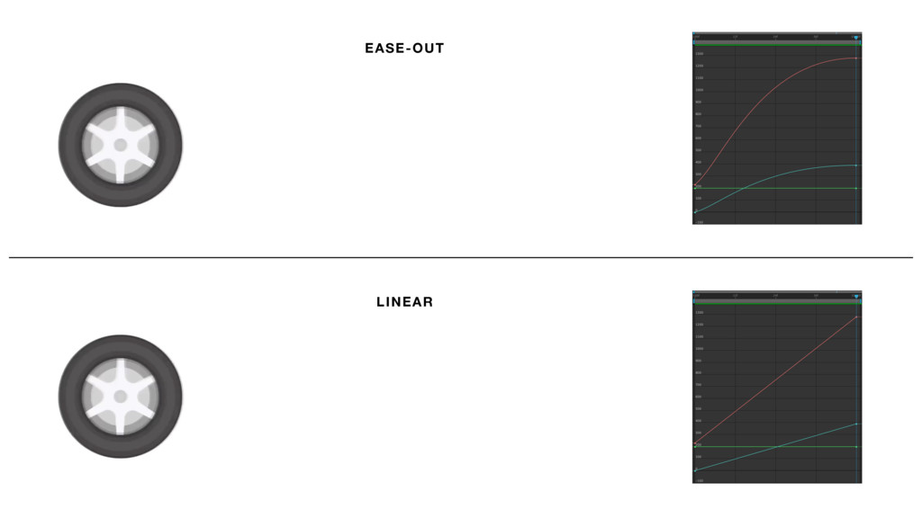
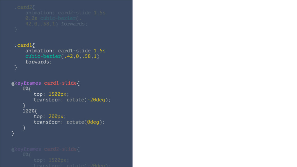
Here is the presentation that I used for my talk on UX Choreography at Metarefresh 2016, organised by HasGeek. The actual Keynote file had many embedded video animations. Unfortunately, Speaker Deck does not support Keynote files and hence I had to convert it to PDF, losing all the animations in the process. Please check out my work on https://dribbble.com/saptarshipr to get a flavour of the animations.
 nbkouhou
 takanorip
 koyaman
 nagata03
 sony
sony
 nttcom
 root_recruit
 garyuten
 yuri_ohashi
 vivion
 hypebeans
 mhand01
 pedronauck
 bkeepers
 aleyda
 swwweet
 jdejongh
 matthewcrist
 ipullrank
 thirion
 reverentgeek
 nonsquared
 katarinadahlin
 csswizardry