Upgrade to Pro — share decks privately, control downloads, hide ads and more …

Infographics pt.2: „The magnificent seven“ – DOs and DON’Ts for the seven most used infographics

Tim Karsko
October 20, 2016
110

Infographics pt.2: „The magnificent seven“ – DOs and DON’Ts for the seven most used infographics

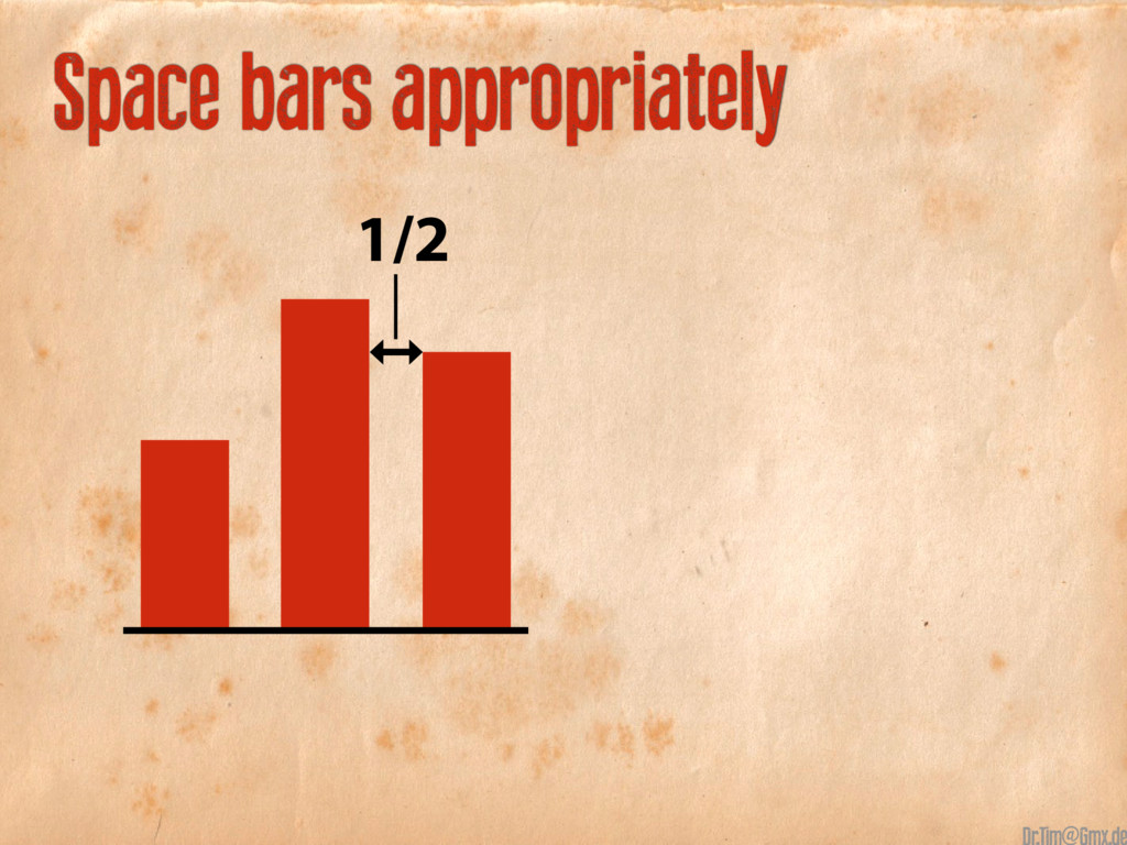
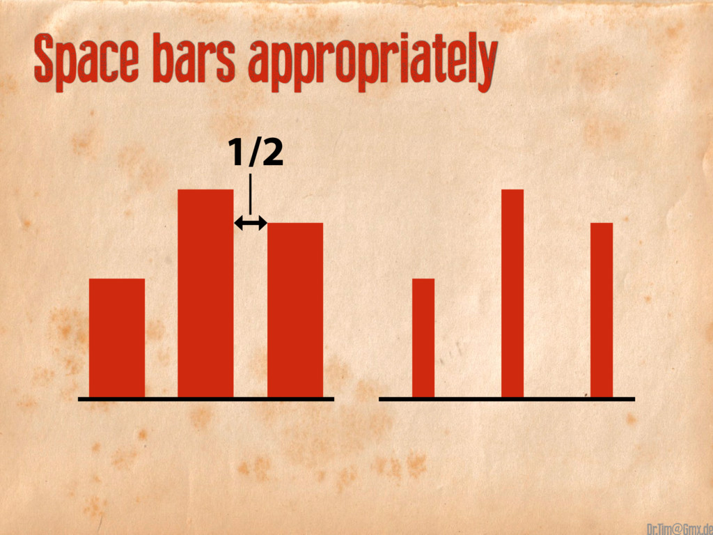
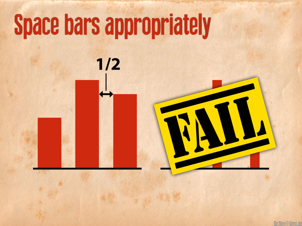
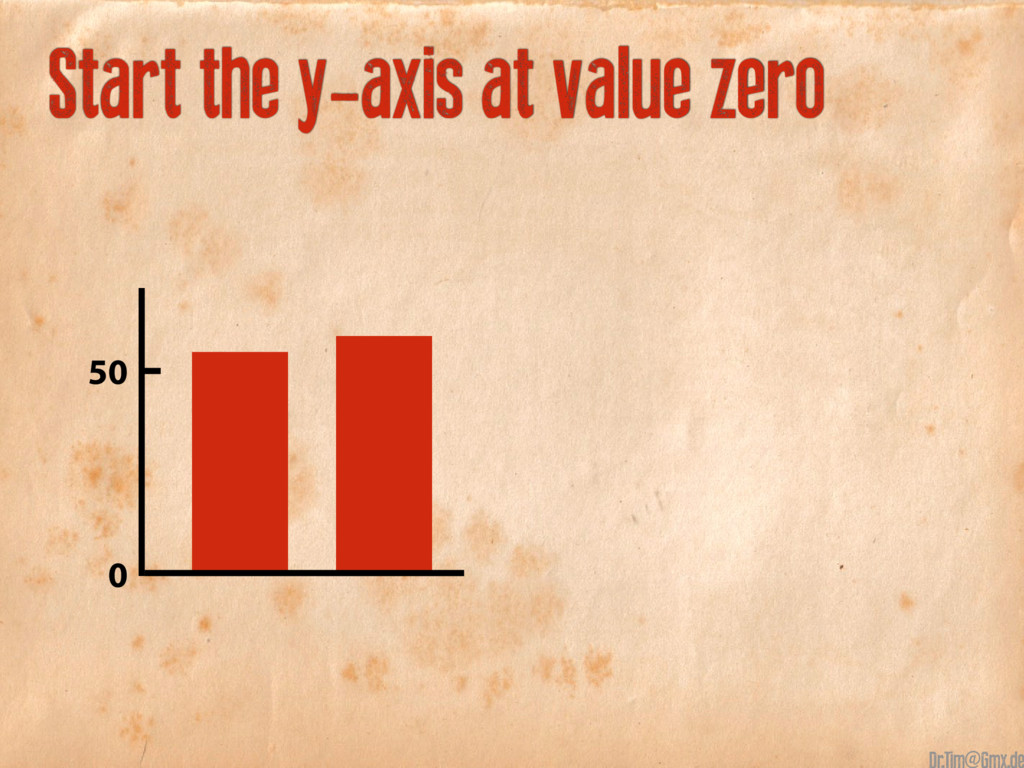
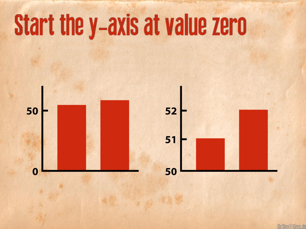
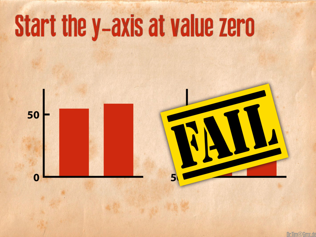
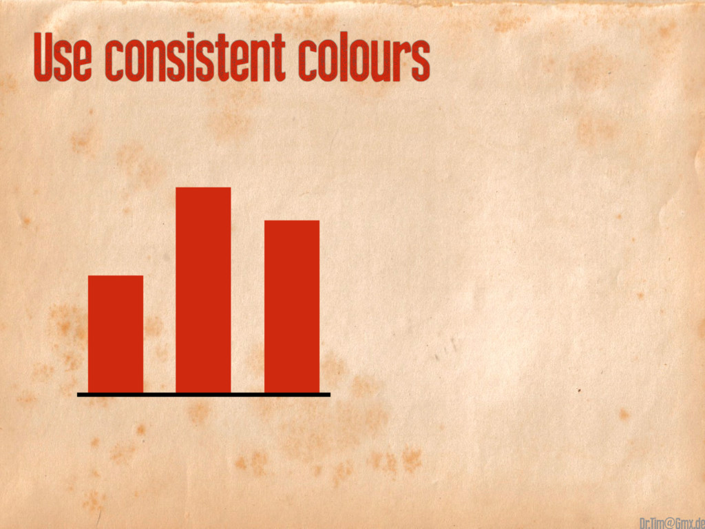
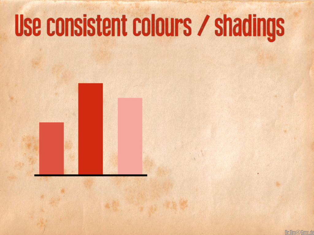
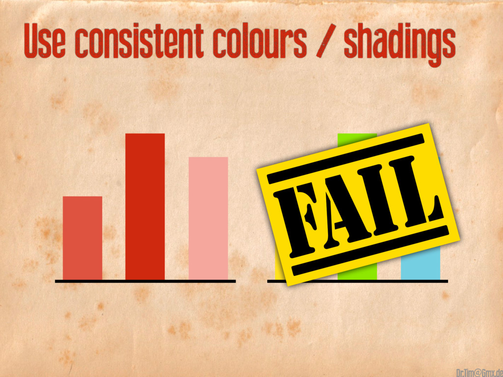
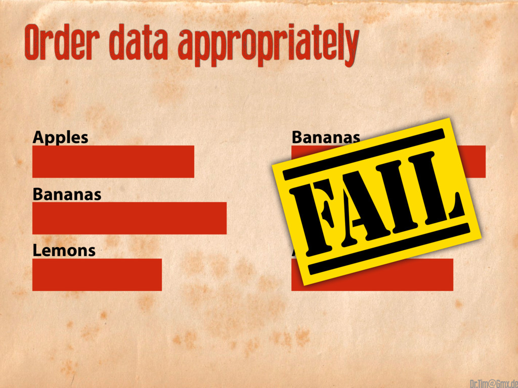
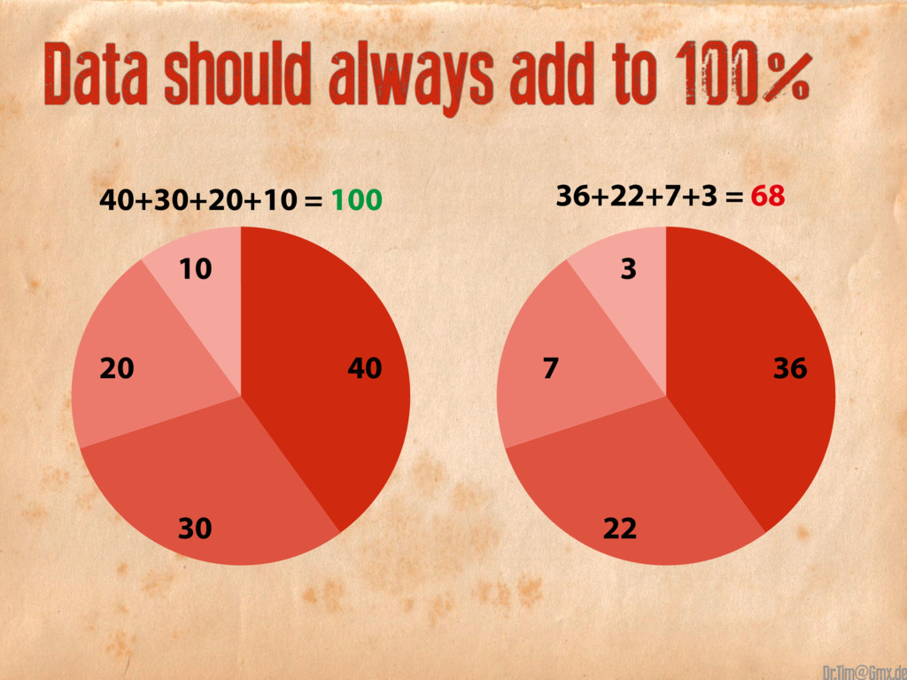
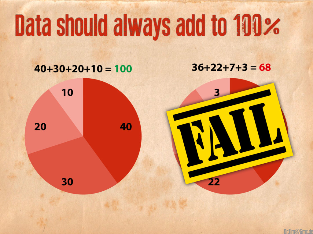
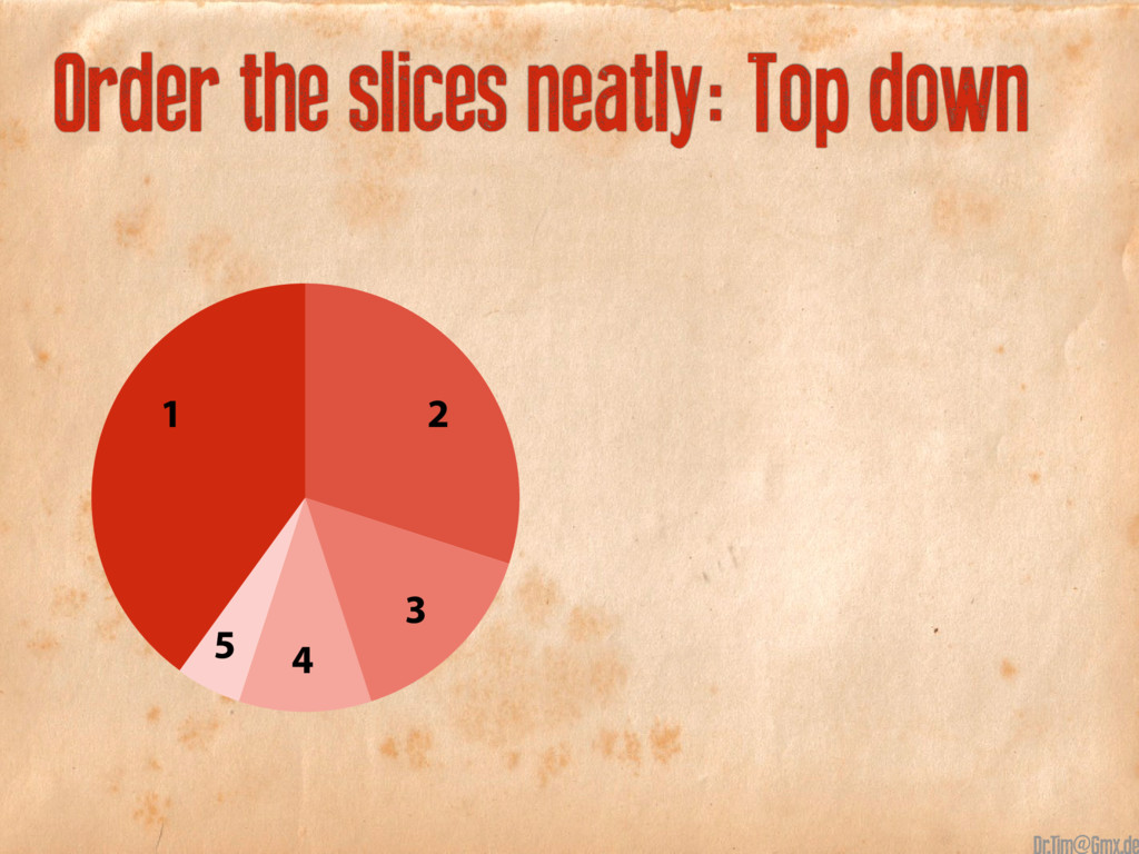
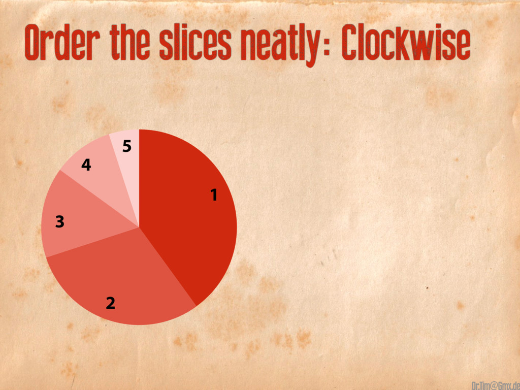
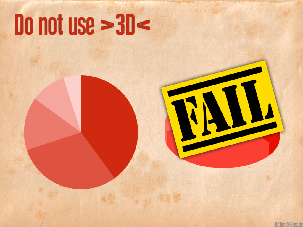
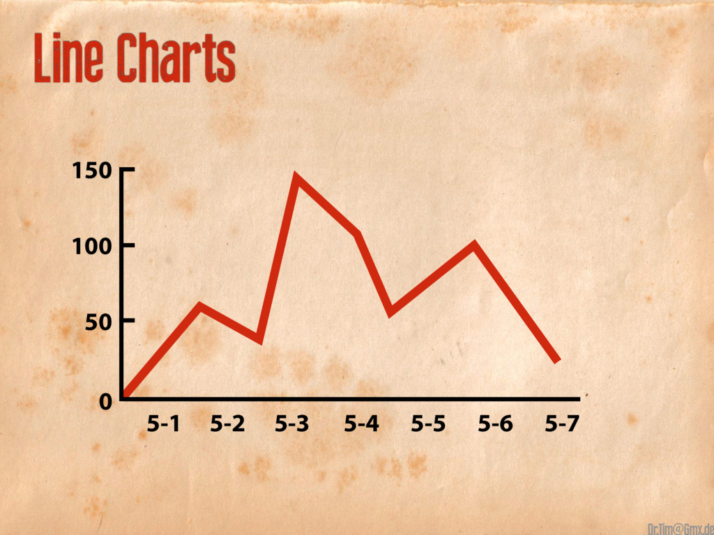
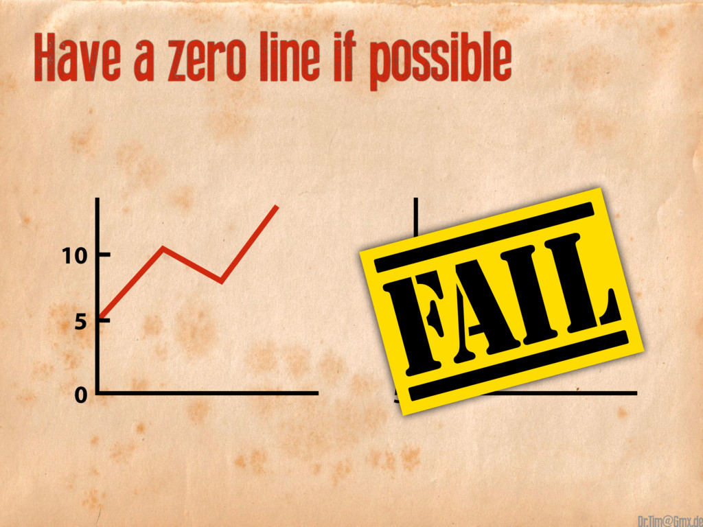
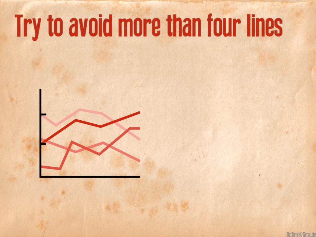
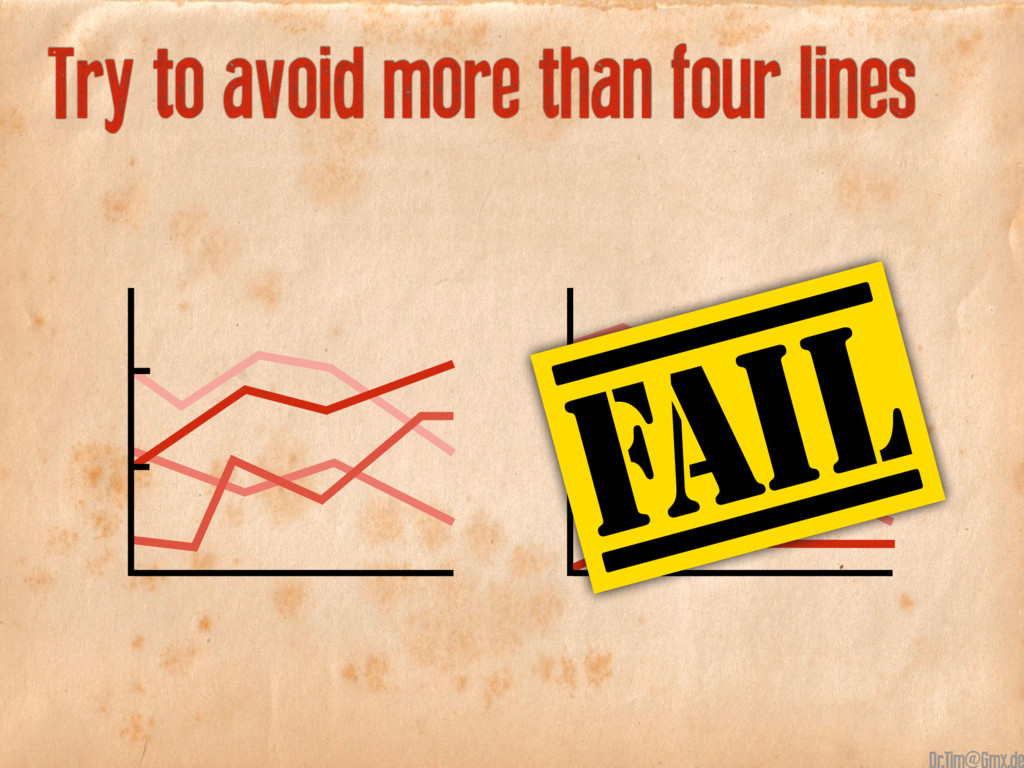
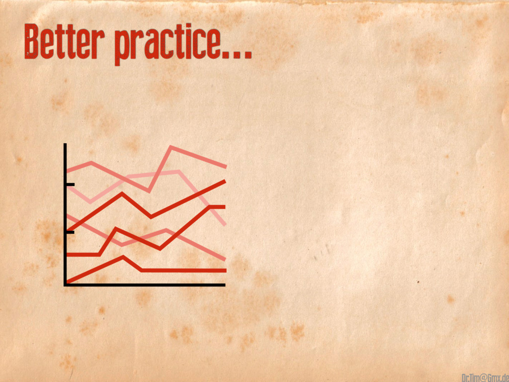
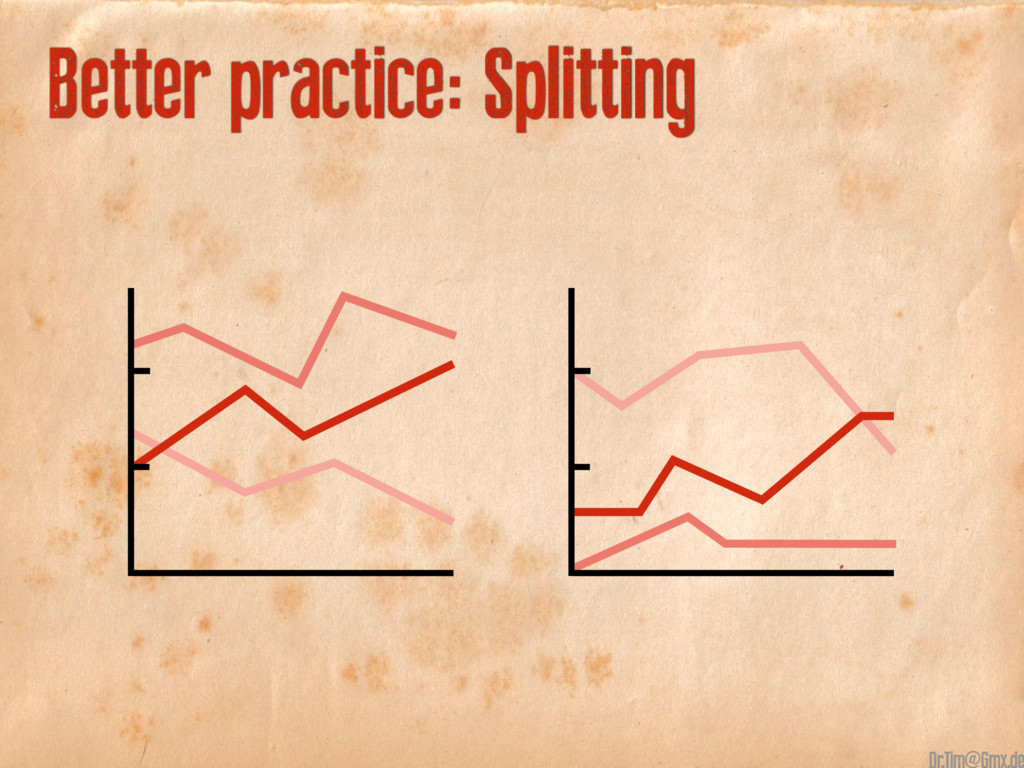
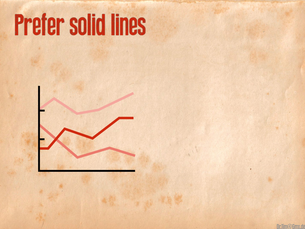
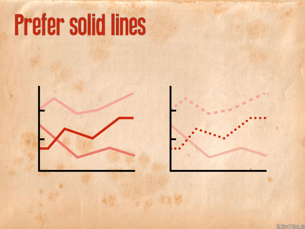
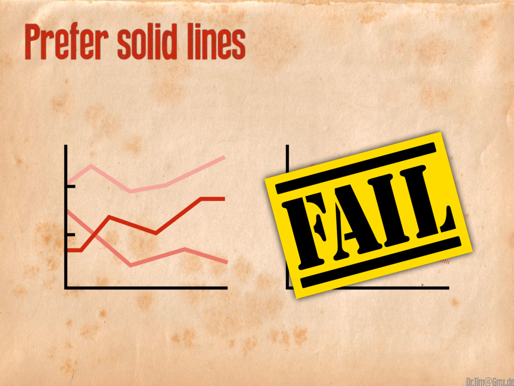
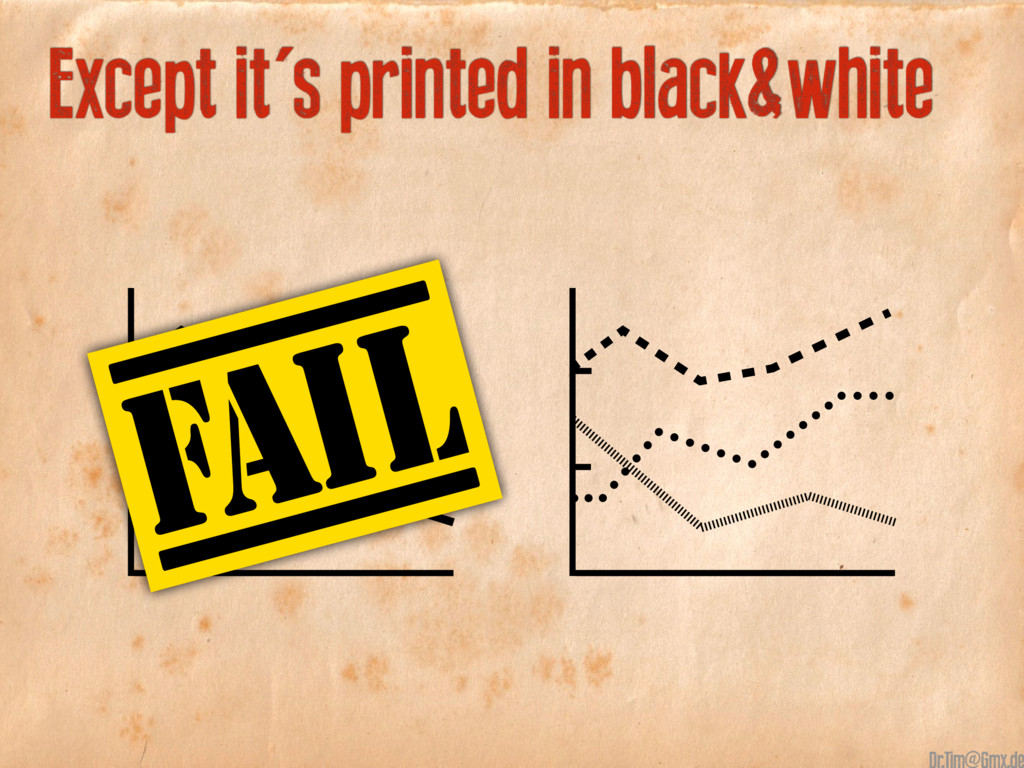
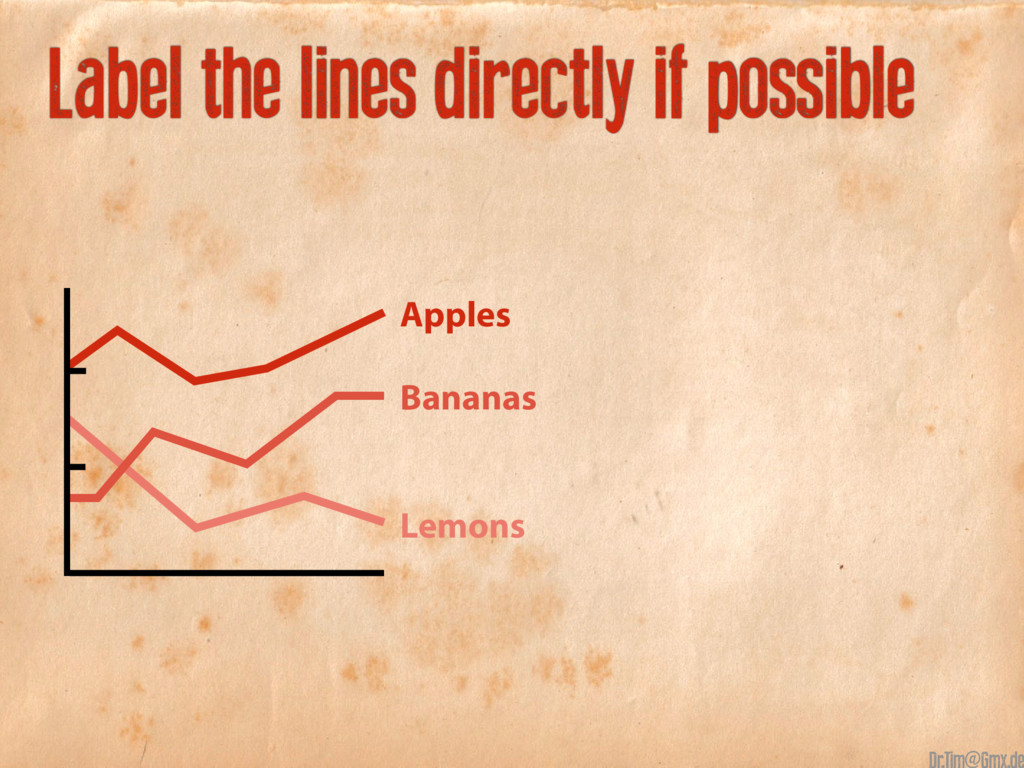
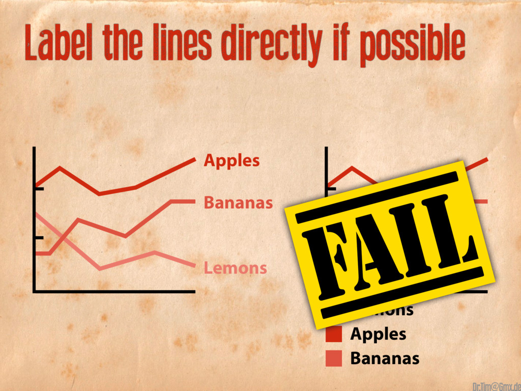
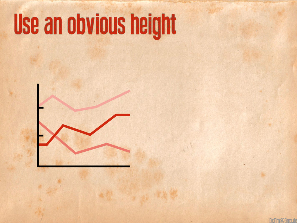
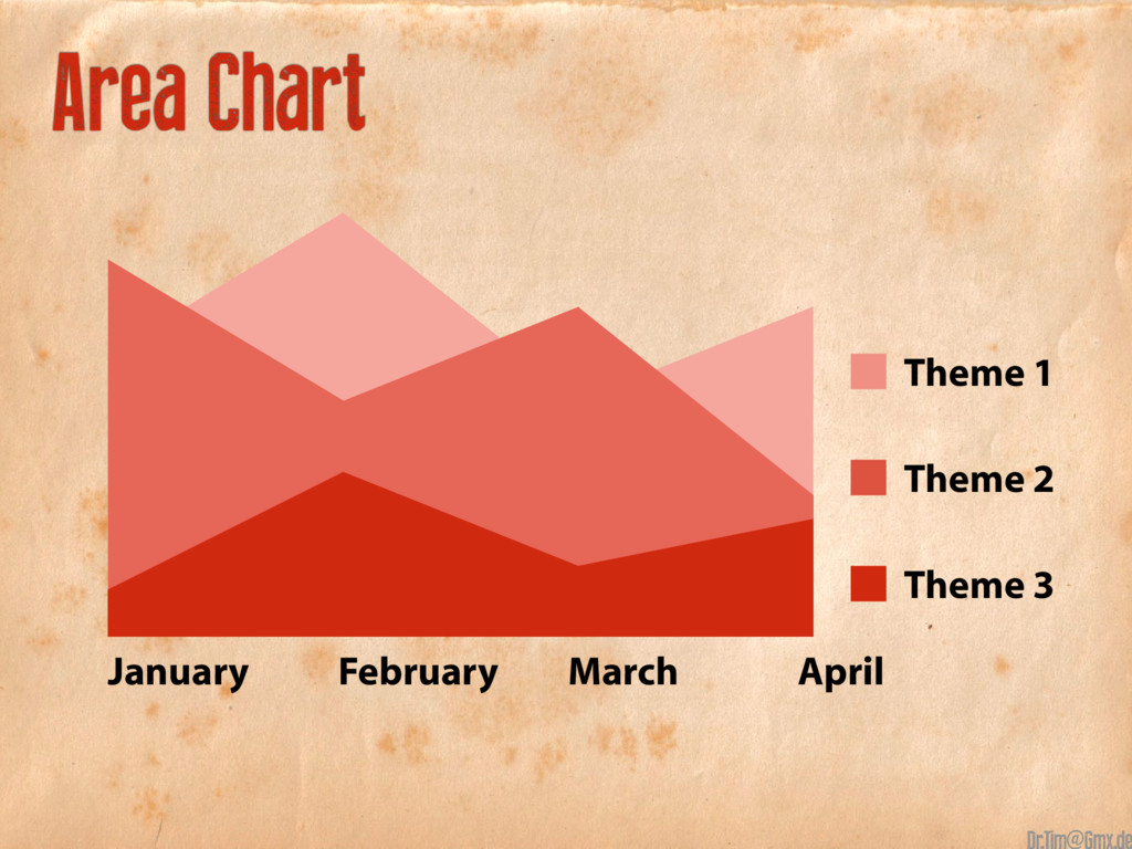
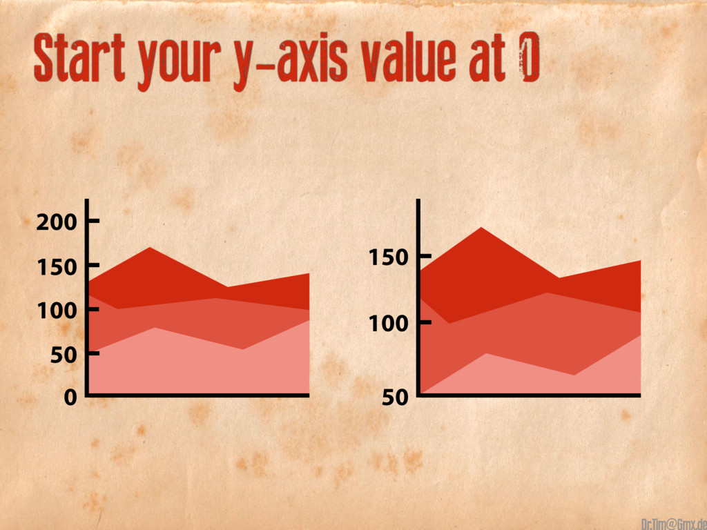
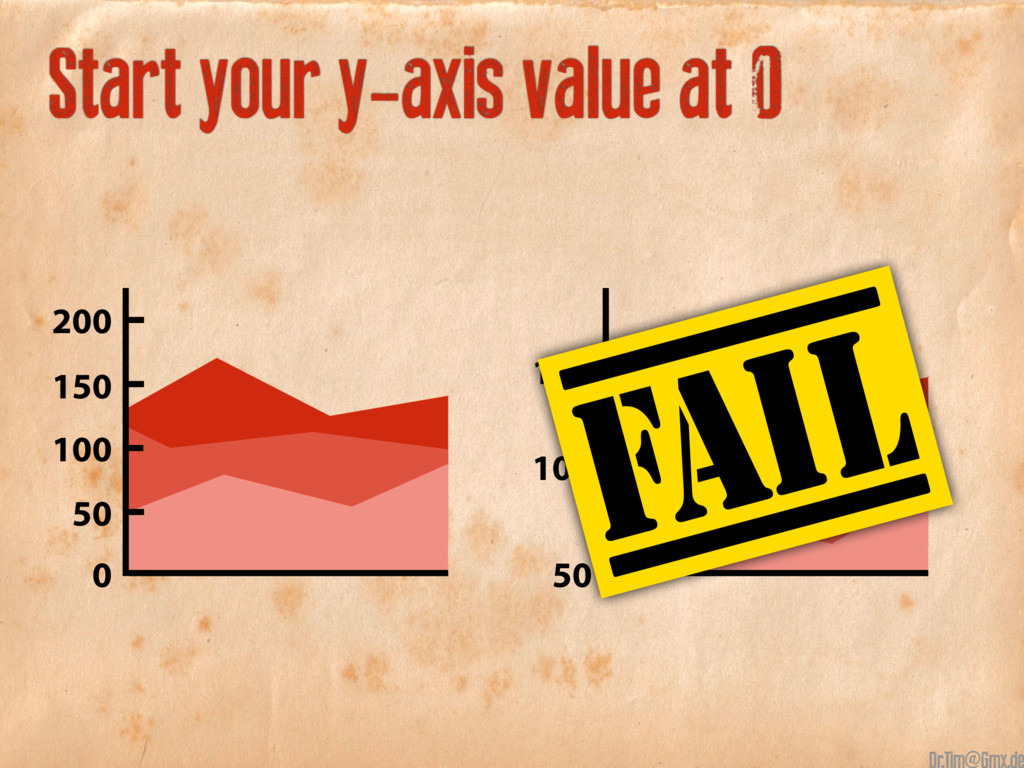
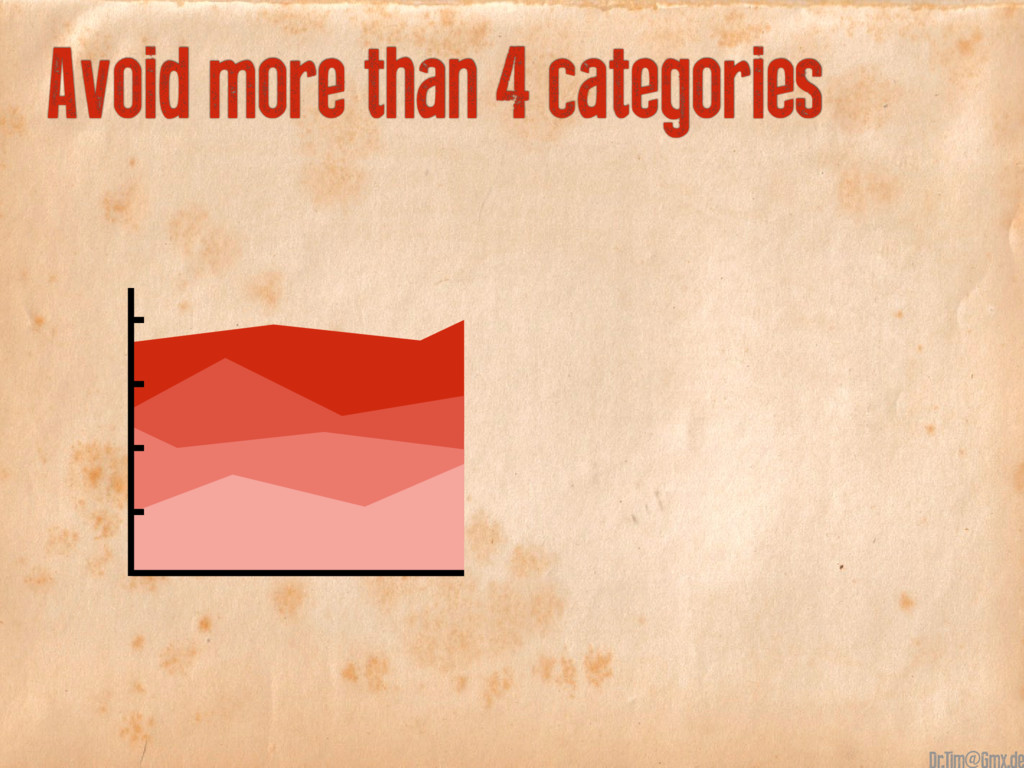
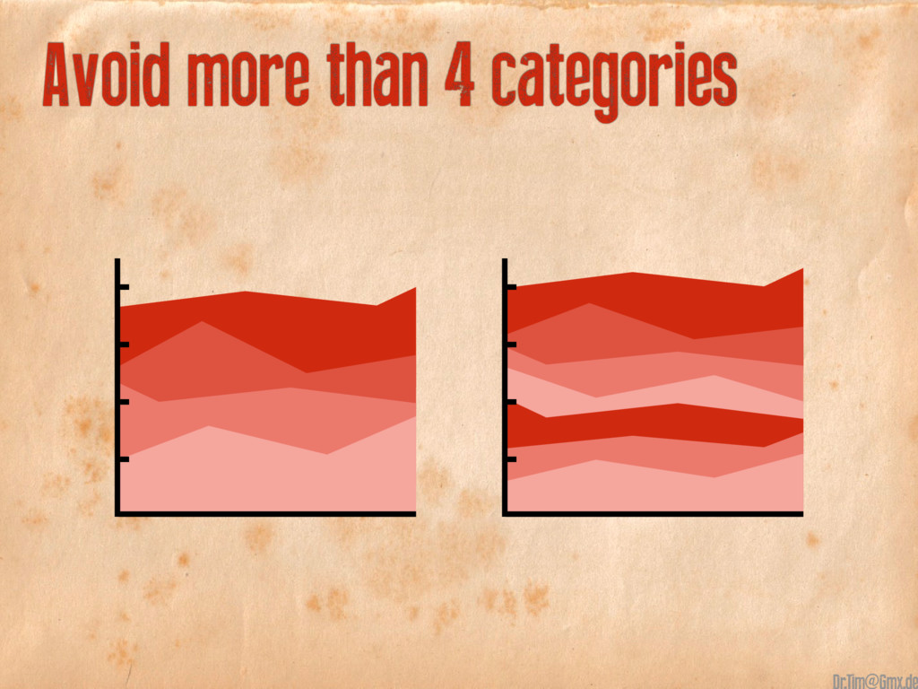
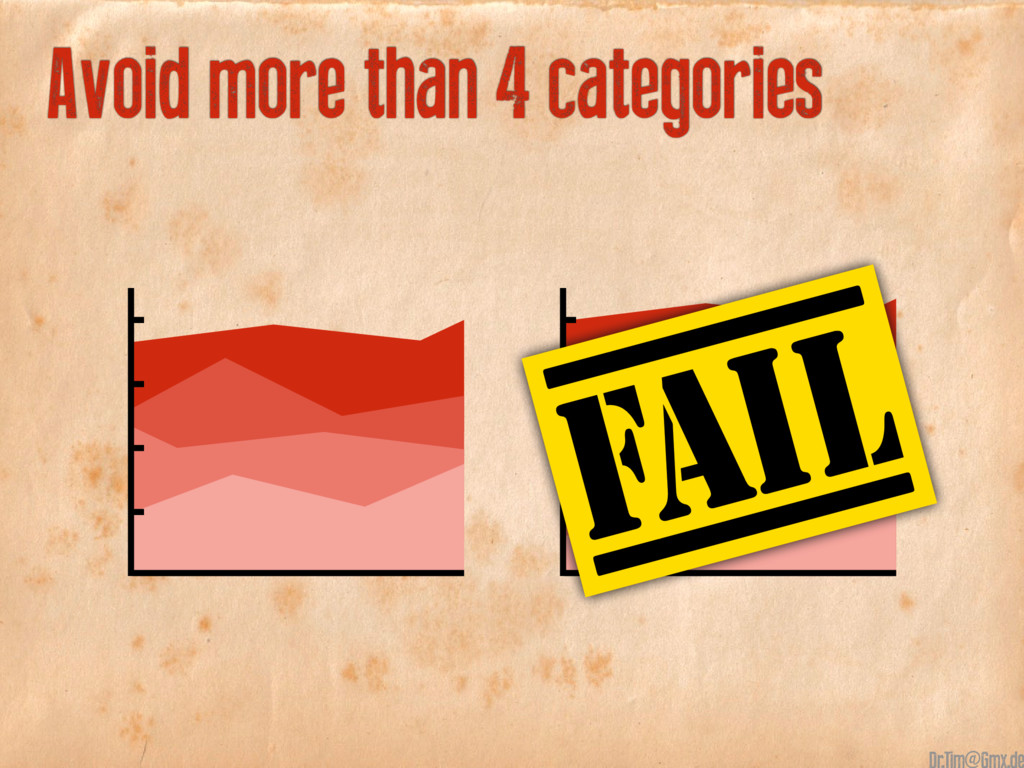
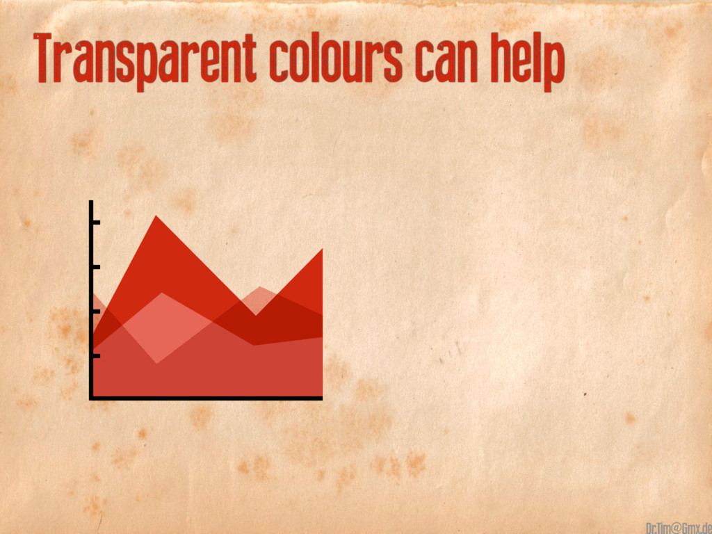
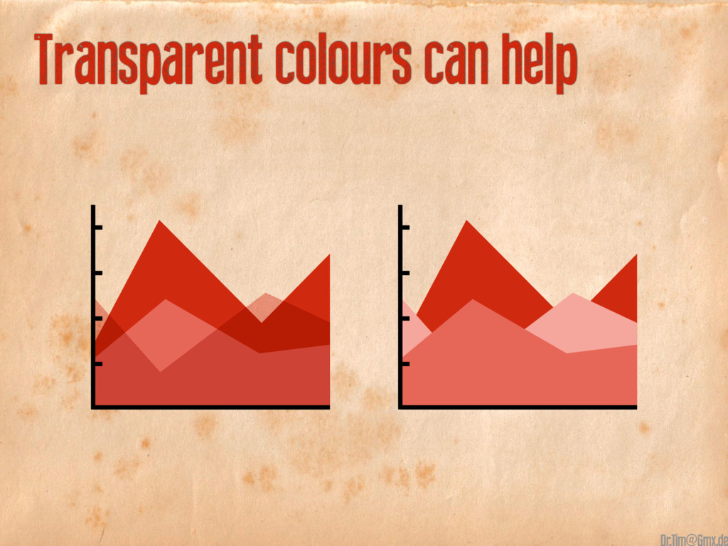
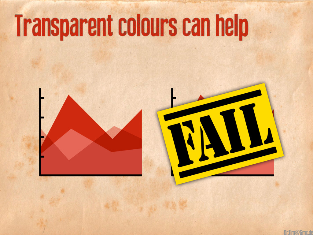
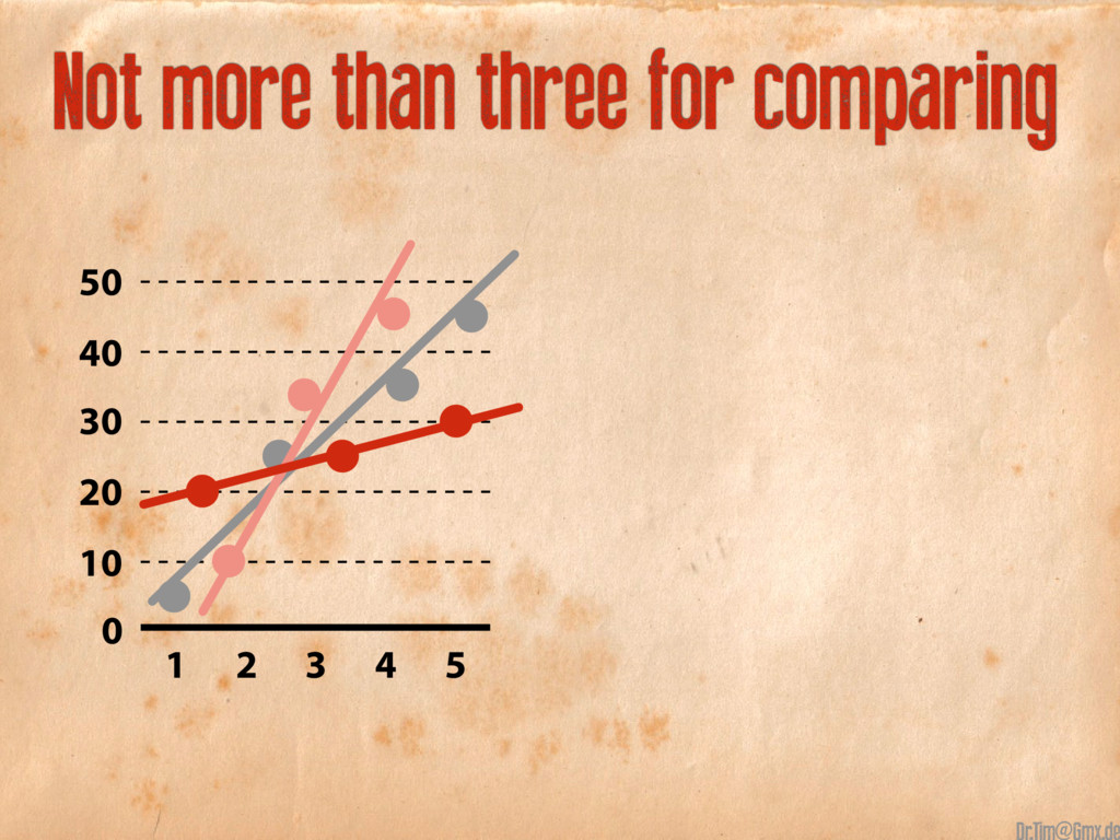
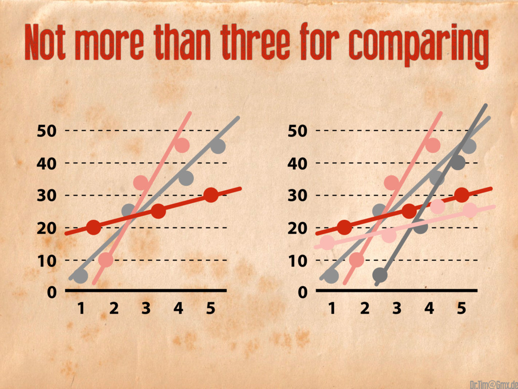
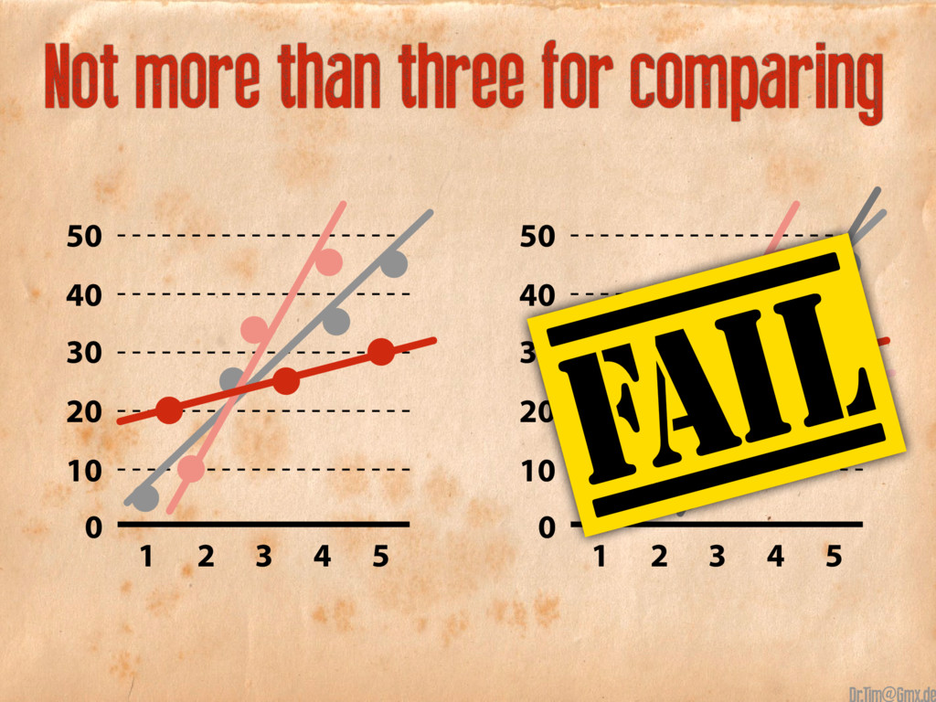
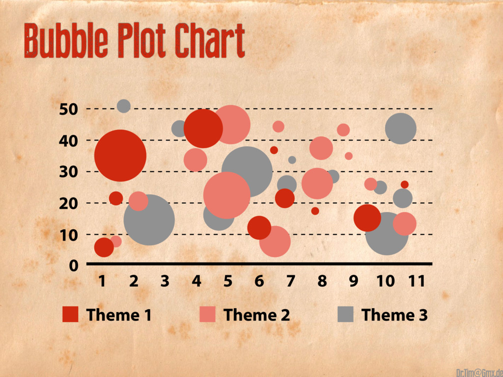
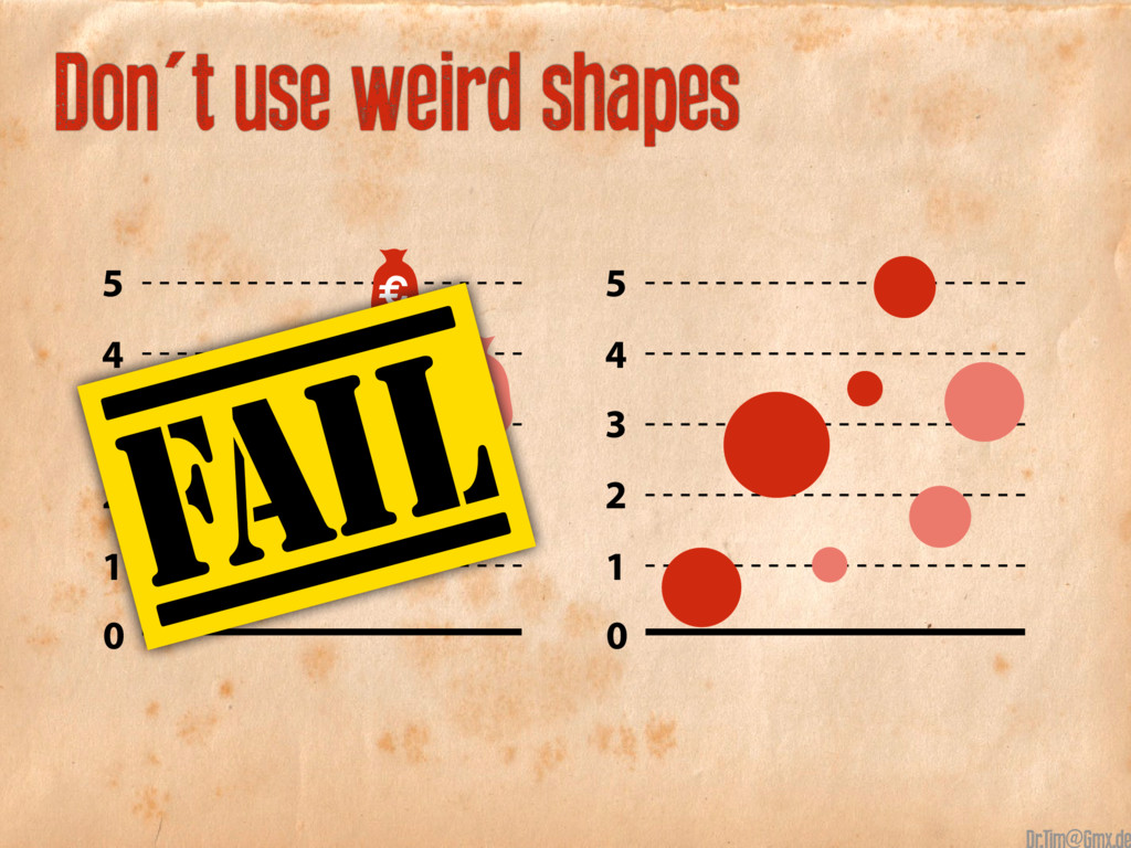
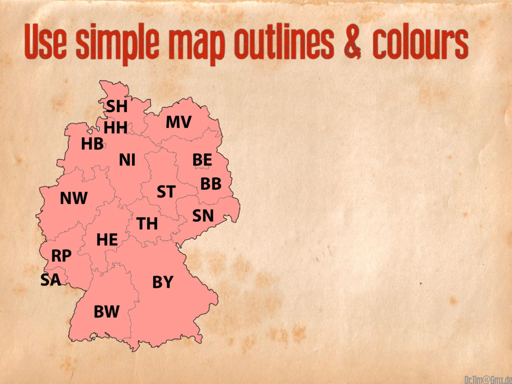
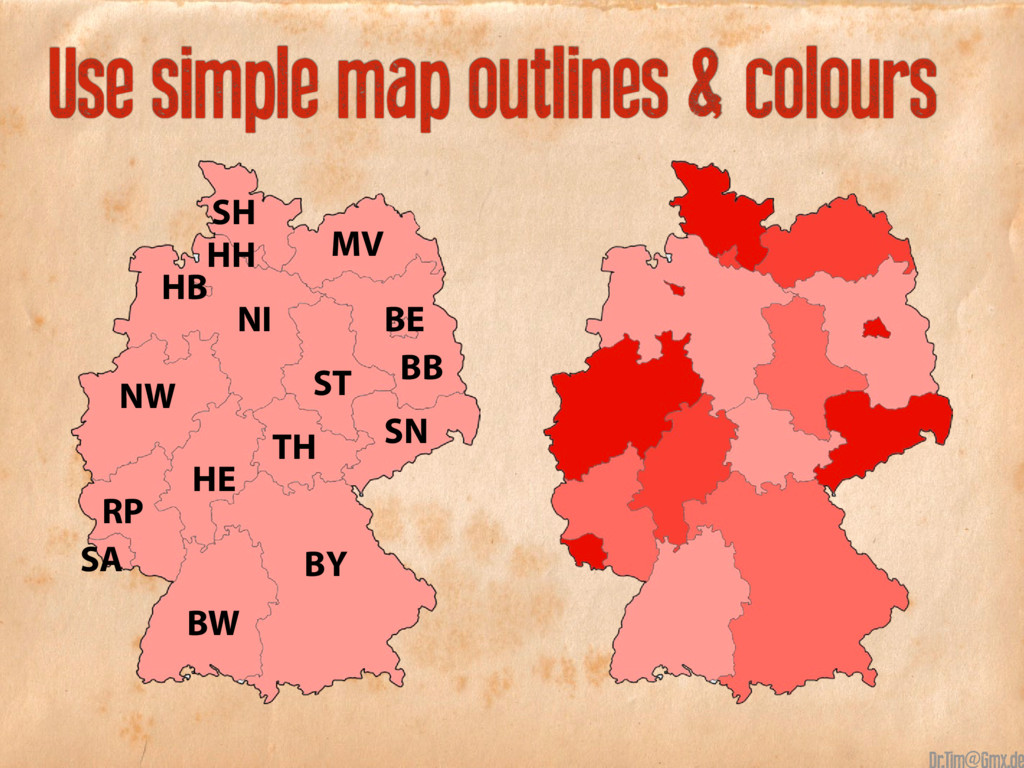
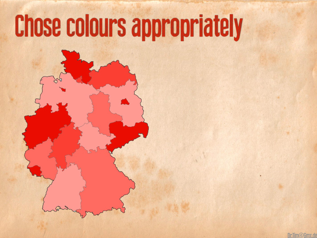
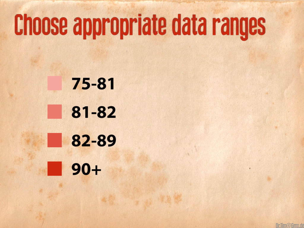
DOs and DON’Ts for the seven most used infographics:
„Infographics pt.2 - The Magnificent Seven“
(Refering to „Infographics pt.1 - The Good, the Bad and the Ugly“)

Or watch the Live-Presentation here:
https://www.youtube.com/watch?v=xedeUh_sfrw&list=PL0J0BguyGBjCaXZDCof2YCsNNBzGPF_Zw

Tim Karsko

October 20, 2016
Tweet

Transcript

  1. @

  2. 1 @

  3. Bar Charts, vertical stacked January February March 250 200 150

    100 50 0 Theme 1 Theme 2 Theme 3 Theme 4 @
  4. Bar Charts, stacked to 100% Theme 1 Theme 2 Theme

    3 Theme 4 January February March 250 200 150 100 50 0 @
  5. Theme 1 Theme 2 Theme 3 Theme 4 Bar Charts,

    horizontal The quick Brown fox Jumps over 350 330 360 200 240 260 140 190 180 80 110 70 @
  6. 2 @

  7. 40+30+20+10 40+30+20+10 Data should always add to 100% 36 40

    22 30 3 10 7 20 40+30+20+10 = 100 36+22+7+3 = 68 @
  8. 3 @

  9. 4 @

  10. 5 @

  11. Scatter Plots 50 40 30 20 10 1 2 3

    4 5 6 7 8 9 10 11 0 Theme 3 Theme 2 Theme 1 @
  12. Start the y-axis value at 0 50 70 40 60

    30 20 1 2 3 4 5 50 40 30 20 10 1 2 3 4 5 0 @
  13. Start the y-axis value at 0 50 70 40 60

    30 20 1 2 3 4 5 50 40 30 20 10 1 2 3 4 5 0 @
  14. 50 40 30 20 10 1 2 3 4 5

    0 Include more variables @
  15. 50 40 30 20 10 1 2 3 4 5

    0 50 40 30 20 10 1 2 3 4 5 0 Include more variables (e.g. size) @
  16. 50 40 30 20 10 1 2 3 4 5

    0 Trend lines can be usefull @
  17. 50 40 30 20 10 1 2 3 4 5

    0 50 40 30 20 10 1 2 3 4 5 0 Trend lines can be usefull @
  18. Not more than three for comparing 50 40 30 20

    10 1 2 3 4 5 0 50 40 30 20 10 1 2 3 4 5 0 @
  19. Not more than three for comparing 50 40 30 20

    10 1 2 3 4 5 0 50 40 30 20 10 1 2 3 4 5 0 @
  20. 6 @

  21. 50 40 30 20 10 1 2 3 4 5

    6 7 8 9 10 11 0 Theme 3 Theme 2 Theme 1 Bubble Plot Chart @
  22. 5 4 3 2 1 0 € € € €

    € € € Don't use weird shapes @
  23. Don't use weird shapes 5 4 3 2 1 0

    € € € € € € € 5 4 3 2 1 0 @
  24. 5 4 3 2 1 0 € € € €

    € € € 5 4 3 2 1 0 Don't use weird shapes @
  25. 7 @

  26. NW BB BE ST TH HE NI HB SH HH

    MV SN BY BW RP SA Use simple map outlines & colours @
  27. Use simple map outlines & colours NW BB BE ST

    TH HE NI HB SH HH MV SN BY BW RP SA @
  28. Use simple map outlines & colours NW BB BE ST

    TH HE NI HB SH HH MV SN BY BW RP SA @
  29. @

  30. > Do use as few colours as possible and sensefull

    > Do order your data sets in logical heirarchy @
  31. > Do use as few colours as possible and sensefull

    > Do order your data sets in logical heirarchy > Visualize your data to be easy to read and compare @
  32. > Do use as few colours as possible and sensefull

    > Do order your data sets in logical heirarchy > Visualize your data to be easy to read and compare > Use icons instead of labels @
  33. > Do not use high contrast colours like blue vs.

    yellow etc. > Do not use 3D Charts because they screw up perception @
  34. > Do not use high contrast colours like blue vs.

    yellow etc. > Do not use 3D Charts because they screw up perception > Do not use more than 6 colours @
  35. > Do not use high contrast colours like blue vs.

    yellow etc. > Do not use 3D Charts because they screw up perception > Do not use more than 6 colours > Do not use distracting Fonts and Elements (italic, underlined ...) @
  36. > Do not use high contrast colours like blue vs.

    yellow etc. > Do not use 3D Charts because they screw up perception > Do not use more than 6 colours > Do not use distracting Fonts and Elements (italic, underlined ...) @
  37. > Do not use high contrast colours like blue vs.

    yellow etc. > Do not use 3D Charts because they screw up perception > Do not use more than 6 colours > Do not use distracting Fonts and Elements (italic, underlined ...) @
  38. > Do not use high contrast colours like blue vs.

    yellow etc. > Do not use 3D Charts because they screw up perception > Do not use more than 6 colours > Do not use distracting Fonts and Elements (italic, underlined ...) @
  39. > Do not use high contrast colours like blue vs.

    yellow etc. > Do not use 3D Charts because they screw up perception > Do not use more than 6 colours > Do not use distracting Fonts and Elements (italic, underlined ...) @
  40. > Do not use high contrast colours like blue vs.

    yellow etc. > Do not use 3D Charts because they screw up perception > Do not use more than 6 colours > Do not use distracting Fonts and Elements (italic, underlined ...) @
  41. @

  42. @