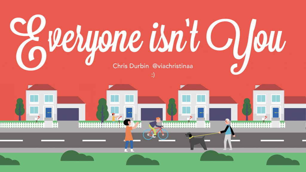
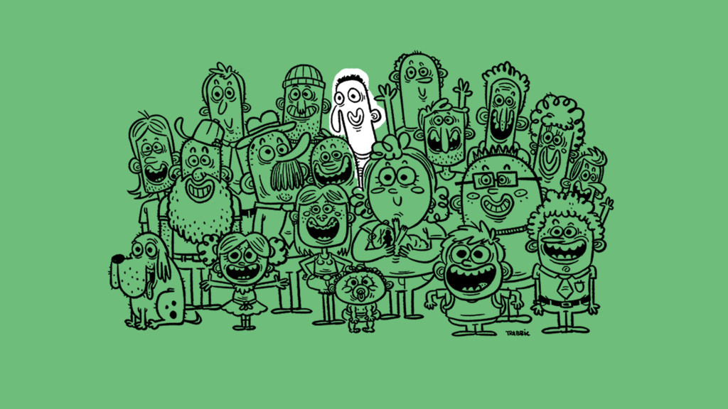
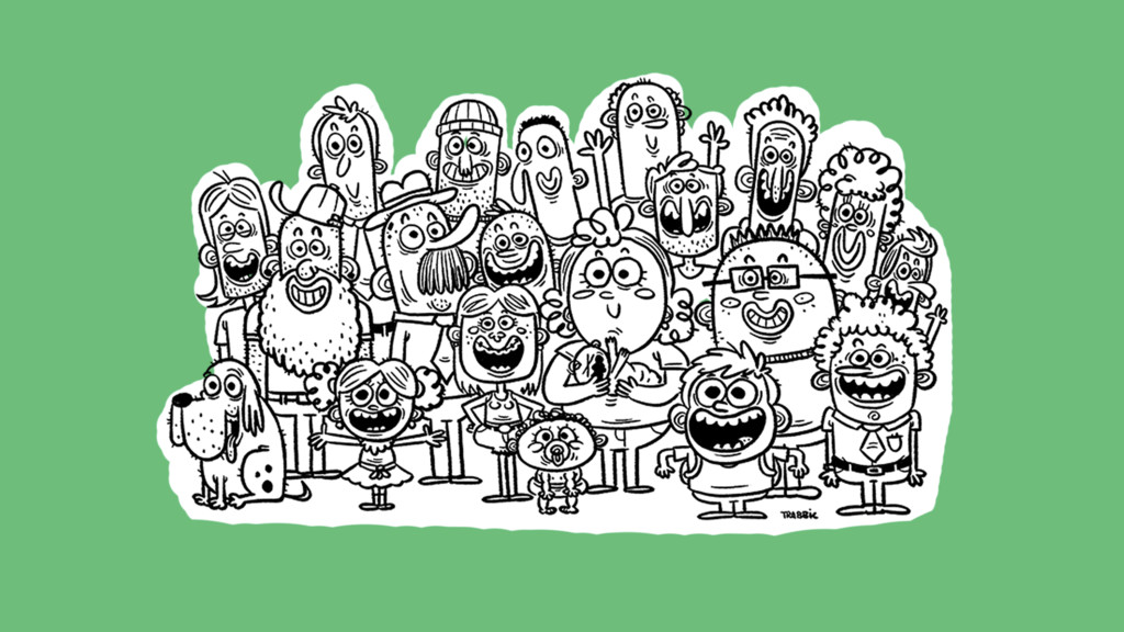
By 2020, there will be 5 generations spanning the American workforce. Chances are if you're designing enterprise software, you're designing for users who are not like you. This talk will take a trip behind the veil of ignorance, a thought experiment which will help you imagine what it’s like to not be you. At the end, we’ll explain the inclusive design process and share practical usability guidelines to consider when designing for everyone.
-- TRANSCRIPT --
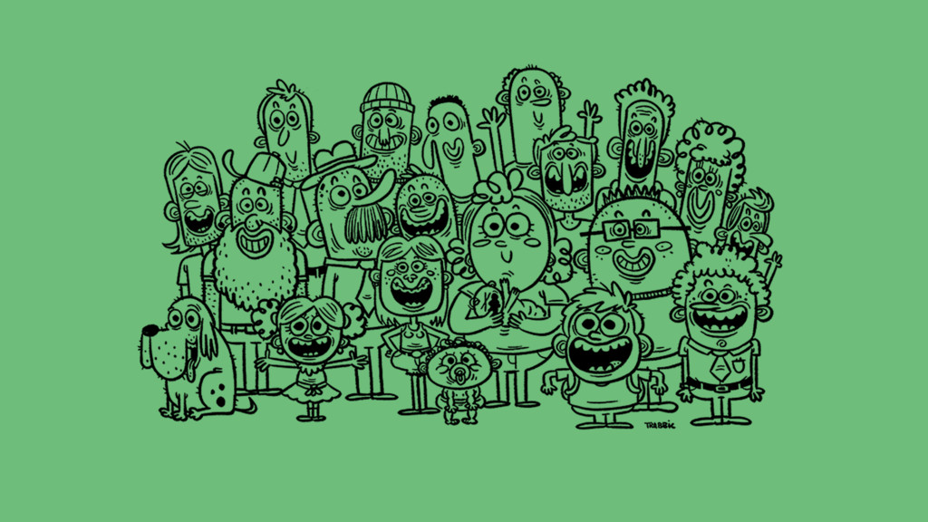
Right now is an exciting time to be designing enterprise software because by 2020, for the first time in history there will be 5 generations spanning the American workforce. Thanks to modern medicine, people are living & working longer they used to.
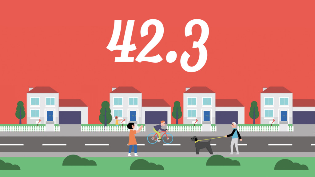
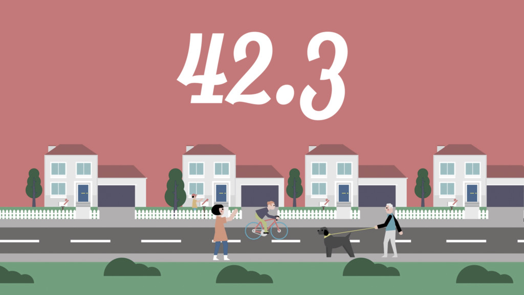
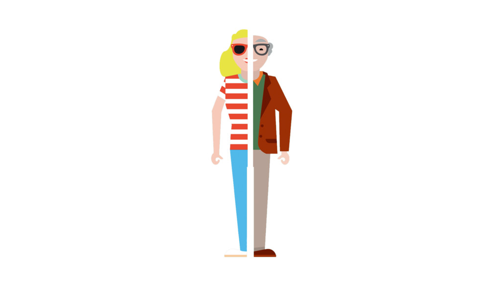
That means if you’re designing for the workforce, your product has to be easily understood by 18 year olds, 68 year olds, and everyone in between. According to the Bureau of Labor Statistics, the median age of American workers is 42.3 years old. Can anyone guess why that’s an interesting average?
Have you ever handed something to someone and watched them do one of these? {holds thing close to face, then pulls far away from face}. That's because from the age of about 40, the lens of the eye begins to harden, causing a condition called “presbyopia.” which makes it difficult to see things that are close to you, and things that are small.
Another thing that happens to our eyes over time is less and less light is able get through the retina. By the time you’re 40ish, only about 50% of the light hitting your eye actually gets through.
That means color vision declines, and we become worse at distinguishing between similar colors. Shades of blue in particular, become harder to distinguish from each other.
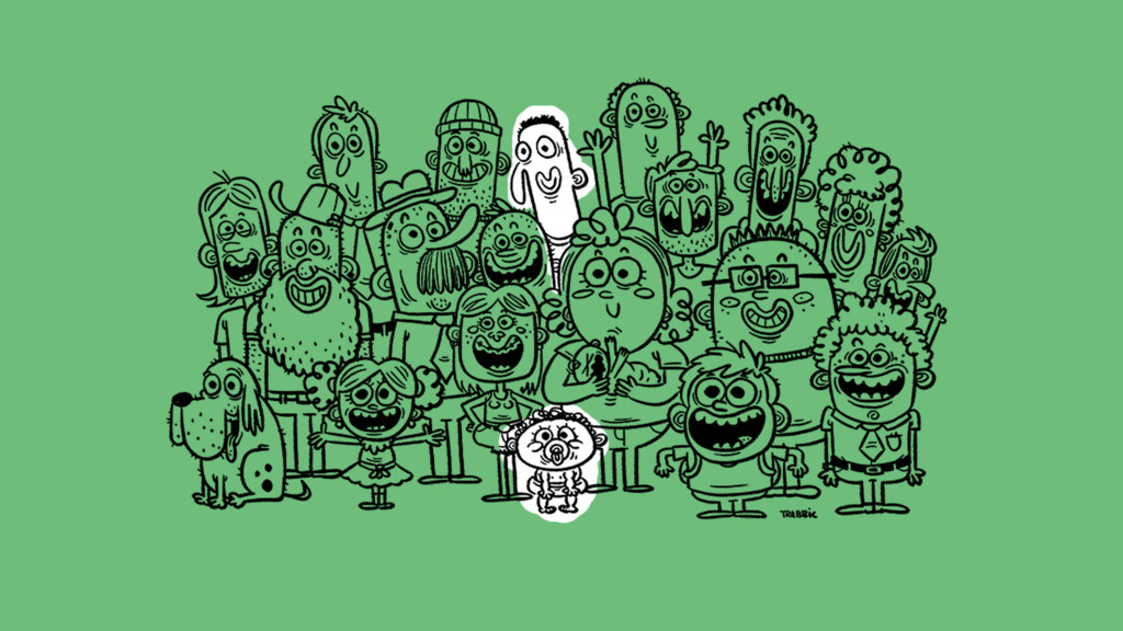
Now, designing for everyone goes both ways, it’s not just about what the youth need to know about boomers. If you happen to be 42.3 years old, how would you go about designing for someone who is 22 years old?
Your mental model of the web and technology is kinda different than a digital native's. You lived through the dawn of the internet, and 10 years ago it was a scary place, and it left scars, and those best practices could still influence how you create, critique and approve work.
Point is, No matter who you are, you need to be able to step outside of yourself and imagine what its like not to be you, and that’s what I want to talk to you guys about tonight.
Back in the early 70s, an American philosopher named John Rawls published a book of political philosophy and ethics called “A Theory of Justice” – and from this book came a concept called “the veil of ignorance.”
Basically, let’s pretend you were instantly able to re-create our society in totality, and you could do it in whatever way you wanted.
You could make – or eliminate – whatever laws you desired, and you could implement whatever financial and judicial structures you believed would work best. Everything is yours to control.
However, the moment after you create this system, the you that you know right now will be totally gone. Once you create the system, you could become a rough facsimile of your current self, or you might be someone entirely new.
The you creating the society is behind a veil of ignorance, and the future you will step out from behind the veil and will be forced to live with whatever society this you creates. You have no control over who you will become.
Knowing this, you will probably want to create a society that is as fair and complete as possible, since you have no idea what station you’ll inherit within your own new, self-constructed boundaries of your new society.
You'll need to think outside of your current needs, because tomorrow you might be blind, pregnant, or have freakishly big hands. You don’t know!
So what does that have to do with enterprise software? When you sit down to create something, be it a society or a piece of software, you are doing so behind a veil of ignorance – the only difference is you don’t have the luxury, Once you send it out into the world, of experiencing the thing you just made as a completely different person.
You can perform studies and collect data and what have you, but there will always be a layer of abstraction between the thing you made, and the way someone else experiences it.
Often times when we’re working on something and trying to figure things out, we often refer to the majority when we look at our data. Where do the most people click? What do most people do when they get to this screen? How do most people read this page?
We fall into the habit of optimizing for the many because it’s seems so obvious – If I’m going to build something, I’m going start where I’ll have the largest impact on the most amount of people.
But what if you optimized for the few?
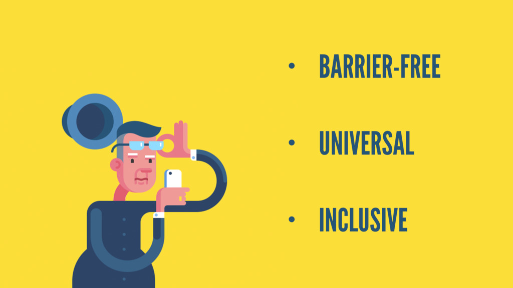
What if you looked at the edge cases, and optimized for the people who encountered the most barriers to entry? This is something that we already do today in the physical world and it goes by a few names: barrier-free design, universal design, and inclusive design.
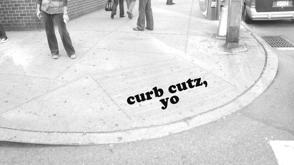
The most well-known examples of this are curb cuts and wheelchair ramps. These are things that are essential for people in wheelchairs, but they are enjoyed by all of us. Because we exist behind a veil of ignorance and our life doesn’t necessitate it, they’re damn near invisible.
Historically, accessibility in design focused on “accommodating” people. Making a separate wheel chair entrance for only the people in wheel chairs. But now, it’s known that many “accommodations” actually benefit everybody. When was the last time you walked up a ramp and felt impeded by it?
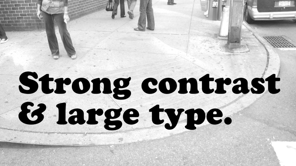
We all need to be building the digital equivalents of curb cuts and wheelchair ramps in our work – which means using strong contrast and large type. The workplace today is too DIVERSE a place to start your design process elsewhere.
Now, these are not the ONLY 2 things you need to think about when designing for everyone, but they are the easiest to do well, and the 2 I see screwed up the most often - and needlessly so.
I often hear two complaints when advocating for these two super simple best practices:
• Restricting color combinations limit my choices as a designer.
• Big type looks clumsy, is ugly, is too big - whatever, insert complaint here
First, lets talk about contrast.
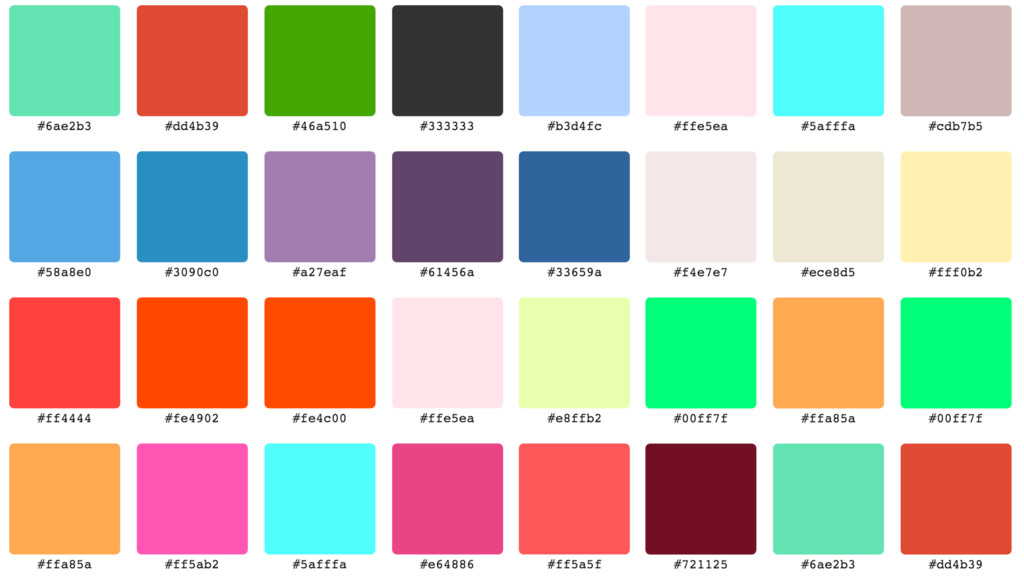
There are over 16 million possible combinations of hexcodes. If only 1% of all color combinations are accessible than there are still almost over 150,000 color combinations to choose from. This is more than adequate.
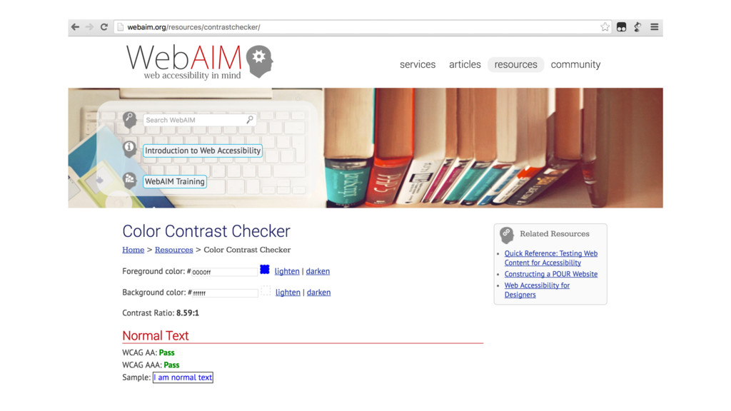
To meet accessibility standards, your color contrast ratio needs to be 4.5 to 1. If you don’t know how to do that or what that means, let me tell you, you can’t go wrong with black text on a white background.
If you want to be fancy, you can check your color combination ratios, with this super simple tool online that I found callled “Googling test color contrast ratio.” It will give you a pass or fail score and tell you your ratio.
Boom. Done. Easy. You’re a pro. Now lets move on to typography – the major complaint being “Big type looks clumsy, is ugly, is too big - w/e, insert complaint”
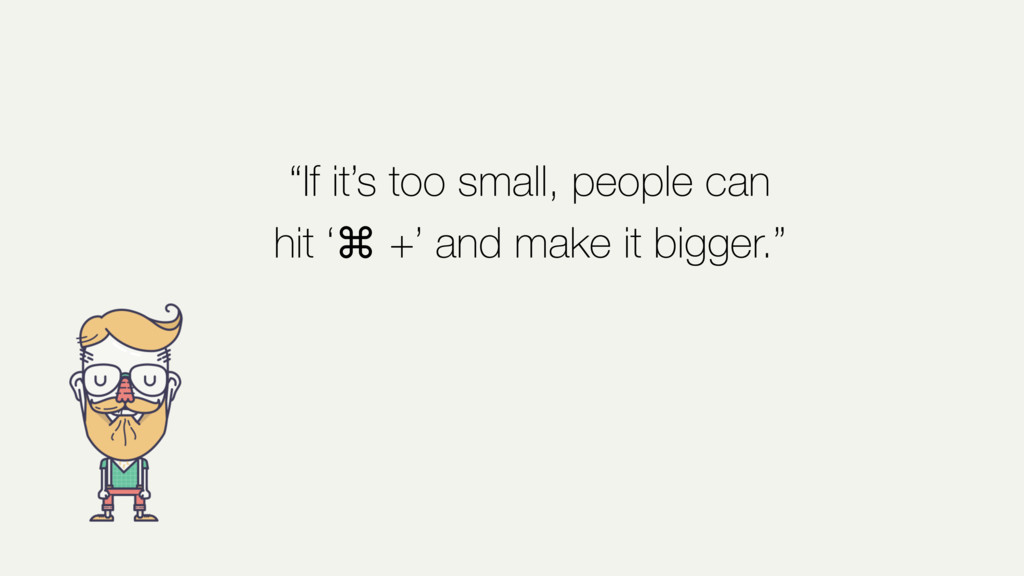
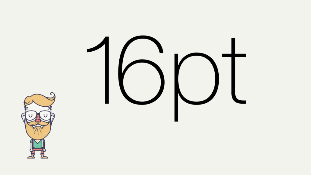
If you ever hear someone justify their 10pt type with" "If it is too small people can hit command + and make the type bigger.” There is only 1 correct response to that phrase:
No. Hold on let me just bump up the type a little bit and make it bigger so you can read that… Ah much better.
No!
Aside from the fact that not everyone even knows to do this, I offer a counter: If the type is so big that it offends your user they can hit command - and make the type smaller. :)
Which by the way, I have never observed anyone do this. What I have seen are people bump UP the size of the page while mumbling, “I can’t read it, it’s too small.” This seems backwards, why would you make someone do that?
The thing about large type is that everyone can read it. Not everyone can read small type. You want to be at or near the ballpark of 16pt type. If you’re sure, do one of these {pull thing far away} to see if it’s legible. When all else fails, employ the powers of the squint test!
If you feel big type looks clumsy, it is most likely due to a type scale that doesn't relate to the proportions within your system. Typography, like color, and music is all about how values relate to each other. Tweak the entire system until you get to a place where your important type is legible.
When you sit down to design things, step out from behind the veil of ignorance. Imagine a world where you are not who you are right now. And think about all the things that could possibly frustrate you.
Design for EVERYONE you can think of, ESPECIALLY the few. The barrier-free approach to design saves you the trouble of going back and retrofitting changes later.
As a design community, we should be building fewer staircases and more ramps and curb cuts.
Don't design for your flavor of eyesight, your flavor of screen resolution, and your fast internet connection.
If everyone can use your product, it's good for business. But even if it wasn’t, it’s the right thing to do. Which makes it worth doing.