Designing better user interfaces sets out to teach interface design by talking through concrete examples: what works, what doesn’t work. A good interface consists of a thousand details done right. This presentation is all about those details.
by talking through concrete examples: what works, what doesn’t work. A good interface consists of a thousand details done right. This presentation is all about those details.
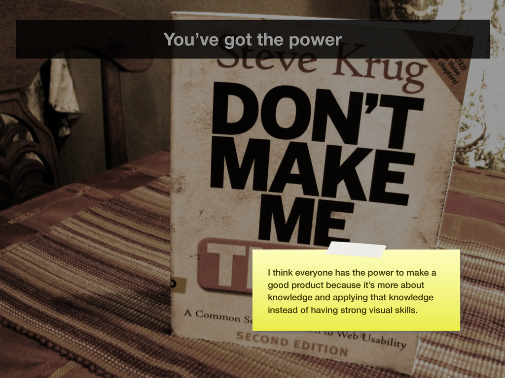
the slides don’t distract from what is being said. This “web” version contains sticky notes (like this one) that summarize what I talked about when displaying the slide during the original talk.
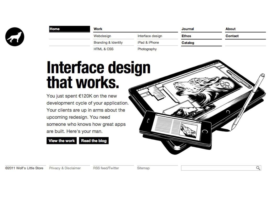
Under work you can see what I do: interface design, web design, branding and identity, HTML & CSS, photography and design for mobile devices. Companies evolve and this is actually a little bit outdated - I specifically want to focus more on the interface design part. The next website will reflect this :)
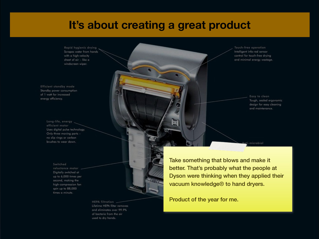
and make it better. That’s probably what the people at Dyson were thinking when they applied their vacuum knowledge® to hand dryers. Product of the year for me.
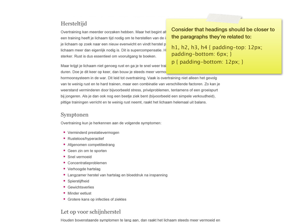
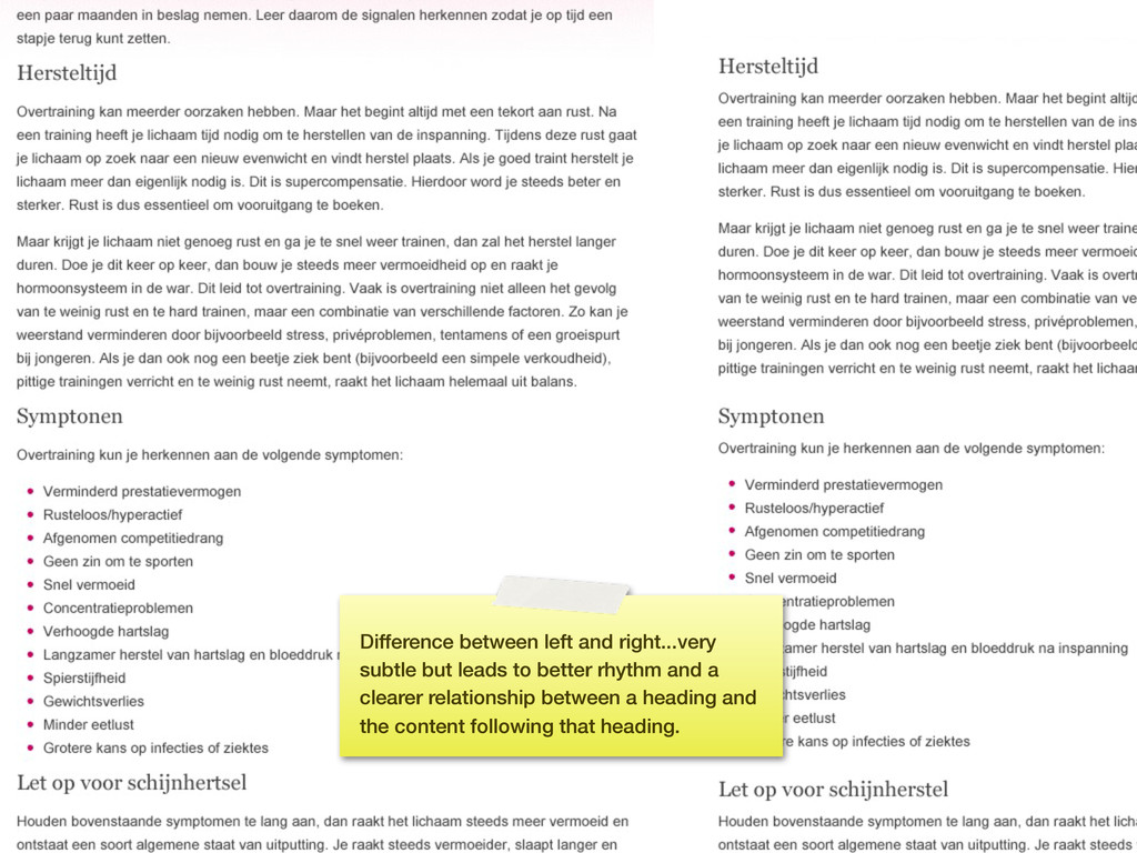
difference between a good interface and a great one is in all those details: the spelling of a word, the spacing between items, the colors used. There’s — literally — thousands of details that are important. Today I want to talk about a few of these details.
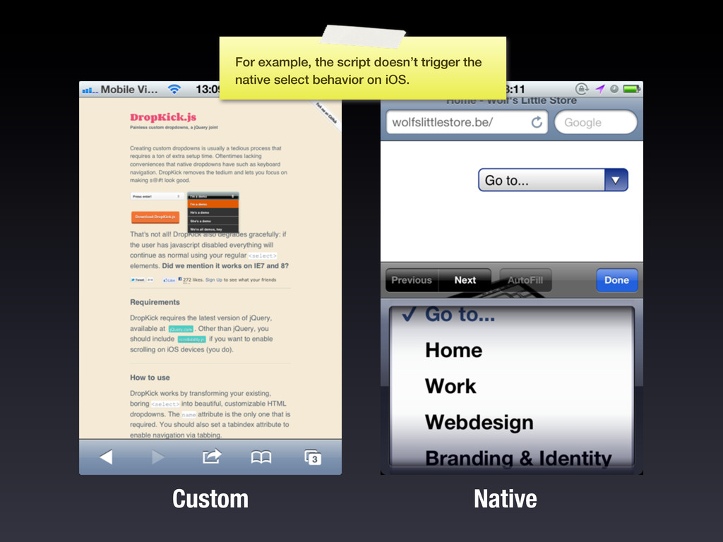
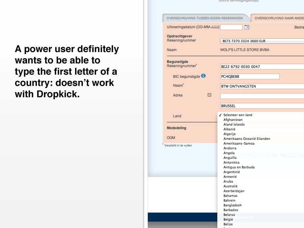
a ton of extra setup time. Oftentimes lacking conveniences that native dropdowns have such as keyboard navigation. DropKick removes the tedium and lets you focus on making s@#t look good.” “
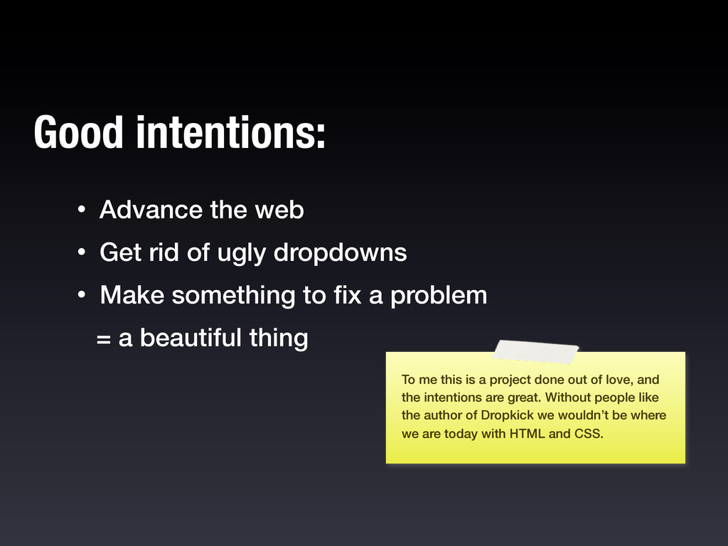
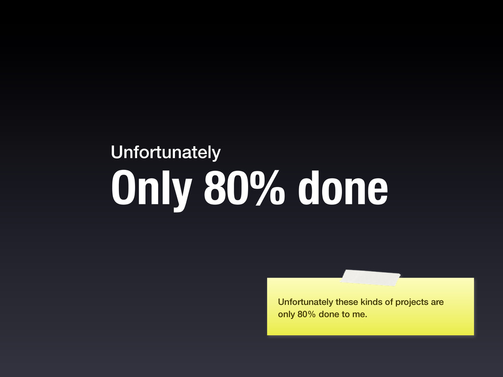
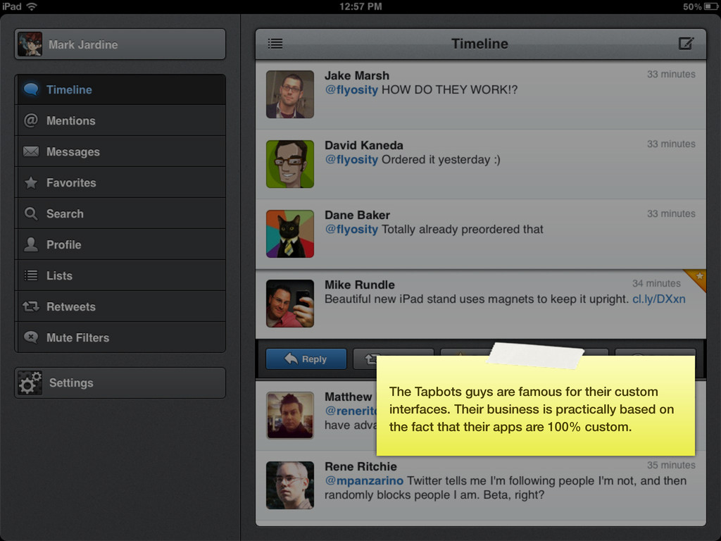
• Make something to fix a problem = a beautiful thing Good intentions: To me this is a project done out of love, and the intentions are great. Without people like the author of Dropkick we wouldn’t be where we are today with HTML and CSS.
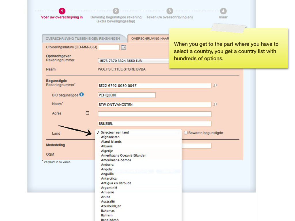
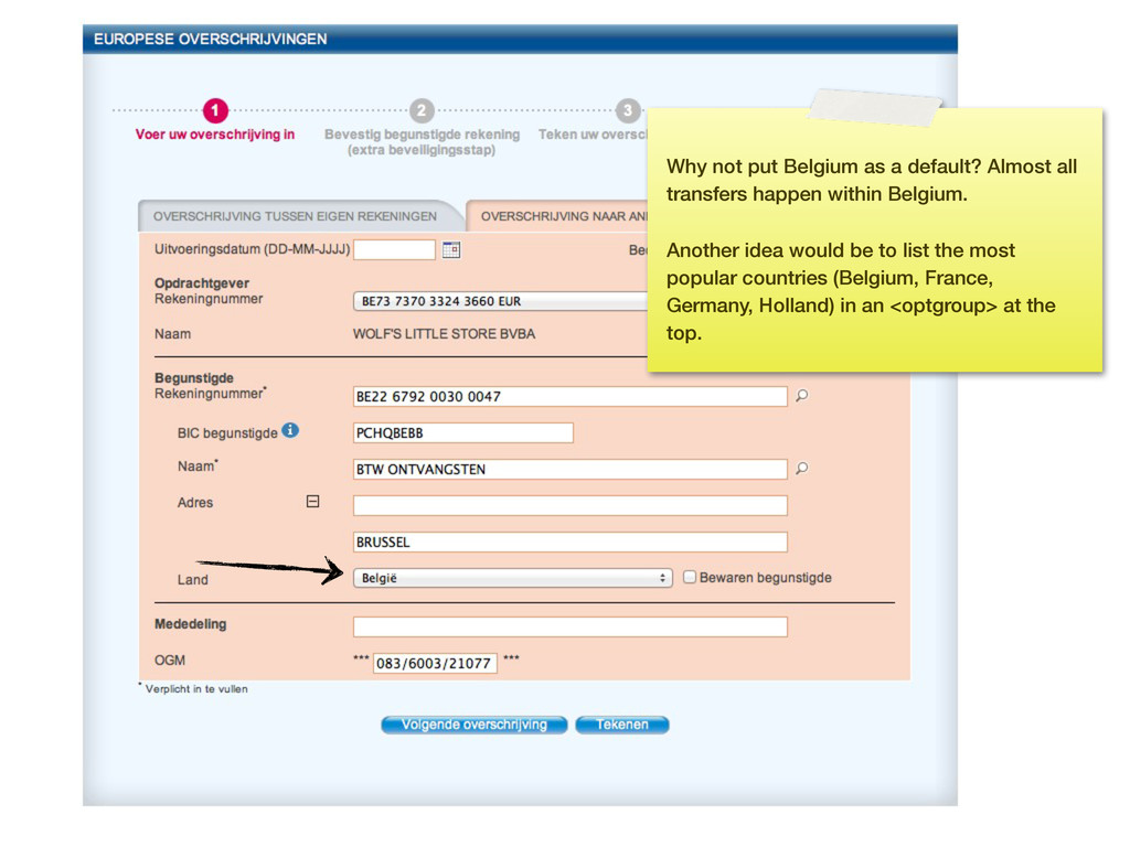
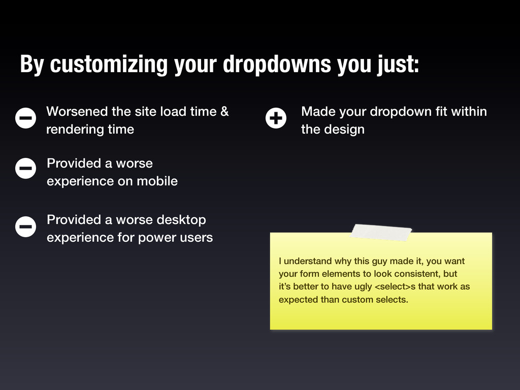
on mobile Provided a worse desktop experience for power users Worsened the site load time & rendering time Made your dropdown fit within the design I understand why this guy made it, you want your form elements to look consistent, but it’s better to have ugly <select>s that work as expected than custom selects.
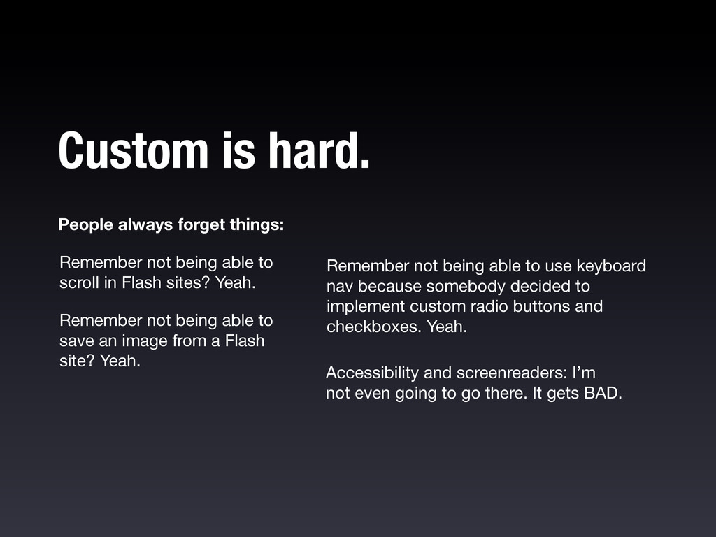
in Flash sites? Yeah. Remember not being able to use keyboard nav because somebody decided to implement custom radio buttons and checkboxes. Yeah. Accessibility and screenreaders: I’m not even going to go there. It gets BAD. Remember not being able to save an image from a Flash site? Yeah. Custom is hard.
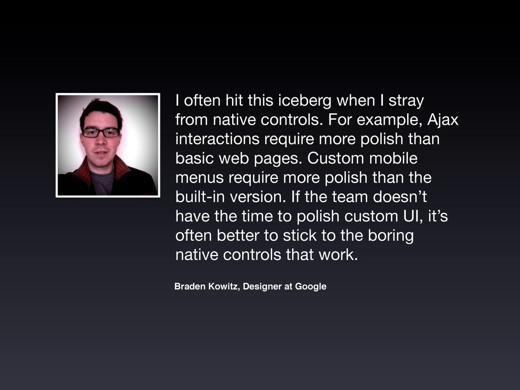
controls. For example, Ajax interactions require more polish than basic web pages. Custom mobile menus require more polish than the built-in version. If the team doesn’t have the time to polish custom UI, it’s often better to stick to the boring native controls that work. Braden Kowitz, Designer at Google
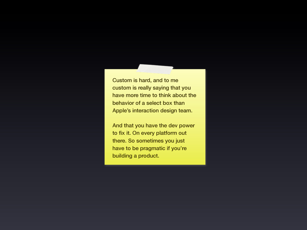
that you have more time to think about the behavior of a select box than Apple’s interaction design team. And that you have the dev power to fix it. On every platform out there. So sometimes you just have to be pragmatic if you’re building a product.
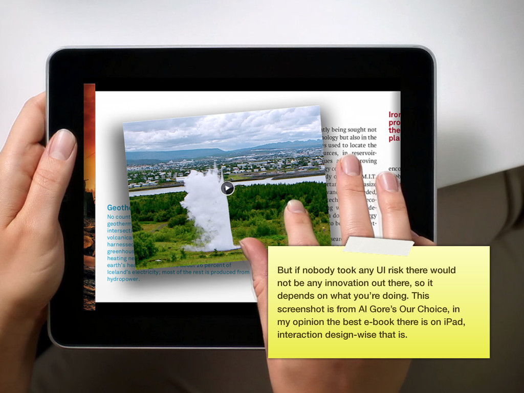
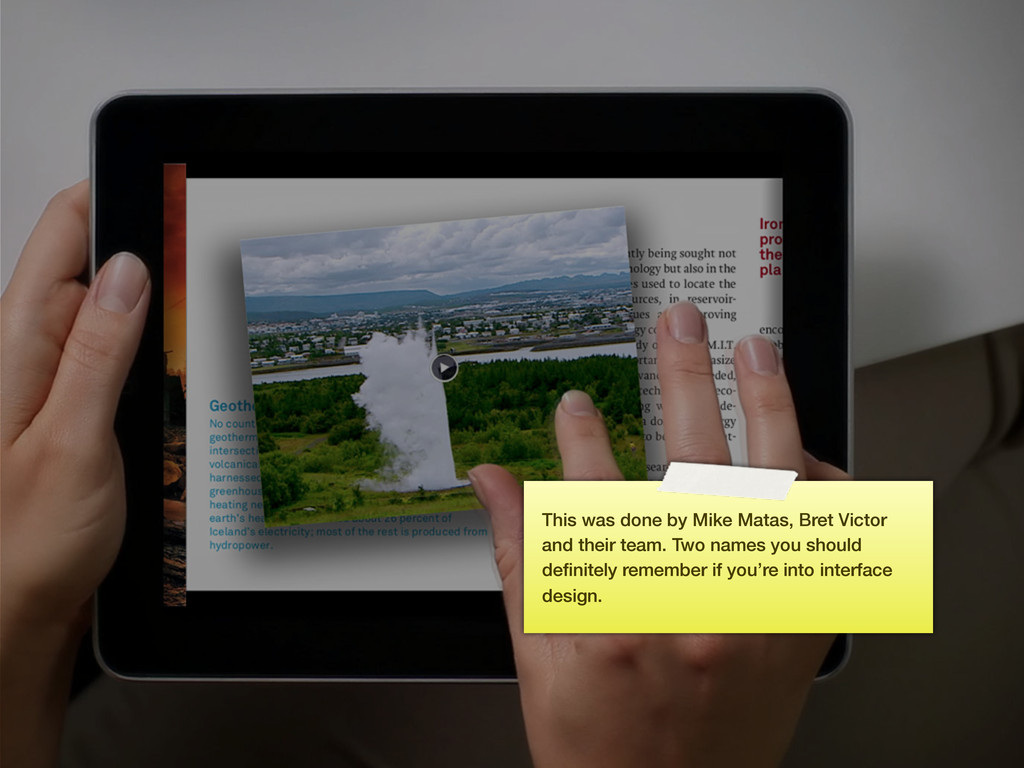
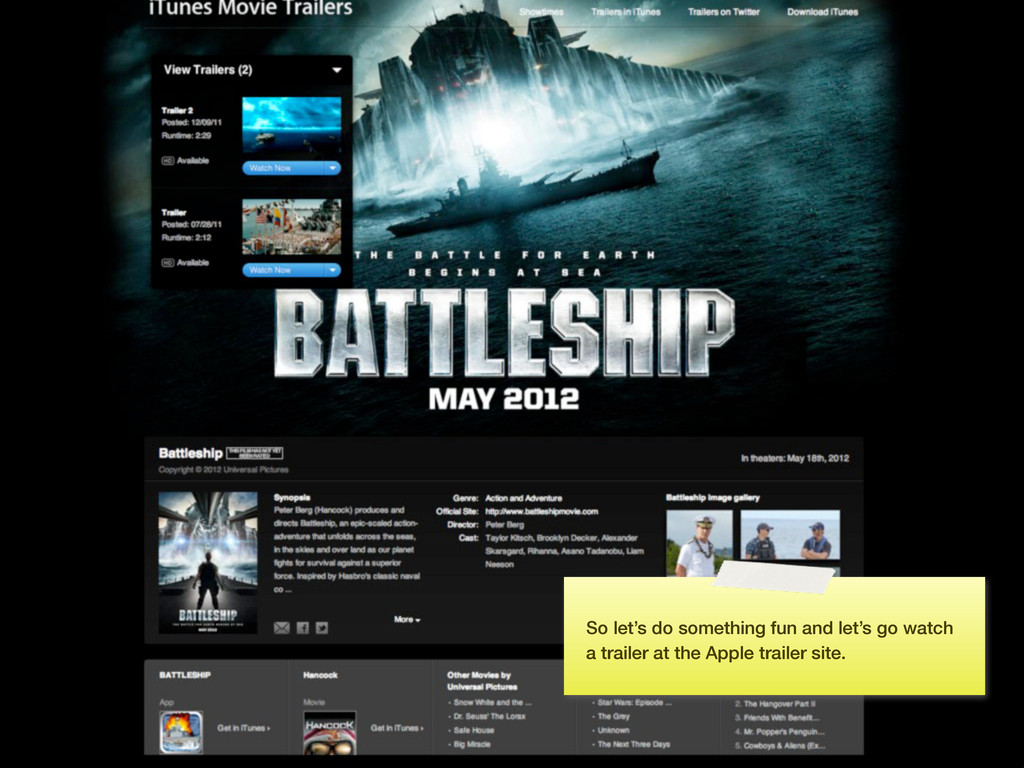
be any innovation out there, so it depends on what you’re doing. This screenshot is from Al Gore’s Our Choice, in my opinion the best e-book there is on iPad, interaction design-wise that is.
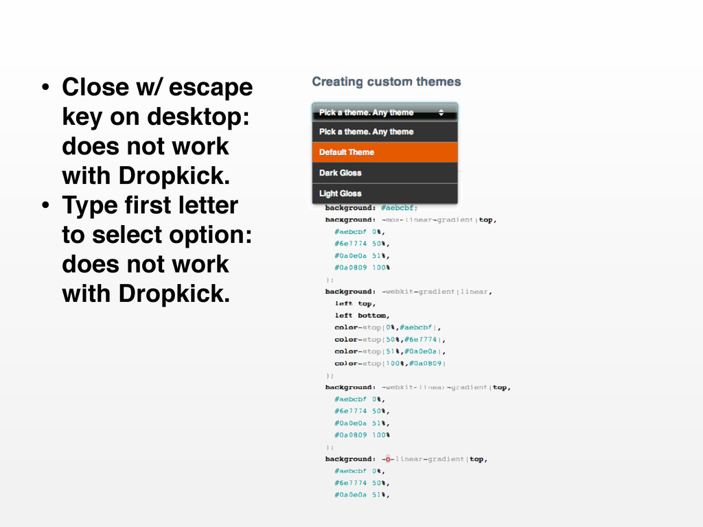
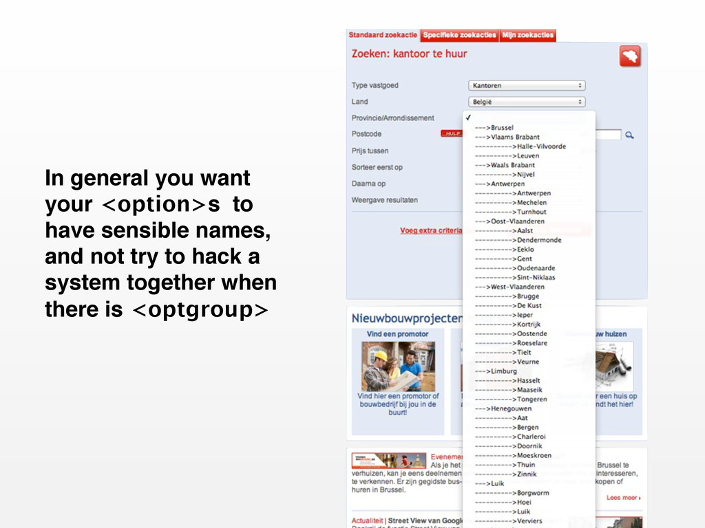
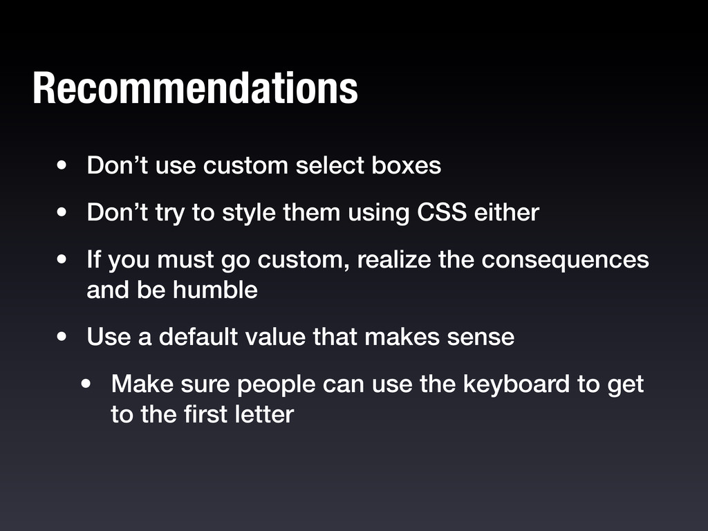
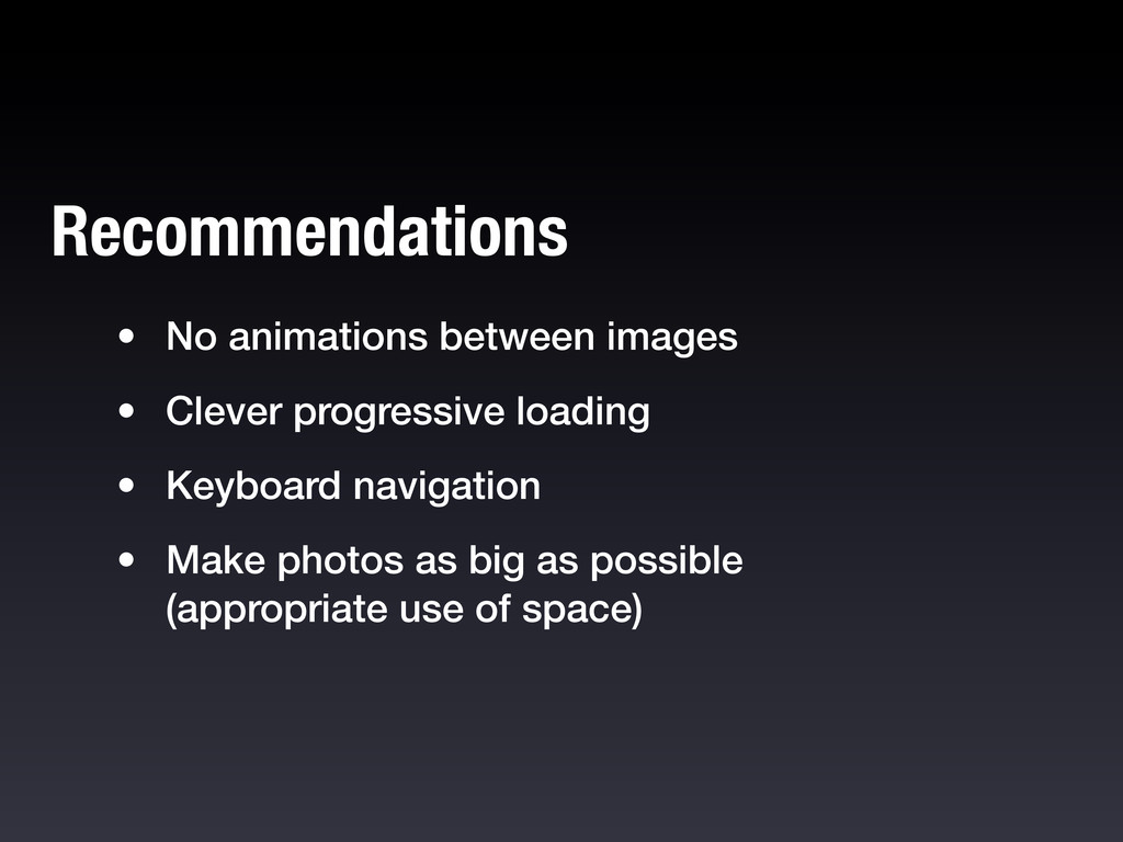
style them using CSS either • If you must go custom, realize the consequences and be humble • Use a default value that makes sense • Make sure people can use the keyboard to get to the first letter Recommendations
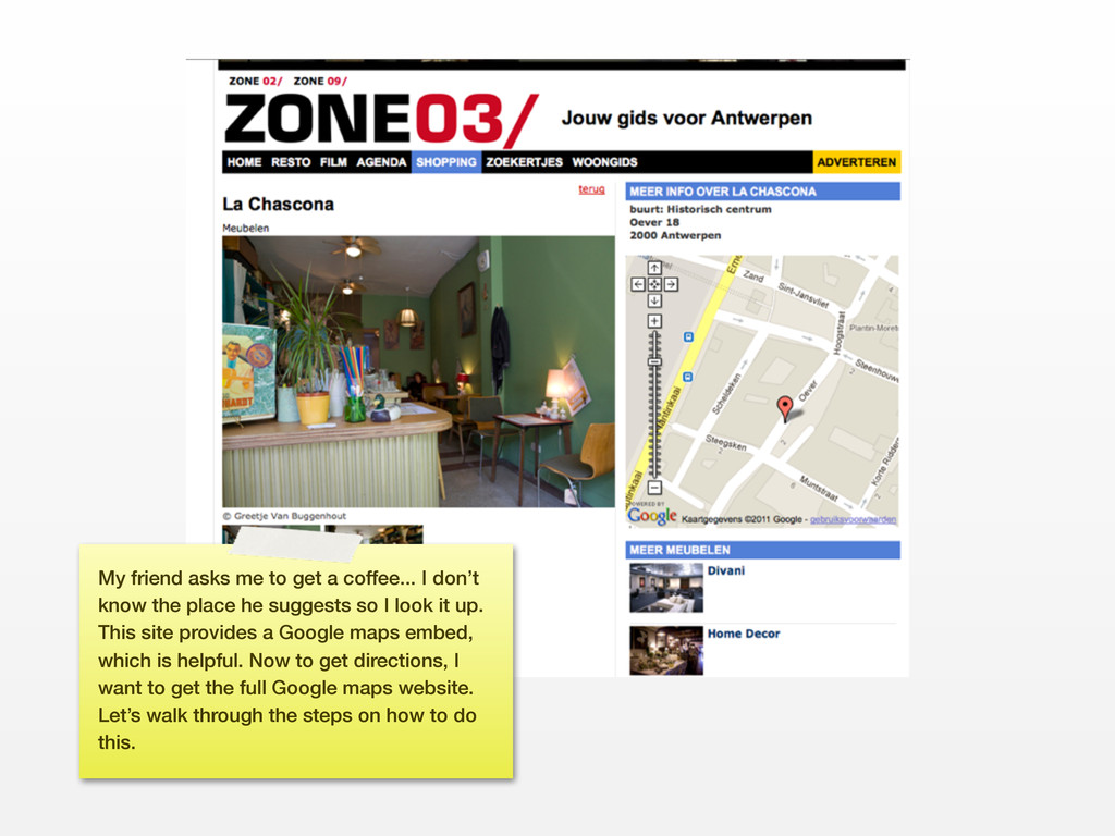
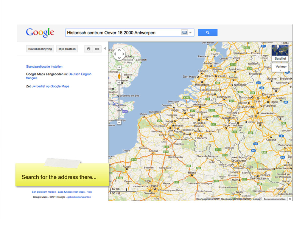
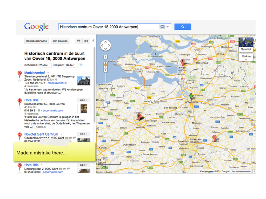
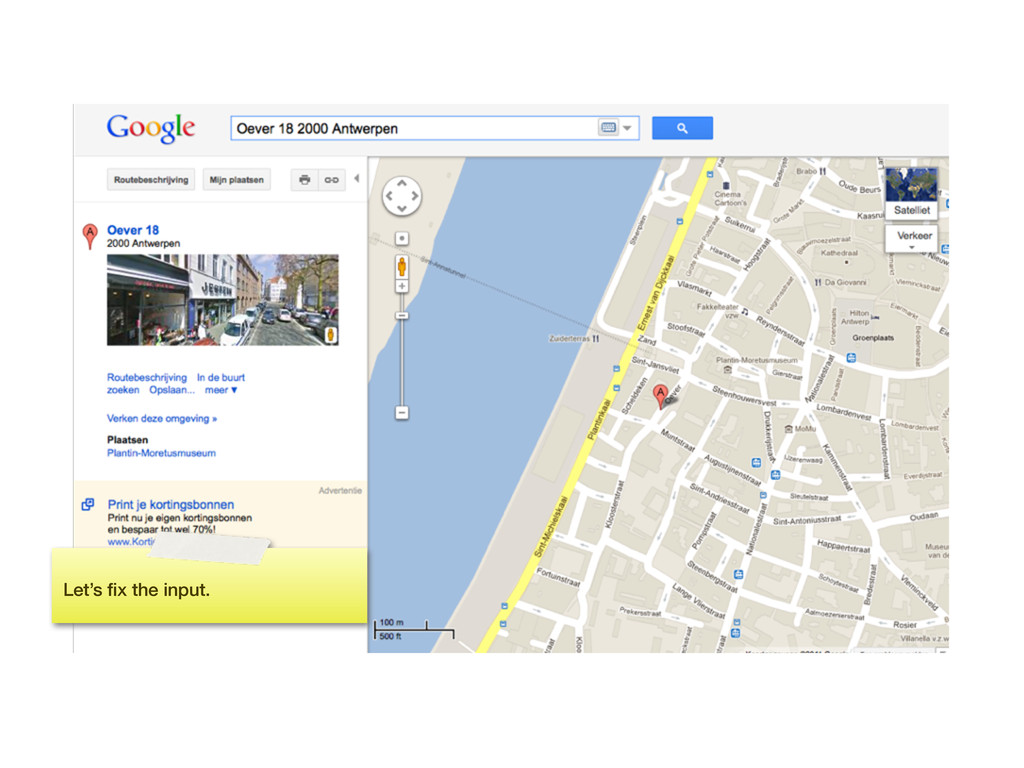
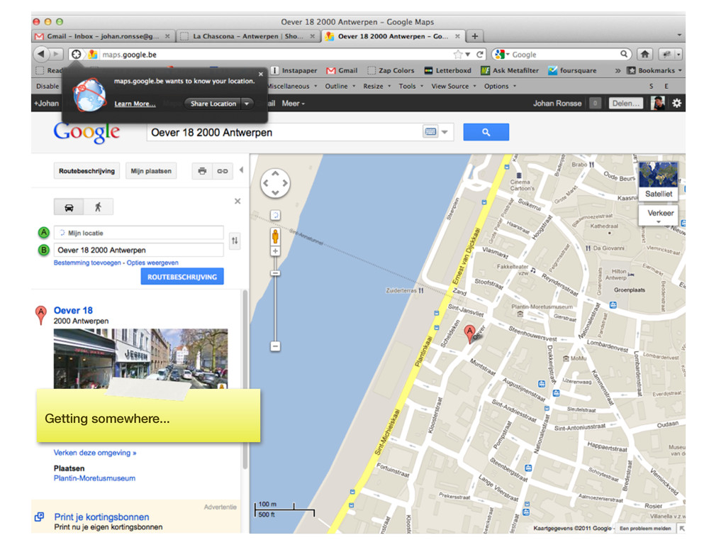
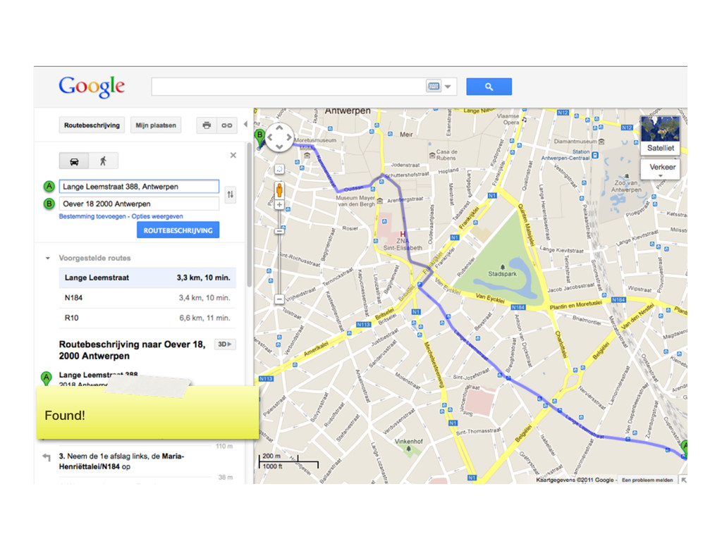
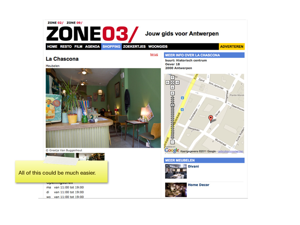
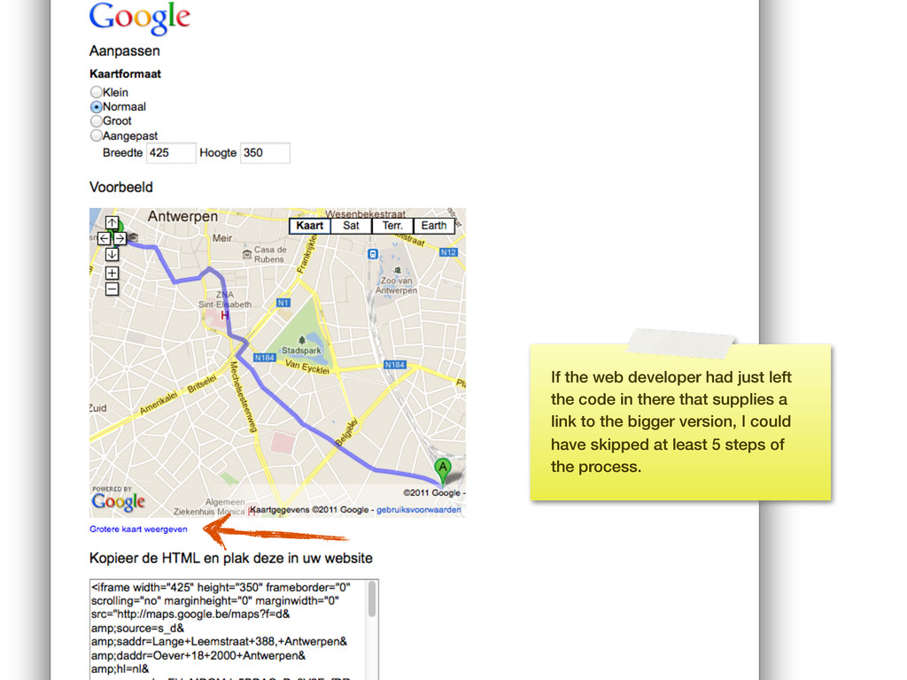
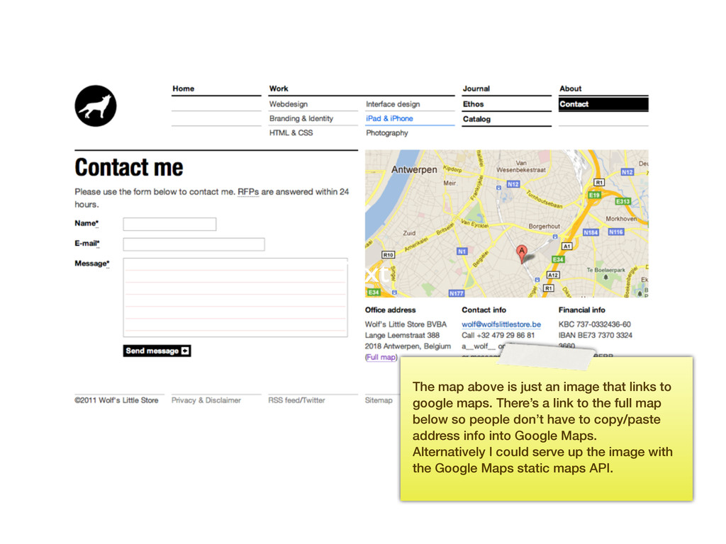
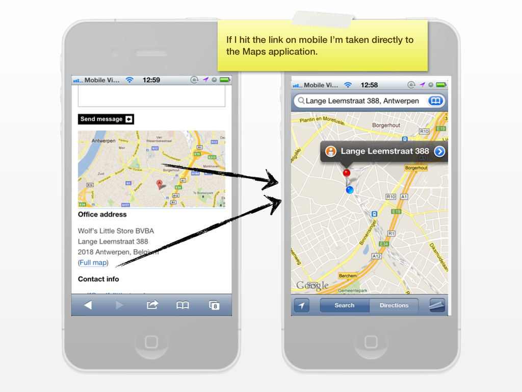
know the place he suggests so I look it up. This site provides a Google maps embed, which is helpful. Now to get directions, I want to get the full Google maps website. Let’s walk through the steps on how to do this.
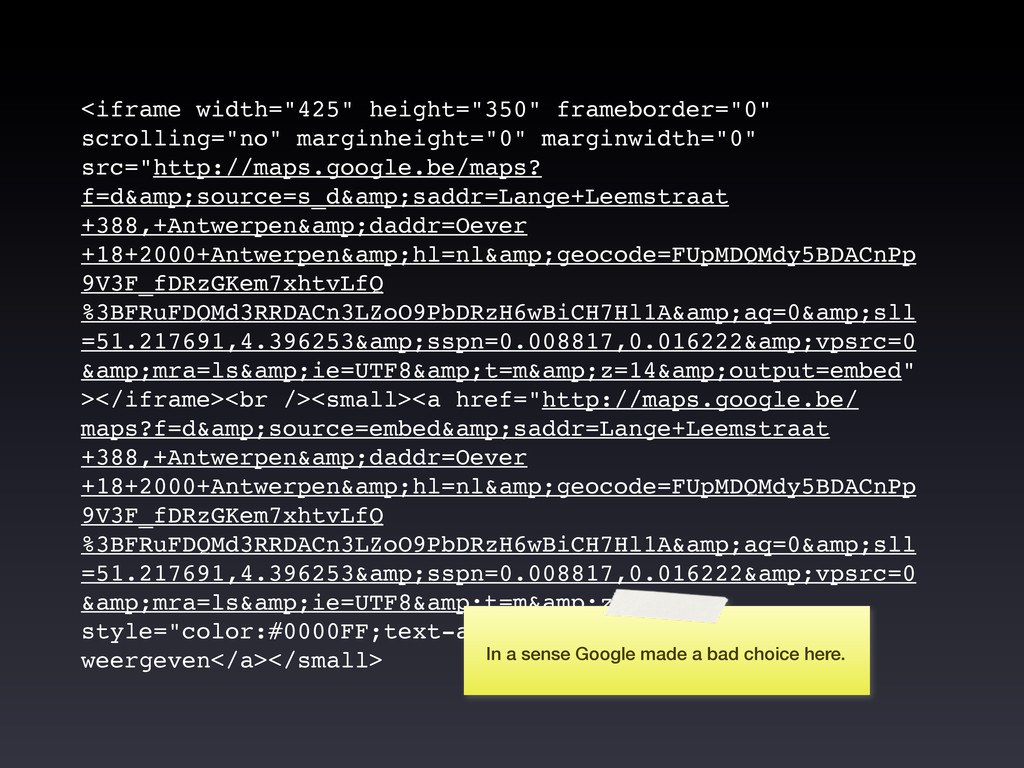
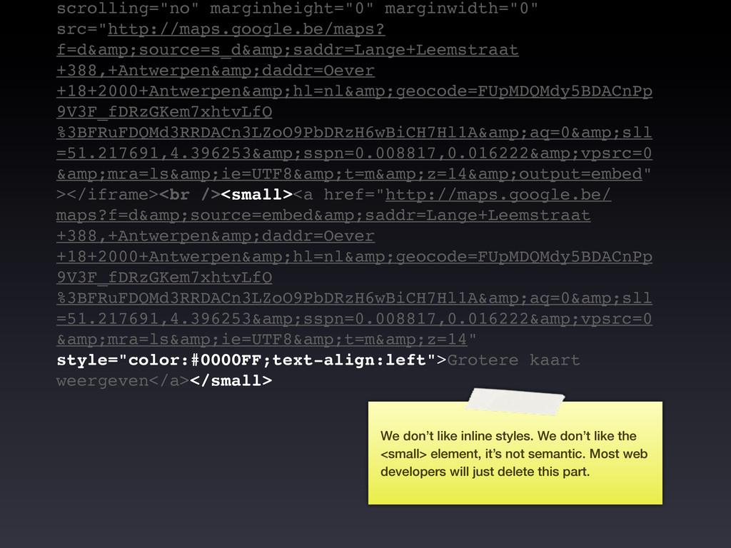
+18+2000+Antwerpen&hl=nl&geocode=FUpMDQMdy5BDACnPp 9V3F_fDRzGKem7xhtvLfQ %3BFRuFDQMd3RRDACn3LZoO9PbDRzH6wBiCH7Hl1A&aq=0&sll =51.217691,4.396253&sspn=0.008817,0.016222&vpsrc=0 &mra=ls&ie=UTF8&t=m&z=14&output=embed" ></iframe><br /><small><a href="http://maps.google.be/ maps?f=d&source=embed&saddr=Lange+Leemstraat +388,+Antwerpen&daddr=Oever +18+2000+Antwerpen&hl=nl&geocode=FUpMDQMdy5BDACnPp 9V3F_fDRzGKem7xhtvLfQ %3BFRuFDQMd3RRDACn3LZoO9PbDRzH6wBiCH7Hl1A&aq=0&sll =51.217691,4.396253&sspn=0.008817,0.016222&vpsrc=0 &mra=ls&ie=UTF8&t=m&z=14" style="color:#0000FF;text-align:left">Grotere kaart weergeven</a></small> In a sense Google made a bad choice here.
&mra=ls&ie=UTF8&t=m&z=14&output=embed" ></iframe><br /><small><a href="http://maps.google.be/ maps?f=d&source=embed&saddr=Lange+Leemstraat +388,+Antwerpen&daddr=Oever +18+2000+Antwerpen&hl=nl&geocode=FUpMDQMdy5BDACnPp 9V3F_fDRzGKem7xhtvLfQ %3BFRuFDQMd3RRDACn3LZoO9PbDRzH6wBiCH7Hl1A&aq=0&sll =51.217691,4.396253&sspn=0.008817,0.016222&vpsrc=0 &mra=ls&ie=UTF8&t=m&z=14" style="color:#0000FF;text-align:left">Grotere kaart weergeven</a></small> We don’t like inline styles. We don’t like the <small> element, it’s not semantic. Most web developers will just delete this part.
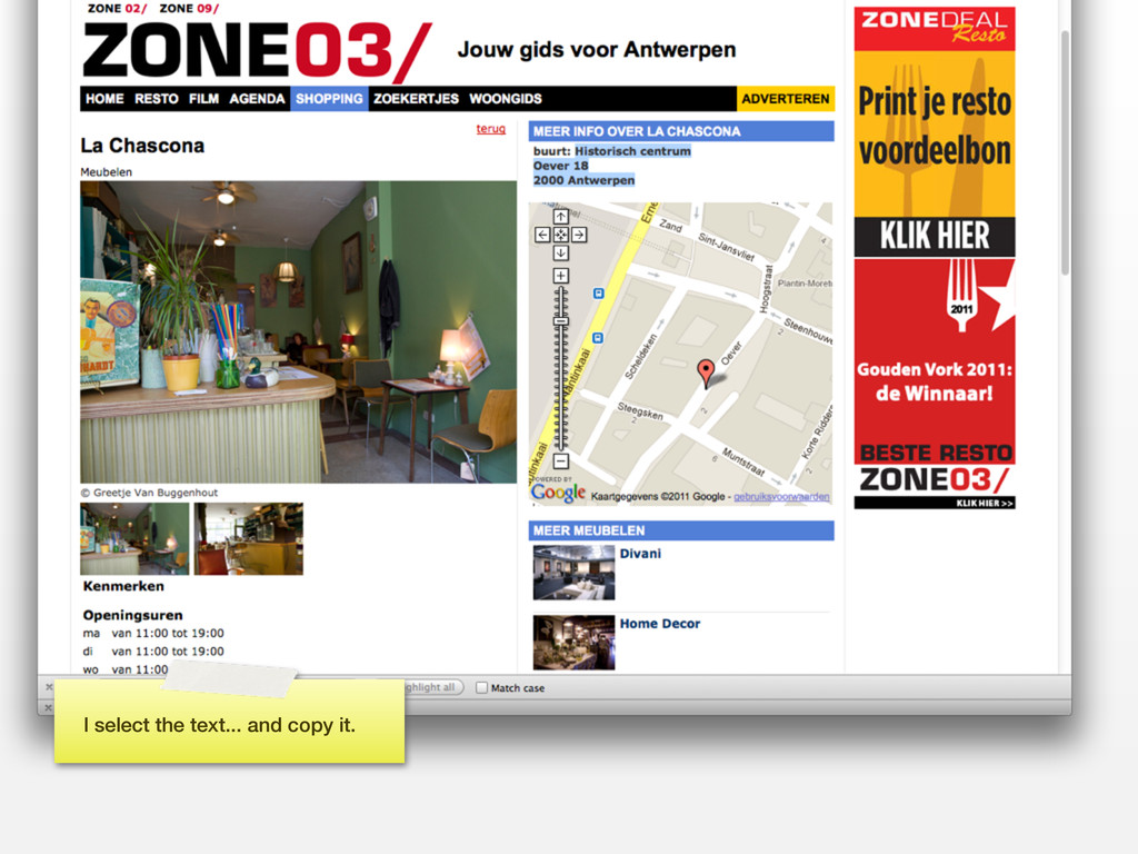
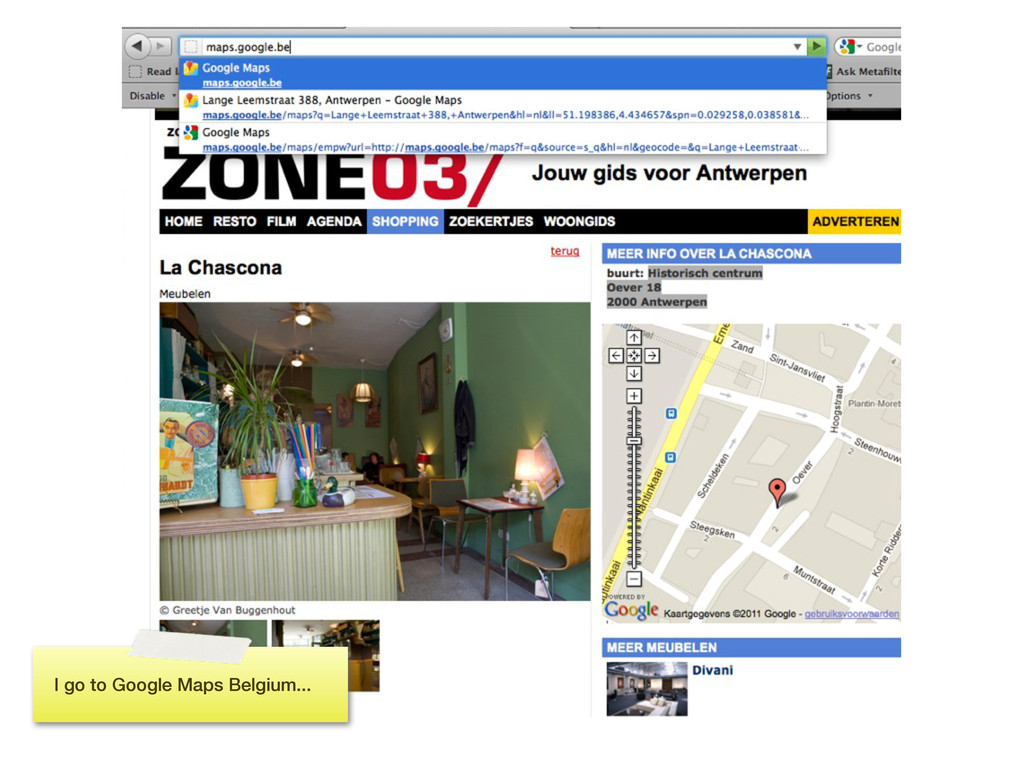
to google maps. There’s a link to the full map below so people don’t have to copy/paste address info into Google Maps. Alternatively I could serve up the image with the Google Maps static maps API.
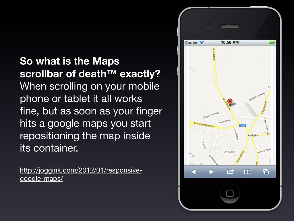
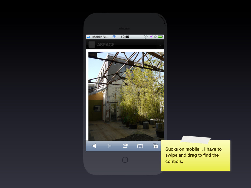
scrolling on your mobile phone or tablet it all works fine, but as soon as your finger hits a google maps you start repositioning the map inside its container. http://joggink.com/2012/01/responsive- google-maps/
locations • Of course, using maps to display map data is warranted (!) • If you must, always add a link to Google maps underneath a Google embed • Better, use the Google Static maps API instead of an embed if the image is for illustrative purposes, and link that image to Google maps Recommendations
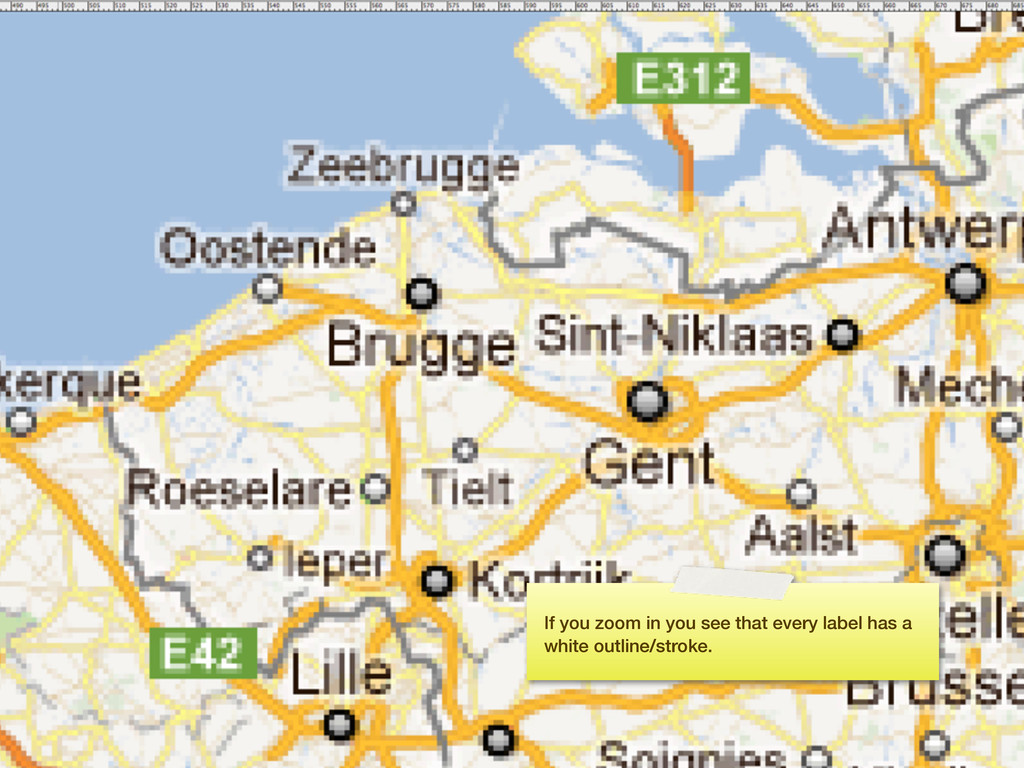
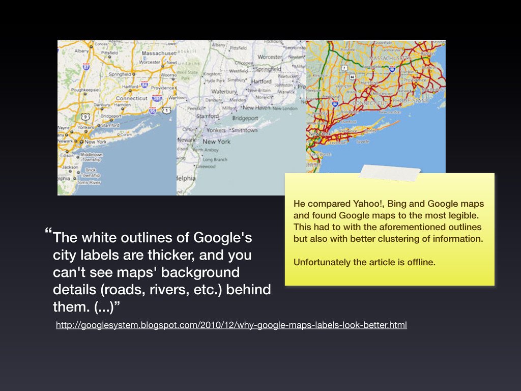
you can't see maps' background details (roads, rivers, etc.) behind them. (...)” http://googlesystem.blogspot.com/2010/12/why-google-maps-labels-look-better.html “ He compared Yahoo!, Bing and Google maps and found Google maps to the most legible. This had to with the aforementioned outlines but also with better clustering of information. Unfortunately the article is offline.
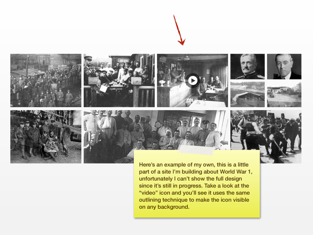
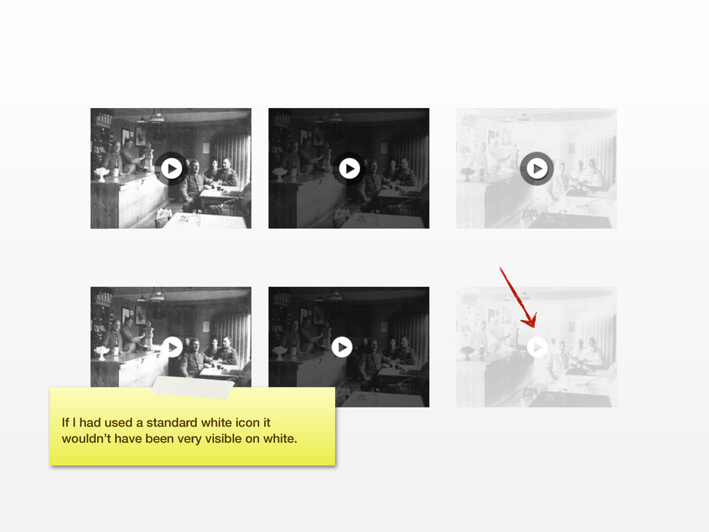
part of a site I’m building about World War 1, unfortunately I can’t show the full design since it’s still in progress. Take a look at the “video” icon and you’ll see it uses the same outlining technique to make the icon visible on any background.
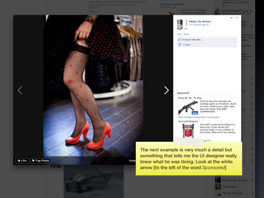
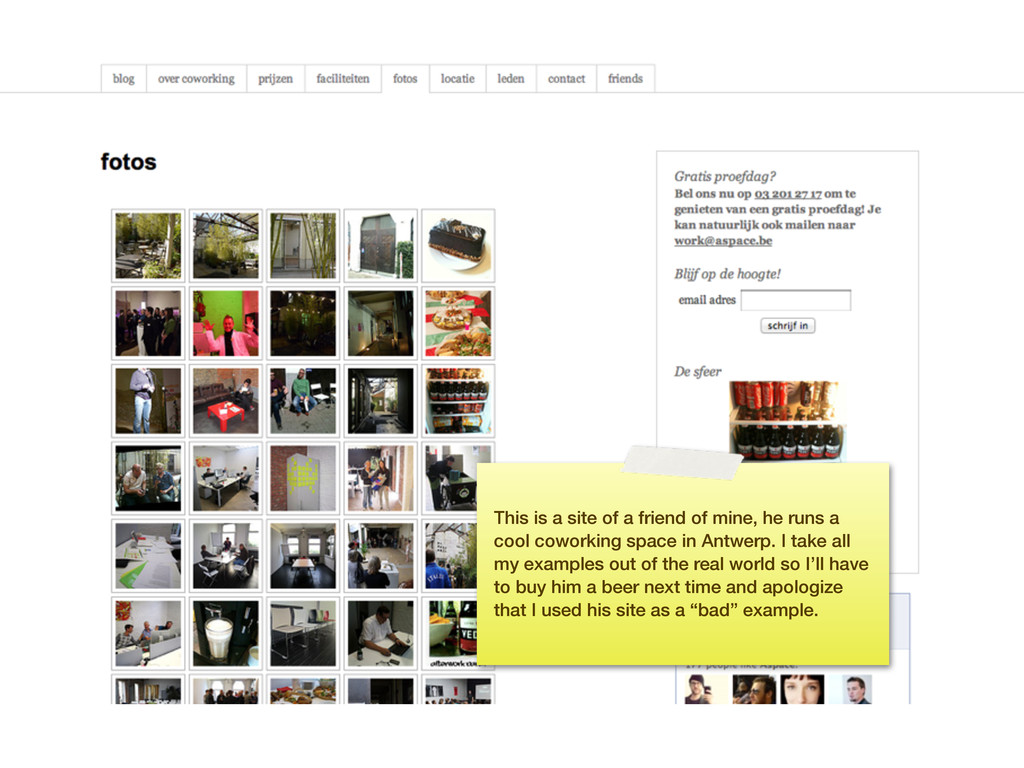
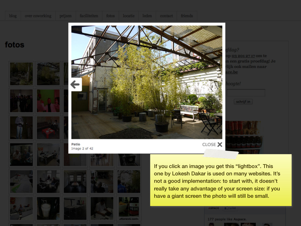
runs a cool coworking space in Antwerp. I take all my examples out of the real world so I’ll have to buy him a beer next time and apologize that I used his site as a “bad” example.
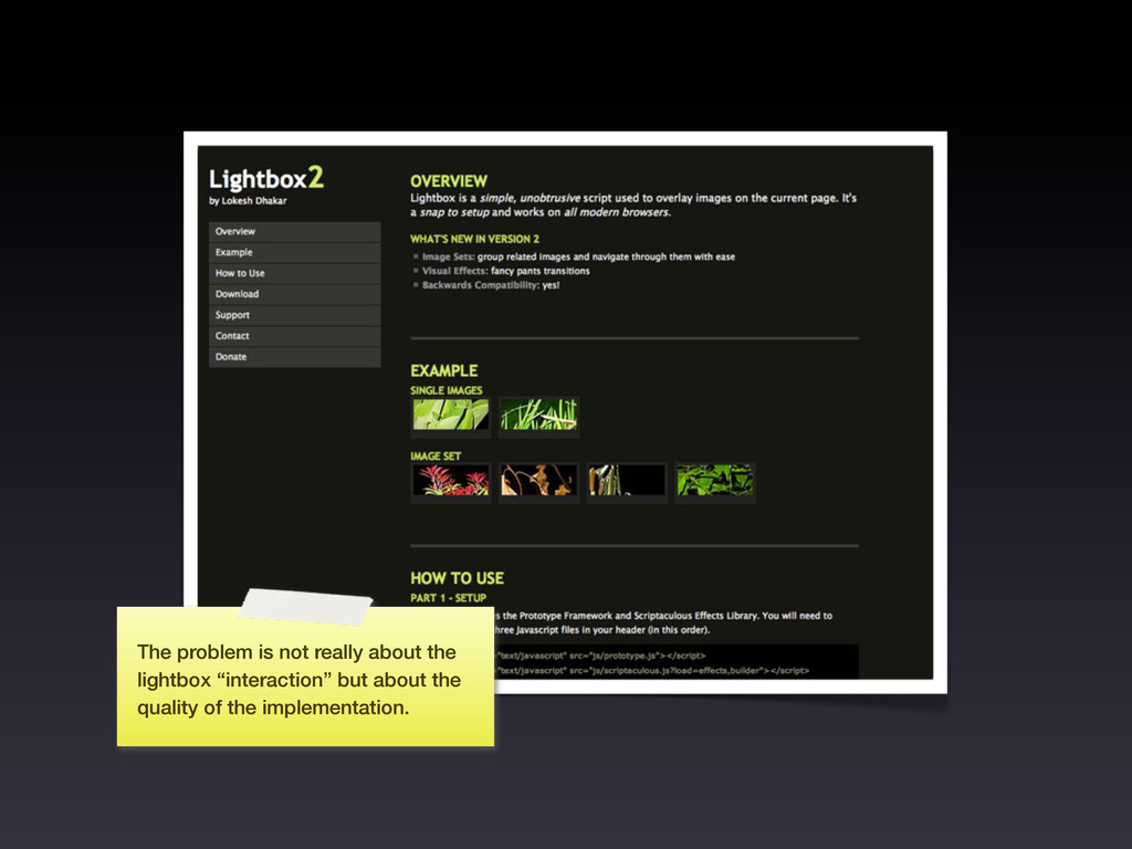
one by Lokesh Dakar is used on many websites. It’s not a good implementation: to start with, it doesn’t really take any advantage of your screen size: if you have a giant screen the photo will still be small.
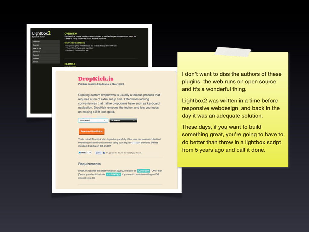
the web runs on open source and it’s a wonderful thing. Lightbox2 was written in a time before responsive webdesign and back in the day it was an adequate solution. These days, if you want to build something great, you’re going to have to do better than throw in a lightbox script from 5 years ago and call it done.
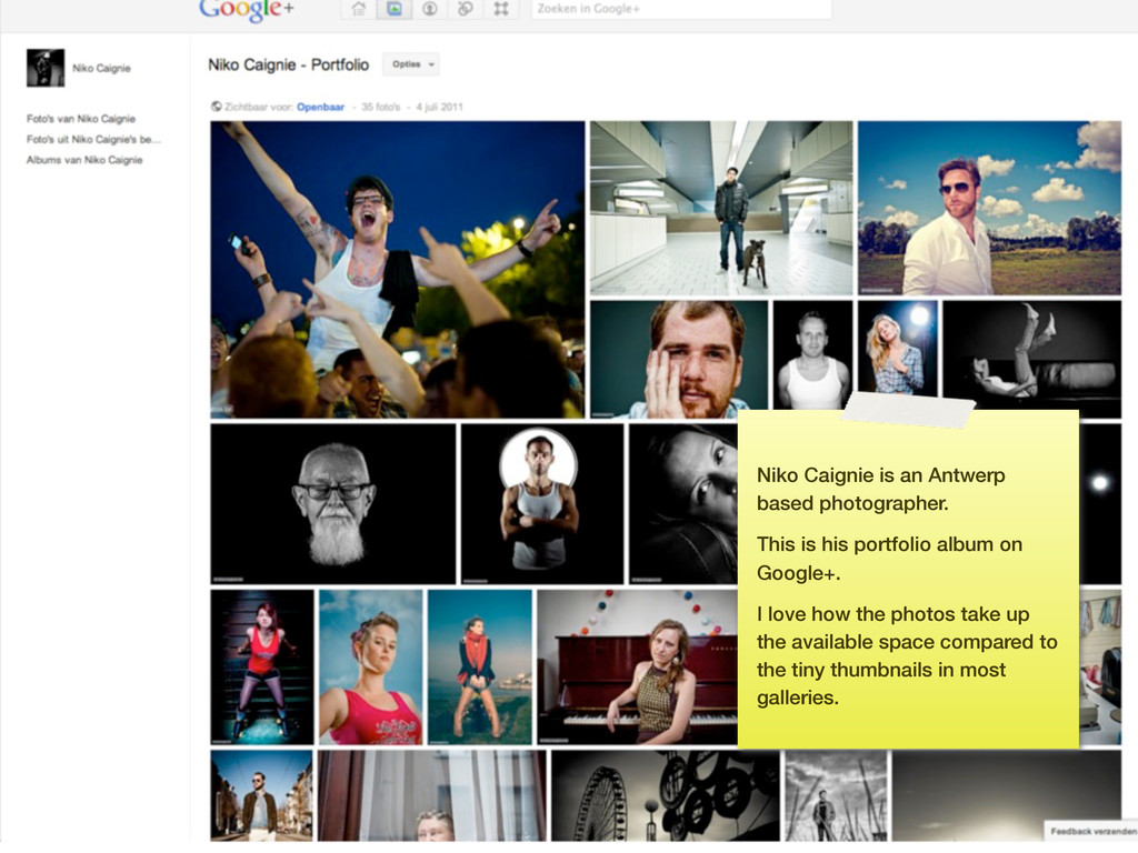
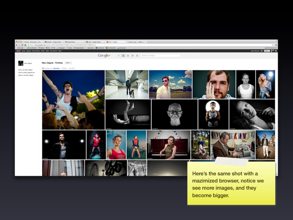
Niko was kind enough to let me use his photography as an example here’s a link to his google+ portfolio: https:// plus.google.com/photos/ 105216293260831528847/ albums/5625394812057179681 (this way you can also see for yourself why it’s a good implementation!)
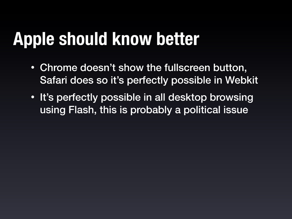
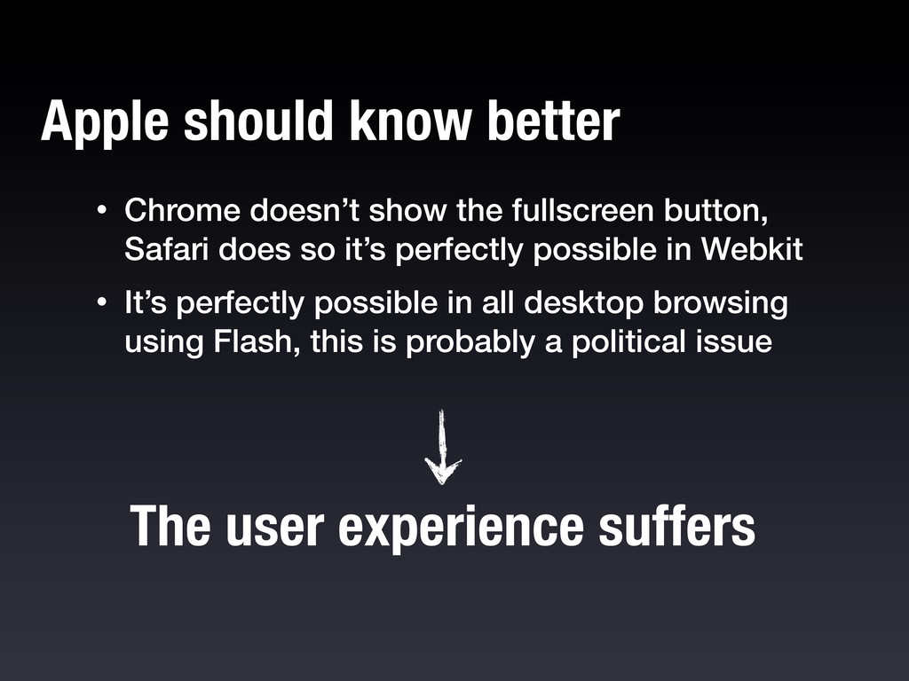
it’s perfectly possible in Webkit • It’s perfectly possible in all desktop browsing using Flash, this is probably a political issue Apple should know better
it’s perfectly possible in Webkit • It’s perfectly possible in all desktop browsing using Flash, this is probably a political issue Apple should know better The user experience suffers
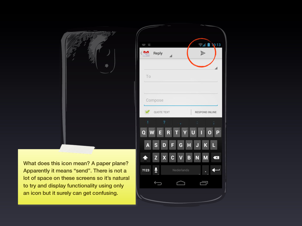
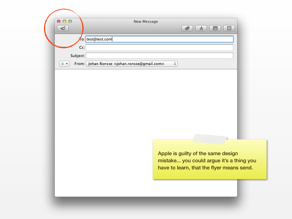
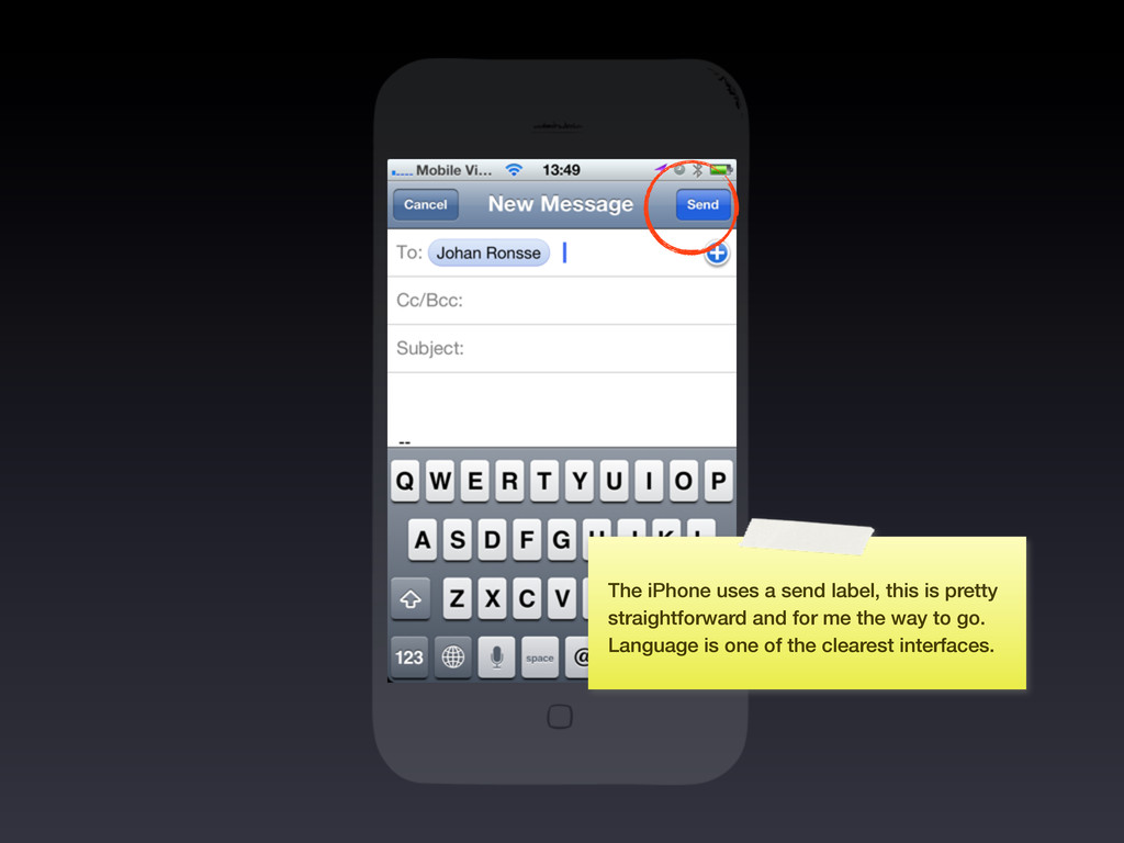
means “send”. There is not a lot of space on these screens so it’s natural to try and display functionality using only an icon but it surely can get confusing.
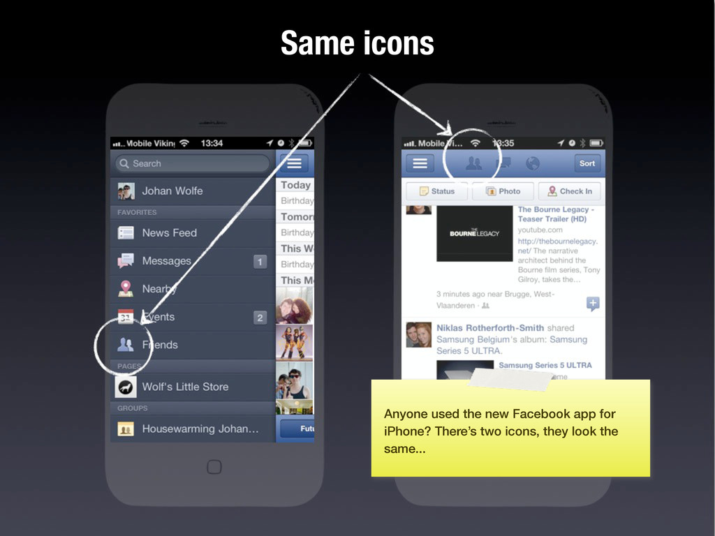
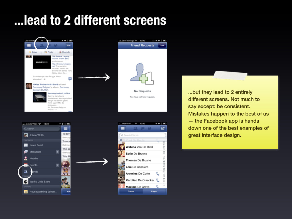
entirely different screens. Not much to say except: be consistent. Mistakes happen to the best of us — the Facebook app is hands down one of the best examples of great interface design.
about all of these details and more. A good interface designer is a pragmatic perfectionist. It’s not enough to just focus on the visual part, you need to focus on EVERYTHING.
craft, they would start off as an apprentice and go to different masters to educate themselves in their craft. Ideally every master was a bit different so the apprentice could learn from varied points of view and form his own. Eventually the apprentice would become a master of their domain. Applying this to modern UI design I believe a good UI designer should dip their toes in other jobs and fields like copywriting, backend development, photography, print design, business, marketing, front-end development and so much more.
my goals is to become the go-to company when talking about UI design. Obviously I can’t do this alone. If you live in or around Antwerp, Get in touch: [email protected] Are you a talented UI designer?
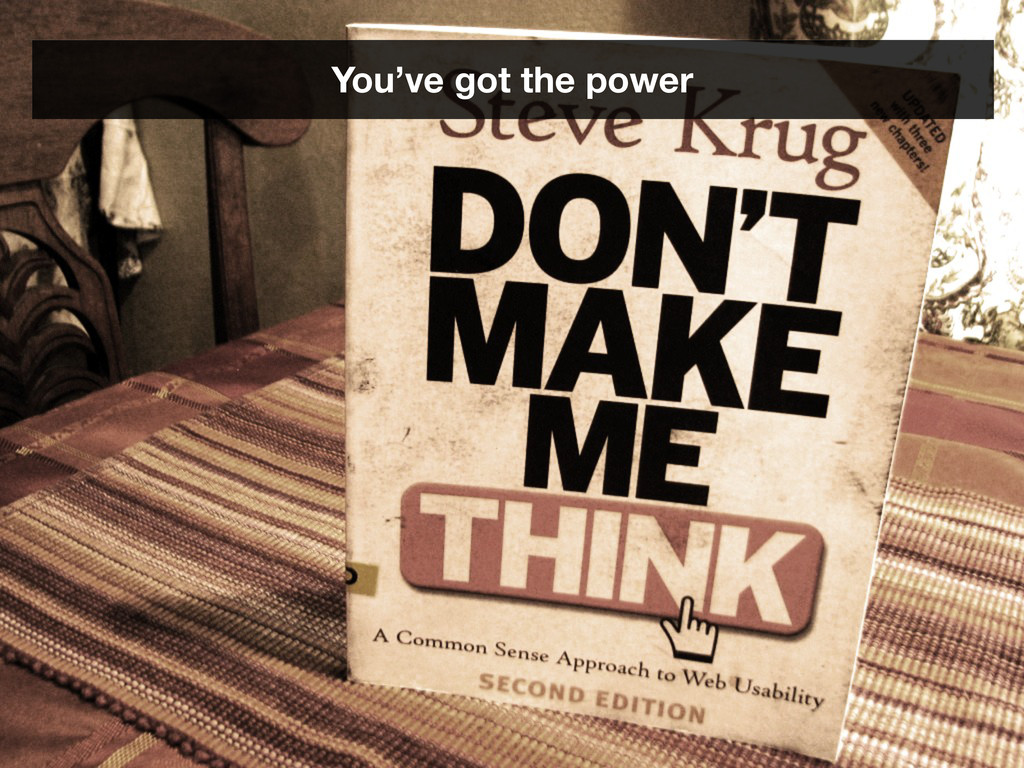
How to improve error messages, help, forms, and other crisis points by Jason Fried & Matthew Linderman Designing Web Usability by Jakob Nielsen Don’t make me think! by Steve Krug Designing the obvious by Robert Hoekman Jr. Designing for interaction by Dan Saffer Getting Real by 37signals http:// gettingreal.37signals.com/ Web content mentioned in this talk http://marketingland.com/review-galaxy-nexus-android-4-phone-1409 http://joggink.com/2012/01/responsive-google-maps/ Web content around the subject http://www.designstaff.org/articles/design-details-2011-11-29.html http://www.andybudd.com/archives/2011/12/why_designers_are_holding_themselves_bac/ http://tapbots.com/blog/design/designing-convertbot http://littlebigdetails.com/
![Thank you! Follow me: @wolfr_ on Twitter E-mail me: [email protected]](https://files.speakerdeck.com/presentations/4f3e57bea0d46a001f00f0ca/slide_113.jpg)