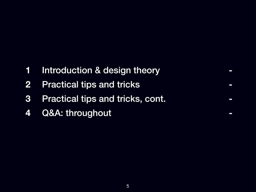
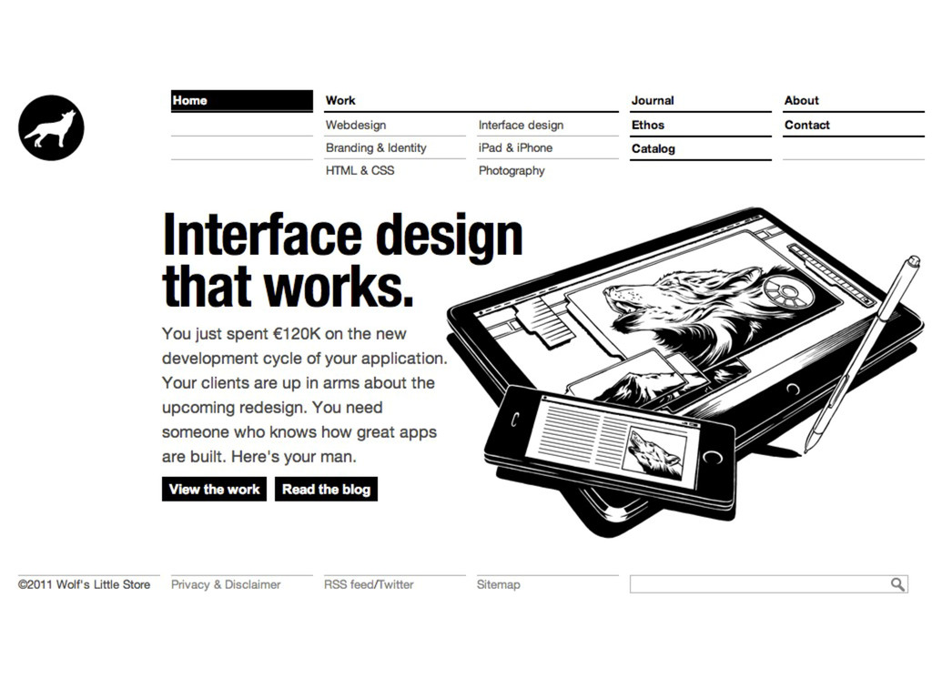
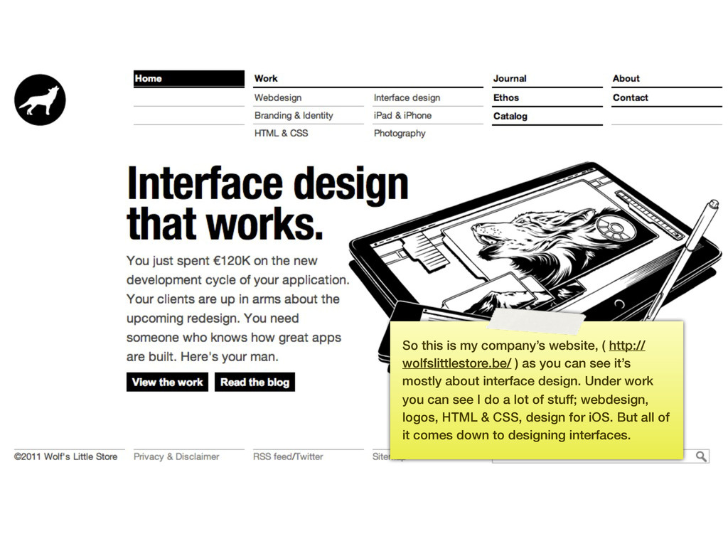
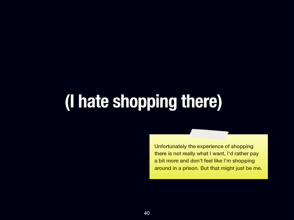
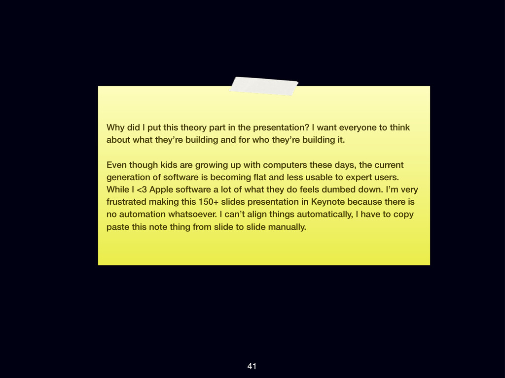
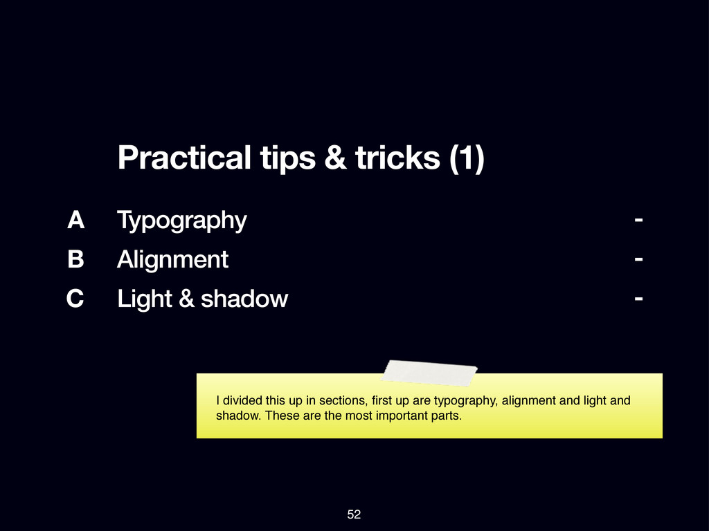
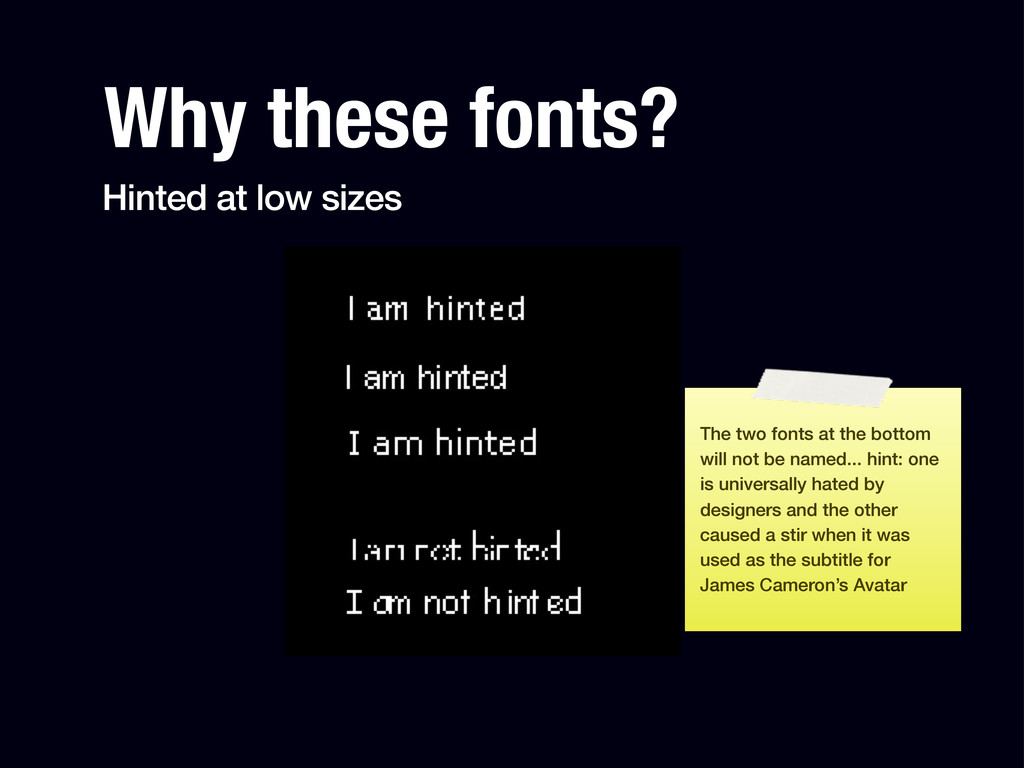
These slides are from a 2 hour presentation called Design for Developers.
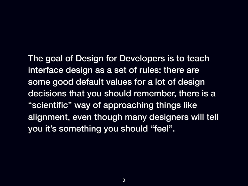
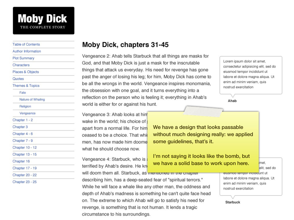
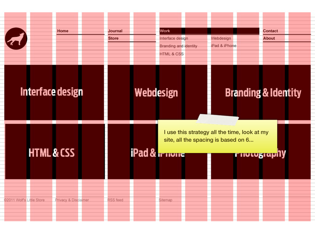
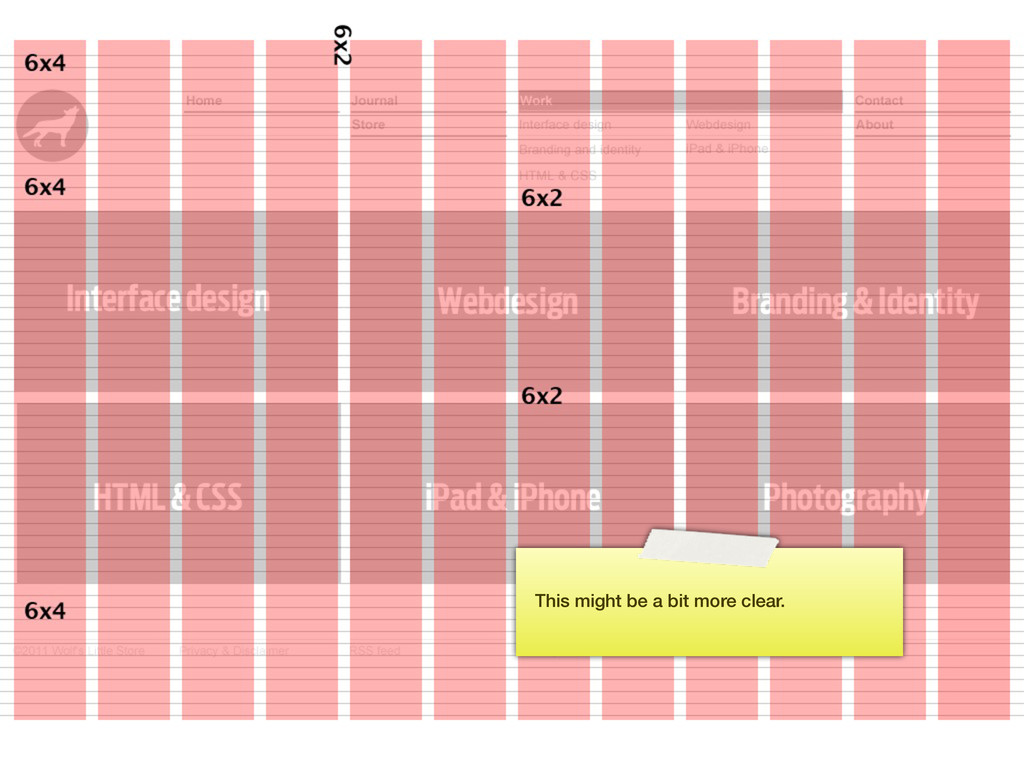
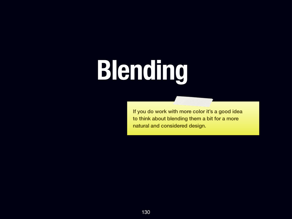
The goal of Design for Developers is to teach interface design as a set of rules: there are some good default values for a lot of design decisions that you should remember, there is a “scientific” way of approaching things like alignment, even though many designers will tell you it’s something you should “feel”.
 wolfr
wolfr
 spacemarket
 nagata03
 kaikou
 hicard
 nishame
 sevendex
 seto
seto
 usagimaru
 yamasaku
 nttcom
 kspace
 hypebeans
 pedronauck
 axbom
axbom
 szymonslowik
 honzajavorek
 keathley
 bethany
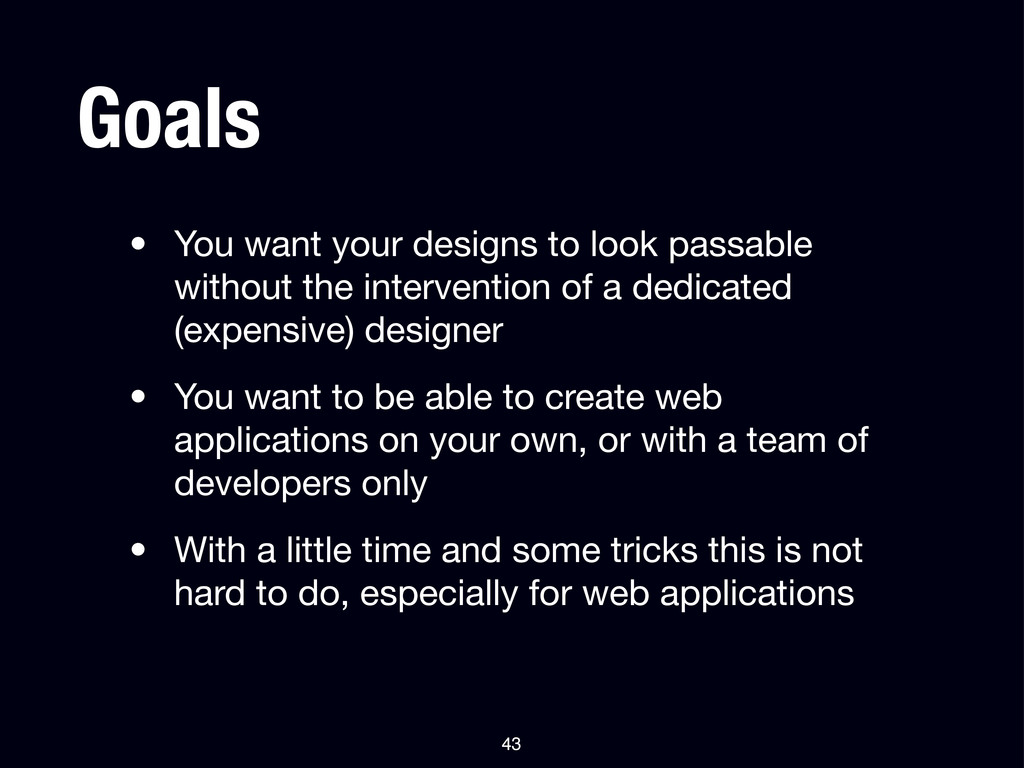
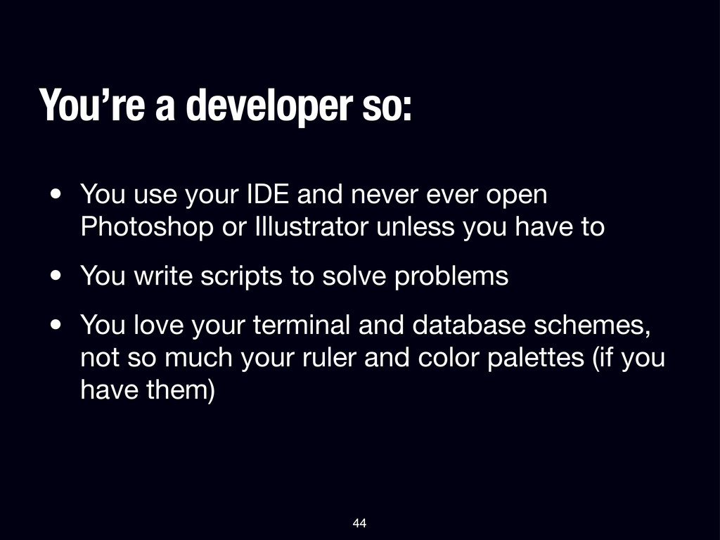
 bkeepers
 aleyda
 nmsamuel
 cromwellryan
 mza
mza