flexbox, was designed as a one-dimensional layout model, and as a method that could offer space distribution between items in an interface and powerful alignment capabilities. Source: https://developer.mozilla.org/en-US/docs/Web/CSS/CSS_Flexible_Box_Layout/Basic_Concepts_of_Flexbox Source: https://developer.mozilla.org/zh-CN/docs/Web/CSS/CSS_Flexible_Box_Layout/Basic_Concepts_of_Flexbox Flexible Box 模型,通常被称为 flexbox,是一种一维的布局模型。它给 flexbox 的子元素之间提供了强大的空间分布和对齐能力。
erse Right Left column Top Bottom column- reverse Bottom Top row row-reverse column column- reverse Source: https://www.jianshu.com/p/ee3b2b45d85d default: row
defines the default size of an element before the remaining space is distributed. source: https://css-tricks.com/snippets/css/a-guide-to-flexbox/#article-header-id-12 Flex 的长度 div 的长度
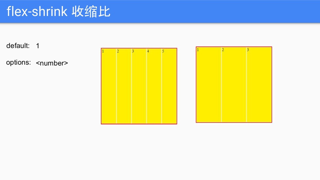
options: This is the shorthand for flex-grow, flex-shrink and flex-basis combined. source: https://css-tricks.com/snippets/css/a-guide-to-flexbox/#article-header-id-13
here source: https://medium.com/@ohansemmanuel/flexbox-is-awesome-but-its-not-welcome-here-a90601c292b6 Don't use flexbox for overall page layout source: https://jakearchibald.com/2014/dont-use-flexbox-for-page-layout/ CSS Flex is not everything. Don’t use CSS Flex in Grid System Back to Basics
 zhangen69
 koxya
koxya
 denyspoltorak
 bengo4com
 hibiki_cube
 youkidearitai
 shibayu36
 rkaga
rkaga
 kamina_zzz
 konifar
 ohmori_yusuke
 javiergs
 uxyall
 katarinadahlin
 pwiseman
 nonsquared
 chrislema
 csswizardry
 holman
 apolaine
 eileencodes
 maggiecrowley
 afnizarnur
 jnunemaker
![flex auto none | [ <’flex-grow’> <’flex-shrink’> <’flex-basis’> ] default:](https://files.speakerdeck.com/presentations/fc9db57dbb604b10ad5fdba65f7ae0c8/slide_20.jpg)
![Thanks! Contact me: [email protected] FB: 陈章恩 (Jacob Tan) Whatsapp: 019-776](https://files.speakerdeck.com/presentations/fc9db57dbb604b10ad5fdba65f7ae0c8/slide_31.jpg)