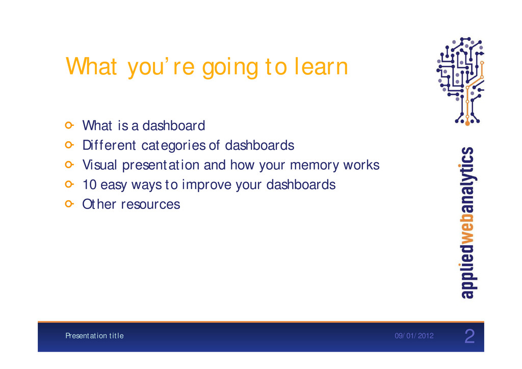
categories of dashboards Visual presentation and how your memory works 10 easy ways to improve your dashboards Other resources 09/01/2012 Presentation title 2
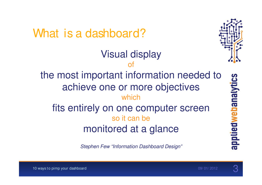
dashboard 3 Visual display of the most important information needed to achieve one or more objectives which fits entirely on one computer screen so it can be monitored at a glance Stephen Few “Information Dashboard Design”
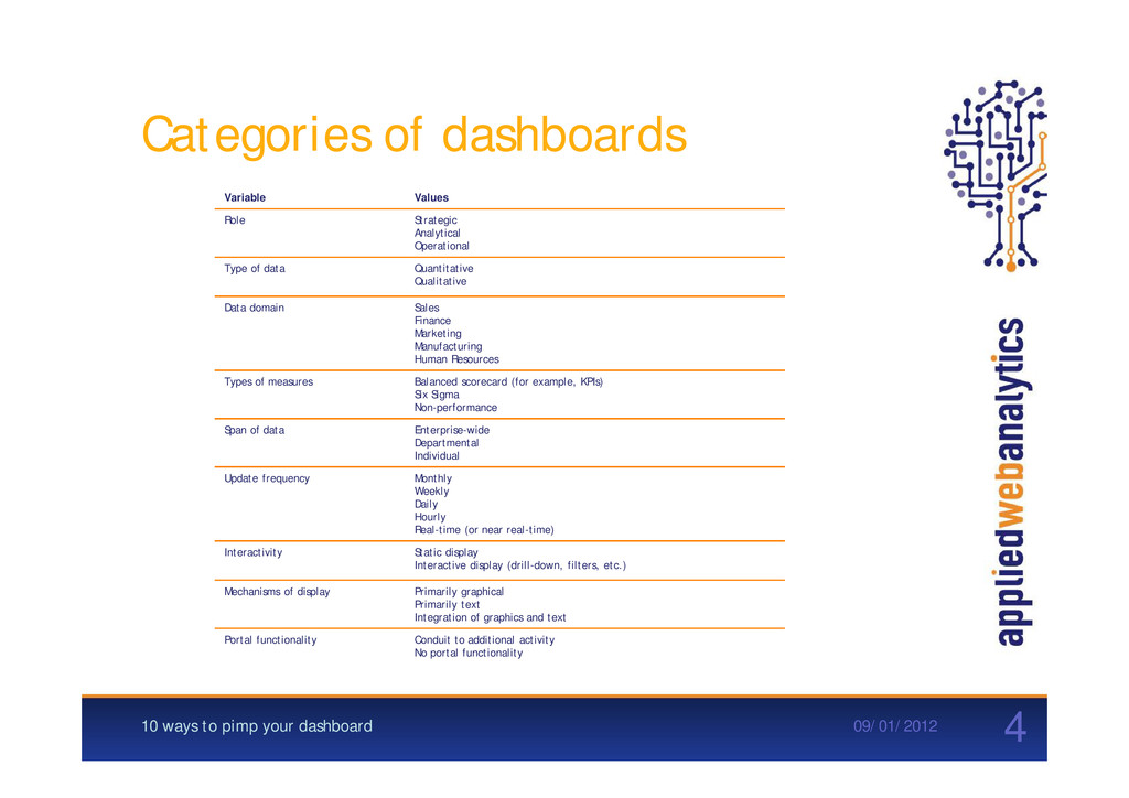
of data Quantitative Qualitative Data domain Sales Finance Marketing Manufacturing Human Resources Types of measures Balanced scorecard (for example, KPIs) Six Sigma Non-performance Span of data Enterprise-wide Departmental Individual Update frequency Monthly Weekly Daily Hourly Real-time (or near real-time) Interactivity Static display Interactive display (drill-down, filters, etc.) Mechanisms of display Primarily graphical Primarily text Integration of graphics and text Portal functionality Conduit to additional activity No portal functionality 09/01/2012 10 ways to pimp your dashboard 4
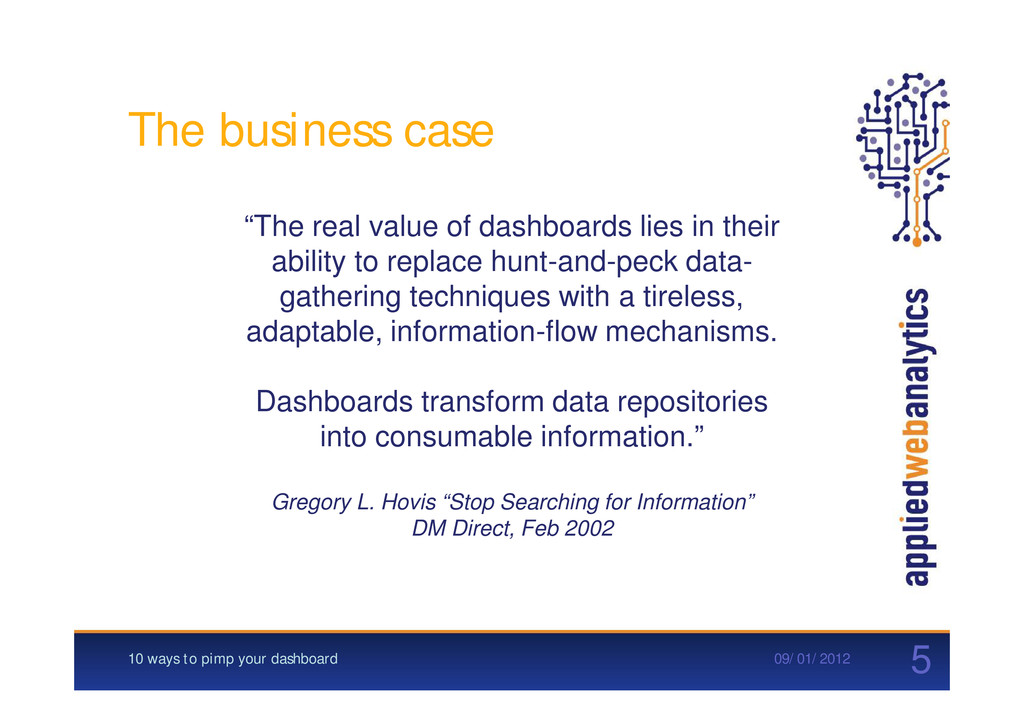
5 “The real value of dashboards lies in their ability to replace hunt-and-peck data- gathering techniques with a tireless, adaptable, information-flow mechanisms. Dashboards transform data repositories into consumable information.” Gregory L. Hovis “Stop Searching for Information” DM Direct, Feb 2002
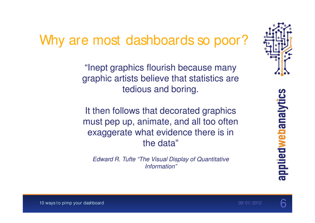
pimp your dashboard 6 “Inept graphics flourish because many graphic artists believe that statistics are tedious and boring. It then follows that decorated graphics must pep up, animate, and all too often exaggerate what evidence there is in the data” Edward R. Tufte “The Visual Display of Quantitative Information”
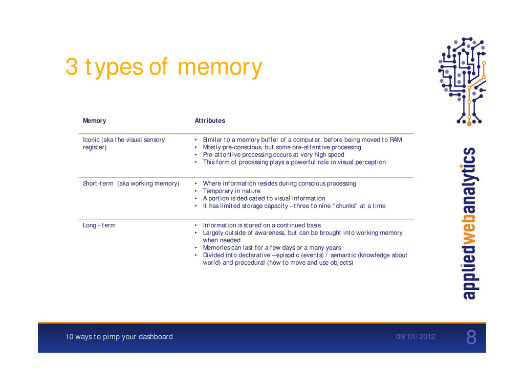
sensory register) • Similar to a memory buffer of a computer, before being moved to RAM • Mostly pre-conscious, but some pre-attentive processing • Pre-attentive processing occurs at very high speed • This form of processing plays a powerful role in visual perception Short-term (aka working memory) • Where information resides during conscious processing • Temporary in nature • A portion is dedicated to visual information • It has limited storage capacity – three to nine “chunks” at a time Long - term • Information is stored on a continued basis • Largely outside of awareness, but can be brought into working memory when needed • Memories can last for a few days or a many years • Divided into declarative – episodic (events) / semantic (knowledge about world) and procedural (how to move and use objects) 09/01/2012 10 ways to pimp your dashboard 8
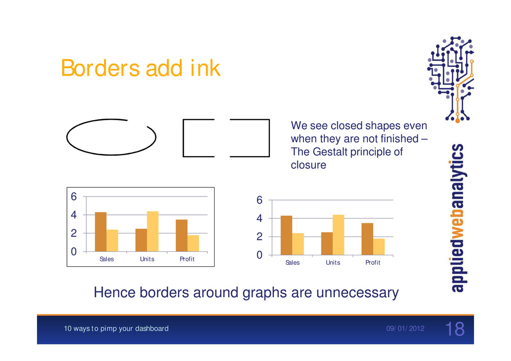
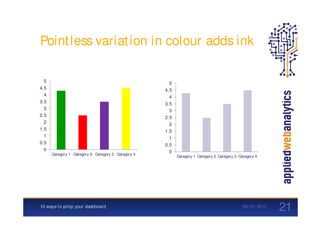
ink We see closed shapes even when they are not finished – The Gestalt principle of closure Hence borders around graphs are unnecessary 0 2 4 6 Sales Units Profit 0 2 4 6 Sales Units Profit
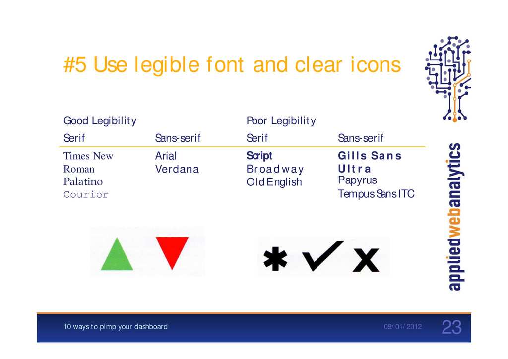
Legibility Serif Sans-serif Serif Sans-serif Times New Roman Palatino Courier Arial Verdana Script Broadway Old English Gills Sans Ultra Papyrus Tempus Sans ITC 09/01/2012 10 ways to pimp your dashboard 23
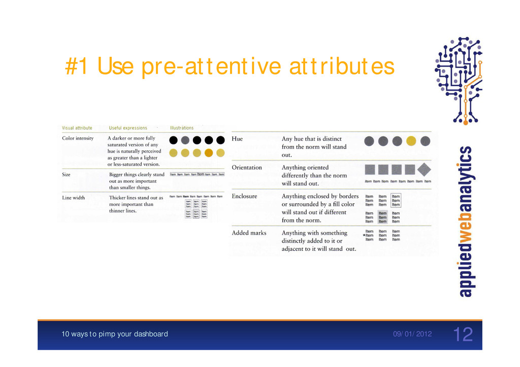
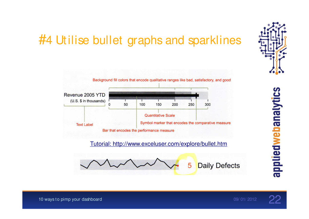
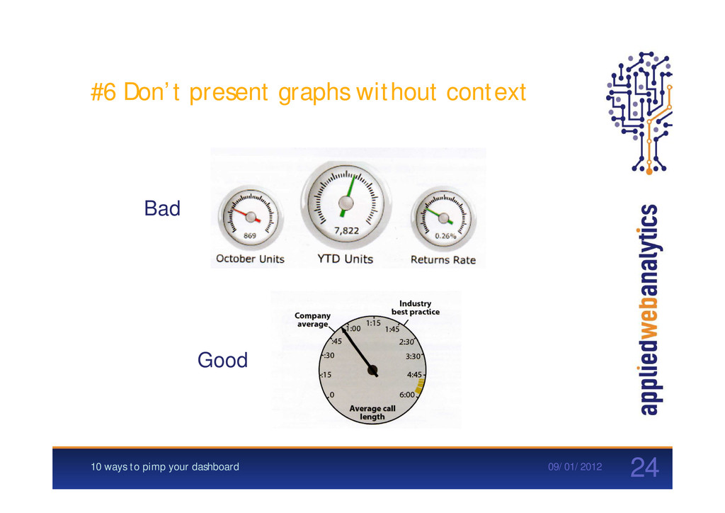
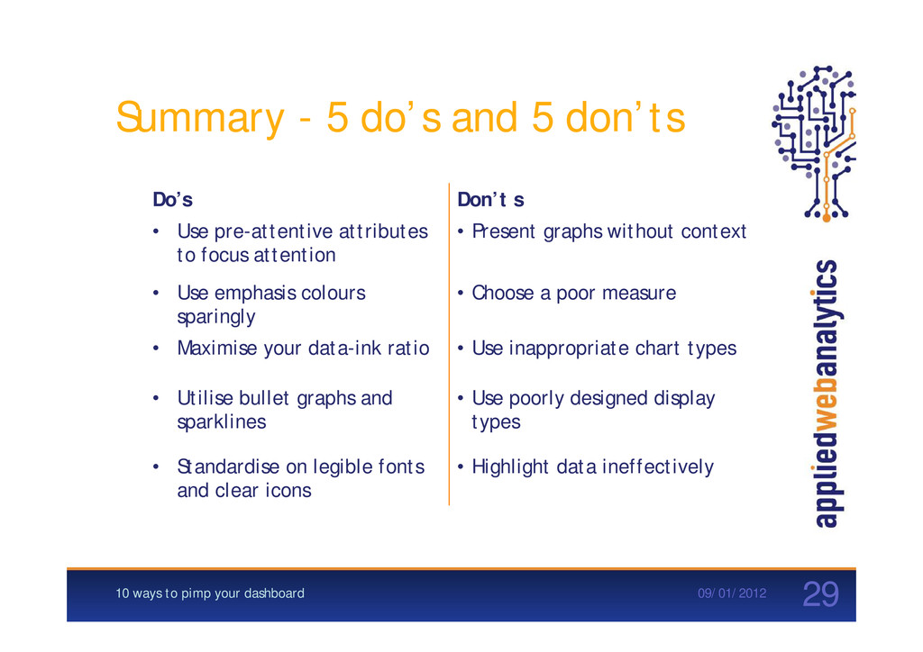
to pimp your dashboard 29 Do’s Don’t s • Use pre-attentive attributes to focus attention • Present graphs without context • Use emphasis colours sparingly • Choose a poor measure • Maximise your data-ink ratio • Use inappropriate chart types • Utilise bullet graphs and sparklines • Use poorly designed display types • Standardise on legible fonts and clear icons • Highlight data ineffectively
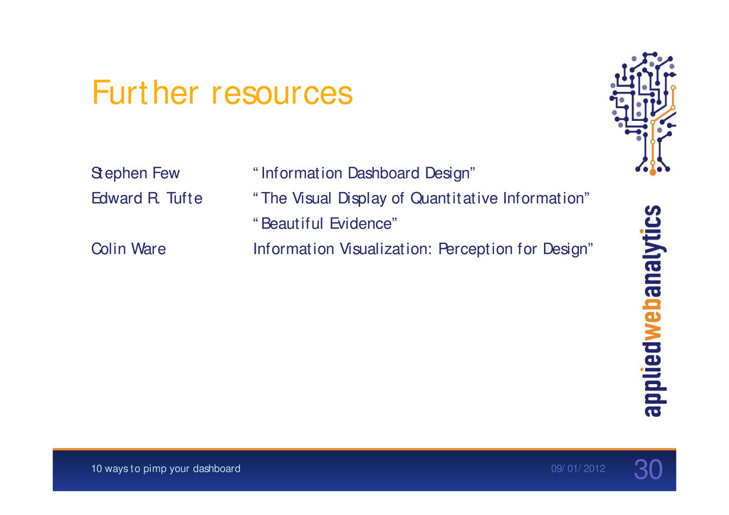
“The Visual Display of Quantitative Information” “Beautiful Evidence” Colin Ware Information Visualization: Perception for Design” 09/01/2012 10 ways to pimp your dashboard 30