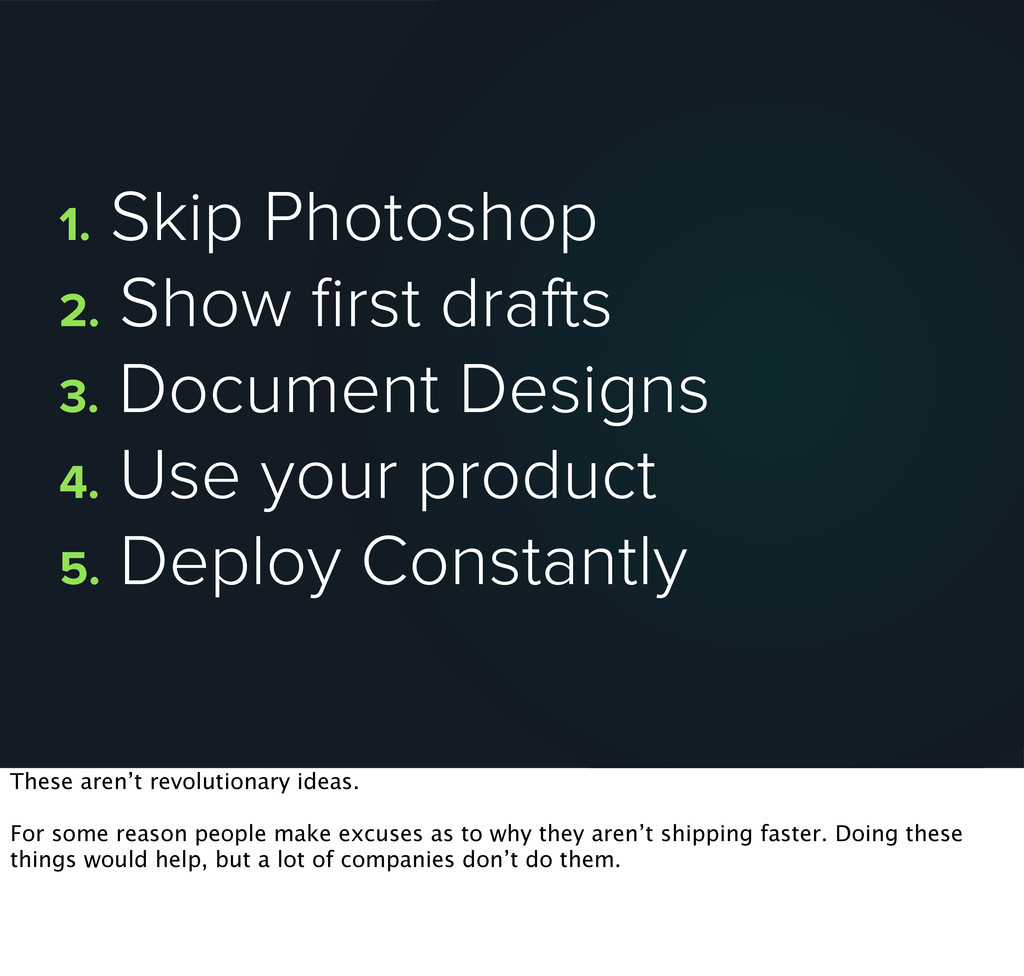
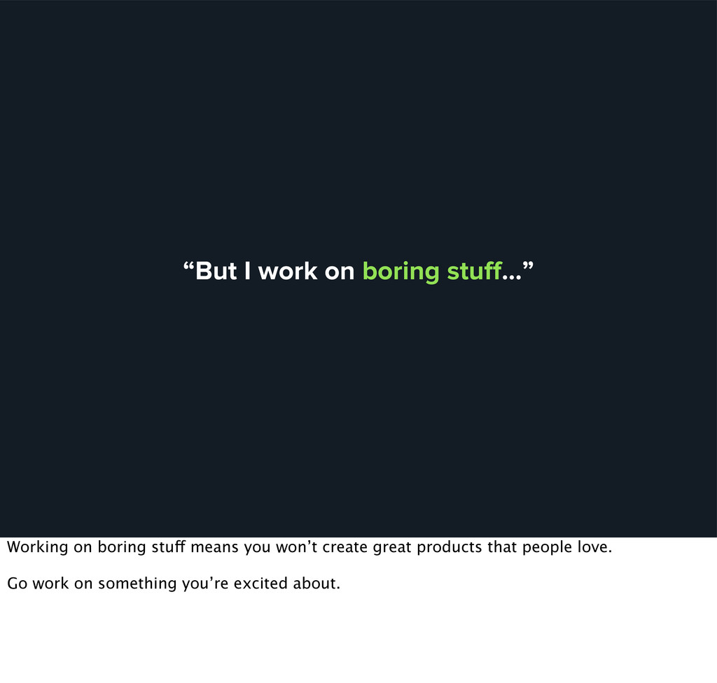
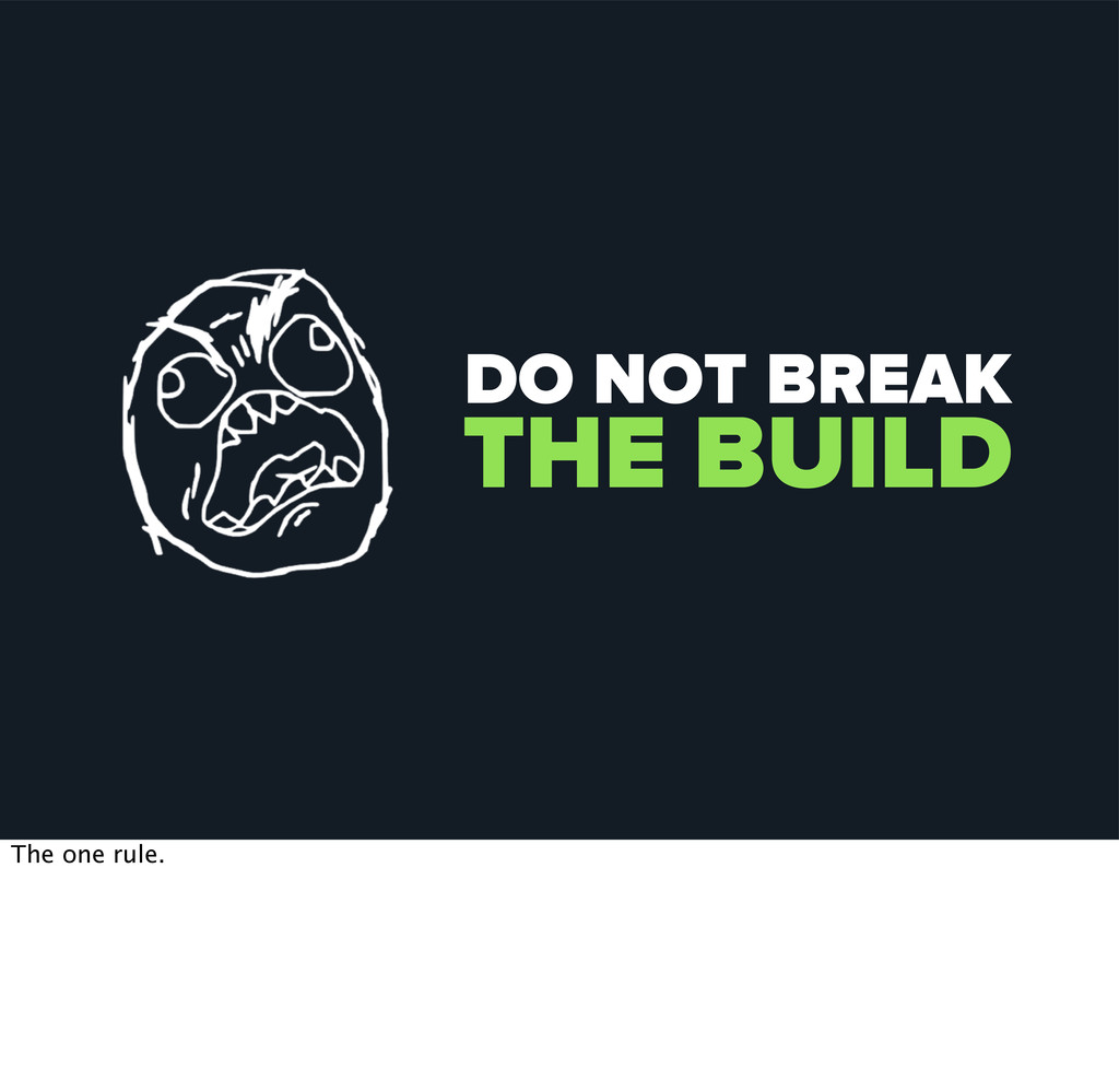
4. Use your product 5. Deploy Constantly These aren’t revolutionary ideas. For some reason people make excuses as to why they aren’t shipping faster. Doing these things would help, but a lot of companies don’t do them.
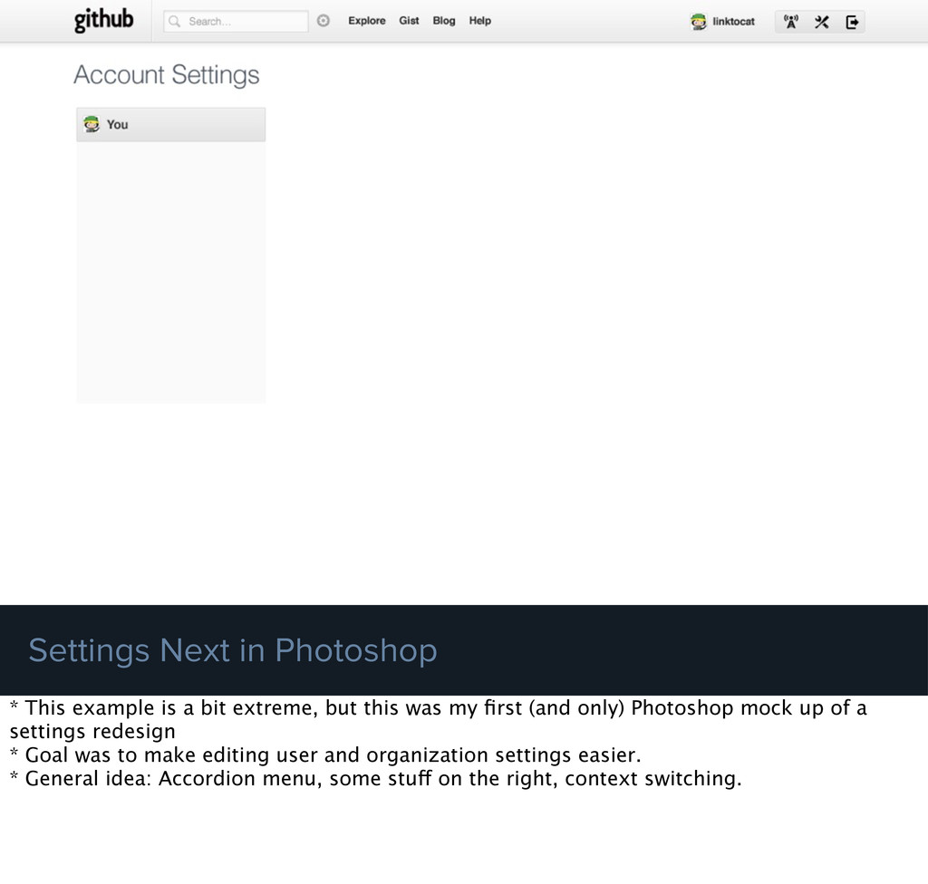
extreme, but this was my first (and only) Photoshop mock up of a settings redesign * Goal was to make editing user and organization settings easier. * General idea: Accordion menu, some stuff on the right, context switching.
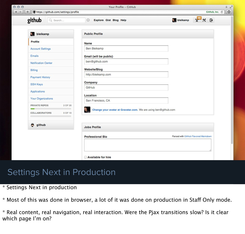
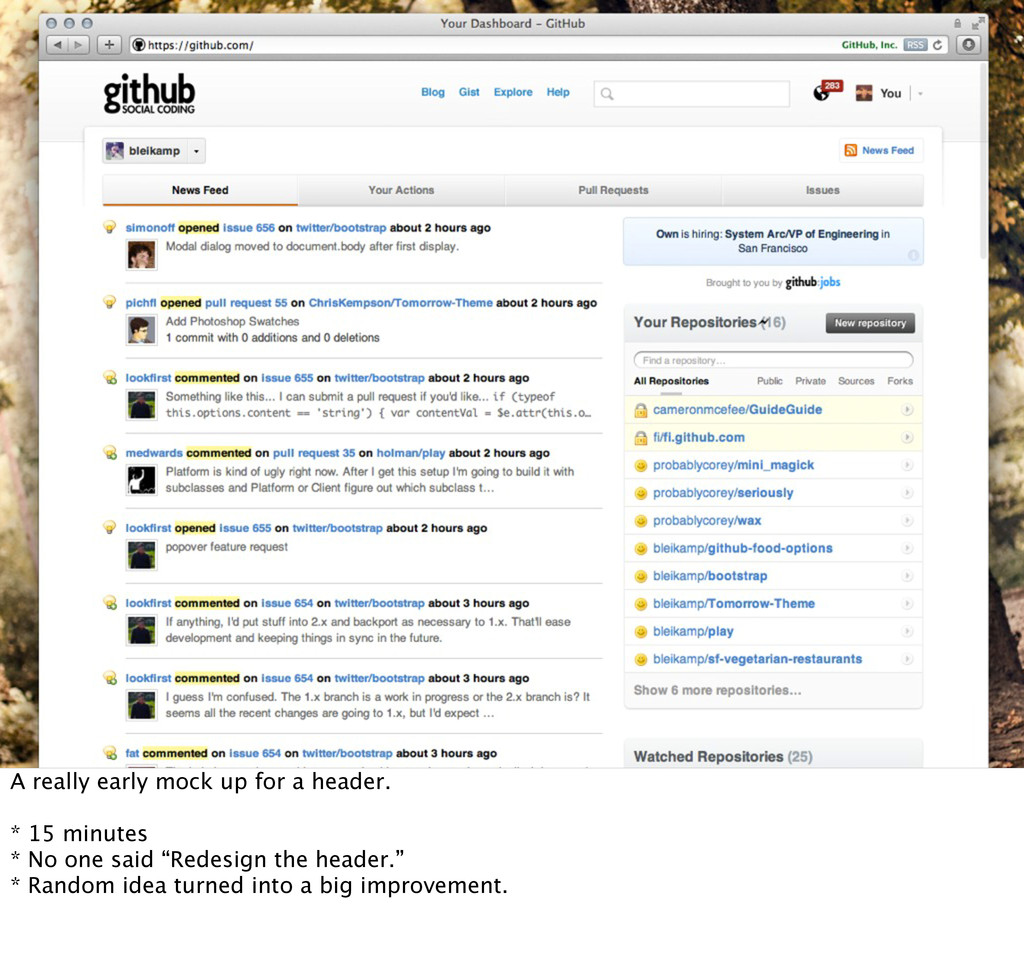
Most of this was done in browser, a lot of it was done on production in Staff Only mode. * Real content, real navigation, real interaction. Were the Pjax transitions slow? Is it clear which page I’m on?
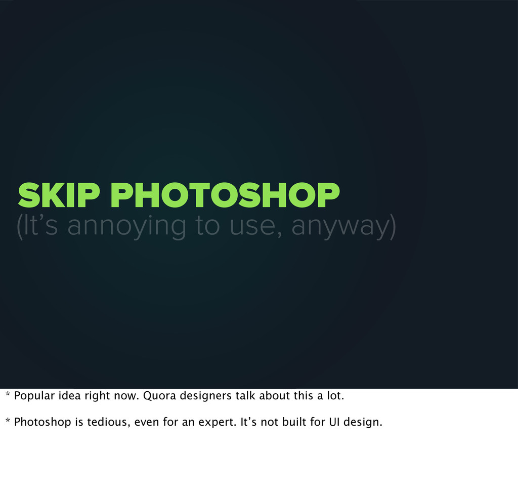
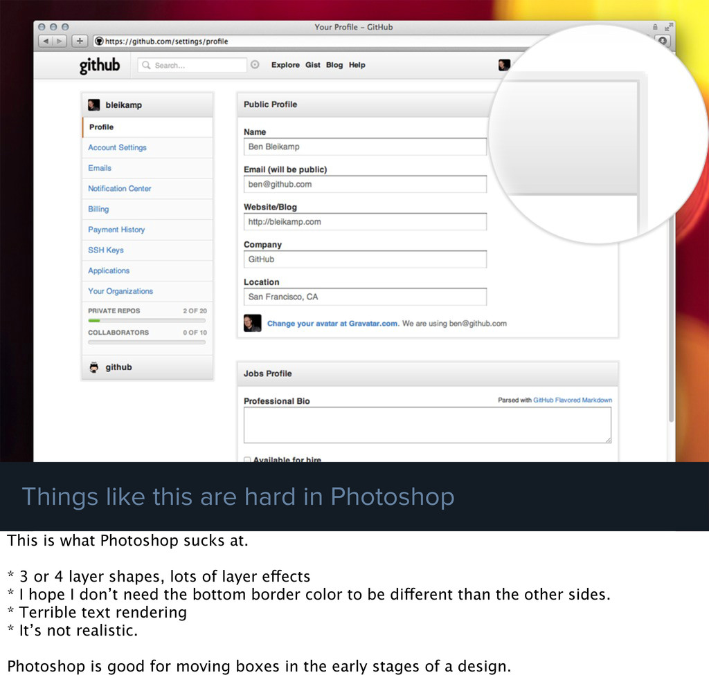
Photoshop This is what Photoshop sucks at. * 3 or 4 layer shapes, lots of layer effects * I hope I don’t need the bottom border color to be different than the other sides. * Terrible text rendering * It’s not realistic. Photoshop is good for moving boxes in the early stages of a design.
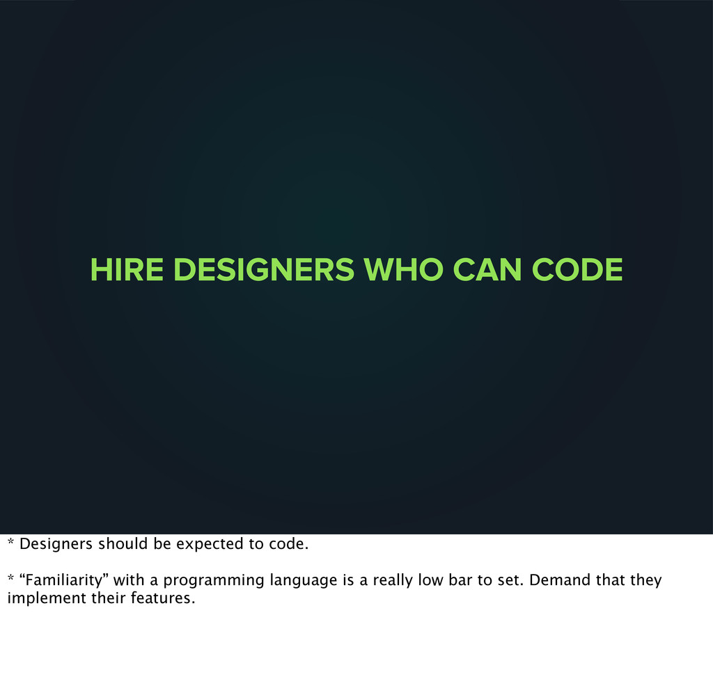
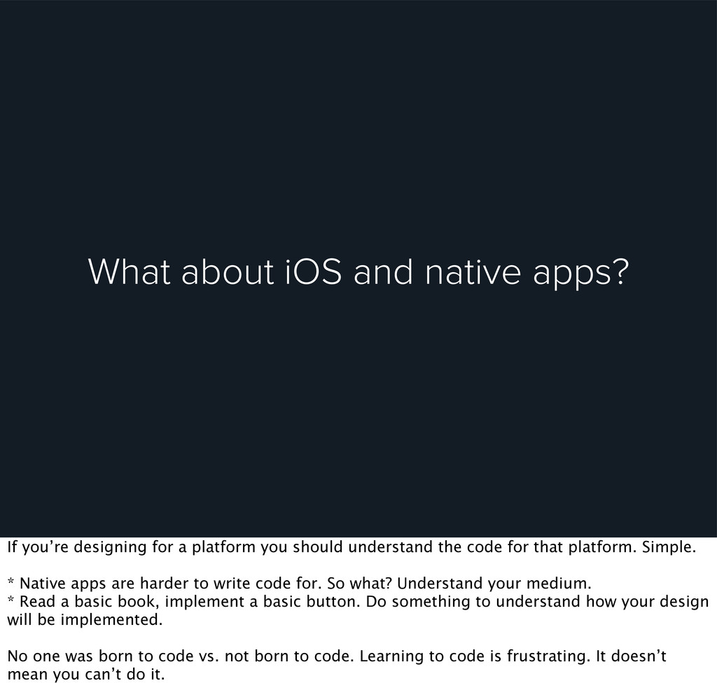
a platform you should understand the code for that platform. Simple. * Native apps are harder to write code for. So what? Understand your medium. * Read a basic book, implement a basic button. Do something to understand how your design will be implemented. No one was born to code vs. not born to code. Learning to code is frustrating. It doesn’t mean you can’t do it.
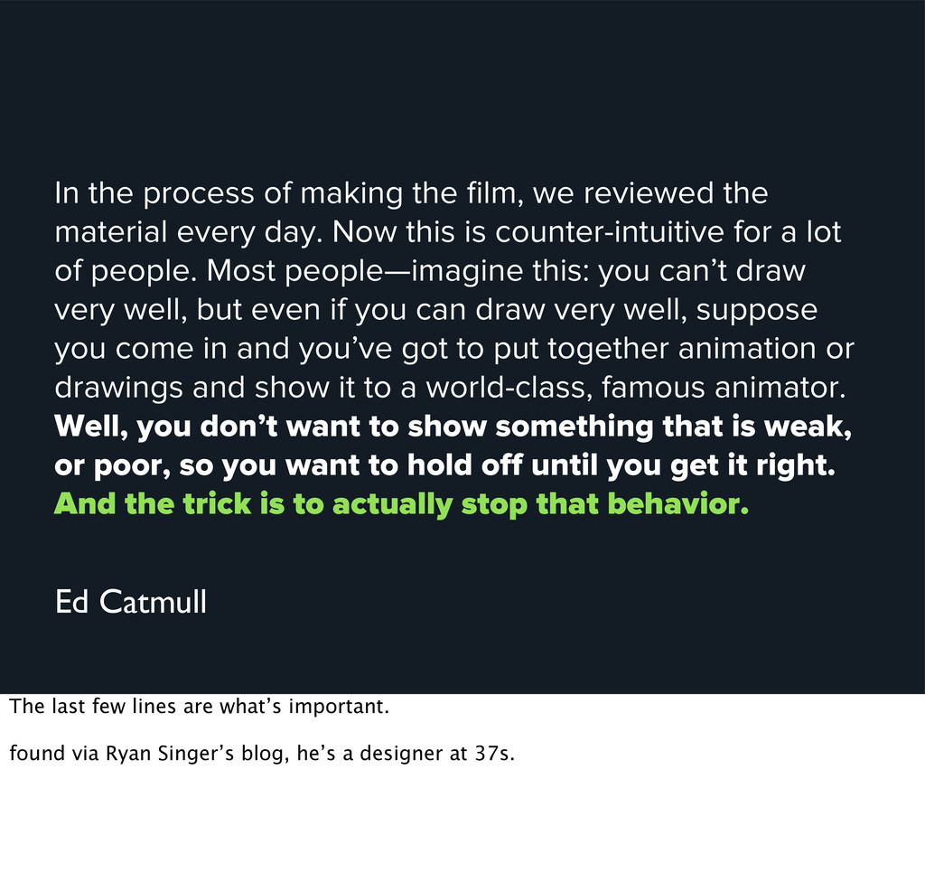
material every day. Now this is counter-intuitive for a lot of people. Most people—imagine this: you can’t draw very well, but even if you can draw very well, suppose you come in and you’ve got to put together animation or drawings and show it to a world-class, famous animator. Well, you don’t want to show something that is weak, or poor, so you want to hold off until you get it right. And the trick is to actually stop that behavior. Ed Catmull The last few lines are what’s important. found via Ryan Singer’s blog, he’s a designer at 37s.
it’s okay to perfect it and worry about pixels. Shipping should be your priority. Don’t hold a feature back because of a 2px vs 3px border radius. Release it. We can iterate quickly on the web. We’re not Apple trying to release the perfect piece of hardware on a global scale.
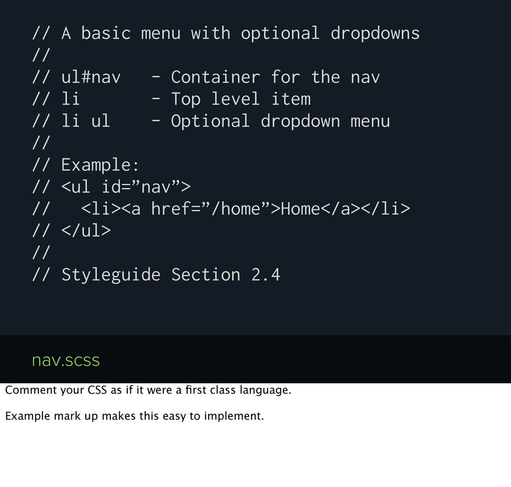
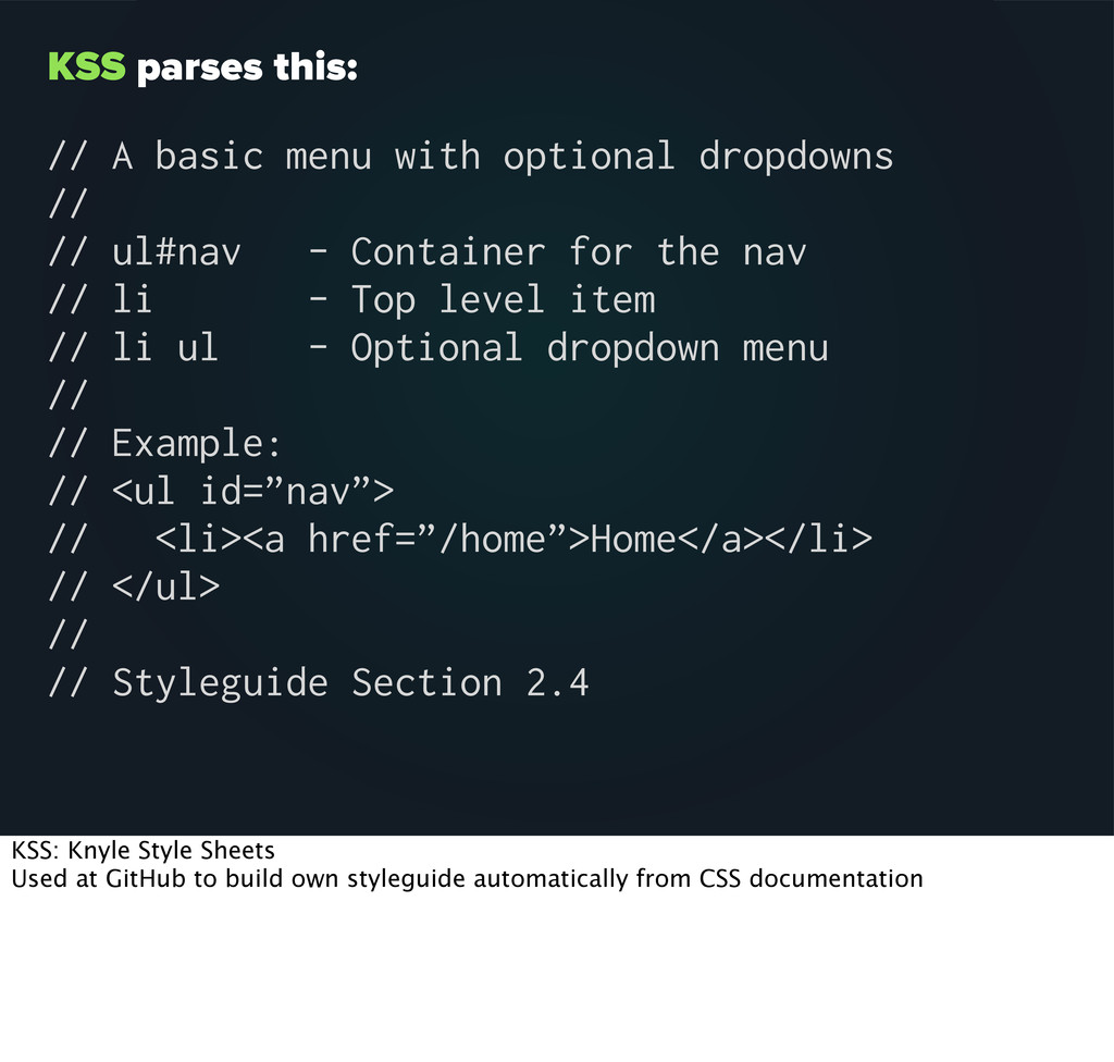
- Container for the nav // li - Top level item // li ul - Optional dropdown menu // // Example: // <ul id=”nav”> // <li><a href=”/home”>Home</a></li> // </ul> // // Styleguide Section 2.4 nav.scss Comment your CSS as if it were a first class language. Example mark up makes this easy to implement.
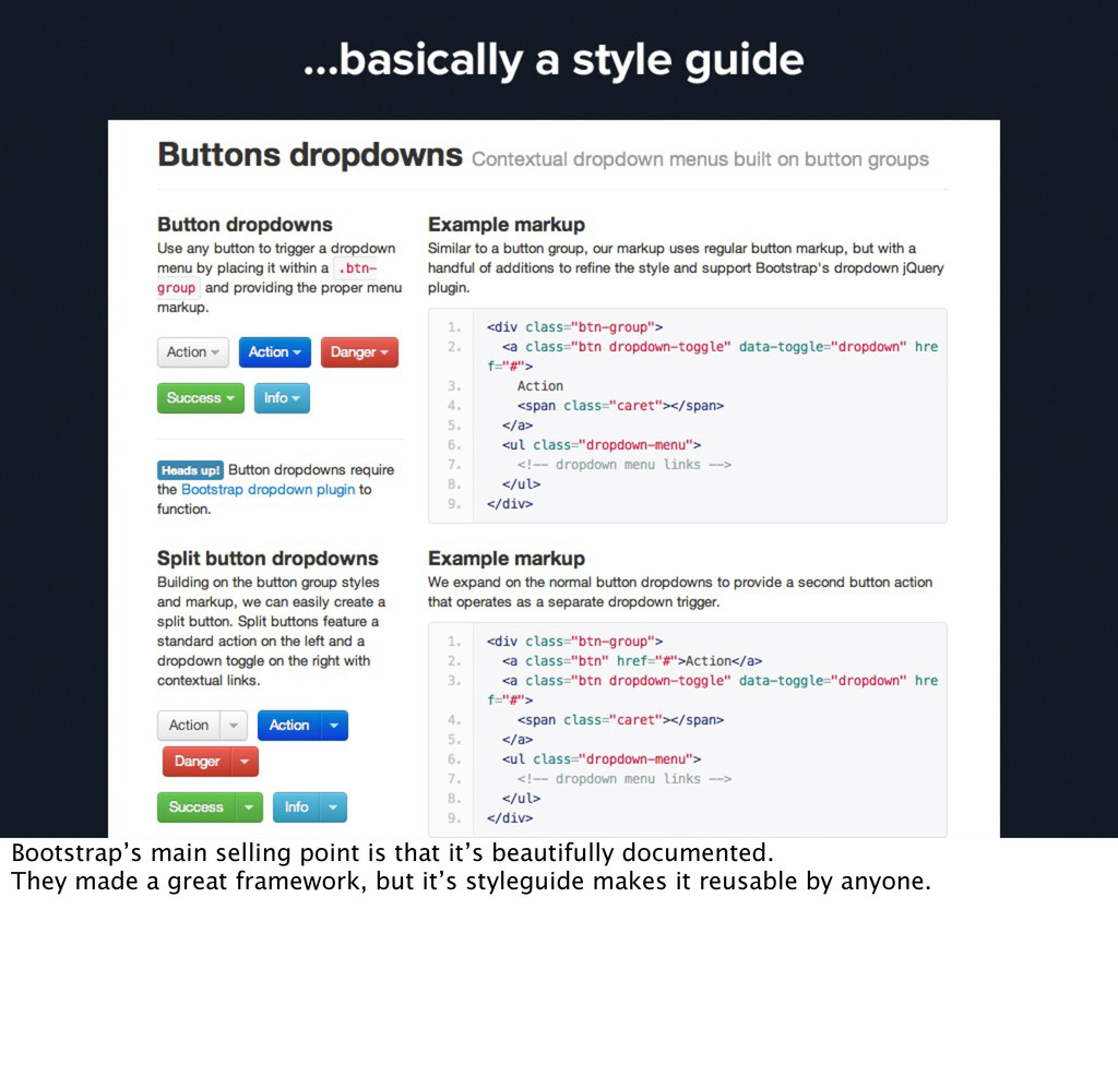
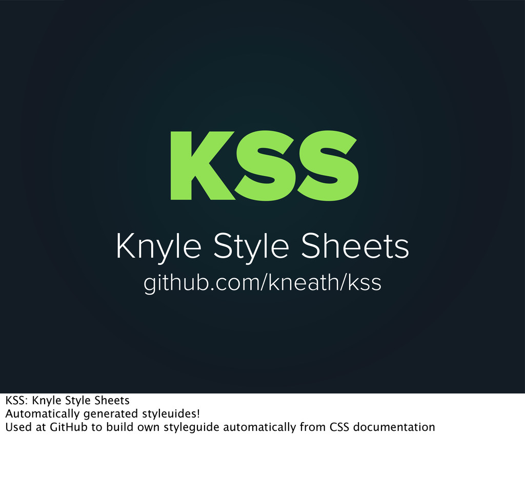
// // ul#nav - Container for the nav // li - Top level item // li ul - Optional dropdown menu // // Example: // <ul id=”nav”> // <li><a href=”/home”>Home</a></li> // </ul> // // Styleguide Section 2.4 KSS: Knyle Style Sheets Used at GitHub to build own styleguide automatically from CSS documentation
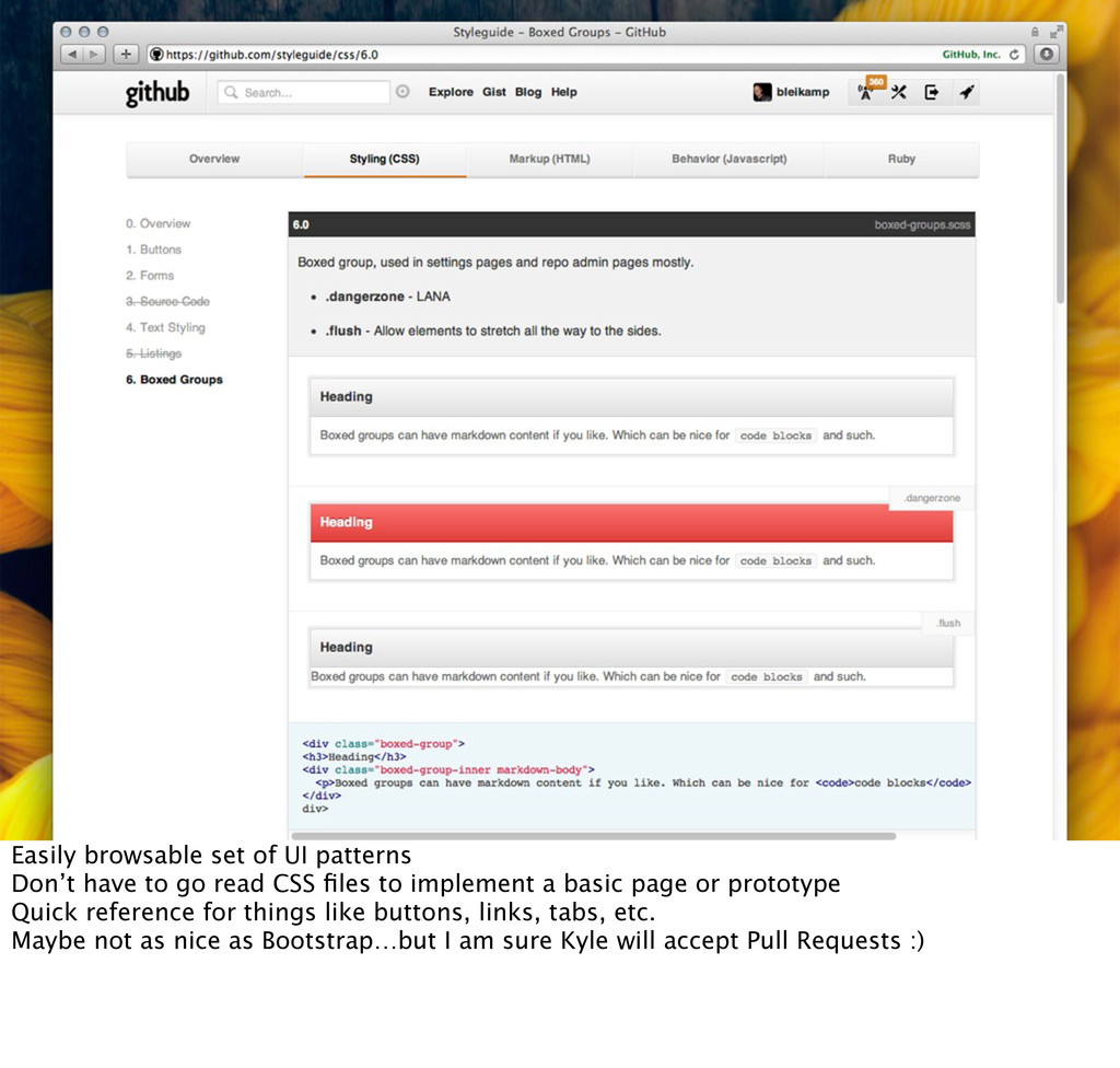
read CSS files to implement a basic page or prototype Quick reference for things like buttons, links, tabs, etc. Maybe not as nice as Bootstrap…but I am sure Kyle will accept Pull Requests :)
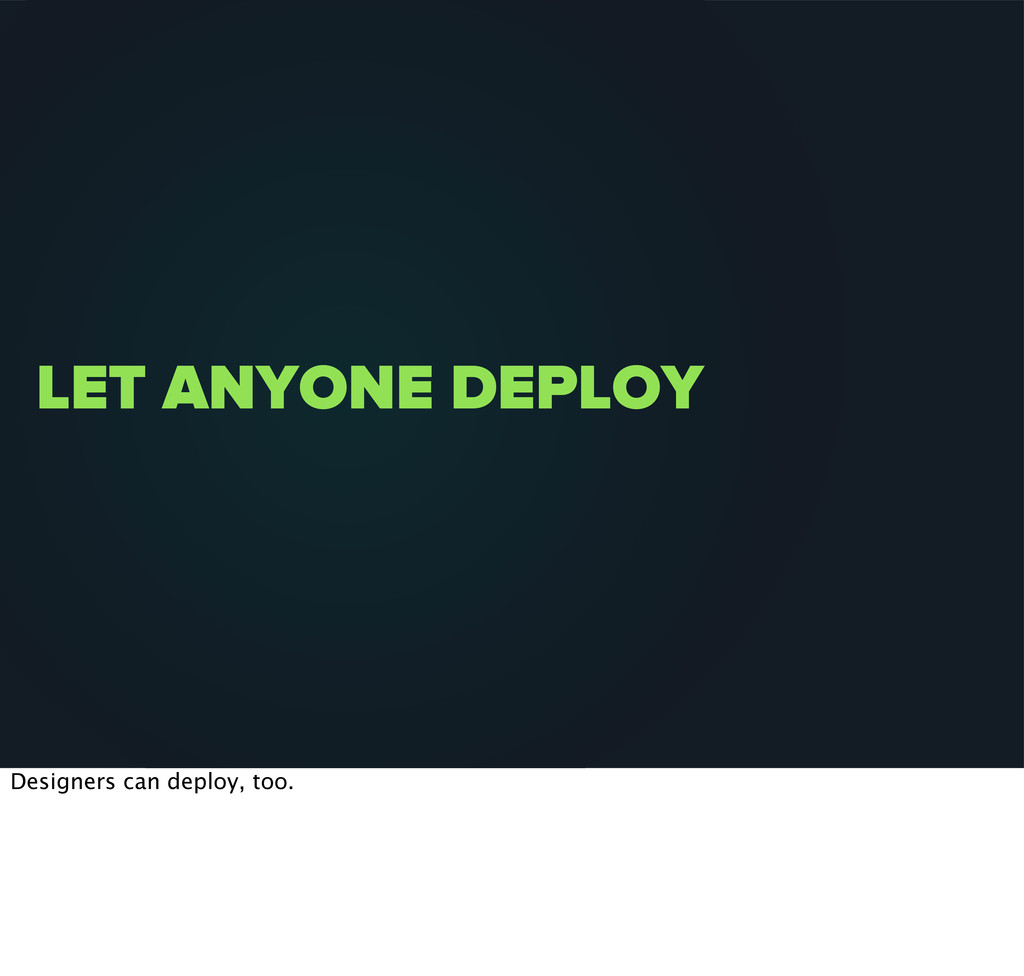
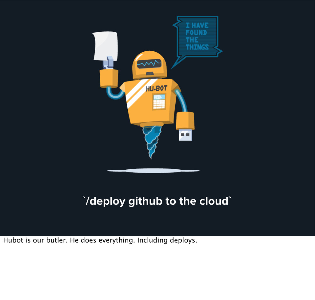
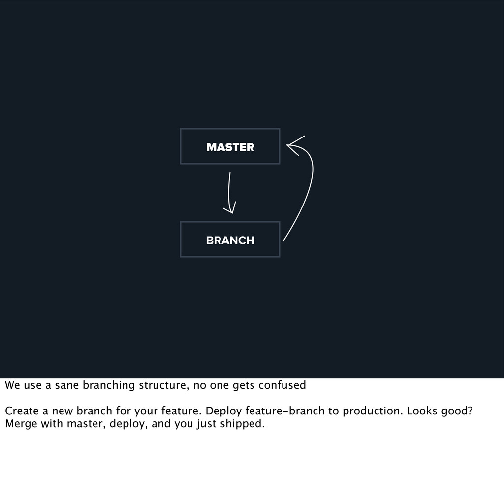
backend architecture and deploy strategies. It loses it’s elegance and simplicity, but most people don’t consider backend systems to have an influence on design decisions. * If deploying is a big commitment I am less likely to make quick fixes * I can deploy earlier because I know if there is a mistake I can make the fix quickly.