Upgrade to Pro — share decks privately, control downloads, hide ads and more …

-Tokyo Digital Twin Project 2021- Demonstration 01 Report

data_rikatsuyou
June 21, 2022
430

-Tokyo Digital Twin Project 2021- Demonstration 01 Report

data_rikatsuyou

June 21, 2022
Tweet

Transcript

  1. Copyright © Mitsubishi Research Institute Tokyo Digital Twin Project Demonstration

    01 Real-time human flow visualization including underground space Report
  2. Contents 1 1. Background and Overview 2. Area 3. Part

    A: Human Flow Data Collection and Visualization 4. Part B: Disaster Information Provision 5. Operation 6. User Survey 7. Results and Issues 8. Future Direction
  3. 3 Background Information(congestion level, evacuation) provision based on real-time human

    flow data ◼ Mechanism to enhance QOL by using outdoor spaces in urban center area ◼ Information providing system for people with difficulty returning home in the event of disaster ◼ New lifestyle with/after Corona : avoiding closed, crowded, and close-contact settings Provision of real-time human flow data from above and below ground during daily life and disaster is necessary. Evacuation route guidance based on human flow in urban area Effective information provision in the event of a disaster
  4. Goal and Overview Overview ◼ Route simulation was conducted by

    merging congestion information and spatial information. Route guidance in normal situations was distributed via a web application and its effectiveness was verified. (Part A) ◼ Route guidance to evacuation sites and disaster information were distributed under the assumption of a disaster situation and its effectiveness was verified. (Part B) ◼ The web application and 3D viewer data was made public, and opinions about its effectiveness and problems were collected through a questionnaire survey to identify issues for social implementation. (Part A / B) Goal 4 ◼ Realizing safe and secure life in Tokyo using real-time human flow forecasting data ◼ Encouraging people to avoid congestion and improve awareness of disaster prevention and evacuation
  5. 6 Area: Aboveground (Part A / B) 出所:Tokyo Digital Twin

    Smooth NAVI 【Legend】 :Demo Area :Info Device Reasons Otemachi, Marunouchi, and Yurakucho areas were selected as aboveground demo area. Many visitors made regular real-time data collection easy • Largest office district in Japan with large daytime population, made it easy to measure human flow. • 42,000 people had difficulty returning home on weekdays, while the capacity is 21,000 (estimated March 2020), recognized seriously. Public-private partnerships made it easy to collect and link data • Leading area for the Smart Tokyo Implementation Strategy • Active Private area management organizations • Leading model project for the 2019 Smart City Model Project (publicly solicited by the MLIT) Existing services could be linked and compared with • The issues to be addressed in this demonstration could be clarified by comparing with existing services. • This could serve as a trial for public-private partnerships in the future, such as route search service collaboration and background data sharing.
  6. 7 Area: Underground (Part A / B) The corridor between

    Shin-Marunouchi Bldg. and Marunouchi Bldg. was selected as underground demo area. Reasons Source: Marunouchi Map(Mitsubishi Estate) https://www.marunouchi.com/files/pdf/j_jp_02.pdf Vaccin ation site ① ② ③ Many passers-by made regular real-time data collection easy • This corridor is regularly used by commuters and shoppers to the Shin-Maru Building and Maru Building, so many human flows can be measured. Gyoko-dori Street was used as a vaccination site • During the demonstration period, Gyoko-dori Street was used as a vaccination site, and an increase in human flow is expected as a detour route. Other conditions • Power supply for sensors was available • 3D digital map of the area had already been developed by the Urban Development Bureau. Marunouchi Building Shin-Marunouchi Building
  7. Data Collection 9 Comparing the characteristics of each sensor, smartphone

    GPS was employed. Smartphone GPS Camera Wi-Fi packet sensor Bluetooth System GPS location data of smartphones is anonymized to get human flow in the specific area. Optical cameras are installed on sidewalks, etc., and human flow is measured using image recognition technology. Human flow is measured based on the number of devices using Wi-Fi function in smartphones. Human flow is measured based on the number of devices using Bluetooth function in smartphones. Problem Entire human flow cannot be measured due to the dependance on certain smartphone carriers. Privacy issues must be considered when facial images are acquired. Human flow cannot be measured when Wi-Fi function is turned off. Human flow cannot be measured when Bluetooth function is turned off. Decision Adopted with calibration based on entire human flow measured with other devices. Not adopted due to privacy issues Not adopted because the ON/OFF ratio of Wi-Fi function cannot be estimated. Not adopted because the ON/OFF ratio of Bluetooth function cannot be estimated.
  8. Forecast data at present and 1 hour later was made

    based on real-time human flow data, calibrated with fixed sensors. 10 Aboveground: Real-time Human Flow Data Detail Data name LocationMind xPop About data Data based on GPS data in NTT docomo devices Processing method Human flow in Otemachi / Marunouchi / Yurakucho Area(Daimaruyu area) was analyzed and index data of density of human flow was made for each road link. (When route guidance is set as an output, showing human flow by road links is more likely to reflect actual congestion on a route than showing by groups of buildings. Also, GPS data inside buildings is often missing because they do not move, which poses a challenge to accuracy.) Note To minimize the influence of time lag, forecasts were made based on current data. Decision ◼ Forecast data at present and 1 hour later was made based on real-time data provided with a delay of about 1 hour. ◼ Forecast was calibrated with human flow data collected by fixed sensors (LiDAR, camera). ◼ Fixed human flow sensors were installed with permission from building management companies.
  9. Aboveground: Real-time Human Flow Data Fixed human flow sensors were

    installed in order to count all passers-by and improve the accuracy of data. Method Environment Equipment: Cameras and LiDAR on sidewalks, etc. A pair of camera and LiDAR measure pedestrians on both sides of sidewalks. Location: Sidewalks of Naka-dori Avenue, etc. Measurement: Pedestrians on Naka-dori Avenue 11
  10. Aboveground: Real-time Human Flow Data Road network (DRM Link) was

    used in order to visualize congestion level on the roads. 12 Road network Mesh Dot Arrow Tying the measured people's locations to links on the road network Tying locations of people in one mesh Displaying people measured with a dot or other mark Showing numbers and directions of people by arrow size and color Source:MLIT PLATEAU (https://www.mlit.go.jp/plateau/) ◼ Road network display is suitable to orthogonally arranged roads in Daimaruyu area. ◼ Road network display is popular in car navigation system, easy to familiarize with.
  11. Aboveground: Visualization of Congestion 3 congestion levels were defined and

    tied to the road links with Map-Matching Method. 13 People near a link between intersections were tied to the link. (using Map-Matching Method) Method of tying 111 112 Four people are on 111-112 link. 111 112 Congestion level is calculated and provided. Definition of 3 congestion levels 3 levels were defined based on trial measurements of human flow data before the start of the service. Congestion Level Very Crowded Crowded Vacant Color Red Yellow Green Number of people Over 3,000 1,500-3,000 under1,500
  12. Underground: Real-time Human Flow Data The number of passers-by was

    estimated by the sensors, with smartphone device information anonymized. 14 Detail Data name unerry About data Radio waves transmitted by smartphones are used. Processing method Index data of density of human flow was generated respectively for each passage in Maru Building and Shin-Maru Building, located in Daimaruyu area. Note The actual number was estimated based on the number of people passing near the sensors. Decision ◼ Congestion level forecast at 1 hour later was calculated within the sensors based on real- time data provided with a delay of about 1 hour. ◼ Human flow sensors were installed with permission from building management companies.
  13. Underground: Real-time Human Flow Data 15 Environment Underground measurement sensors

    Radiowaves of smartphones were used instead of GPS, and the number of passers-by was estimated using IoT sensors. Service Temperature Interface Battery Weight Size Service Humidity Water Protection IPX5 20 - 80%RH -20-55℃ (with battery) USB Type C, DC Jack 1800mAh (standart) body: 66g, battery: 30g L100mm x W65mm x H14mm
  14. Underground: Real-time Human Flow Data 16 3 sensors were installed

    in the underground passage. Sensor location① Sensor location③ Sensor location② 出所:Marunouchi Map(Mitsubishi Estate) https://www.marunouchi.com/files/pdf/j_jp_02.pdf Locations of underground sensors 2 sensors on Maru Building side (①②) 1 sensor on Shin-Maru Building side (③) Vaccin ation site ① ② ③ Marunouchi Building Shin-Marunouchi Building
  15. Underground: Real-time Human Flow Data Mesh was employed in order

    to show locations of people underground. 17 Mesh Underground passage Dot Arrow Tying locations of people in one mesh Tying locations to links on the underground road network if exist. Displaying people measured with a dot or other mark Showing numbers and directions of people by arrow size and color Source:MLIT PLATEAU (https://www.mlit.go.jp/plateau/) ◼ Mesh display is suitable for closed underground passages.
  16. Underground: Visualization of Congestion 18 Each passage in Maru Building

    and Shin-Maru Building was defined as one mesh respectively and the number of people was counted. Count within a mesh Definition of 3 congestion levels 3 levels were defined based on trial measurements of human flow data before the start of the service. Congestion level Very crowded crowded Vacant Color Red Yellow Green Number of people Over 3,000 1,500-3,000 under1,500 1mesh each Maru building Shin-Maru building 3 congestion levels were defined based on the number of people in meshes measured by IoT sensors.
  17. 大丸有エリア地下における背景データ The 3D digital map data from the Urban Development

    Bureau was used as the background map. 19 Source:Tokyo Digital Twin Project 3D Viewer https://3dview.tokyo-digitaltwin.metro.tokyo.lg.jp/ [Data] Public indoor spaces (underground) Daimaru area 3D digital map data (FY2021/2022) Background Map
  18. Interface of Web App Interface were designed clearly with minimal

    information. 20 Home screen Title Overview Main screen External link Survey Help Current location Disaster mode Underground Congestion level Settings Route search Route option Language Expression of the image of route guidance inspired by the curves of the symbol mark of Tokyo. Visible buttons and simple icons for high clarity Main screen Route option, Language Title and overview Base map and current location Options at the settings icon
  19. Interface of Web App Congestion levels, congestion avoidance route, and

    the shortest route were displayed in one map. 21 Route guidance Underground congestion level Congestion information and route guidance Congestion levels in the range of sensors Start Goal The area of congestion level display Congestion avoidance route and shortest route on the base map with congestion level In the image on the right, Solid line: Congestion avoidance route Dashed line: Shortest route (can be changed in settings) Congestion level in partial areas No route guidance
  20. Disaster Information Provision Necessary information was selected assuming the use

    in an event of disaster. 23 Disaster Evacuation Site in Chiyoda City Chiyoda Ward Disaster Evacuation Site Map Source:Chiyoda Ward Disaster Evacuation Site Map (https://www.city.chiyoda.lg.jp/documents/2093/taihibashoannai_1.pdf) Kitanomaru Park The East Garden of the Imperial Palace Kokyo Gaien National Garden Hibiya Park Sanadabori Ground Sotobori Park 【Evacuation site】 A temporary evacuation site used immediately after the strike of disaster to avoid danger and chaos, and to ensure safety. (As of December 2020, 6 evacuation centers.) Providing information of evacuation routes and sites Disaster Evacuation Site Kitanomaru Park The East Garden of the Imperial Palace Kokyo Gaien National Garden Tokyo Sta. Hibiya Park Sanadabori Ground Sotobori Park
  21. Disaster Information Provision Methods of providing information about evacuation routes

    and sites were examined. 24 Route guidance to evacuation sites Locations of Marunouchi Vision The route to evacuation sites was shown in the 3D viewer. Locations of about 100 monitors in the Daimaruyu district were provided. (Related news and neighborhood information would be on the monitors during disaster) Source:Marunouchi Media Link (http://marunouchi-media-link.jp/asset/pdf/media_link_marunouchi.pdf) Locations of Marunouchi Vision Digital twin 3D viewer with route guidance to evacuation sites.
  22. End Hibiya park Start Yurakucho st.(west gate) Disaster Information Provision

    A route guidance from Yurakucho Sta. to Hibiya Park was made and shown. 25 Example of evacuation route Display on the 3D viewer S G Pedestrian viewpoint using the stories function
  23. Period Part A and B started on September 22, 2021.

    27 [Part A] Congestion levels based on real-time human flow Jul Aug Sep Oct Nov Dec Jun Feb Mar Preparation Implementation Wrap up Jul Aug Sep Oct Nov Dec Jun Feb Mar Preparation Implementation Wrap up Route guidance for Hibiya Park is still provided [Part B] Locations of evacuation sites *Route guidance for Hibiya Park is still provided
  24. Call for Participants The wide range of participants were invited,

    especially those related to the Daimaruyu area. 28 Email for Digital Twin and Smart city stakeholders Target Recipient/Media General The expert commission members Companies in the commission PLATEAU community ICF(Initiative for Co-creating the Future) The media Visitor Town information website Marunouchi vision Individual dissemination to trustee acquaintances Worker Daimaruyu conference Mitsubishi Estate-owned building tenant companies Email subscribers of OMY Area Management Association(Ligare) Marunouchi.com Facebook Marunouchi vision Marunouchi.com Facebook Area-targeted email for Daimaruyu stakeholders
  25. Outline of User Survey The questionnaires were collected from users

    of web app and 3D viewer, respectively. 30 Period October 13, 2021 - February 25, 2022 Method Web questionnaire (separate surveys for web application and 3D viewer) Target Web app: Web app users 3D viewer: 3D viewer users Number of responses Web app: 753 3D viewer: 600 Outline of the survey
  26. <Appendix> Questionnaire Webpage Visitors were led to the questionnaire webpage

    from the official website or each service. 31 Link to questionnaire from web app Link to questionnaire from 3D viewer Link to questionnaire from the official website
  27. <Appendix> Respondent The respondents were recruited from the visitors of

    the webpage, the app users etc. 32 ACT5 Member Point App Web Survey Monitor Target: Residents of Daimaru-Yuri area, etc. Period: November 17 to November 25, 2021 Number of responses: 119 web apps, 84 3D viewers Target: Residents of Tokyo who live and work in the Daimaru-Yuri district Period: December 10, 2021 - December 14, 2021 Number of respondents: 418 web apps, 417 3D viewers App of “Daimaruyu SDGs ACT5” , acting for achieving SDGs in the area, was introduced and points were awarded to respondents. The Internet research service provided by Macromill was used.
  28. Web App: Questionnaire Opinions about the feasibility of congestion avoidance

    and areas for improvement were gathered. 33 Main question Check point Attribute ◼ Gender, Age, and Relationship to Daimaruyu area Differences in trends by attribute Web App ◼ Recognition route ◼ Reason for access Effective method to be recognized widely Functions of high interest Congestion avoidance route ◼ Use of the route search, purpose, and scenario ◼ Adoption of congestion avoidance route ◼ Whether congestion could actually be avoided ◼ (If congestion could not be avoided) Reason, specific date, time, and location ◼ (If the avoidance route was not taken) Reason Users of the route search Actual users of avoidance routes Effectiveness of avoidance routes Points of improvement in search method Congestion level display ◼ Clarity of above and below ground display ◼ Opinions about congestion level display Points of improvement in display method Disaster information ◼ Recognition of evacuation sites and Marunouchi Vision, and usefulness of location information ◼ Effectiveness of offline functions ◼ Opinion about information needed during disasters Recognition of existing services Effectiveness of offline information Points for improvement Others ◼ Expansion in other areas ◼ Recommendation of the web application ◼ Opinions about difficulties and additional functions Needs for web app in other regions Points for improvement in general
  29. Web App: Survey Results (1/9) No significant differences were found

    in gender and among generations. 34 Respondent attributes(Gender, Age) Male 41% Female 58% NA 1% Gender 20-34 32% 35-49 36% 50- 31% Age
  30. Web App: Survey Results (2/9) Many of the respondents were

    the workers at Daimaruyu area. 35 Respondent attributes(Relationship with Daimaruyu area) Work at/often visit for business 74% Never/rarely visit 2% Occasionally visit for sightseeing, shopping, events, etc. 10% Occasionally visit for business 13% Live within walking distance/ Used to live, well know 1% Main relationship with Daimaruyu Area
  31. Web App: Survey Results (3/9) The respondents were mainly interested

    in “Congestion display” and “congestion avoidance route.” 36 Web application recognition route and reasons for access Notification from the company working for, 31% Tokyo Metropolitan Government official HP/SNS, 11% Mail magazine, 11% Acquainta nces, 12% Others, 19% 0% 10% 20% 30% 40% 50% 60% 70% 80% 90% 100% Recognition route Congestion avoidance route search, 35%. Congestion level display above and below ground, 38%. Disaster information, 22% Other, 5% 0% 10% 20% 30% 40% 50% 60% 70% 80% 90% 100% Reason for access
  32. Web App: Survey Results (4/9) More than half of those

    who searched for congestion avoidance route realized the route information effective. 37 Congestion avoidance route Use 36% Don’t Use 64% Pass 65% Don’t pass 35% Avoid 34% Somewhat avoid 58% Did you search for congestion avoidance routes? succeeded somehow succeeded Passed Didn’t Pass Did you pass the route indeed? Did you succeed in avoiding the congestion? Searched Didn’t search
  33. Web App: Survey Results (5/9) The key point to be

    improved in congestion avoidance route is the search method. 38 Congestion Avoidance Route Search (Web App) Key Points of Improvement ❶ Showing time required ❷ Registering and saving searched routes, Searching by lot numbers or keywords ❸ Searching for barrier-free routes ❹ Translating information (ex. Building name) in the base map for the English version 1 4 3 2
  34. Web App: Survey Results (6/9) The method of congestion level

    display was satisfactory, but there was room for continuous consideration. 39 Clarity of congestion level display Clear 23% Relatively clear 42% Relatively unclear 17% Unclear 8% No opinion 10% Above-ground Clear 15% Relatively clear 36% Relatively unclear 24% Unclear 14% No opinion 11% Underground
  35. Web App: Survey Results (7/9) The key point to be

    improved in congestion level display is the clarity and simplicity. 40 Clarity of congestion level display 1 2 4 3 Key Points of Improvement ❶ Explanations for how to use (adding examples, etc.) ❷ Forecast for the next few days ❸ Congestion levels of each section, including directions and changing trends, making clear they are about the sidewalks ❹ Concrete indicator of congestion level ➎ Good color design based on the Tokyo Color Universal Design Guideline ➏ Current location, even in underground spaces ➐ Route search including underground routes 5 6 7
  36. Web App: Survey Results (8/9) Among users of offline disaster

    information provision, about 70% responded it was effective. 41 Disaster information provision Effective 74% Ineffective 7% Not sure 19% Effectiveness of providing offline information in the event of disaster
  37. Web App: Survey Results (9/9) There is a need for

    real-time information on congestion as well as locations of evacuation sites. 42 Disaster information provision Key Points of Improvement ❶ Voice guidance is desirable. ❷ The entrances of evacuation sites can be showed. ❸ Congestion levels of evacuation sites can be showed. ❹ Evacuation routes can be displayed automatically . ➎ It would be better to show the safe evacuation route, congestion levels, distance, time required, safe route home, and estimated waiting time if unable to return home, etc. 1 2 3 4 5
  38. 3D Viewer: Questionnaire Whether the contents had helped users to

    image their evacuation route was verified. 43 Main questions in the 3D viewer survey Points to be checked Attribute ◼ Gender, age, and relationship to Otemachi/Marunouchi/Yurakucho District Different trends made by attributes 3D Viewer ◼ Reasons for access Functions of high interest Congestion level display ◼ Clarity of above and underground congestion displays ◼ Opinions about congestion level display Points for improvement of congestion level display Evacuation route guidance ◼ Opinions about how the evacuation route guidance is displayed ◼ Imaginability of evacuation routes ◼ Information/functions needed to simulate evacuation routes Points for improvement and effectiveness of evacuation route guidance Other ◼ Expansion in other areas ◼ 3D Viewer recommendation rate ◼ Opinions about desirable features to be added or ones found difficult to use Development needs in other regions, Points for improvement of the 3D viewer in general
  39. 3D Viewer: Survey Results (1/6) Over-50-year-old respondents for the 3D

    viewer were small in amount, compared to those for the web app. 44 Respondent Attributes (Gender and Age) Male 51% Female 48% NA 1% Gender 20-34 34% 35-49 38% Over 50 28% Age
  40. 3D Viewer: Survey Results (2/6) Many of the respondents were

    workers at Daimaruyu area, the main target of the survey. 45 Respondent attributes (Relationship with Daimaruyu area) Work at/often visit for business 80% Never/rarely visit 2% Occasionally visit for sightseeing, shopping, events, etc. 9% Occasionally visit for business 8% Live within walking distance/ Used to live, well know. 1% Main relationship with Daimaruyu area
  41. 3D Viewer: Survey Results (3/6) Users of the 3D viewer

    were highly interested in 3D digital maps in general. 46 Reasons for accessing the 3D viewer The congestion level display above and underground was interesting, 33% The evacuation route guidance was interesting, 23% 3D digital map in general was interesting, 41% Others, 3% 0% 10% 20% 30% 40% 50% 60% 70% 80% 90% 100% Reasons for access
  42. 3D Viewer: Survey Results (4/6) Above-ground congestion level display was

    satisfactory, but underground display could be improved. 47 Clarity of congestion level display Clear 15% Relatively clear 27% Relatively unclear 22% Unclear 28% No opinion 8% Underground Clear 20% Relatively Clear 37% Relatively unclear 19% Unclear 15% No opinion 9% Above-ground
  43. 3D Viewer: Survey Results (5/6) About 70% users of the

    evacuation route guidance answered they were able to image their evacuation routes. 48 Effectiveness of evacuation route guidance during disaster Had clear image 69% Didn’t have clear image 31% Image of evacuation route
  44. 3D Viewer: Survey Results (6/6) Additional information is needed to

    let users have clearer image of evacuation routes. 49 Evacuation route guidance Key Points of Improvement ❶ Names of streets and intersections ❷ Street trees and landmarks ❸ Images and names of buildings ❹ Length and time required of routes ➎ Suggestions for alternative routes 3 2 1 4 5 For use in the event of a disaster ◼ Usable size of data for smartphone ◼ Switchable to 2D ◼ Real-time information such as dangerous locations
  45. Results The usefulness was verified of information provision on congestion

    and disaster using real-time human flow data. 51 ◼ Real-time human flow forecast data was provided via the web app for Daimaruyu area, including underground spaces, where tend to be crowded. ◼ Survey results confirmed that providing congestion levels and congestion avoidance routes was effective for encouraging congestion avoidance behavior. → A certain number of the web app users searched congestion avoidance routes, and about 70% of them adopted the searched routes, with about 90% of them realizing its usefulness. [Part A] Real-time human flow forecast data was provided and its usefulness was verified. ◼ 3D evacuation routes and other practical data were provided via the 3D viewer and the web app for Daimaruyu area to improve awareness of disaster prevention in daily life and encourage evacuation in the event of a disaster. ◼ Survey results confirmed it was effective to provide services for disaster (3D evacuation route guidance, offline information provision during disasters) in combination with daily services. → About 70% of the respondents answered the evacuation route display in 3D viewer was useful. → About 70% of the respondents answered offline information during disasters was useful. [Part B] Evacuation routes were visualized 3D and improvement in awareness was verified.
  46. Issues (1) Clarity and simplicity of the service should be

    improved. 52 ◼ 3 color-coded levels may not be enough to show situations of congestion objectively. ◼ More specific information on congestion level is needed to encourage behavior change. Display method of congestion level ◼ A certain amount of time is required before real-time human flow data displayed on screen due to preprocessing processes such as map matching, traffic mode determination, stay object determination, and concealment. ◼ To be more “real-time”, a logic to make the preprocessing quick and accurate should be developed. Accuracy and speed of congestion level display ◼ Data volume was not the point in this demonstration, since the purpose was letting users to check evacuation routes in advance and foster evacuation awareness in daily life. ◼ Supposing a disaster where services cannot be provided continuously with telecommunication restricted, the amount of provided data should be revised carefully. Data volume for use in the event of a disaster
  47. Issues (2) Displayed congestion levels did not always reflect actual

    situations accurately. 53 The system showed this vacant area as “a little crowded”. Cause 1: In urban short trips, GPS accuracy was lowered by many tower blocks. Cause 2: The prediction method of human flow was not satisfactory. Cause 3: Error due to the difference in the time when data was calibrated. Data collection Processed past data Predictive model learning Preprocessing Future forecast Calibration and anonymization Send to Web system
  48. Issues (3) The service should be easy to use for

    everyone. 54 ◼ Color Universal Design → In this demonstration, three colors (red, yellow, and green) were used for color-coding of congestion levels. The color-coding should comply to the Tokyo Color Universal Design Guidelines to be used by various people. ◼ Language support → The web application basically supported English, but some parts were displayed in Japanese, limiting information in English. The same amount of information should be provided in other languages. ◼ Voice guidance → Voice guidance of congestion avoidance route can be helpful for visually impaired users. Universal design
  49. Issues (4) It is essential to expand over a wider

    area with safety and security. 55 ◼ System for utilizing data from various devices in a wide area like entire Tokyo → Multiple entities will install various sensors so the system for integrating data is necessary. → A method is needed to utilize GPS data in areas where data is kept secret due to small population. Integrated human flow data for a wide area ◼ Privacy consideration in the collections of personally identifiable information → Even when anonymized, individuals may be identified by combining other data. Regulations for data use in compliance with the revised Personal Information Protection Law and other related laws and regulations. Privacy-conscious collection and use of data
  50. Information and Functions Needed Useful information and functions were identified

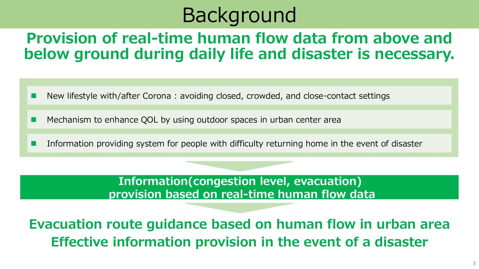
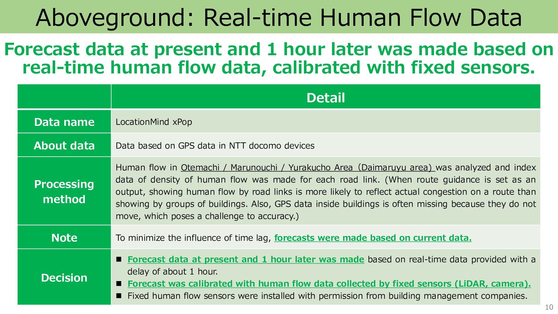
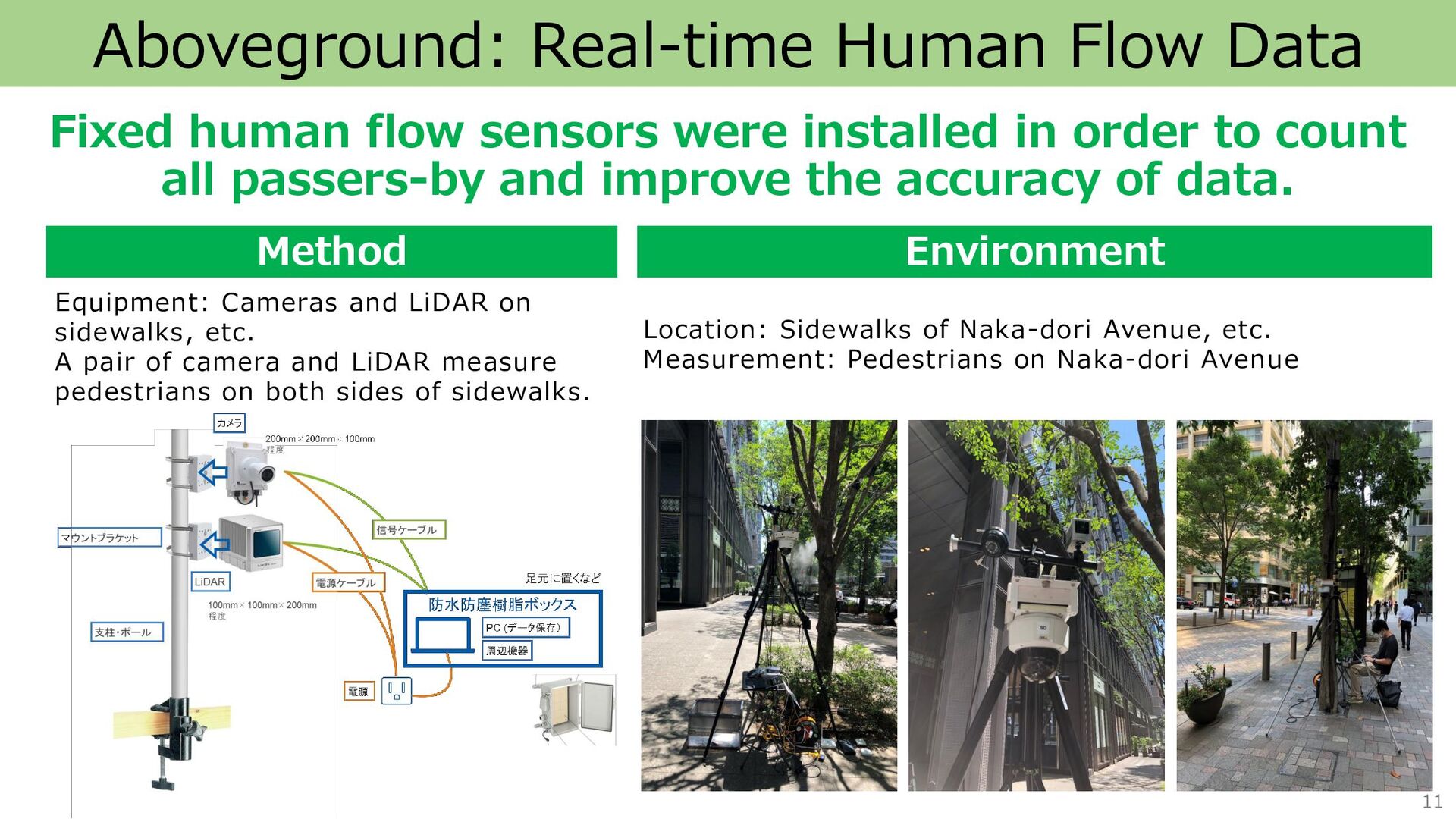
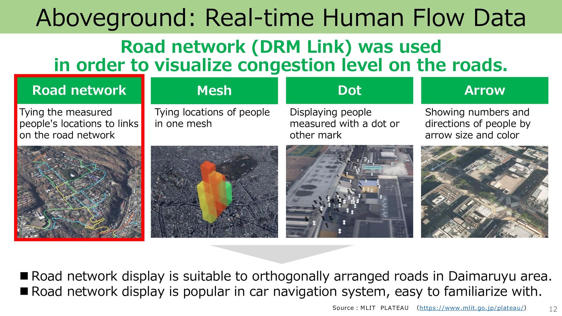
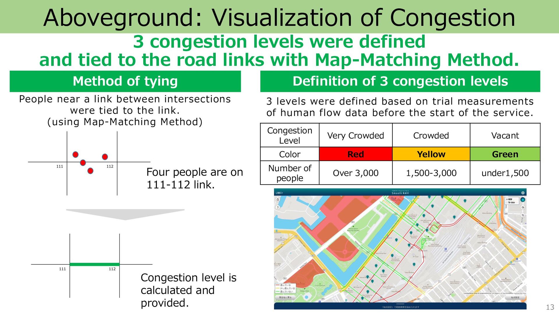
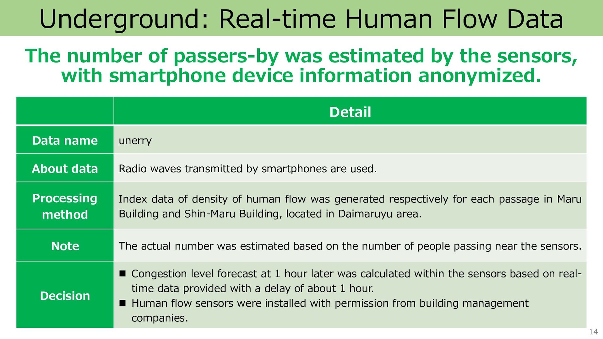
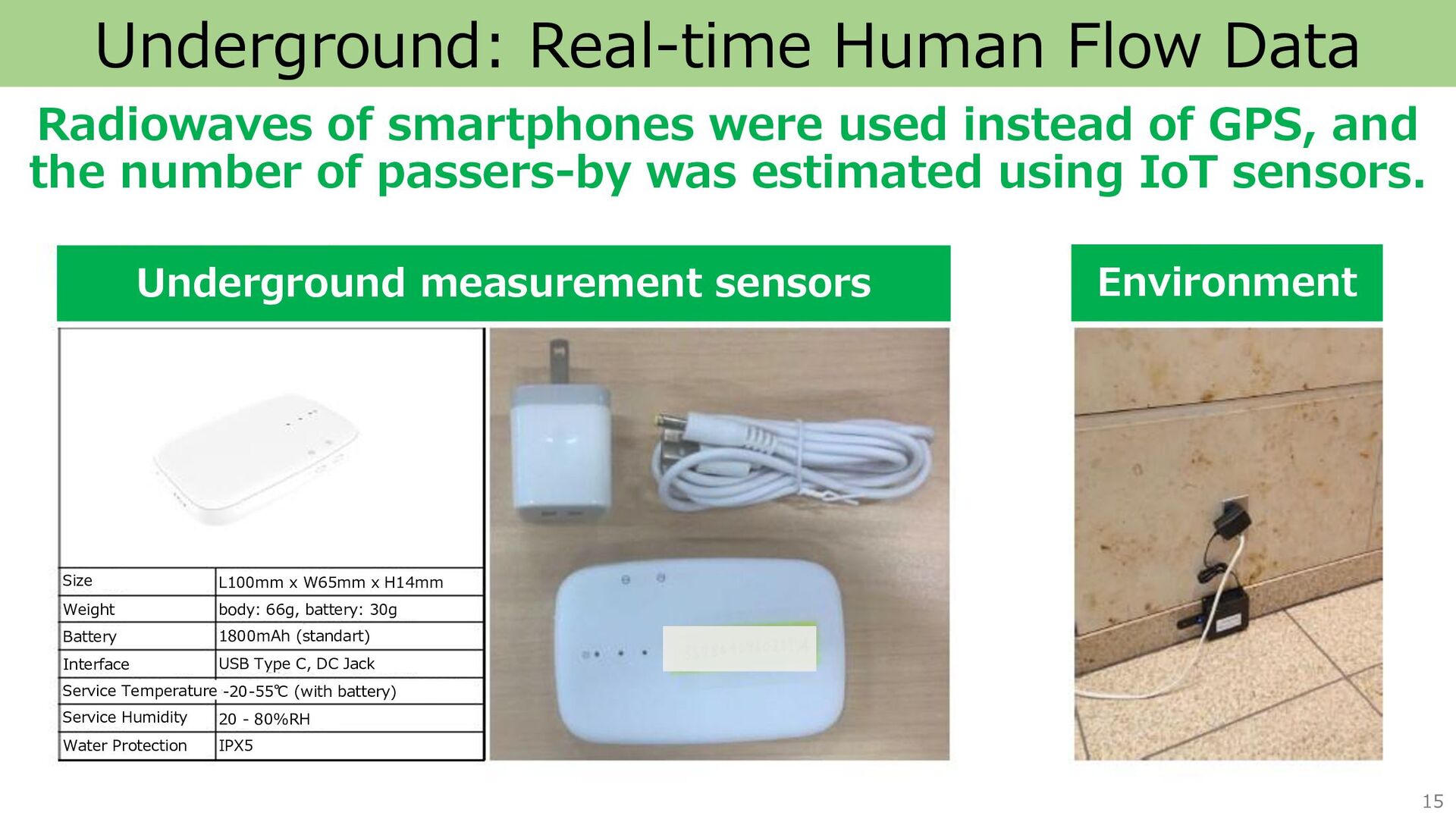
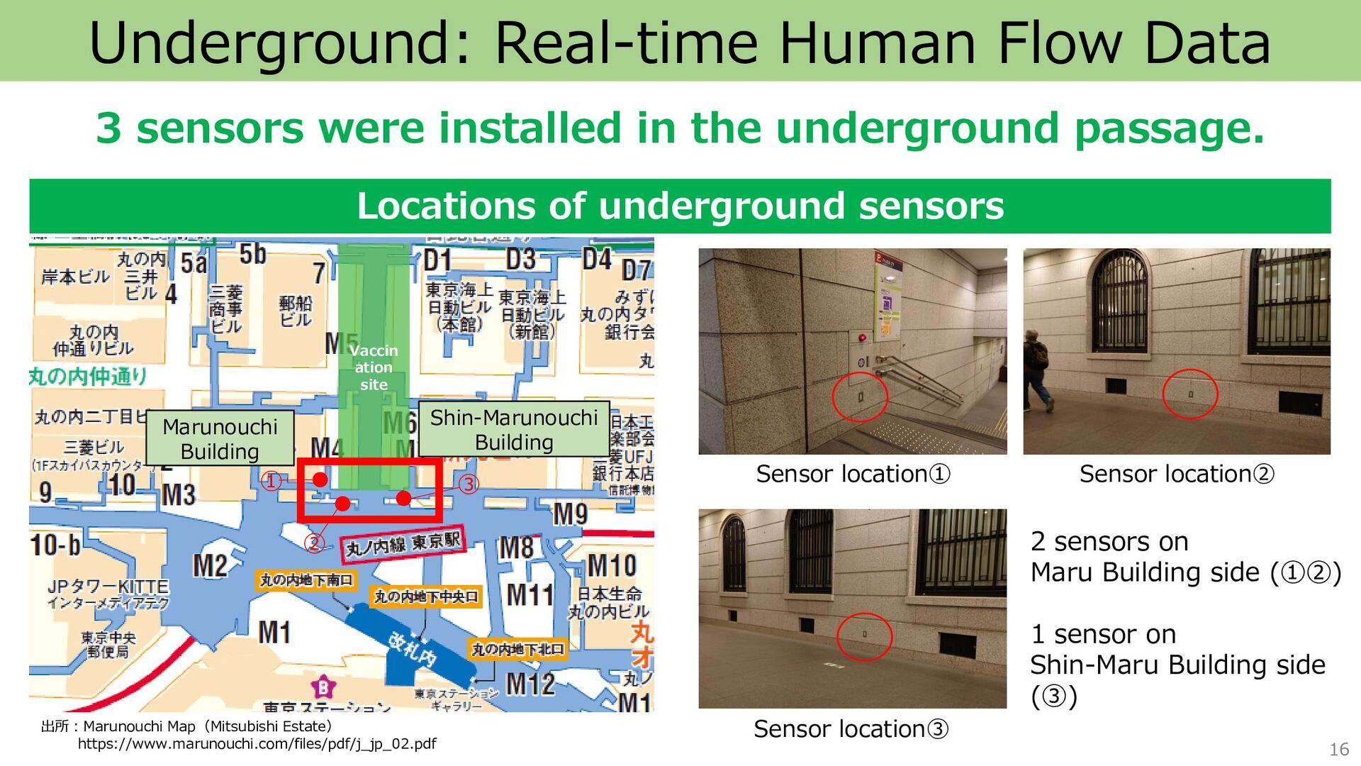
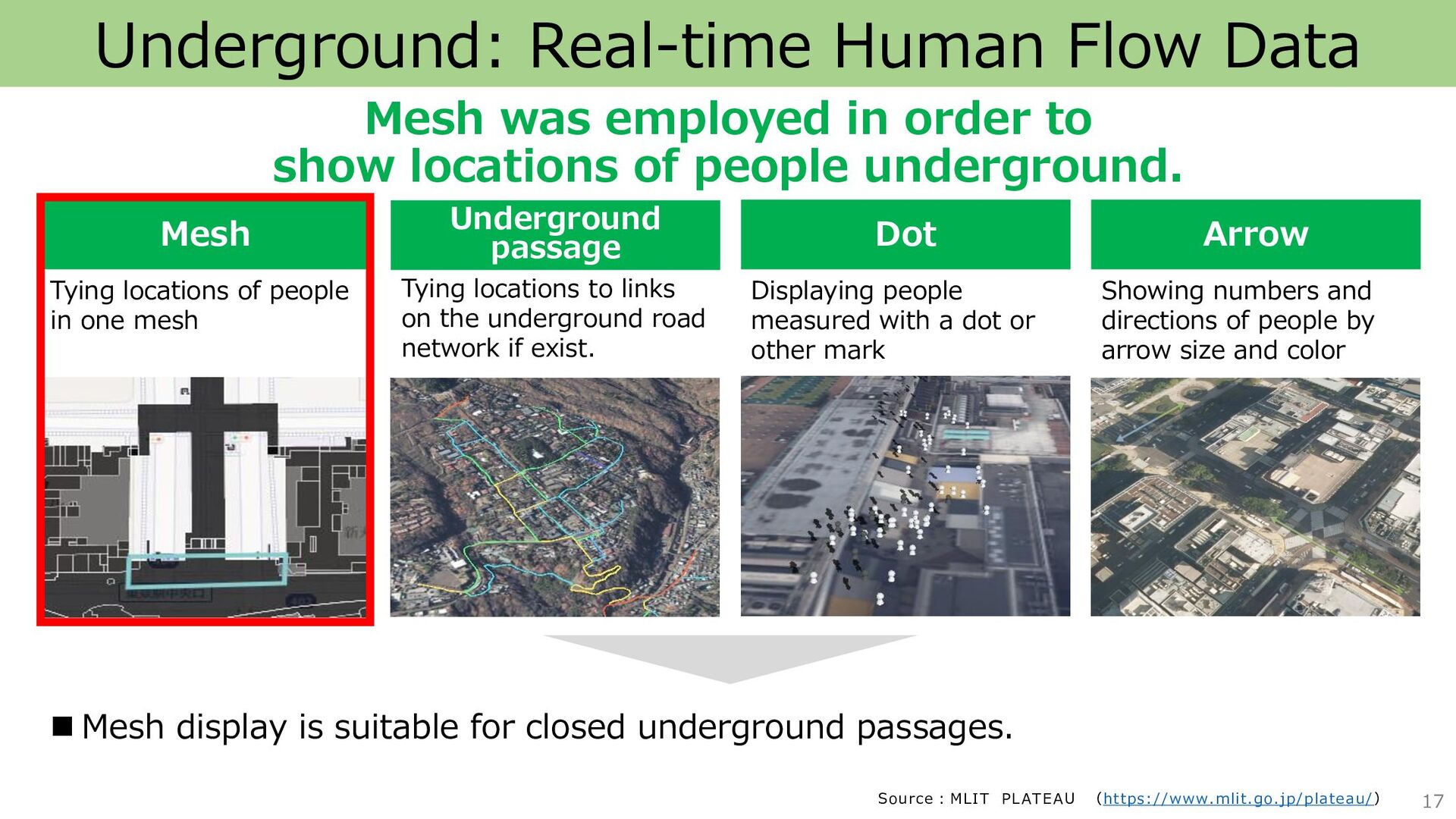
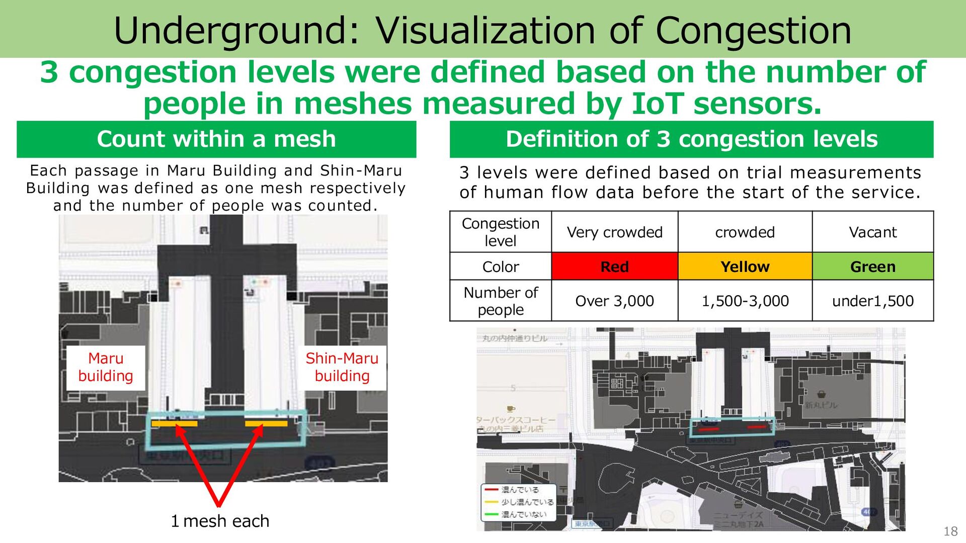
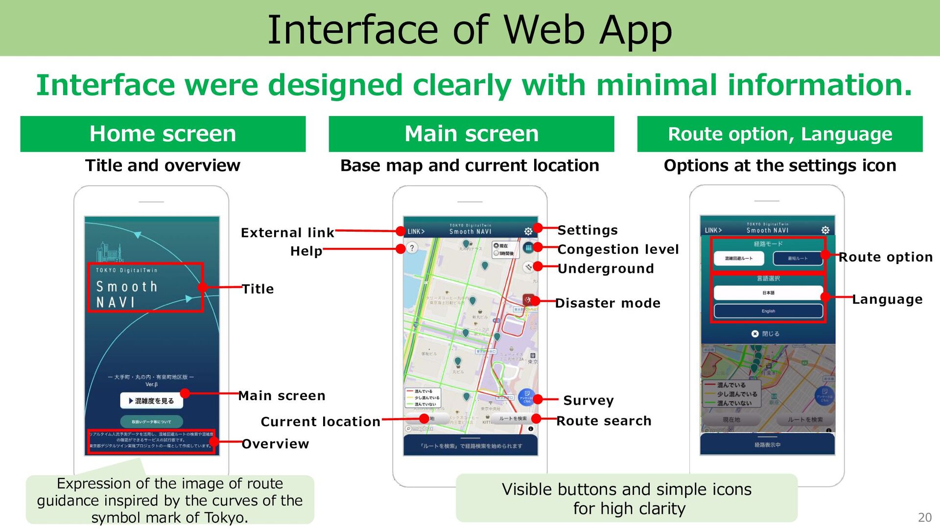
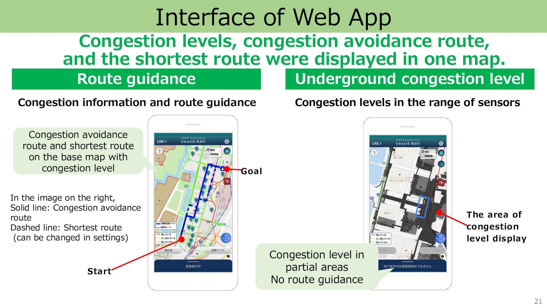
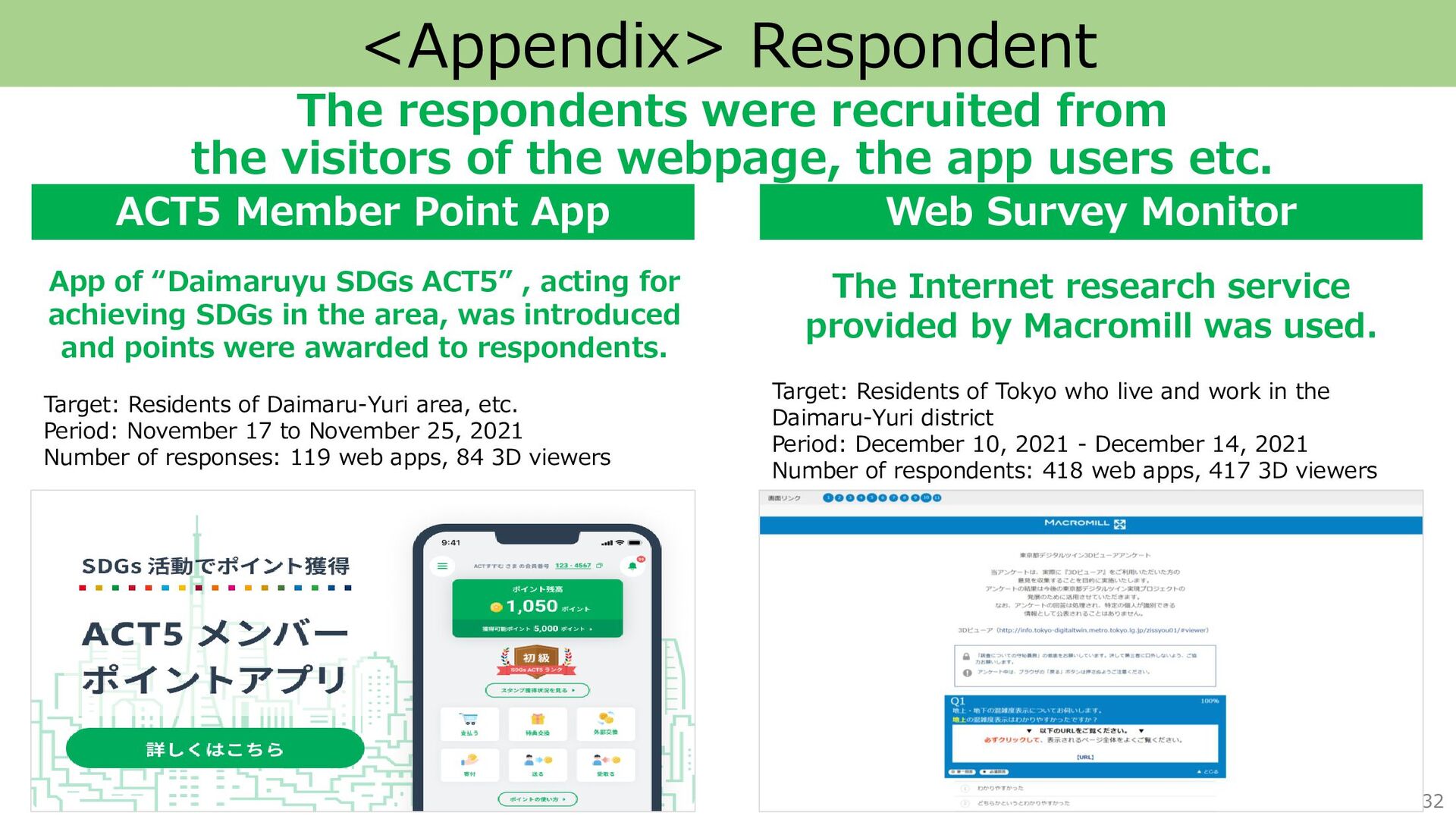
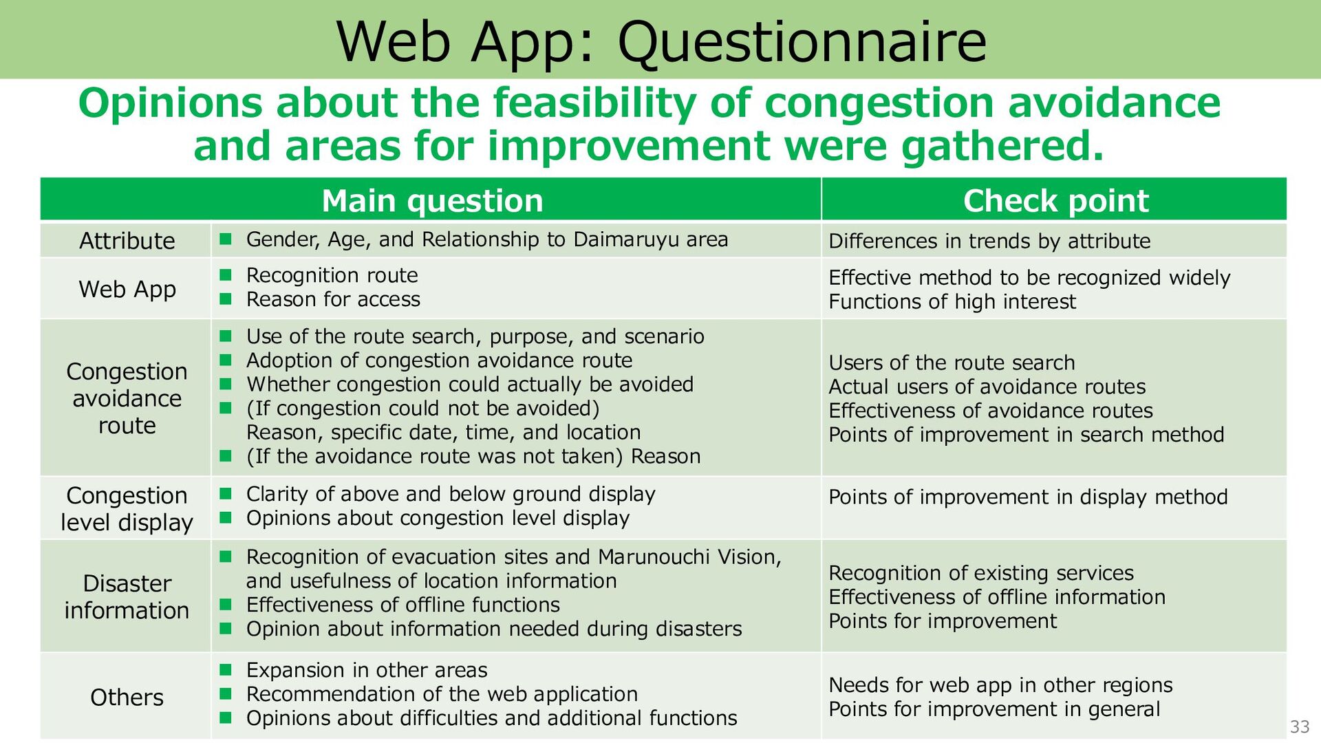
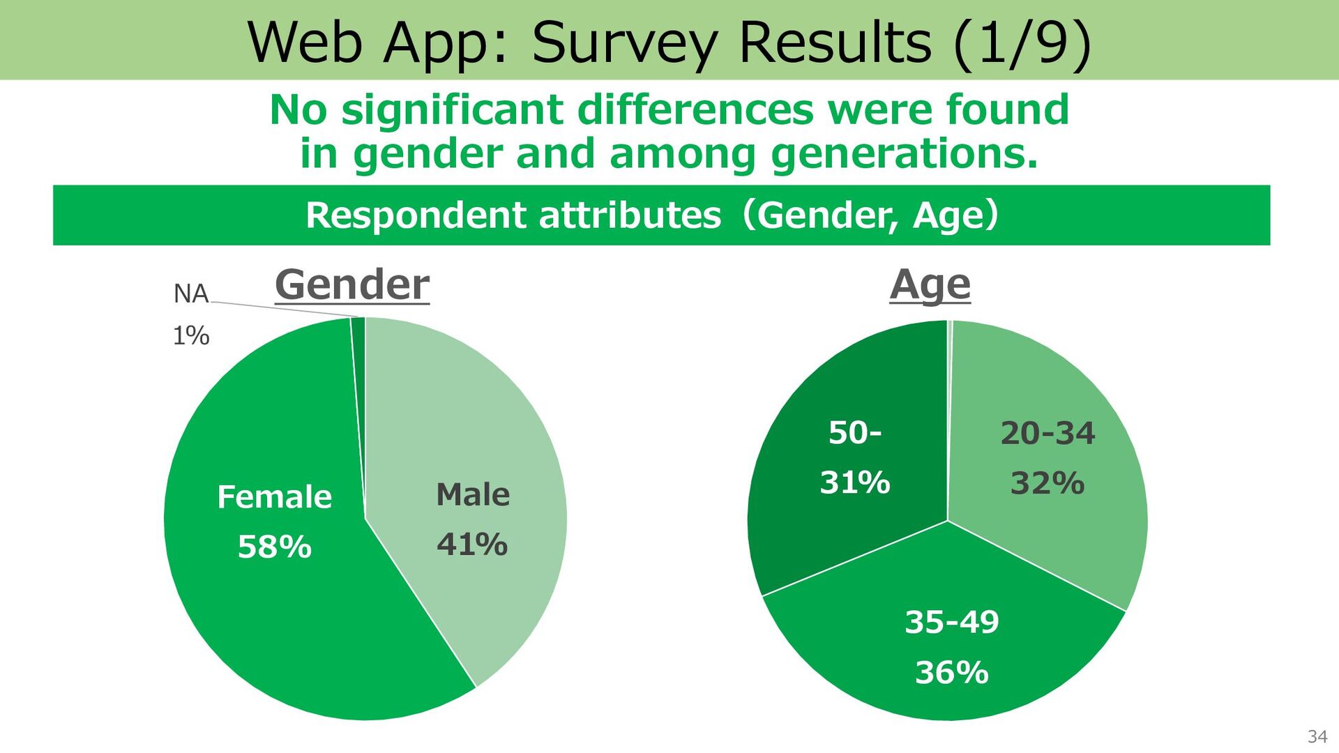
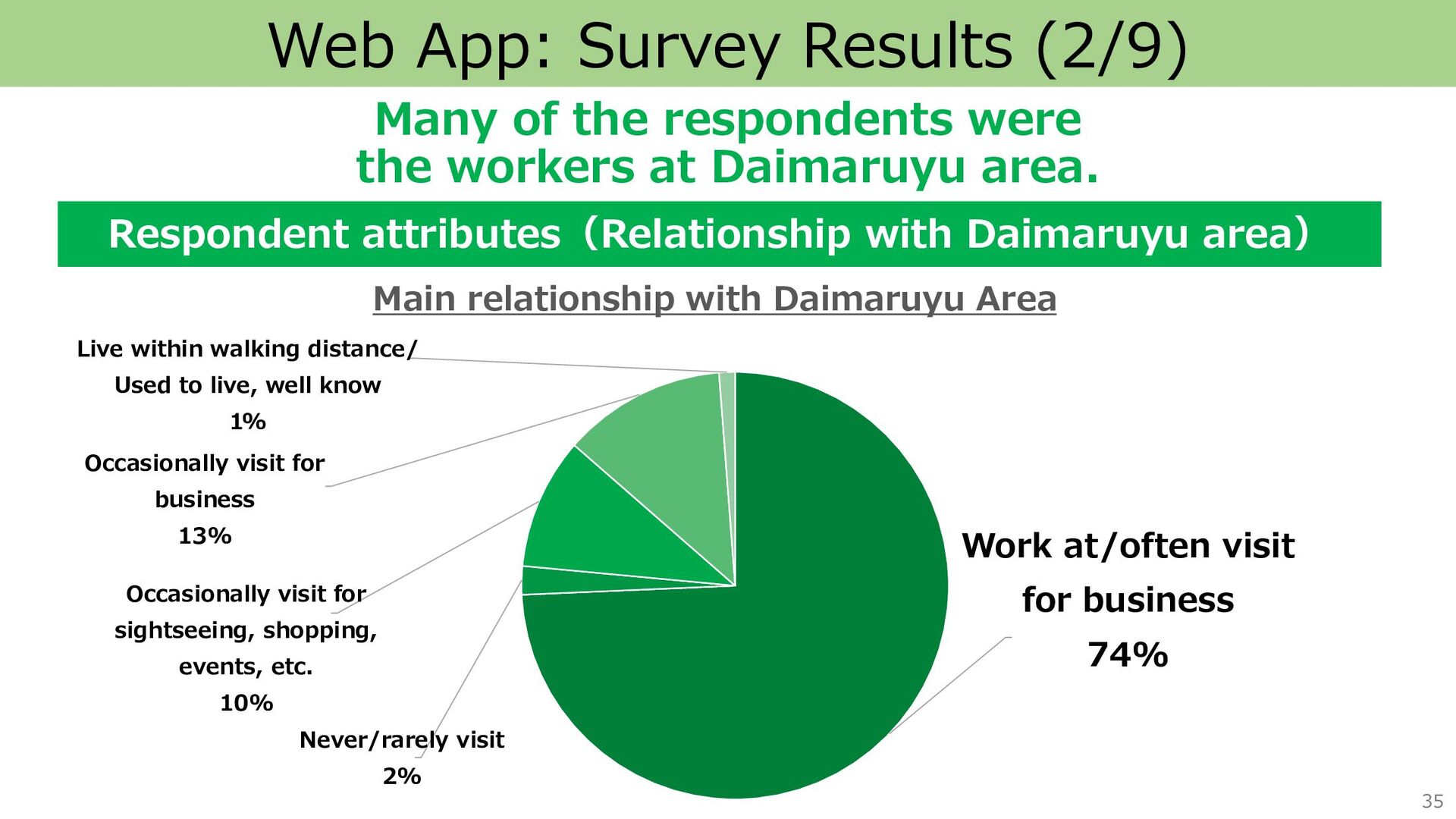
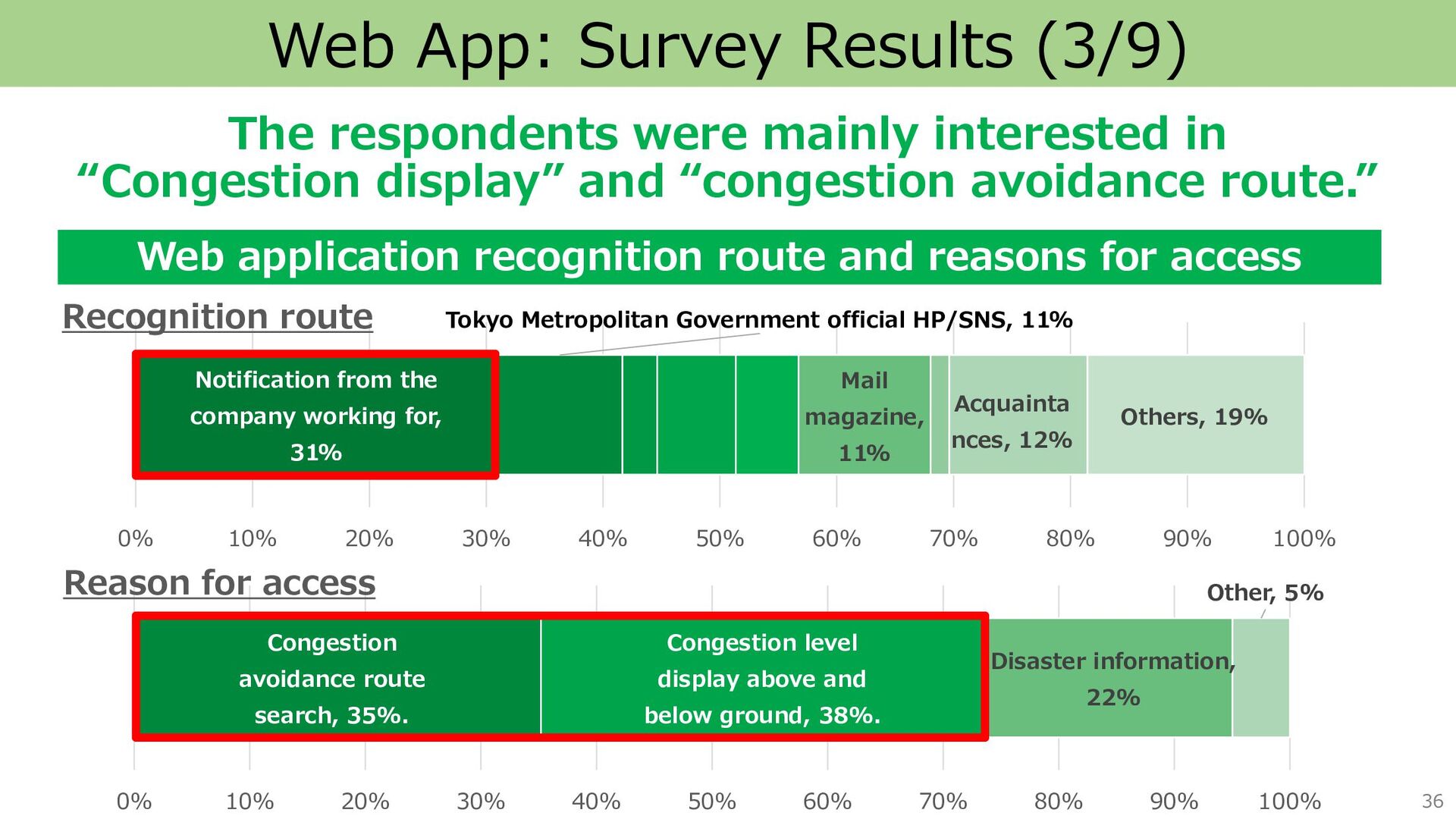
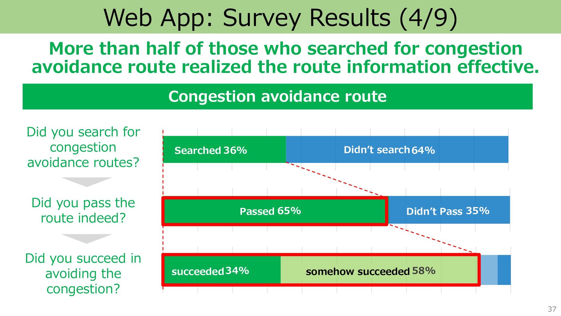
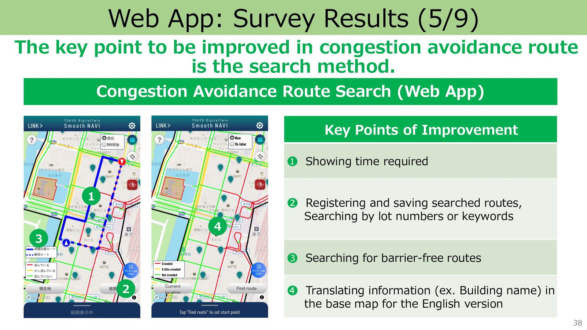
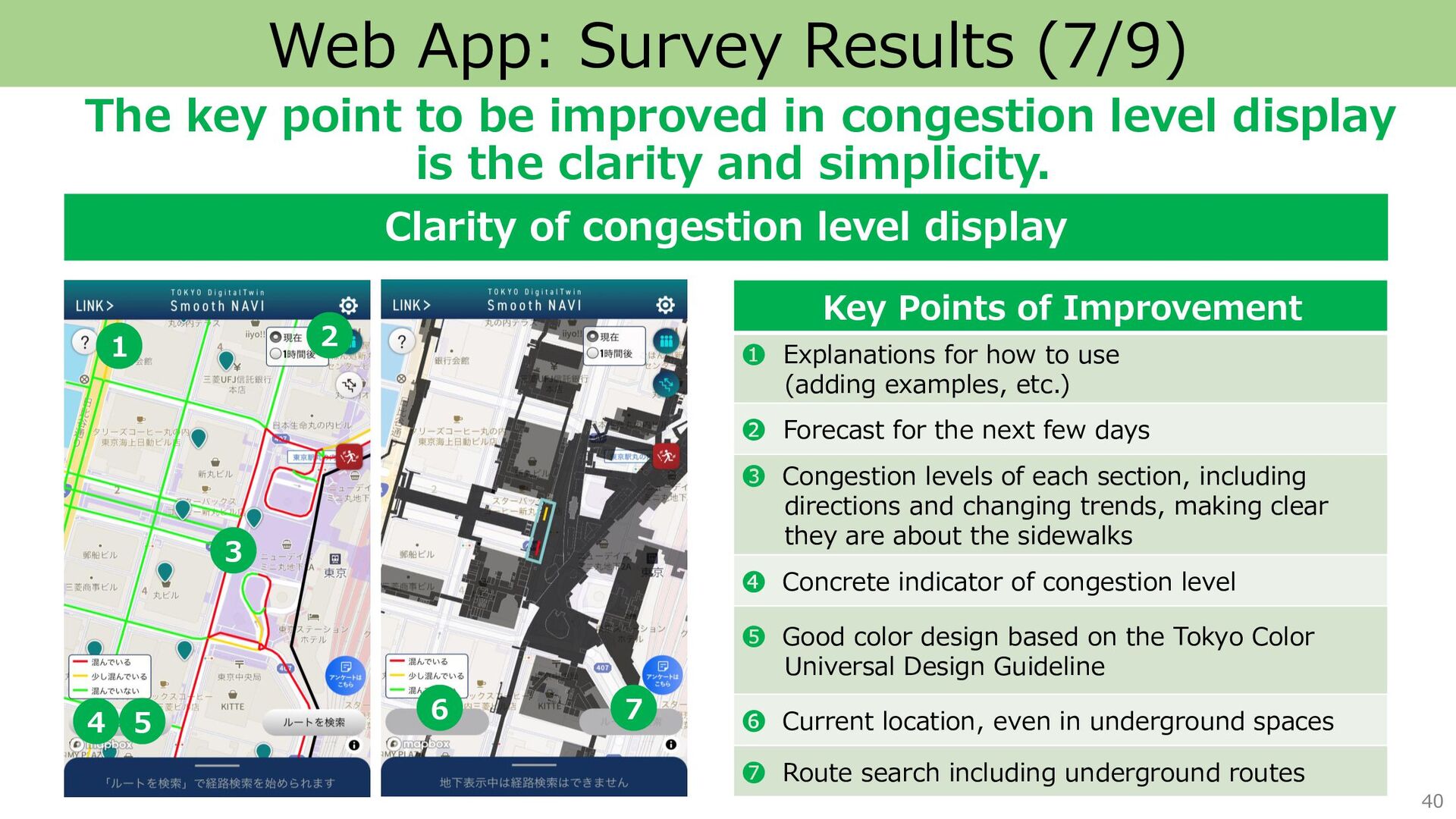
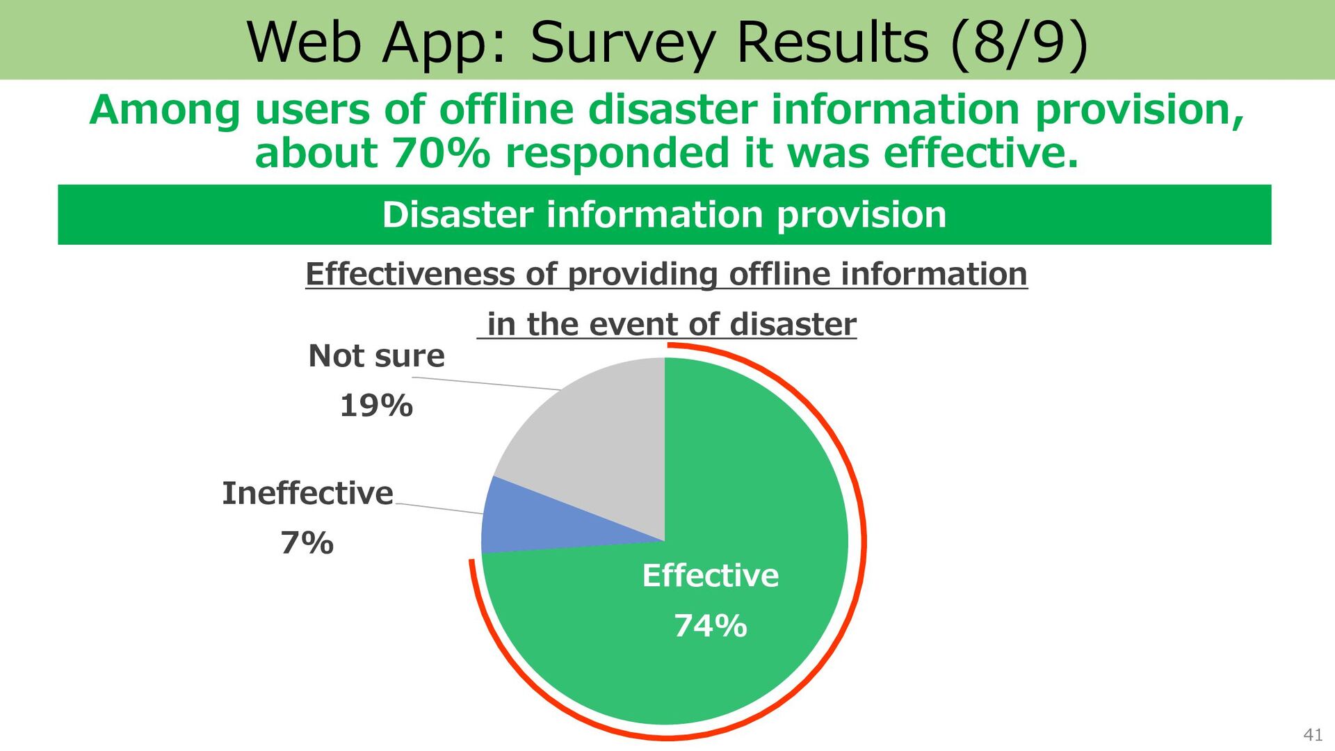
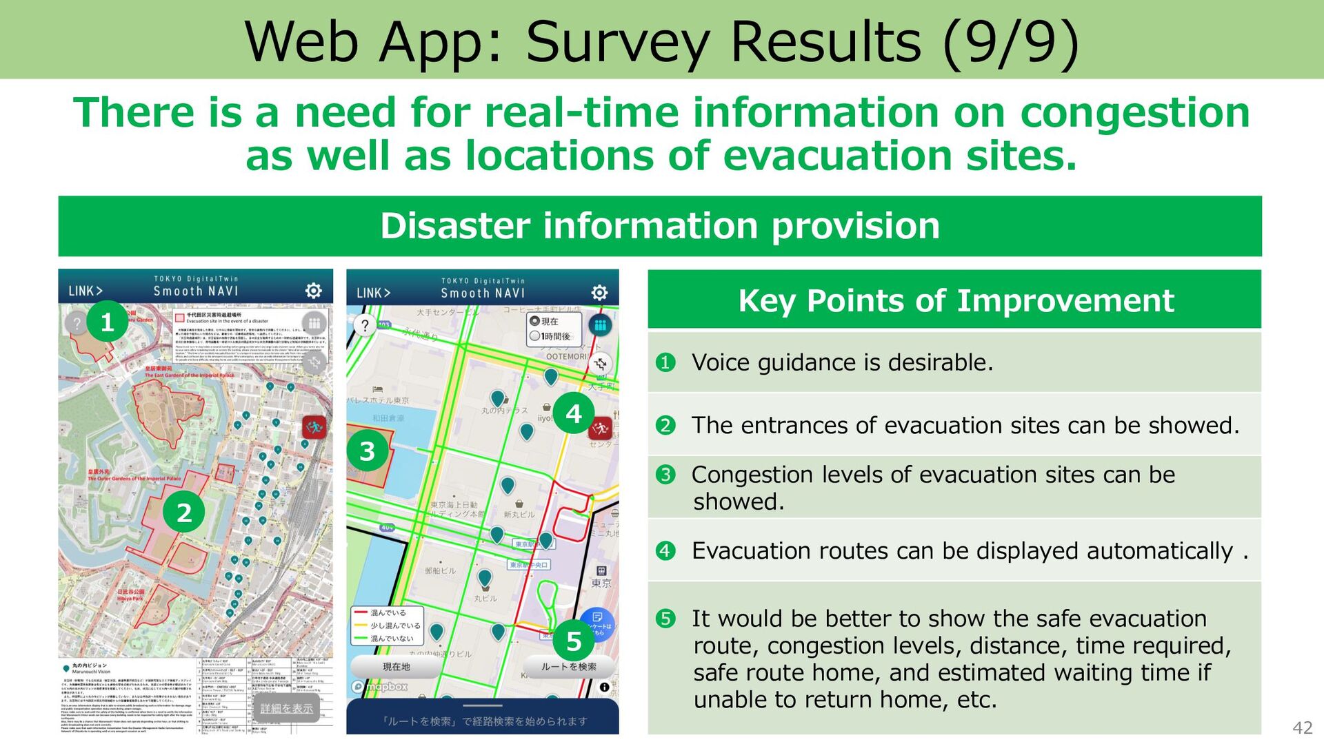
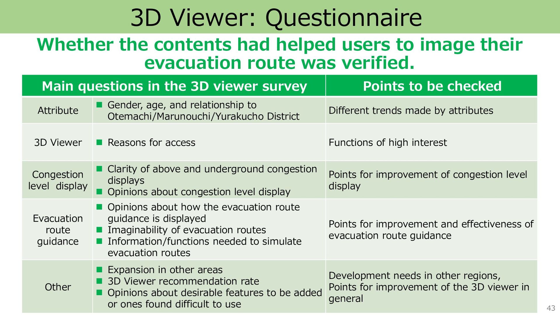
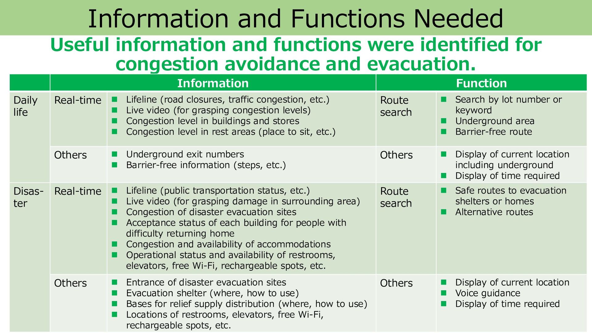
    for congestion avoidance and evacuation. 56 Information Function Daily life Real-time ◼ Lifeline (road closures, traffic congestion, etc.) ◼ Live video (for grasping congestion levels) ◼ Congestion level in buildings and stores ◼ Congestion level in rest areas (place to sit, etc.) Route search ◼ Search by lot number or keyword ◼ Underground area ◼ Barrier-free route Others ◼ Underground exit numbers ◼ Barrier-free information (steps, etc.) Others ◼ Display of current location including underground ◼ Display of time required Disas- ter Real-time ◼ Lifeline (public transportation status, etc.) ◼ Live video (for grasping damage in surrounding area) ◼ Congestion of disaster evacuation sites ◼ Acceptance status of each building for people with difficulty returning home ◼ Congestion and availability of accommodations ◼ Operational status and availability of restrooms, elevators, free Wi-Fi, rechargeable spots, etc. Route search ◼ Safe routes to evacuation shelters or homes ◼ Alternative routes Others ◼ Entrance of disaster evacuation sites ◼ Evacuation shelter (where, how to use) ◼ Bases for relief supply distribution (where, how to use) ◼ Locations of restrooms, elevators, free Wi-Fi, rechargeable spots, etc. Others ◼ Display of current location ◼ Voice guidance ◼ Display of time required
  51. 58 Future Direction Technical and operational issues will be addressed

    and a system for expanding over broader area will be considered. We aim to realize safe and secure life in Tokyo by providing information of congestion and disaster based on real-time human flow data. Technical issues Operational issues ◼ System for expanding over broader areas in Tokyo ◼ Method of acquiring and using human flow data with the consideration of privacy ◼ Congestion display method ◼ Accuracy of congestion information ◼ Reliability in the event of a disaster ◼ Universal design ×