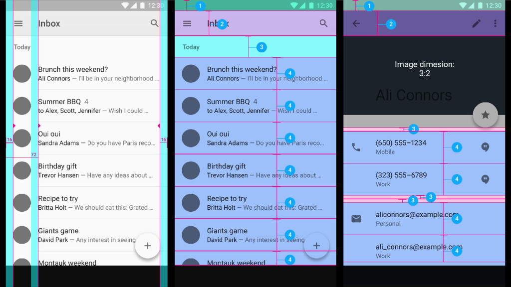
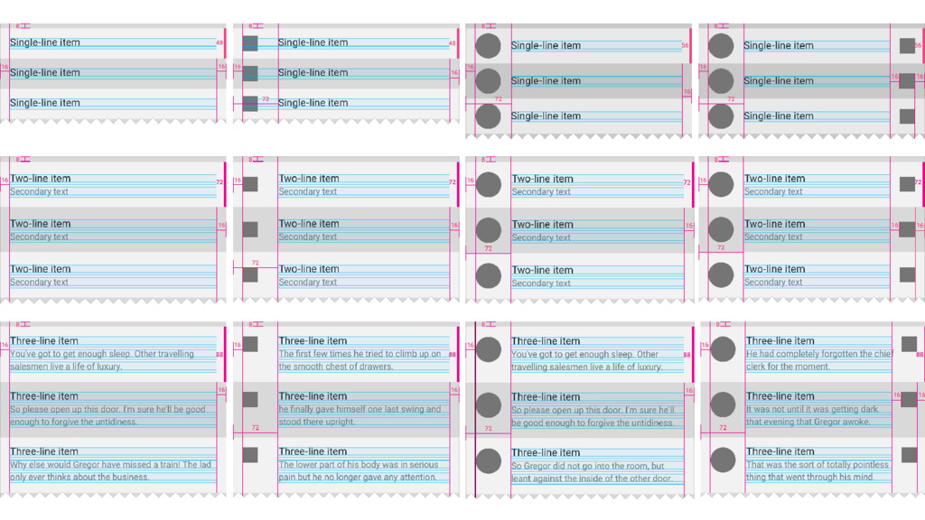
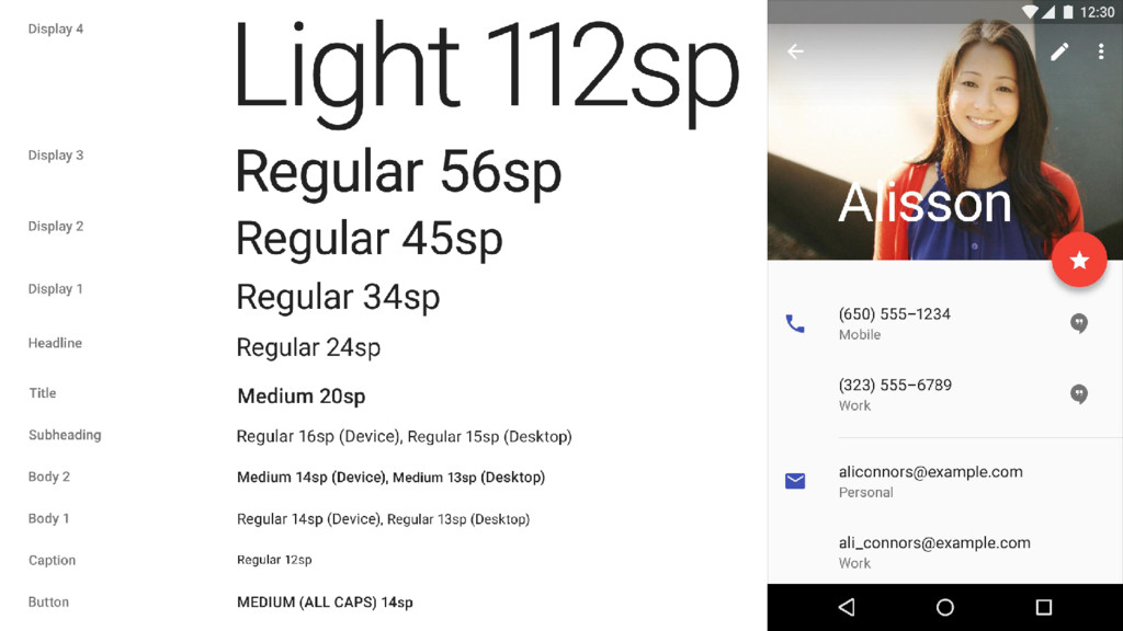
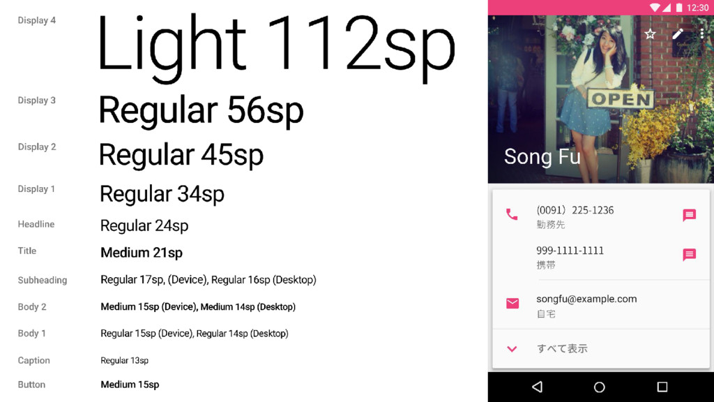
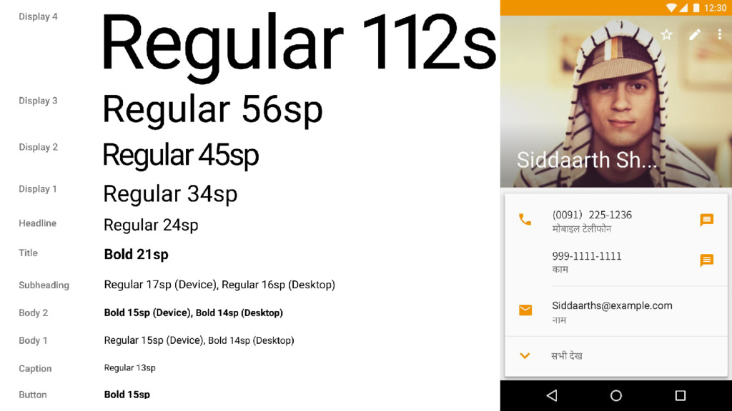
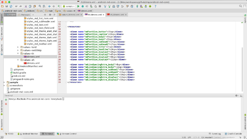
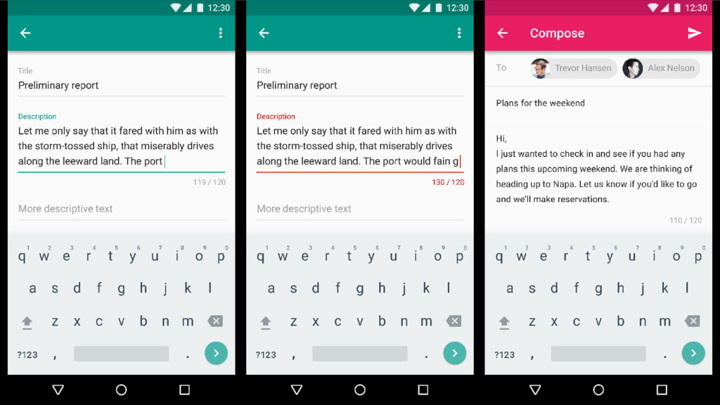
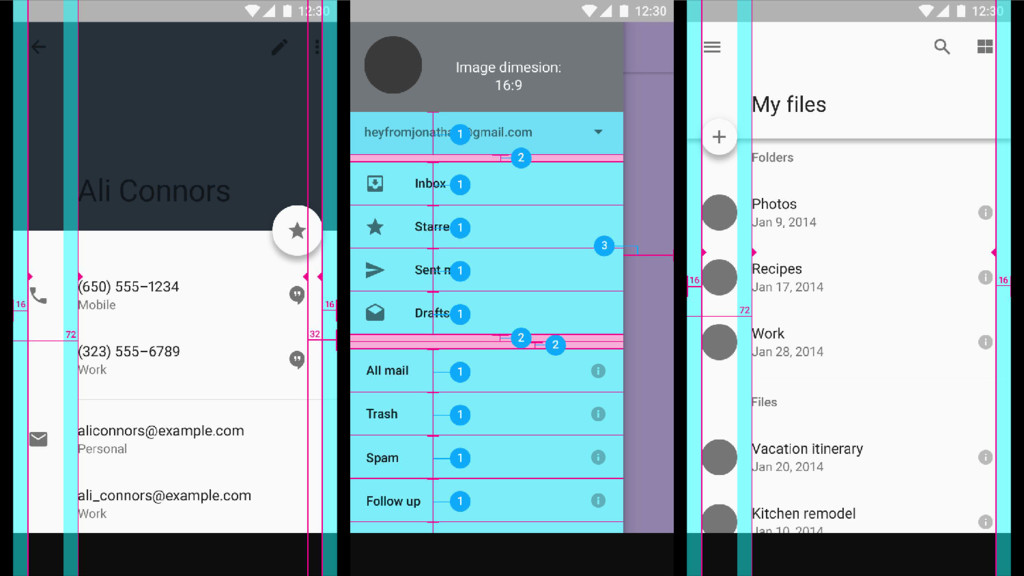
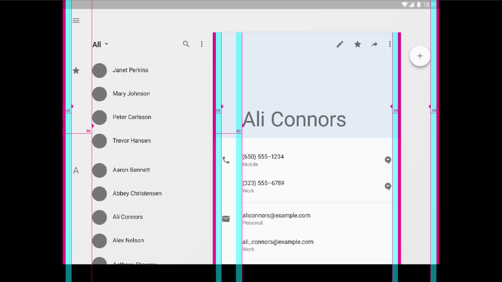
as typography, grids, space, scale, color, and imagery – to create hierarchy, meaning, and focus that immerse the user in the experience. Material design adopts tools from the field of print design, like baseline grids and structural templates, encouraging consistency across environments by repeating visual elements, structural grids, and spacing across platforms and screen sizes. These layouts scale to fit any screen size, which simplifies the process of creating scalable apps.
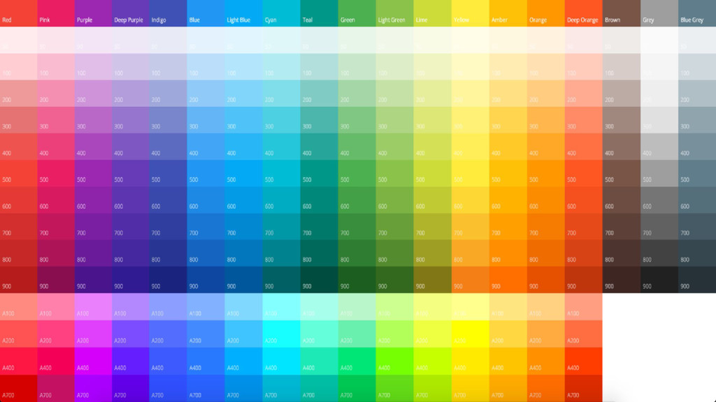
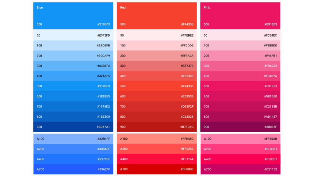
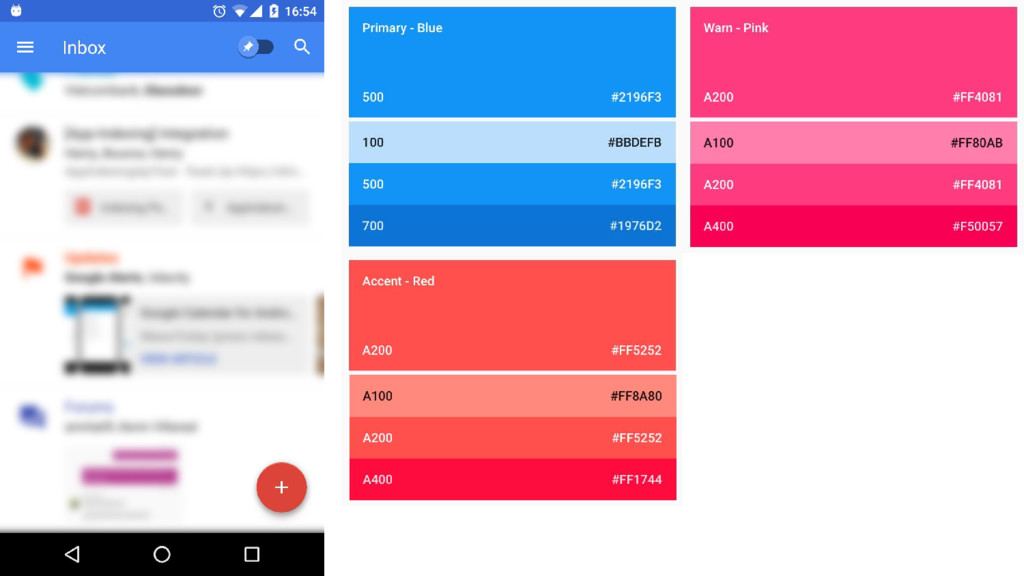
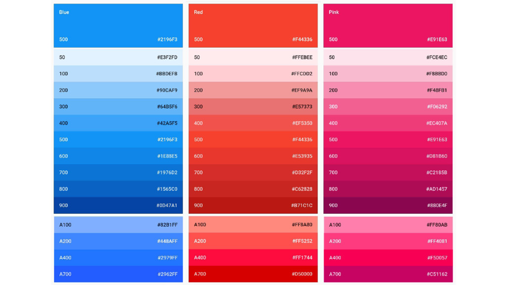
from the material design color palette. Limit your selection of colors to three hues from the primary palette and one accent color from the secondary palette.
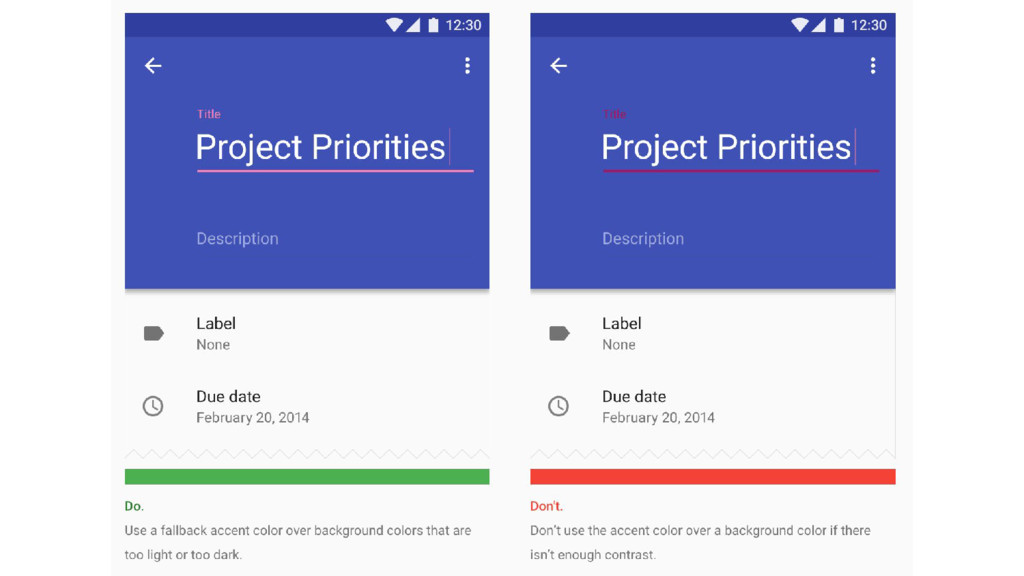
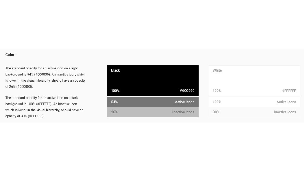
Palette Normal Hue - Light Hue - Dark Hue 4 main palettes x 3 color hues 100 - 500 - 700 - A100 - A200 - A400 Light Background VS Dark Background Primary / Secondary / Hint Text Color - Divider Color - Icon Color


 odashi
 genda
 4o1sobblue
 pfn
 shumei_ito
 glaforge
 shugo
 bitkey
 masakiokuda
 tomokusaba
 oikon48
 orderedlist
 irinanazarova
 codingconduct
 eitanlees
 davidcarrasco
 khoart
 baasie
 eileencodes
 chriscoyier
 techseoconnect
 apolaine
 hannesfritz