Animations enable us to convey changes over time, transitions between states, or the unfolding of a narrative. We can show processes, tell stories and evoke emotions where it is difficult or impossible with static graphics and text alone. The capabilities of modern web browsers and libraries like D3.js allow us to use animation in visualizations very easily. But we must also ask if the animations we create are necessary, meaningful and effective. Especially in visualization we need to be careful not to distort the data or introduce unneeded complexity.
---
Examples shown in the talk (because they're much more fun live):
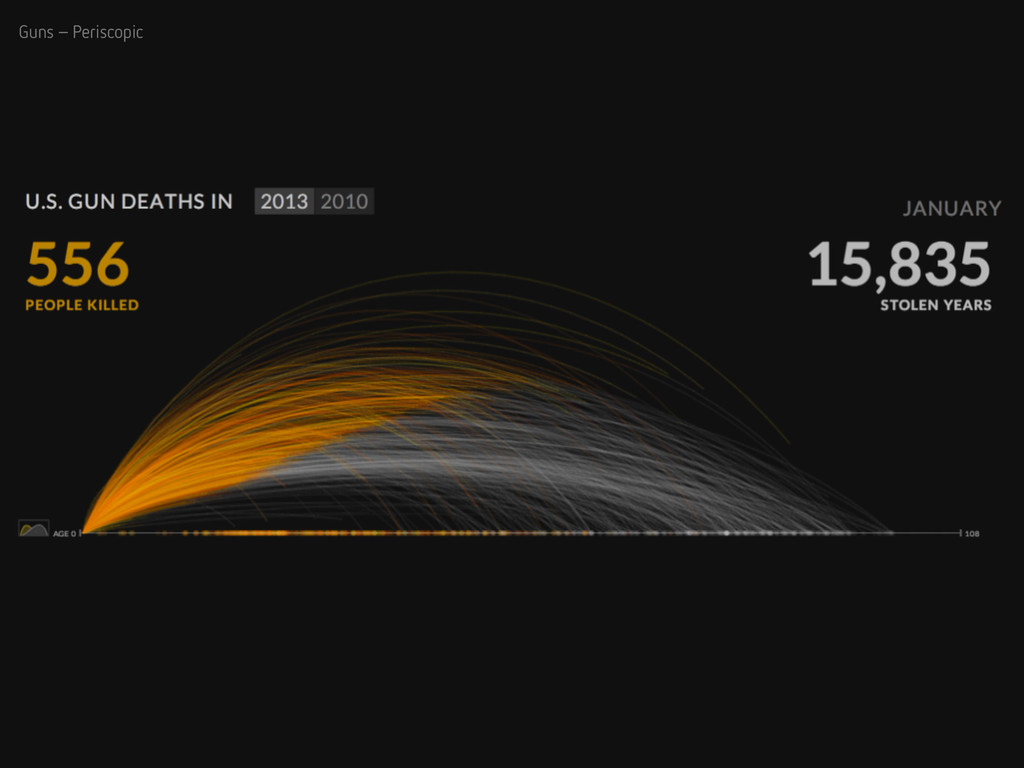
U.S. Gun Deaths – Periscopic
http://guns.periscopic.com/
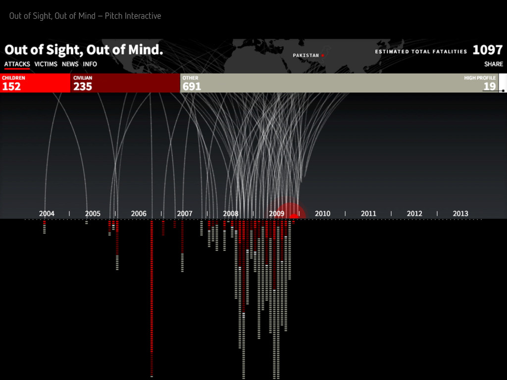
Out of Sight, Out of Mind – Pitch Interactive
http://drones.pitchinteractive.com/
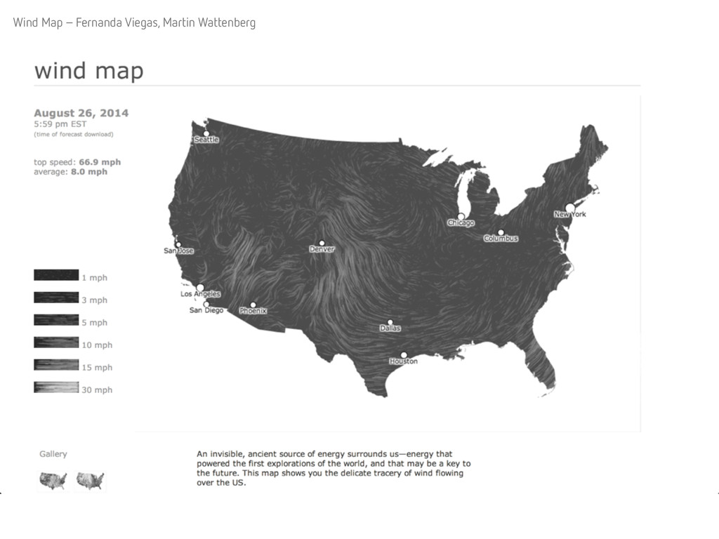
Wind Map – Fernanda Viegas, Martin Wattenberg
http://hint.fm/wind/
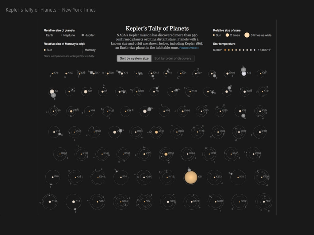
Kepler’s Tally of Planets – New York Times
http://www.nytimes.com/interactive/science/space/keplers-tally-of-planets.html
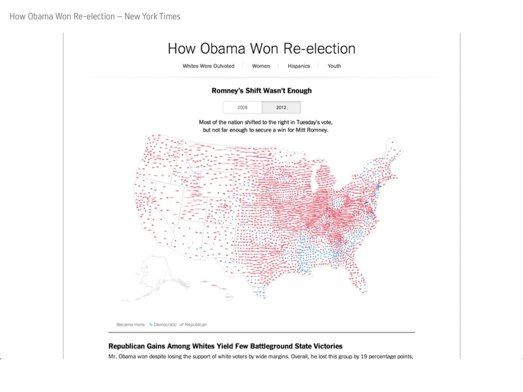
How Obama Won Re-election – New York Times
http://www.nytimes.com/interactive/2012/11/07/us/politics/obamas-diverse-base-of-support.html
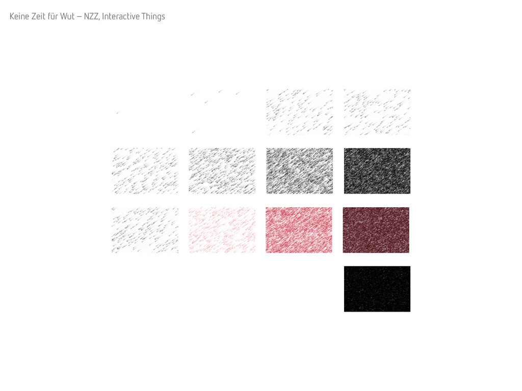
Keine Zeit für Wut – NZZ, Interactive Things
http://fukushima.nzz.ch/#die-schulleiterin
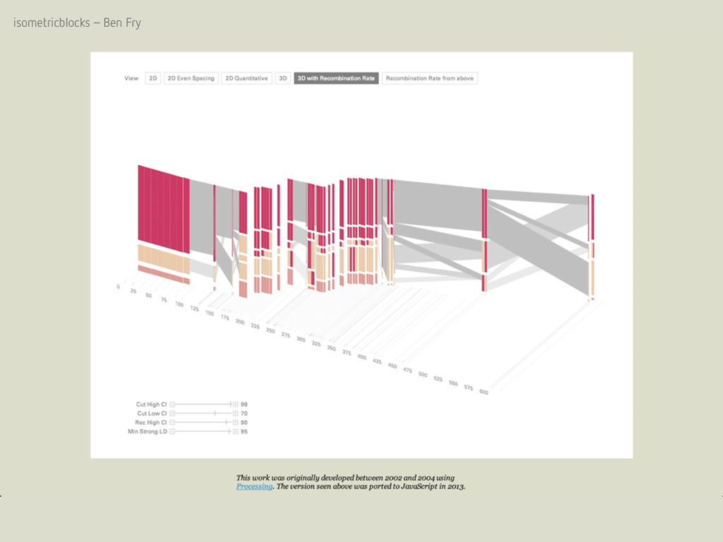
isometricblocks – Ben Fry
http://benfry.com/isometricblocks/
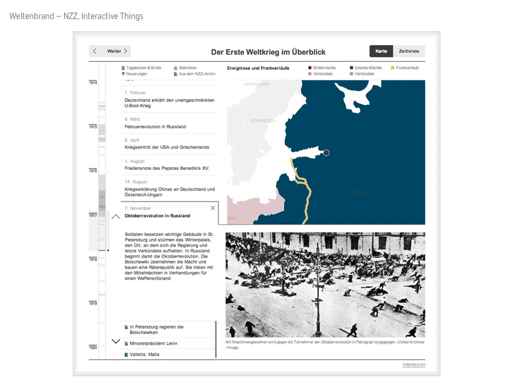
Weltenbrand – NZZ, Interactive Things
http://www.nzz.ch/international/weltkrieg/weltenbrand-chronik-des-ersten-weltkriegs-1.18331813
Wie sich Taschendiebe und Polizisten in 26 Kantonen begegnen – NZZ, Interactive Things
http://work.interactivethings.com/nzz-swiss-maps/polizisten-und-taschendiebstaehle.html
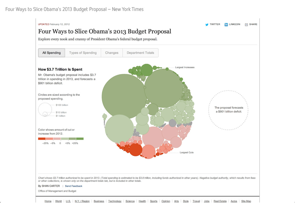
Four Ways to Slice Obama’s 2013 Budget Proposal – New York Times
http://www.nytimes.com/interactive/2012/02/13/us/politics/2013-budget-proposal-graphic.html
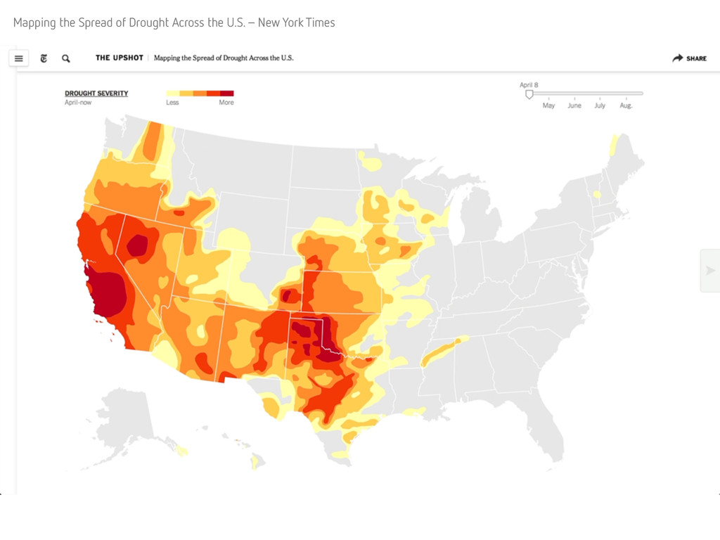
Mapping the Spread of Drought Across the U.S. – New York Times
http://www.nytimes.com/interactive/2014/upshot/mapping-the-spread-of-drought-across-the-us.html
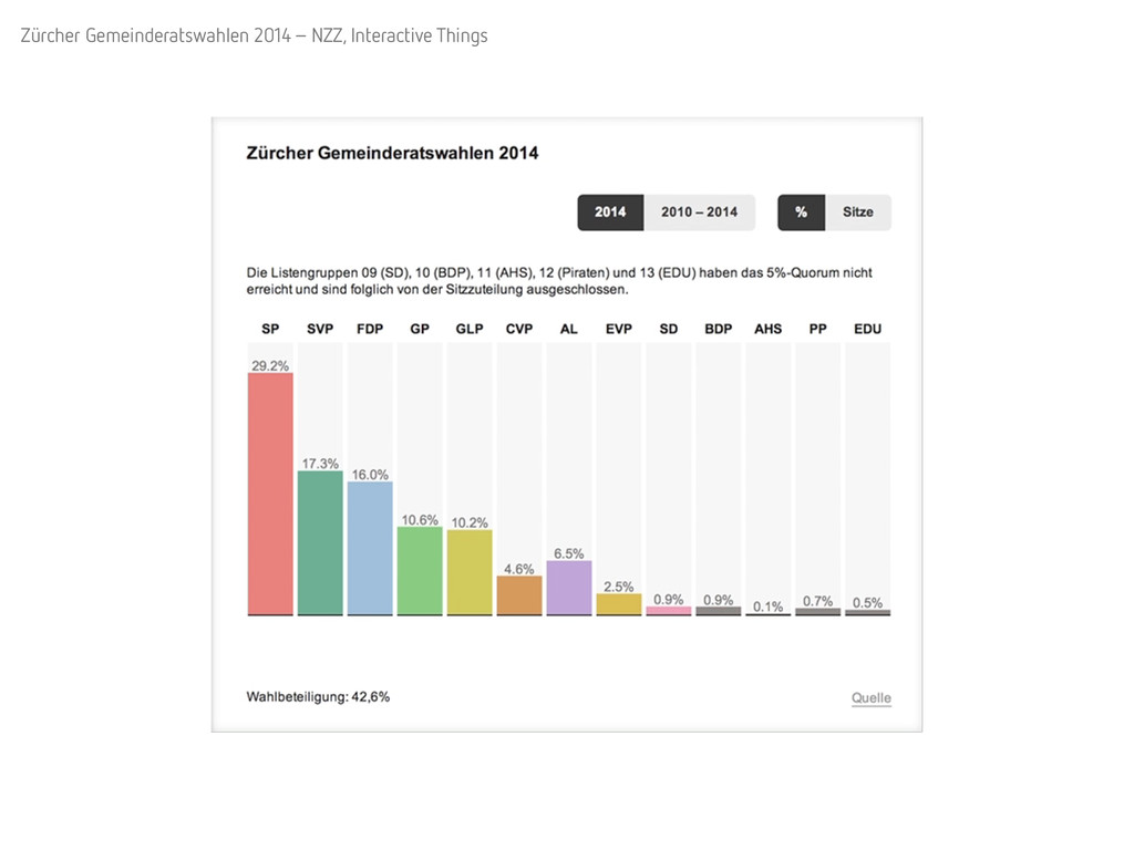
Zürcher Gemeinderatswahlen 2014 – NZZ, Interactive Things
http://www.nzz.ch/aktuell/data/zuercher-stadtrats--und-gemeinderatswahlen-alle-wahlergebnisse-im-ueberblick-1.18239805
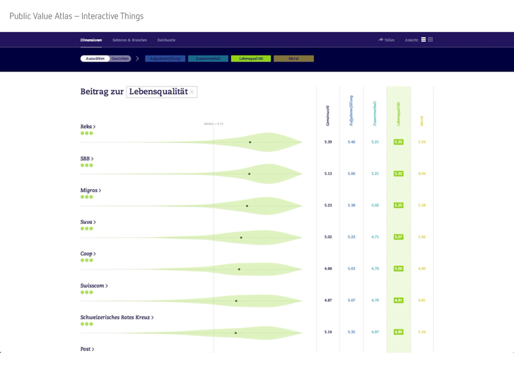
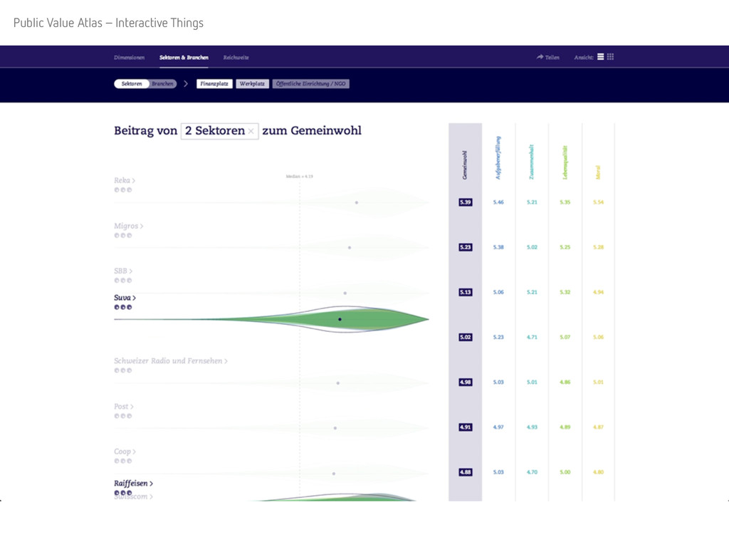
Public Value Atlas – Interactive Things
http://www.gemeinwohl.ch/atlas
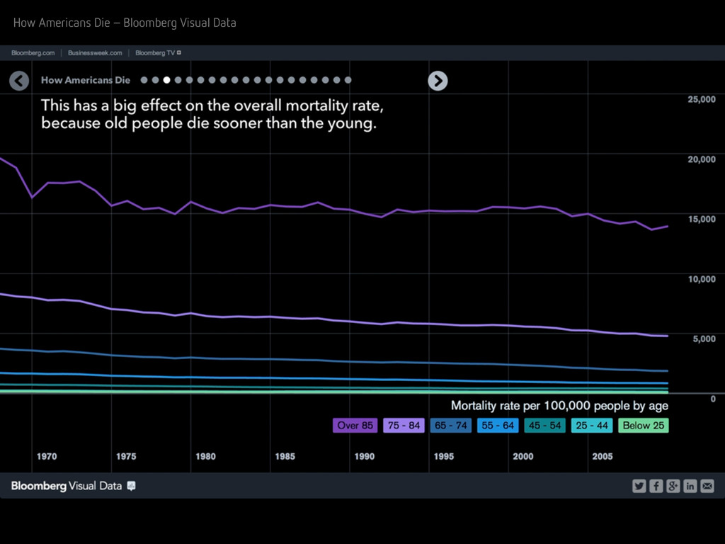
How Americans Die – Bloomberg Visual Data
http://www.bloomberg.com/dataview/2014-04-17/how-americans-die.html
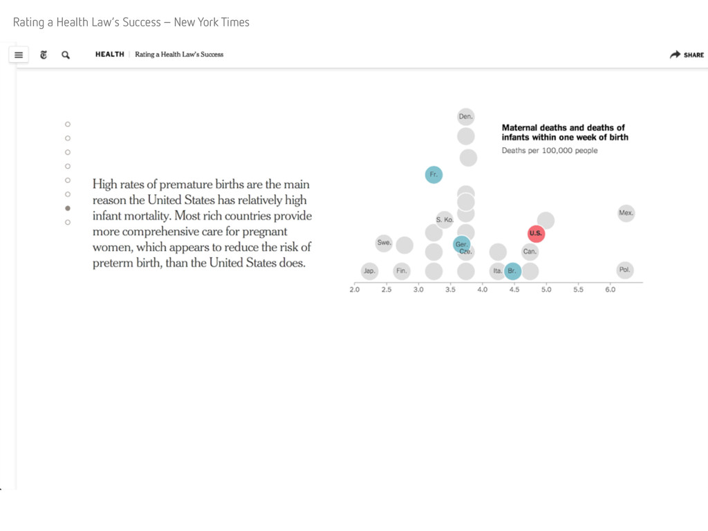
Rating a Health Law’s Success – New York Times
http://www.nytimes.com/interactive/2014/05/19/health/rating-a-health-laws-success.html
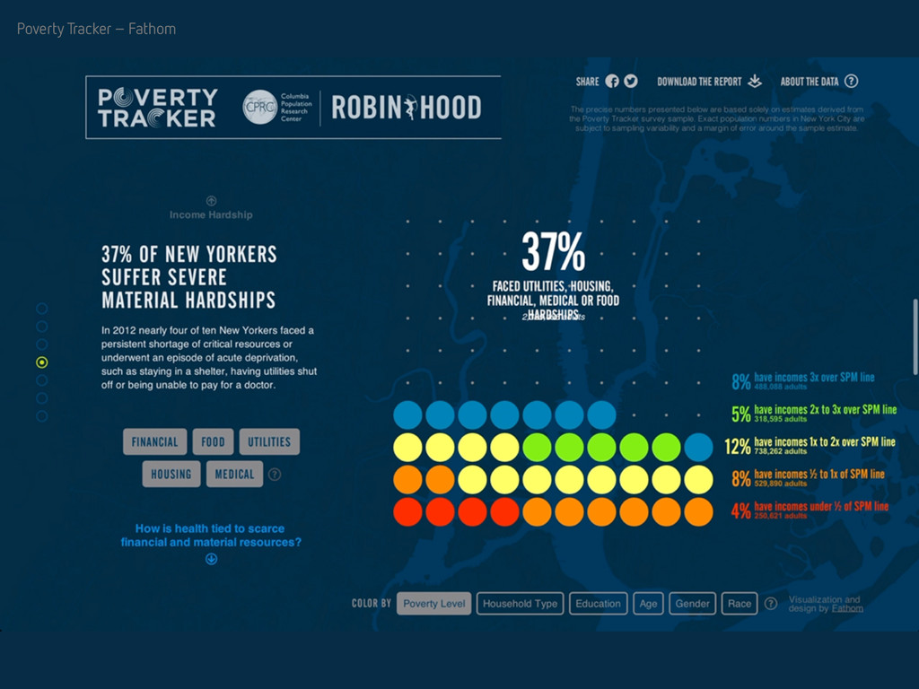
Poverty Tracker – Fathom
http://povertytracker.robinhood.org/
---
References
Heer J, Robertson G – Animated Transitions in Statistical Data Graphics (2007)
http://vis.stanford.edu/files/2007-AnimatedTransitions-InfoVis.pdf
Fisher Danyel – Animation for Visualization: Opportunities and Drawbacks (2010)
http://research.microsoft.com/pubs/130998/bv_ch19.pdf
Tversky B, Morrison JB, Bétrancourt M – Animation: can it facilitate? (2002)
http://psych.stanford.edu/~bt/diagrams/papers/tversky_betrancourt.pdf
---
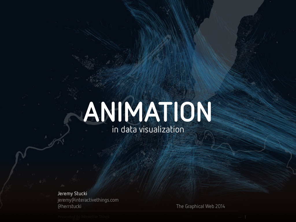
Talk held at the Graphical Web 2014 in Winchester https://www.graphicalweb.org/2014/