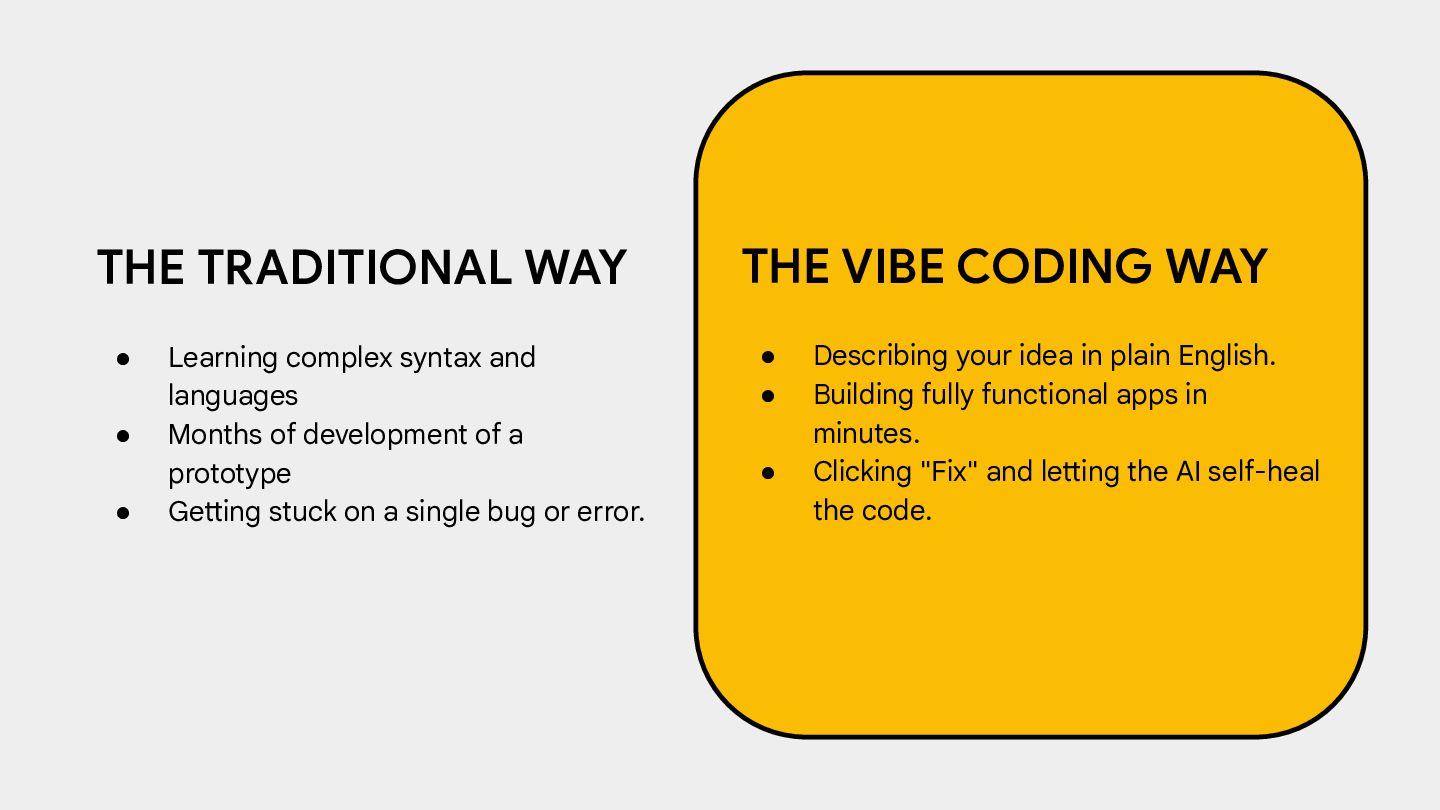
Months of development of a prototype • Getting stuck on a single bug or error. THE VIBE CODING WAY • Describing your idea in plain English. • Building fully functional apps in minutes. • Clicking "Fix" and letting the AI self-heal the code.
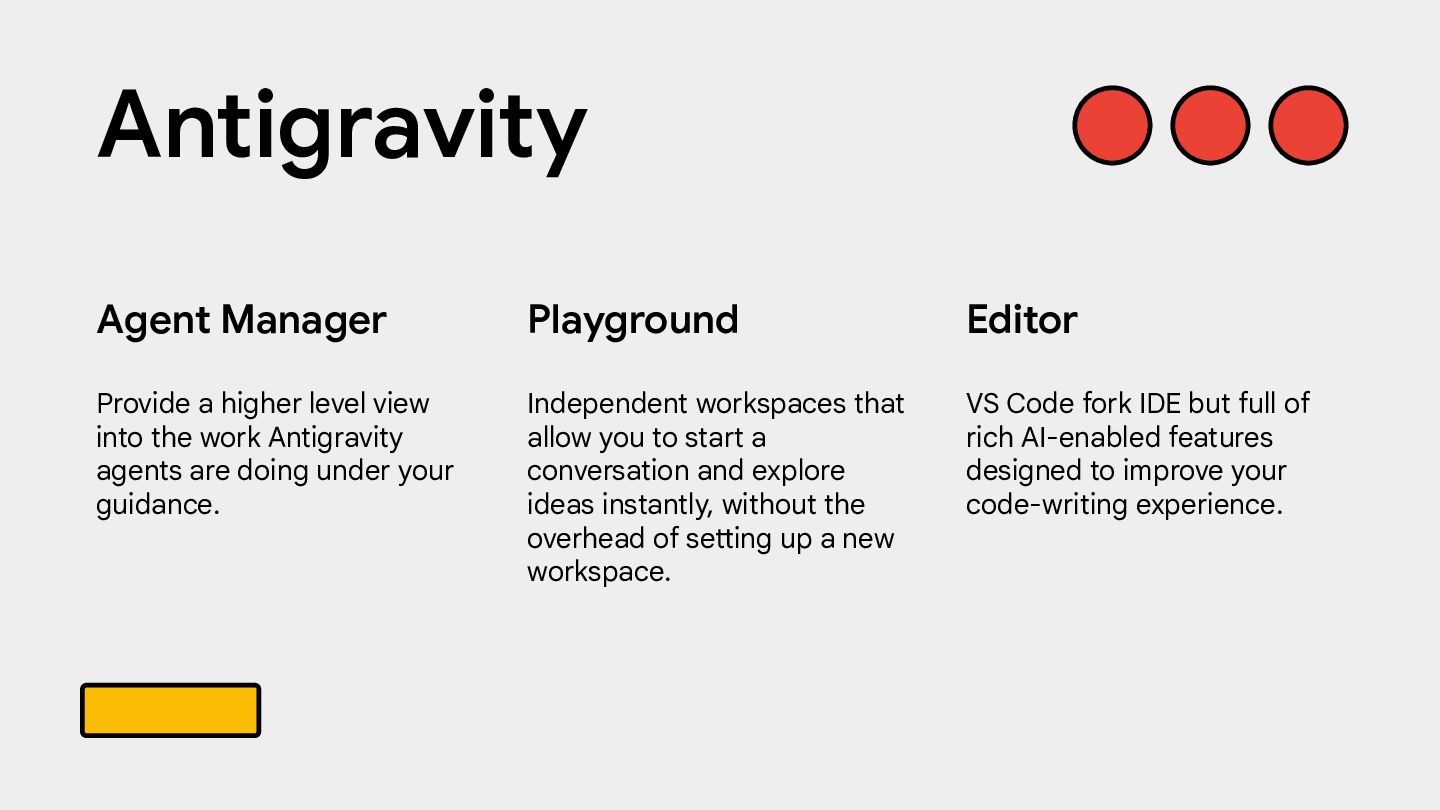
and explore ideas instantly, without the overhead of setting up a new workspace. Agent Manager Provide a higher level view into the work Antigravity agents are doing under your guidance. Editor VS Code fork IDE but full of rich AI-enabled features designed to improve your code-writing experience. Antigravity
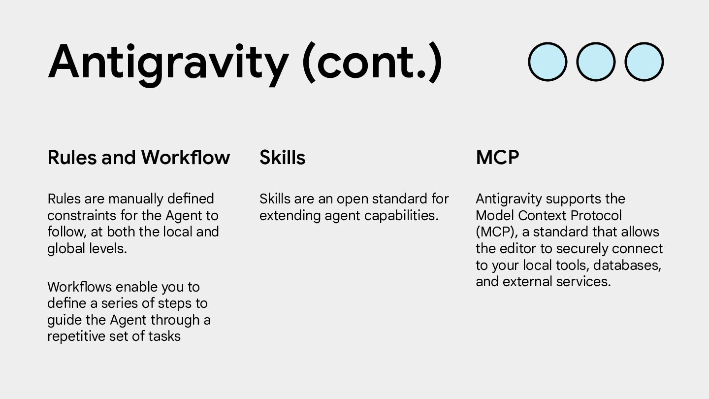
Rules and Workflow Rules are manually defined constraints for the Agent to follow, at both the local and global levels. Workflows enable you to define a series of steps to guide the Agent through a repetitive set of tasks MCP Antigravity supports the Model Context Protocol (MCP), a standard that allows the editor to securely connect to your local tools, databases, and external services. Antigravity (cont.)
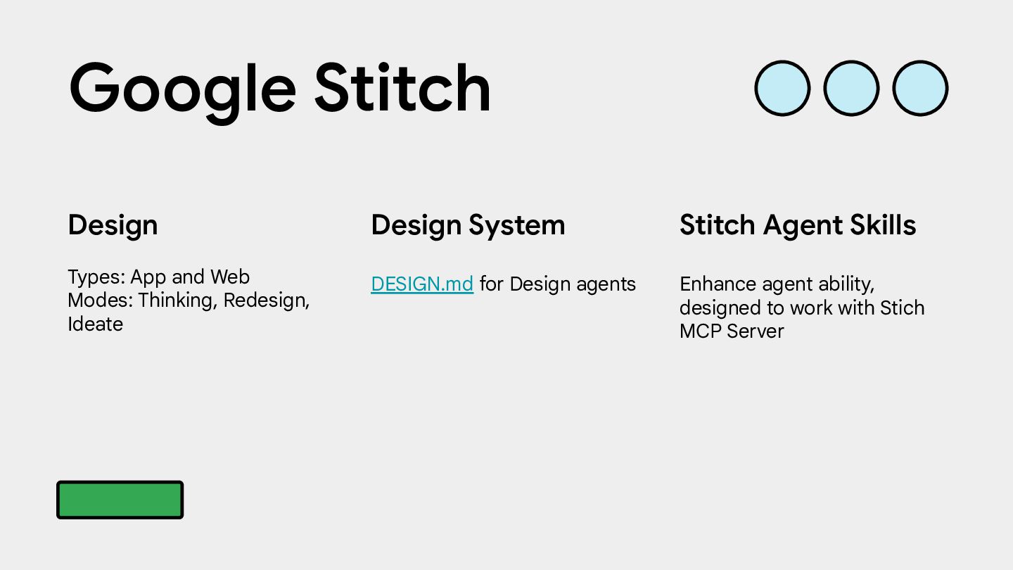
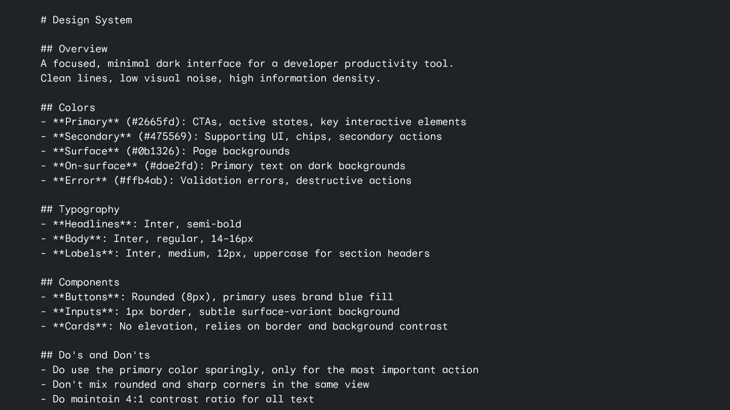
for a developer productivity tool. Clean lines, low visual noise, high information density. ## Colors - **Primary** (#2665fd): CTAs, active states, key interactive elements - **Secondary** (#475569): Supporting UI, chips, secondary actions - **Surface** (#0b1326): Page backgrounds - **On-surface** (#dae2fd): Primary text on dark backgrounds - **Error** (#ffb4ab): Validation errors, destructive actions ## Typography - **Headlines**: Inter, semi-bold - **Body**: Inter, regular, 14–16px - **Labels**: Inter, medium, 12px, uppercase for section headers ## Components - **Buttons**: Rounded (8px), primary uses brand blue fill - **Inputs**: 1px border, subtle surface-variant background - **Cards**: No elevation, relies on border and background contrast ## Do's and Don'ts - Do use the primary color sparingly, only for the most important action - Don't mix rounded and sharp corners in the same view - Do maintain 4:1 contrast ratio for all text
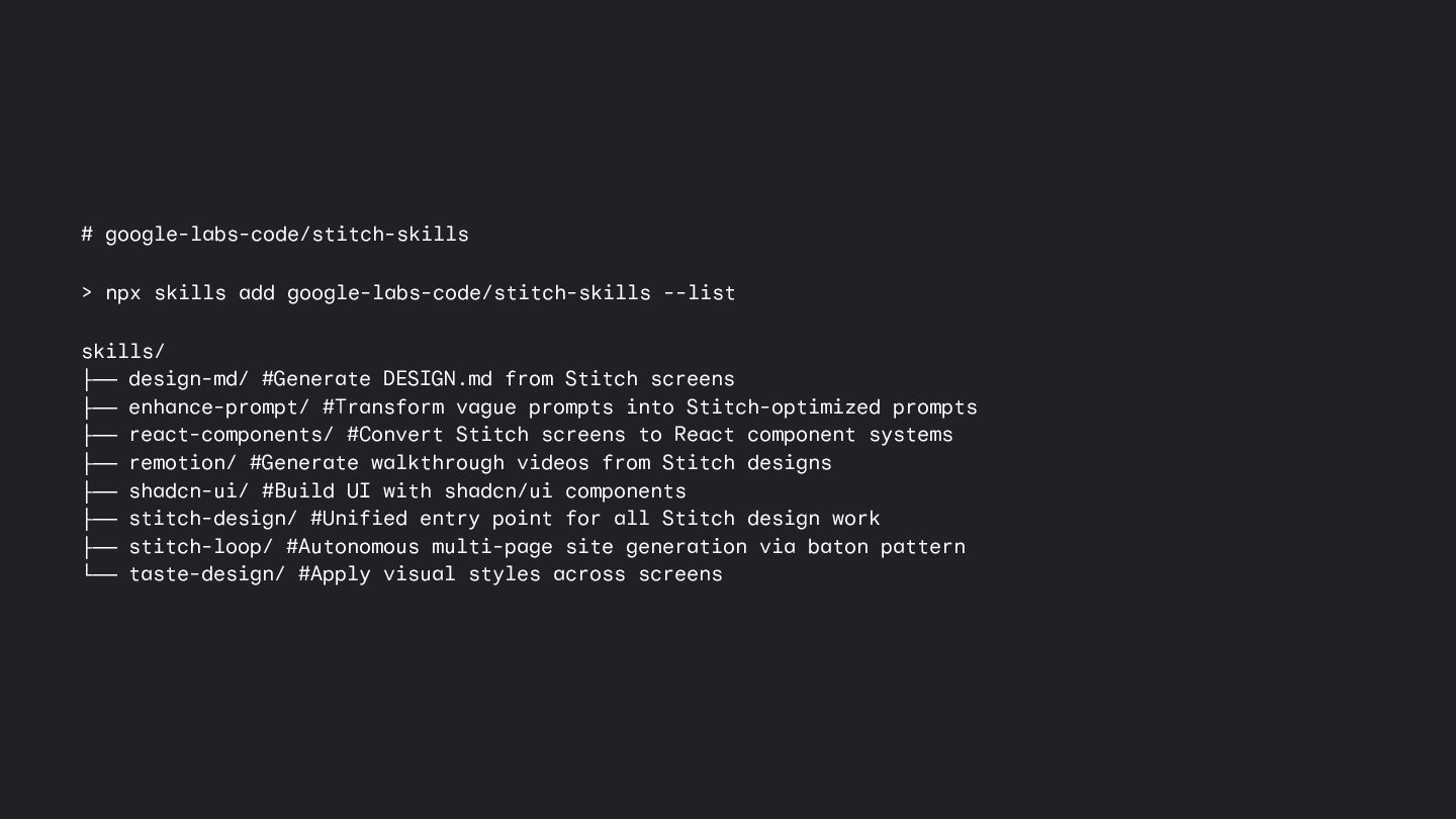
design-md/ #Generate DESIGN.md from Stitch screens ├── enhance-prompt/ #Transform vague prompts into Stitch-optimized prompts ├── react-components/ #Convert Stitch screens to React component systems ├── remotion/ #Generate walkthrough videos from Stitch designs ├── shadcn-ui/ #Build UI with shadcn/ui components ├── stitch-design/ #Unified entry point for all Stitch design work ├── stitch-loop/ #Autonomous multi-page site generation via baton pattern └── taste-design/ #Apply visual styles across screens
 hoangnguyen92dn
 prgckwb
 lycorptech_jp
 smt7174
 kaonavi
 rakus_dev
 cyberagentdevelopers
 shift_evolve
 yama3133
 twada
twada
 geekplus_tech
 fkmy
fkmy
 legalontechnologies
 jonrohan
 codingconduct
 sarafernandez
 cassininazir
 lauravandoore
 kastner
 akihiro_kokubo
 samanthasiow
 kimpetersen
 jonoalderson
 techseoconnect