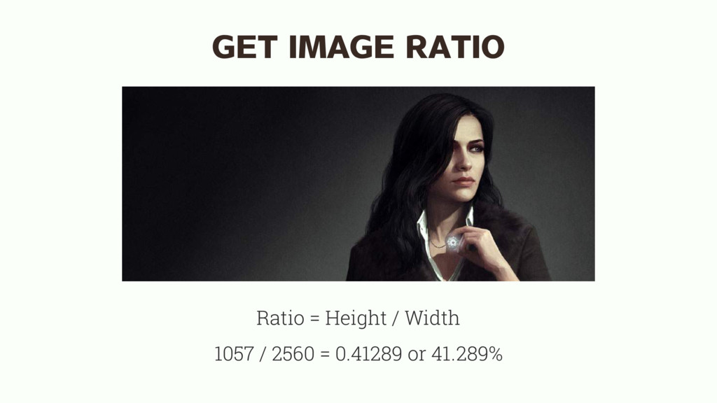
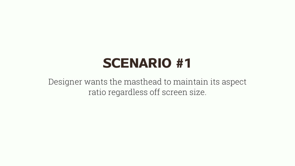
always show the entire image, even if it means there is empty space left in the container. padding-bottom value gives the container a height corresponding to the image ratio div { background-size: contain; padding-bottom: 41.289%; }
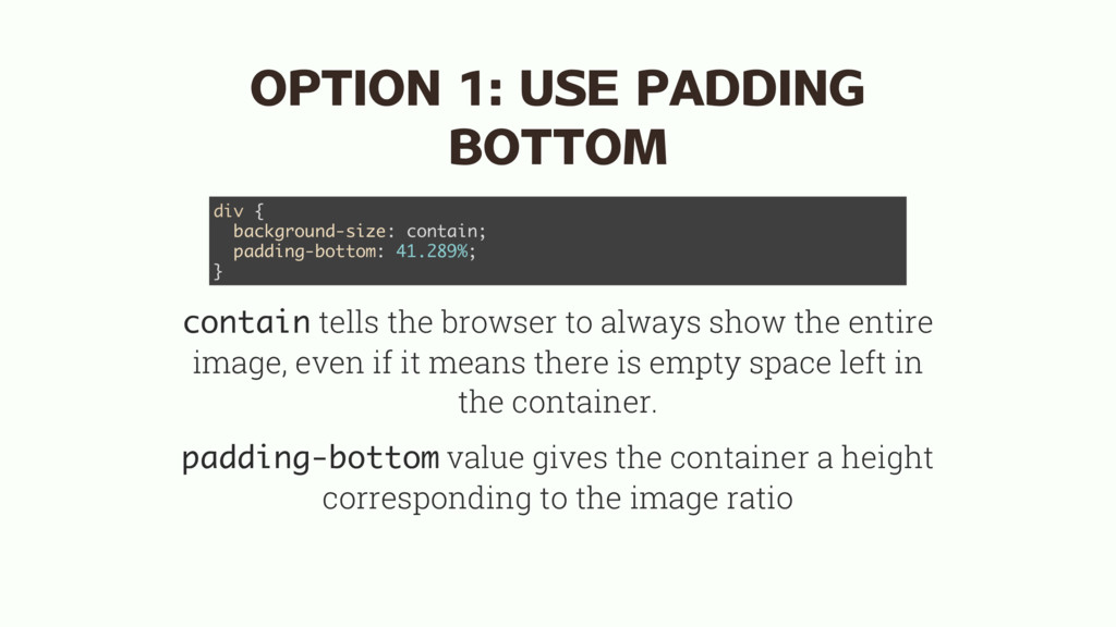
always cover the entire container, even if the sides have to be cut off. height value gives the container a height corresponding to the image ratio, because of the relative unit viewport width. div { background-size: cover; height: 41.289vw; }
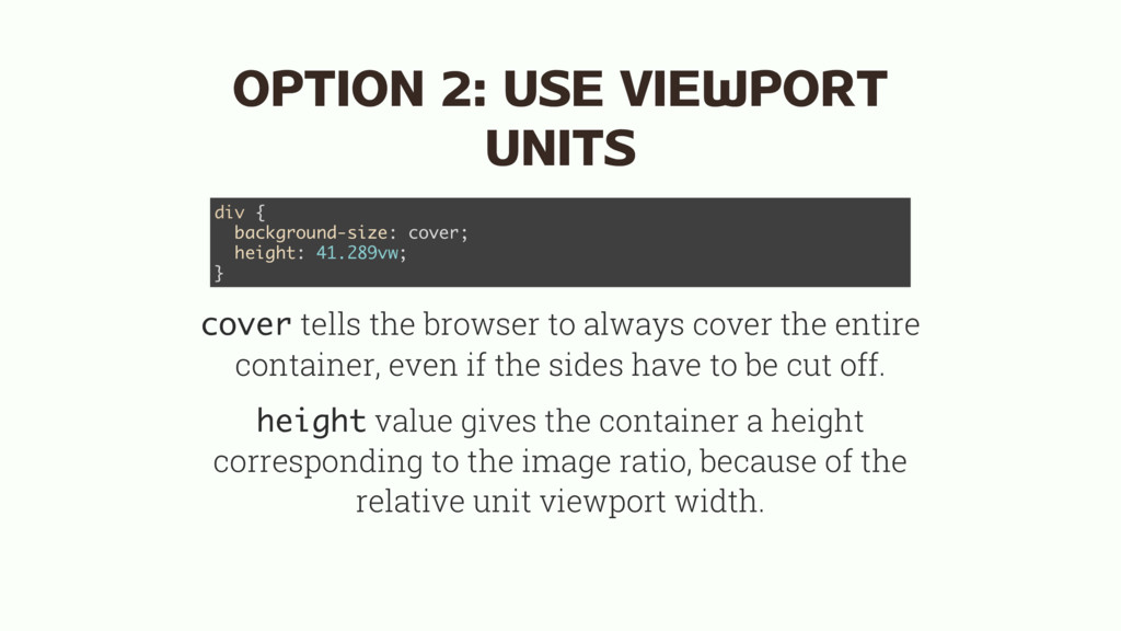
you don't need anything. Maybe not entirely nothing. max-width: 100% makes sure the image doesn't overflow the container. May occur if you're working with a CMS. img { max-width: 100%; }
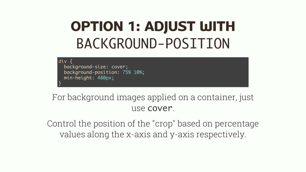
a container, just use cover. Control the position of the "crop" based on percentage values along the x-axis and y-axis respectively. div { background-size: cover; background-position: 75% 10%; min-height: 480px; }
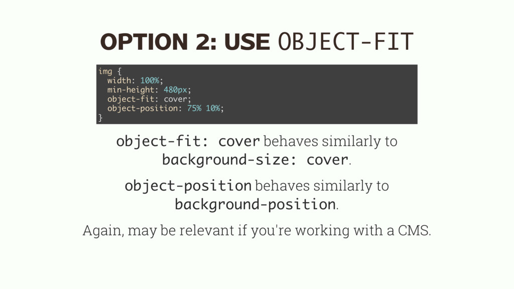
cover. object-position behaves similarly to background-position. Again, may be relevant if you're working with a CMS. img { width: 100%; min-height: 480px; object-fit: cover; object-position: 75% 10%; }
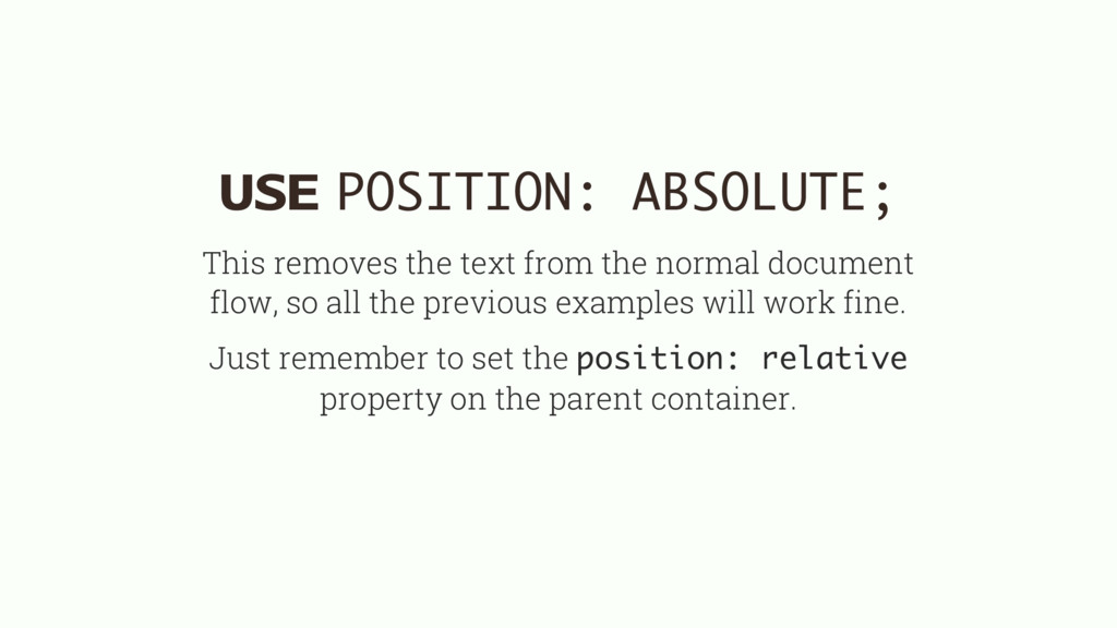
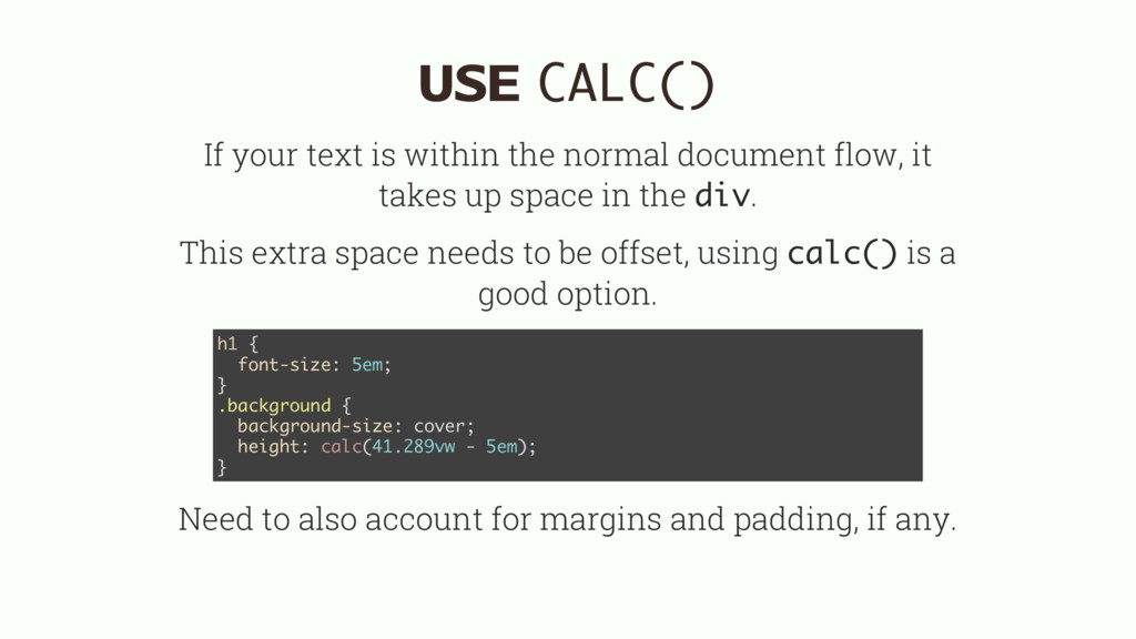
flow, it takes up space in the div. This extra space needs to be offset, using calc() is a good option. Need to also account for margins and padding, if any. h1 { font-size: 5em; } .background { background-size: cover; height: calc(41.289vw - 5em); }
 huijing
 nrslib
 pocke
pocke
 contour_gara
 kamoneggi
 bicstone
 kohzas
 kuranuki
 ivargrimstad
 pyama86
 takuroabe
 chriscoyier
 afnizarnur
 rabernat
 marcduiker
 tammyeverts
 emna__ayadi
 yeseniaperezcruz
 marcelosomers
 thirion
 bkeepers
 marktimemedia
 erikaheidi