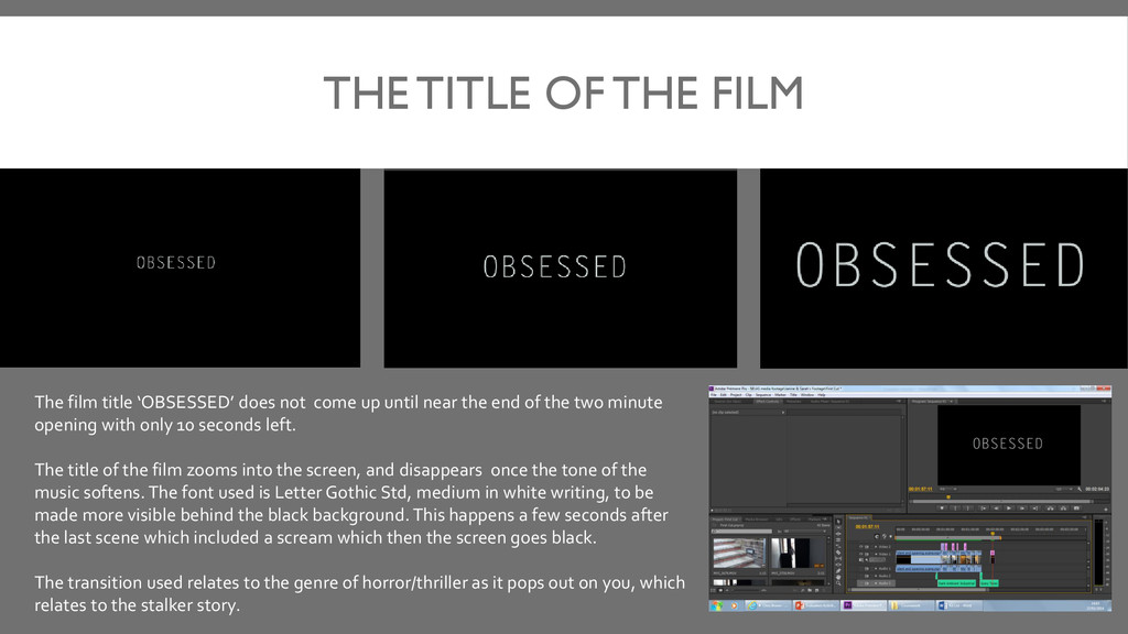
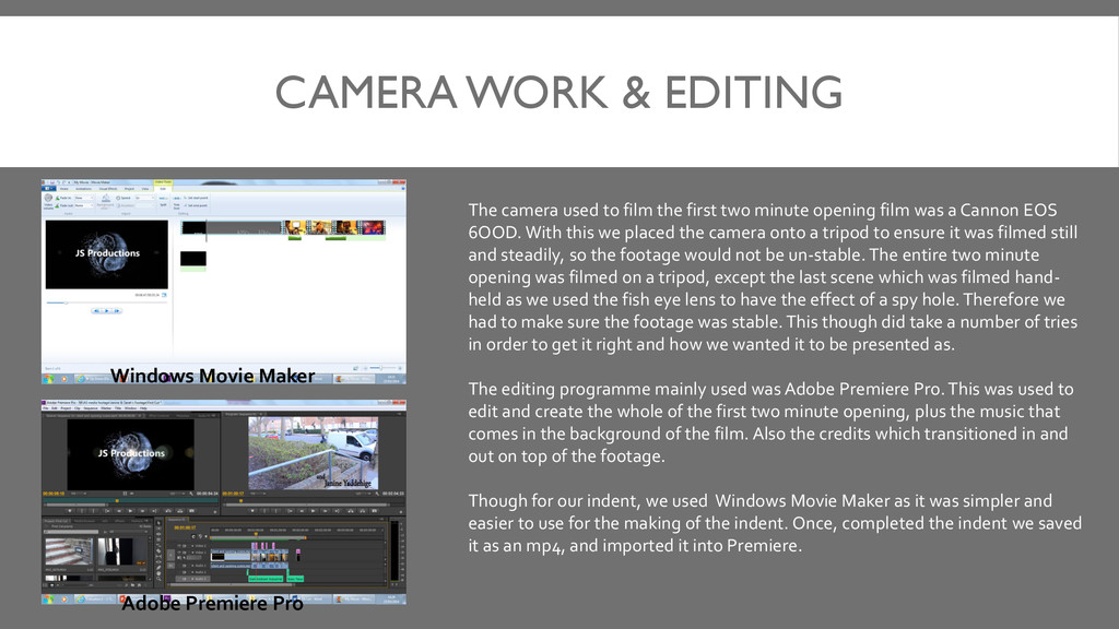
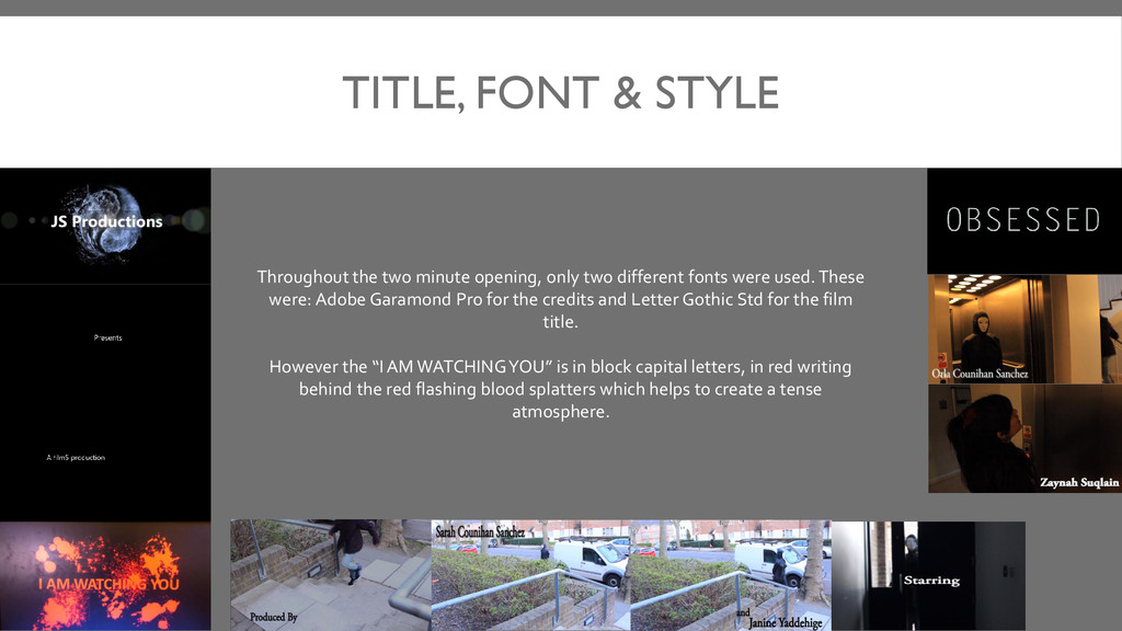
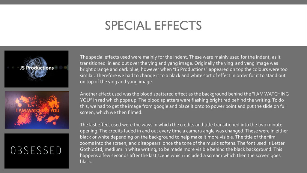
indent. These were mainly used for the indent, as it transitioned in and out over the ying and yang image. Originally the ying and yang image was bright orange and dark blue, however when “JS Productions” appeared on top the colours were too similar. Therefore we had to change it to a black and white sort of effect in order for it to stand out on top of the ying and yang image. Another effect used was the blood spattered effect as the background behind the “I AM WATCHING YOU” in red which pops up. The blood splatters were flashing bright red behind the writing. To do this, we had to get the image from google and place it onto to power point and put the slide on full screen, which we then filmed. The last effect used were the ways in which the credits and title transitioned into the two minute opening. The credits faded in and out every time a camera angle was changed. These were in either black or white depending on the background to help make it more visible. The title of the film zooms into the screen, and disappears once the tone of the music softens. The font used is Letter Gothic Std, medium in white writing, to be made more visible behind the black background. This happens a few seconds after the last scene which included a scream which then the screen goes black.