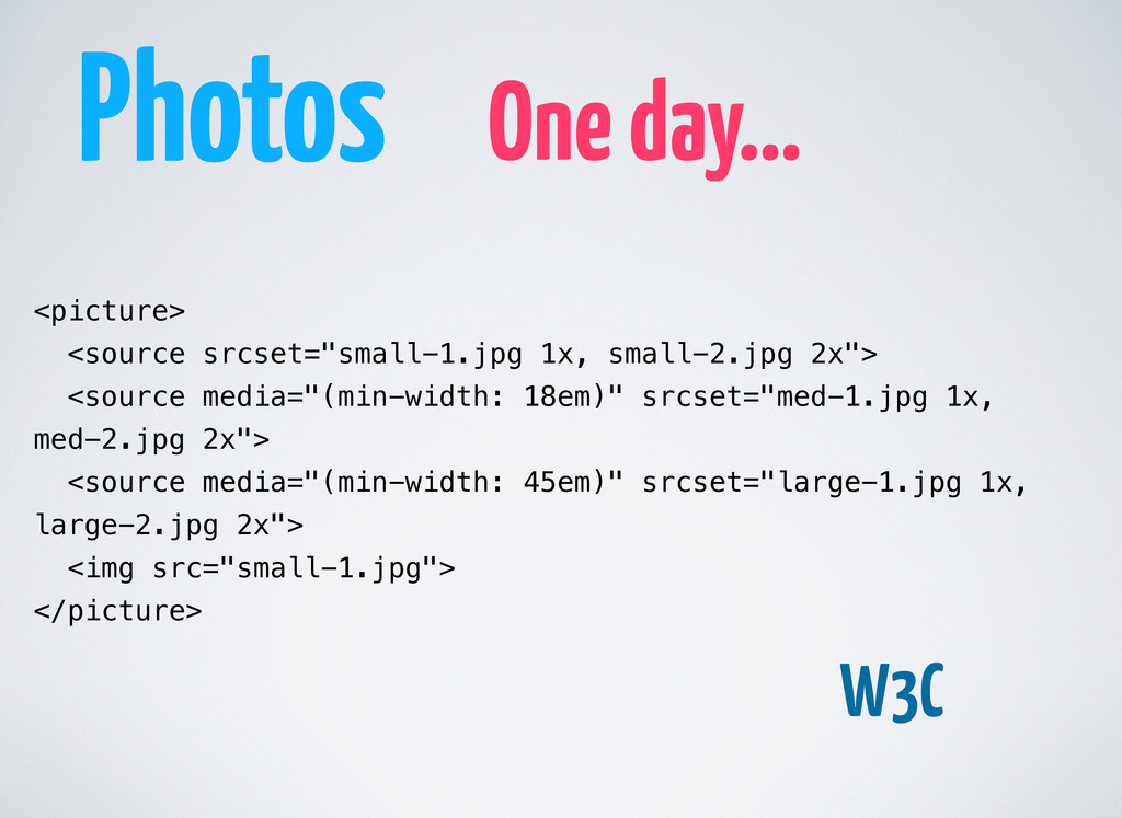
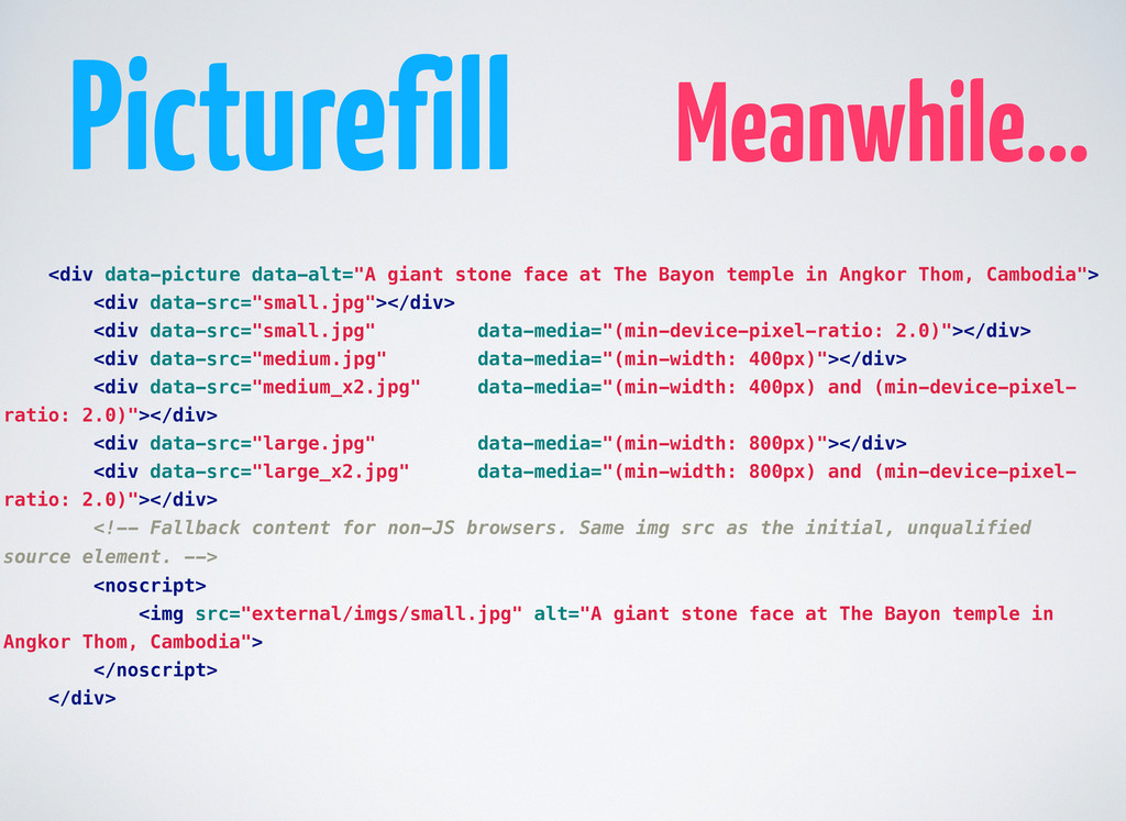
Bayon temple in Angkor Thom, Cambodia"> <div data-src="small.jpg"></div> <div data-src="small.jpg" data-media="(min-device-pixel-ratio: 2.0)"></div> <div data-src="medium.jpg" data-media="(min-width: 400px)"></div> <div data-src="medium_x2.jpg" data-media="(min-width: 400px) and (min-device-pixel- ratio: 2.0)"></div> <div data-src="large.jpg" data-media="(min-width: 800px)"></div> <div data-src="large_x2.jpg" data-media="(min-width: 800px) and (min-device-pixel- ratio: 2.0)"></div> <!-- Fallback content for non-JS browsers. Same img src as the initial, unqualified source element. --> <noscript> <img src="external/imgs/small.jpg" alt="A giant stone face at The Bayon temple in Angkor Thom, Cambodia"> </noscript> </div>
 jarkko
 nagata03
 hypebeans
 hiranotomoki
 kenichiota0711
 lynteo
 mhand01
 visional_engineering_and_design
 nishame
 keroyama
 godlingkogami
 root_recruit
 abokadotyann
 aleyda
 reverentgeek
 samtorres
 leimatthew05
 trishagee
 bluesmoon
 michielstock
 mongodb
 tammyeverts
 wjessup
 katarinadahlin