Upgrade to Pro
— share decks privately, control downloads, hide ads and more …
Speaker Deck
Features
Speaker Deck
PRO
Sign in
Sign up for free
Search
Search
React Alicante 17' - Writing highly reusable Re...
Search
Javier Velasco
October 06, 2017
280
1
Share
Embed
Copy iframe code
Copy JS code
Copy link
Start on current slide
React Alicante 17' - Writing highly reusable React components
Javier Velasco
October 06, 2017
More Decks by Javier Velasco
See All by Javier Velasco
Styling in React Toolbox
javivelasco
0
140
Meet Backbone.js
javivelasco
2
150
Featured
See All Featured
Code Review Best Practice
trishagee
74
20k
From π to Pie charts
rasagy
0
220
How to make the Groovebox
asonas
2
2.3k
Why Your Marketing Sucks and What You Can Do About It - Sophie Logan
marketingsoph
0
180
技術選定の審美眼(2025年版) / Understanding the Spiral of Technologies 2025 edition
twada
PRO
118
120k
Design in an AI World
tapps
1
260
世界の人気アプリ100個を分析して見えたペイウォール設計の心得
akihiro_kokubo
PRO
72
40k
The Psychology of Web Performance [Beyond Tellerrand 2023]
tammyeverts
49
3.5k
"I'm Feeling Lucky" - Building Great Search Experiences for Today's Users (#IAC19)
danielanewman
230
23k
Navigating Algorithm Shifts & AI Overviews - #SMXNext
aleyda
1
1.3k
Facilitating Awesome Meetings
lara
57
7k
Between Models and Reality
mayunak
4
360
Transcript
September 2017 Writing highly reusable React components Javi Velasco
Thanks to our sponsors!
javi velasco @javivelasco audiense
A library of React components implementing Material Design guidelines with
the power of CSS modules. www.react-toolbox.com React Toolbox
None
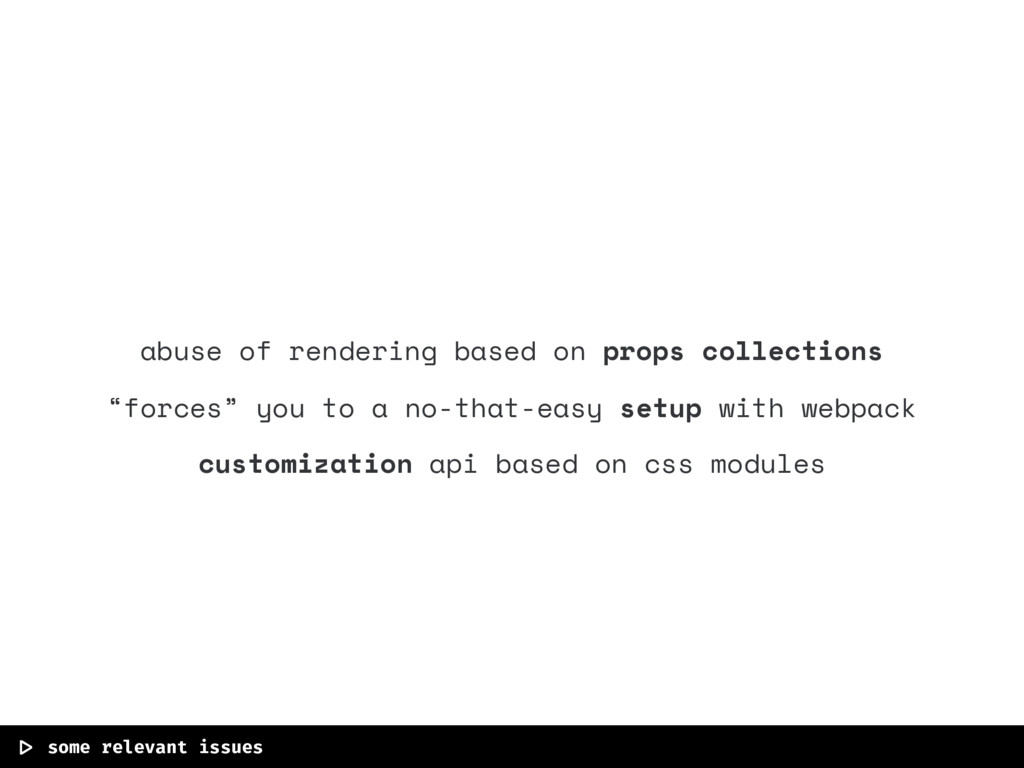
abuse of rendering based on props collections “forces” you to
a no-that-easy setup with webpack customization api based on css modules |> some relevant issues
None
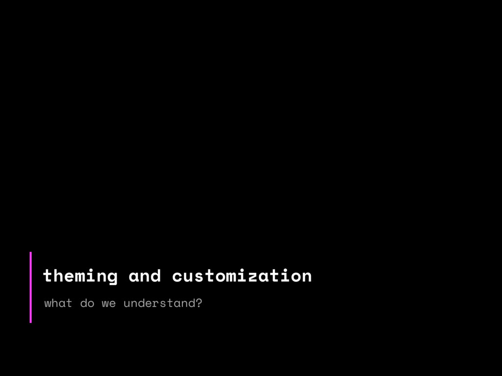
theming and customization what do we understand?
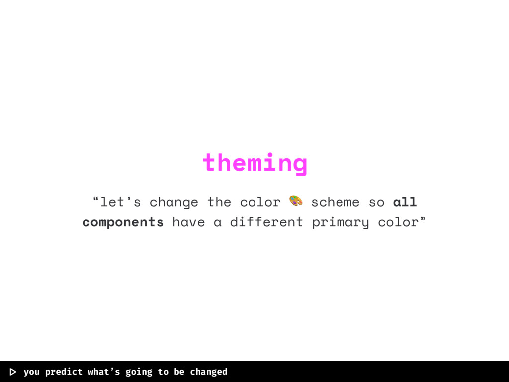
“let’s change the color scheme so all components have a
different primary color” |> you predict what’s going to be changed theming
“the card title is too small and I don’t care
about what md says , I want it bigger” |> you can’t predict what’s going to change style customization
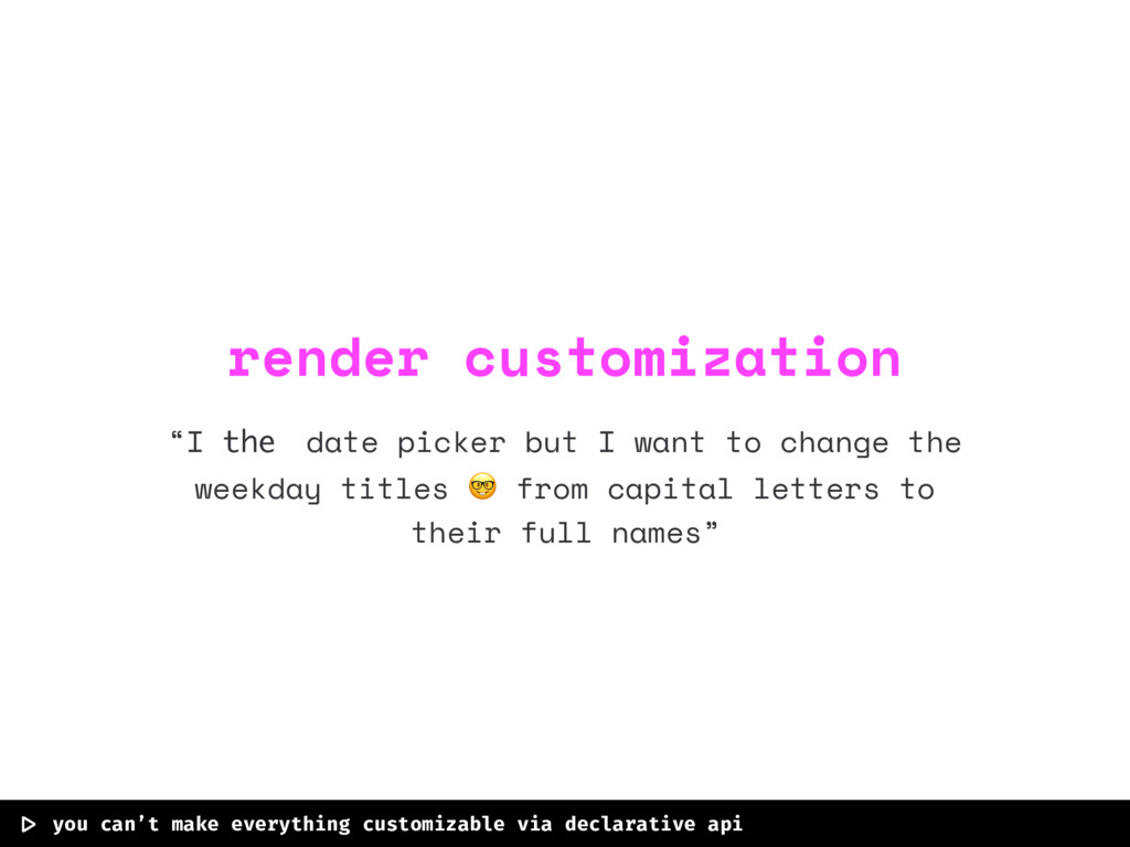
“I the date picker but I want to change the
weekday titles from capital letters to their full names” |> you can’t make everything customizable via declarative api render customization
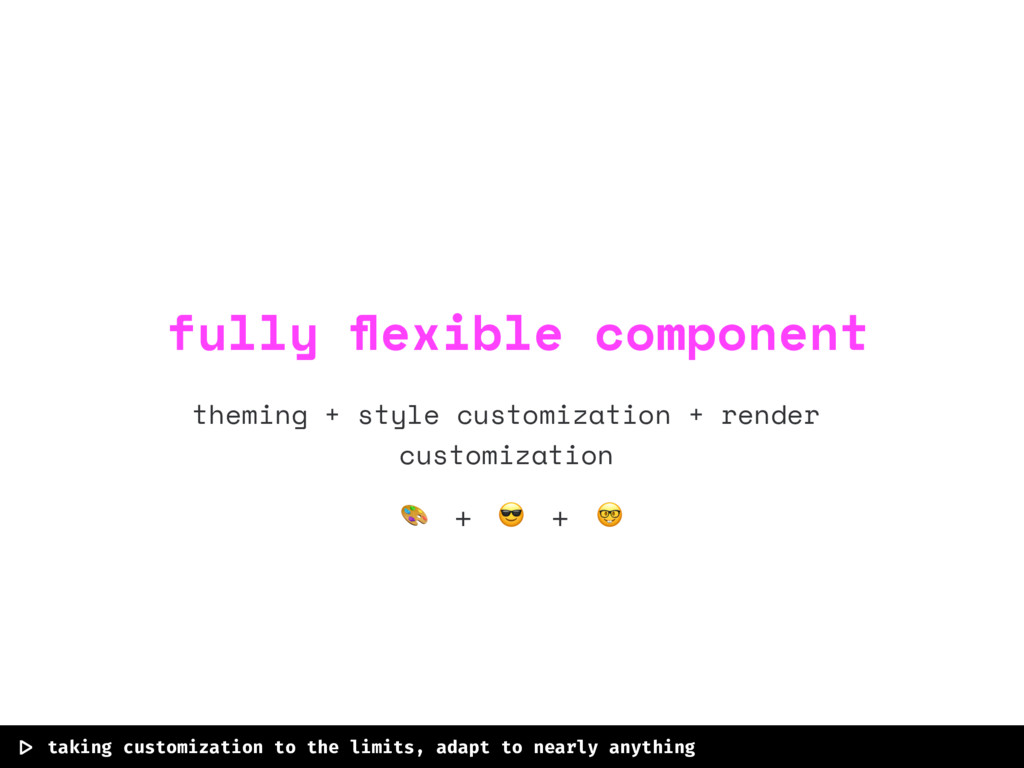
theming + style customization + render customization |> taking customization
to the limits, adapt to nearly anything fully flexible component + +
how react faces styling or how can we deal with
styles in react components.
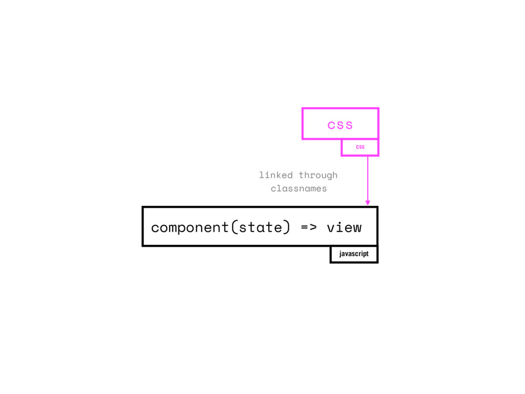
component(state) => view javascript css css linked through classnames
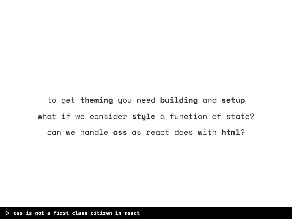
to get theming you need building and setup what if
we consider style a function of state? can we handle css as react does with html? |> css is not a first class citizen in react
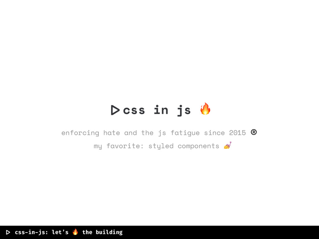
|>css in js enforcing hate and the js fatigue since
2015 ® my favorite: styled components |> css-in-js: let’s the building
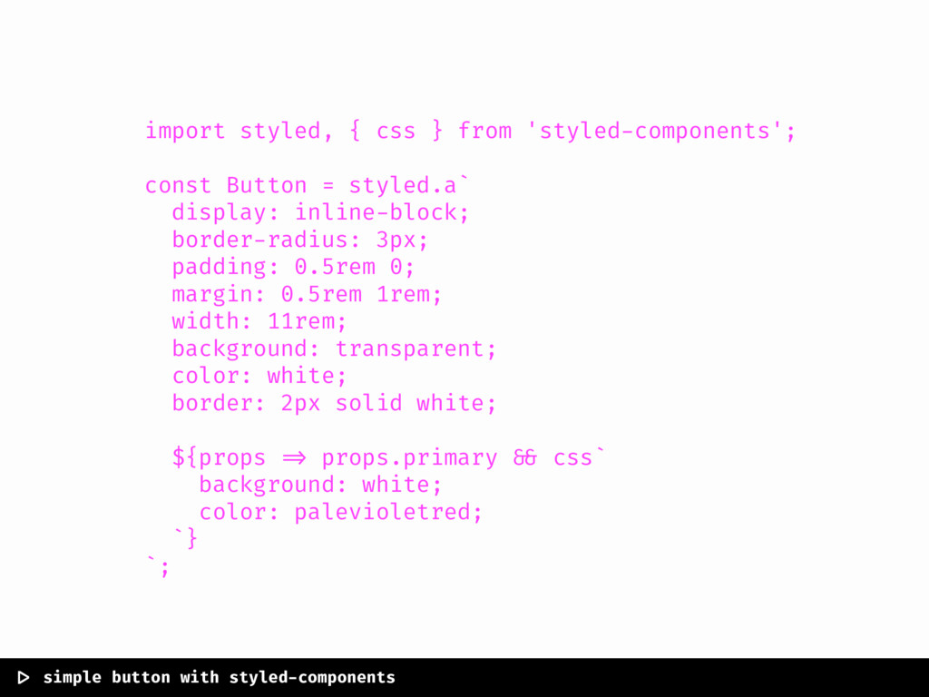
import styled, { css } from 'styled-components'; const Button =
styled.a` display: inline-block; border-radius: 3px; padding: 0.5rem 0; margin: 0.5rem 1rem; width: 11rem; background: transparent; color: white; border: 2px solid white; ${props => props.primary && css` background: white; color: palevioletred; `} `; |> simple button with styled-components
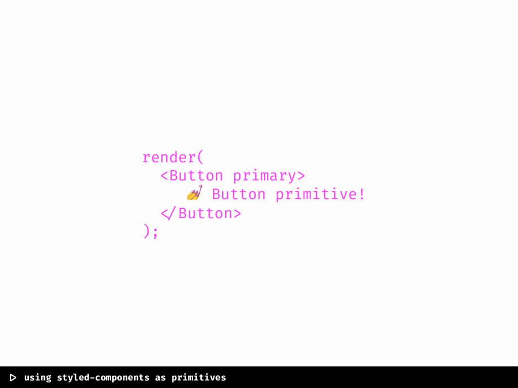
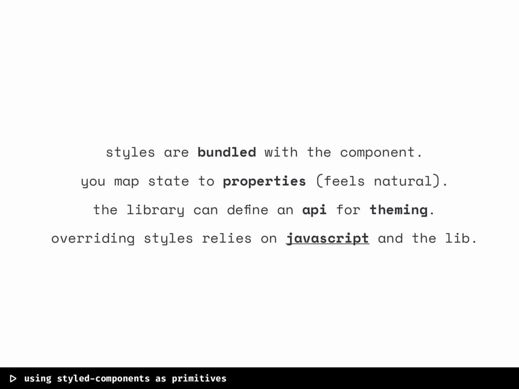
render( <Button primary> Button primitive! </Button> ); |> using styled-components
as primitives
|> using styled-components as primitives styles are bundled with the
component. you map state to properties (feels natural). the library can define an api for theming. overriding styles relies on javascript and the lib.
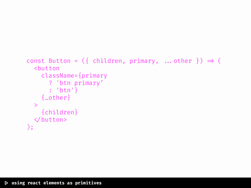
const Button = ({ children, primary, ...other }) => (
<button className={primary ? 'btn primary’ : 'btn'} {…other} > {children} </button> ); |> using react elements as primitives
const Button = ({ children, primary, ...other }) => (
<button className={primary ? 'btn primary’ : 'btn'} {…other} > {children} </button> ); |> using react elements as primitives
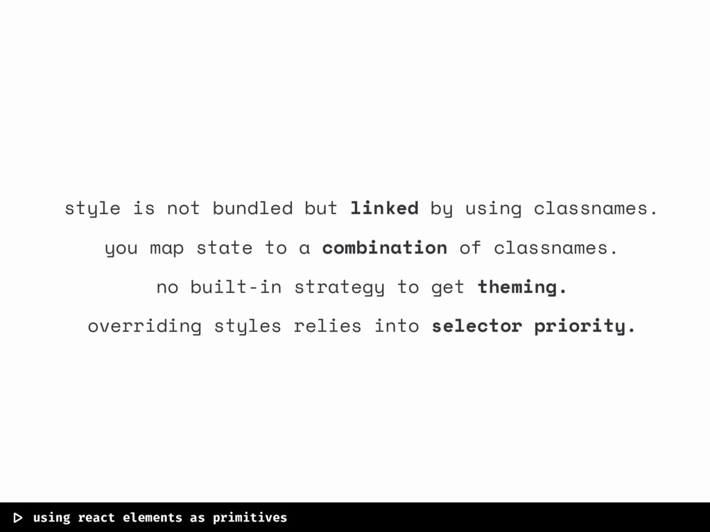
|> using react elements as primitives style is not bundled
but linked by using classnames. you map state to a combination of classnames. no built-in strategy to get theming. overriding styles relies into selector priority.
solving theming and style customization using but you can use
anything else!
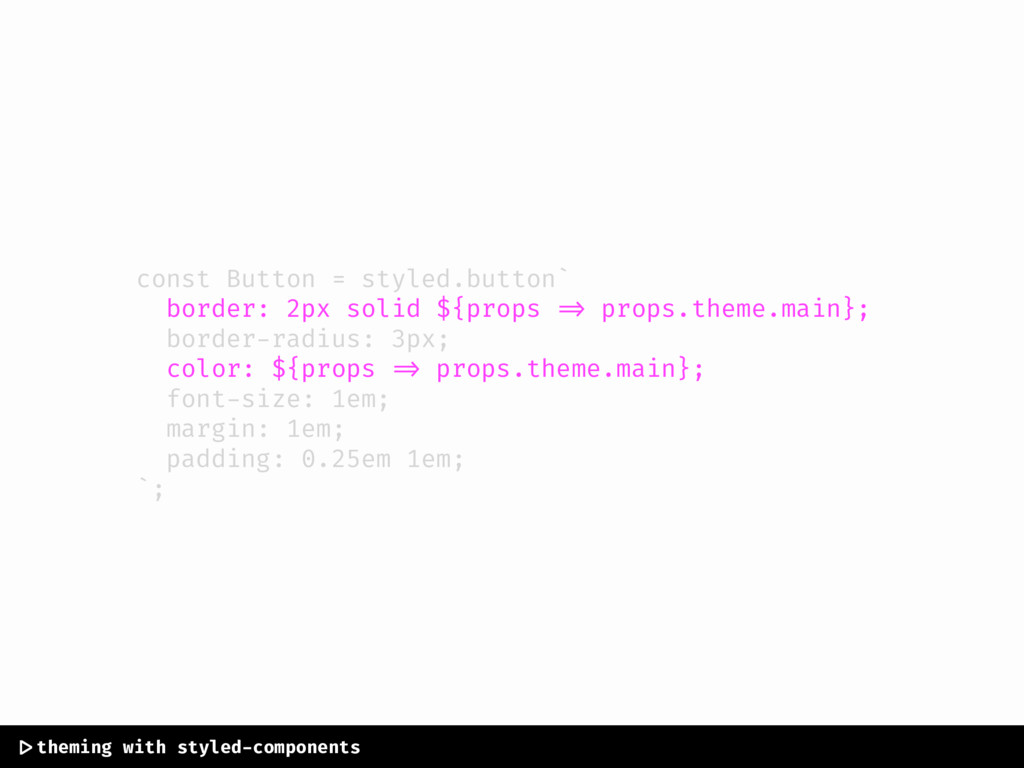
const Button = styled.button` border: 2px solid ${props => props.theme.main};
border-radius: 3px; color: ${props => props.theme.main}; font-size: 1em; margin: 1em; padding: 0.25em 1em; `; |>theming with styled-components
const Button = styled.button` border: 2px solid ${props => props.theme.main};
border-radius: 3px; color: ${props => props.theme.main}; font-size: 1em; margin: 1em; padding: 0.25em 1em; `; |>theming with styled-components
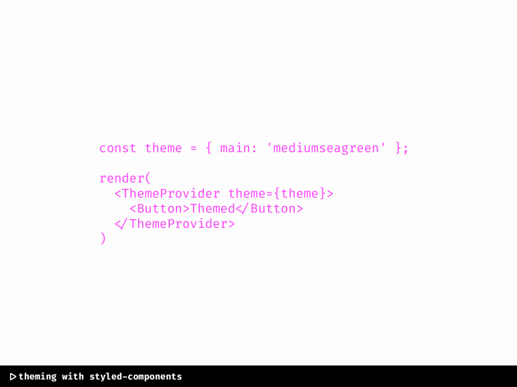
const theme = { main: 'mediumseagreen' }; render( <ThemeProvider theme={theme}>
<Button>Themed </Button> </ThemeProvider> ) |>theming with styled-components
const theme = { main: 'mediumseagreen' }; render( <ThemeProvider theme={theme}>
<Button>Themed </Button> </ThemeProvider> ) |>theming with styled-components
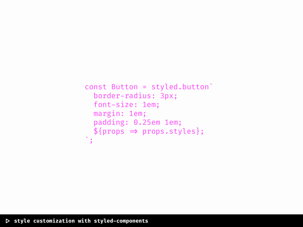
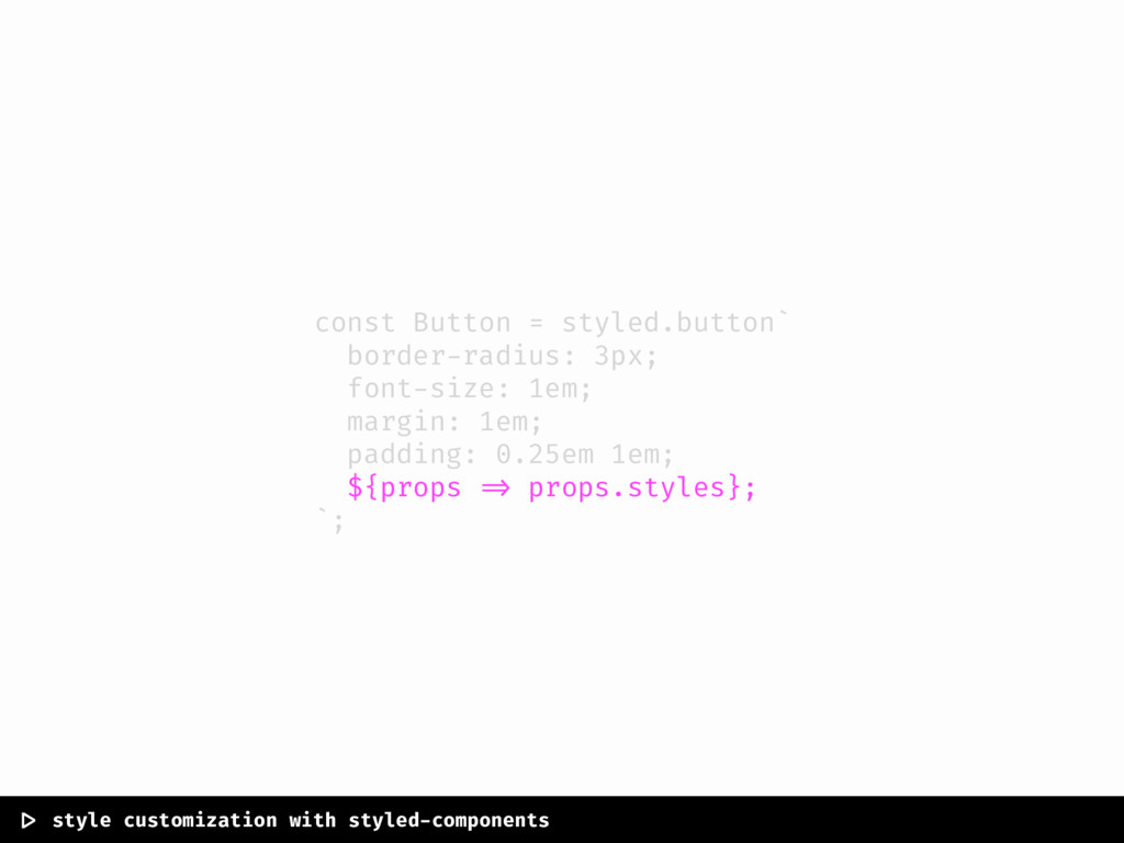
const Button = styled.button` border-radius: 3px; font-size: 1em; margin: 1em;
padding: 0.25em 1em; ${props => props.styles}; `; |> style customization with styled-components
const Button = styled.button` border-radius: 3px; font-size: 1em; margin: 1em;
padding: 0.25em 1em; ${props => props.styles}; `; |> style customization with styled-components
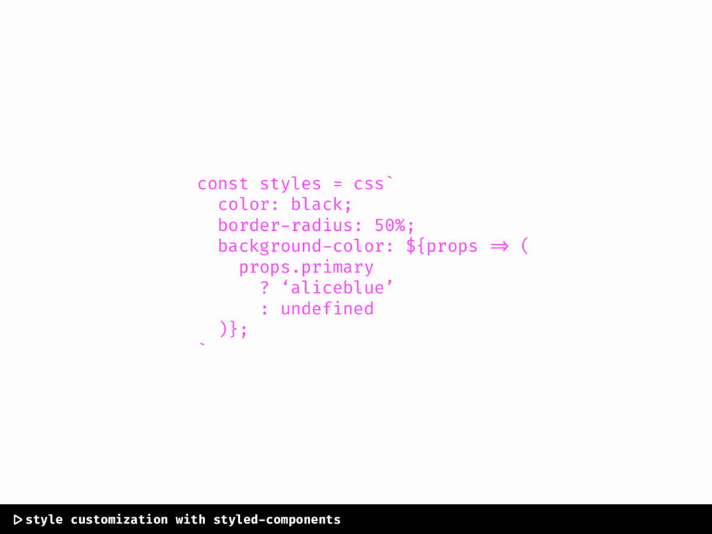
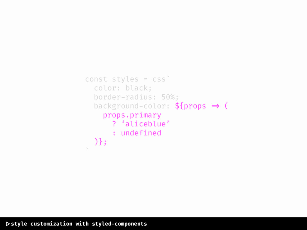
const styles = css` color: black; border-radius: 50%; background-color: ${props
=> ( props.primary ? ‘aliceblue’ : undefined )}; ` |>style customization with styled-components
const styles = css` color: black; border-radius: 50%; background-color: ${props
=> ( props.primary ? ‘aliceblue’ : undefined )}; ` |>style customization with styled-components
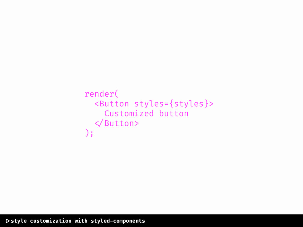
render( <Button styles={styles}> Customized button </Button> ); |>style customization with
styled-components
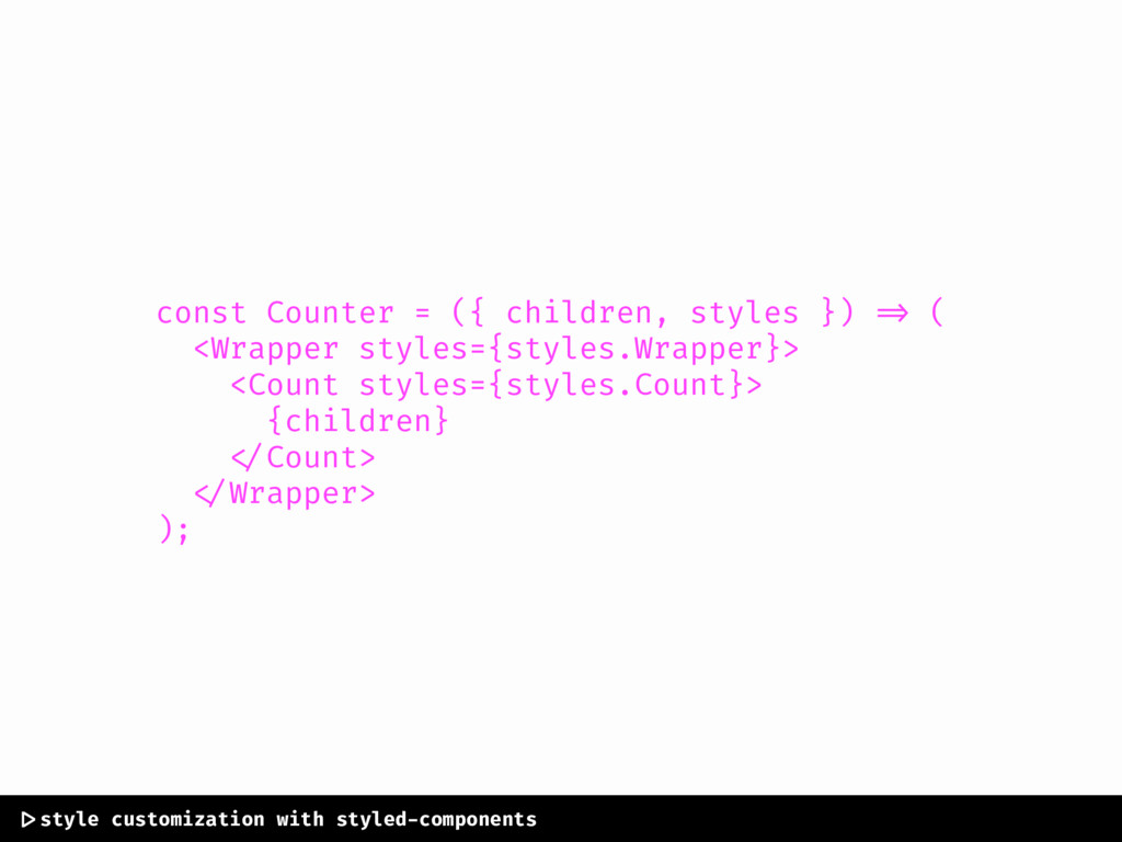
const Counter = ({ children, styles }) => ( <Wrapper
styles={styles.Wrapper}> <Count styles={styles.Count}> {children} </Count> </Wrapper> ); |>style customization with styled-components
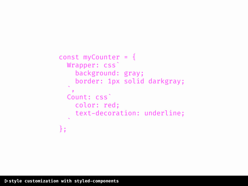
const myCounter = { Wrapper: css` background: gray; border: 1px
solid darkgray; `, Count: css` color: red; text-decoration: underline; ` }; |>style customization with styled-components
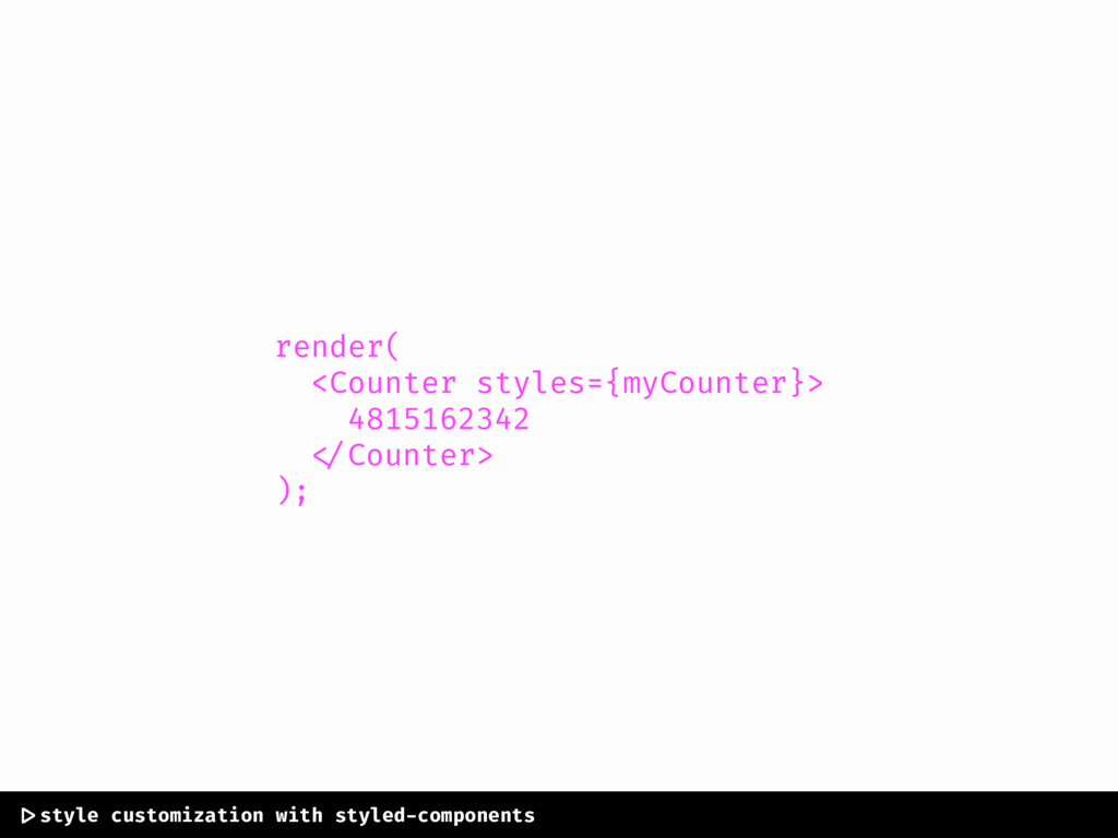
render( <Counter styles={myCounter}> 4815162342 </Counter> ); |>style customization with styled-components
solving render customization introducing component injection
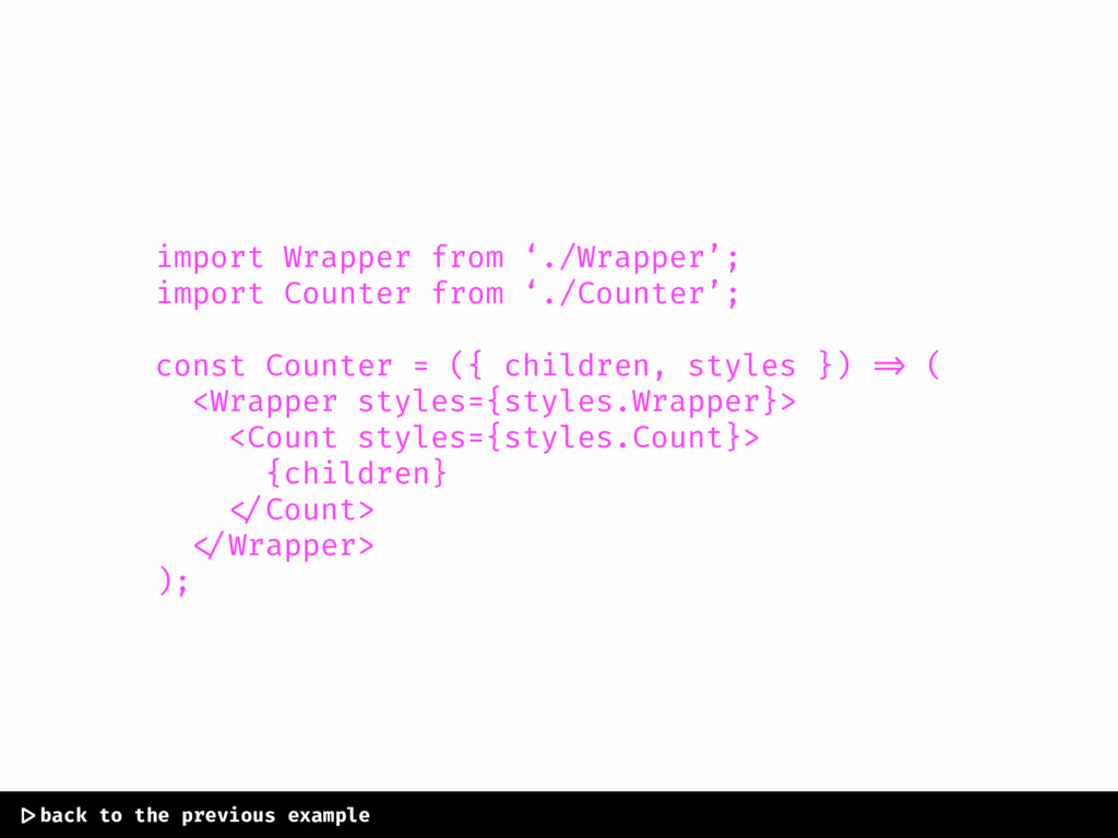
import Wrapper from ‘./Wrapper’; import Counter from ‘./Counter’; const Counter
= ({ children, styles }) => ( <Wrapper styles={styles.Wrapper}> <Count styles={styles.Count}> {children} </Count> </Wrapper> ); |>back to the previous example
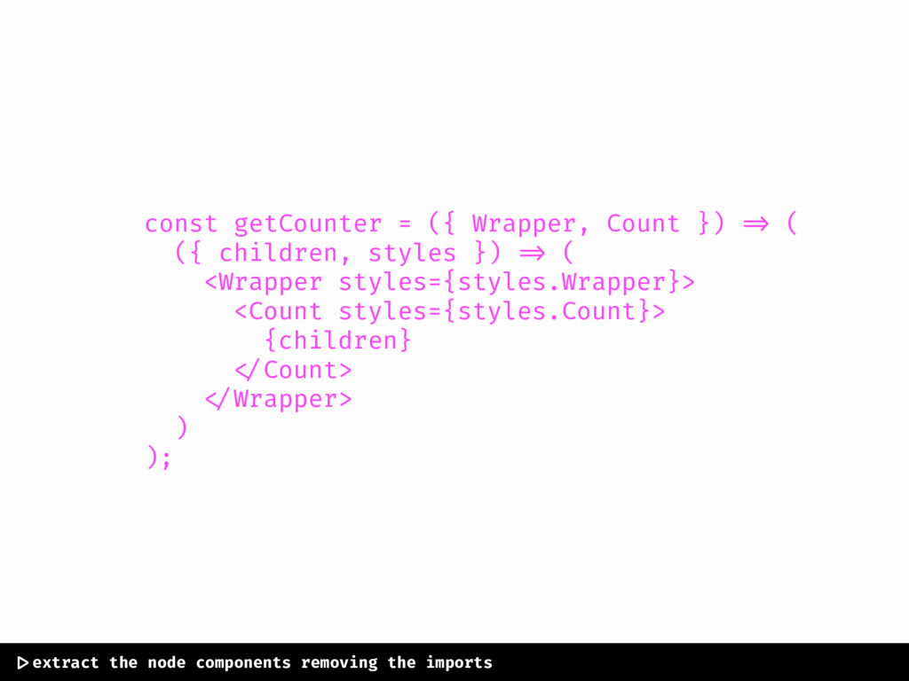
const getCounter = ({ Wrapper, Count }) => ( ({
children, styles }) => ( <Wrapper styles={styles.Wrapper}> <Count styles={styles.Count}> {children} </Count> </Wrapper> ) ); |>extract the node components removing the imports
import styled from ‘styled-components’; const Counter = getCounter({ Wrapper: styled.div`
background-color: purple; height: 100px; width: 100px; ${props => props.styles}; `, Count: styled.span` color: white; display: block; text-align: center; ${props => props.styles}; ` }) |> create a counter component by injecting fela components
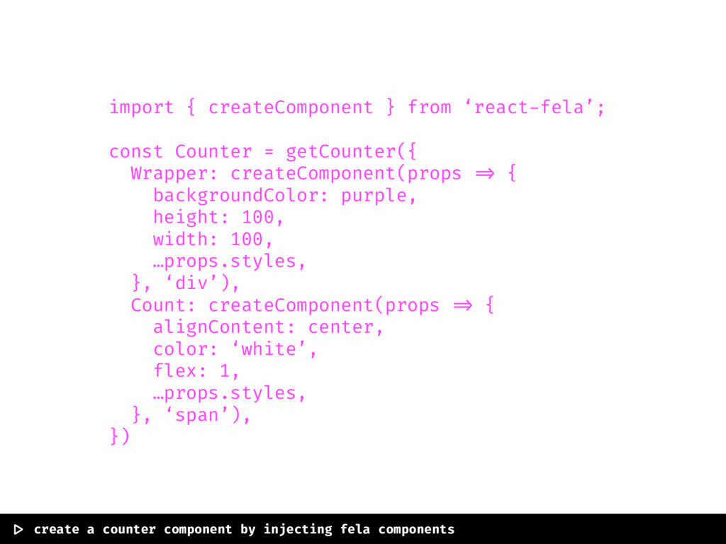
import { createComponent } from ‘react-fela’; const Counter = getCounter({
Wrapper: createComponent(props => { backgroundColor: purple, height: 100, width: 100, …props.styles, }, ‘div’), Count: createComponent(props => { alignContent: center, color: ‘white’, flex: 1, …props.styles, }, ‘span’), }) |> create a counter component by injecting fela components
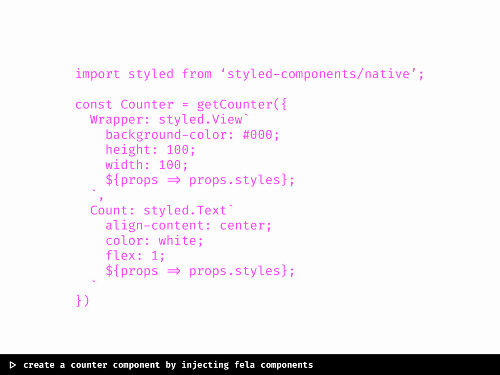
import styled from ‘styled-components/native’; const Counter = getCounter({ Wrapper: styled.View`
background-color: #000; height: 100; width: 100; ${props => props.styles}; `, Count: styled.Text` align-content: center; color: white; flex: 1; ${props => props.styles}; ` }) |> create a counter component by injecting fela components
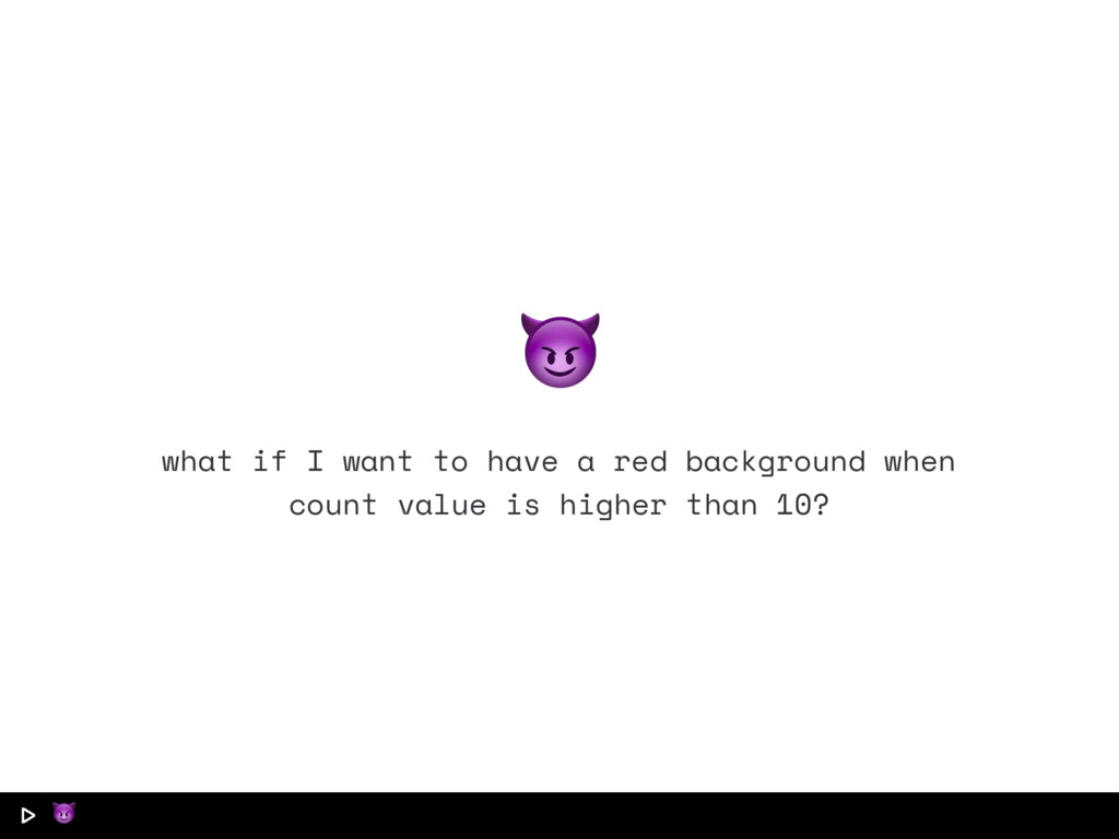
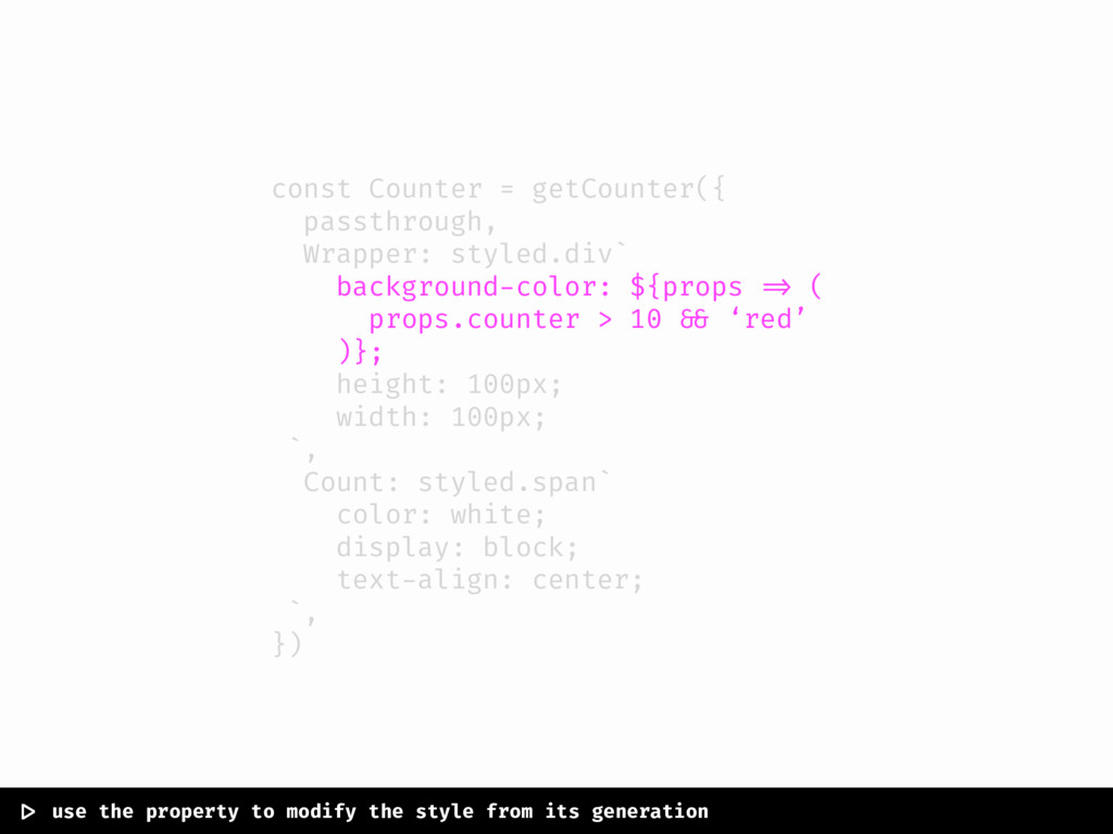
|> what if I want to have a red background
when count value is higher than 10?
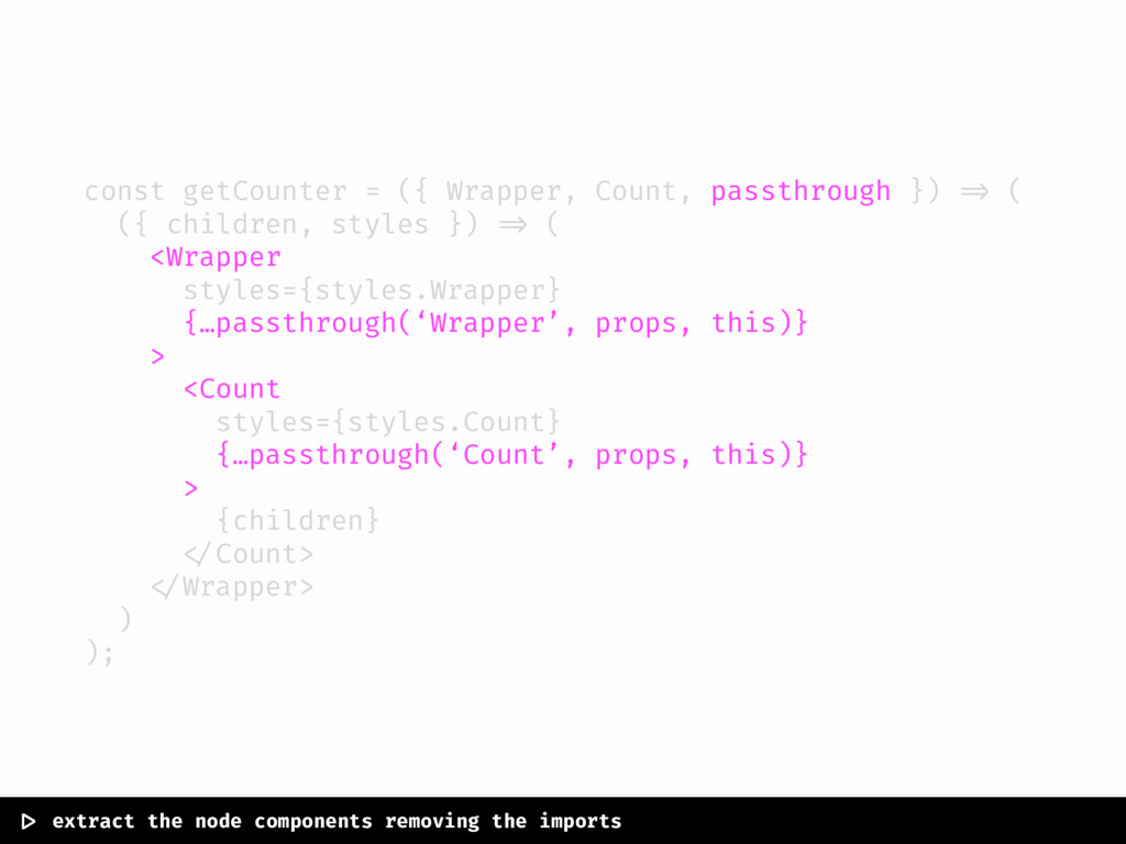
const getCounter = ({ Wrapper, Count, passthrough }) => (
({ children, styles }) => ( <Wrapper styles={styles.Wrapper} {…passthrough(‘Wrapper’, props, this)} > <Count styles={styles.Count} {…passthrough(‘Count’, props, this)} > {children} </Count> </Wrapper> ) ); |> extract the node components removing the imports
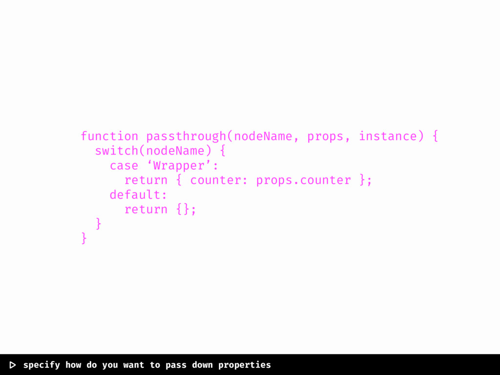
function passthrough(nodeName, props, instance) { switch(nodeName) { case ‘Wrapper’: return
{ counter: props.counter }; default: return {}; } } |> specify how do you want to pass down properties
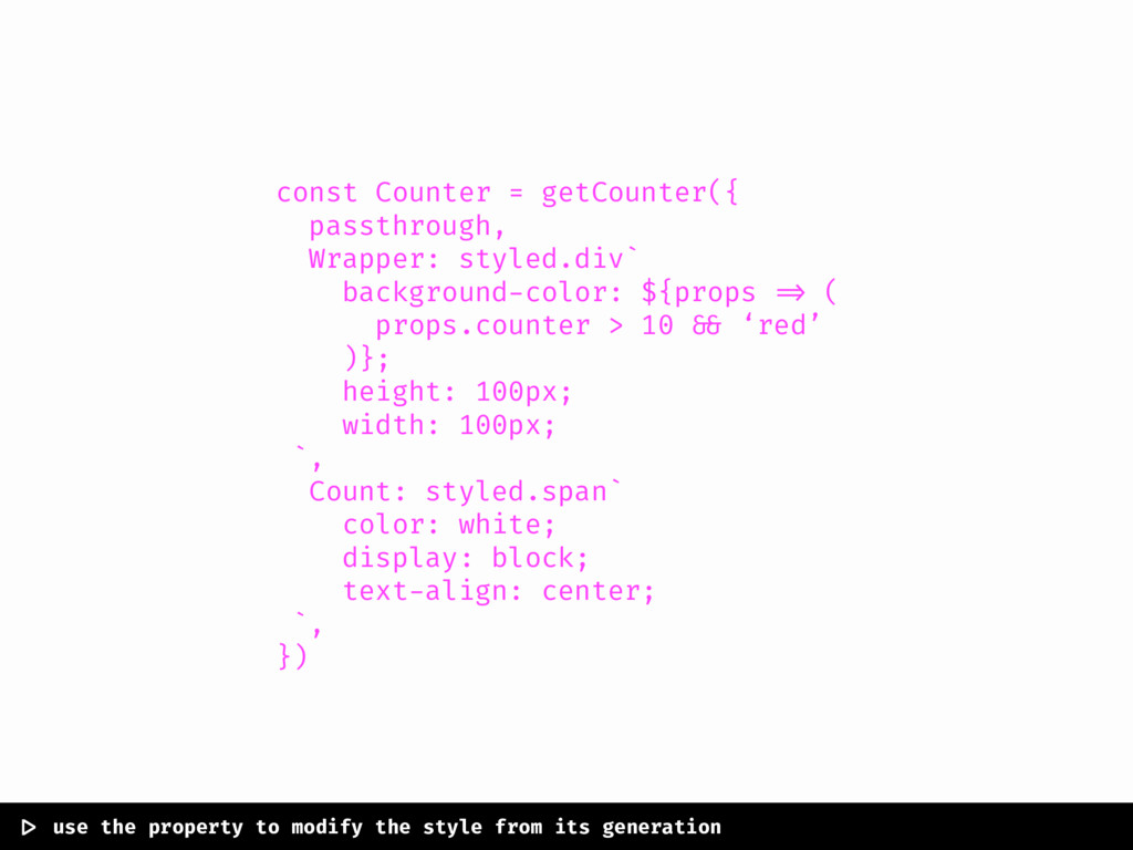
const Counter = getCounter({ passthrough, Wrapper: styled.div` background-color: ${props =>
( props.counter > 10 && ‘red’ )}; height: 100px; width: 100px; `, Count: styled.span` color: white; display: block; text-align: center; `, }) |> use the property to modify the style from its generation
const Counter = getCounter({ passthrough, Wrapper: styled.div` background-color: ${props =>
( props.counter > 10 && ‘red’ )}; height: 100px; width: 100px; `, Count: styled.span` color: white; display: block; text-align: center; `, }) |> use the property to modify the style from its generation
None
back to react-toolbox! the road for a final version.
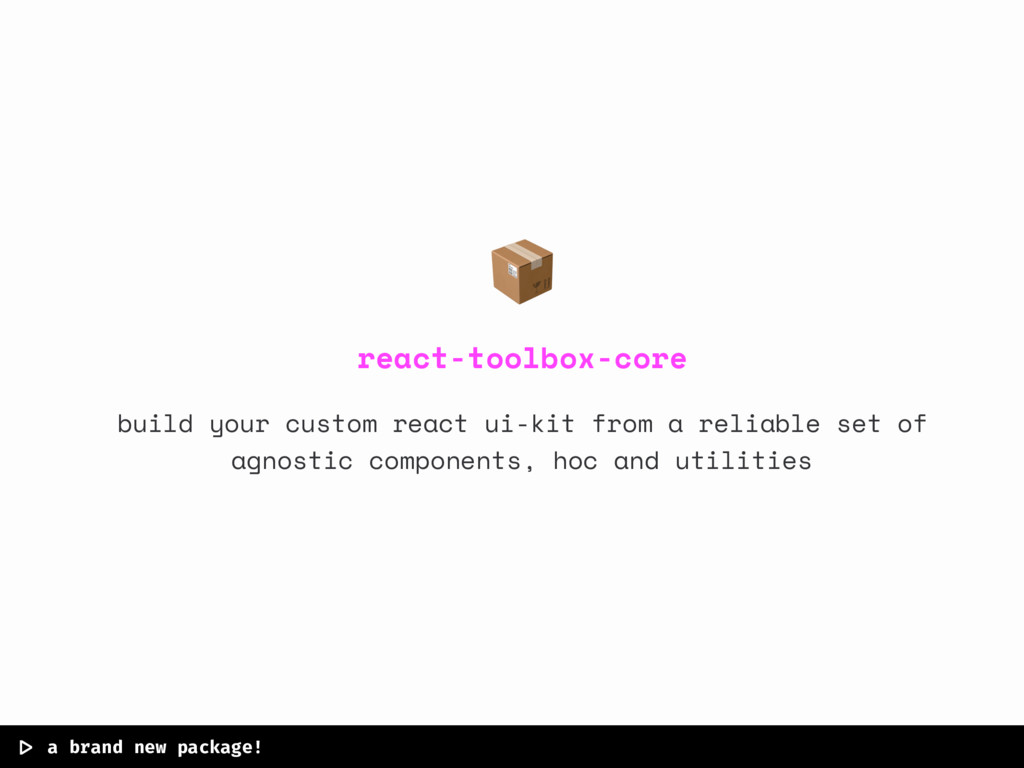
|> a brand new package! react-toolbox-core build your custom react
ui-kit from a reliable set of agnostic components, hoc and utilities
|> what’s coming with react-toolbox-core? an hoc to make navigable
components complex components like a date picker an hoc to position elements in the screen
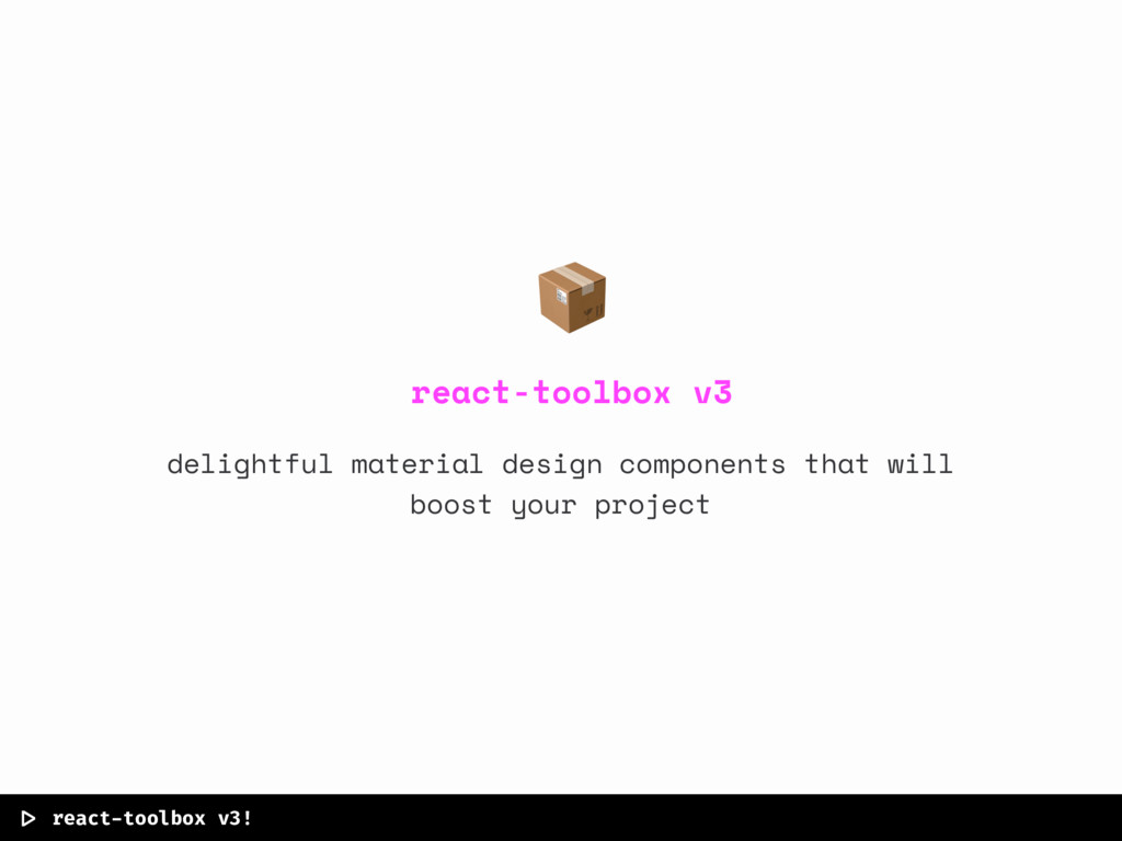
|> react-toolbox v3! react-toolbox v3 delightful material design components that
will boost your project
|> what’s coming with react-toolbox-core? customize render by injecting nodes
customize styles without worrying about selectors js theming api powered by styled components powerful children based api
thank you!
 javivelasco
 trishagee
 rasagy
 asonas
 marketingsoph
 twada
twada
 tapps
tapps
 akihiro_kokubo
 tammyeverts
 danielanewman
 aleyda
 lara
lara
 mayunak