Upgrade to Pro
— share decks privately, control downloads, hide ads and more …
Speaker Deck
Sign up for free
Menu
Search
Features
All features
Private URLs
Password Protection
Custom URLS
Scheduled publishing
Remove Branding
Restrict embedding
Deck Collections
Notes
Features
All features
Private URLs
Password Protection
Custom URLS
Scheduled publishing
Remove Branding
Restrict embedding
Deck Collections
Notes
Explore
Featured decks
Featured speakers
Programming
Technology
Storyboards
Explore
Featured decks
Featured speakers
Programming
Technology
Storyboards
Pricing
Search
Sign in
Sign up for free
Flexbox Rocks - ConvergeSE 2016
Search
Jeremy Frank
April 15, 2016
160
0
Share
Embed
Copy iframe code
Copy JS code
Copy link
Start on current slide
Flexbox Rocks - ConvergeSE 2016
Jeremy Frank
April 15, 2016
More Decks by Jeremy Frank
See All by Jeremy Frank
Craftsmanship
jeremyfrank
0
41
Featured
See All Featured
Put a Button on it: Removing Barriers to Going Fast.
kastner
60
4.6k
For a Future-Friendly Web
brad_frost
184
10k
The Language of Interfaces
destraynor
162
27k
So, you think you're a good person
axbom
PRO
2
2.2k
Un-Boring Meetings
codingconduct
0
460
Darren the Foodie - Storyboard
khoart
PRO
4
4k
Measuring & Analyzing Core Web Vitals
bluesmoon
9
1k
Ten Tips & Tricks for a 🌱 transition
stuffmc
1
270
Jamie Indigo - Trashchat’s Guide to Black Boxes: Technical SEO Tactics for LLMs
techseoconnect
PRO
0
710
Winning Ecommerce Organic Search in an AI Era - #searchnstuff2025
aleyda
2
2.2k
Sharpening the Axe: The Primacy of Toolmaking
bcantrill
46
3k
Leadership Guide Workshop - DevTernity 2021
reverentgeek
1
400
Transcript
Jeremy Frank / April 2016 / ConvergeSE FLEXBOX ROCKS
History Basics & Terminology Examples Resources
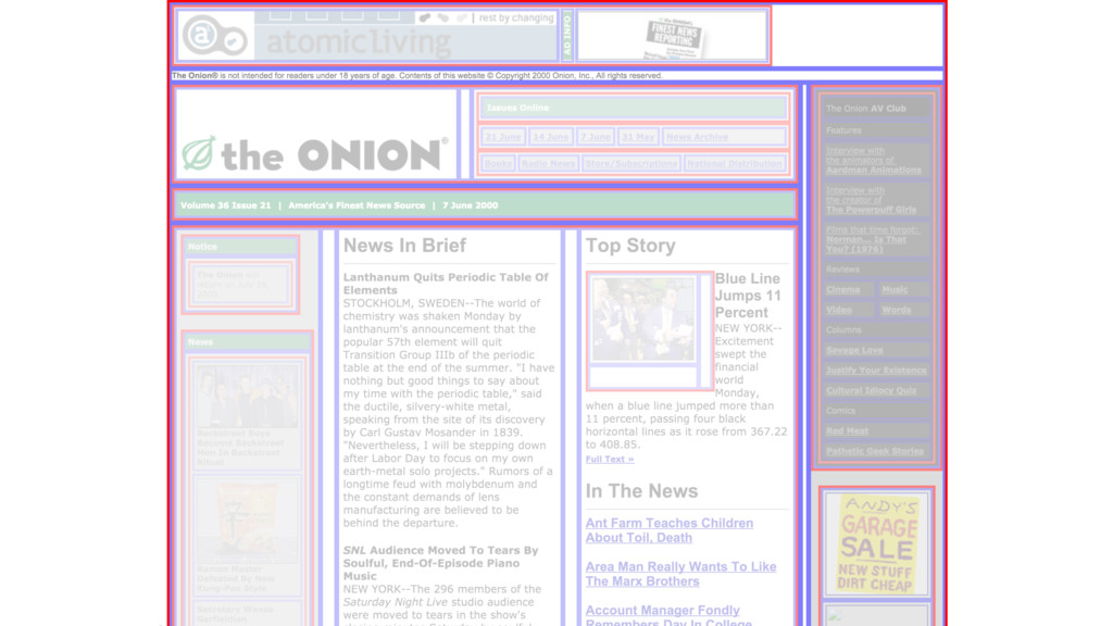
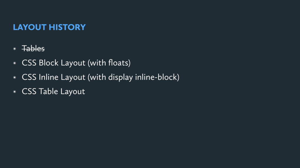
LAYOUT HISTORY
None
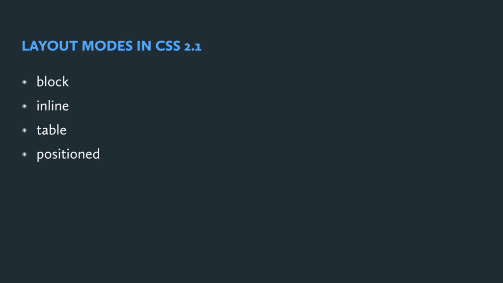
๏ block ๏ inline ๏ table ๏ positioned LAYOUT MODES
IN CSS 2.1
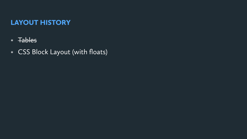
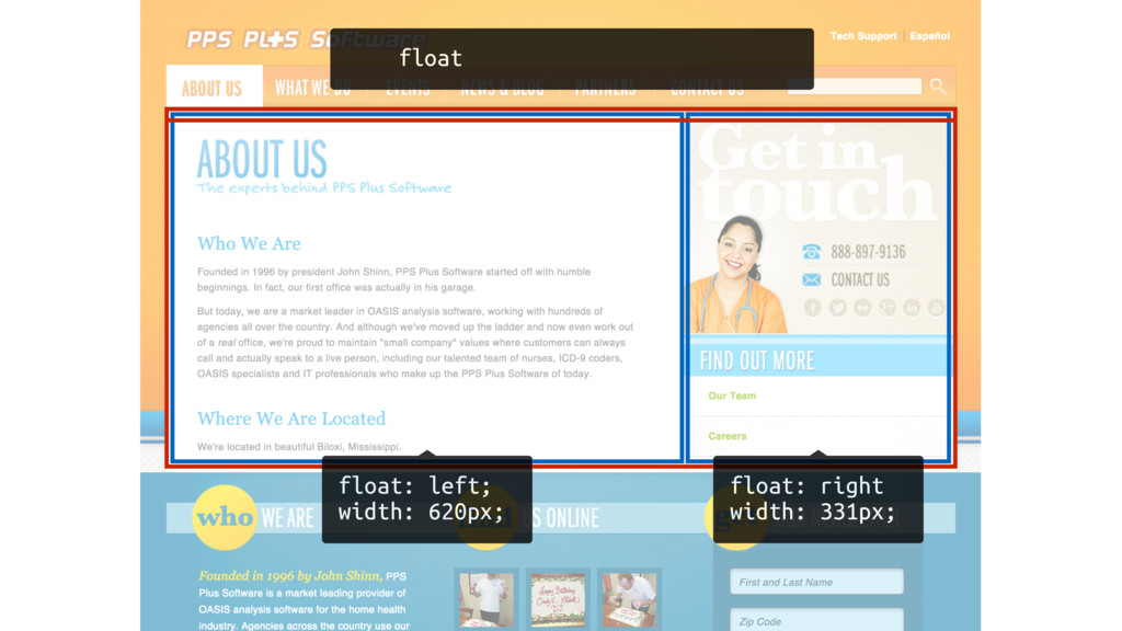
๏ Tables ๏ CSS Block Layout (with floats) LAYOUT HISTORY
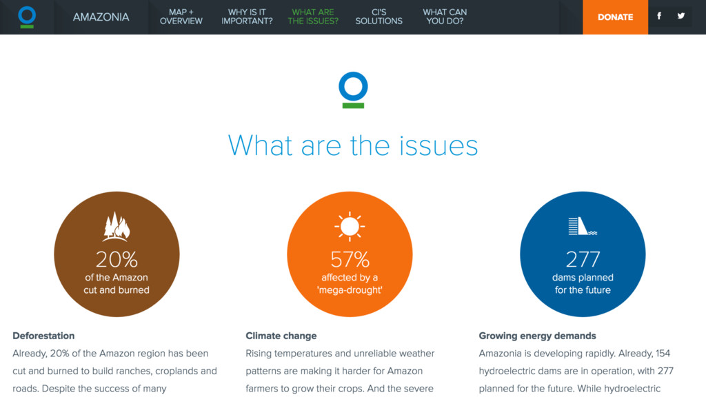
float: left; width: 620px; float: right width: 331px; float
๏ Tables ๏ CSS Block Layout (with floats) ๏ CSS
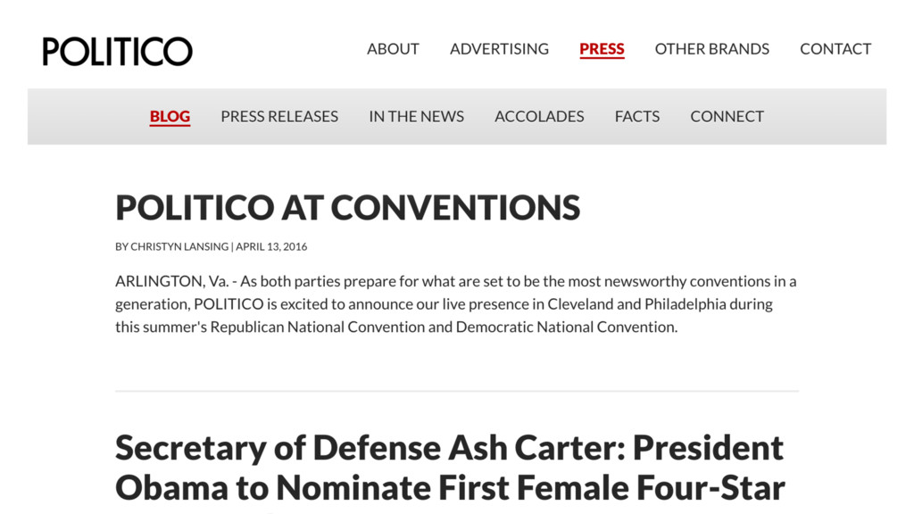
Inline Layout (with display inline-block) LAYOUT HISTORY
None
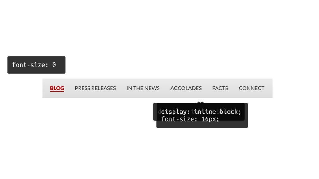
font-size: 0 display: inline-block; display: inline-block; font-size: 16px;
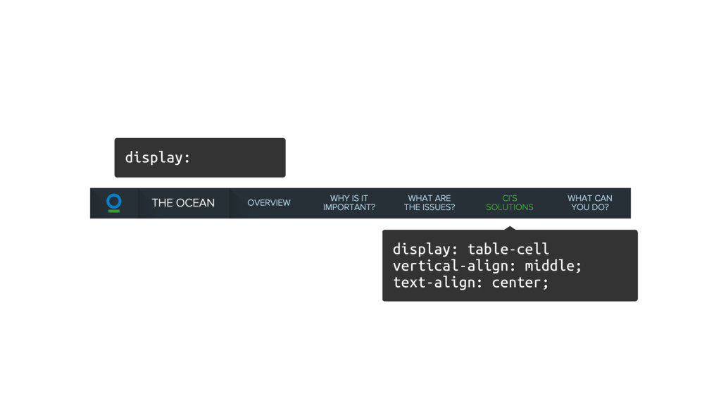
๏ Tables ๏ CSS Block Layout (with floats) ๏ CSS
Inline Layout (with display inline-block) ๏ CSS Table Layout LAYOUT HISTORY
None
display: table-cell vertical-align: middle; text-align: center; display:
None
Now We Have Flexbox!
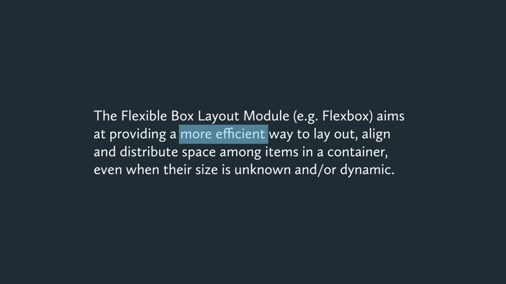
The Flexible Box Layout Module (e.g. Flexbox) aims at providing
a more efficient way to lay out, align and distribute space among items in a container, even when their size is unknown and/or dynamic.
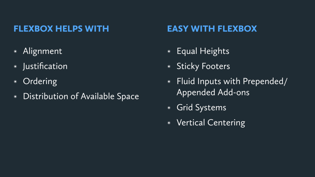
๏ Alignment ๏ Justification ๏ Ordering ๏ Distribution of Available
Space FLEXBOX HELPS WITH ๏ Equal Heights ๏ Sticky Footers ๏ Fluid Inputs with Prepended/ Appended Add-ons ๏ Grid Systems ๏ Vertical Centering EASY WITH FLEXBOX
Me What about page layout?
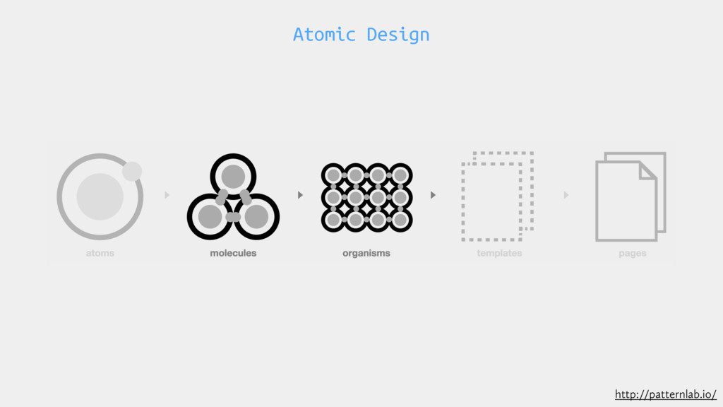
Atomic Design http://patternlab.io/
BASICS & TERMINOLOGY
Containers, Items & Axis
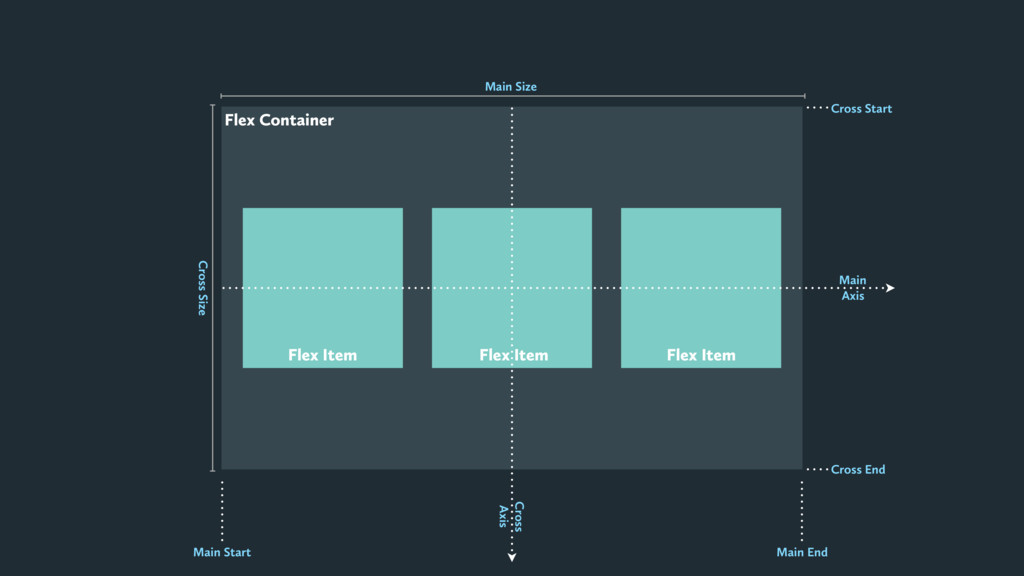
Flex Container Flex Item Flex Item Flex Item Main Axis
Cross Axis Cross Start Cross End Main End Main Start Main Size Cross Size
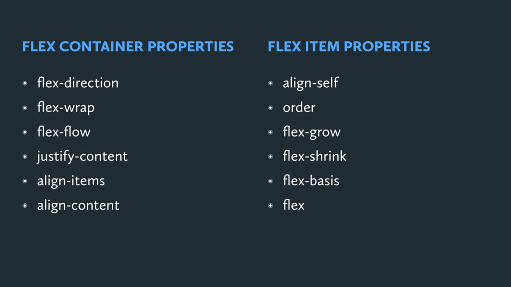
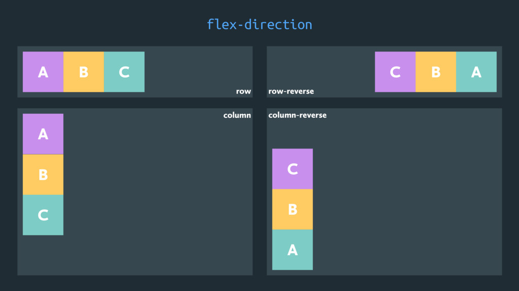
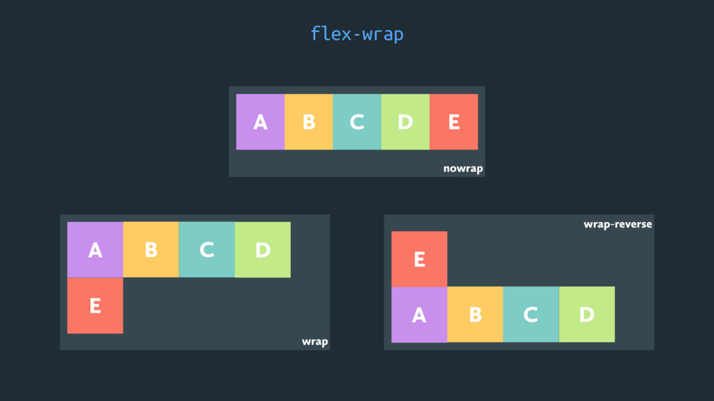
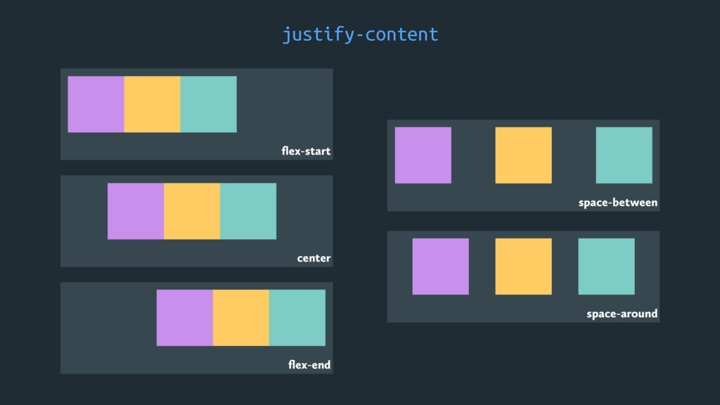
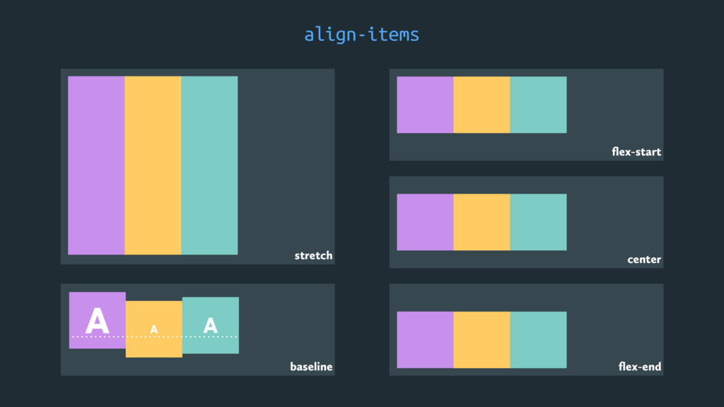
๏ flex-direction ๏ flex-wrap ๏ flex-flow ๏ justify-content ๏ align-items
๏ align-content FLEX CONTAINER PROPERTIES ๏ align-self ๏ order ๏ flex-grow ๏ flex-shrink ๏ flex-basis ๏ flex FLEX ITEM PROPERTIES
Flex Container Properties
flex-direction row B A C row-reverse B C A column
A B C column-reverse C A B
flex-wrap nowrap wrap B A C D E B A
C E D wrap-reverse E B A C D
justify-content flex-start flex-end center space-between space-around
align-items flex-start flex-end center stretch baseline A A A
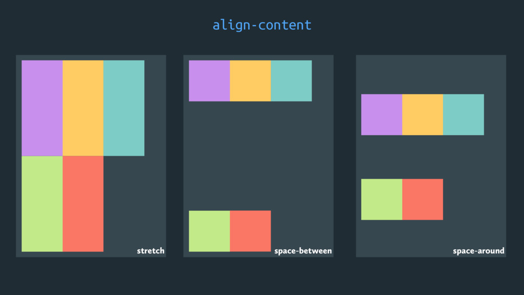
align-content stretch space-between space-around
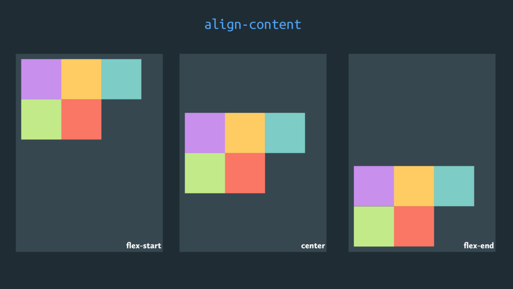
align-content. flex-start center flex-end
Flex Item Properties
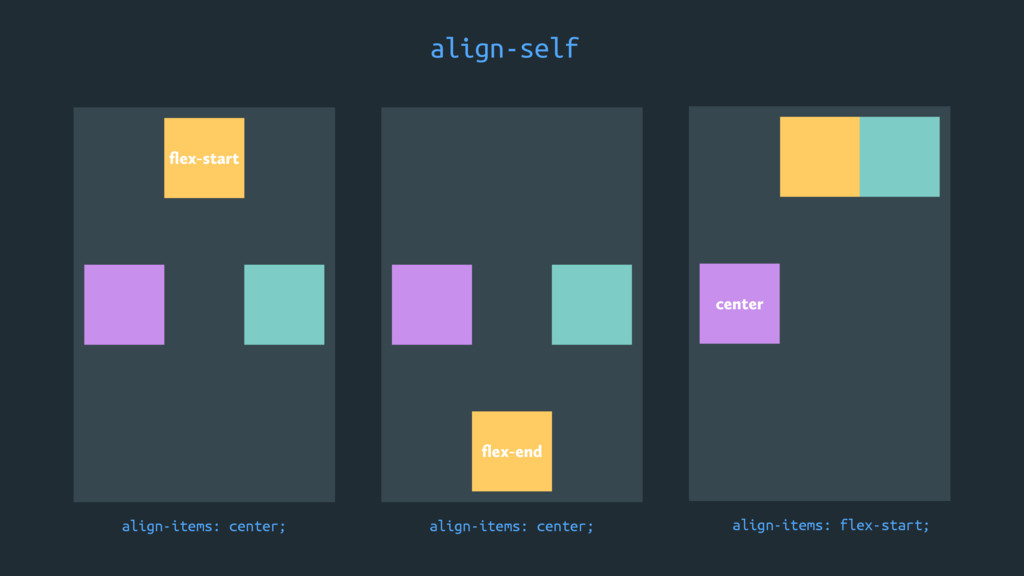
align-self. flex-start flex-end align-items: center; align-items: center; center align-items: flex-start;
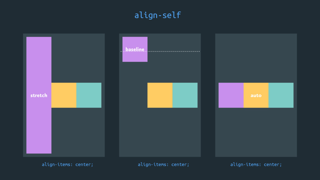
align-self. stretch baseline align-items: center; align-items: center; auto align-items: center;
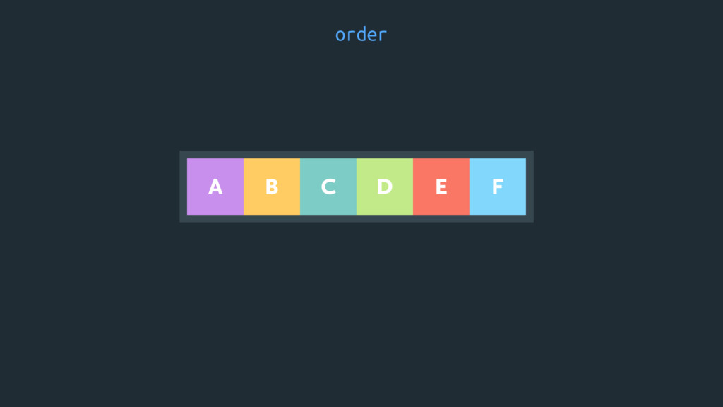
order B A C E D F
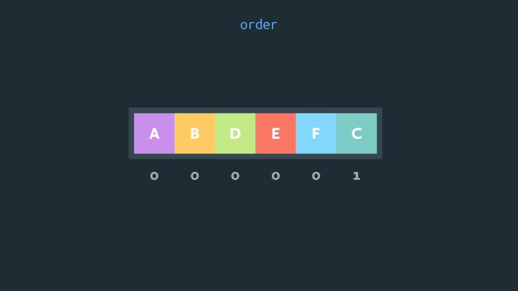
order 0 0 0 0 0 1 B A C
E D F
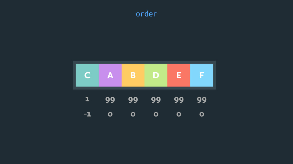
order B A C E D F 1 99 99
99 99 99 -1 0 0 0 0 0
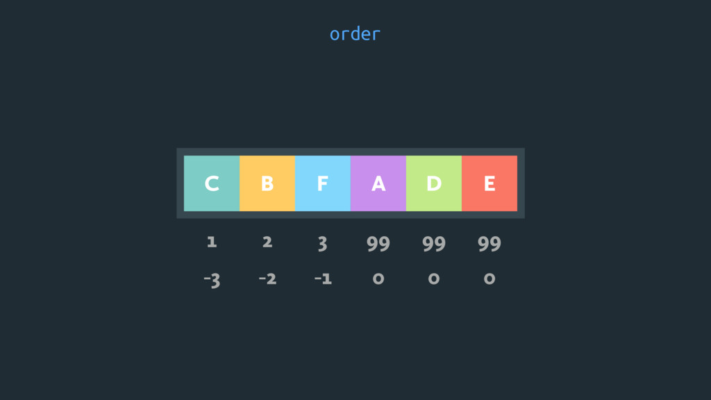
order B A C E D F 1 2 3
99 99 99 -3 -2 -1 0 0 0
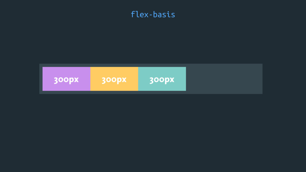
flex-basis 300px 300px 300px
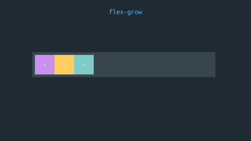
flex-grow - - -
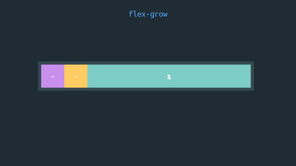
flex-grow - - 1
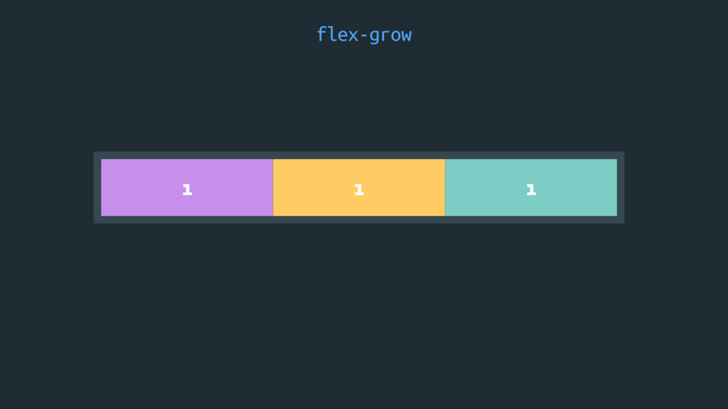
flex-grow 1 1 1
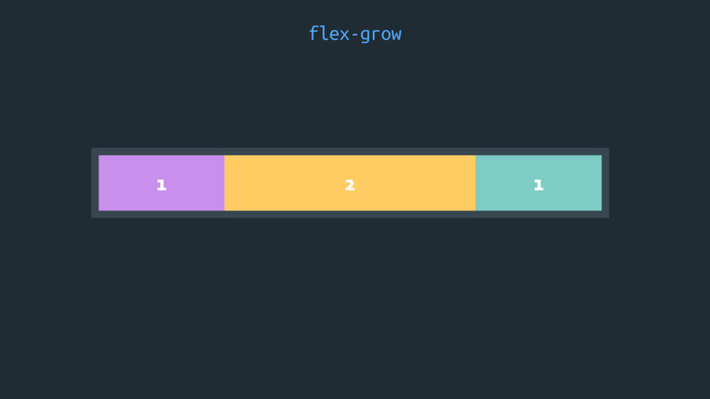
flex-grow 2 1 1
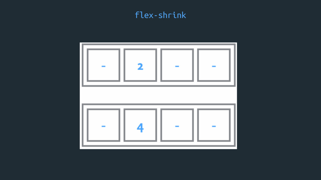
flex-shrink
EXAMPLES
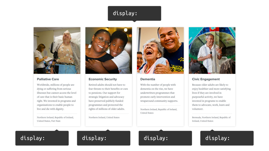
Equal Heights
display: display: display: display: display:
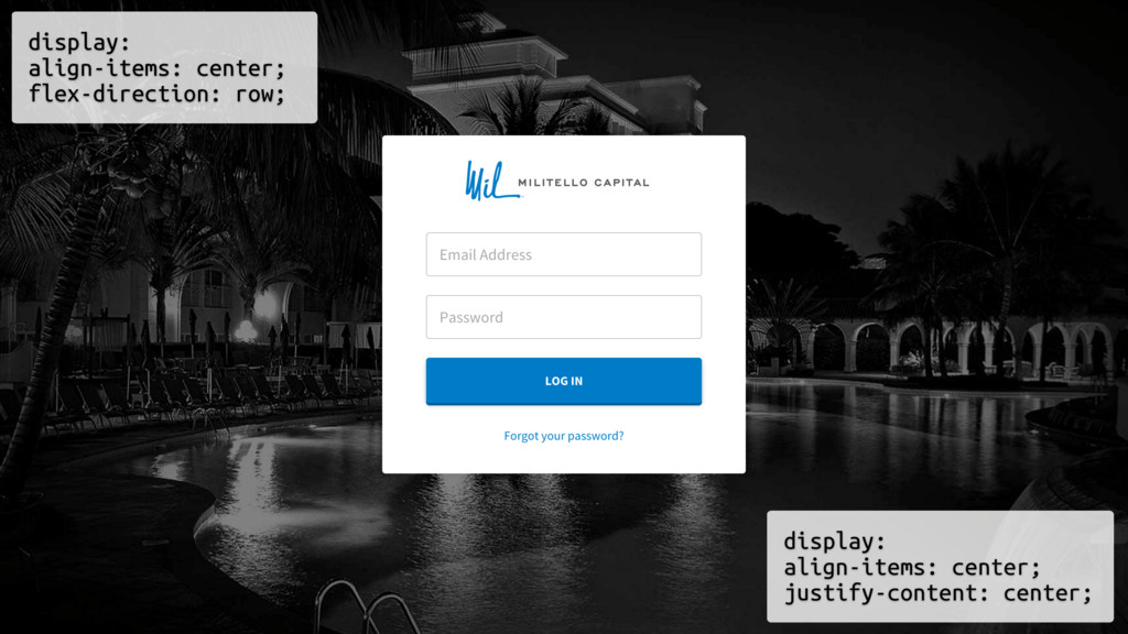
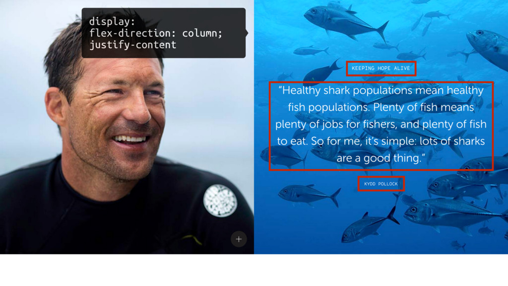
Vertical Centering
display: align-items: center; flex-direction: row; display: align-items: center; justify-content: center;
display: flex-direction: column; justify-content
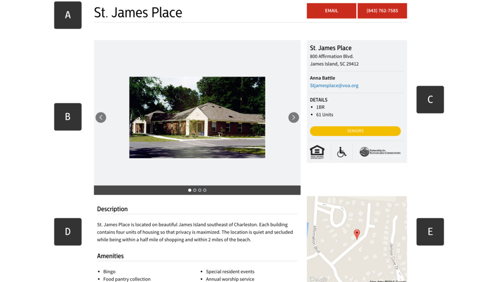
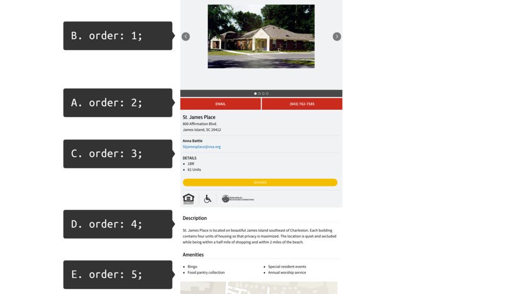
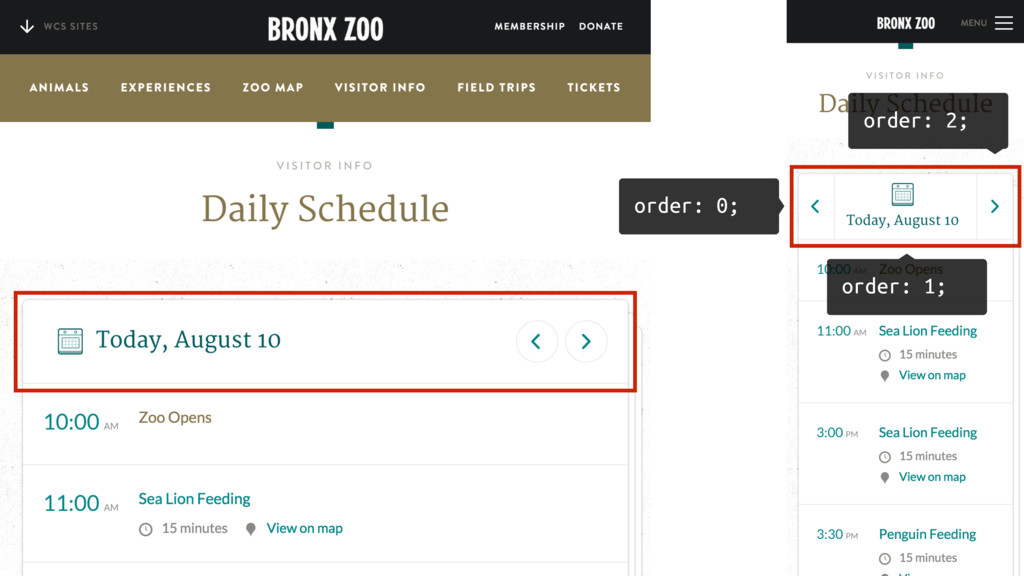
Reordering
A B C E D
A. order: 2; B. order: 1; C. order: 3; D.
order: 4; E. order: 5;
order: 2; order: 1; order: 0;
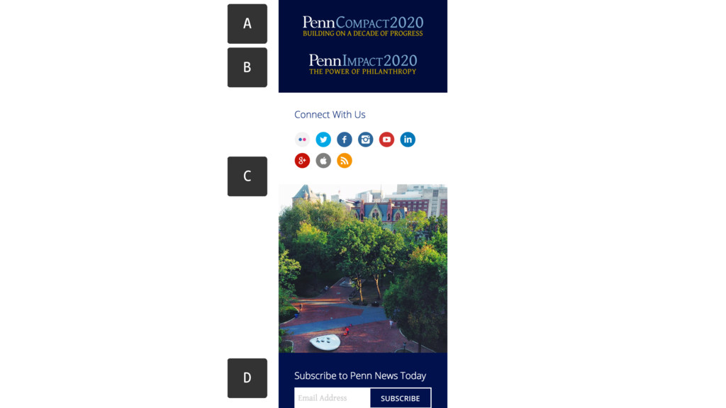
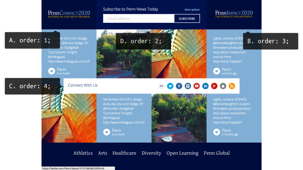
A B C D
D. order: 2; A. order: 1; B. order: 3; C.
order: 4;
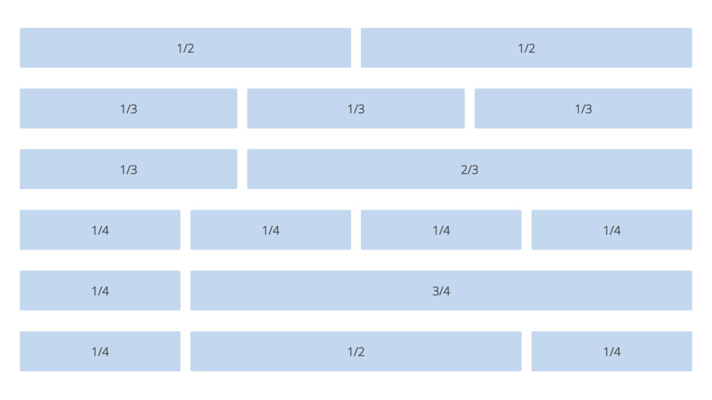
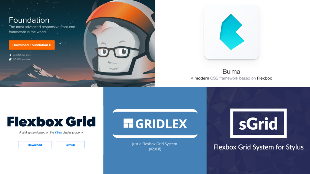
Grid Systems
None
None
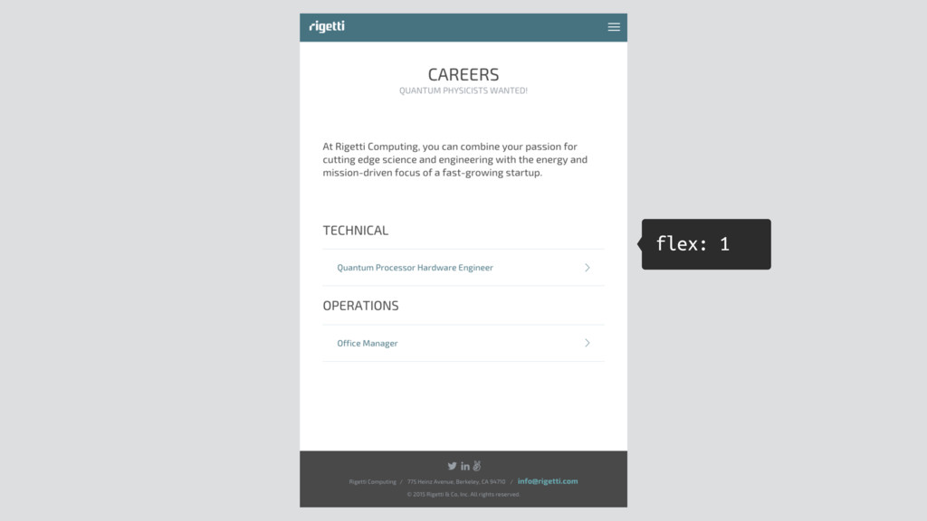
Sticky Footer
flex: 1
Layout Shifting
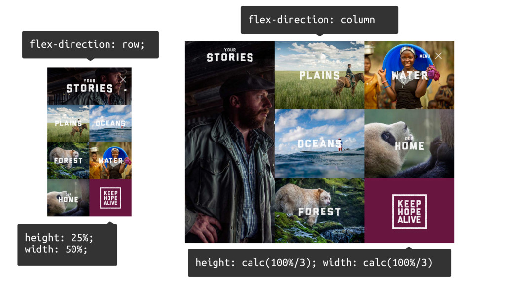
flex-direction: column flex-direction: row; height: 25%; width: 50%; height: calc(100%/3);
width: calc(100%/3)
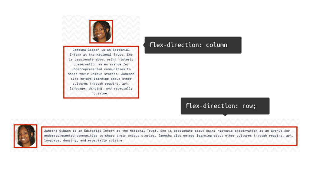
flex-direction: column flex-direction: row;
HOW TO GET STARTED
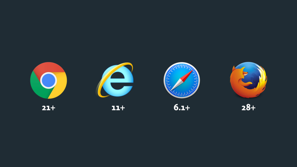
21+ 11+ 6.1+ 28+
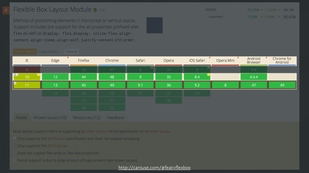
http://caniuse.com/#feat=flexbox
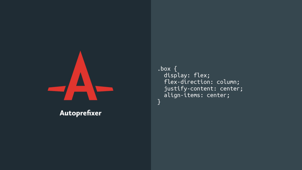
.box { display: -webkit-box; display: -webkit-flex; display: -ms-flexbox; display: flex;
-webkit-box-orient: vertical; -webkit-box-direction: normal; -webkit-flex-direction: column; -ms-flex-direction: column; flex-direction: column; -webkit-box-pack: center; -webkit-justify-content: center; -ms-flex-pack: center; justify-content: center; -webkit-box-align: center; -webkit-align-items: center; -ms-flex-align: center; align-items: center; } Autoprefixer .box { display: flex; flex-direction: column; justify-content: center; align-items: center; }
Gulp Grunt Webpack
Codekit Prepros Hammer
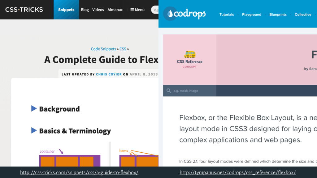
http://tympanus.net/codrops/css_reference/flexbox/ http://css-tricks.com/snippets/css/a-guide-to-flexbox/
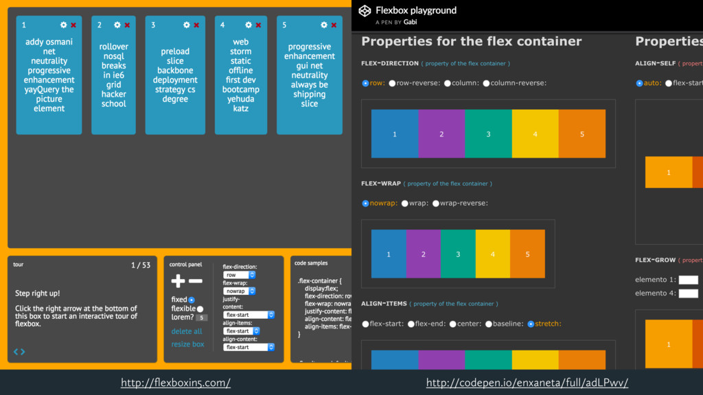
http://codepen.io/enxaneta/full/adLPwv/ http://flexboxin5.com/
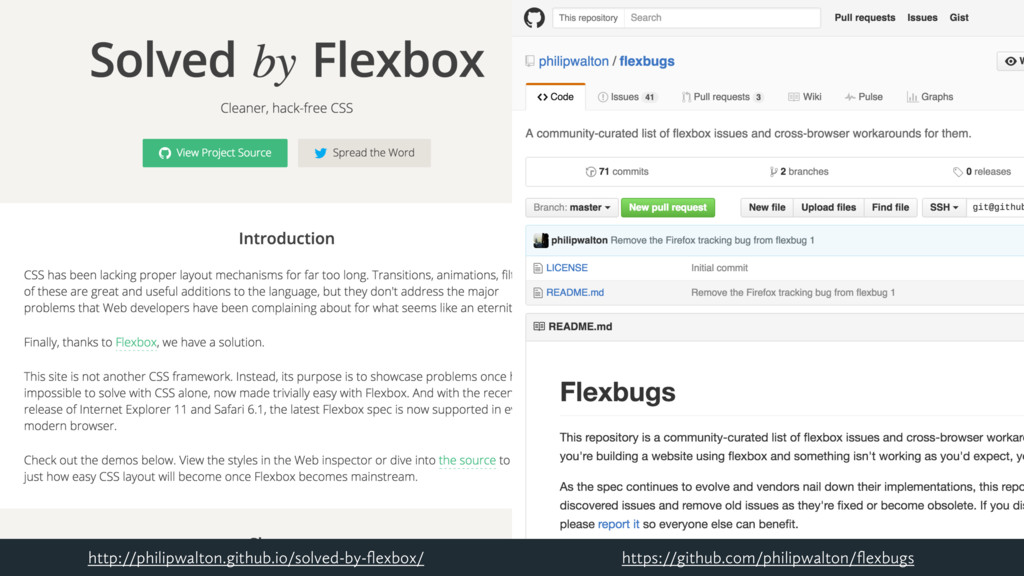
https://github.com/philipwalton/flexbugs http://philipwalton.github.io/solved-by-flexbox/
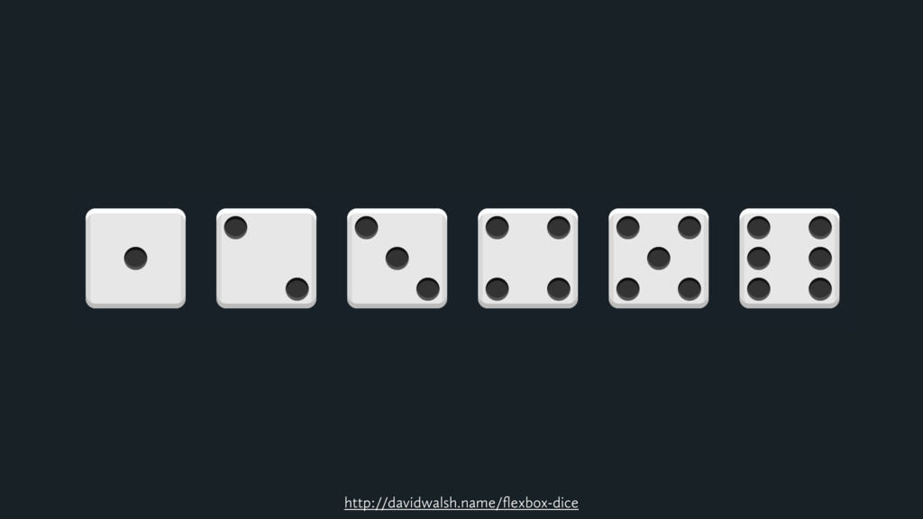
http://davidwalsh.name/flexbox-dice
Thank You! http://www.flex-box-racing.com/gallery/bes-paul-richard-2014/ @jeremyfrank


 jeremyfrank
 kastner
 brad_frost
 destraynor
 axbom
axbom
 codingconduct
 khoart
 bluesmoon
 stuffmc
 techseoconnect
 aleyda
 bcantrill
 reverentgeek