Upgrade to Pro
— share decks privately, control downloads, hide ads and more …
Speaker Deck
Features
Speaker Deck
PRO
Sign in
Sign up for free
Search
Search
User Onboarding Teardown
Search
James Sowers
August 20, 2014
Design
140
0
Share
User Onboarding Teardown
A quick overview of the user onboarding process used at UserOnboard.com. Meta much?
James Sowers
August 20, 2014
Other Decks in Design
See All in Design
20251128_武蔵野美術大学InnovationDay_参加型の未来
a2k
1
120
Rethinking IFUs: What Board Game Rulebooks Contribute to IFU Usability
deadlinepoet
0
270
decksh object reference
ajstarks
2
1.6k
TUNAG BOOK 2024
stmn
PRO
0
1.5k
コムデマネージャーがプロダクトデザインに挑戦した。むずかしくて楽しかった。
payatsusan213
0
290
ClaudeCodeでマーケターの課題を解決する
kenichiota0711
11
14k
Figma MCPを活用するためのデザインハンドブック
vivion
7
17k
Storyboard Exercise: Chase Sequence
lynteo
1
310
プロダクトデザイナーに学ぶ、『見る気が起きる』ダッシュボードの作り方 / Creating Engaging Dashboards: Lessons from Product Designers
yamamotoyuta
2
800
「バイブコーディングって何?」から始まった、 AIとの一年間と、その先のこと
seto
0
520
タイル紹介サイト「タイルだもんで」
calpin
0
130
CREATIVE CLASS受講課題|無印良品を題材としたブランド再構築について
happy_ferret153
0
890
Featured
See All Featured
Why Mistakes Are the Best Teachers: Turning Failure into a Pathway for Growth
auna
0
140
The Web Performance Landscape in 2024 [PerfNow 2024]
tammyeverts
12
1.1k
Max Prin - Stacking Signals: How International SEO Comes Together (And Falls Apart)
techseoconnect
PRO
0
160
WCS-LA-2024
lcolladotor
0
590
Improving Core Web Vitals using Speculation Rules API
sergeychernyshev
21
1.5k
Scaling GitHub
holman
464
140k
GraphQLとの向き合い方2022年版
quramy
50
15k
Avoiding the “Bad Training, Faster” Trap in the Age of AI
tmiket
0
150
Thoughts on Productivity
jonyablonski
76
5.2k
Distributed Sagas: A Protocol for Coordinating Microservices
caitiem20
333
22k
Organizational Design Perspectives: An Ontology of Organizational Design Elements
kimpetersen
PRO
1
690
JAMstack: Web Apps at Ludicrous Speed - All Things Open 2022
reverentgeek
1
440
Transcript
How User Onboard Onboards New Users
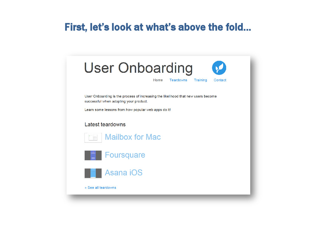
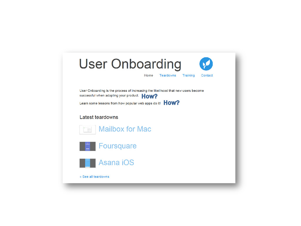
First, let’s look at what’s above the fold…
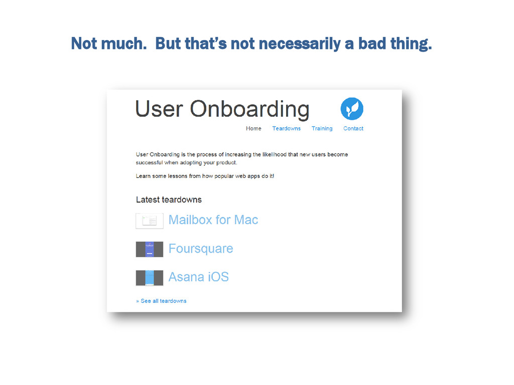
Not much. But that’s not necessarily a bad thing.
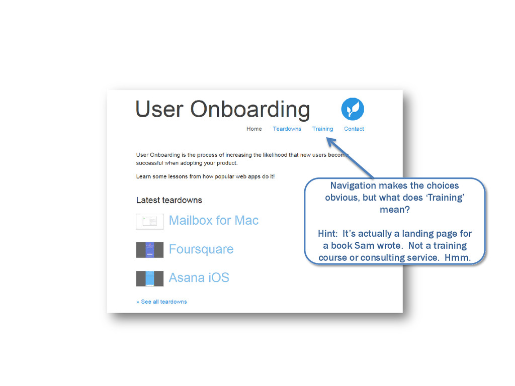
Navigation makes the choices obvious, but what does ‘Training’ mean?
Hint: It’s actually a landing page for a book Sam wrote. Not a training course or consulting service. Hmm.
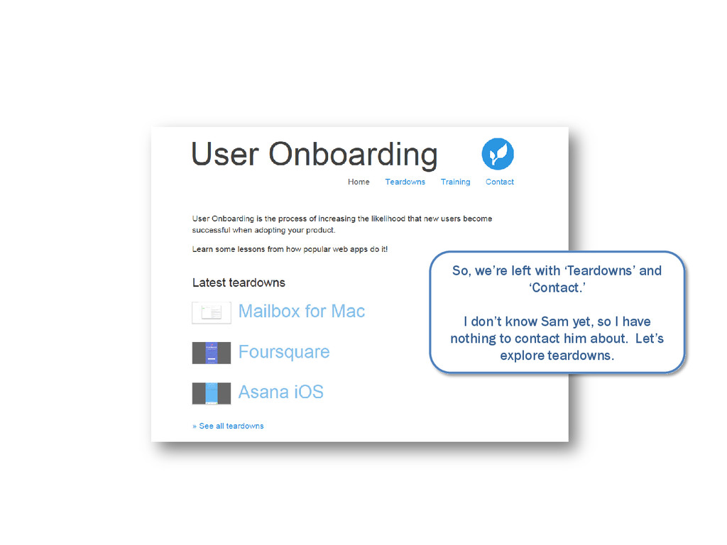
So, we’re left with ‘Teardowns’ and ‘Contact.’ I don’t know
Sam yet, so I have nothing to contact him about. Let’s explore teardowns.
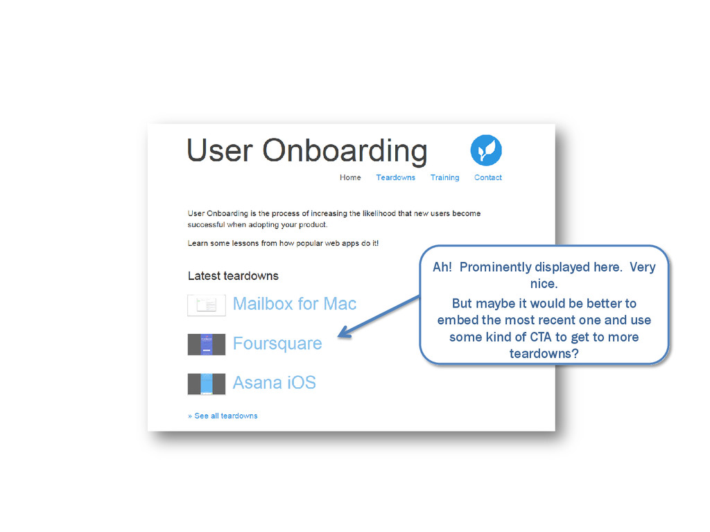
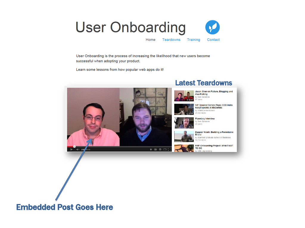
Ah! Prominently displayed here. Very nice. But maybe it would
be better to embed the most recent one and use some kind of CTA to get to more teardowns?
None
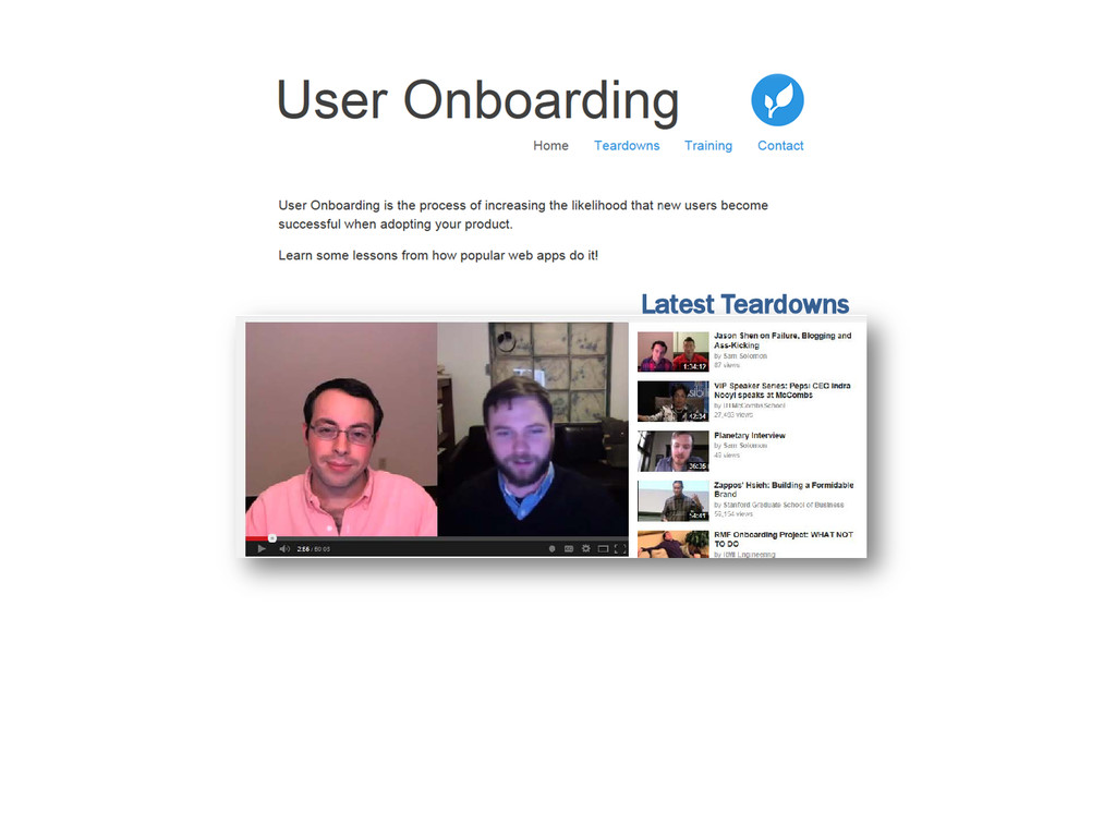
Latest Teardowns
Embedded Post Goes Here Latest Teardowns
Why make me leave the homepage to view a sample
of your work? Side note: Loved the interview, Sam!
Let’s continue…
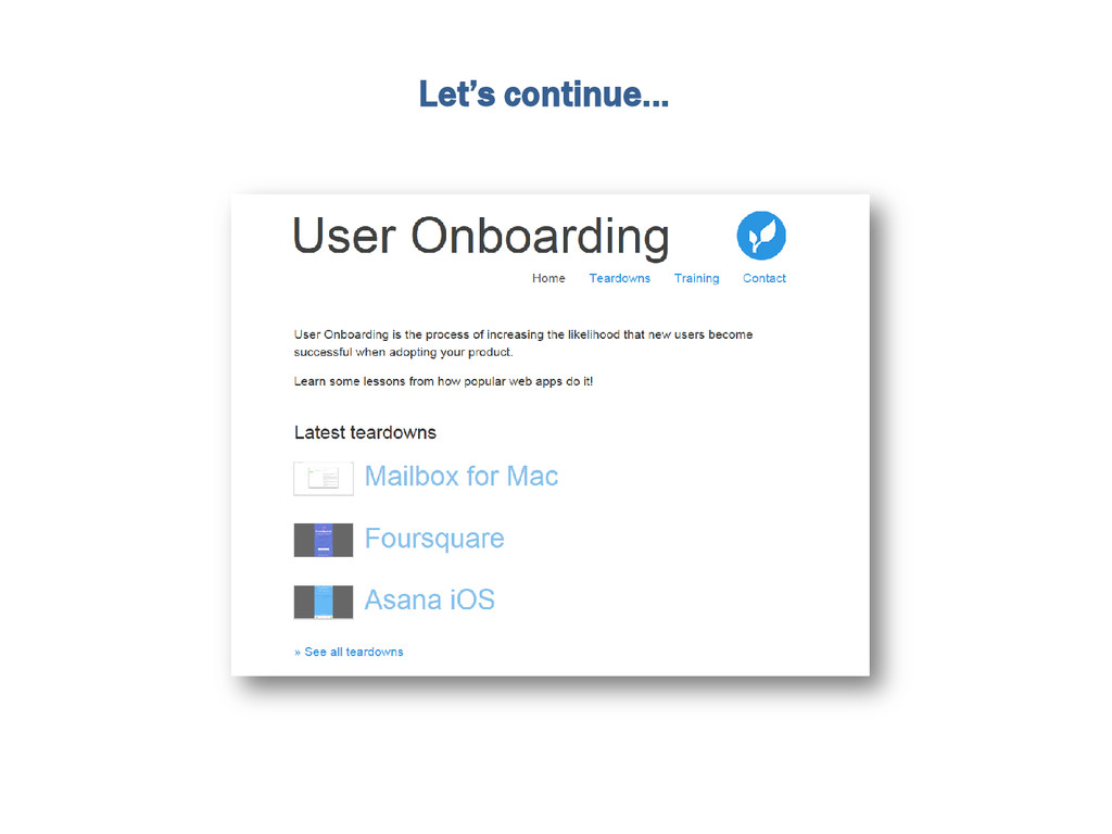
Let’s continue…
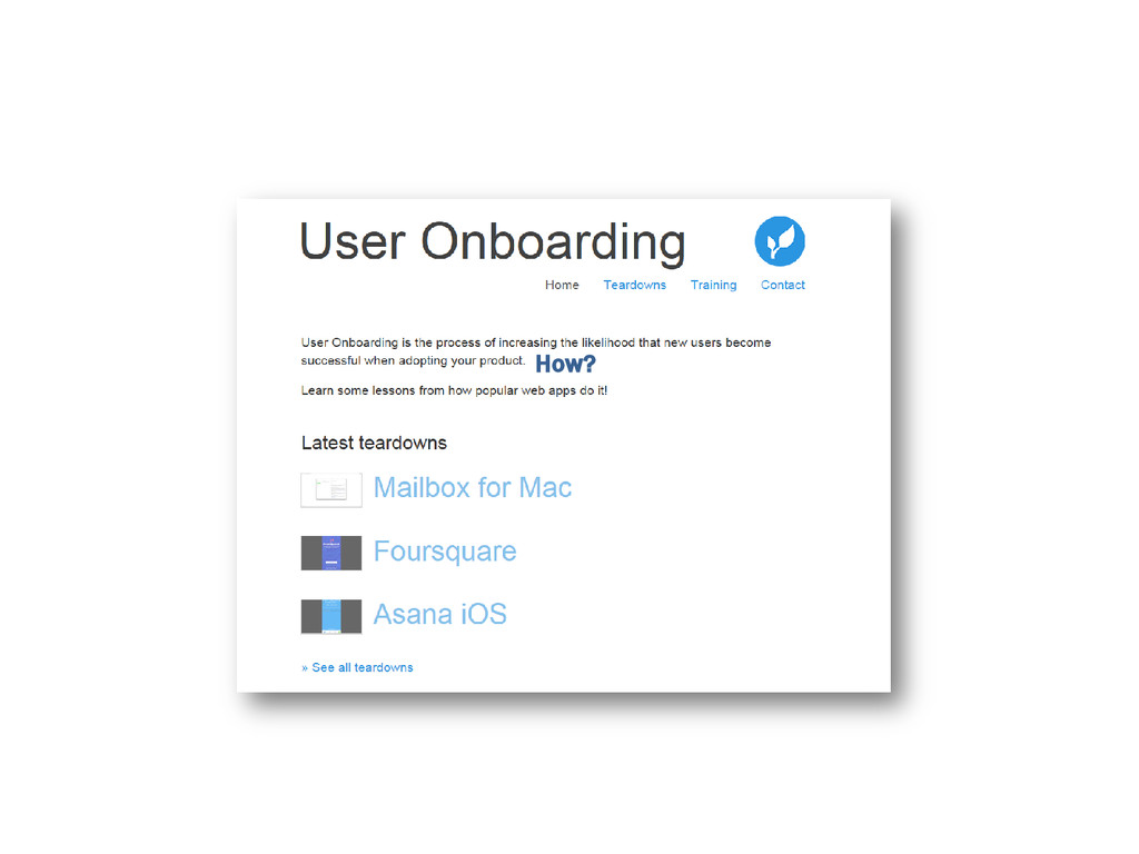
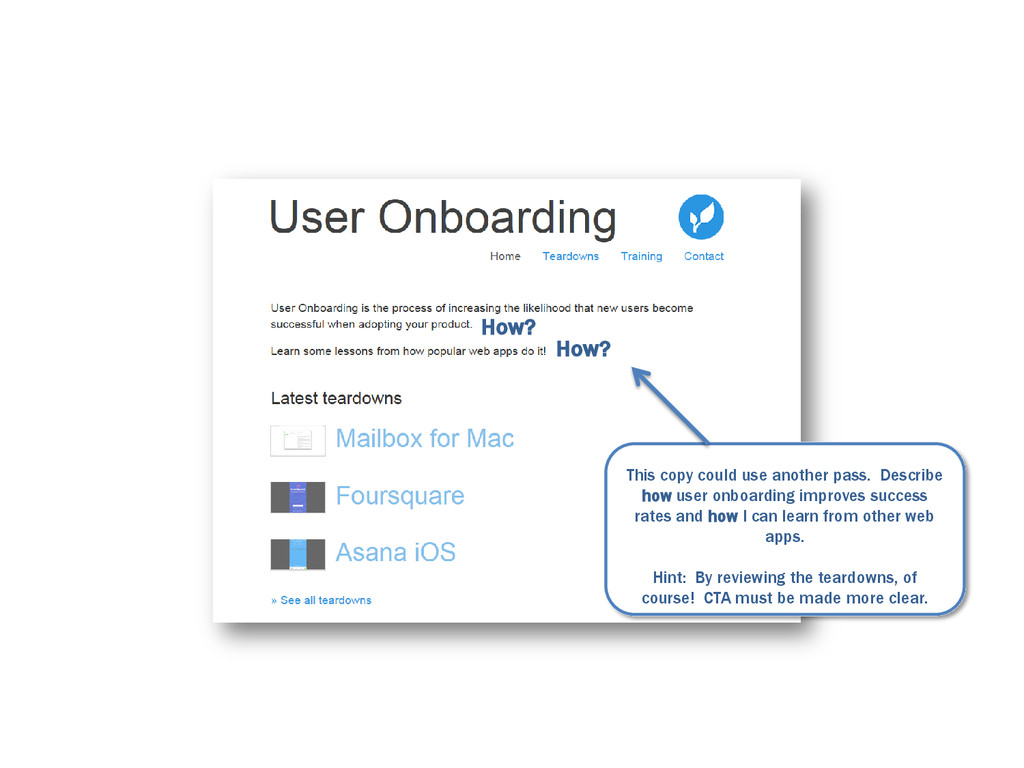
How?
How? How?
This copy could use another pass. Describe how user onboarding
improves success rates and how I can learn from other web apps. Hint: By reviewing the teardowns, of course! CTA must be made more clear. How? How?
And that’s basically it. But wait, what’s below the fold?
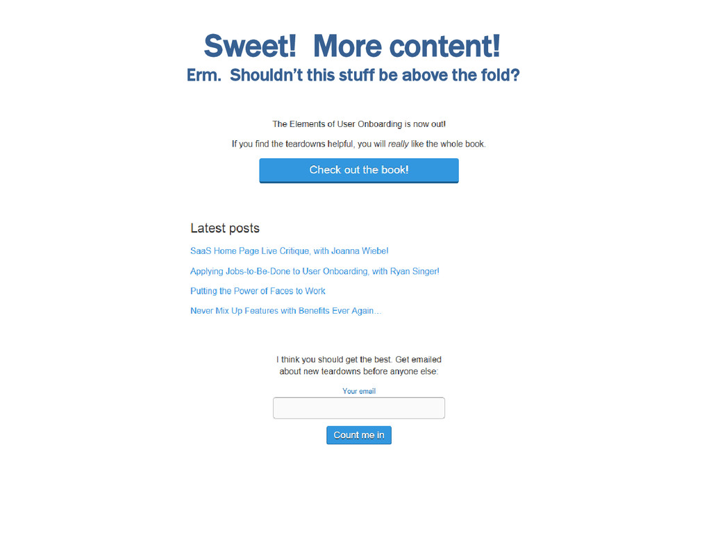
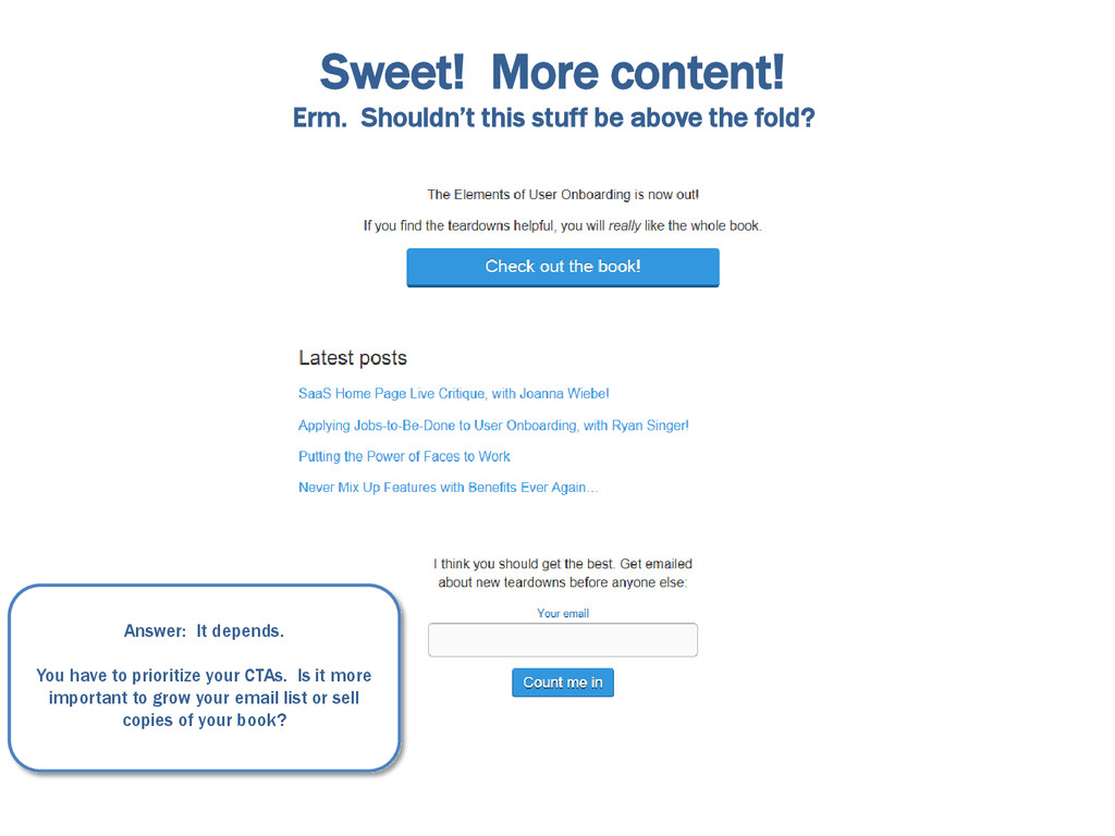
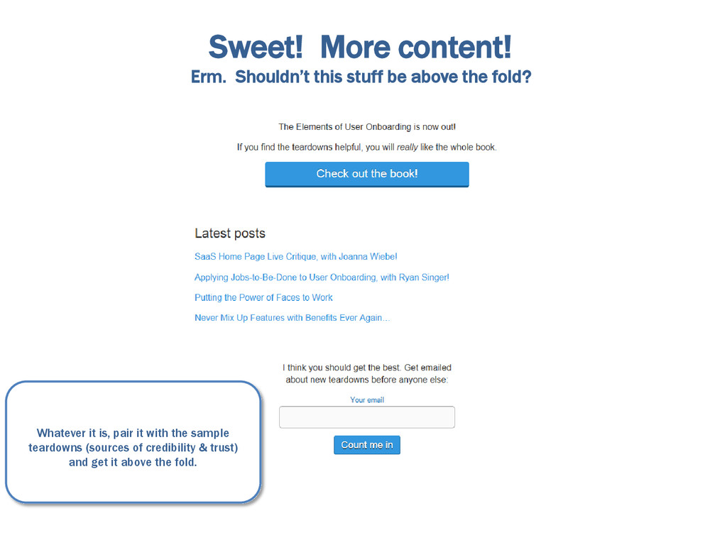
Sweet! More content! Erm. Shouldn’t this stuff be above the
fold?
Sweet! More content! Erm. Shouldn’t this stuff be above the
fold? Answer: It depends. You have to prioritize your CTAs. Is it more important to grow your email list or sell copies of your book?
Sweet! More content! Erm. Shouldn’t this stuff be above the
fold? Whatever it is, pair it with the sample teardowns (sources of credibility & trust) and get it above the fold.
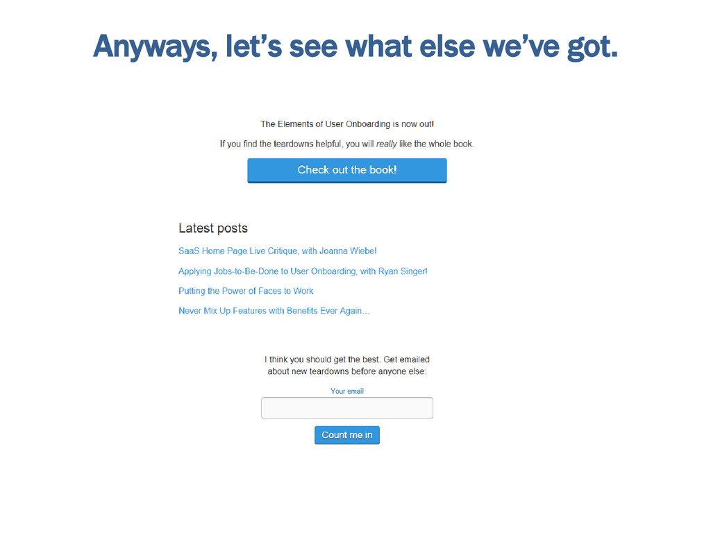
Anyways, let’s see what else we’ve got.
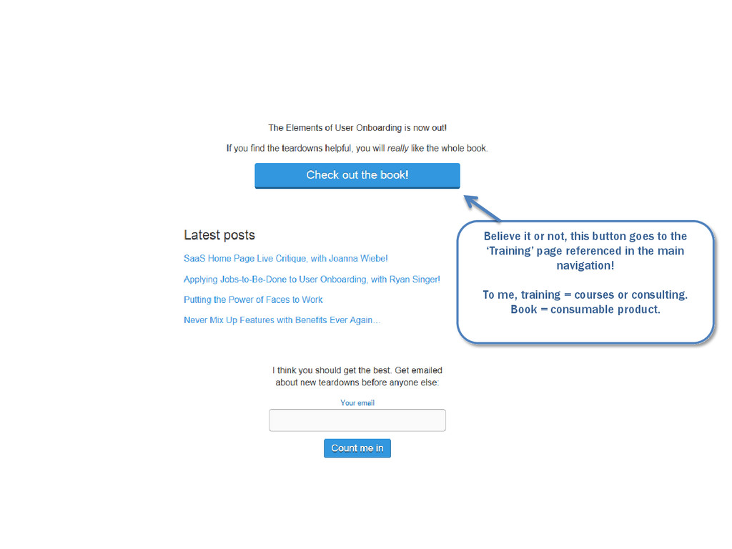
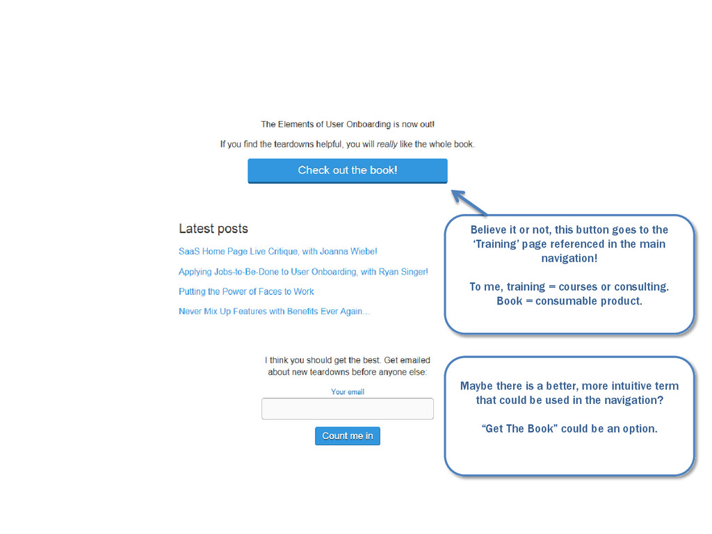
Believe it or not, this button goes to the ‘Training’
page referenced in the main navigation! To me, training = courses or consulting. Book = consumable product.
Believe it or not, this button goes to the ‘Training’
page referenced in the main navigation! To me, training = courses or consulting. Book = consumable product. Maybe there is a better, more intuitive term that could be used in the navigation? “Get The Book” could be an option.
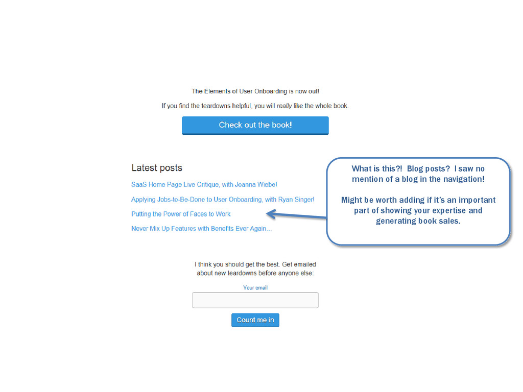
What is this?! Blog posts? I saw no mention of
a blog in the navigation! Might be worth adding if it’s an important part of showing your expertise and generating book sales.
Side Note: This feels out of place here. Like it
was tucked in between these two CTAs at the last minute.
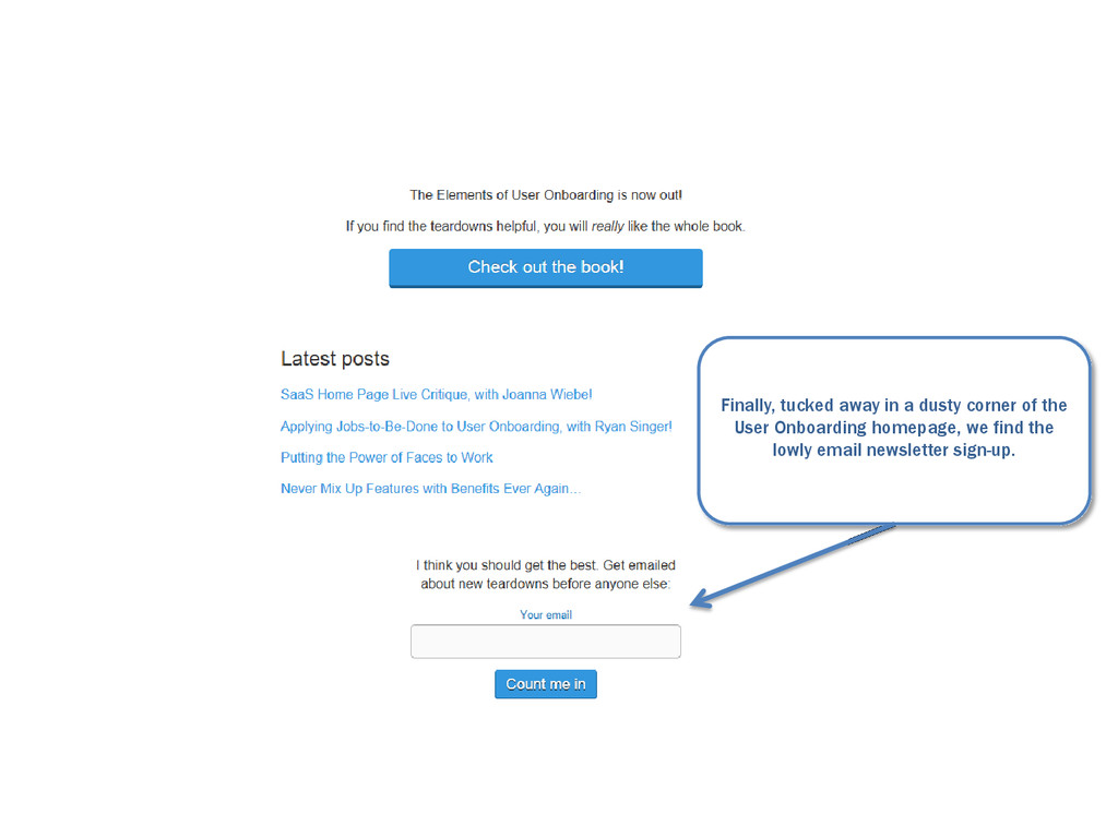
Finally, tucked away in a dusty corner of the User
Onboarding homepage, we find the lowly email newsletter sign-up.
If it’s important, emphasize it, make the button larger and
get it above the fold. If not, maybe it’s worth a text link in the main body copy that directs to MailChimp/Aweber/Whatever.
Ok, Smart Guy. If you’re so smart. How would you
design the homepage?
Well, I’ll show you.
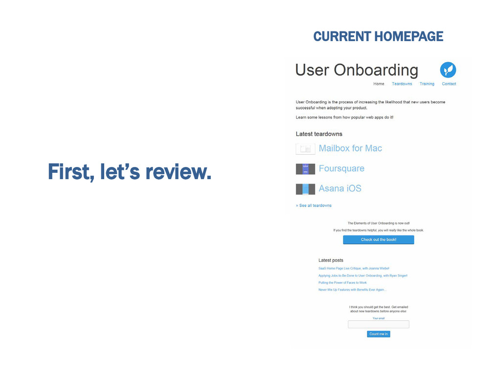
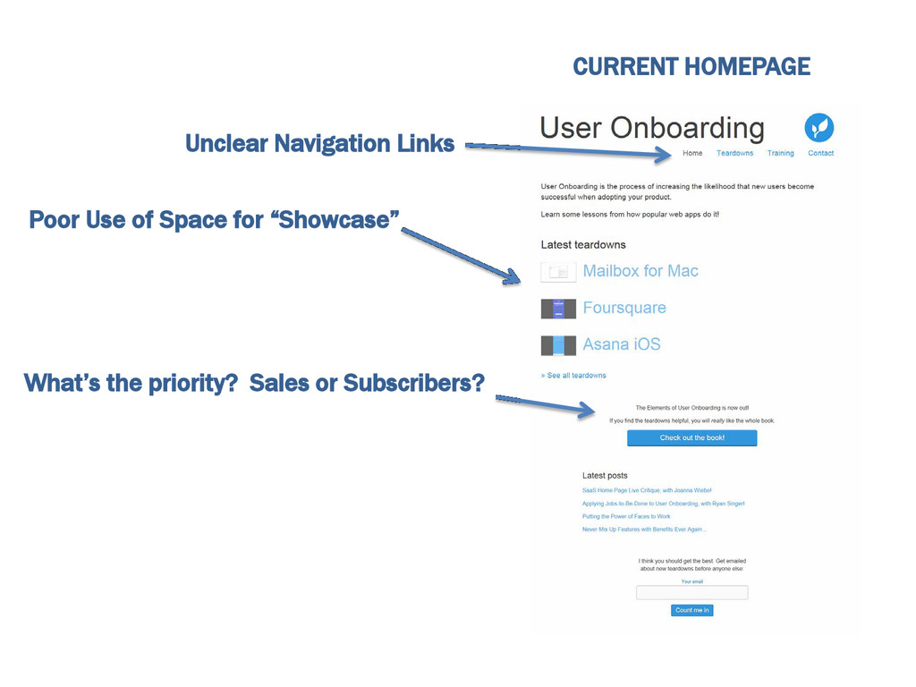
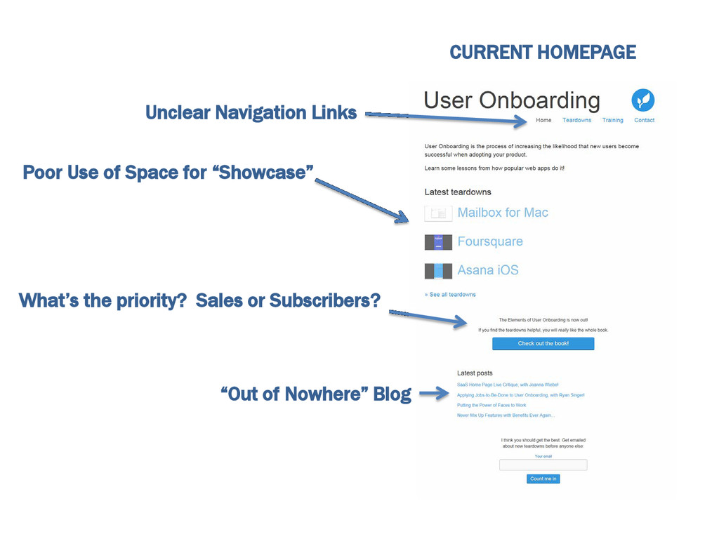
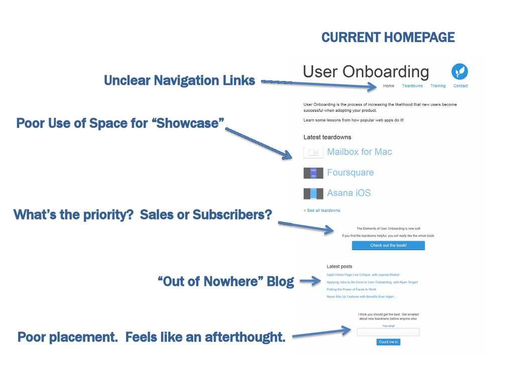
First, let’s review. CURRENT HOMEPAGE
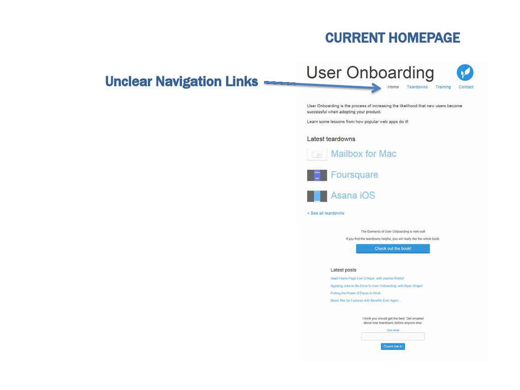
CURRENT HOMEPAGE Unclear Navigation Links
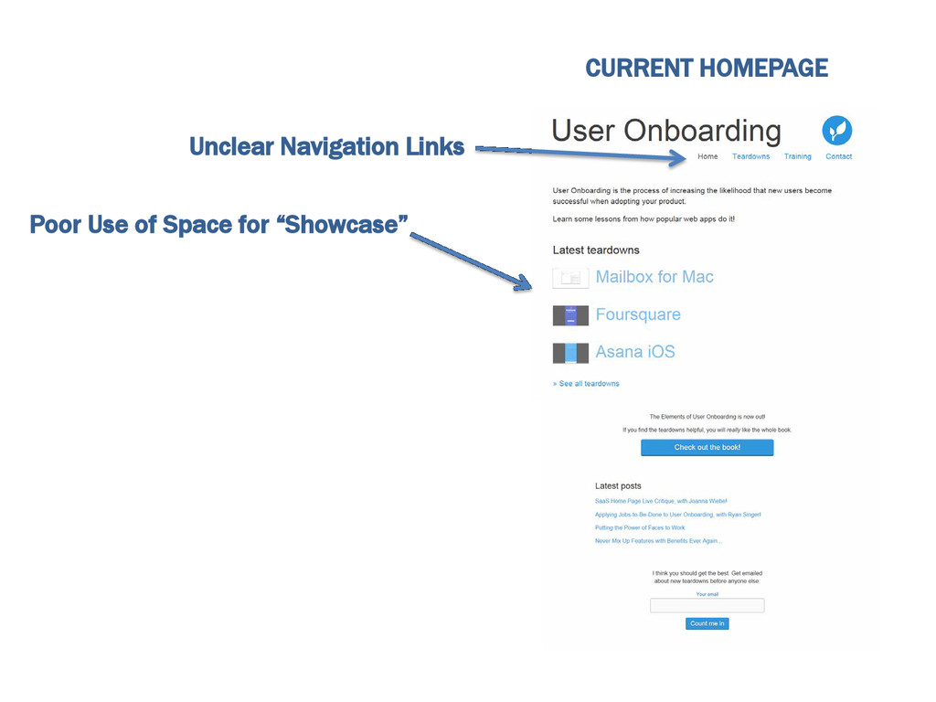
CURRENT HOMEPAGE Unclear Navigation Links Poor Use of Space for
“Showcase”
CURRENT HOMEPAGE Unclear Navigation Links Poor Use of Space for
“Showcase” What’s the priority? Sales or Subscribers?
CURRENT HOMEPAGE Unclear Navigation Links Poor Use of Space for
“Showcase” “Out of Nowhere” Blog What’s the priority? Sales or Subscribers?
CURRENT HOMEPAGE Unclear Navigation Links Poor Use of Space for
“Showcase” “Out of Nowhere” Blog What’s the priority? Sales or Subscribers? Poor placement. Feels like an afterthought.
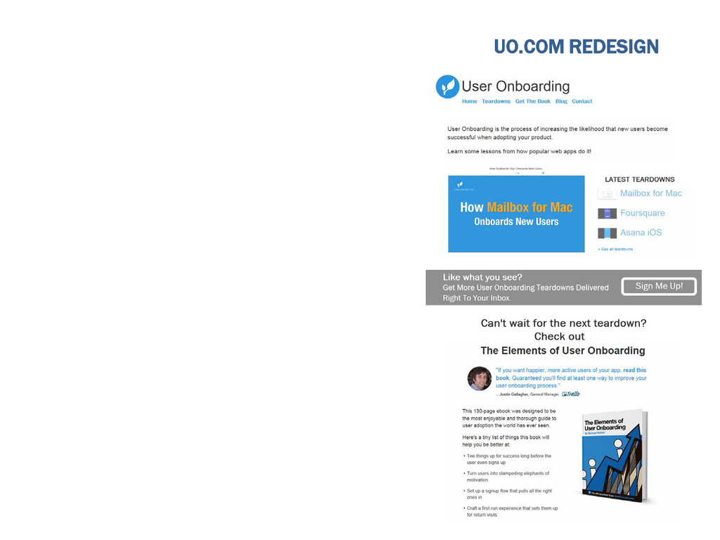
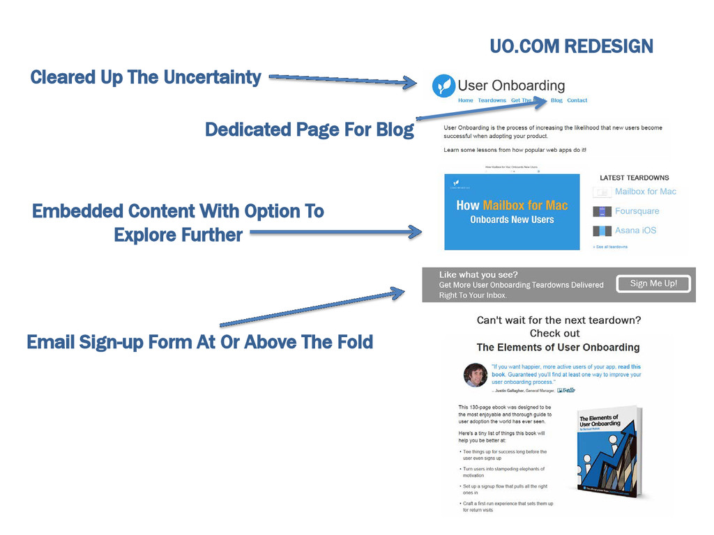
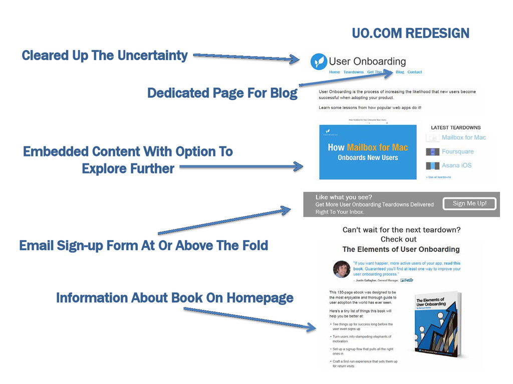
Now, here’s my version.
Now, here’s my version. Disclaimer: I’m not a designer. This
was my haphazard take on the redesign with Pixlr and about 30 mins of free time. We’ll call it a “wireframe.”
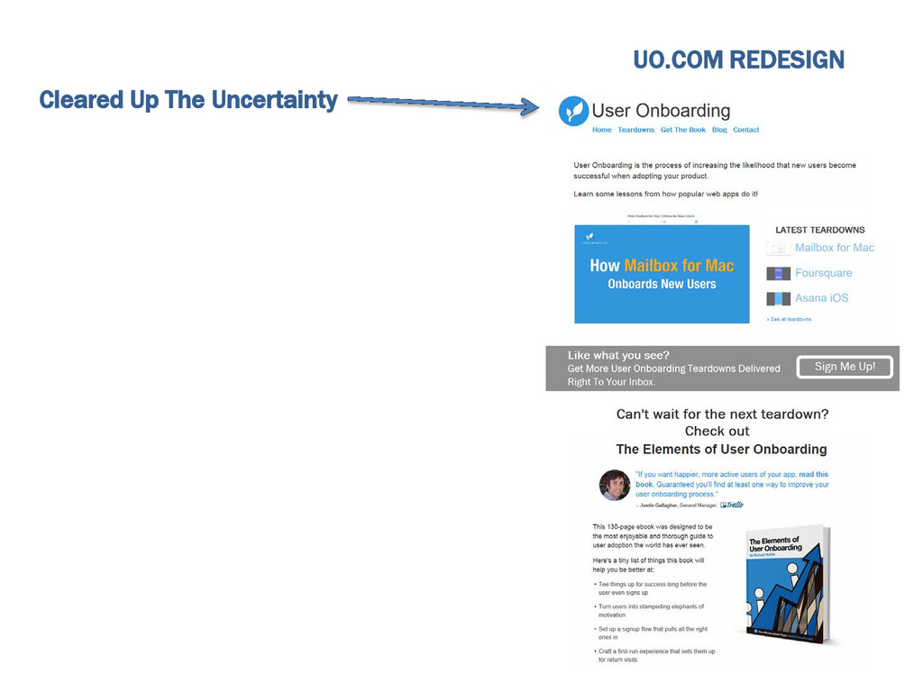
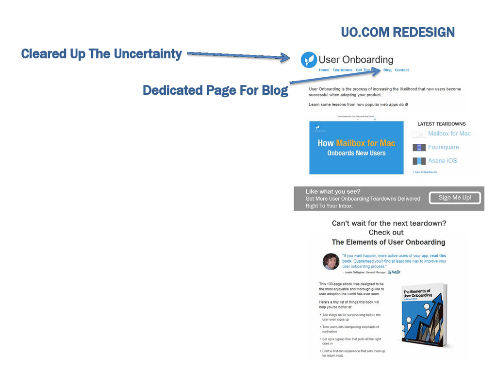
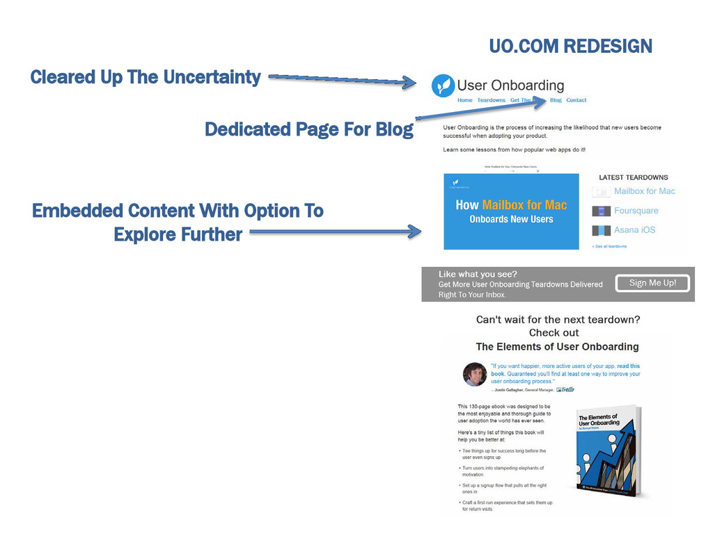
UO.COM REDESIGN
Cleared Up The Uncertainty UO.COM REDESIGN
Cleared Up The Uncertainty Dedicated Page For Blog UO.COM REDESIGN
Cleared Up The Uncertainty Embedded Content With Option To Explore
Further Dedicated Page For Blog UO.COM REDESIGN
Cleared Up The Uncertainty Embedded Content With Option To Explore
Further Dedicated Page For Blog Email Sign-up Form At Or Above The Fold UO.COM REDESIGN
Cleared Up The Uncertainty Embedded Content With Option To Explore
Further Dedicated Page For Blog Email Sign-up Form At Or Above The Fold Information About Book On Homepage UO.COM REDESIGN
That’s all, Folks. Hope you enjoyed the show as much
as I enjoyed making it!