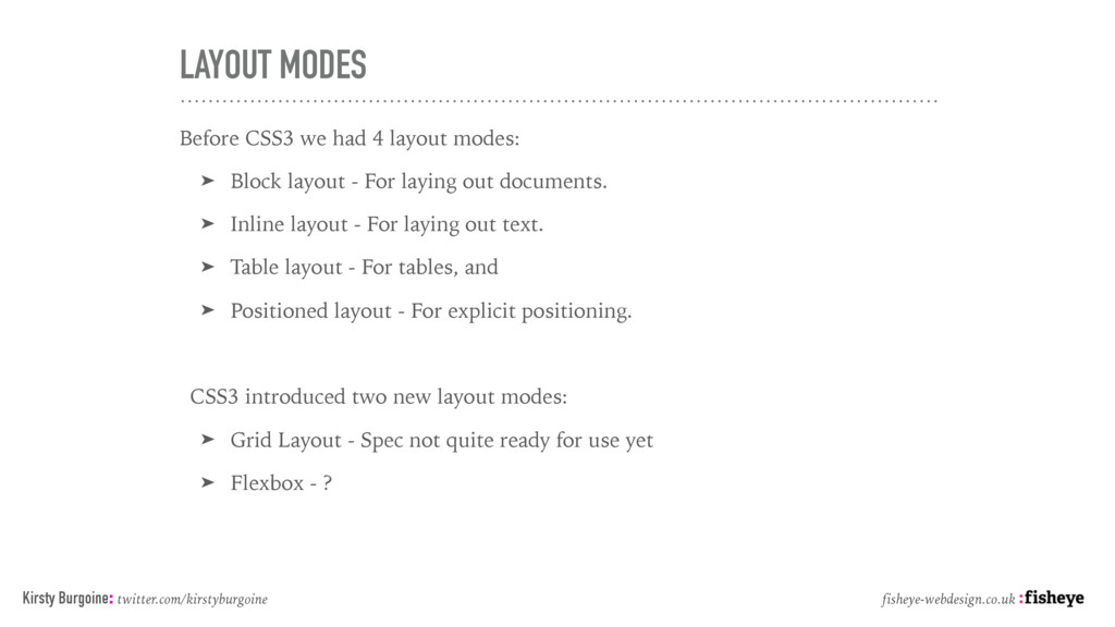
Block layout - For laying out documents. ➤ Inline layout - For laying out text. ➤ Table layout - For tables, and ➤ Positioned layout - For explicit positioning. CSS3 introduced two new layout modes: ➤ Grid Layout - Spec not quite ready for use yet ➤ Flexbox - ? Kirsty Burgoine: twitter.com/kirstyburgoine fisheye-webdesign.co.uk
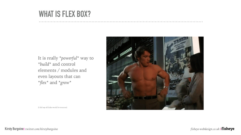
*build* and control elements / modules and even layouts that can *flex* and *grow* (I did say all links would be tenuous) Kirsty Burgoine: twitter.com/kirstyburgoine fisheye-webdesign.co.uk
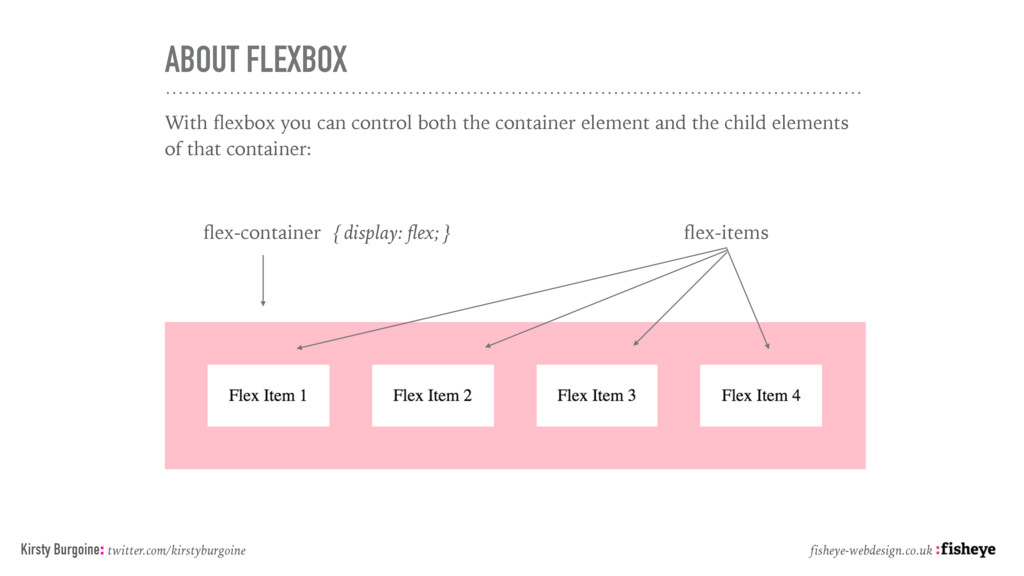
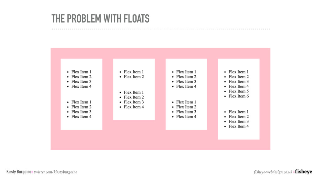
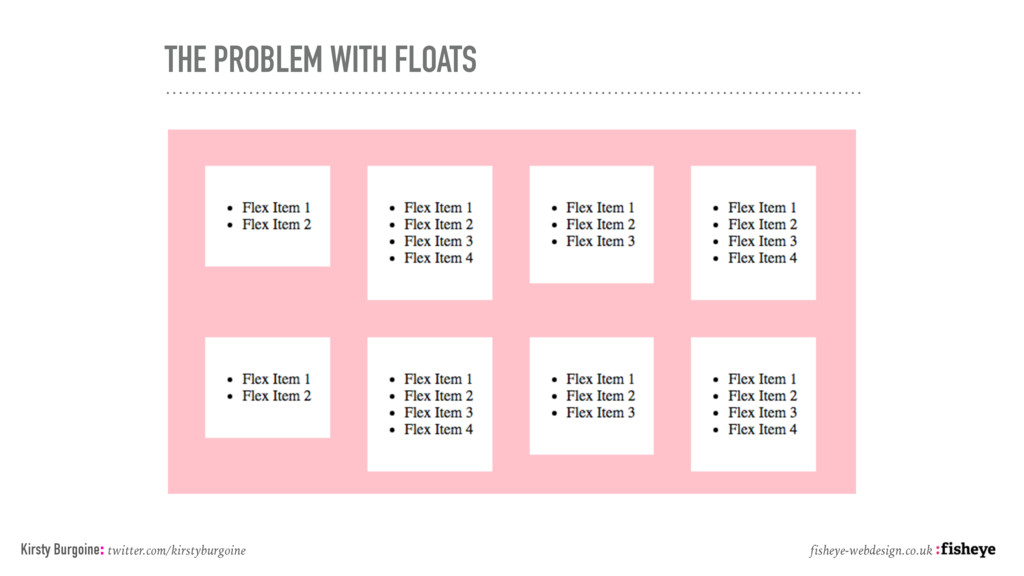
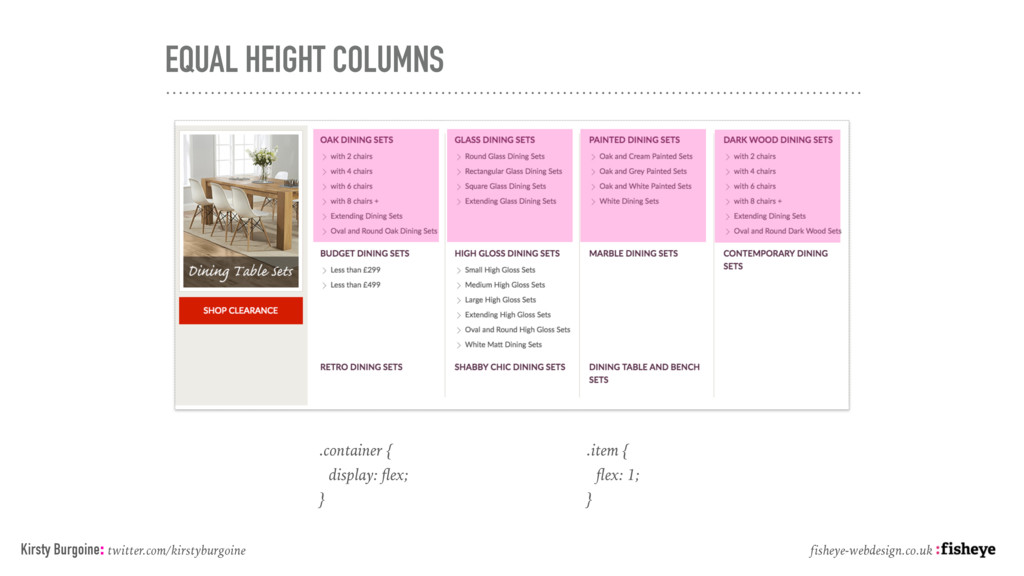
element and the child elements of that container: flex-container { display: flex; } flex-items Kirsty Burgoine: twitter.com/kirstyburgoine fisheye-webdesign.co.uk
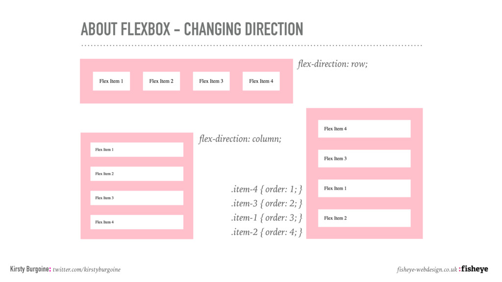
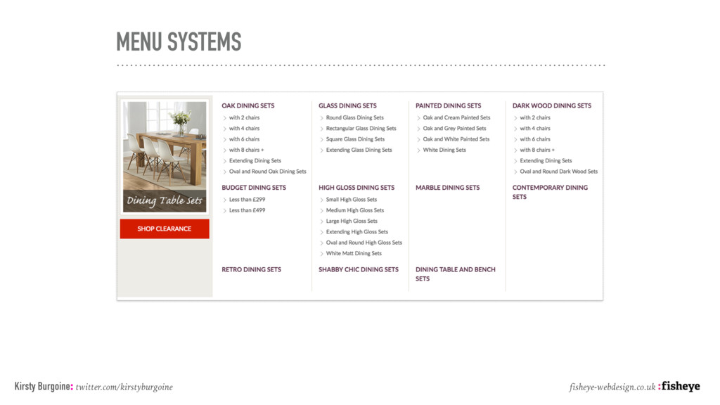
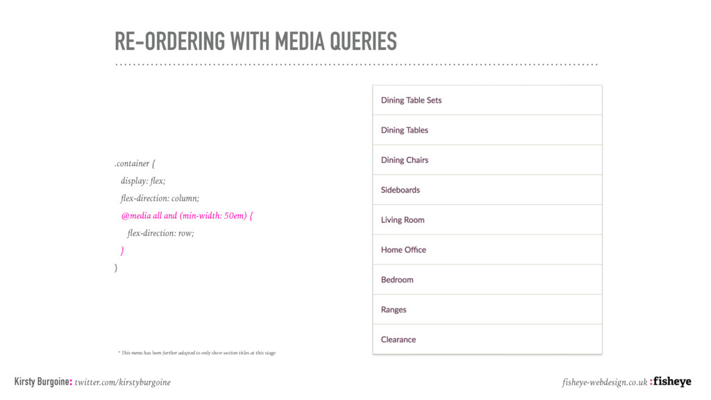
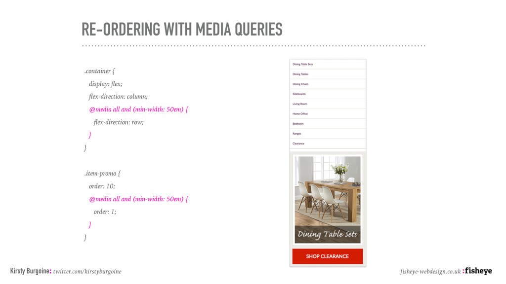
@media all and (min-width: 50em) { flex-direction: row; } } Kirsty Burgoine: twitter.com/kirstyburgoine fisheye-webdesign.co.uk * This menu has been further adapted to only show section titles at this stage
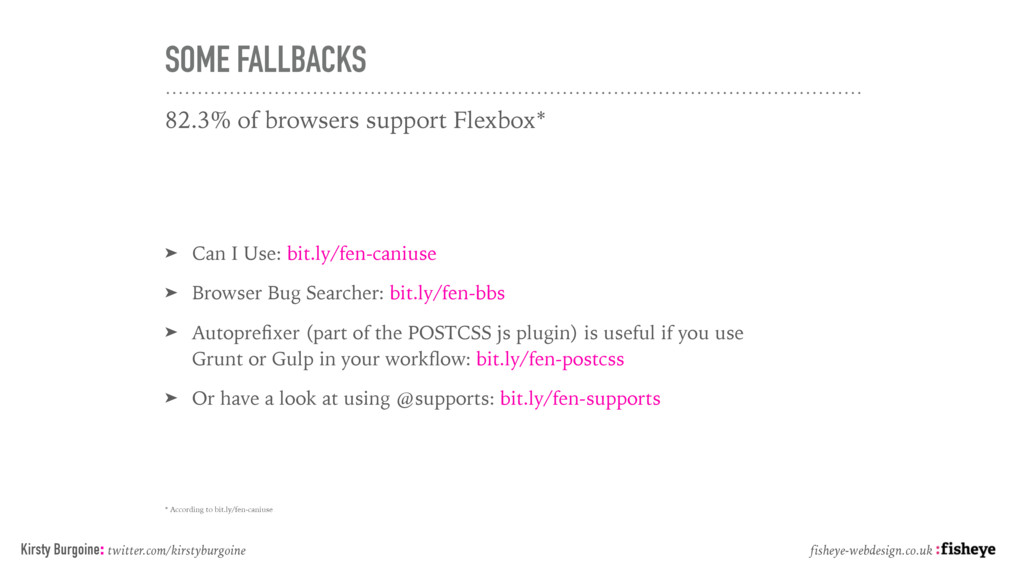
Use: bit.ly/fen-caniuse ➤ Browser Bug Searcher: bit.ly/fen-bbs ➤ Autoprefixer (part of the POSTCSS js plugin) is useful if you use Grunt or Gulp in your workflow: bit.ly/fen-postcss ➤ Or have a look at using @supports: bit.ly/fen-supports * According to bit.ly/fen-caniuse Kirsty Burgoine: twitter.com/kirstyburgoine fisheye-webdesign.co.uk
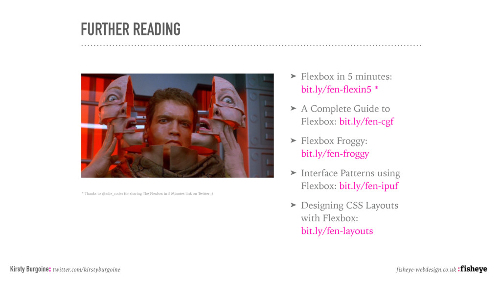
A Complete Guide to Flexbox: bit.ly/fen-cgf ➤ Flexbox Froggy: bit.ly/fen-froggy ➤ Interface Patterns using Flexbox: bit.ly/fen-ipuf ➤ Designing CSS Layouts with Flexbox: bit.ly/fen-layouts Kirsty Burgoine: twitter.com/kirstyburgoine fisheye-webdesign.co.uk * Thanks to @adie_codes for sharing The Flexbox in 5 Minutes link on Twitter :)
End Developer @ Fisheye Tweet me: @kirstyburgoine Email me: [email protected] Invite me to your Slack Channel where I will mostly lurk… fisheye-webdesign.co.uk
 knishioka
 moongift
 comi190327
 hirodragon112
 nek0128
 visional_engineering_and_design
 fortegp05
 ymty
ymty
 tsurunosd
 ichikawaken
 kkato1
 oracle4engineer
 honzajavorek
 marketingsoph
 emna__ayadi
 katarinadahlin
 scottboms
 ryanjones
 kneath
 akademiya2063
 carmenintech
 rkendrick25
 inesmontani