Upgrade to Pro — share decks privately, control downloads, hide ads and more …

Utility-First CSS with Tailwind

klickreflex
February 12, 2019

Utility-First CSS with Tailwind

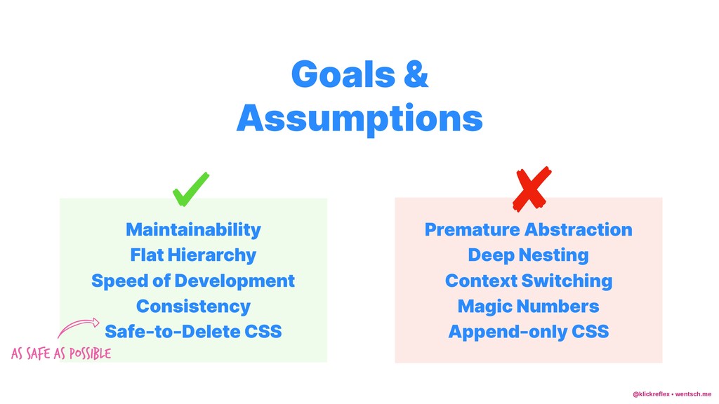
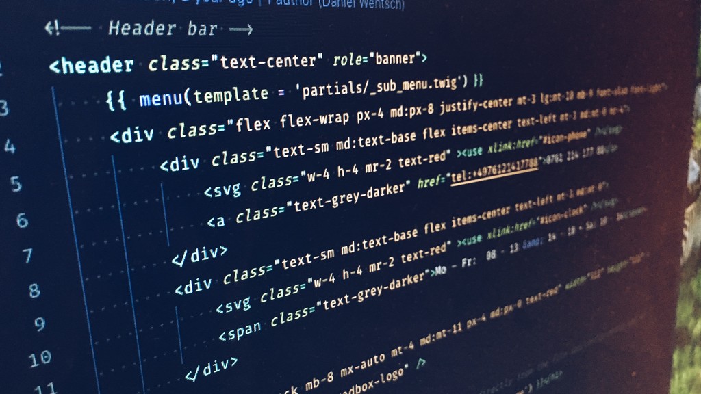
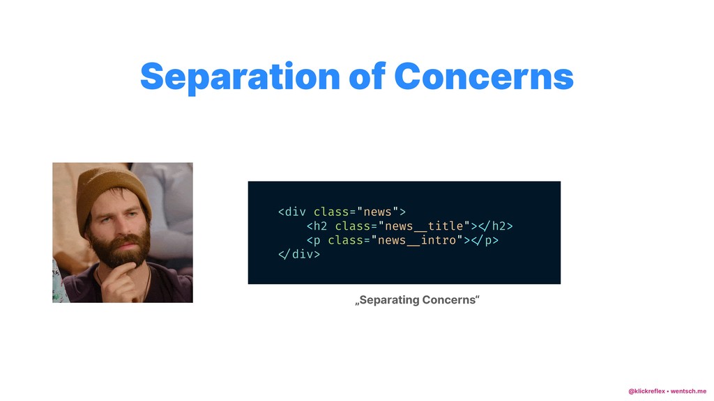
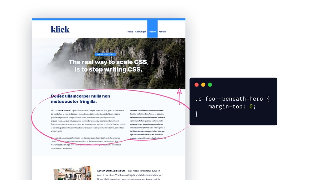
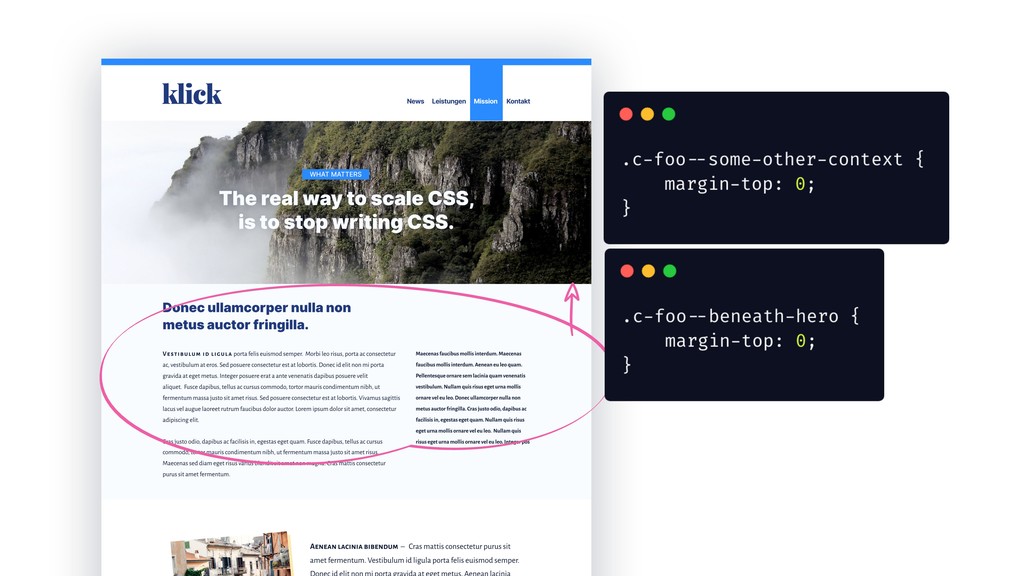
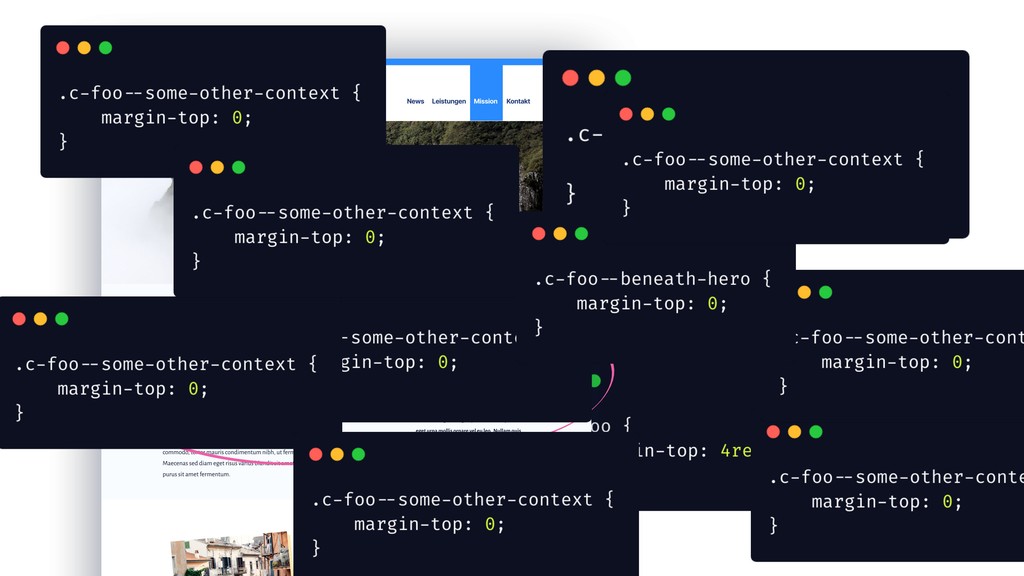
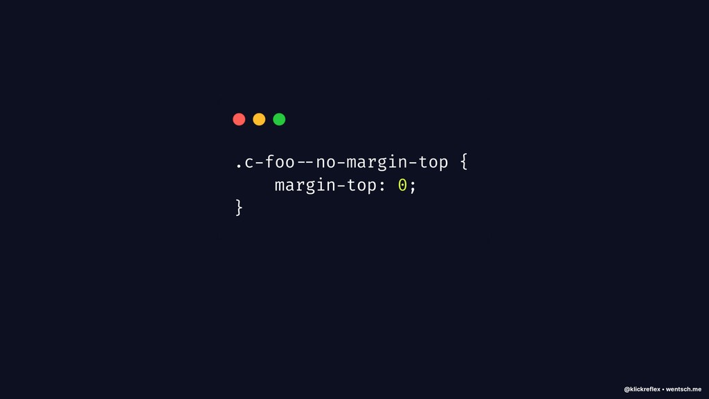
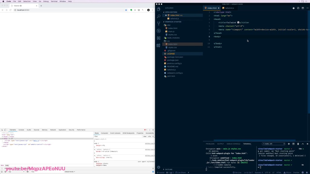
Write maintainable frontend code and battle CSS anxiety by follwing a more functional approach to writing HTML & CSS.

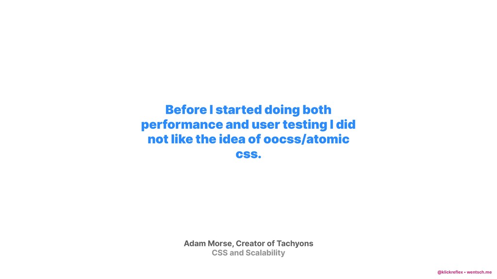
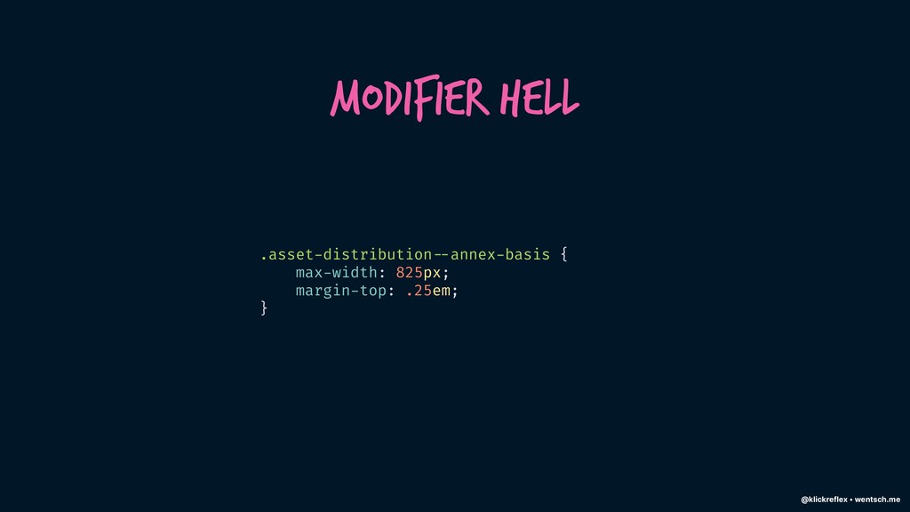
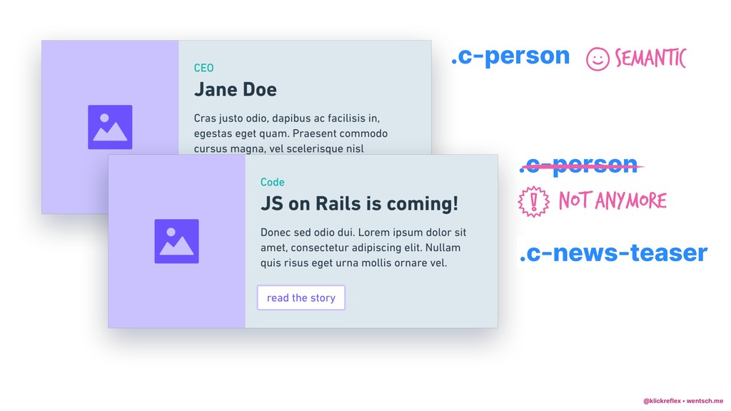
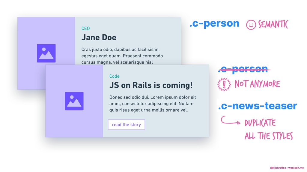
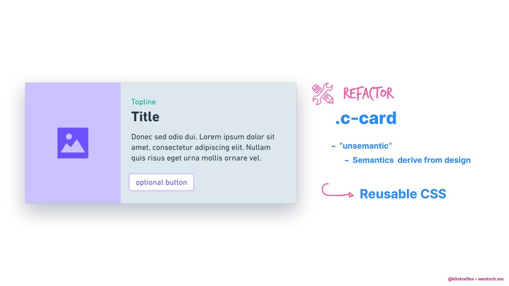
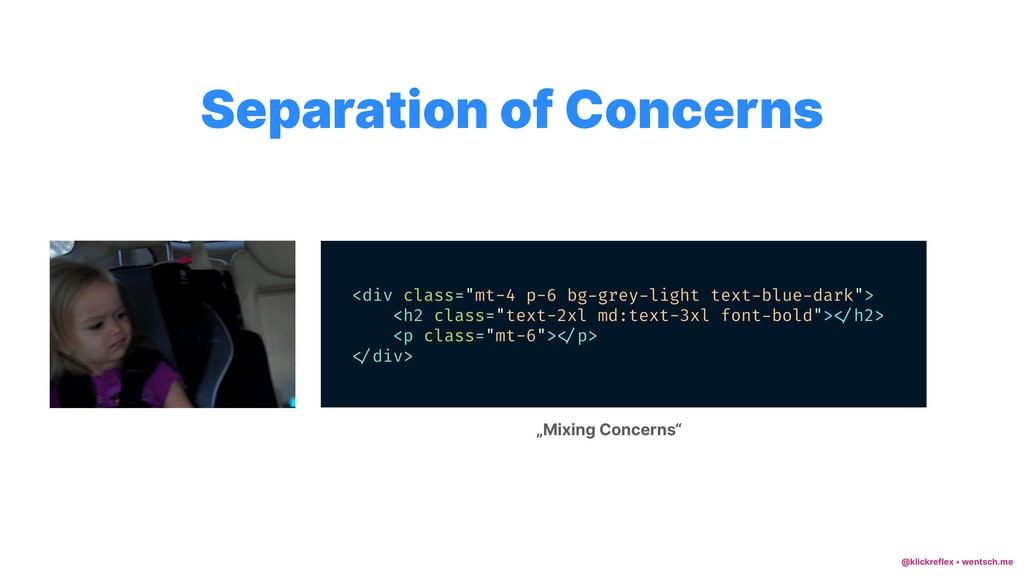
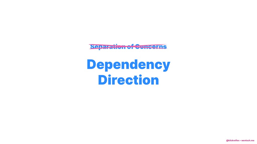
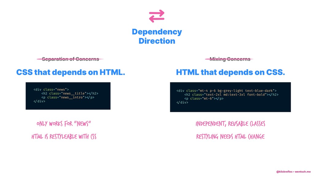
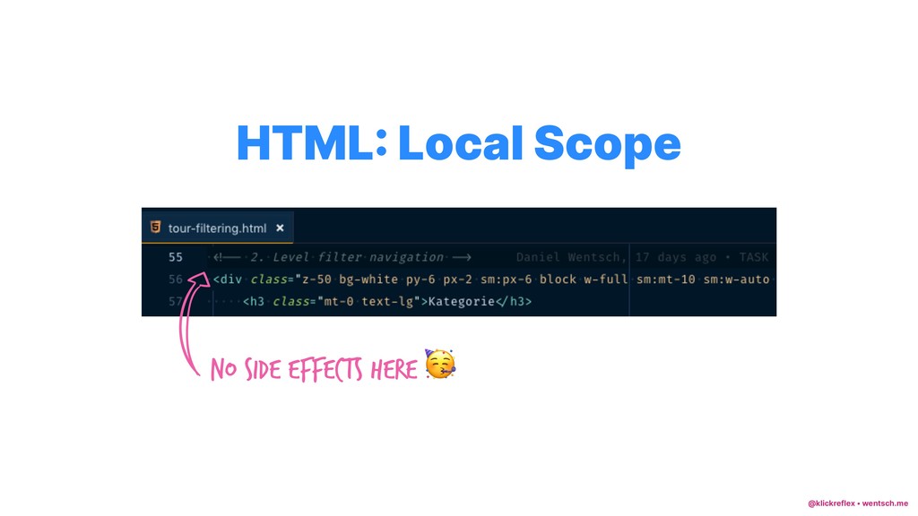
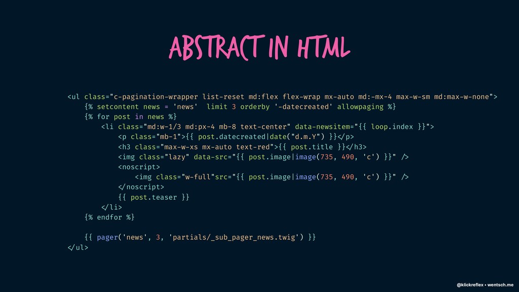
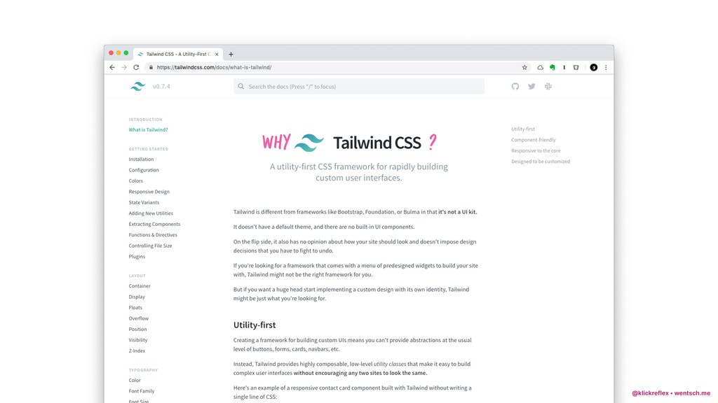
In the late summer of 2017 I came across the concept of Functional CSS, later more commonly referred to as Utility First CSS.

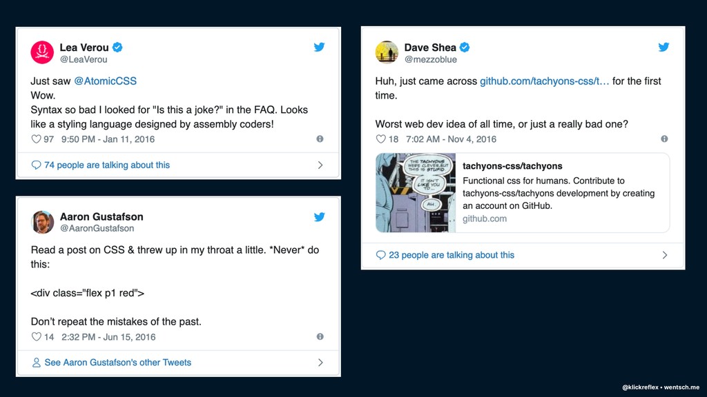
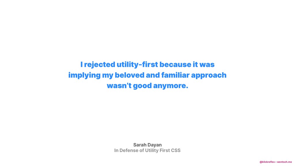
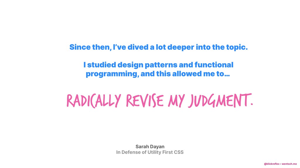
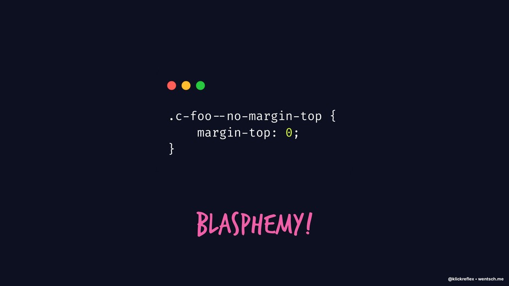
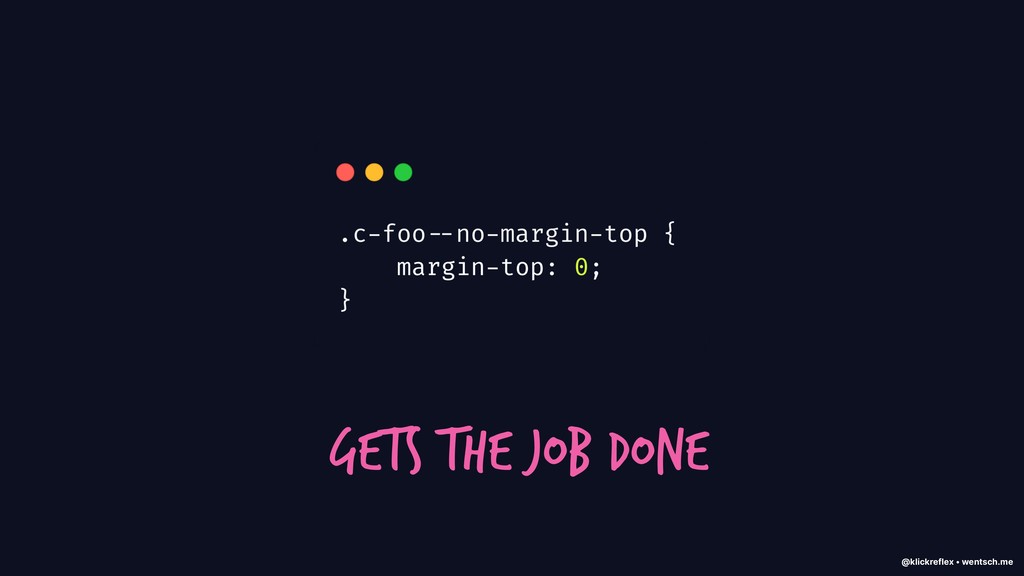
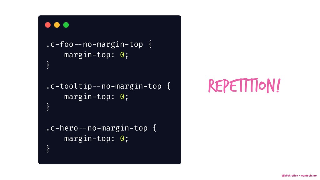
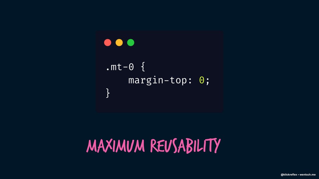
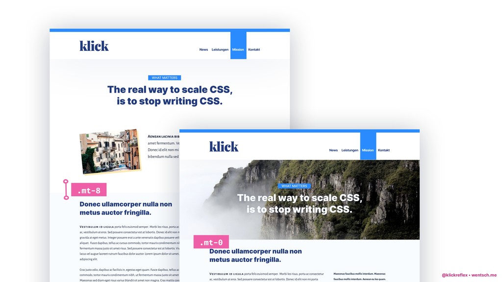
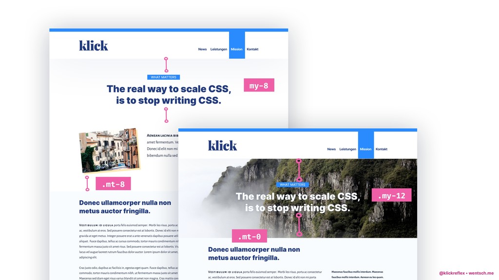
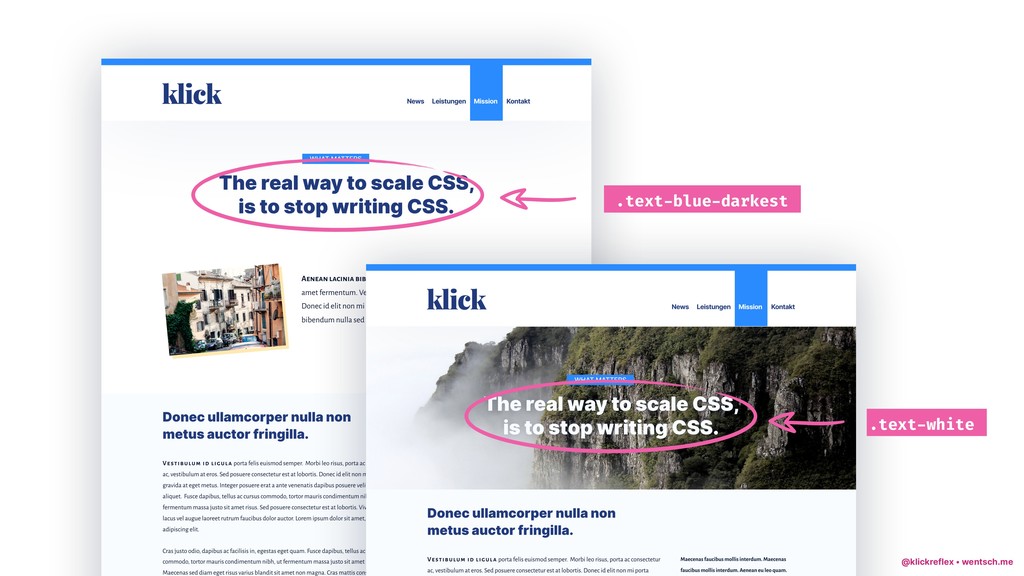
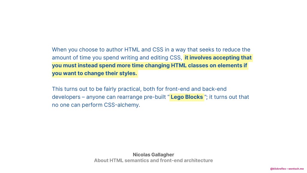
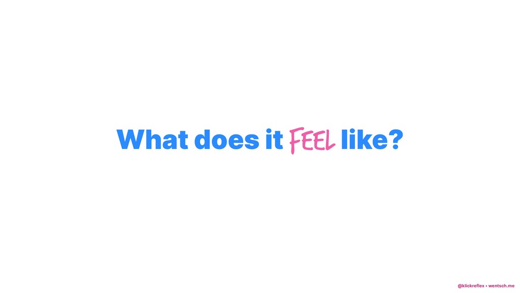
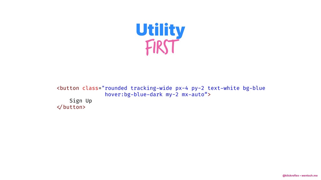
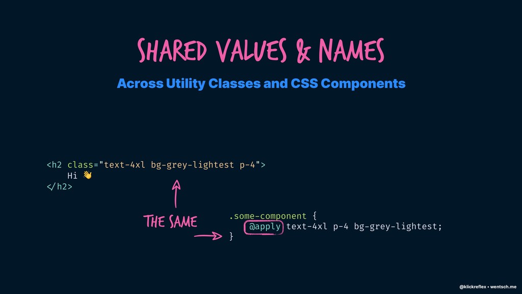
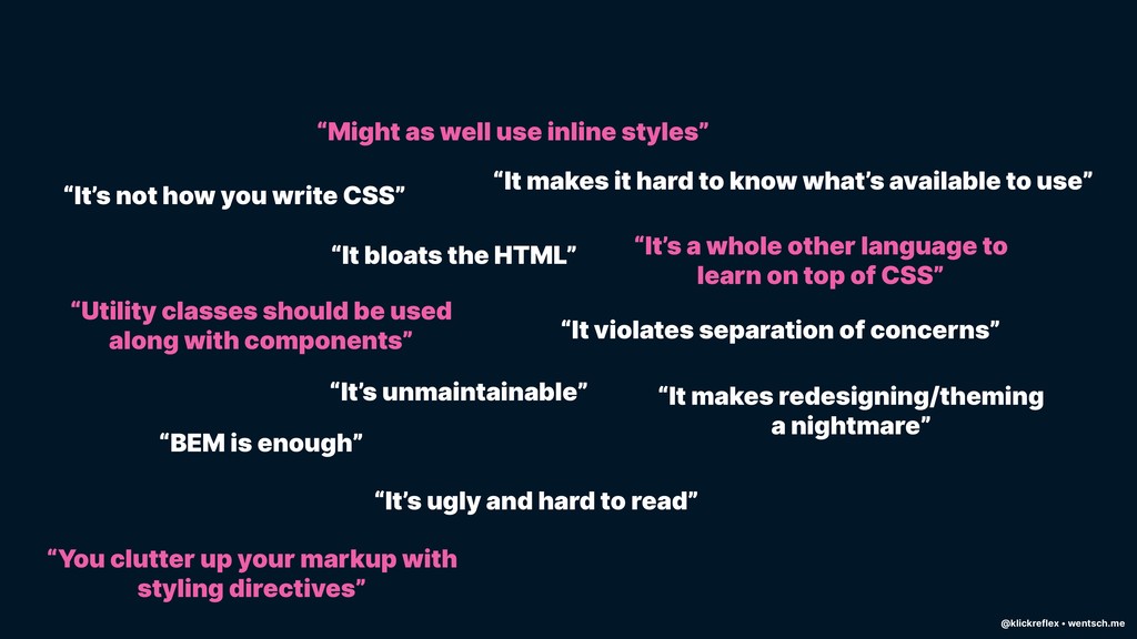
Like everybody else I was highly sceptical at first. Looking at class collections such as "f6 link dim br2 ph3 pv2 mb2 dib white bg-black" makes a lot of developers cringe – not only at first sight. But after digging deeper and seeing how some amazing people used the seemingly radical approach to their advantage got me convinced quickly.

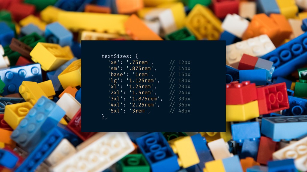
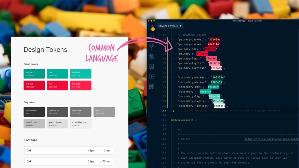
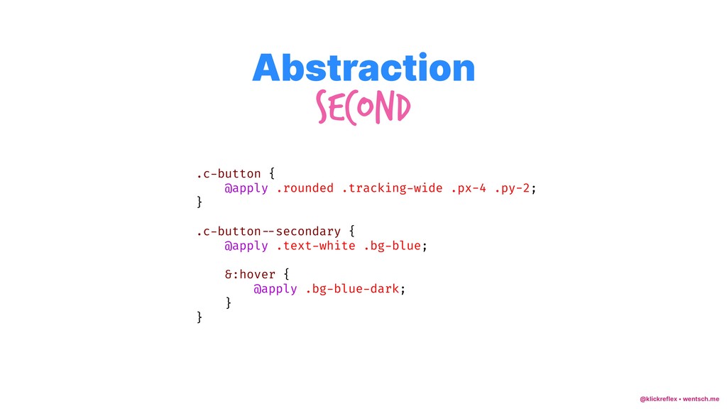
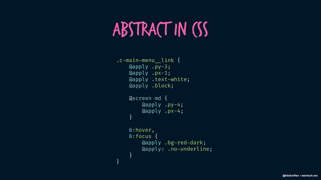
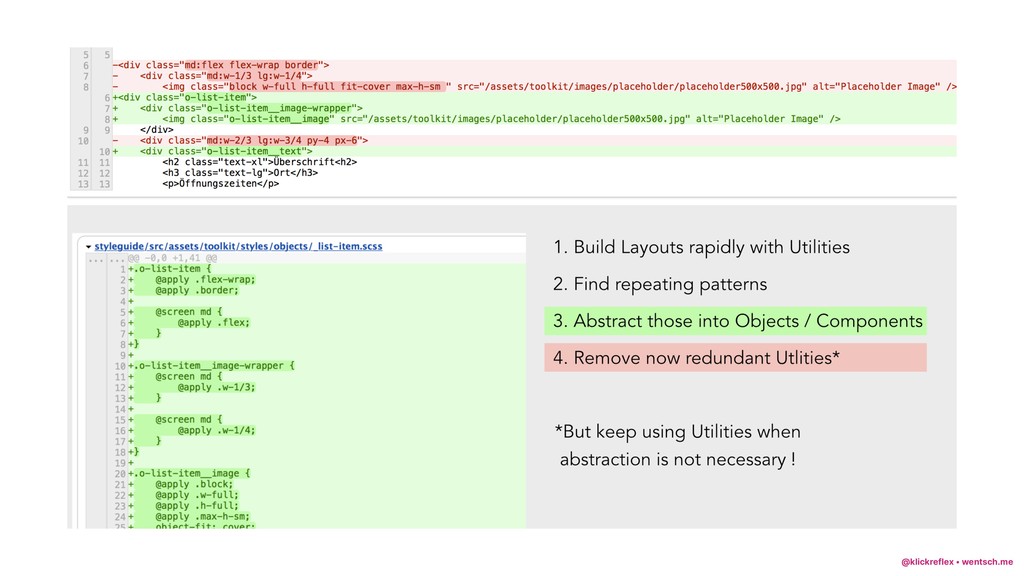
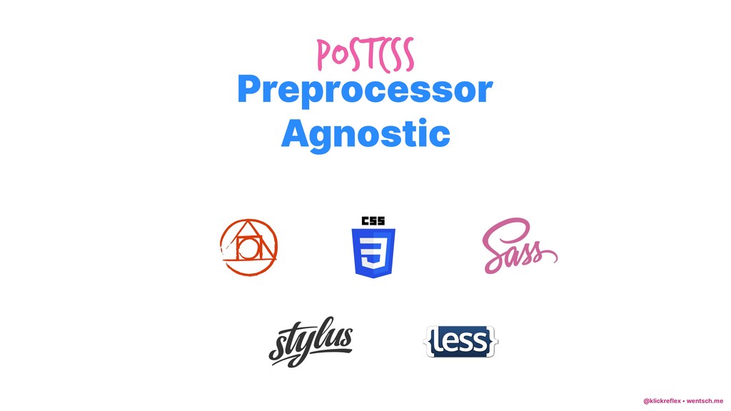
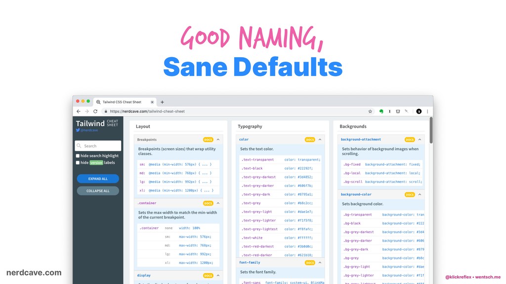
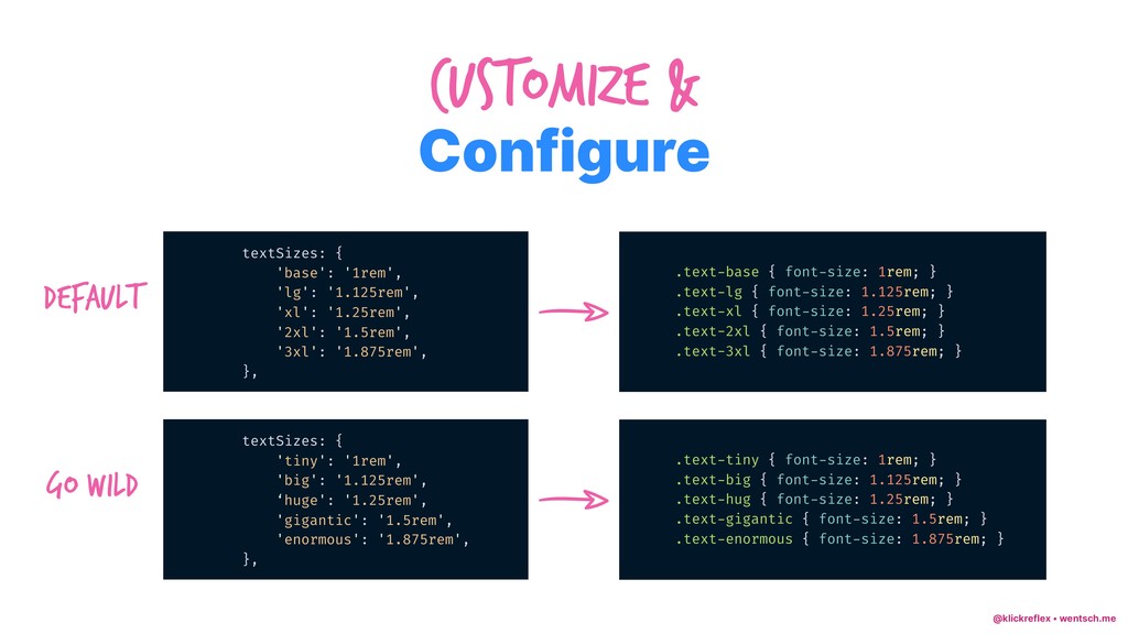
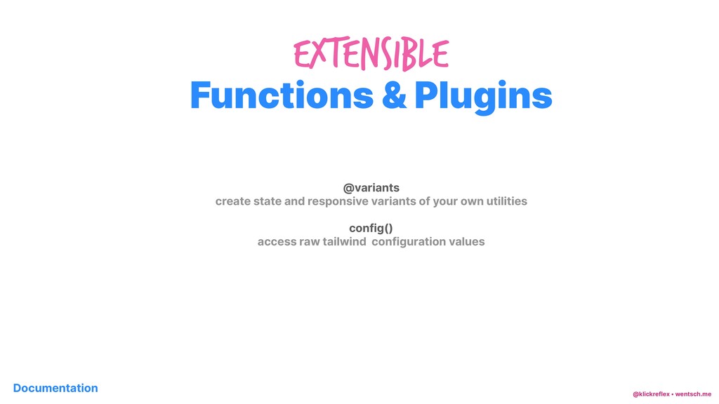
After doing my research on the available frameworks at the time I decided to patch together a mash-up that combined the things I liked best in various tools. Soon thereafter, TailwindCSS appeared on the scene and made me realize immediately that I could stop my efforts and use it. Because it solved everything I tried and a lot more. Great naming conventions, well defined default configuration, easy to expand, built with JavaScript, completely preprocessor-agnostic and equipped with tools to extract utilities into traditional BEM components it was love at first sight. And it's growing stronger the more I'm using it.

klickreflex

February 12, 2019
Tweet

Other Decks in Programming

Transcript

  1. @klickreflex • wentsch.me Hi Daniel ⌨ Frontend Code ✏ UX

    Design # Site Building $ land in sicht & freelance % Living Styleguides & Drupal, Neos, TYPO3, … work ' Structure & Consistency ( Connecting Design & Code focus
  2. @klickreflex • wentsch.me Hi Daniel Passionate About ❤ Friends &

    Family * Books ⛺ Outdoors & Camping , Running - Sustainability Toolbox
  3. @klickreflex • wentsch.me Goals & Assumptions Maintainability Flat Hierarchy Speed

    of Development Consistency Safe-to-Delete CSS Premature Abstraction Deep Nesting Context Switching Magic Numbers Append-only CSS As Safe as possible
  4. @klickreflex • wentsch.me Before I started doing both performance and

    user testing I did not like the idea of oocss/atomic css. Adam Morse, Creator of Tachyons CSS and Scalability
  5. @klickreflex • wentsch.me I rejected utility-first because it was implying

    my beloved and familiar approach wasn’t good anymore. Sarah Dayan In Defense of Utility First CSS
  6. @klickreflex • wentsch.me Sarah Dayan In Defense of Utility First

    CSS Since then, I’ve dived a lot deeper into the topic. 
 I studied design patterns and functional programming, and this allowed me to… radically revise my judgment.
  7. @klickreflex • wentsch.me Specificity wars & Append-only CSS .favorite {

    color: red; } .button --secondary.favorite { color: blue; } #product-27 .button --secondary.favorite { color: green; } #product-27 .contact-block .this-is:not(.cool) .button --secondary.favorite { color: red; }
  8. @klickreflex • wentsch.me Separation of Concerns „Separating Concerns“ <div class="news">

    <h2 class="news __title"> </h2> <p class="news __intro"> </p> </div>
  9. @klickreflex • wentsch.me Separation of Concerns „Mixing Concerns“ <div class="mt-4

    p-6 bg-grey-light text-blue-dark"> <h2 class="text-2xl md:text-3xl font-bold"> </h2> <p class="mt-6"> </p> </div>
  10. @klickreflex • wentsch.me Dependency Direction Separation of Concerns CSS that

    depends on HTML. HTML that depends on CSS. Mixing Concerns <div class="news"> <h2 class="news __title"> </h2> <p class="news __intro"> </p> </div> <div class="mt-4 p-6 bg-grey-light text-blue-dark"> <h2 class="text-2xl md:text-3xl font-bold"> </h2> <p class="mt-6"> </p> </div> Only works for „news“ Independent, reusable CLASses HTML is Restyleable With CSS Restyling needs HTML Change
  11. @klickreflex • wentsch.me The more a component does, or the

    more specific a component is, the harder it is to reuse. Adam Wathan CSS Utility Classes and "Separation of Concerns"
  12. @klickreflex • wentsch.me When you choose to author HTML and

    CSS in a way that seeks to reduce the amount of time you spend writing and editing CSS, it involves accepting that you must instead spend more time changing HTML classes on elements if you want to change their styles. This turns out to be fairly practical, both for front-end and back-end developers – anyone can rearrange pre-built “ Lego Blocks ”; it turns out that no one can perform CSS-alchemy. Nicolas Gallagher About HTML semantics and front-end architecture
  13. @klickreflex • wentsch.me textSizes: { 'xs': '.75rem', // 12px 'sm':

    '.875rem', // 14px 'base': '1rem', // 16px 'lg': '1.125rem', // 18px 'xl': '1.25rem', // 20px '2xl': '1.5rem', // 24px '3xl': '1.875rem', // 30px '4xl': '2.25rem', // 36px '5xl': '3rem', // 48px },
  14. @klickreflex • wentsch.me margin: { 'auto': 'auto', 'px': '1px', '0':

    '0', '1': '0.25rem', '2': '0.5rem', '3': '0.75rem', '4': '1rem', '5': '1.25rem', '6': '1.5rem', '8': '2rem', '10': '2.5rem', '12': '3rem', '16': '4rem', '20': '5rem', '24': '6rem', '32': '8rem', },
  15. @klickreflex • wentsch.me shadows: { default: '0 2px 4px 0

    rgba(0,0,0,0.10)', 'md': '0 4px 8px 0 rgba(0,0,0,0.12), 0 2px 4px 0 rgba(0,0,0,0.08)', 'lg': '0 15px 30px 0 rgba(0,0,0,0.11), 0 5px 15px 0 rgba(0,0,0,0.08)', 'inner': 'inset 0 2px 4px 0 rgba(0,0,0,0.06)', 'outline': '0 0 0 3px rgba(52,144,220,0.5)', 'none': 'none', },
  16. @klickreflex • wentsch.me Utility First <button class="rounded tracking-wide px-4 py-2

    text-white bg-blue hover:bg-blue-dark my-2 mx-auto“> Sign Up </button>
  17. @klickreflex • wentsch.me .c-button { @apply .rounded .tracking-wide .px-4 .py-2;

    } .c-button --secondary { @apply .text-white .bg-blue; &:hover { @apply .bg-blue-dark; } } Abstraction Second
  18. @klickreflex • wentsch.me Abstract in HTML <ul class="c-pagination-wrapper list-reset md:flex

    flex-wrap mx-auto md:-mx-4 max-w-sm md:max-w-none"> {% setcontent news = 'news' limit 3 orderby '-datecreated' allowpaging %} {% for post in news %} <li class="md:w-1/3 md:px-4 mb-8 text-center" data-newsitem="{{ loop.index }}"> <p class="mb-1">{{ post.datecreated|date("d.m.Y") }} </p> <h3 class="max-w-xs mx-auto text-red">{{ post.title }} </h3> <img class="lazy" data-src="{{ post.image|image(735, 490, 'c') }}" /> <noscript> <img class="w-full"src="{{ post.image|image(735, 490, 'c') }}" /> </noscript> {{ post.teaser }} </li> {% endfor %} {{ pager('news', 3, 'partials/_sub_pager_news.twig') }} </ul>
  19. @klickreflex • wentsch.me Abstract in HTML <?php function displaynice_preprocess(&$variables) {

    $variables['components']['spacing']['top']['none'] = 'mt-0'; $variables['components']['spacing']['top']['small'] = 'mt-2 md:mt-4'; $variables['components']['spacing']['top']['base'] = 'mt-4 md:mt-8'; $variables['components']['spacing']['top']['large'] = 'mt-8 md:mt-12 lg:mt-16'; $variables['components']['container'] = 'max-w-xl mx-auto px-4'; } <div class="{{ components.container }}"> {% if content.field_hero __title %} <h2 class="text-3xl sm:text-5xl">{{ content.field_hero __title }} </h2> {% endif %} {% if content.field_hero __text %} <div class="max-w-lg text-lg sm:text-2xl mt-1"> {{ content.field_hero __text }} </div> {% endif %} </div>
  20. @klickreflex • wentsch.me Abstract in CSS .c-main-menu __link { @apply

    .py-3; @apply .px-1; @apply .text-white; @apply .block; @screen md { @apply .py-4; @apply .px-4; } &:hover, &:focus { @apply .bg-red-dark; @apply: .no-underline; } }
  21. @klickreflex • wentsch.me .some-component { } @apply text-4xl p-4 bg-grey-lightest;

    Across Utility Classes and CSS Components Shared Values & Names <h2 class="text-4xl bg-grey-lightest p-4"> Hi 1 </h2>
  22. @klickreflex • wentsch.me .some-component { } @apply text-4xl p-4 bg-grey-lightest;

    Across Utility Classes and CSS Components Shared Values & Names <h2 class="text-4xl bg-grey-lightest p-4"> Hi 1 </h2> the same
  23. @klickreflex • wentsch.me Configure Customize & textSizes: { 'base': '1rem',

    'lg': '1.125rem', 'xl': '1.25rem', '2xl': '1.5rem', '3xl': '1.875rem', }, .text-base { font-size: 1rem; } .text-lg { font-size: 1.125rem; } .text-xl { font-size: 1.25rem; } .text-2xl { font-size: 1.5rem; } .text-3xl { font-size: 1.875rem; } Default textSizes: { 'tiny': '1rem', 'big': '1.125rem', ‘huge': '1.25rem', 'gigantic': '1.5rem', 'enormous': '1.875rem', }, .text-tiny { font-size: 1rem; } .text-big { font-size: 1.125rem; } .text-hug { font-size: 1.25rem; } .text-gigantic { font-size: 1.5rem; } .text-enormous { font-size: 1.875rem; } Go wild
  24. @klickreflex • wentsch.me Functions & Plugins ExtenSible @variants create state

    and responsive variants of your own utilities config() access raw tailwind configuration values Documentation
  25. @klickreflex • wentsch.me @variants responsive, hover, focus { .banana {

    fruit: 2; } .apple { fruit: 3; } } @variants directive
  26. @klickreflex • wentsch.me @variants responsive, hover, focus { .banana {

    fruit: 2; } .apple { fruit: 3; } } .banana { fruit: 2 } .apple { fruit: 3 } .hover\:banana:hover { fruit: 2 } .hover\:apple:hover { fruit: 3 } .focus\:banana:focus { fruit: 2 } .focus\:apple:focus { fruit: 3 } @media (min-width: 576px) { .sm\:banana { fruit:2 } .sm\:apple { fruit: 3 } .sm\:hover\:banana:hover { fruit: 2 @variants directive
  27. @klickreflex • wentsch.me Simple Tailwind Plugin module.exports = function (variants)

    { return function({ addUtilities }) { const boxSizing = { '.border-box': { boxSizing: 'border-box' }, '.content-box': { boxSizing: 'content-box' } } addUtilities(boxSizing, variants) } } require(‘tailwindcss-box-sizing’)({ variants: ['responsive', 'hover'], }), tailwind.config.js tailwind-box-sizing/index.js
  28. @klickreflex • wentsch.me www.purgecss.com Remove unused CSS const gulp =

    require('gulp') const purgecss = require('gulp-purgecss') gulp.task('purgecss', () => { return gulp .src('src/**/*.css') .pipe( purgecss({ content: ['src/**/*.html'] }) ) .pipe(gulp.dest('build/css')) })
  29. @klickreflex • wentsch.me “Might as well use inline styles” “It

    violates separation of concerns” “It bloats the HTML” “BEM is enough” “It’s a whole other language to learn on top of CSS” “It’s unmaintainable” “It’s ugly and hard to read” “It’s not how you write CSS” “It makes it hard to know what’s available to use” “Utility classes should be used along with components” “It makes redesigning/theming a nightmare” “You clutter up your markup with styling directives”
  30. @klickreflex • wentsch.me „Might as well Use Inline Styles“ <h2

    class="text-md lg:text-lg"> Media Queries <a class="bg-red hover:bg-blue"> Pseudo Classes <!-- Well defined options… --> <h2 class="text-xl"> </h2>" <!-- … vs. Arbitrary Magic Numbers --> <h2 style="font-size: 3.2528rem"> </h2> Consistency Central Changes
  31. @klickreflex • wentsch.me „You clutter up your DOM with styling

    directives“ This is true. But I don't have an argument for why that's bad other than that it is stylistically ugly. Which I agree with. But it's fast to render in the browser. And it also has helped me get dev teams to build responsive interfaces more quickly. And those are the things I care about: Adam Morse Creator of Tachyons Dev velocity and application performance.
  32. @klickreflex • wentsch.me “It’s a whole other language to learn

    on top of CSS” You can’t escape having to use a naming interface between your HTML and CSS Sarah Dayan In Defense of Utility-First CSS Ultimately, functional class names are easier to understand because they describe the style. You know what they do without having to lookup the actual styles, while semantic names force you to either look at the rendering or browse code.