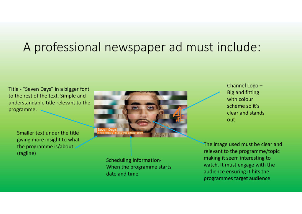
and fitting with colour scheme so it’s clear and stands out Title ‐ “Seven Days” in a bigger font to the rest of the text. Simple and understandable title relevant to the programme. Smaller text under the title giving more insight to what the programme is/about (tagline) Scheduling Information‐ When the programme starts date and time The image used must be clear and relevant to the programme/topic making it seem interesting to watch. It must engage with the audience ensuring it hits the programmes target audience
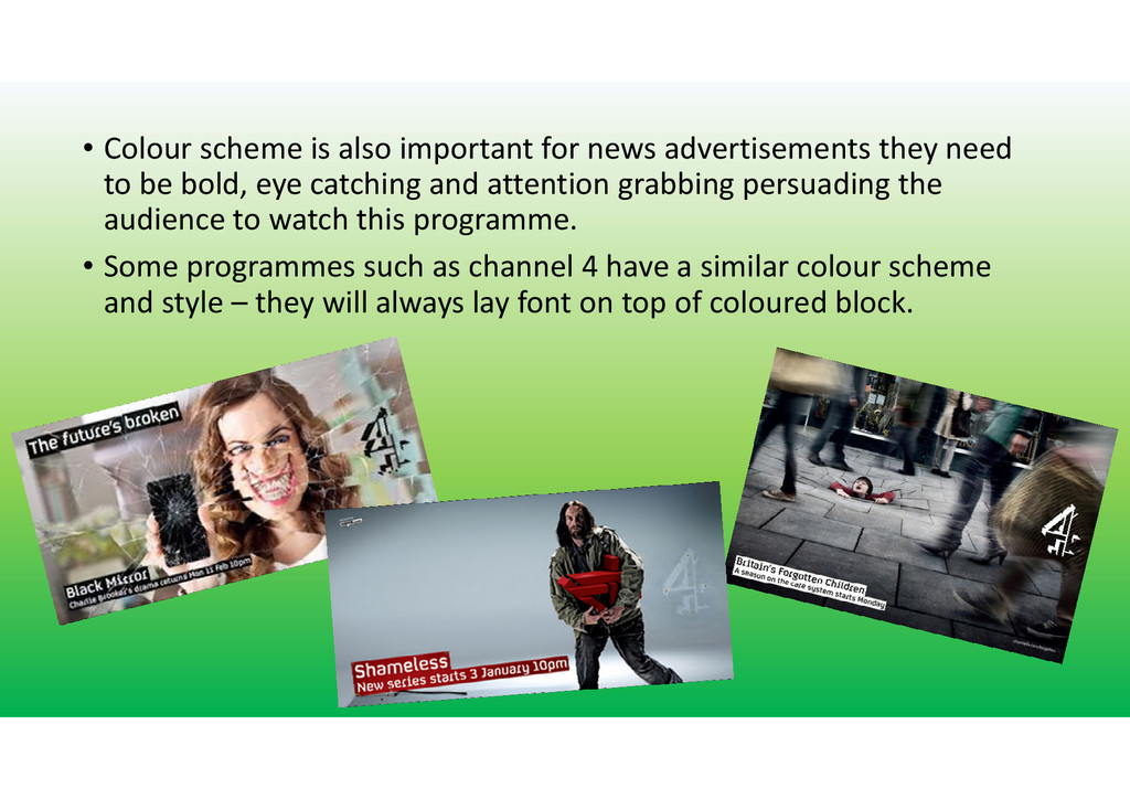
need to be bold, eye catching and attention grabbing persuading the audience to watch this programme. • Some programmes such as channel 4 have a similar colour scheme and style – they will always lay font on top of coloured block.


 laurensmith09
 tmiket
 jonoalderson
 mayunak
 garrettdimon
 kevinliebholz
 holman
 eitanlees
 keithpitt
 csswizardry
 inesmontani
 reverentgeek
 rkendrick25