Upgrade to Pro — share decks privately, control downloads, hide ads and more …

Moving The Design Process To The Browser @ WordCamp Europe 2016

Moving The Design Process To The Browser @ WordCamp Europe 2016

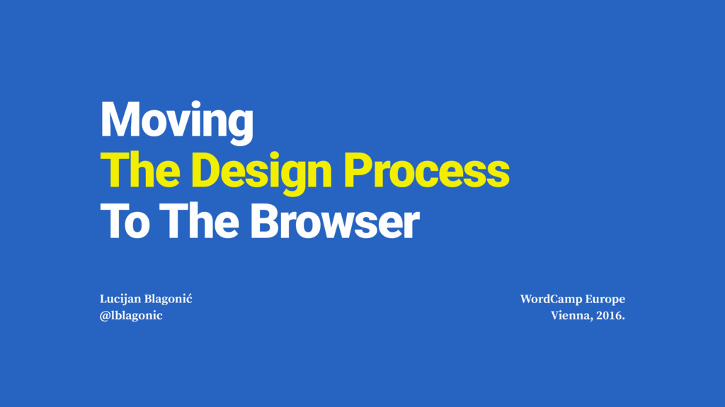
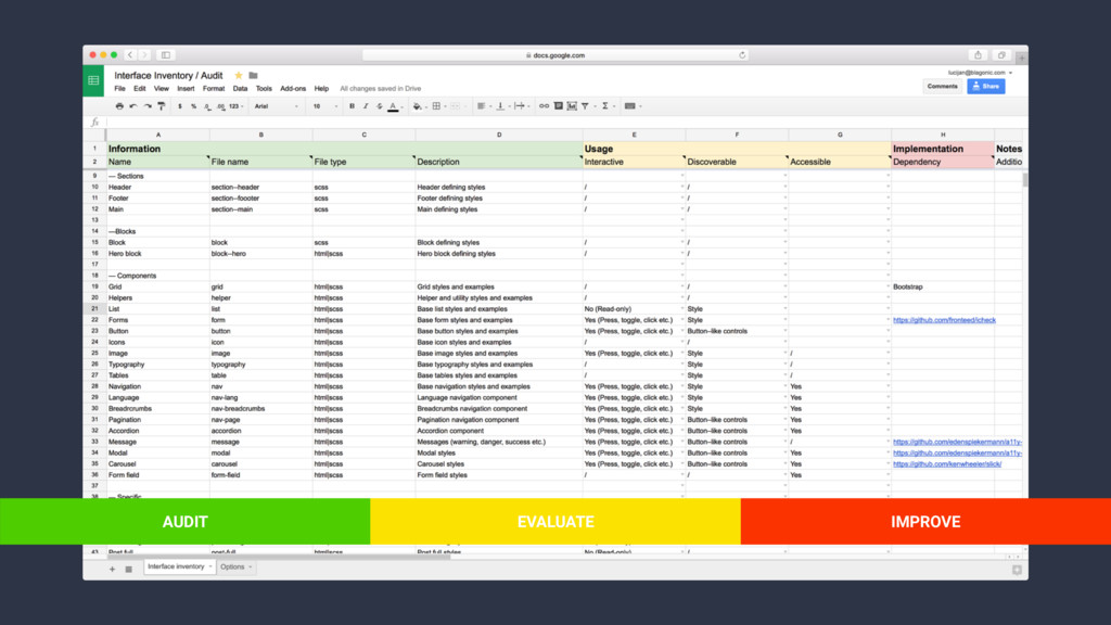
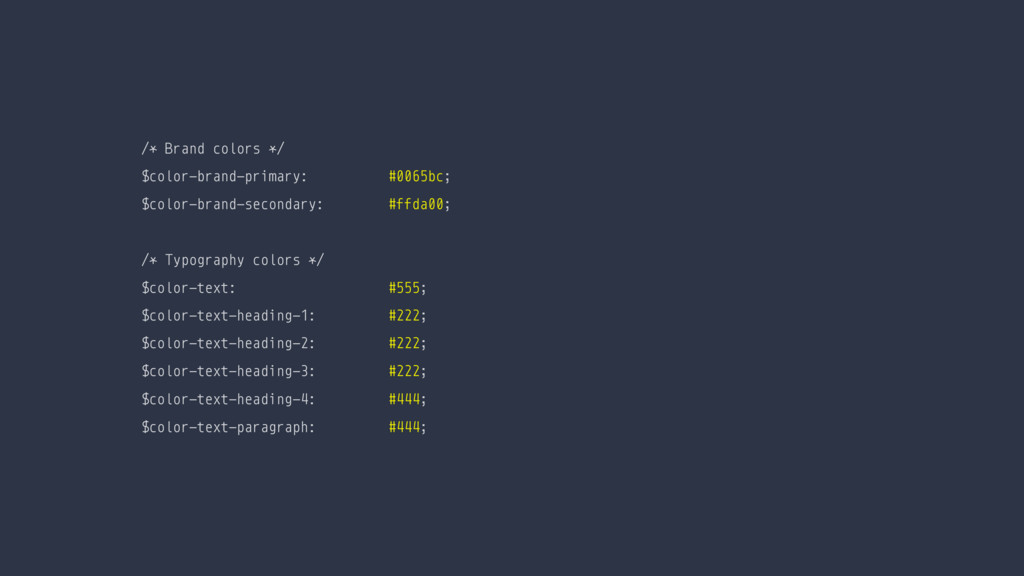
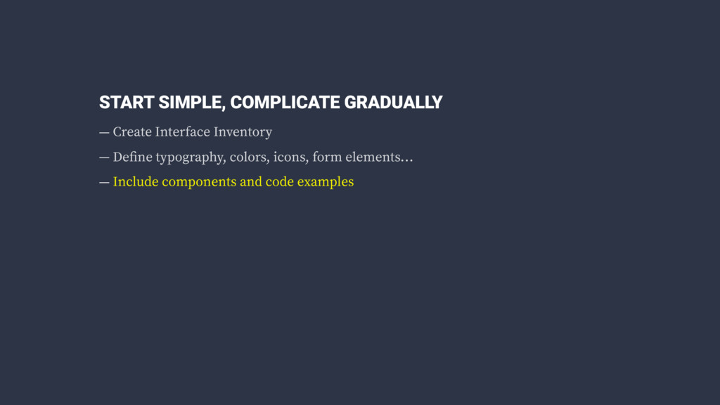
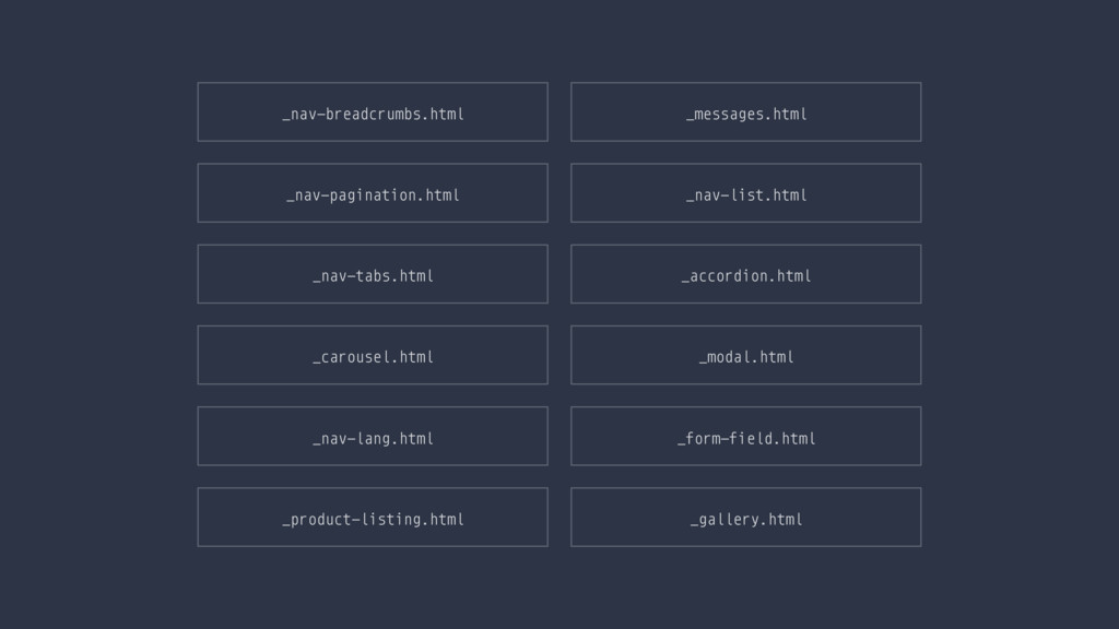
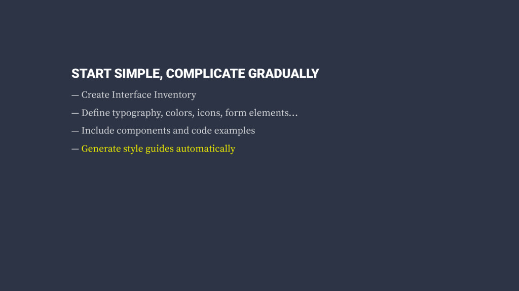
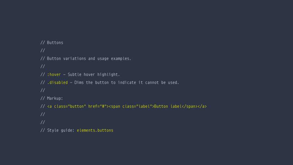
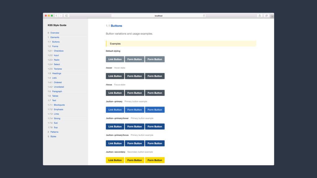
Responsive design has changed the way we think about designing websites — we have to cater to wide range of devices and interactions and adapt our design process accordingly. Learn about the benefits of utilizing style guides to establish a strong visual language which will help you design and code stand–alone modular components.

Lucijan Blagonić

June 26, 2016
Tweet

More Decks by Lucijan Blagonić

Other Decks in Design

Transcript

  1. Moving 
 The Design Process 
 To The Browser Lucijan

    Blagonić @lblagonic WordCamp Europe Vienna, 2016.
  2. STATIC DESIGN MOCKUPS — Unrealistic expectations — Limited interaction —

    Different screens and devices — Content: images and text
  3. STATIC DESIGN MOCKUPS — Unrealistic expectations — Limited interaction —

    Different screens and devices — Content: images and text — Single point of view
  4. Look at me — a barely readable text placed over

    a image. Looking good, until the image resizes on mobile, or tablet, or any other device with a different aspect ratio. Beautiful Image I’m Really Important Menu Cool Website
  5. Look at me — a barely readable text placed over

    a image. Looking good, until the image resizes on mobile, or tablet, or any other device with a different aspect ratio. Beautiful Image I’m Really Important Menu Cool Website
  6. ACTUAL USER CONCERNS — It takes too long to load

    — Text is not legible — It’s not keyboard accessible
  7. ACTUAL USER CONCERNS — It takes too long to load

    — Text is not legible — It’s not keyboard accessible — The touch targets are too small
  8. ACTUAL USER CONCERNS — It takes too long to load

    — Text is not legible — It’s not keyboard accessible — The touch targets are too small — There are no hover states
  9. ACTUAL USER CONCERNS — It takes too long to load

    — Text is not legible — It’s not keyboard accessible — The touch targets are too small — There are no hover states — It lags when I scroll (Parallax <3)
  10. ACTUAL USER CONCERNS — It takes too long to load

    — Text is not legible — It’s not keyboard accessible — The touch targets are too small — There are no hover states — It lags when I scroll (Parallax <3) …
  11. homepage.html _header.html _footer.html _carousel.html _form-search.html _product-listing.html _nav-header-menu.html _nav-footer-menu.html … product.html

    _product-listing.html _product-action.html _product-description.html _product-gallery.html _nav-header-menu.html _nav-footer-menu.html _nav-breadcrumbs.html …
  12. STYLE GUIDES — Changing the way we deliver design —

    Modular thinking — Visual consistency
  13. STYLE GUIDES — Changing the way we deliver design —

    Modular thinking — Visual consistency — Self–documented
  14. <!—— Product item component: _product-item.html ——> <div class="product-item @@product-style"> <h3

    class=“product-title">@@product-title</h3> <img src="@@product-image" alt="@@product-title" /> <p> <strong class="product-price">@@product-price</strong> <strong class="product-discount">@@product-discount</strong> </p> <a href=“#" class="button" title="Buy @@product-title">Buy now!</a> </div>
  15. <!—— Product item component: populated with data via gulp-file-include ——>

    @@include('./_product-item.html', { "product-style": “style-discount", "product-title": "Mug of Grog", "product-image": “mug-of-grog-small—01.jpg", "product-price": "$329" "product-discount": "$149", })
  16. Mug of Grog $329 $149 BUY NOW! Fabulous Idol $1249

    $999 BUY NOW! Banana Picker $249 BUY NOW! SALE SALE
  17. /* Brand colors */ $color-brand-primary: #0065bc; $color-brand-secondary: #ffda00; /* Typography

    colors */ $color-text: #555; $color-text-heading-1: #222; $color-text-heading-2: #222; $color-text-heading-3: #222; $color-text-heading-4: #444; $color-text-paragraph: #444;
  18. START SIMPLE, COMPLICATE GRADUALLY — Create Interface Inventory — Define

    typography, colors, icons, form elements… — Include components and code examples
  19. START SIMPLE, COMPLICATE GRADUALLY — Create Interface Inventory — Define

    typography, colors, icons, form elements… — Include components and code examples — Generate style guides automatically
  20. // Buttons // // Button variations and usage examples. //

    // :hover - Subtle hover highlight. // .disabled - Dims the button to indicate it cannot be used. // // Markup: // <a class="button" href="#"><span class="label">Button label</span></a> // // // Style guide: elements.buttons
  21. START SIMPLE, COMPLICATE GRADUALLY — Create Interface Inventory — Define

    typography, colors, icons, form elements… — Include components and code examples — Generate style guides automatically — Utilize browser tools for testing
  22. START SIMPLE, COMPLICATE GRADUALLY — Create Interface Inventory — Define

    typography, colors, icons, form elements… — Include components and code examples — Generate style guides automatically — Utilize browser tools for testing — Iterate + improve
  23. RESOURCES Collection of tools and articles for building style guides

    — Styleguides.io http://styleguides.io/ An In-Depth Overview Of Living Style Guide Tools — Smashing Magazine https://www.smashingmagazine.com/2015/04/an-in-depth-overview-of-living-style-guide-tools/ Documenting Interfaces Concept — Personal Blog (Polar North) http://polarnorth.org/blog/documenting-interfaces/ Has Design Become Too Hard — Article by Jeffrey Zeldman http://www.commarts.com/column/has-design-become-too-hard