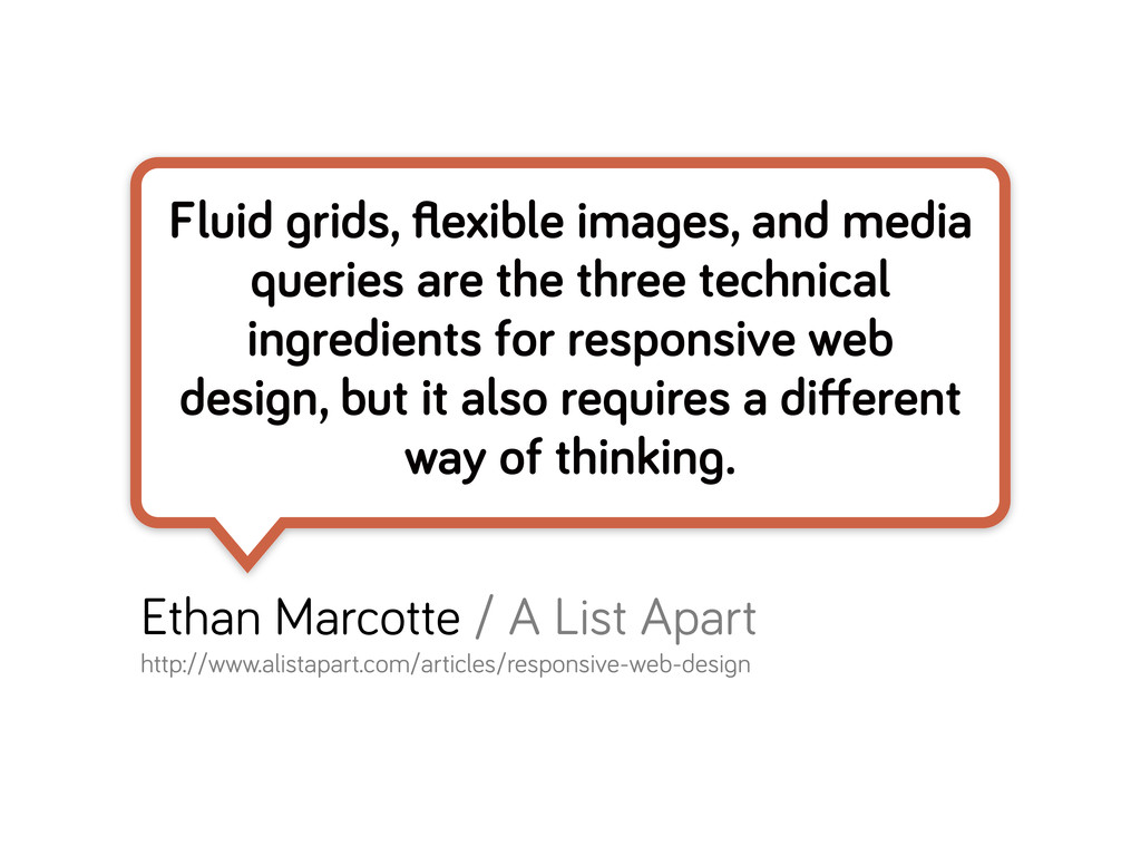
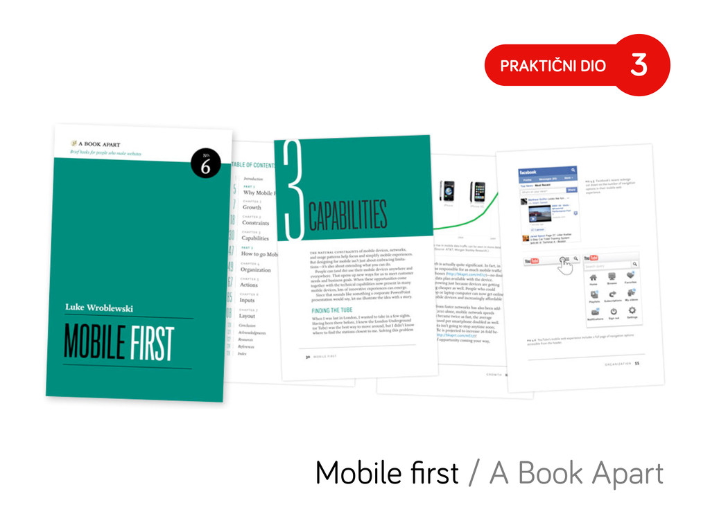
three technical in redients for responsive web desi n, but it also requires a different way of thinkin . Ethan Marcotte / A List Apart http://www.alistapart.com/articles/responsive-web-desi n
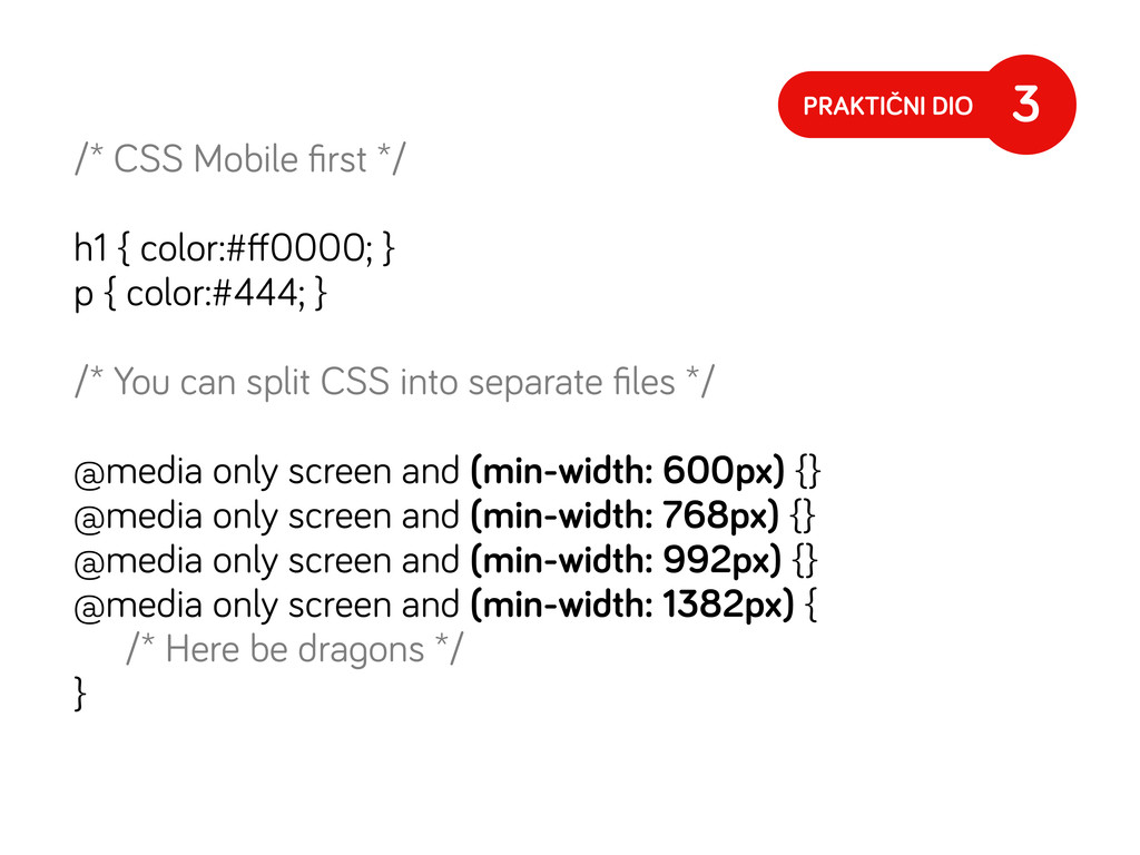
{ color:#444; } /* You can split CSS into separate files */ @media only screen and (min-width: 600px) {} @media only screen and (min-width: 768px) {} @media only screen and (min-width: 992px) {} @media only screen and (min-width: 1382px) { /* Here be dra ons */ } PRAKTIČNI DIO 3
https:// ist. ithub.com/3446599 */ @media only screen and (min-device-pixel-ratio: 1.3), only screen and (-webkit-min-device-pixel-ratio: 1.3), only screen and (-o-min-device-pixel-ratio: 13/10), only screen and (min-resolution: 120dpi) { /* Place code here */ } 7
 lucijanblagonic
 teba_eleven
 shotamatsuo
 r5ni4
r5ni4
 karad
karad
 sevendex
 kenichiota0711
 marzstarz
 tajima_kaho
 shosira
 sony
sony
 stmn
stmn
 littlebusters
 joshbly
 reverentgeek
 schroneko
 ivargrimstad
 productmarketing
 lauravandoore
 chriscoyier
 techseoconnect
 inesmontani
 axbom
axbom
 honzajavorek
 jdejongh
![Internet Explorer <!--[if lt IE 9]> 8](https://files.speakerdeck.com/presentations/3e8c0bf019070130cc261231380e44fa/slide_63.jpg)