Upgrade to Pro — share decks privately, control downloads, hide ads and more …

Responsive Images: ain't we there yet?

Responsive Images: ain't we there yet?

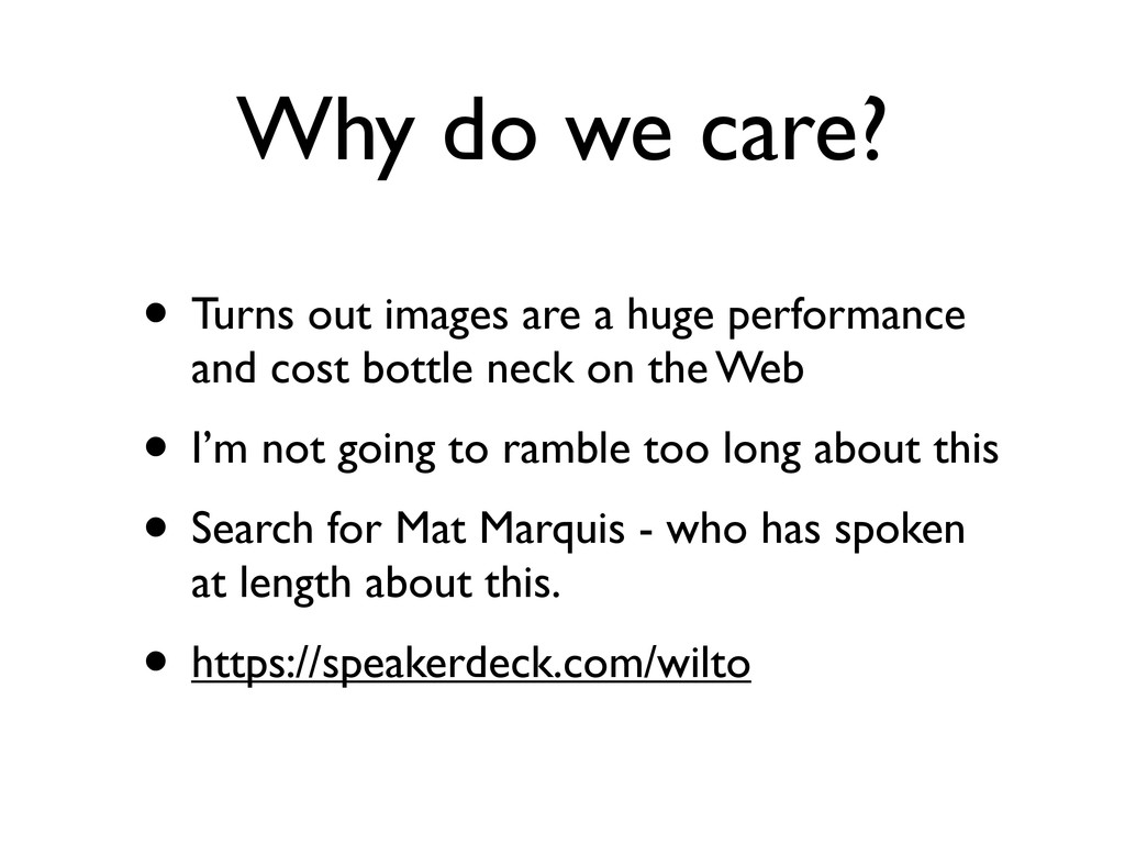
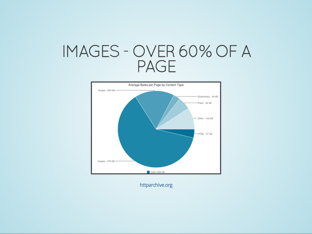
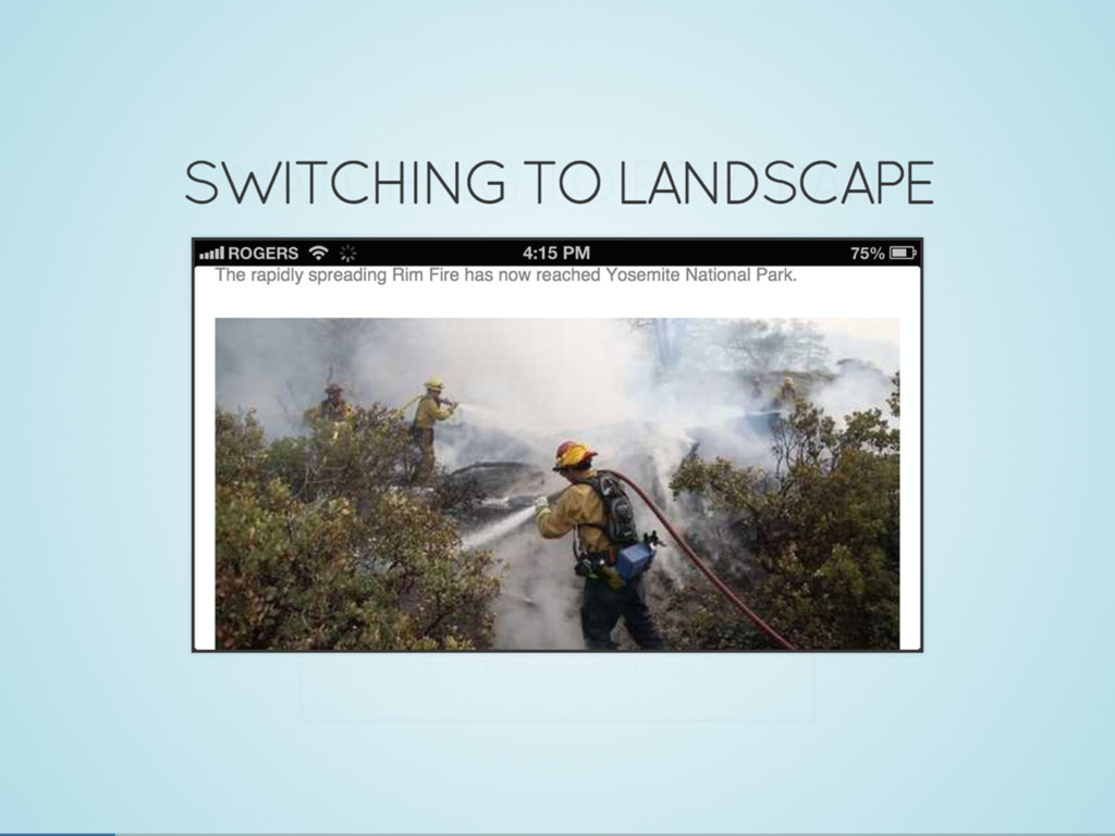
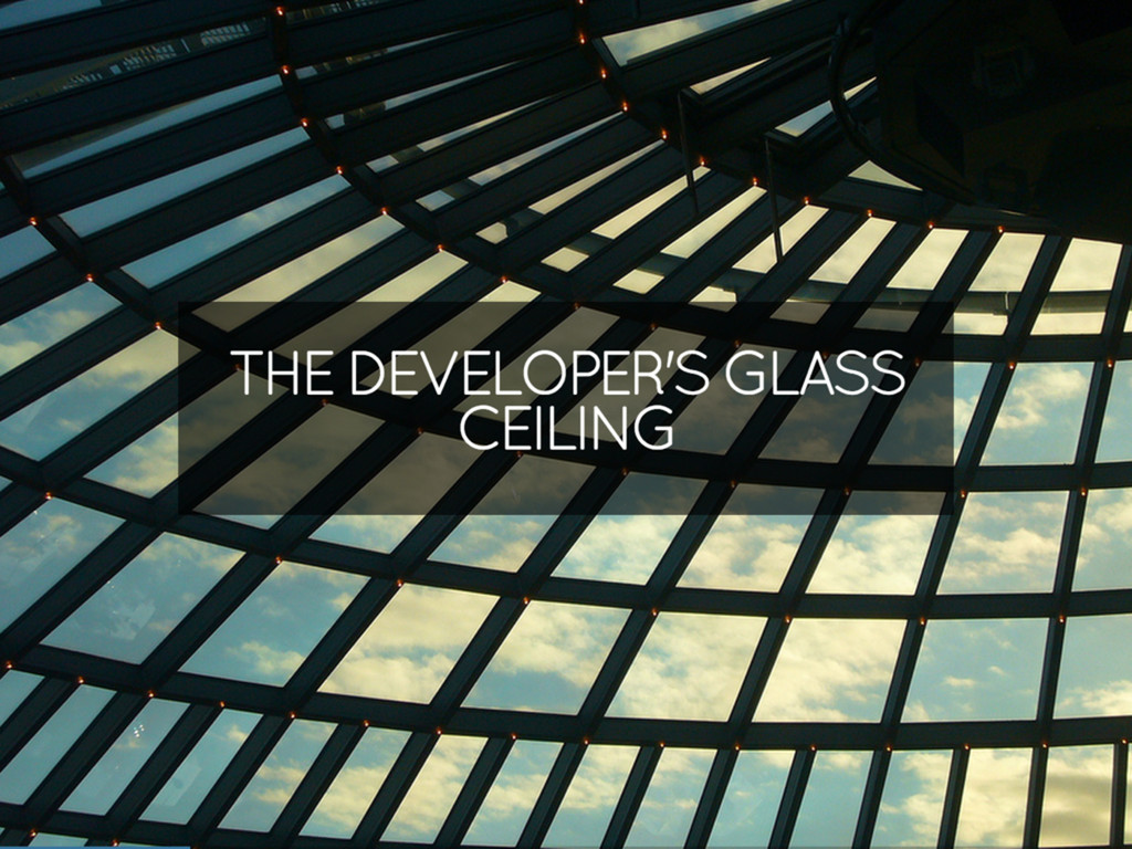
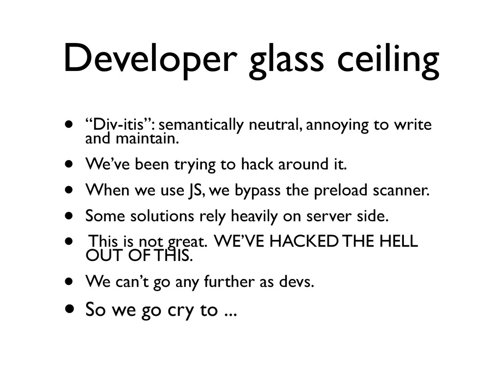
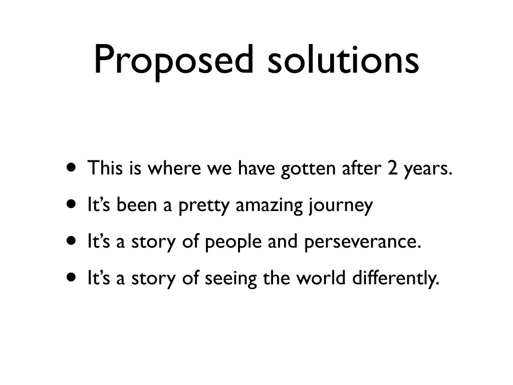
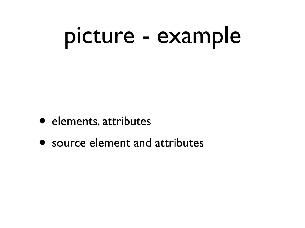
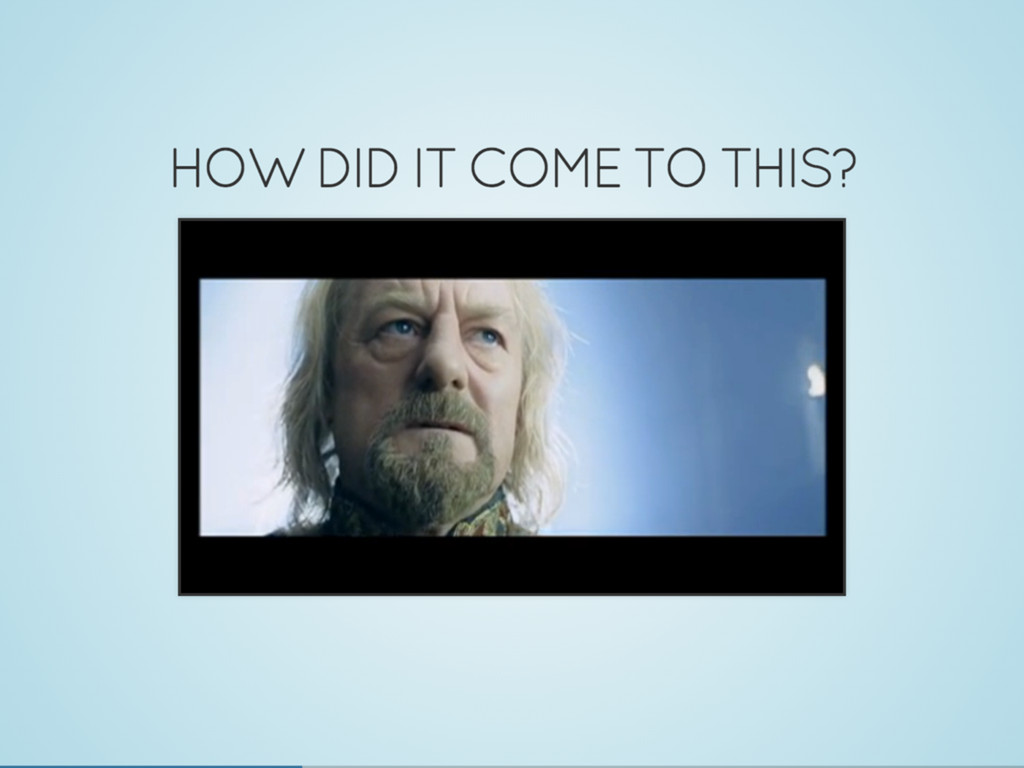
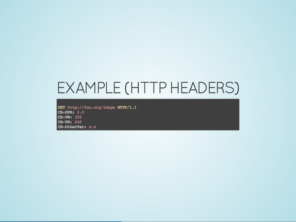
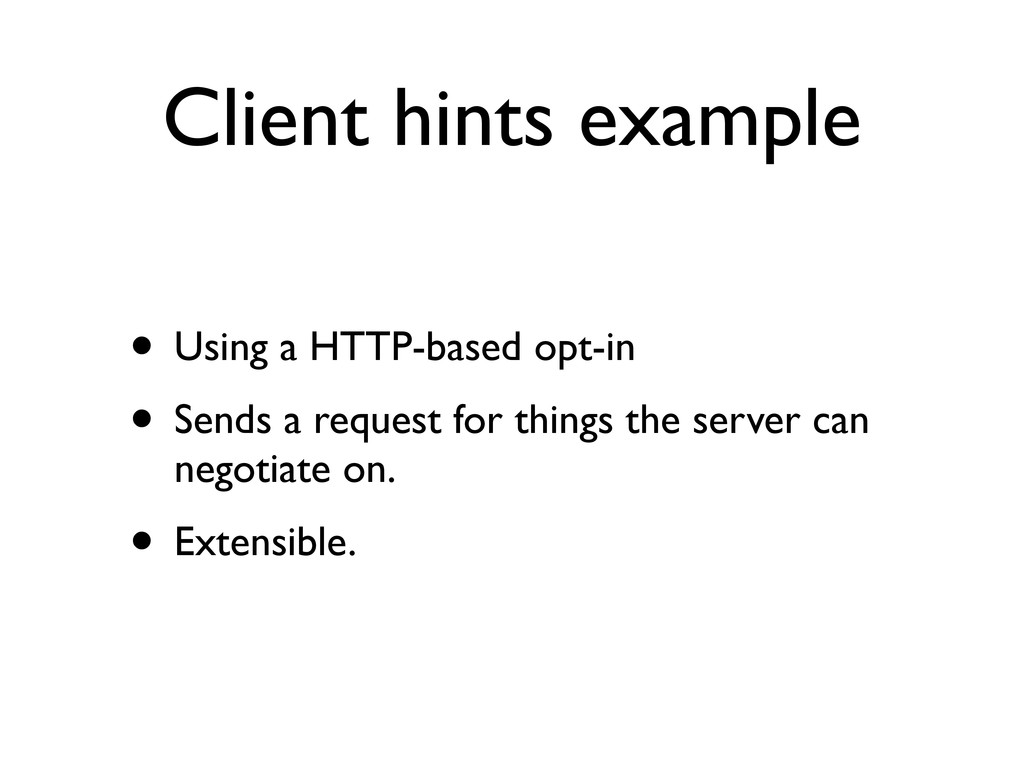
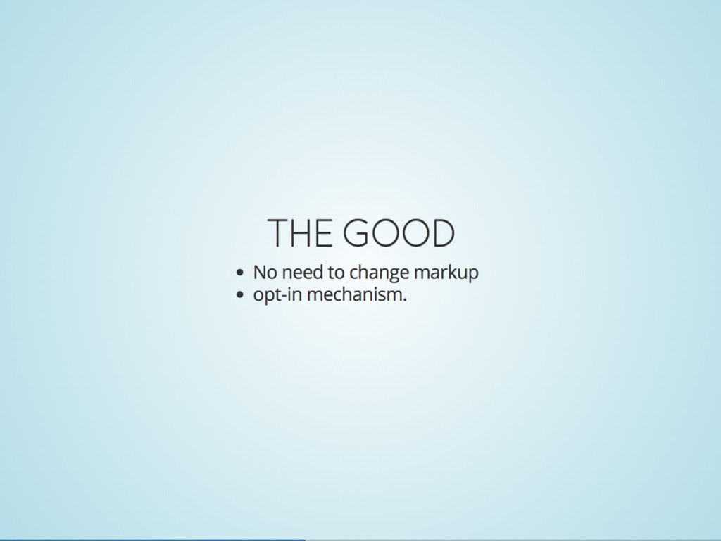
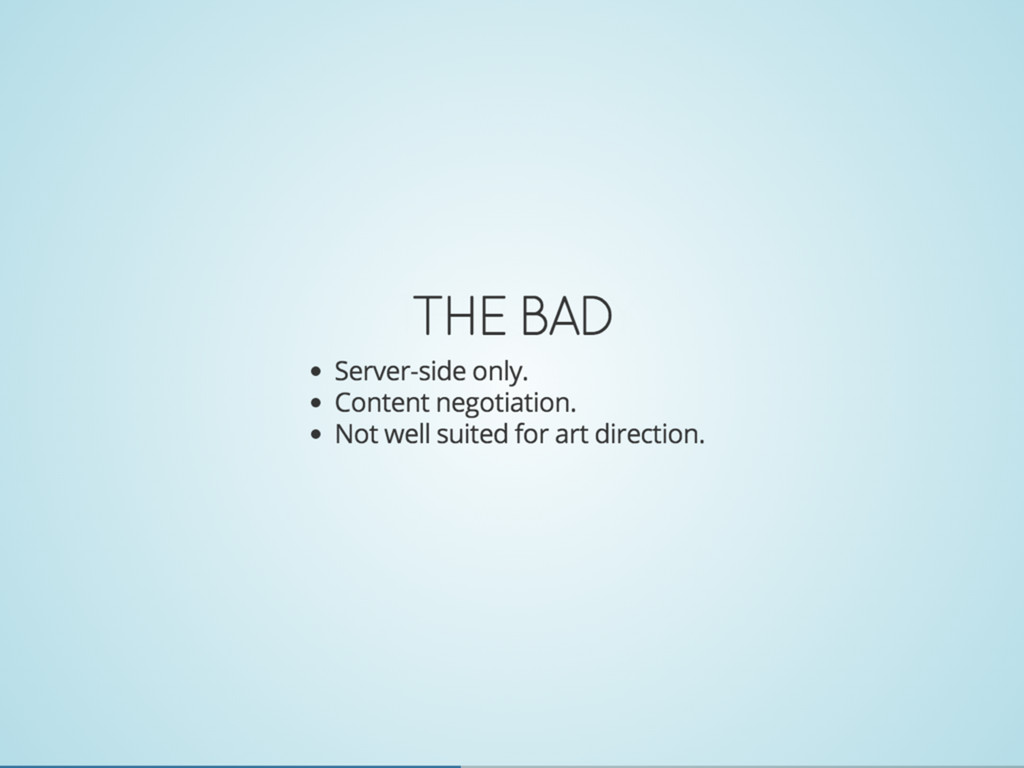
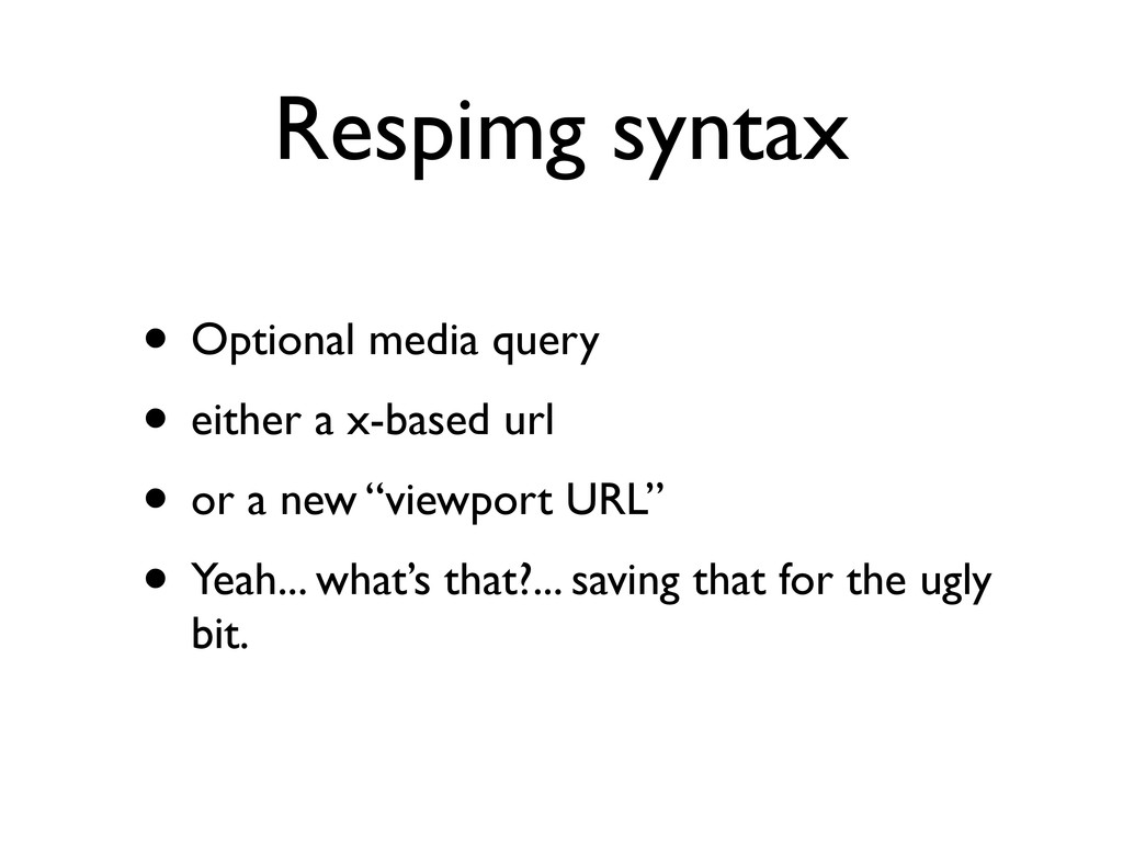
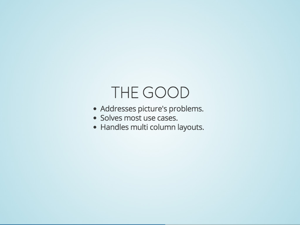
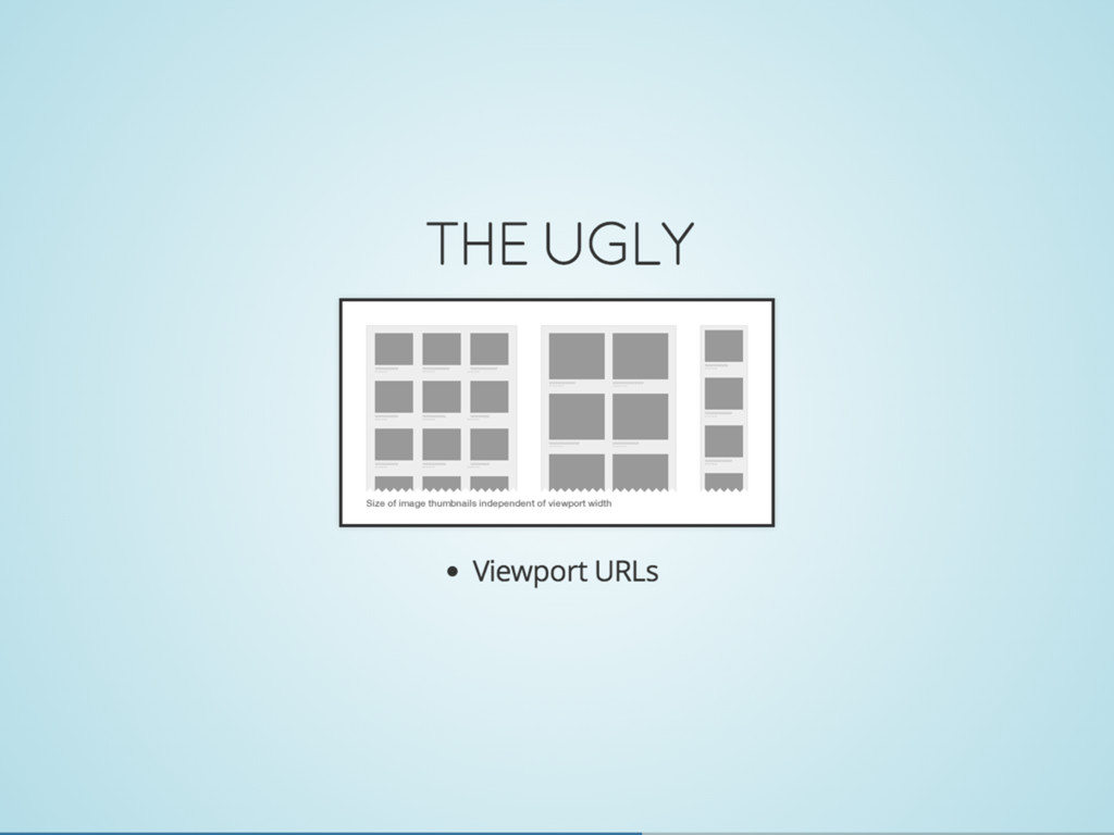
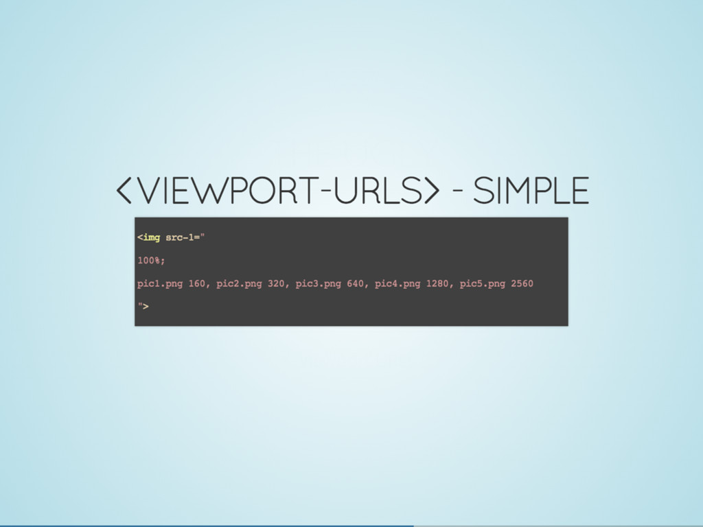
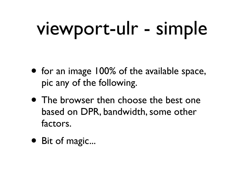
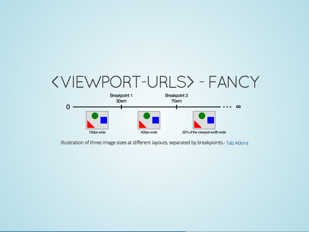
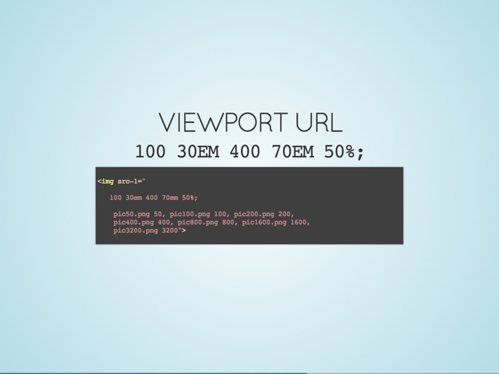
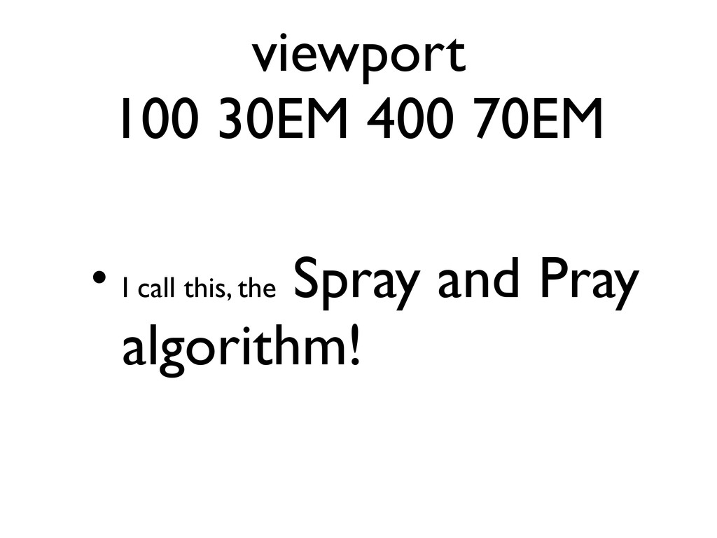
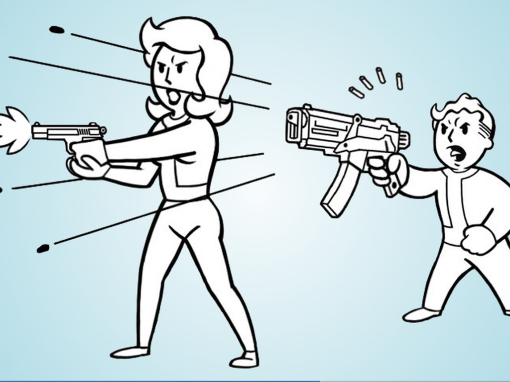
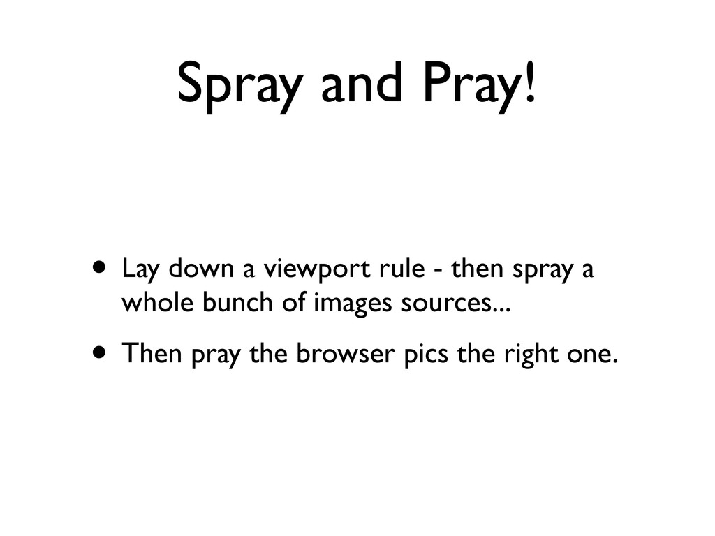
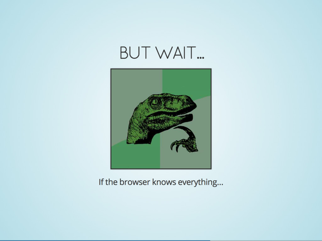
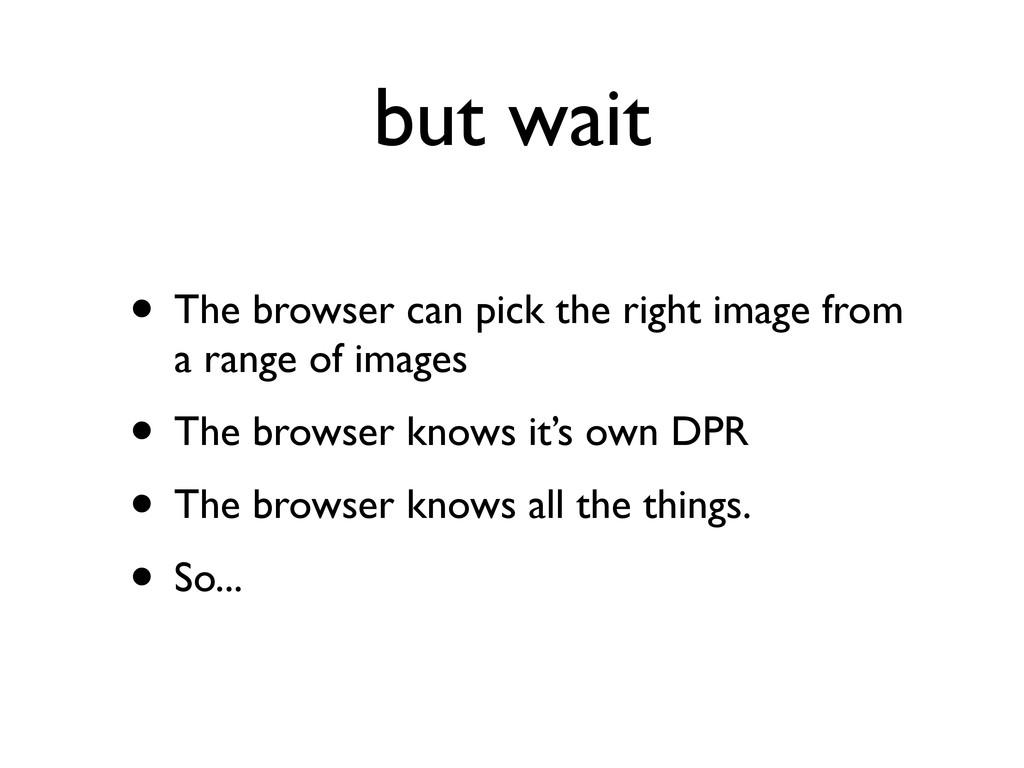
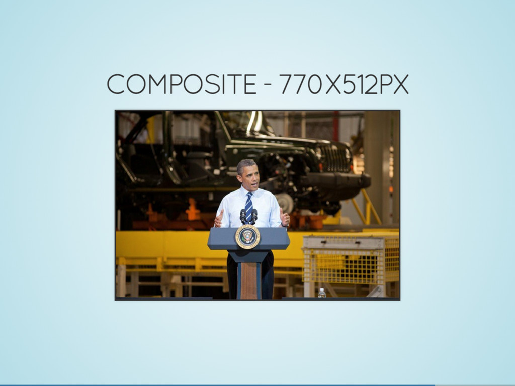
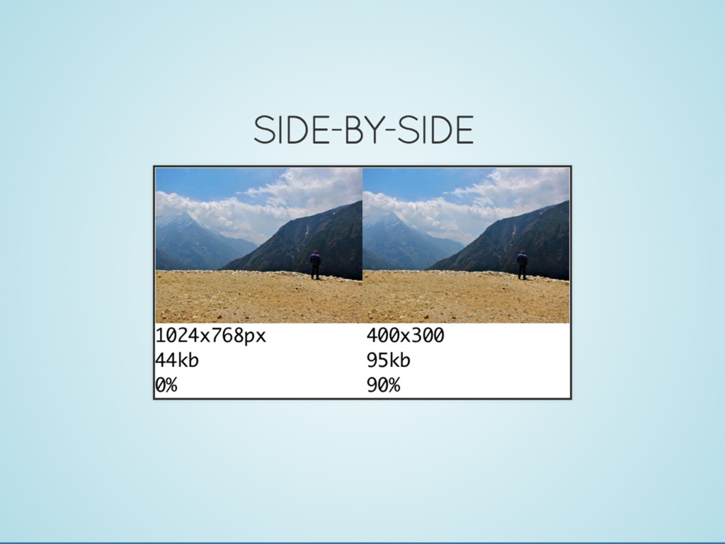
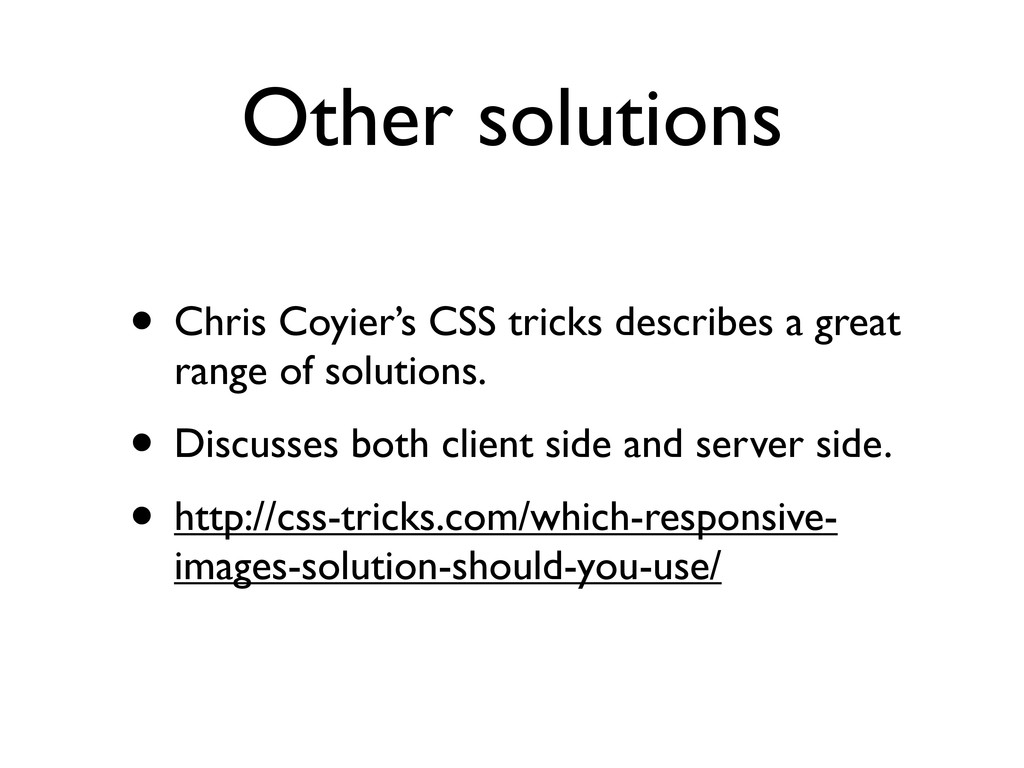
The debate around responsive images has been raging for about two years with seemingly limited traction from browser makers. Like anything Web, turns out that this problem is not as simple to solve as it first appears. To understand the complexities, we need to pop the hood of a browser and see how resources are requested without waiting for layout. Once we understand how a browser's handle image loading, we can then start discussing possible solutions — of which there are many right now on the table. It may turn out that we have most of the bits we need to do responsive images, but a standardised (in-browser) solution may still be needed.

Marcos Caceres

October 11, 2013
Tweet

More Decks by Marcos Caceres

Other Decks in Technology

Transcript

  1. • Platform Architect - Mozilla • Work on Web API

    team. • We try to standardize Firefox OS API at W3C. • Over the last year or so, been involved in W3C RICG. • Lead editor of use case and picture spec. About me
  2. RICG • 300+ members • Grass roots effort - We

    do all our work in Github, and IRC • Join us! (don’t worry, will remind you at end of talk too!)
  3. Why do we care? • Turns out images are a

    huge performance and cost bottle neck on the Web • I’m not going to ramble too long about this • Search for Mat Marquis - who has spoken at length about this. • https://speakerdeck.com/wilto
  4. images - over 60% • When compared to all other

    resources, images constitute, on average, +60% • Average page size is still increasing.
  5. RWD Conspiracy • Turns out that despite people taking up

    the RWD cause, we are still serving the same amount of data to both desktop and mobile. • Not always a bad thing! (probably a good thing!) • This can sometimes be wasteful (too much data for a little screen). • And can have a performance impact (e.g., sending all of jQuery).
  6. What are responsive images? • Images that correspond to a

    particular environment. • “Environment” is the the browsing context that the browser provides. • We interact with some of that environment through CSS and JS. • But other parts we cannot interface with - like user preferences. • To understand - let’s look at use cases.
  7. Use cases • Use cases is generally what we see

    people doing in the wild. • A big part of what the RICG does is collect use cases and try to understand them. • Having a good understanding of use cases allows us to formulate requirements.
  8. Stretchy images • The most common case is stretchy images.

    • You know, images that will stretch to fit some column of content. • This is usually done with the old “css-max- width” or “height”.
  9. Fitting different viewports • Can be tricky, as different viewports

    can accommodate images in different ways. • This image, by Paul Robert Lloyd, will serve a very purpose throughout this presentation.
  10. Device pixel ratio • What’s the DPR of it iphone?

    • How do we know that? • DPR is hard. • You need to understand the difference between a physical pixel, a device independent pixel, and a CSS pixel. • Zooming also affects DPR.
  11. Device pixel ratio 2 • Anyway, we know that having

    to upscale images can sometimes lead to crappy looking images. • We need to remember that when we are talking about image sizes • <img width and height> are in CSS pixels. • How those images appear on the screen depends on DRP
  12. Viewport matching • Generally means matching on width of the

    device • So, if your user’s resolution is 2560, you send something to match that size. • On desktop, it’s easy. • This gets funky when you add in DPR. • Device width + DPR. 200, 2x = 400px wide.
  13. Matching to portrait • This is example from the BCC

    • Generally, you target images to the way you assume your user’s prefer to consume content. • But this changes from one device to another.
  14. Switch to landscape • When switching to landscape, this can

    have severe effects • ... at least, if you care about image quality and not about global warming burning down Yosemite national park :)
  15. Art direction - crop • Art direction is the party-pooper

    use case. • It’s the elephant in the room. • It comes in two forms: crop / swap • Crop is easy to understand... • But for a crop, you don’t want to download the big image • Can potentially be done with CSS? Anyone?
  16. Art Direction - Swap • The more interesting case. •

    Based on some constraint or environmental. Not just landscape (viewport is also very common). • Used a lot of time with image + text placement.
  17. Other use cases • These are the lesser known •

    Print - beautiful printed documents! • File format support • eInk - contrast control.
  18. Use cases Doc • If you want to know more...

    • http://usecases.responsiveimages.org
  19. Developer glass ceiling • “Div-itis”: semantically neutral, annoying to write

    and maintain. • We’ve been trying to hack around it. • When we use JS, we bypass the preload scanner. • Some solutions rely heavily on server side. • This is not great. WE’VE HACKED THE HELL OUT OF THIS. • We can’t go any further as devs. • So we go cry to ...
  20. Standards bodies • This is painful and time consuming •

    Developers and browser vendors speak different languages • We both see the world differently • Declarative vs imperative • By the time you get here, you are probably going to be pretty pissed off. • 2 years, we made progress...
  21. Proposed solutions • This is where we have gotten after

    2 years. • It’s been a pretty amazing journey • It’s a story of people and perseverance. • It’s a story of seeing the world differently.
  22. The Good, bad, ugly • There is rarely a perfect

    solution. • There are always edge cases • For each of the proposed solutions, I want to show the good, the bad, the ugly • You would have seen some of these solutions before... • let’s start with...
  23. The picture element • Dubious origins - Bruce Lawson, but

    we’ve found earlier references. • It follows the <video> and <audio> element. • Relies on source and its attributes • http://picture.responsiveimages.org/
  24. The good • It covers the use cases: • art

    direction, dpr selection. • it does advanced use cases too (print, eInk, etc.) • Dev’s get it. Bruce designed it, right? So it’s going to be genius.
  25. The bad • Multiple elements are hard for browsers. •

    Mixes media queries and markup. • Some media queries can’t be evaluated until after layout. • If the source changes the height/width then you might end up in an infinite loop. • Doesn’t fully solve the problem... consider...
  26. The ugly • We know picture works ok with viewport

    selection, art direction... • But can can picture be used with stretchy layouts and flex box?
  27. Picture 95 • John Mellor from google tried to find

    out... • Why he works at Google and we don’t :) • Some notable things here: repetition of sizes over and over again. • I know what you are thinking...
  28. the srcset attribute • How did it come to this?

    • Note that the media query part was not really the problem • “srcset” doesn’t get the problem. • Let’s take a look at it...
  29. <img> • Sometimes we get so much into a problem

    that we don’t see if from every angle: • We are very used to markup, js, of c++ • This (<img src>) is what we really want! Not all that complex crap. • What if we approach the problem at another layer. • Think, the browser knows everything...
  30. Client Hints • HTTP-based solution. • It was created proposed

    by Ilya Grigorik. • It’s been in the works for about a year. • So how does it work?
  31. Client hints example • Using a HTTP-based opt-in • Sends

    a request for things the server can negotiate on. • Extensible.
  32. It’s all f%^$# • We need to go back to

    the drawing board • See if we can fix this...
  33. Drawing board • If we collapse picture back into and

    img element.. • And retain the source order as attributes...
  34. RESPIMG SYNTAX • Only proposed last week • Subject to

    change • Don’t get too excited - WHATWG not convinced. • Let’s take a look...
  35. Respimg syntax • Optional media query • either a x-based

    url • or a new “viewport URL” • Yeah... what’s that?... saving that for the ugly bit.
  36. The ugly • The viewport URLs are not particularly ugly.

    • Just a bit complicated to get at first.
  37. viewport-ulr - simple • for an image 100% of the

    available space, pic any of the following. • The browser then choose the best one based on DPR, bandwidth, some other factors. • Bit of magic...
  38. Spray and Pray! • Lay down a viewport rule -

    then spray a whole bunch of images sources... • Then pray the browser pics the right one.
  39. but wait • The browser can pick the right image

    from a range of images • The browser knows it’s own DPR • The browser knows all the things. • So...
  40. Responsive Image Container • Non-standard proposal... • Proposed by Friend

    of the RICG, Yoav Weiss • Or if we lovingly know it...
  41. Crystal ball • Don’t know what’s going to happen. •

    Probably want all of them. • Client hints is nice for CDNs and those that can do con-neg • src-n is nice as it covers most of the cases. • but srcset is simple... Come talk to me!
  42. Compress your images • Lost art - back in the

    96s we used to do this all the time. • Transition from dial-up to broadband. • Great tutorial on HTML5 rocks by Colt McAnlis
  43. Lazy - like me • What if you are lazy...

    I mean, a busy person? • Like me? This presentation is 20+mb! • Sorry if viewing on mobile! • Use a CDN or get the server to handle it • Pagespeed, Akamai, CDNConnect, free open source tools too (image chef).
  44. Compressive images • Originally research was done by Dann Jobsis

    • See: http://blog.netvlies.nl/design-interactie/ retina-revolution/ • Popularized by Filament group • Considered an abhorrent abomination by some... but, it’s what we got. • http://filamentgroup.com/lab/ rwd_img_compression/
  45. Compressed image • Yeah, I know you can’t see the

    artifacts on this big screen. • Anyway, again... careful with this. • Again, test it on mobile.
  46. Other solutions • Chris Coyier’s CSS tricks describes a great

    range of solutions. • Discusses both client side and server side. • http://css-tricks.com/which-responsive- images-solution-should-you-use/
  47. Join the RICG • If you are not happy with

    any solution, want to do better, then join us! • http://responsiveimages.org/ • We want people who are passionate about the problem • The RICG community is awesome! Community if friendly, helpful, diverse. • We do everything on GH. • We have something for everyone to do! • Here are some of our current projects....
  48. Sizer Soze • Latest project from Yoav Wiess. • It

    tells you how many bytes you are wasting. • Collaboration with many folks to give this tool a front end. • Again, if you have ideas - it’s a good place to hang out.
  49. x-picture (x-src-n?) • We are also trying to work on

    a web components version. • Working with the awesome guys from national geographic • Going to bug Angelina Fabbro to help us! :)