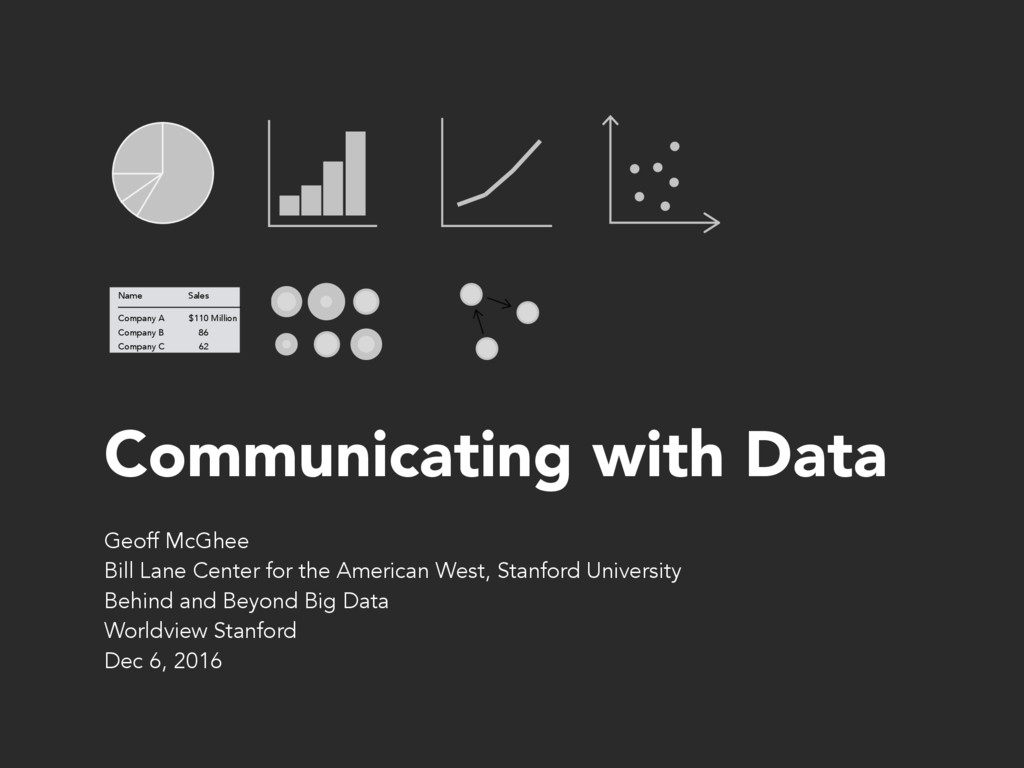
86 62 Sales Name Million Geoff McGhee Bill Lane Center for the American West, Stanford University Behind and Beyond Big Data Worldview Stanford Dec 6, 2016
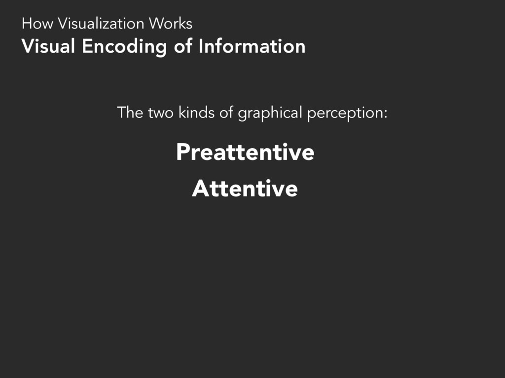
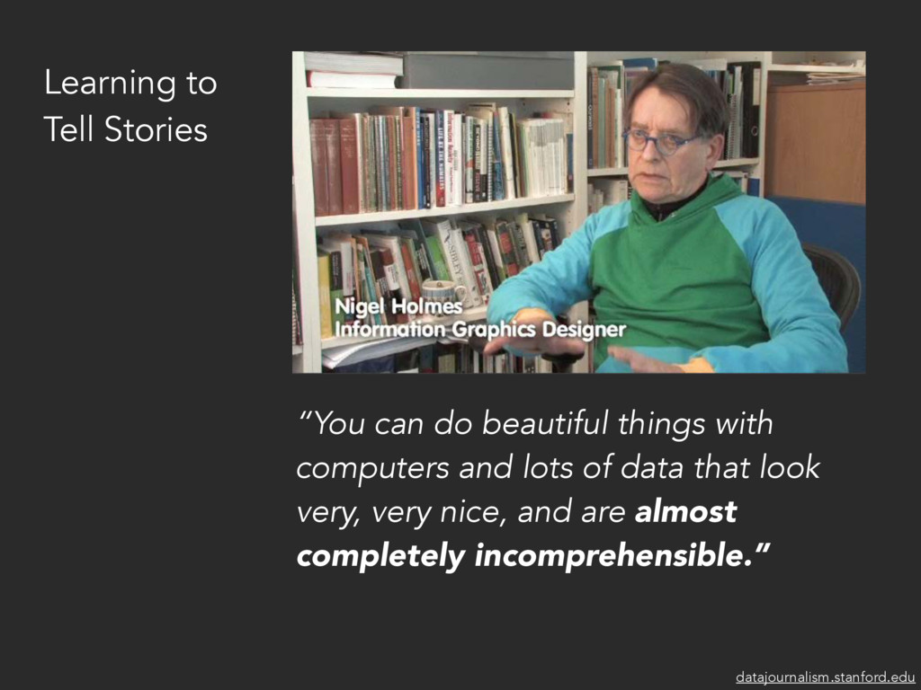
and presentation • New players and skillsets are joining newsrooms • We need to learn more about telling stories with data • Good tools for narrative visualization don’t exist yet Journalism in the Age of Data (2010) datajournalism.stanford.edu
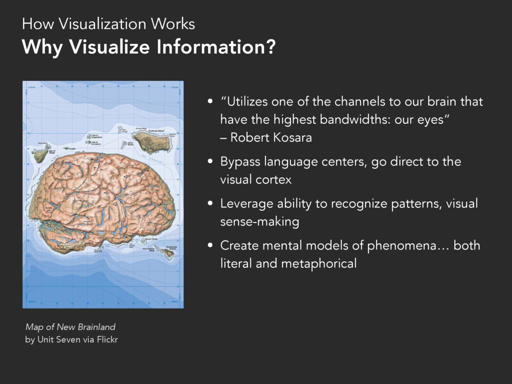
have the highest bandwidths: our eyes” – Robert Kosara • Bypass language centers, go direct to the visual cortex • Leverage ability to recognize patterns, visual sense-making • Create mental models of phenomena… both literal and metaphorical Map of New Brainland by Unit Seven via Flickr How Visualization Works Why Visualize Information?
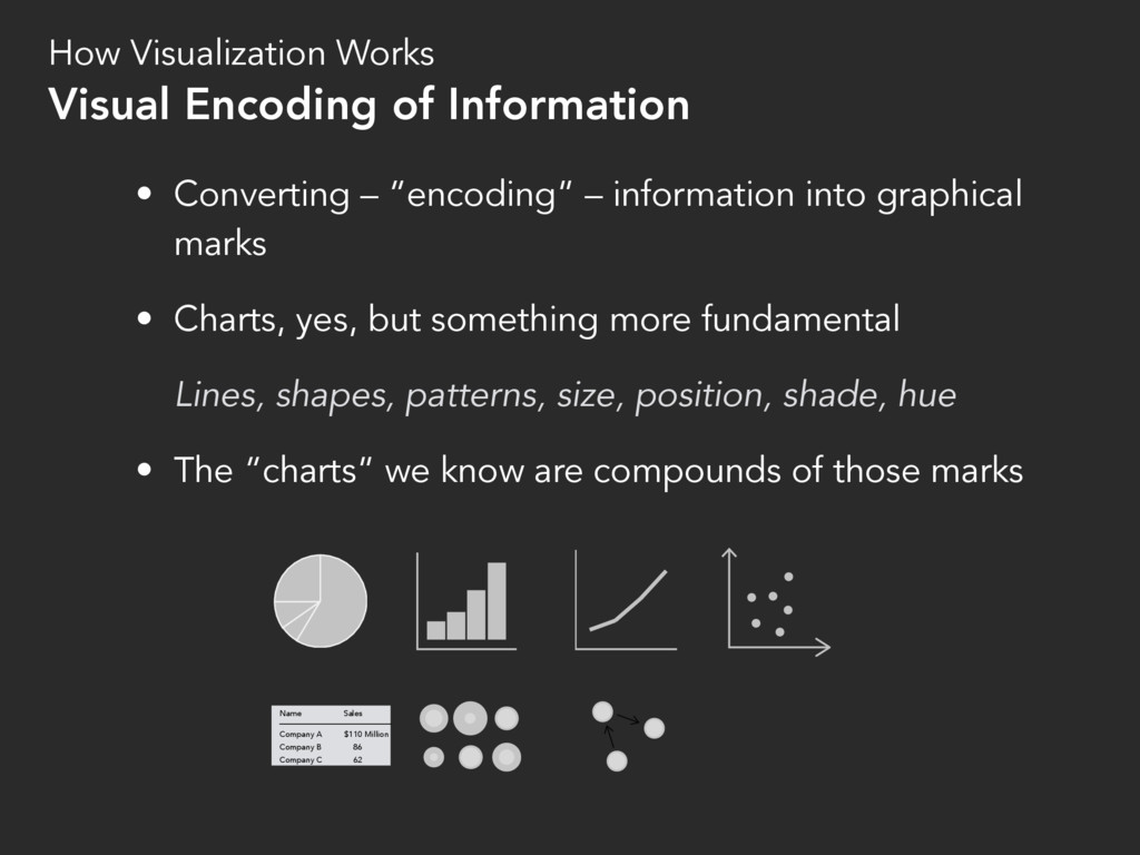
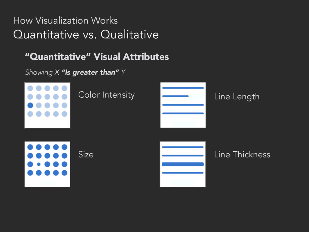
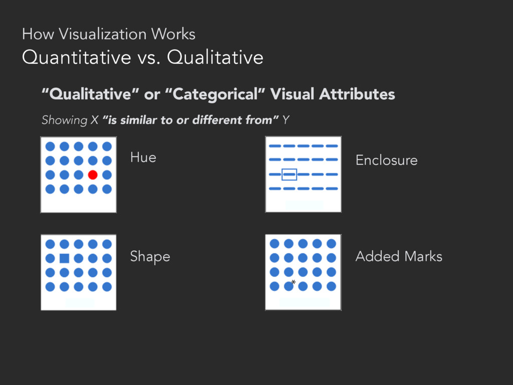
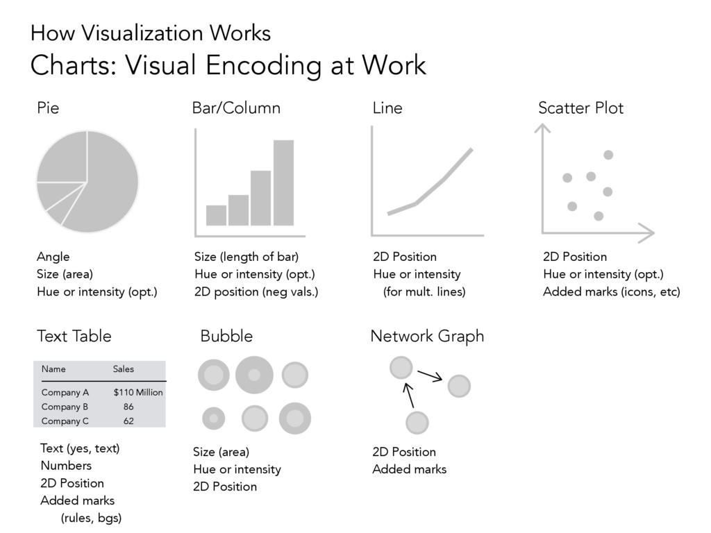
Charts, yes, but something more fundamental Lines, shapes, patterns, size, position, shade, hue • The “charts” we know are compounds of those marks How Visualization Works Visual Encoding of Information Company A Company B Company C $110 86 62 Sales Name Million
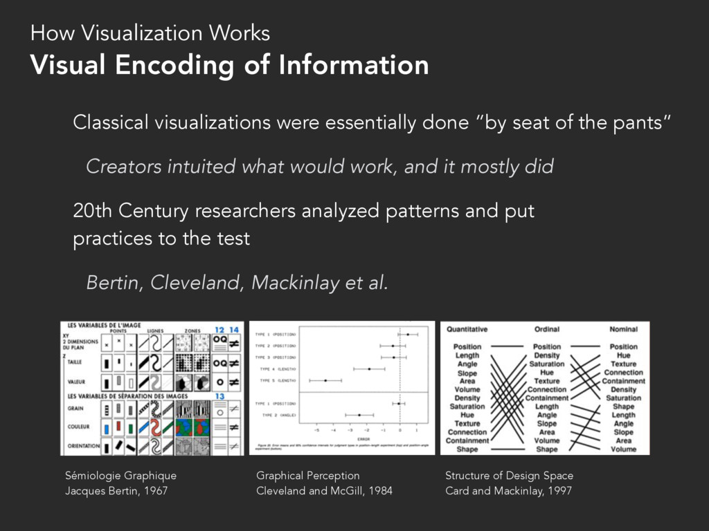
Creators intuited what would work, and it mostly did 20th Century researchers analyzed patterns and put practices to the test Bertin, Cleveland, Mackinlay et al. How Visualization Works Visual Encoding of Information Sémiologie Graphique Jacques Bertin, 1967 Graphical Perception Cleveland and McGill, 1984 Structure of Design Space Card and Mackinlay, 1997
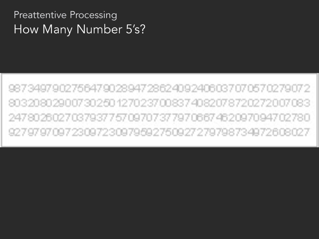
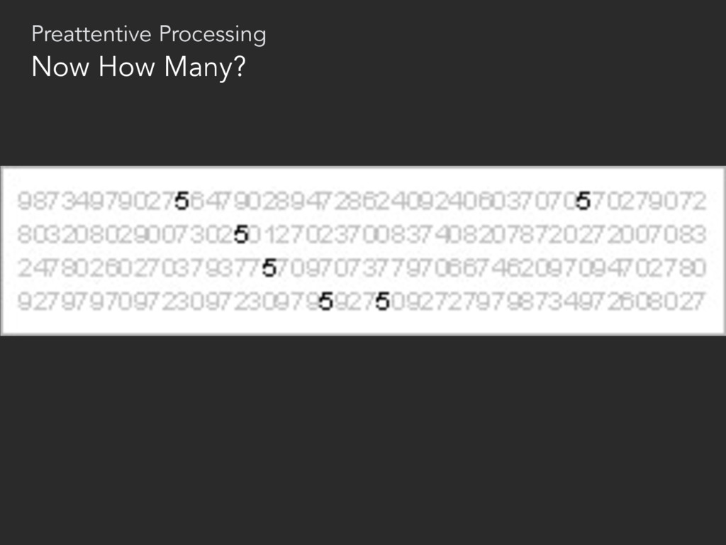
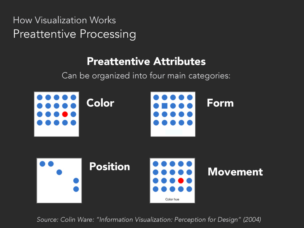
SHAPE differences • First example required reading, because complex shape of a numeral like “5” is an attentive attribute. • Second example: “5’s” are clearly visible when we highlight them in a different shade. Intensity of color is a preattentive attribute. This rapidly occurs below the level of consciousness. • When you find yourself actually reading a chart to try to understand what it says, that’s attentive processing Preattentive Processing How Visualization Works
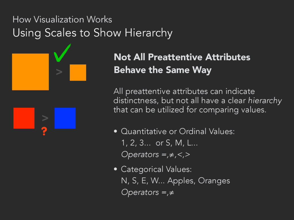
attributes can indicate distinctness, but not all have a clear hierarchy that can be utilized for comparing values. • Quantitative or Ordinal Values: 1, 2, 3... or S, M, L... Operators =,≠,<,> • Categorical Values: N, S, E, W... Apples, Oranges Operators =,≠ > > ? Using Scales to Show Hierarchy How Visualization Works
(length of bar) Hue or intensity (opt.) 2D position (neg vals.) Line 2D Position Hue or intensity (for mult. lines) Scatter Plot 2D Position Hue or intensity (opt.) Added marks (icons, etc) Company A Company B Company C $110 86 62 Sales Name Million Text Table Text (yes, text) Numbers 2D Position Added marks (rules, bgs) Bubble Size (area) Hue or intensity 2D Position Network Graph 2D Position Added marks How Visualization Works Charts: Visual Encoding at Work
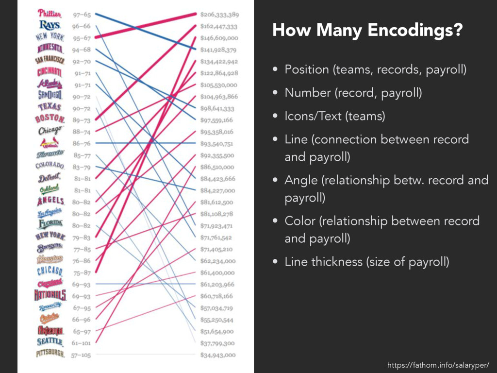
Icons/Text (teams) • Line (connection between record and payroll) • Angle (relationship betw. record and payroll) • Color (relationship between record and payroll) • Line thickness (size of payroll) How Many Encodings? https://fathom.info/salaryper/
something more like a medium, something that can be used to tell stories, and to do all of the things that a medium can do, to delight and inspire...” – Eric Rodenbeck, Journalism in the Age of Data (2010) datajournalism.stanford.edu
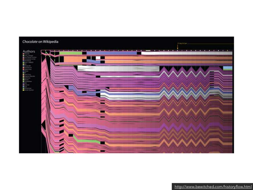
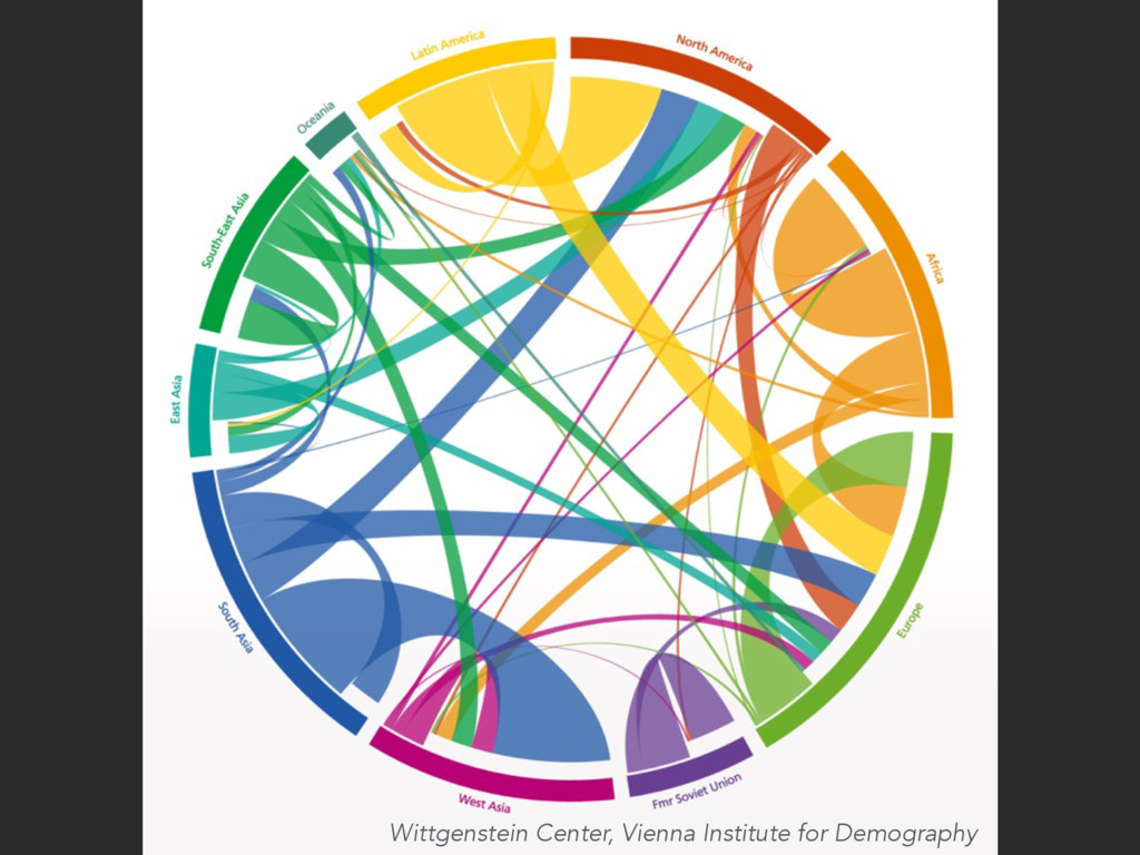
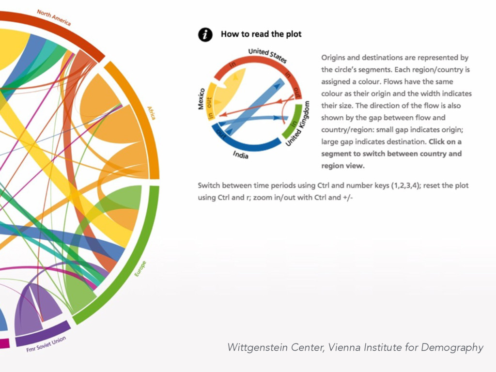
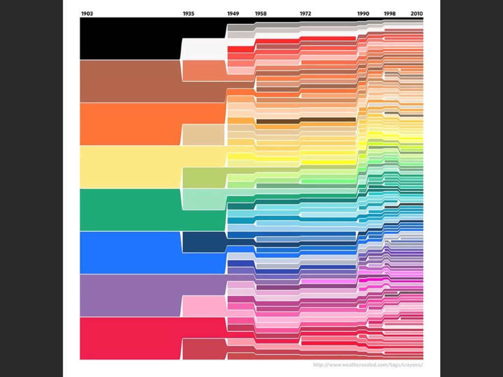
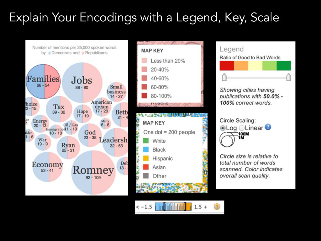
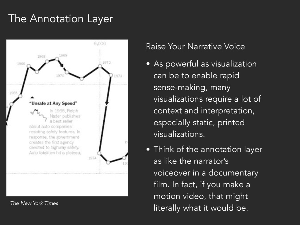
sense-making, many visualizations require a lot of context and interpretation, especially static, printed visualizations. • Think of the annotation layer as like the narrator’s voiceover in a documentary film. In fact, if you make a motion video, that might literally what it would be. Raise Your Narrative Voice The New York Times The Annotation Layer
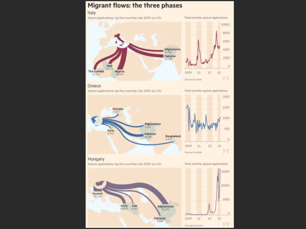
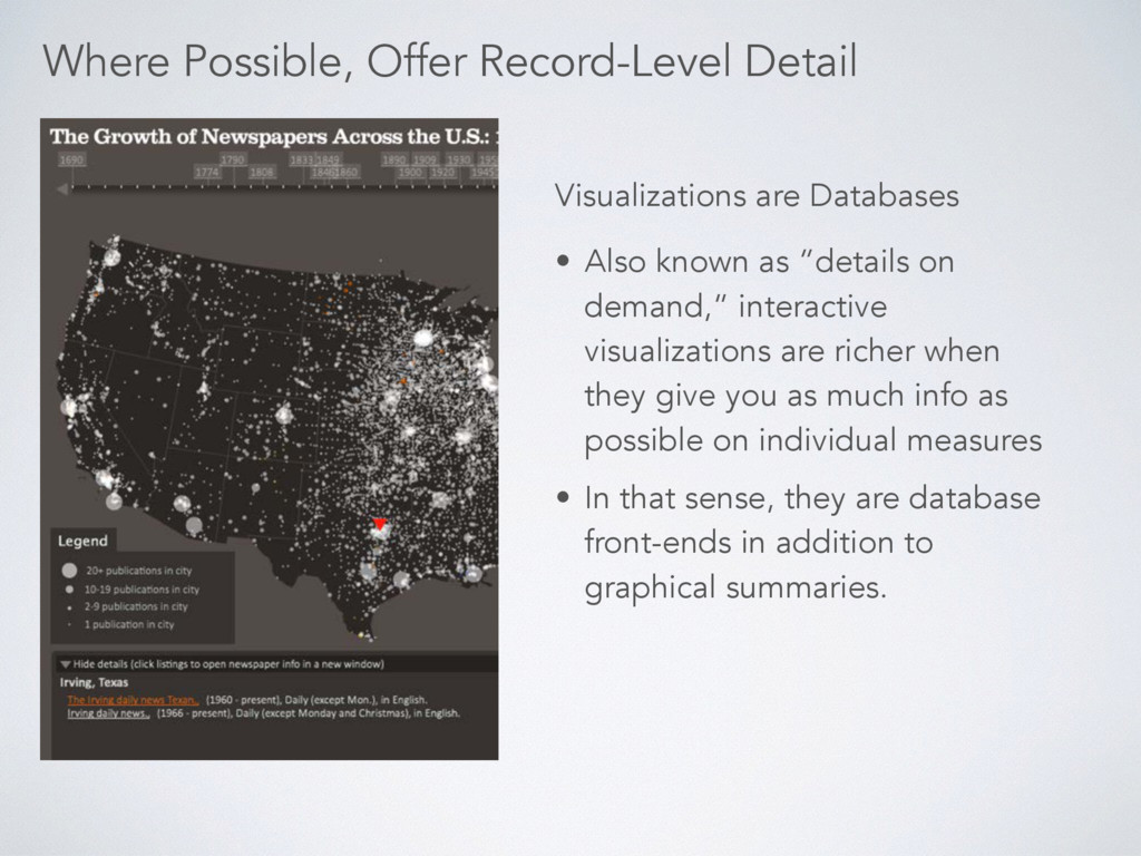
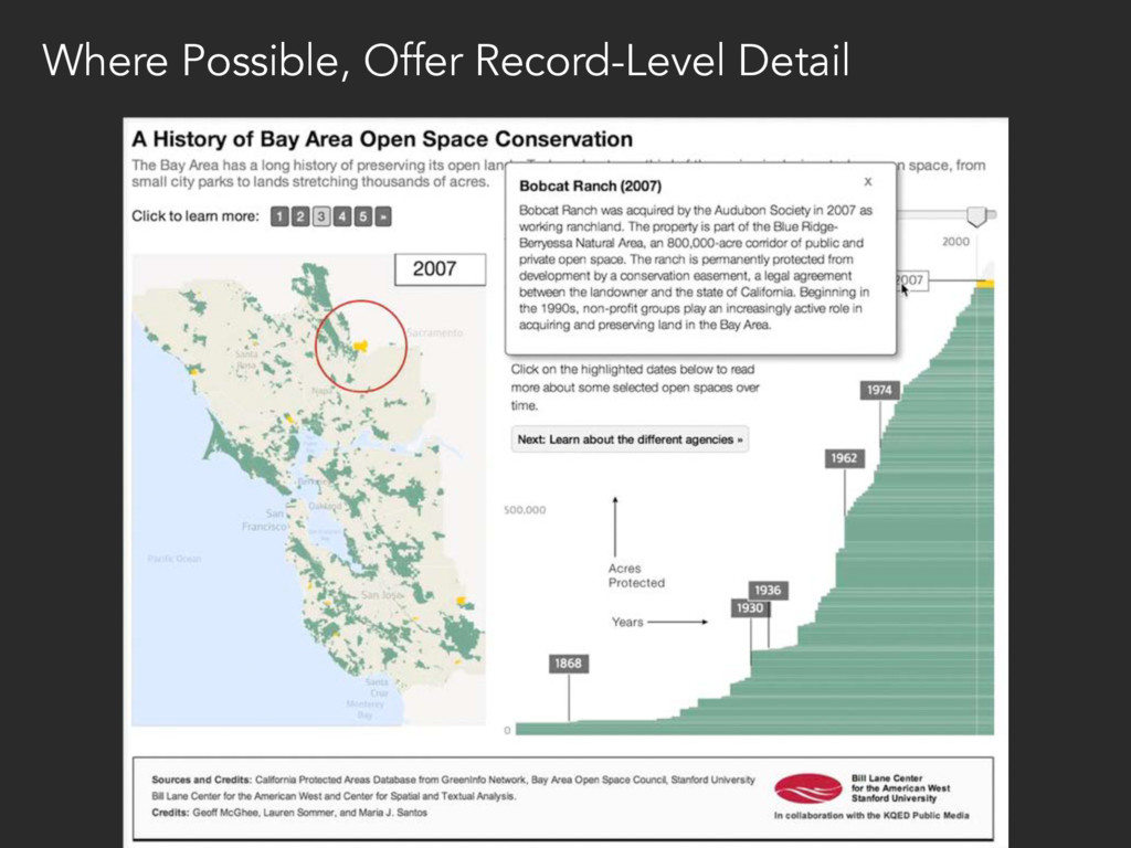
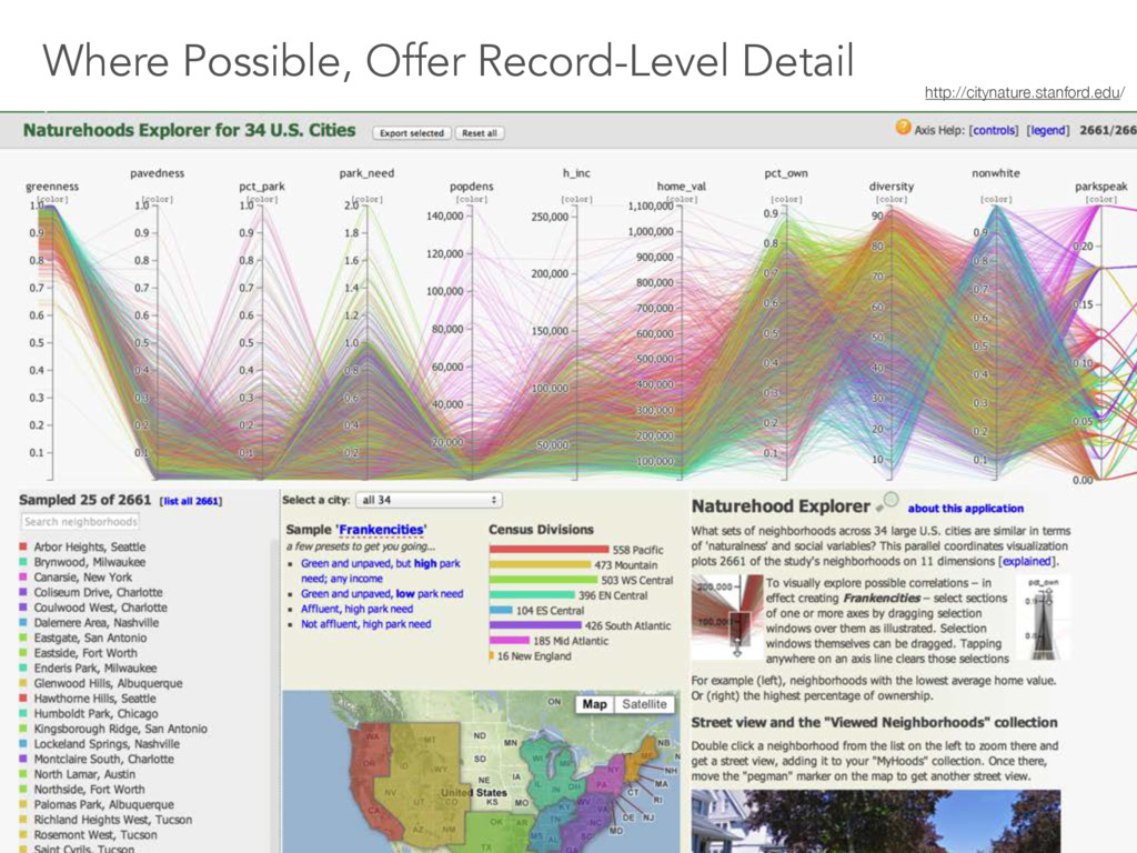
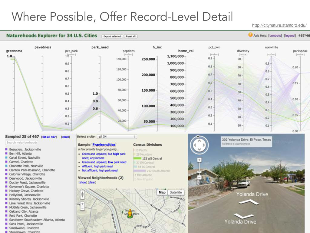
richer when they give you as much info as possible on individual measures • In that sense, they are database front-ends in addition to graphical summaries. Visualizations are Databases Where Possible, Offer Record-Level Detail
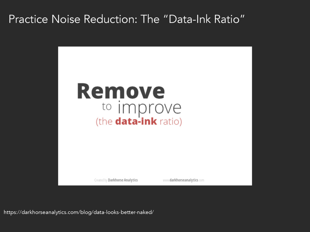
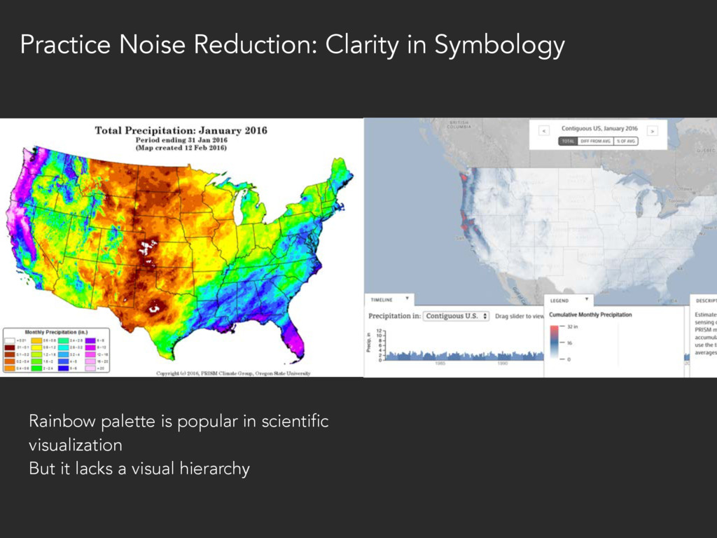
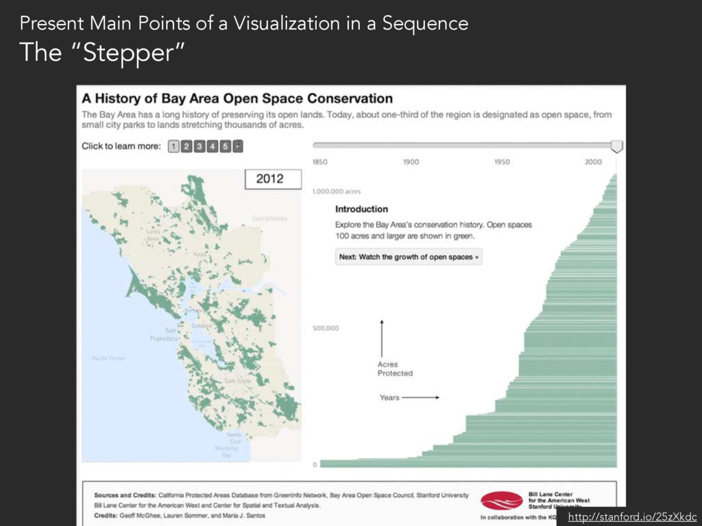
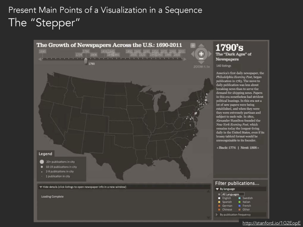
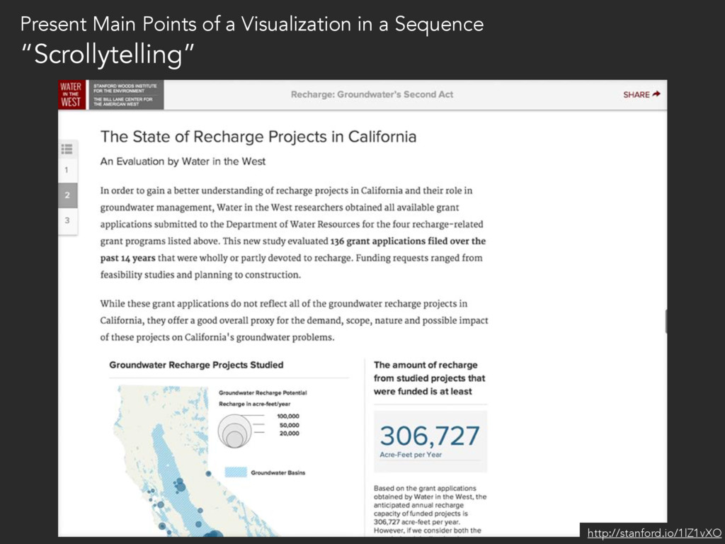
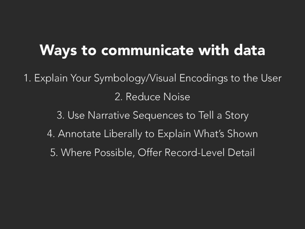
to the User 2. Reduce Noise 3. Use Narrative Sequences to Tell a Story 4. Annotate Liberally to Explain What’s Shown 5. Where Possible, Offer Record-Level Detail
![“I think that there’s a sense that data [visualization] is](https://files.speakerdeck.com/presentations/af16ed83c9d243d6b1ac5fc10d8f4b6f/slide_40.jpg)
![Questions? @mcgeoff [email protected] west.stanford.edu](https://files.speakerdeck.com/presentations/af16ed83c9d243d6b1ac5fc10d8f4b6f/slide_87.jpg)
![Thank you! @mcgeoff [email protected] west.stanford.edu](https://files.speakerdeck.com/presentations/af16ed83c9d243d6b1ac5fc10d8f4b6f/slide_88.jpg)