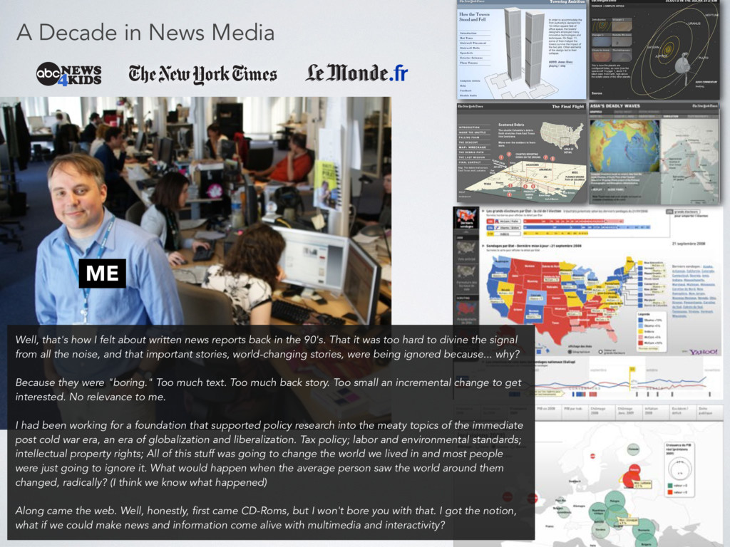
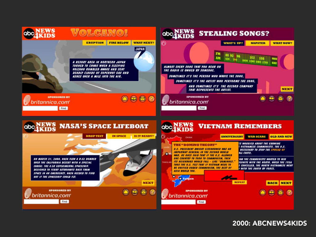
felt about written news reports back in the 90's. That it was too hard to divine the signal from all the noise, and that important stories, world-changing stories, were being ignored because... why? Because they were "boring." Too much text. Too much back story. Too small an incremental change to get interested. No relevance to me. I had been working for a foundation that supported policy research into the meaty topics of the immediate post cold war era, an era of globalization and liberalization. Tax policy; labor and environmental standards; intellectual property rights; All of this stuff was going to change the world we lived in and most people were just going to ignore it. What would happen when the average person saw the world around them changed, radically? (I think we know what happened) Along came the web. Well, honestly, first came CD-Roms, but I won't bore you with that. I got the notion, what if we could make news and information come alive with multimedia and interactivity?
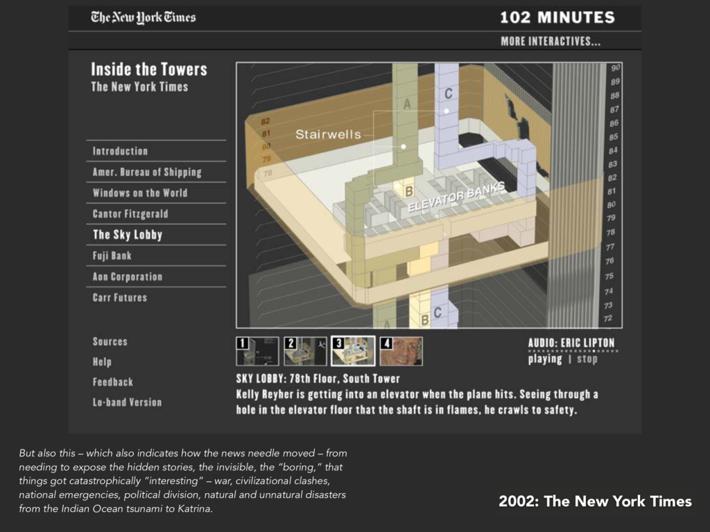
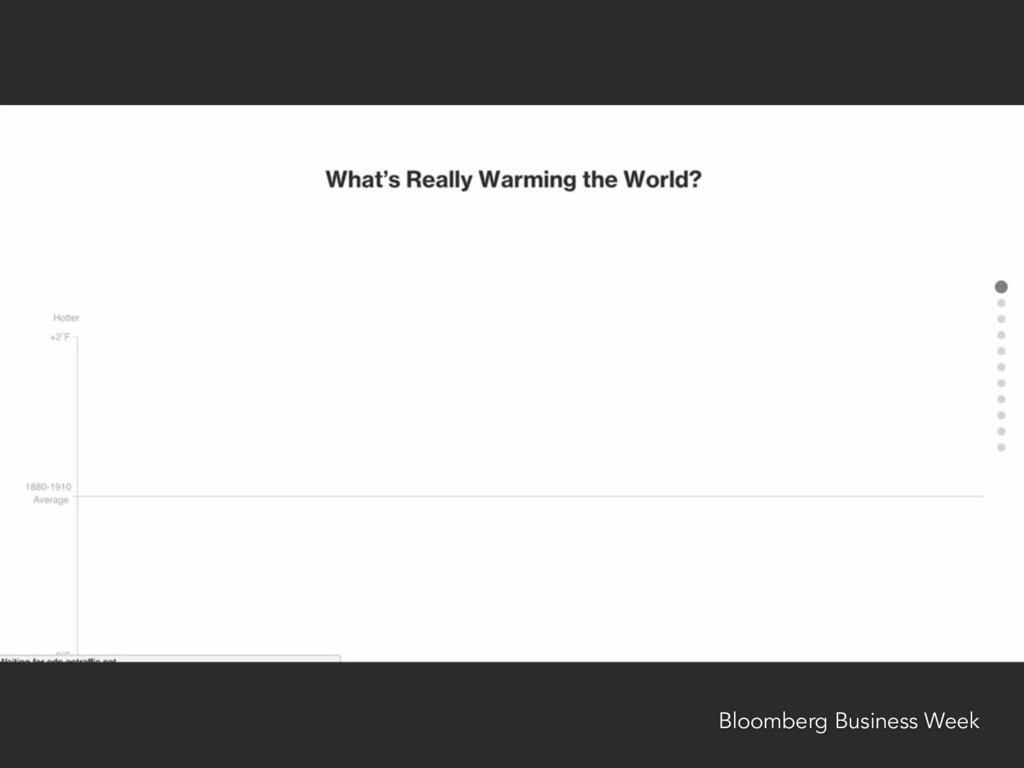
also indicates how the news needle moved – from needing to expose the hidden stories, the invisible, the “boring,” that things got catastrophically “interesting” – war, civilizational clashes, national emergencies, political division, natural and unnatural disasters from the Indian Ocean tsunami to Katrina.
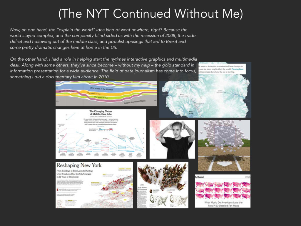
“explain the world” idea kind of went nowhere, right? Because the world stayed complex, and the complexity blind-sided us with the recession of 2008, the trade deficit and hollowing out of the middle class; and populist uprisings that led to Brexit and some pretty dramatic changes here at home in the US. On the other hand, I had a role in helping start the nytimes interactive graphics and multimedia desk. Along with some others, they've since become – without my help – the gold standard in information presentation for a wide audience. The field of data journalism has come into focus, something I did a documentary film about in 2010.
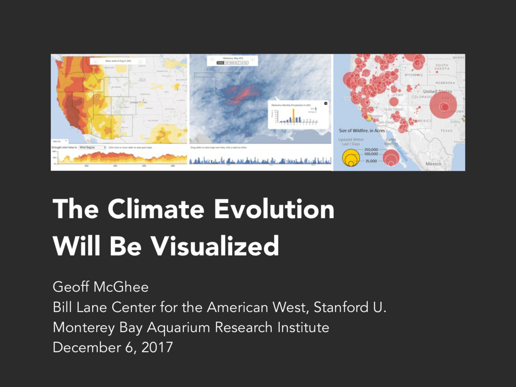
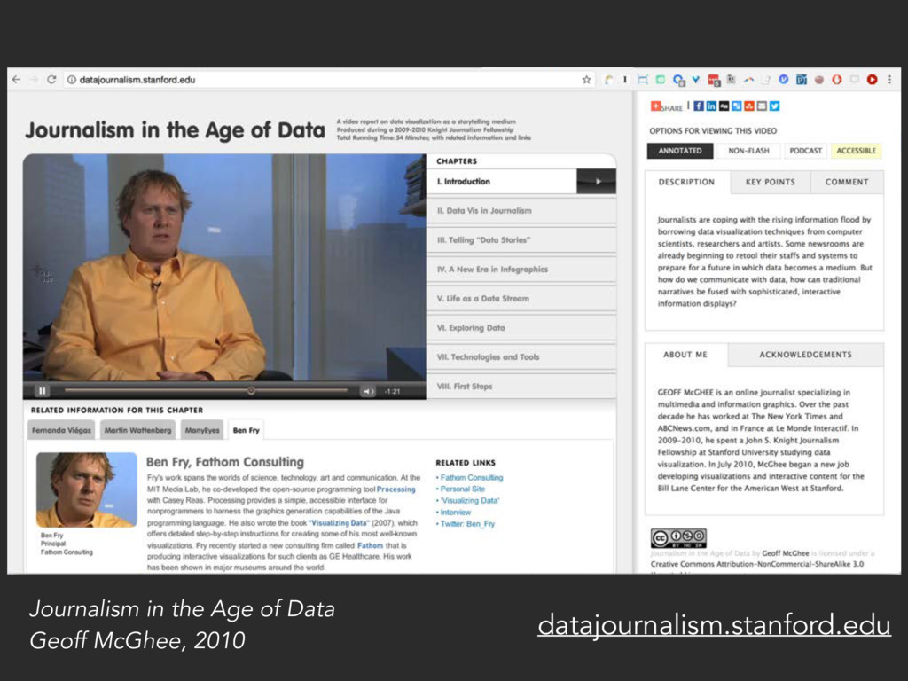
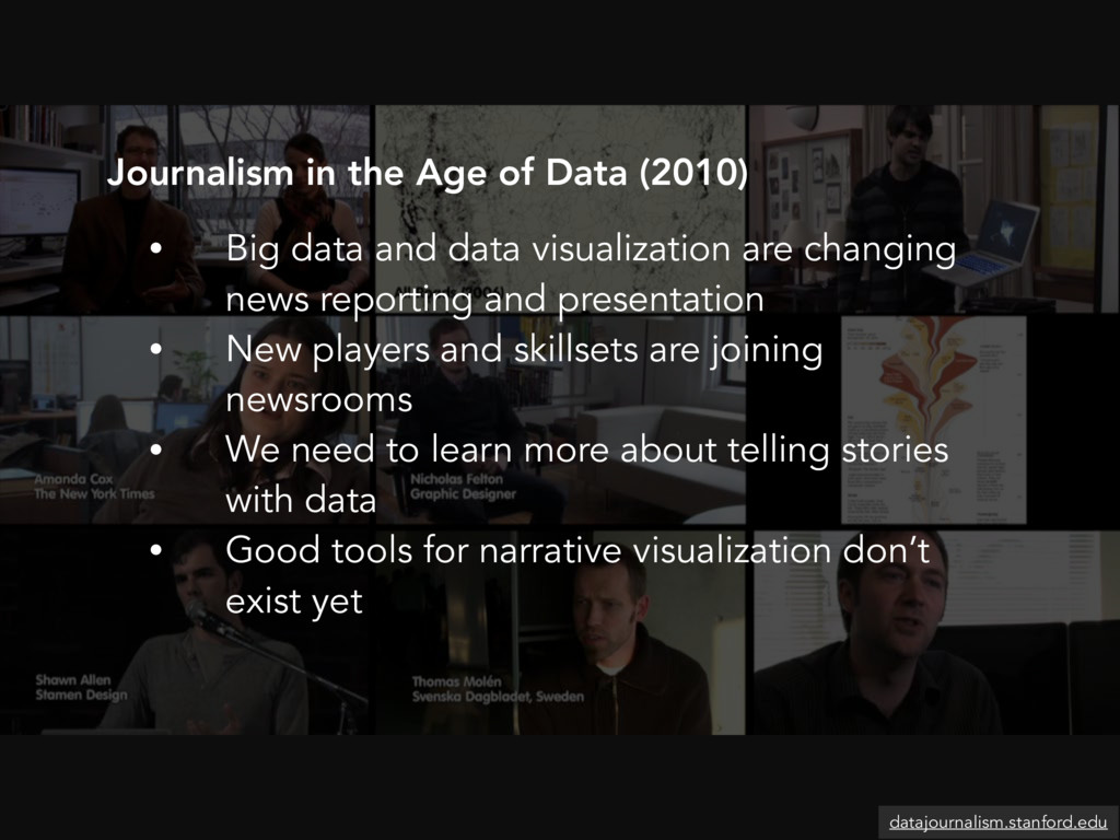
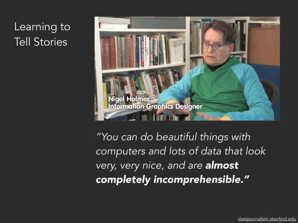
and presentation • New players and skillsets are joining newsrooms • We need to learn more about telling stories with data • Good tools for narrative visualization don’t exist yet Journalism in the Age of Data (2010) datajournalism.stanford.edu
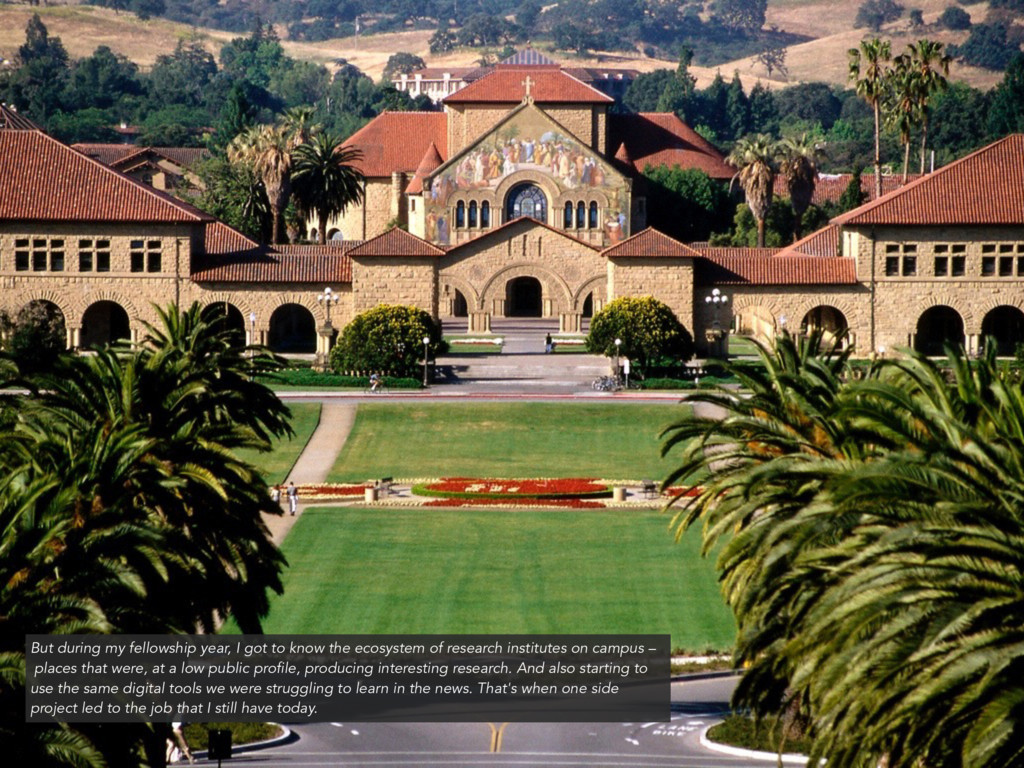
ecosystem of research institutes on campus – places that were, at a low public profile, producing interesting research. And also starting to use the same digital tools we were struggling to learn in the news. That's when one side project led to the job that I still have today.
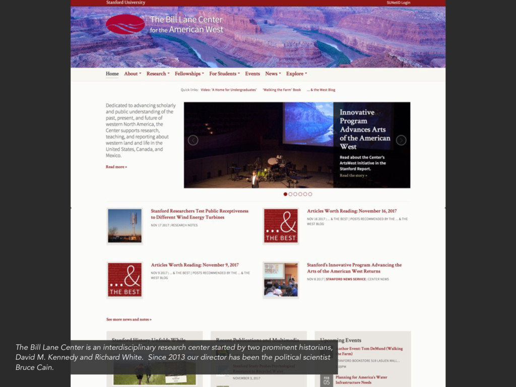
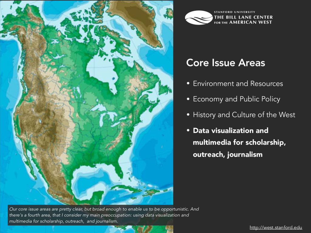
History and Culture of the West • Data visualization and multimedia for scholarship, outreach, journalism Core Issue Areas http://west.stanford.edu Our core issue areas are pretty clear, but broad enough to enable us to be opportunistic. And there's a fourth area, that I consider my main preoccupation: using data visualization and multimedia for scholarship, outreach, and journalism.
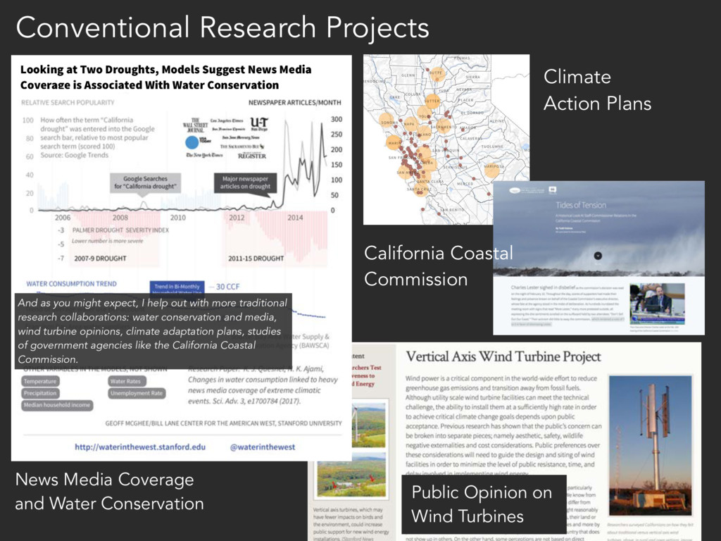
Suggest News Media Coverage is Associated With Water Conservation Climate Action Plans News Media Coverage and Water Conservation Conventional Research Projects California Coastal Commission And as you might expect, I help out with more traditional research collaborations: water conservation and media, wind turbine opinions, climate adaptation plans, studies of government agencies like the California Coastal Commission.
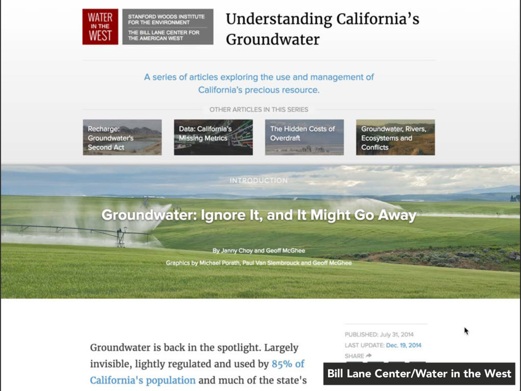
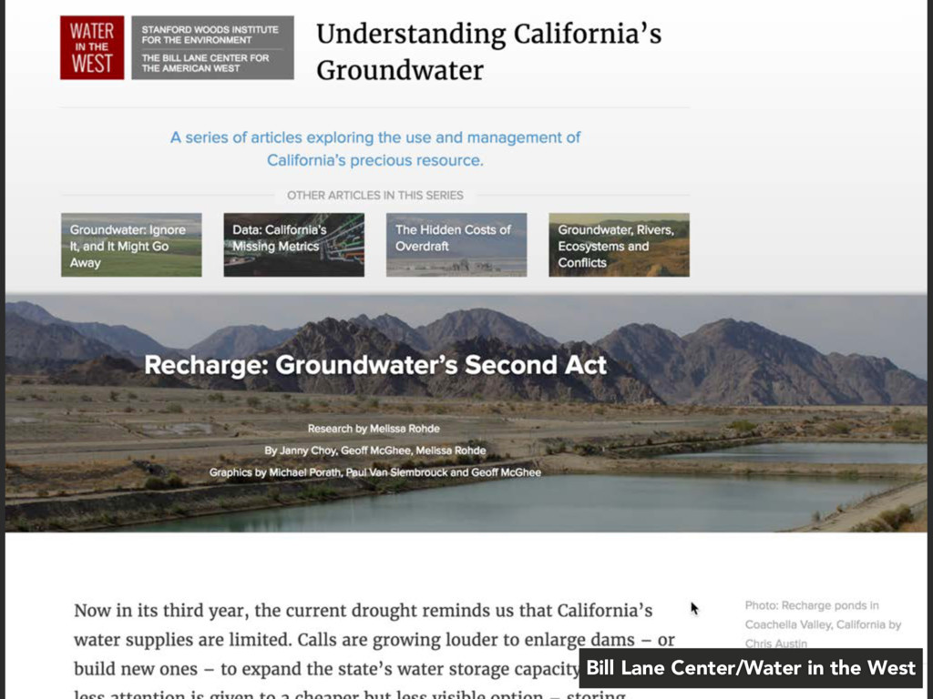
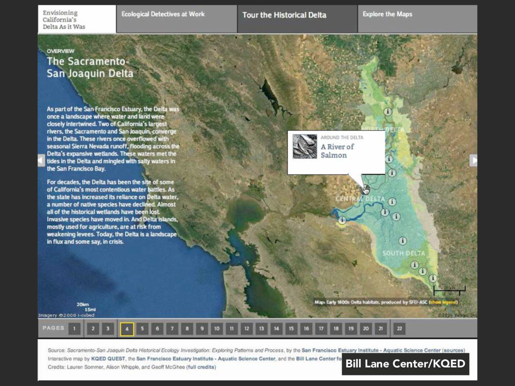
amount of data vis and multimedia connected to those studies.And while we started out doing more in partnership with other organizations, like KQED, High Country News, Harpers',
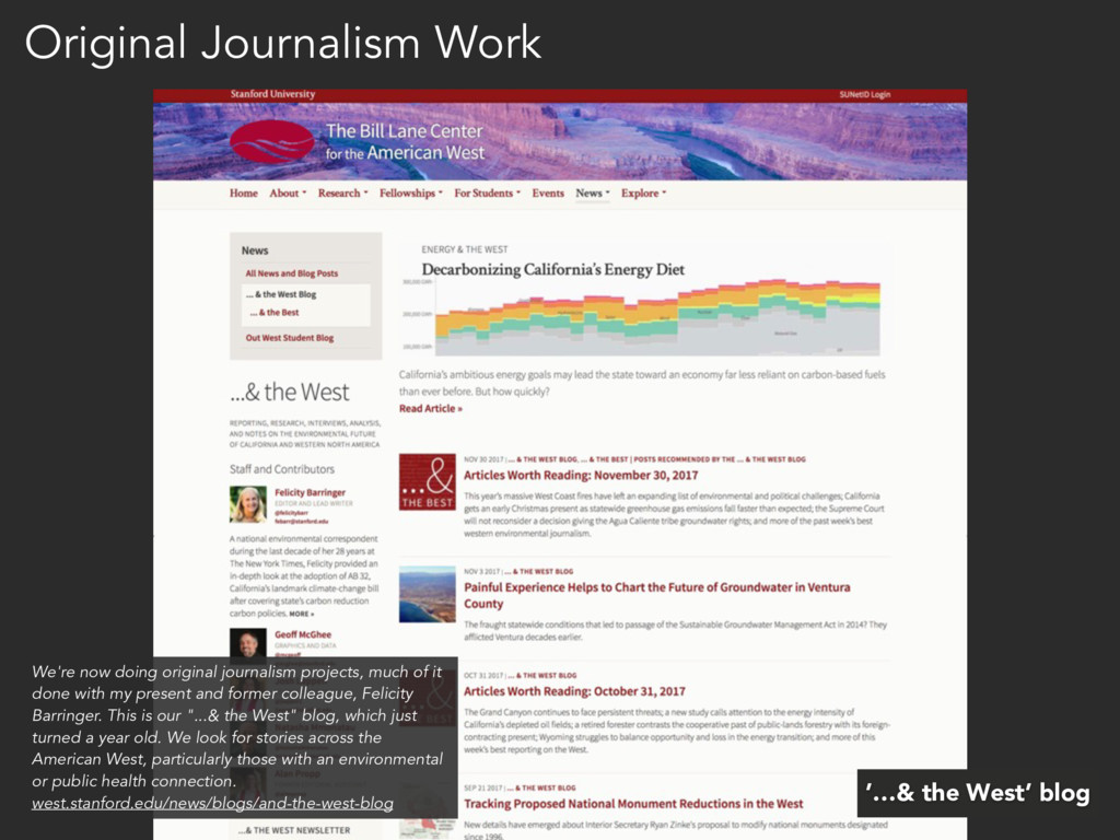
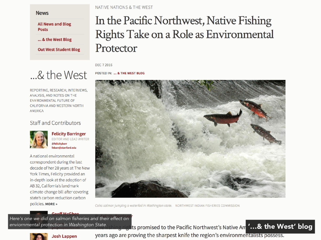
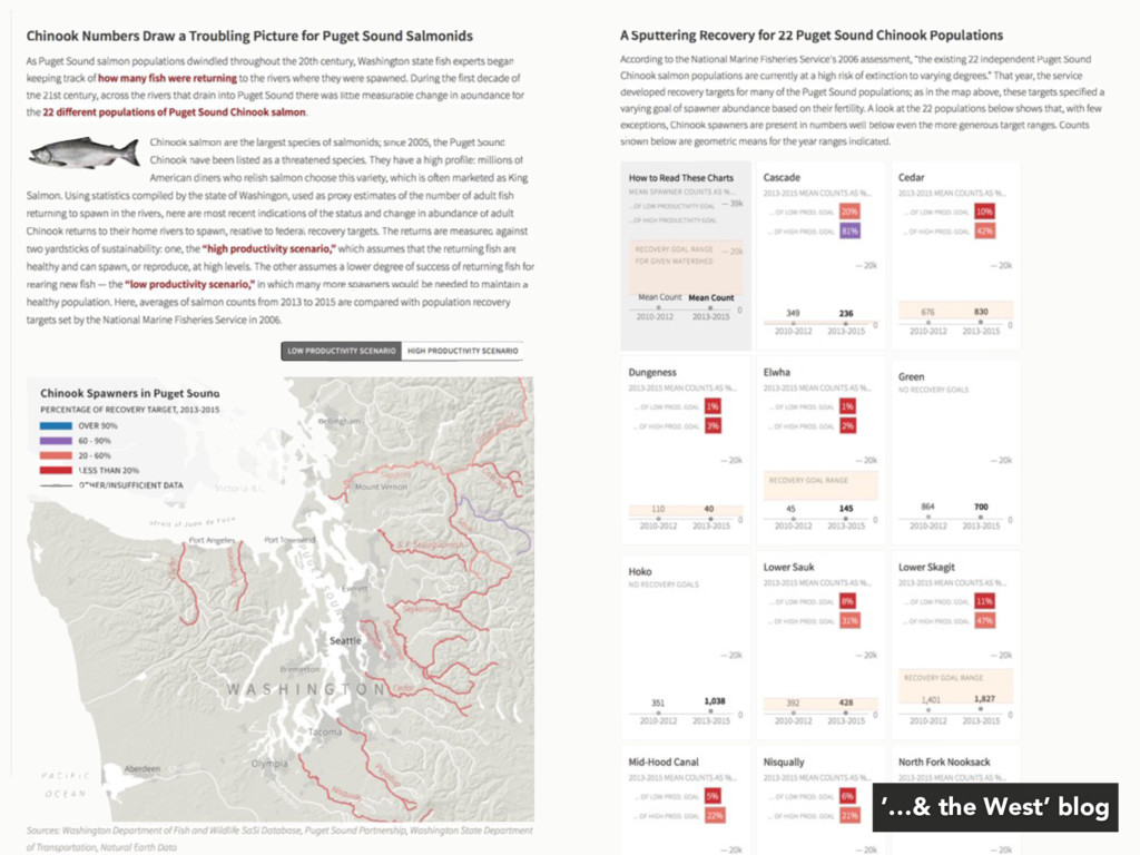
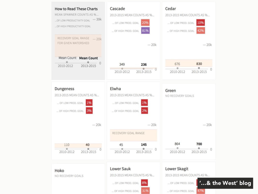
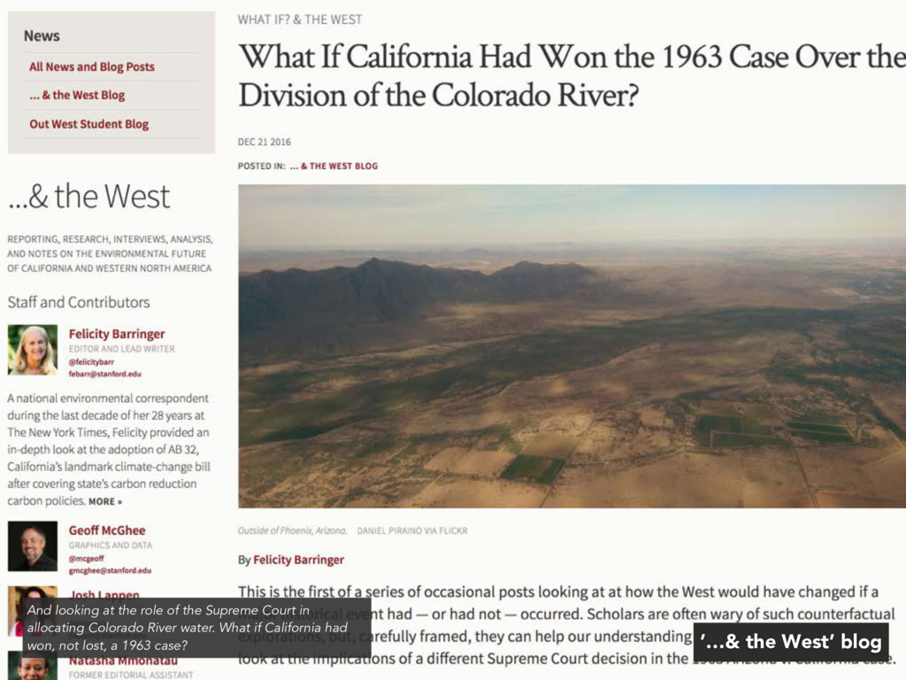
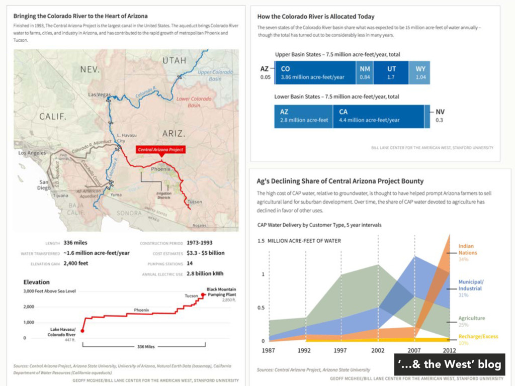
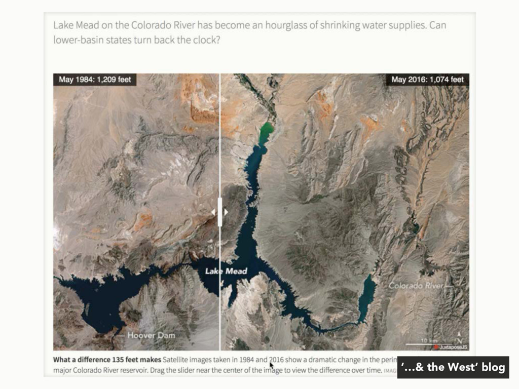
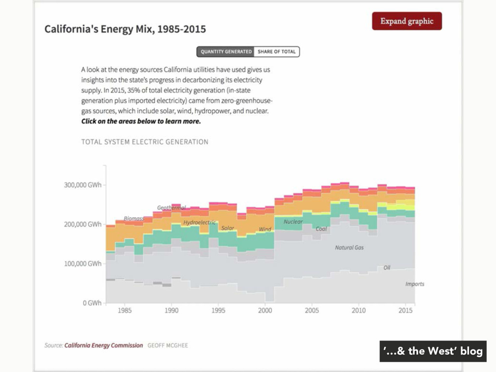
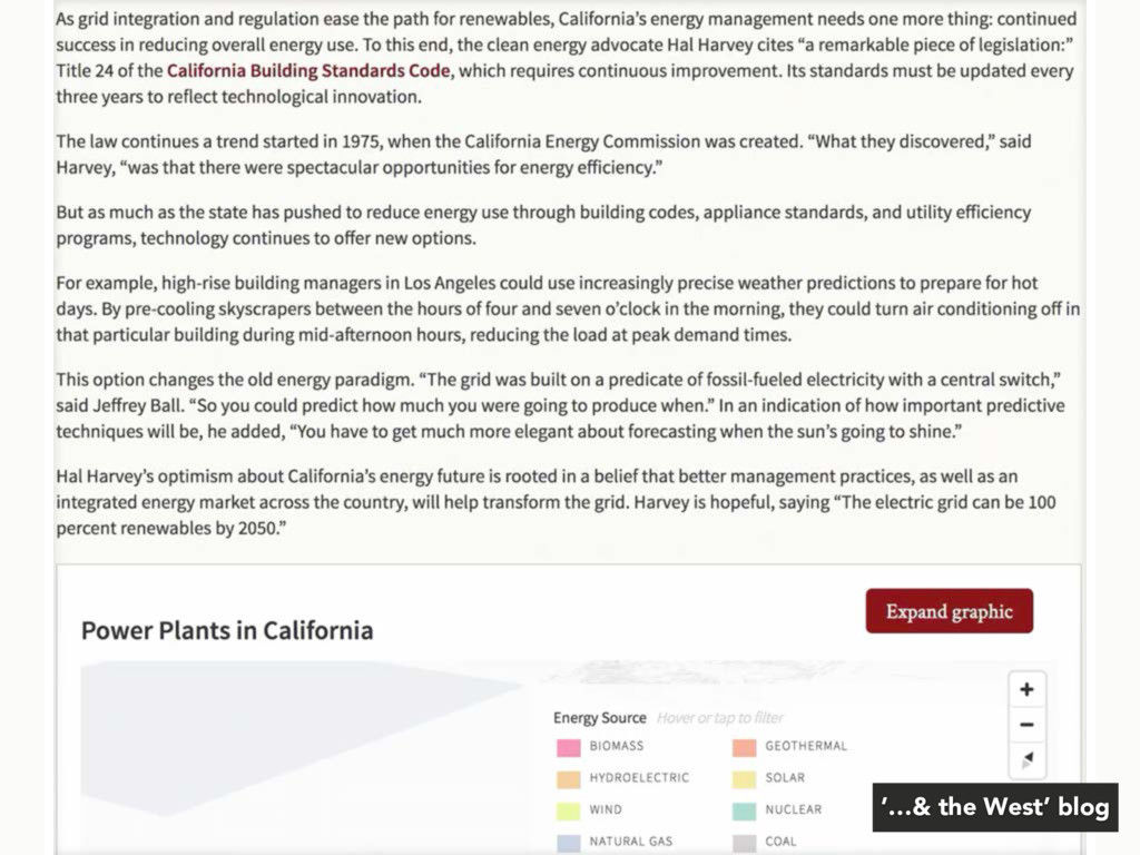
original journalism projects, much of it done with my present and former colleague, Felicity Barringer. This is our "...& the West" blog, which just turned a year old. We look for stories across the American West, particularly those with an environmental or public health connection. west.stanford.edu/news/blogs/and-the-west-blog
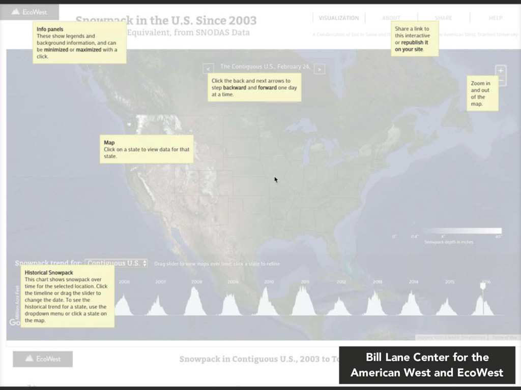
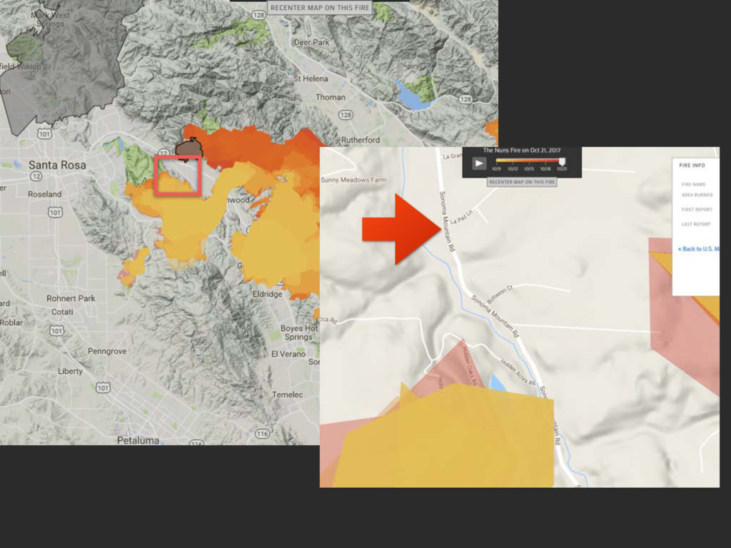
fire animations dating back to 2003 Can zoom to and embed fire animation or state overview Mobile-tolerant responsive layout works at multiple sizes Bill Lane Center for the American West and EcoWest
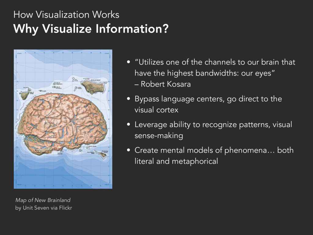
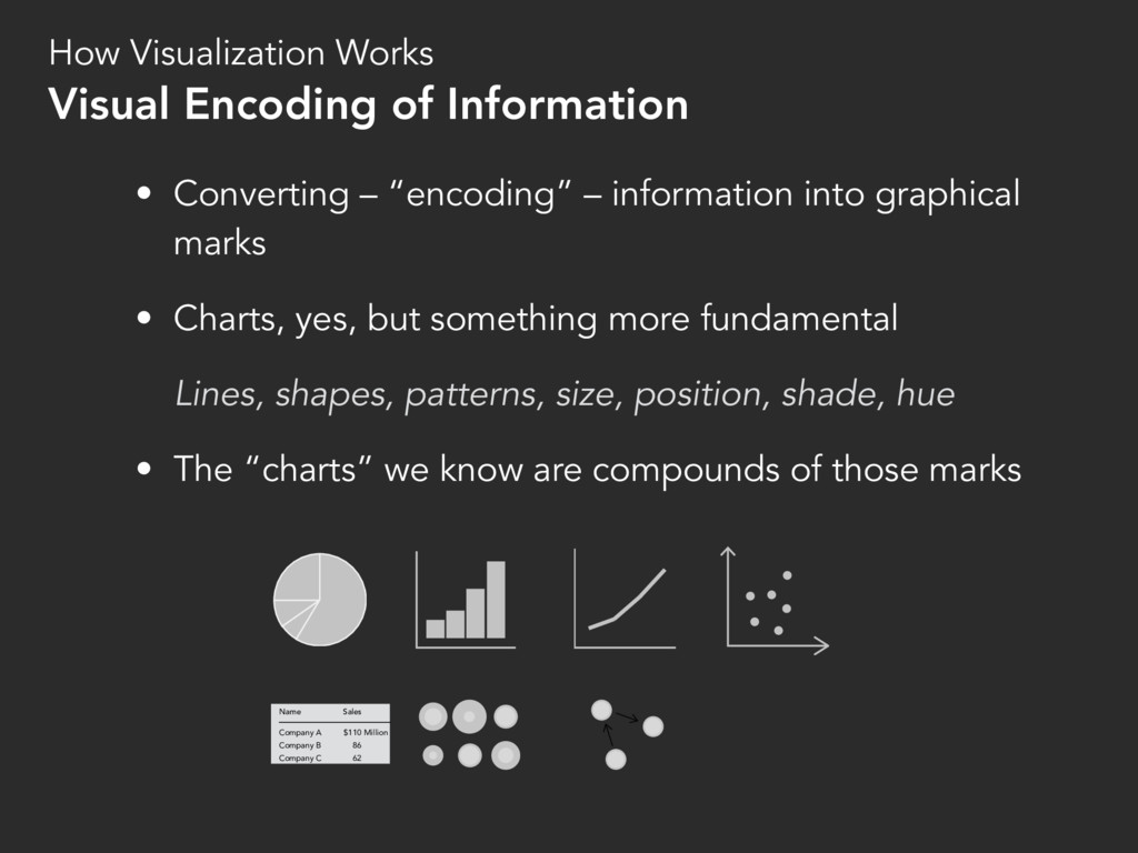
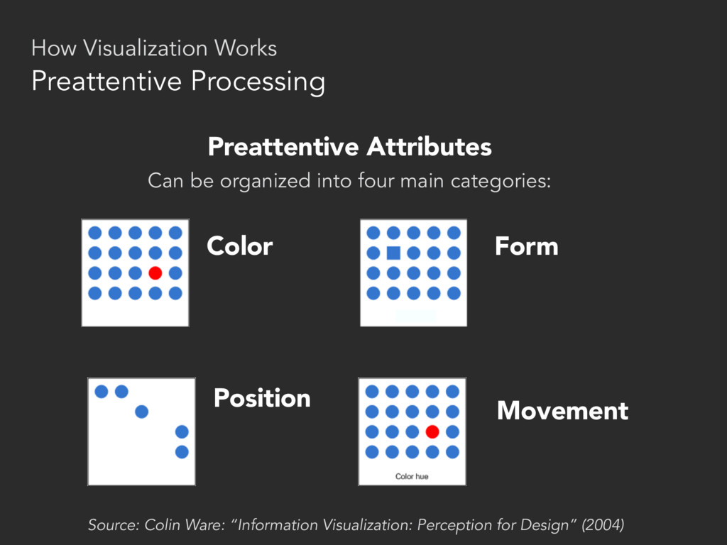
have the highest bandwidths: our eyes” – Robert Kosara • Bypass language centers, go direct to the visual cortex • Leverage ability to recognize patterns, visual sense-making • Create mental models of phenomena… both literal and metaphorical Map of New Brainland by Unit Seven via Flickr How Visualization Works Why Visualize Information?
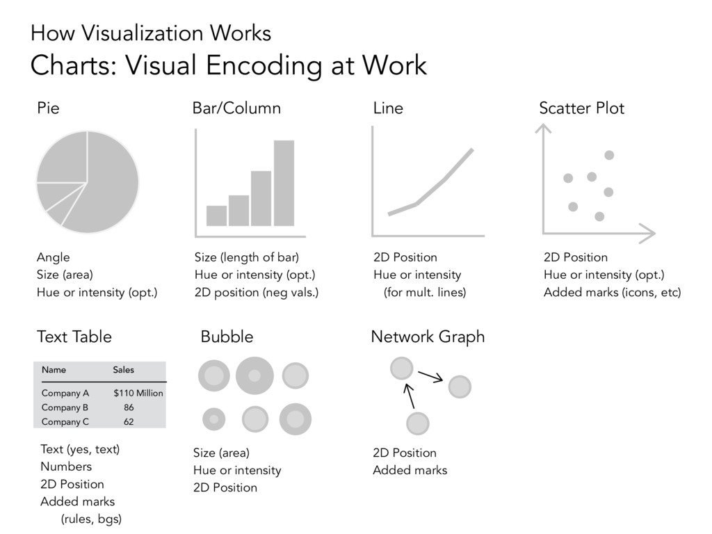
Charts, yes, but something more fundamental Lines, shapes, patterns, size, position, shade, hue • The “charts” we know are compounds of those marks How Visualization Works Visual Encoding of Information Company A Company B Company C $110 86 62 Sales Name Million
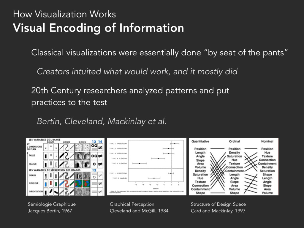
Creators intuited what would work, and it mostly did 20th Century researchers analyzed patterns and put practices to the test Bertin, Cleveland, Mackinlay et al. How Visualization Works Visual Encoding of Information Sémiologie Graphique Jacques Bertin, 1967 Graphical Perception Cleveland and McGill, 1984 Structure of Design Space Card and Mackinlay, 1997
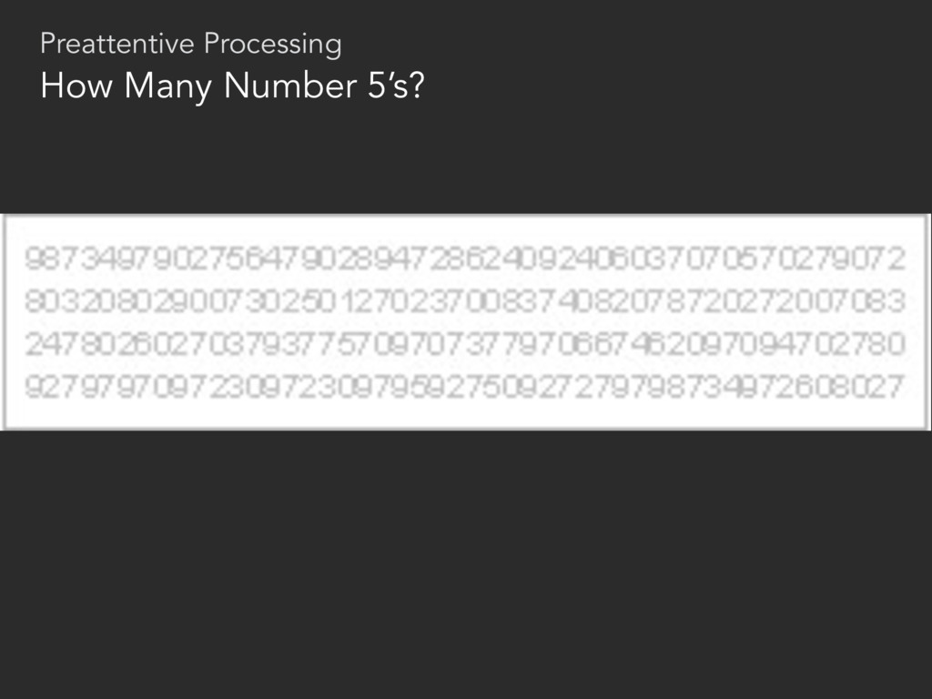
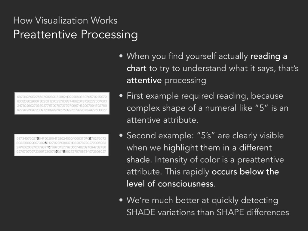
SHAPE differences • First example required reading, because complex shape of a numeral like “5” is an attentive attribute. • Second example: “5’s” are clearly visible when we highlight them in a different shade. Intensity of color is a preattentive attribute. This rapidly occurs below the level of consciousness. • When you find yourself actually reading a chart to try to understand what it says, that’s attentive processing Preattentive Processing How Visualization Works
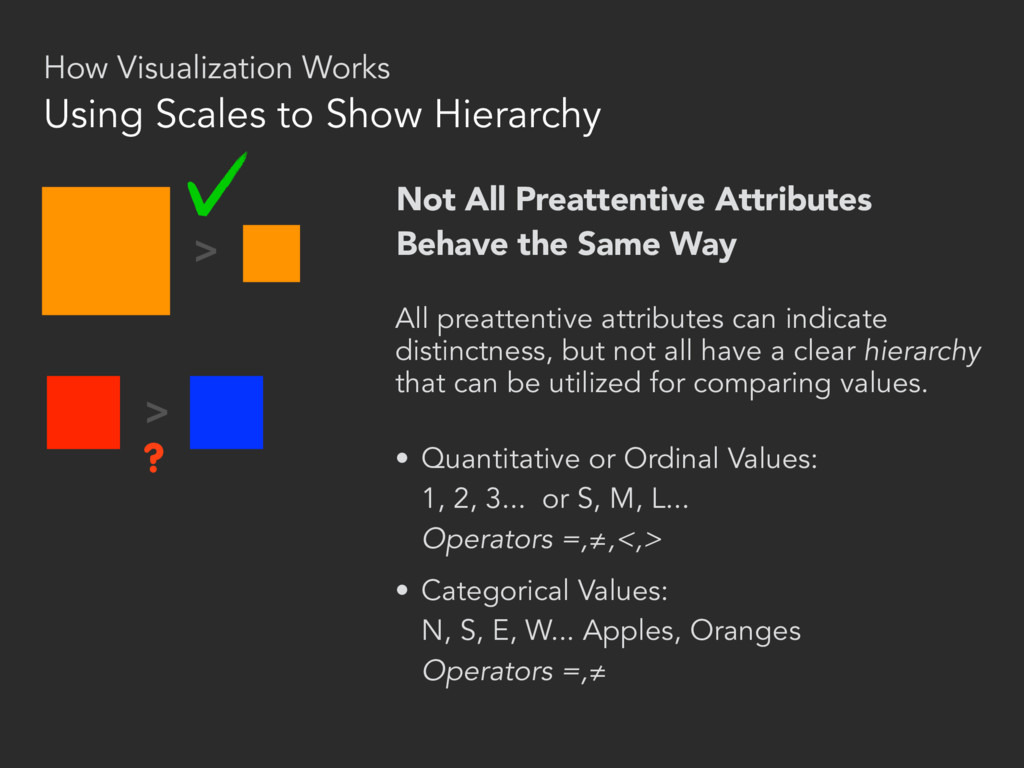
attributes can indicate distinctness, but not all have a clear hierarchy that can be utilized for comparing values. • Quantitative or Ordinal Values: 1, 2, 3... or S, M, L... Operators =,≠,<,> • Categorical Values: N, S, E, W... Apples, Oranges Operators =,≠ > > ? Using Scales to Show Hierarchy How Visualization Works
(length of bar) Hue or intensity (opt.) 2D position (neg vals.) Line 2D Position Hue or intensity (for mult. lines) Scatter Plot 2D Position Hue or intensity (opt.) Added marks (icons, etc) Company A Company B Company C $110 86 62 Sales Name Million Text Table Text (yes, text) Numbers 2D Position Added marks (rules, bgs) Bubble Size (area) Hue or intensity 2D Position Network Graph 2D Position Added marks How Visualization Works Charts: Visual Encoding at Work
something more like a medium, something that can be used to tell stories, and to do all of the things that a medium can do, to delight and inspire...” – Eric Rodenbeck, Journalism in the Age of Data (2010) datajournalism.stanford.edu
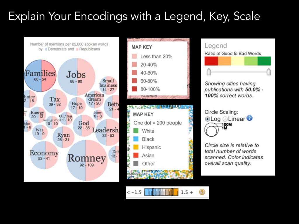
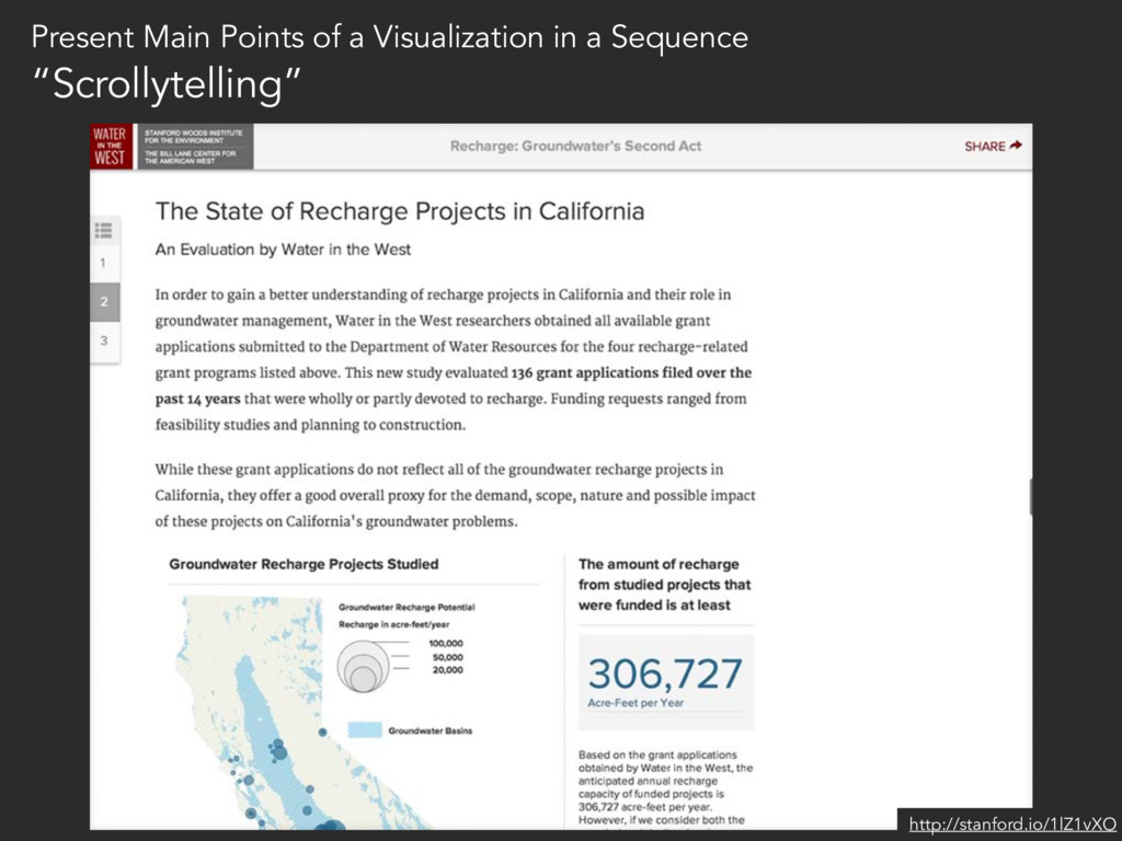
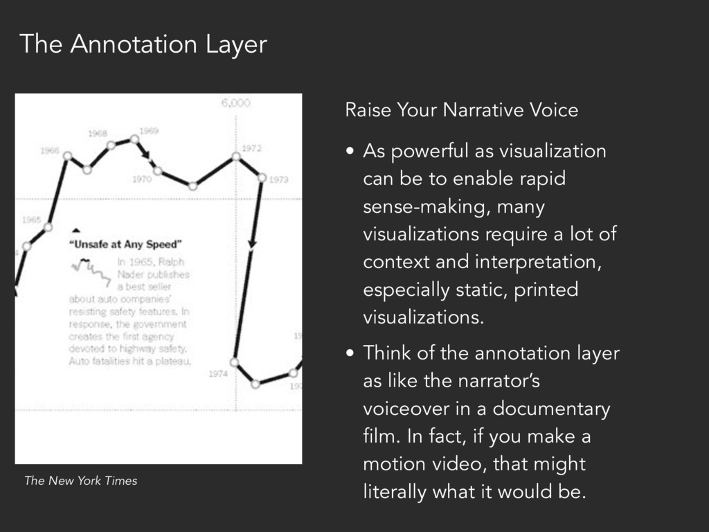
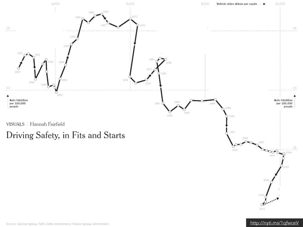
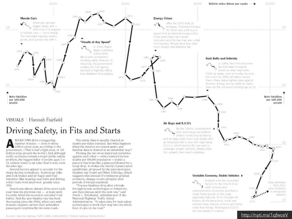
sense-making, many visualizations require a lot of context and interpretation, especially static, printed visualizations. • Think of the annotation layer as like the narrator’s voiceover in a documentary film. In fact, if you make a motion video, that might literally what it would be. Raise Your Narrative Voice The New York Times The Annotation Layer
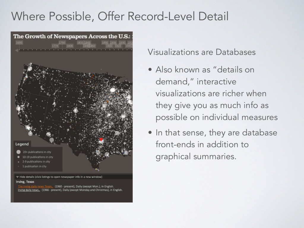
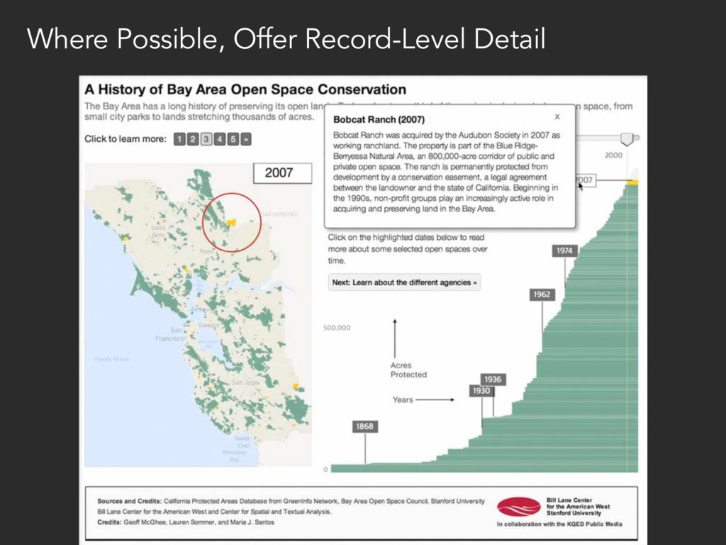
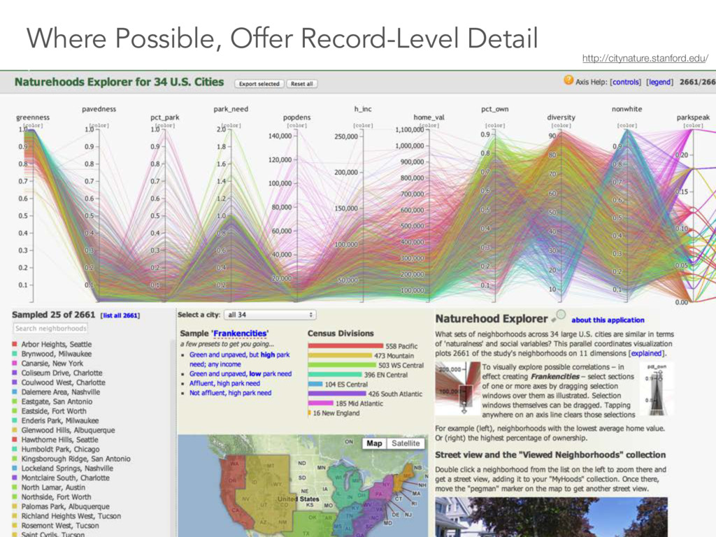
richer when they give you as much info as possible on individual measures • In that sense, they are database front-ends in addition to graphical summaries. Visualizations are Databases Where Possible, Offer Record-Level Detail
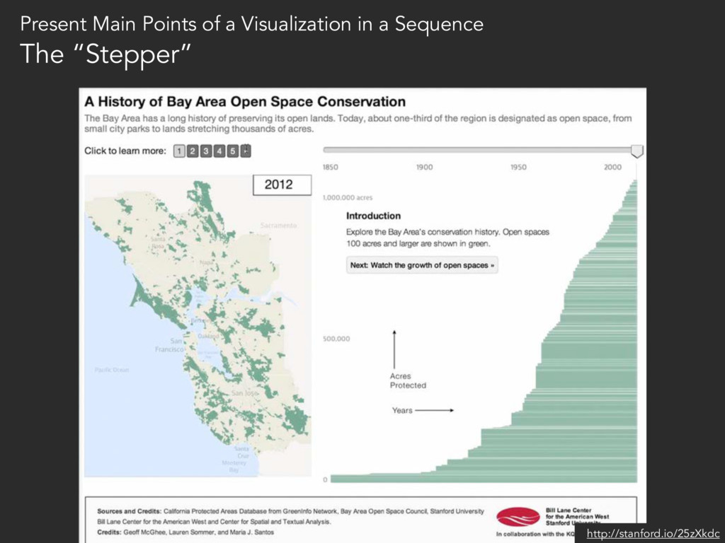
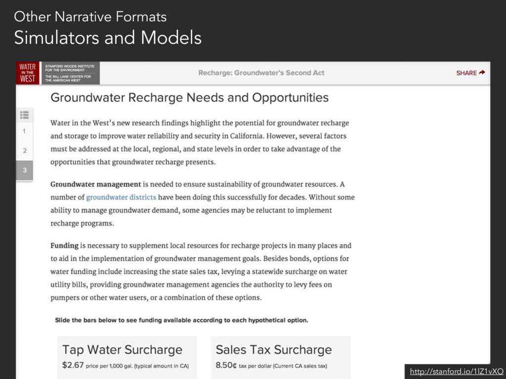
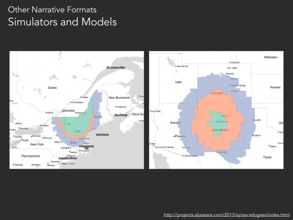
to the User 2. Reduce Noise 3. Use Narrative Sequences to Tell a Story 4. Annotate Liberally to Explain What’s Shown 5. Where Possible, Offer Record-Level Detail
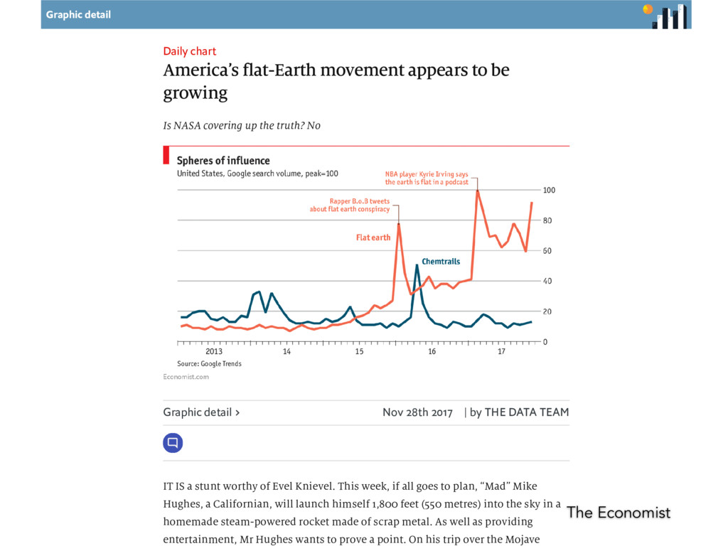
growing Is NASA covering up the truth? No Graphic detail Nov 28th 2017 | by THE DATA TEAM IT IS a stunt worthy of Evel Knievel. This week, if all goes to plan, “Mad” Mike Hughes, a Californian, will launch himself 1,800 feet (550 metres) into the sky in a homemade steam-powered rocket made of scrap metal. As well as providing entertainment, Mr Hughes wants to prove a point. On his trip over the Mojave The Economist
![“I think that there’s a sense that data [visualization] is](https://files.speakerdeck.com/presentations/16908c6e4e8341bbaef8e2ae4486e48d/slide_61.jpg)
![Questions? @mcgeoff [email protected] west.stanford.edu](https://files.speakerdeck.com/presentations/16908c6e4e8341bbaef8e2ae4486e48d/slide_98.jpg)
![Thank you! @mcgeoff [email protected] west.stanford.edu](https://files.speakerdeck.com/presentations/16908c6e4e8341bbaef8e2ae4486e48d/slide_99.jpg)