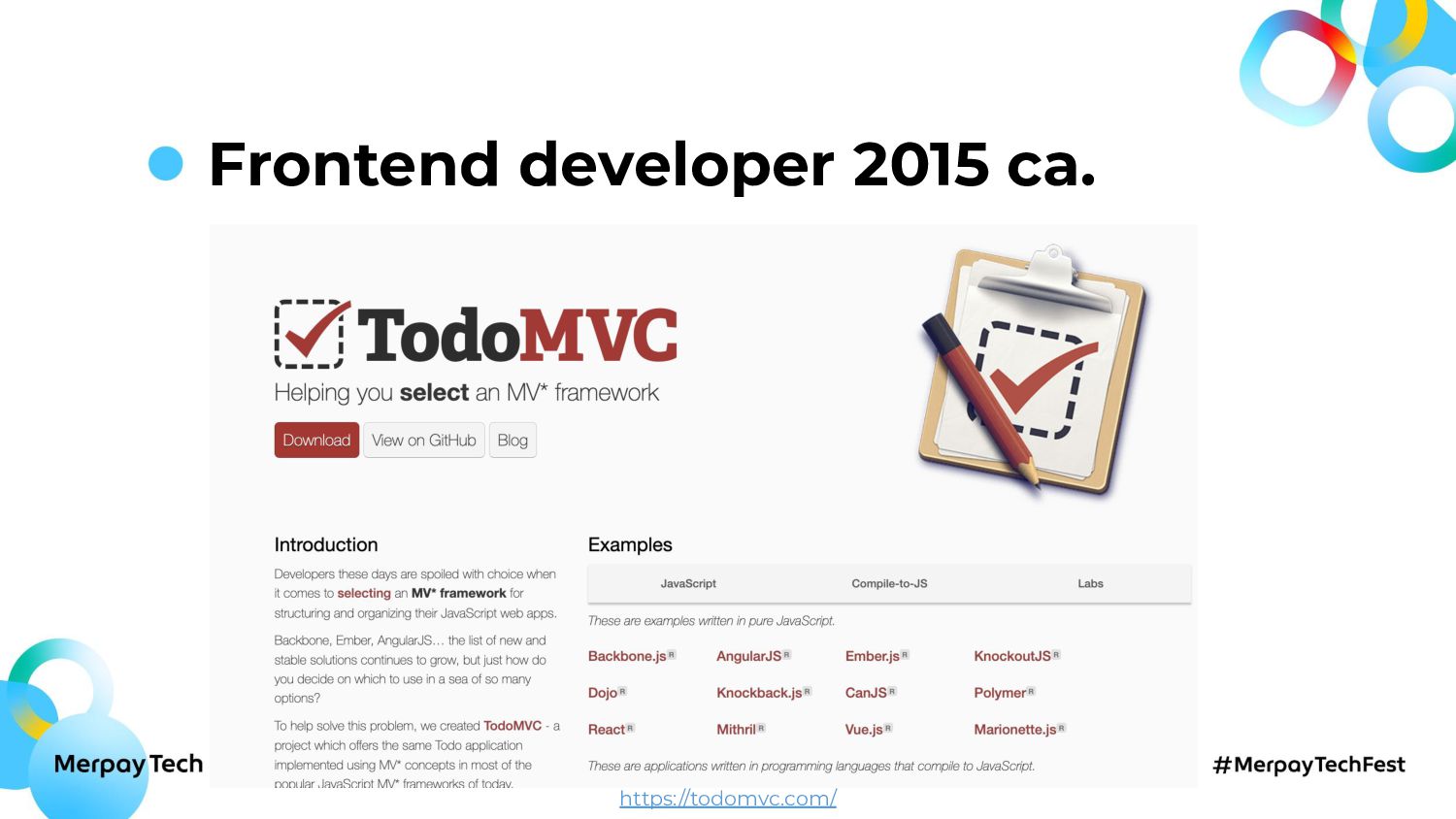
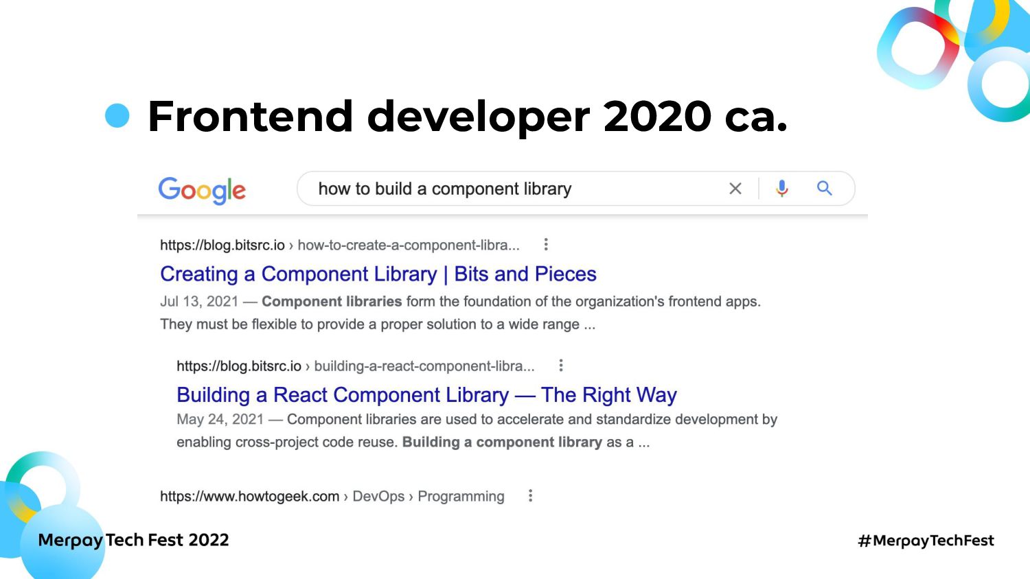
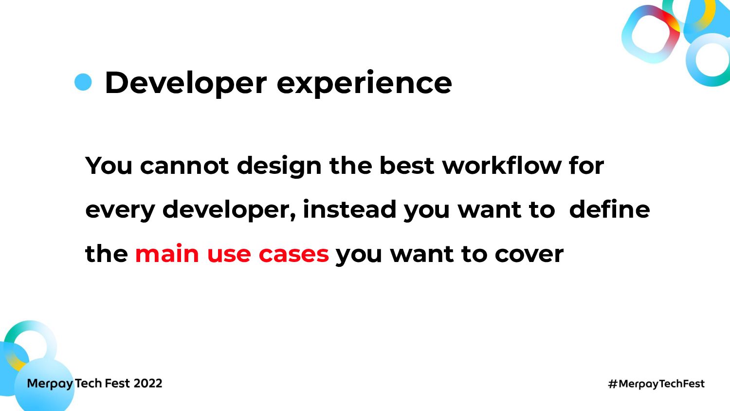
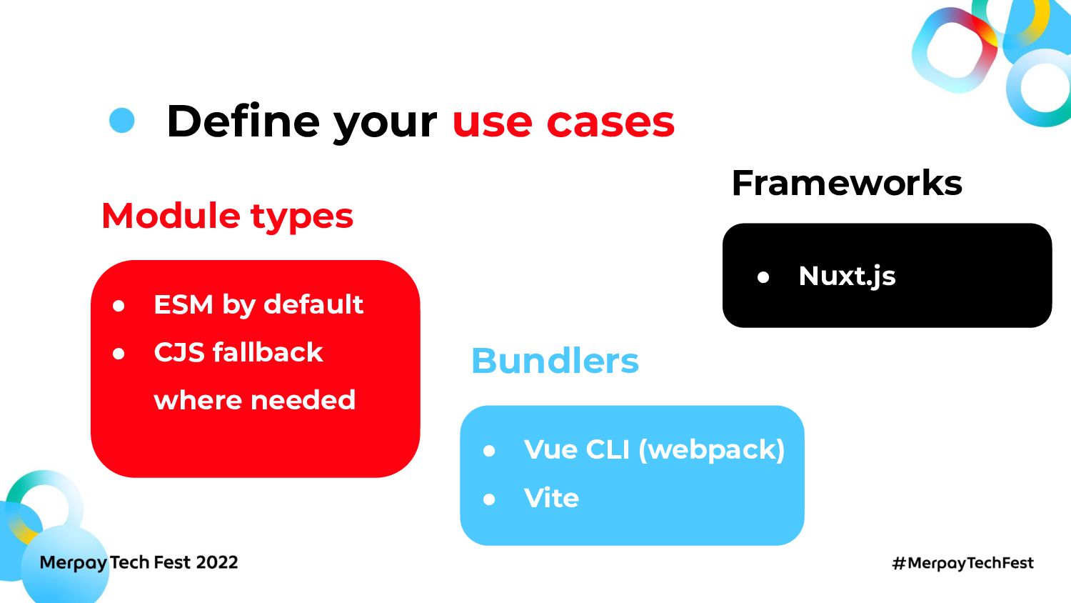
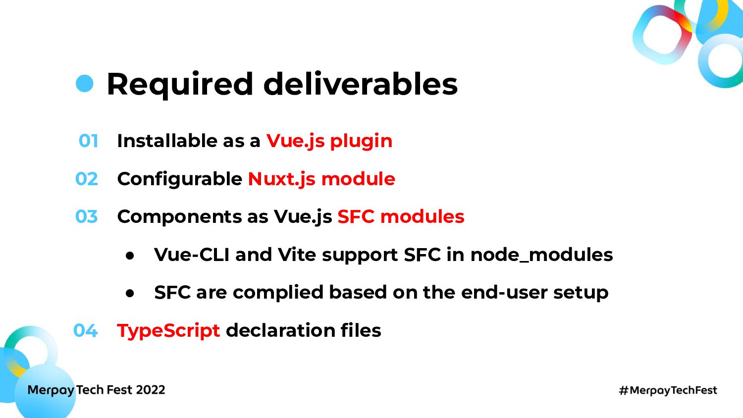
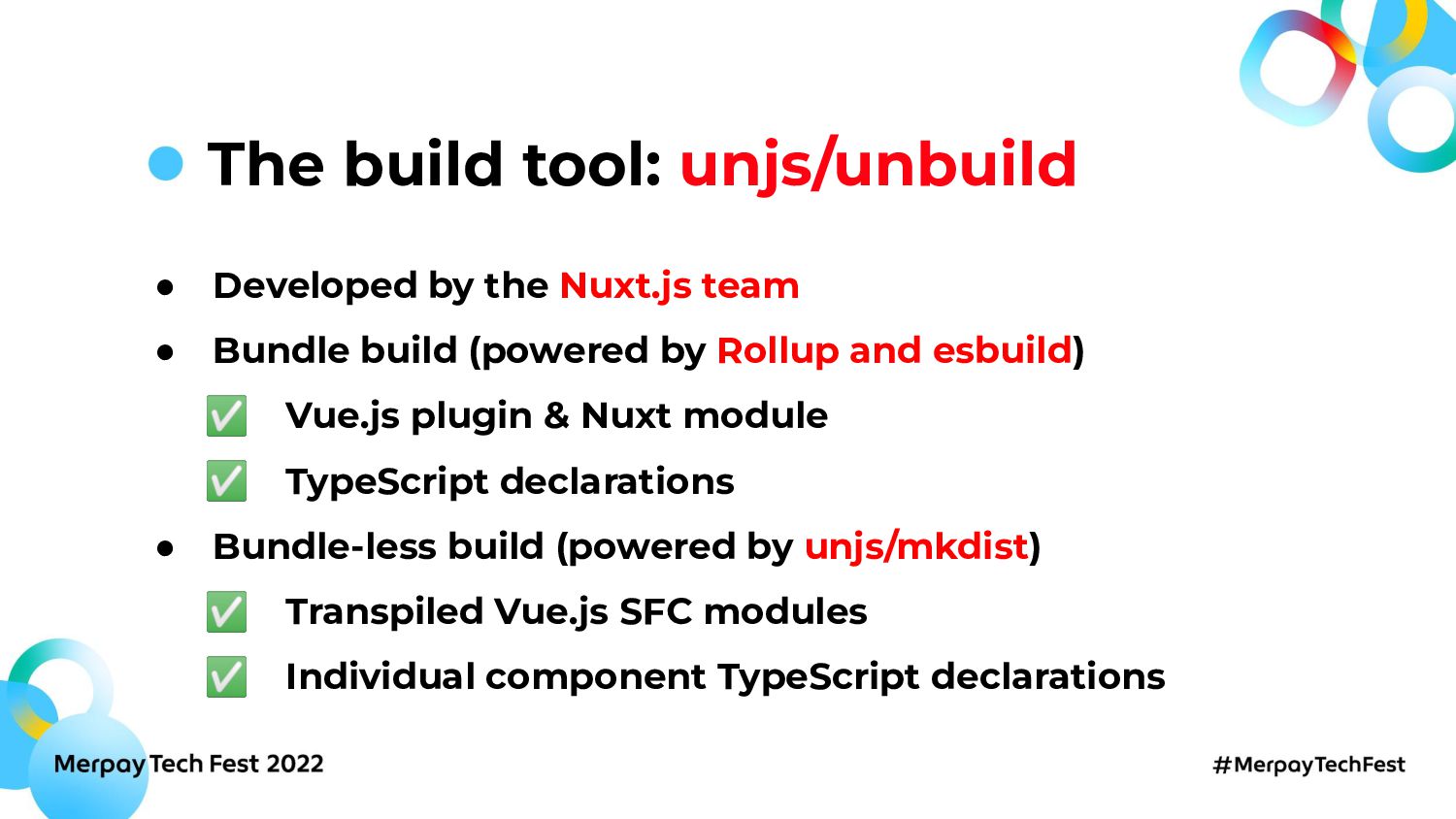
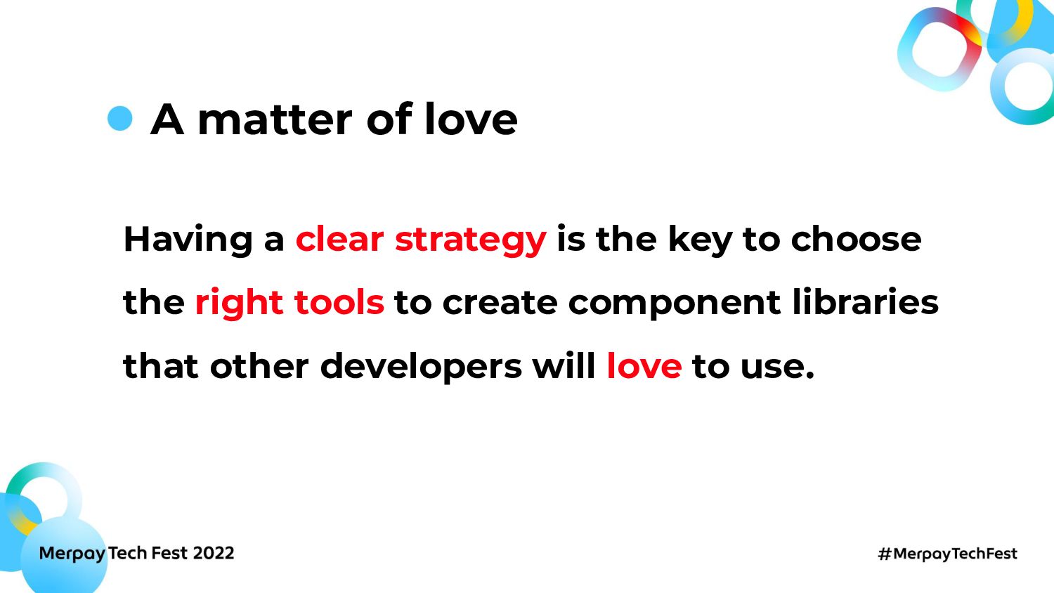
Creating a reliable, usable, and effective frontend component library is a matter of choosing the right tools and strategy to fulfill the developers' needs. In this session, we review the journey the Merpay Frontend team took to rethink and build its internal Vue.js component library
------
Merpay Tech Fest 2022は3日間のオンライン技術カンファレンスです。
IT企業で働くソフトウェアエンジニアおよびメルペイの技術スタックに興味がある方々を対象に2022年8月23日(火)から8月25日(木)までの3日間、開催します。 Merpay Tech Festは事業との関わりから技術への興味を深め、プロダクトやサービスを支えるエンジニアリングを知れるお祭りです。 セッションでは事業を支える組織・技術・課題などへの試行錯誤やアプローチを紹介予定です。お楽しみに!
■イベント関連情報
- 公式ウェブサイト:https://events.merpay.com/techfest-2022/
- 申し込みページ:https://mercari.connpass.com/event/249428/
- Twitterハッシュタグ: #MerpayTechFest
■リンク集
- メルカリ・メルペイイベント一覧:https://mercari.connpass.com/
- メルカリキャリアサイト:https://careers.mercari.com/
- メルカリエンジニアリングブログ:https://engineering.mercari.com/blog/
- メルカリエンジニア向けTwitterアカウント:https://twitter.com/mercaridevjp
- 株式会社メルペイ:https://jp.merpay.com/
 mercari
 ysknsid25
 mtoyoda
 muziyoshiz
 takkuhiro
 subroh0508
 kanny
kanny
 srenext
 moznion
 minorun365
 bto
bto
 grimoh
 kakehashi
 jacobian
 eileencodes
 yeseniaperezcruz
 kastner
 joshbly
 colly
colly
 lcolladotor
 kimpetersen
 jnunemaker
 aemeredith
 productmarketing
 aki_iinuma