Upgrade to Pro — share decks privately, control downloads, hide ads and more …

Material Design

Material Design

DevFest16 breakout session on Material Design

Nsikak Thompson

November 18, 2016
Tweet

More Decks by Nsikak Thompson

Other Decks in Technology

Transcript

  1. Nsikak Thompson Founder Locus+ Thompson_nsikak Nsikak Thompson Lead Android Developer

    @StartHubTech I believe Apps developed in Africa can be more beautiful. Profile
  2. What is Material Design? “Material design is a design language

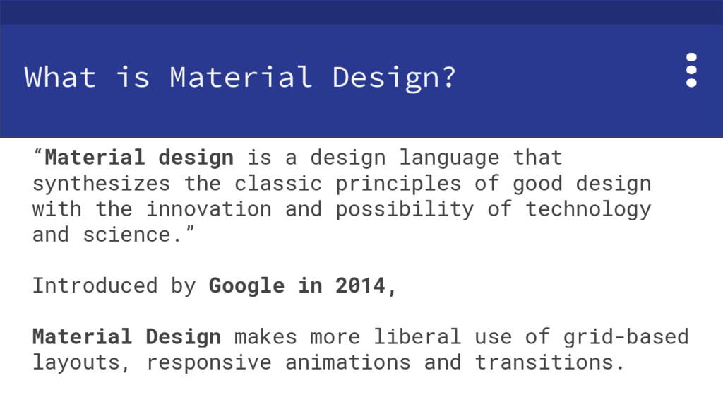
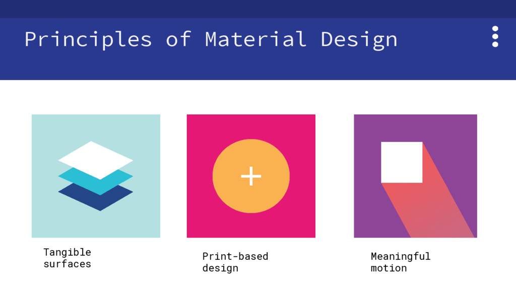
    that synthesizes the classic principles of good design with the innovation and possibility of technology and science.” Introduced by Google in 2014, Material Design makes more liberal use of grid-based layouts, responsive animations and transitions.
  3. What's New in Material Design? As at August 2016 •

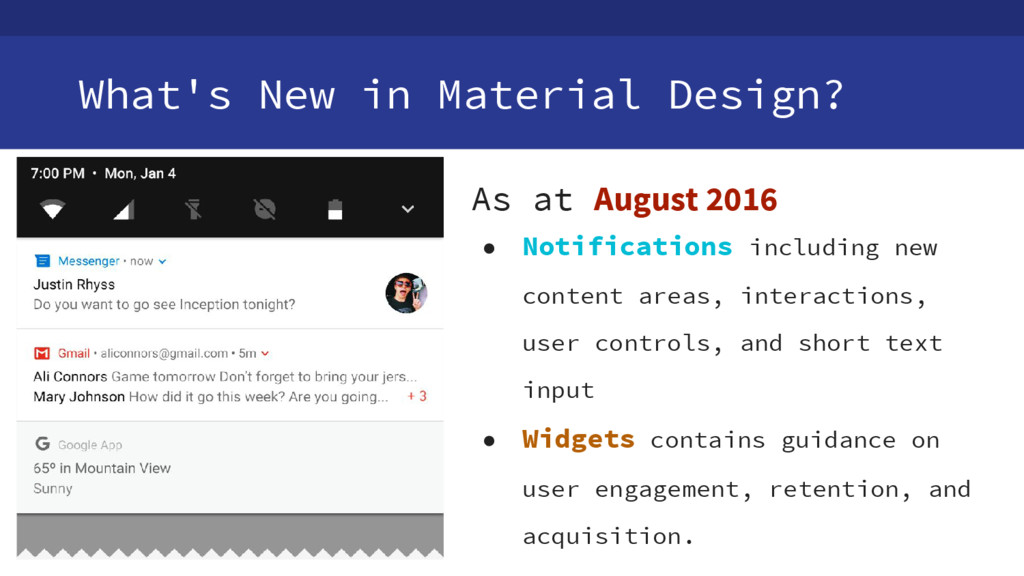
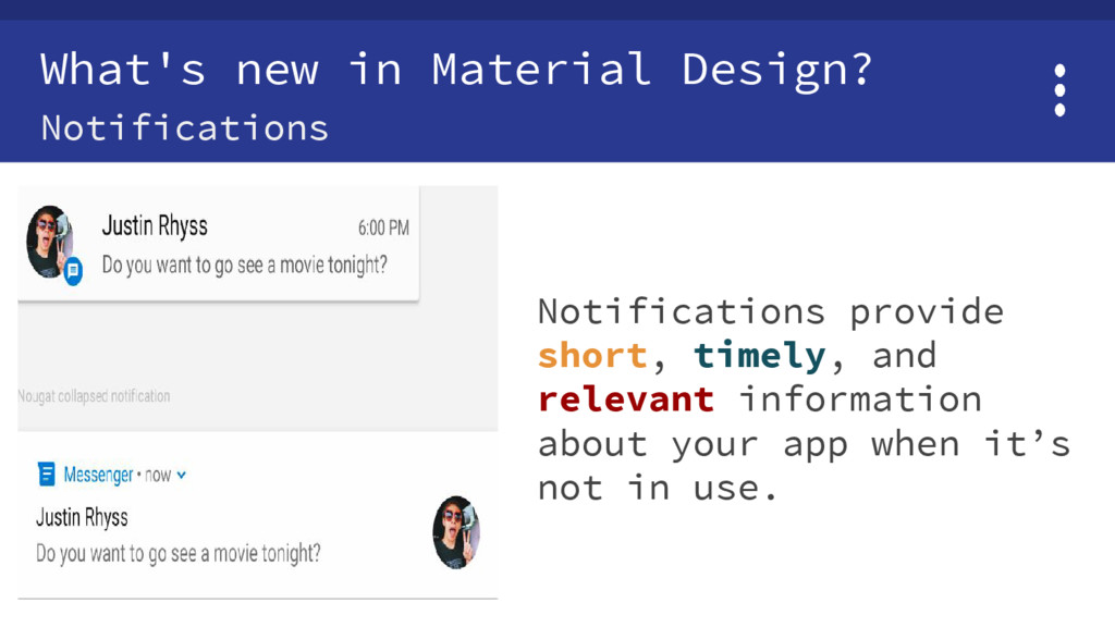
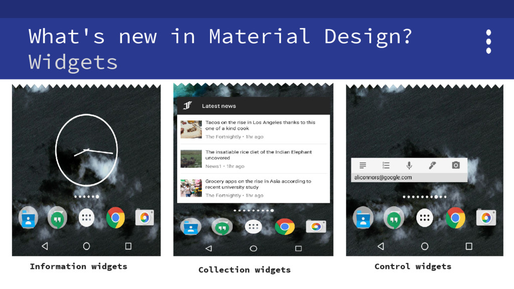
    Notifications including new content areas, interactions, user controls, and short text input • Widgets contains guidance on user engagement, retention, and acquisition.
  4. What's new in Material Design? Notifications Notifications provide short, timely,

    and relevant information about your app when it’s not in use.
  5. Tools & resources Android • AppCompat library for android compile

    'com.android.support:appcompat-v7:24.2.0' • Design library. compile 'com.android.support:design:24.2.0' • 3rd party open source libraries. https://android-arsenal.com/search?q=materia
  6. What you’ll need • Android Studio version 2.1+ and JDK

    8+ • Experience developing Android Apps • A test device with Android 4.1+ • A USB micro to USB cable.
  7. Setting up Download the sample app or Clone the sample

    project from git $ git clone https://github.com/googlecodelabs/android-design-library.git Run the sample app
  8. Themes, Colors and Typography Custom Colors Custom colors can also

    be defined using theme attributes e.g colorPrimaryDark for the Status Bar, colorPrimary for the App Bar and colorAccent for FAB.
  9. Themes, Colors and Typography Custom Colors <resources> <!-- Base application

    theme. → <style name="AppTheme"parent="Theme.AppCompat.Light.DarkActionBar"> <!-- Customize your theme here. → <color name="colorPrimary">#3F51B5</color> <color name="colorPrimaryDark">#303F9F</color> <color name="colorAccent">#FF4081</color> </resources>
  10. Layout and Animation Toolbar <android.support.design.widget.CoordinatorLayout xmlns:android="http://schemas.android.com/apk/res/android" ……………….> <android.support.design.widget.AppBarLayout android:layout_width="match_parent" ………….>

    <!-- Toolbar. → <android.support.v7.widget.Toolbar android:id="@+id/toolbar" android:layout_width="match_parent" android:layout_height="?attr/actionBarSize" android:background="?attr/colorPrimary" app:popupTheme="@style/AppTheme.PopupOverlay" /> ………... Toolbar
  11. Layout and Animation Tabs <android.support.design.widget.CoordinatorLayout ……………….> <!-- Toolbar. → <android.support.v7.widget.Toolbar

    .....> <!-- TabLayout. → <android.support.design.widget.TabLayout android:id="@+id/tabs" android:layout_width="match_parent" android:layout_height="wrap_content" /> .../> Tabs
  12. Layout and Animation CardView and recyclerView • build.gradle dependencies {

    compile 'com.android.support:appcompat-v7:23.4.0' compile 'com.android.support:design:23.4.0' compile 'com.android.support:cardview-v7:23.4.0' compile 'com.android.support:recyclerview-v7:23.4.0' }
  13. Layout and Animation CardView and recyclerView <android.support.v7.widget.RecyclerView xmlns:android="http://schemas.android.com/apk/res/android" xmlns:app="http://schemas.android.com/apk/res-auto" android:id="@+id/my_recycler_view"

    android:layout_width="match_parent" android:layout_height="match_parent" android:clipToPadding="false" android:paddingBottom="@dimen/md_keylines" android:paddingTop="@dimen/md_keylines" android:scrollbars="vertical" app:layout_behavior="@string/appbar_scrolling_view_behavior" />
  14. Vector Drawables Using Vector assets for images 1.Adding Config to

    the Gradle File Build.gradle // Gradle Plugin 2.0+ android { defaultConfig { vectorDrawables.useSupportLibrary = true } } 2. Import Vector Assets to Android Studio
  15. Page Elements NavigationDrawer <android.support.v4.widget.DrawerLayout xmlns:android="http://schemas.android.com/apk/res/android" xmlns:app="http://schemas.android.com/apk/res-auto" android:id="@+id/drawer" android:layout_width="match_parent" android:layout_height="match_parent" android:fitsSystemWindows="true">

    <android.support.design.widget.NavigationView android:id="@+id/nav_view" android:layout_width="wrap_content" android:layout_height="match_parent" android:layout_gravity="start" android:fitsSystemWindows="true" app:headerLayout="@layout/navheader" app:menu="@menu/menu_navigation" /> </android.support.v4.widget.DrawerLayout>
  16. Page Elements Floating Action Button (FAB) 1. add a FloatingActionButton

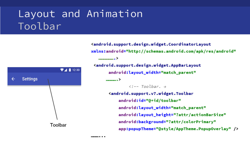
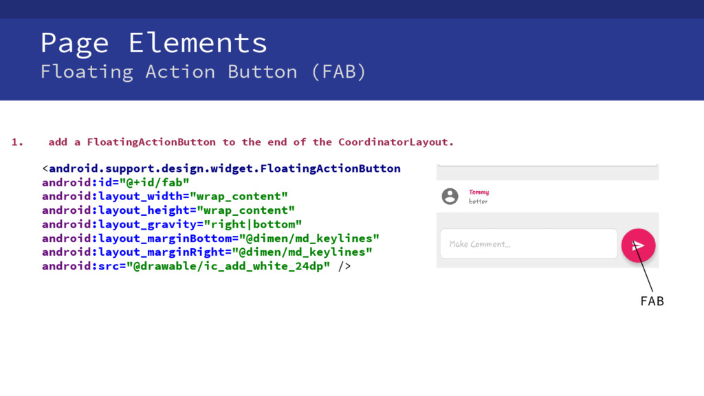
    to the end of the CoordinatorLayout. <android.support.design.widget.FloatingActionButton android:id="@+id/fab" android:layout_width="wrap_content" android:layout_height="wrap_content" android:layout_gravity="right|bottom" android:layout_marginBottom="@dimen/md_keylines" android:layout_marginRight="@dimen/md_keylines" android:src="@drawable/ic_add_white_24dp" /> FAB