Upgrade to Pro — share decks privately, control downloads, hide ads and more …

Web Component, ganz ohne Framework! Live & in Action

Web Component, ganz ohne Framework! Live & in Action

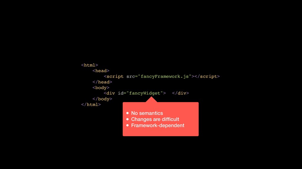
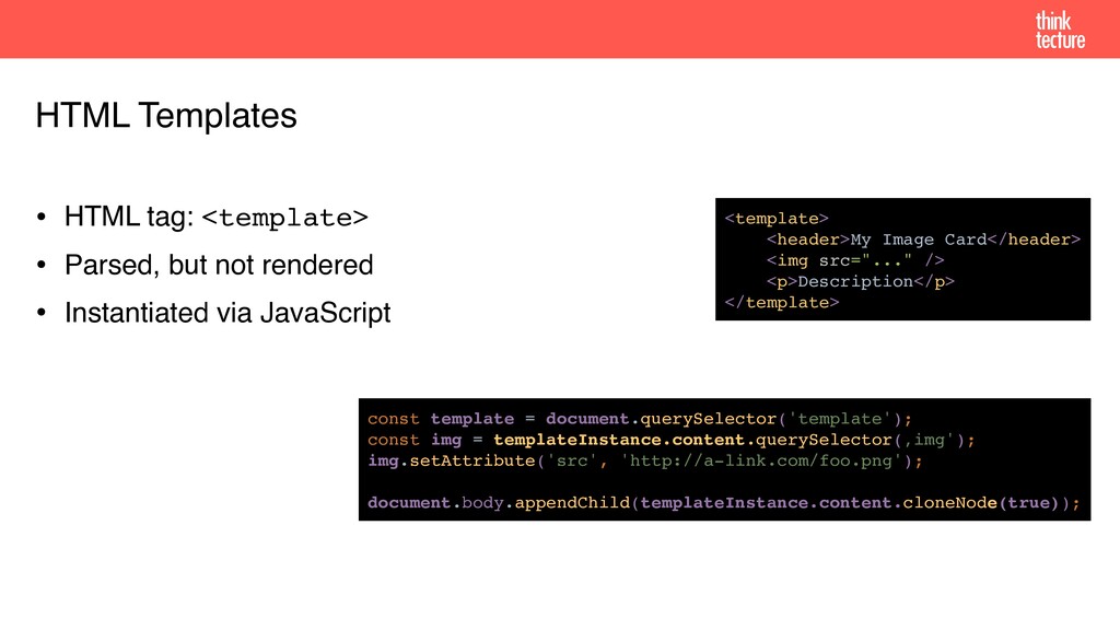
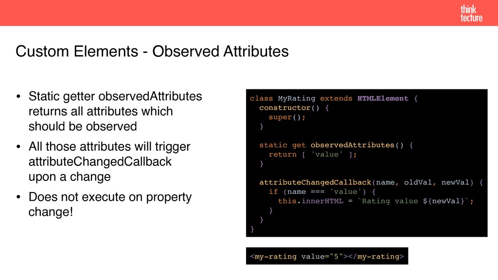
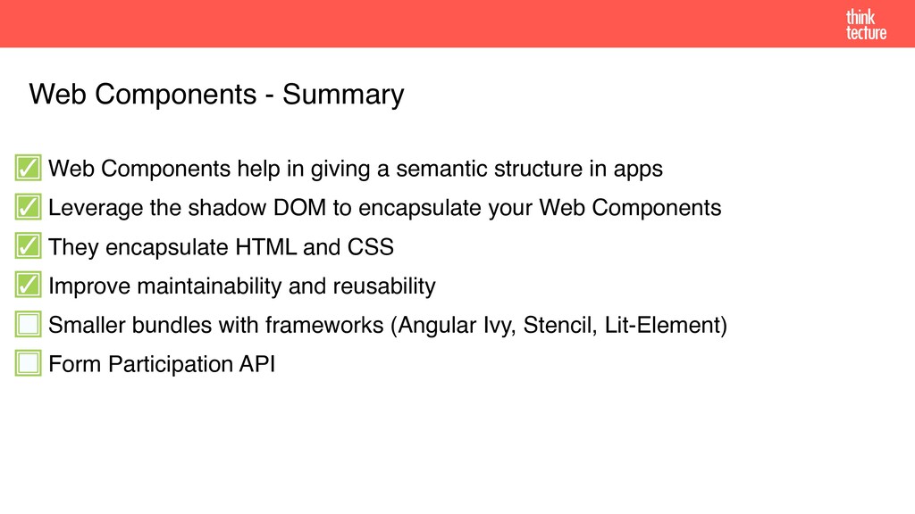
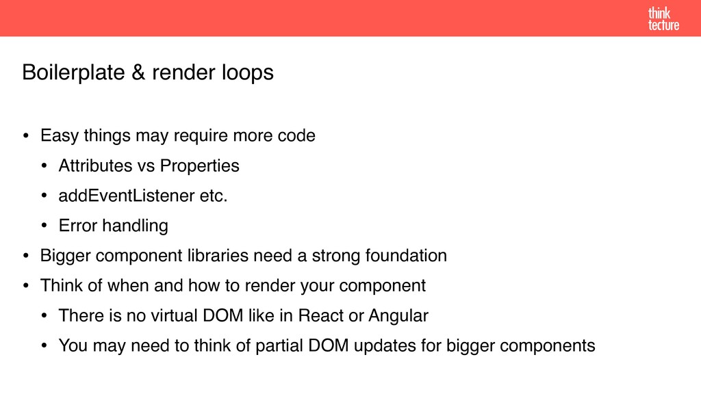
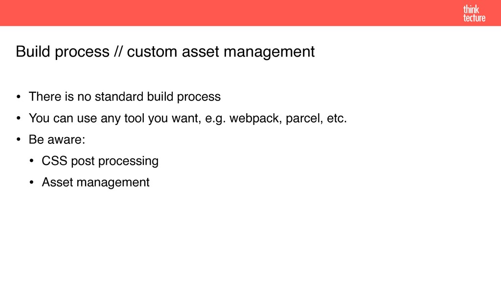
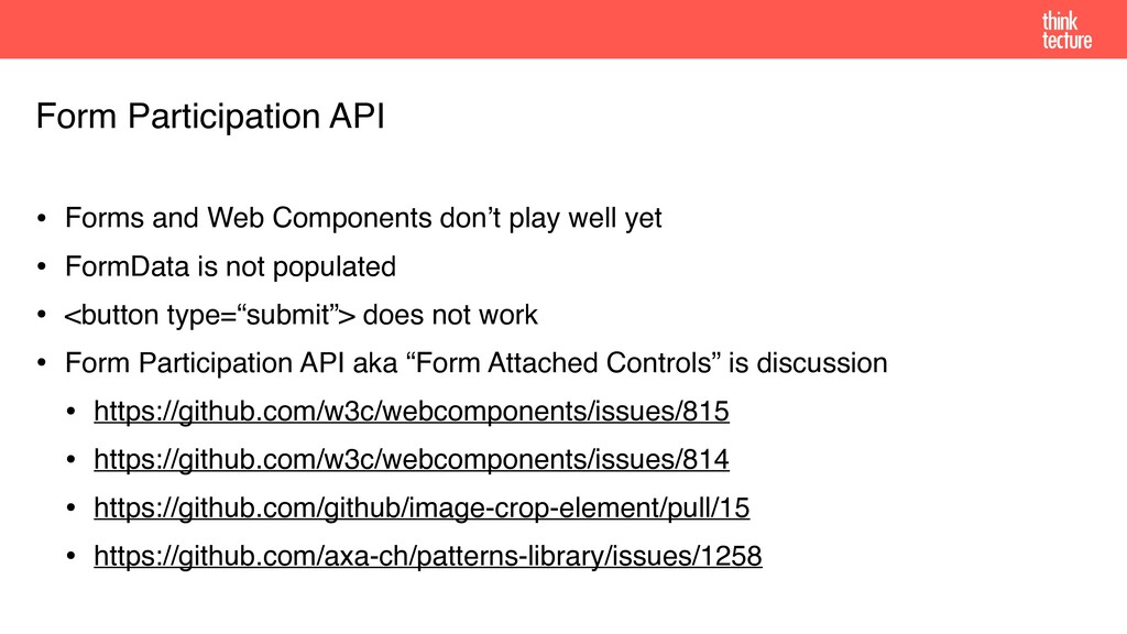
Jeder kennt es: Kapselung und Wiederverwendung von UI-Komponenten im Web sind sehr mühsam. Meist ist es ein Zusammenkopieren von HTML, CSS und JavaScript, oftmals über eine oder mehrere Dateien verteilt. Vergisst man einen Teil, sieht es nicht wie gewünscht aus oder die Interaktion funktioniert nicht.
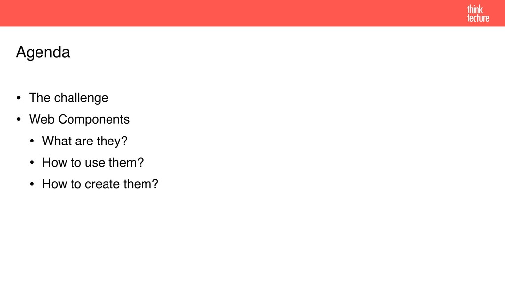
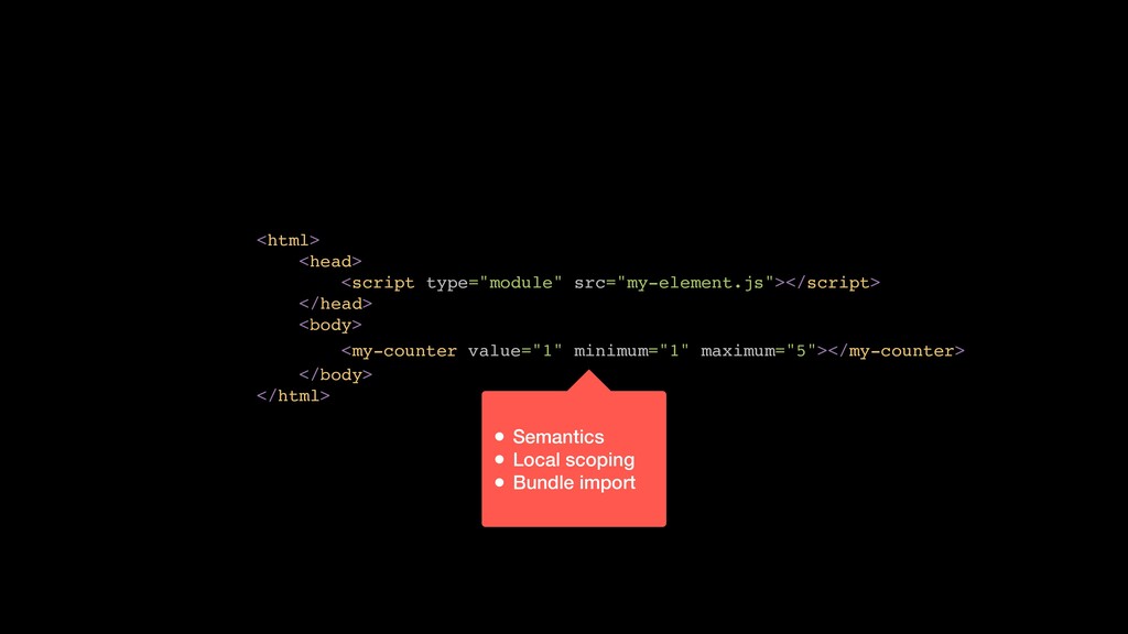
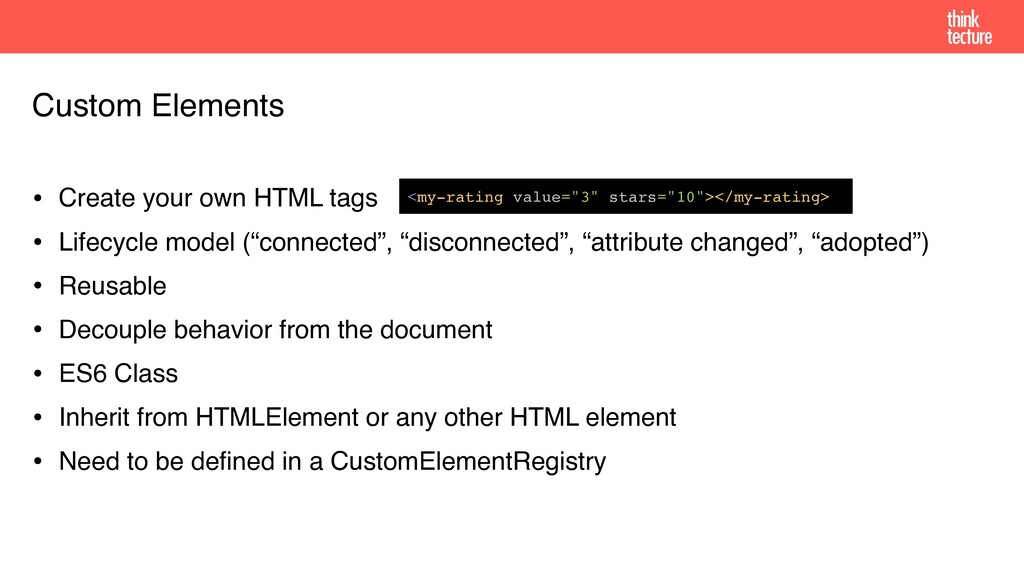
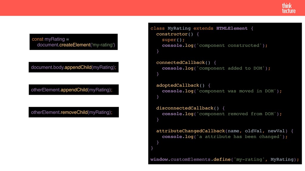
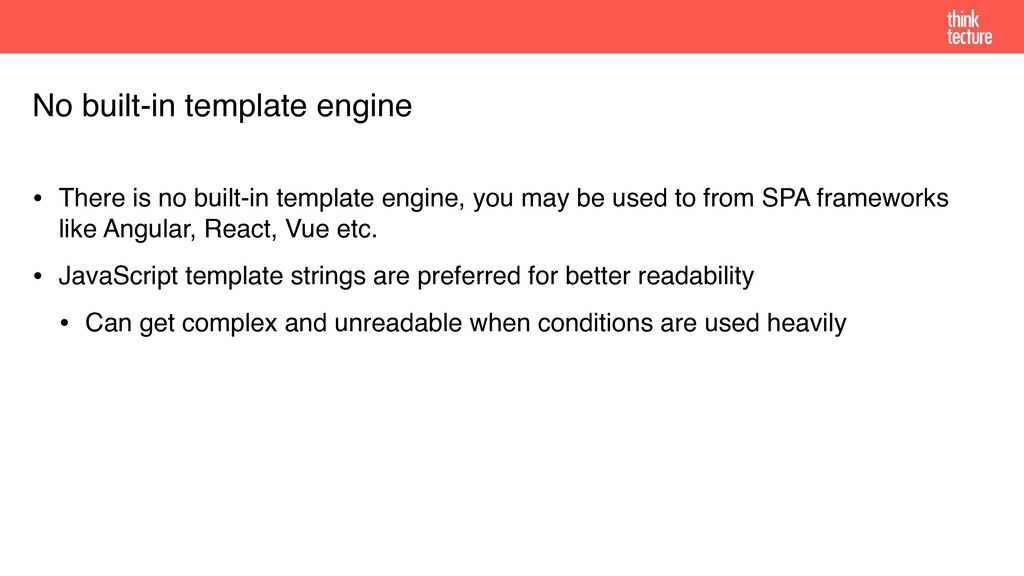
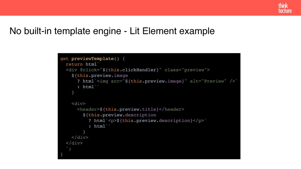
Doch damit ist jetzt Schluss! Mit Web Components eröffnen sich neue Wege im Web, um UI-Komponenten standardisiert und ganz ohne Framework implementieren und verwenden zu können. In dieser Session zeigt Patrick Jahr die wichtigsten Punkte für die erste eigene Web Component mit den Standards HTML Templates, Custom Elements und Shadow DOM.

Patrick Jahr

January 22, 2020
Tweet

More Decks by Patrick Jahr

Other Decks in Programming

Transcript

  1. Who am I? Patrick Jahr [email protected] @jahr_patrick Software Consultant und

    Developer @ Thinktecture AG https://www.thinktecture.com/patrick-jahr
  2. • The challenge • Web Components • What are they?

    • How to use them? • How to create them? Agenda
  3. <div id="fancyWidget"> </div> <html> <head> <script src="fancyFramework.js"></script> </head> <body> </body>

    </html> • No semantics • Changes are difficult • Framework-dependent
  4. <div id="fancyWidget"> <html> <head> <script src="fancyFramework.js"></script> </head> <body> </body> </html>

    <span id="label"></span> <button id="incButton">+</button> <button id="decButton">-</button> </div> • Global scoping • Naming conflicts • Styling conflicts
  5. • Web Components are a collection of 3 technologies •

    Custom Elements • HTML Templates • Shadow DOM • Bring a native component model to web instead of having to use frameworks Web Components - What are they?
  6. • HTML tag: <template> • Parsed, but not rendered •

    Instantiated via JavaScript HTML Templates <template> <header>My Image Card</header> <img src="..." /> <p>Description</p> </template> const template = document.querySelector('template'); const img = templateInstance.content.querySelector(‚img'); img.setAttribute('src', 'http://a-link.com/foo.png'); document.body.appendChild(templateInstance.content.cloneNode(true));
  7. • Create your own HTML tags • Lifecycle model (“connected”,

    “disconnected”, “attribute changed”, “adopted”) • Reusable • Decouple behavior from the document • ES6 Class • Inherit from HTMLElement or any other HTML element • Need to be defined in a CustomElementRegistry Custom Elements <my-rating value="3" stars="10"></my-rating>
  8. otherElement.appendChild(myRating); otherElement.removeChild(myRating); document.body.appendChild(myRating); const myRating = document.createElement('my-rating') class MyRating extends

    HTMLElement { constructor() { super(); console.log('component constructed'); } connectedCallback() { console.log('component added to DOM'); } adoptedCallback() { console.log('component was moved in DOM'); } disconnectedCallback() { console.log('component removed from DOM'); } attributeChangedCallback(name, oldVal, newVal) { console.log('a attribute has been changed'); } } window.customElements.define('my-rating', MyRating);
  9. • Static getter observedAttributes
 returns all attributes which
 should be

    observed • All those attributes will trigger
 attributeChangedCallback
 upon a change • Does not execute on property
 change! Custom Elements - Observed Attributes class MyRating extends HTMLElement { constructor() { super(); } static get observedAttributes() { return [ 'value' ]; } attributeChangedCallback(name, oldVal, newVal) { if (name === 'value') { this.innerHTML = `Rating value ${newVal}`; } } } <my-rating value="5"></my-rating>
  10. • Window global registry for all custom elements • API

    • define(): defines a new element • get(): returns the constructor of an element (or undefined) • whenDefined(): returns a promise which is fulfilled, when the custom element is available • upgrade(): upgrades an element before it is connected to its shadow root CustomElementRegistry window.customElements.define('my-rating', MyRating);
  11. • ES6 Import • Via Code Importing Web Components <script

    type="module" src="my-rating.js"></script> // static import import './my-rating.js'; // dynamic import import('./my-rating.js') .then(...); // or lazy-loading via const script = document.createElement('script'); script.src = './my-rating.js'; document.body.appendChild(script); const myElement = document.createElement('my-rating'); document.body.appendChild(myElement);
  12. • Encapsulates HTML and CSS • Isolated DOM: elements within

    Shadow DOM are not selectable from outside • e.g. document.querySelector() won’t return a result • Scoped CSS: CSS styles stay within Shadow DOM, no losses, no influence • Composition: declarative, markup-based API, put elements from outside in • Simplifies CSS: no conflicts with existing classes and IDs • Productivity: app consists of chunks of components instead of one big page Shadow DOM https://developers.google.com/web/fundamentals/web-components/shadowdom
  13. • Shadow host
 DOM node that the 
 shadow DOM

    is attached to • Shadow tree
 DOM tree inside shadow DOM • Shadow boundary
 Place where the shadow DOM
 ends and the regular DOM begins (“Light DOM”) • Shadow root
 Root node of the shadow tree
 Shadow DOM document shadow host Document Tree Shadow Tree shadow root Shadow boundary
  14. • attachShadow() attaches a shadow DOM to any HTML element

    • open and closed mode Shadow DOM <html> <head></head> <body> <div></div> <script> const shadowHost = document.querySelector('div'); const shadowRoot = shadowHost.attachShadow({ mode: 'open' }); shadowRoot.innerHTML = '<h1>Hello World!</h1>'; </script> </body> </html>
  15. • open allows access to the HTML element’s shadow DOM

    • closed does not allow access to the HTML element’s shadow DOM Shadow DOM // ... shadowHost.attachShadow({ mode: 'open' }); document.querySelector('div').shadowRoot.querySelector('h1'); // -> [HTMLHeadingElement] // ... shadowHost.attachShadow({ mode: 'closed '}); document.querySelector('div').shadowRoot.querySelector('h1'); // -> Can not read 'querySelector' of null
  16. • A (named) placeholder 
 to fill with your own

    
 markup • Basically mixes together 
 two DOM trees: 
 the shadow & light tree Shadow DOM - Slots <template> <style> :host { border: 1px solid black; display: block; } </style> <div> <slot></slot> <slot name="another-slot">With Default Content</slot> </div> </template> <!—Default content—> <my-element></my-element> <!-- No slot filled —> <!—Unnamed slot content; Default content for named slot—> <my-element> <div>Unnamed Slot Content</div> </my-element> <!—Unnamed slot content; Another slot content—> <my-element> <div>Unnamed Slot Content 2</div> <div slot="another-slot">Another Slot Content</div> </my-element>
  17. • Slots emit an event, whenever its content changes: slotchange

    • Get the slotted elements via assignedNodes() Shadow DOM - Slots const slot = this.shadowRoot.querySelector('slot'); slot.addEventListener('slotchange', () => { const assignedNodes = slot.assignedNodes(); // Do something with assignedNodes });
  18. • Styling is done via <style>-tags • All stylings are

    local and do not overwrite styles from other shadow DOMs • No other stylings will bleed into the shadow DOM Shadow DOM - Styling <template> <style> h1 { color: red; } </style> <h1>Hello World!</h1> </template> const shadowRoot = document.querySelector('div') .attachShadow({ mode: 'open' }); shadowRoot.innerHTML = '<h1>Hello World!</h1>' + '<style>h1 { color: red; }</style>';
  19. • Inside shadow DOM • :host, :host(), :host-context(), ::slotted() •

    Outside shadow DOM • CSS Shadow Parts: ::part() • In Discussion: ::theme() • Deprecated: >>> (“shadow piercing”) Shadow DOM - CSS Selectors
  20. Shadow DOM - CSS Selectors - Inside Shadow DOM <template>

    <style> :host { display: block; background-color: blue; } :host(.red) { background-color: red; } :host-context(main) { background-color: yellow; } ::slotted(article) { background-color: black; } </style> <div> <p>Before slot</p> <slot>Default Slot content</slot> <p>After slot</p> </div> </template> <my-rating></my-rating> <my-rating class="red"></my-rating> <main> <my-rating></my-rating> </main> <my-rating> <article> Article Content </article> </my-rating>
  21. • CSS Shadow Parts (Working Draft): ::part() • Allows to

    selectively expose elements from the shadow tree to the outside page for styling purposes • https://www.w3.org/TR/css-shadow-parts-1/ • CSS Shadow Parts (Unofficial Draft): ::theme() • Matches any parts with that name, anywhere in the document • http://tabatkins.github.io/specs/css-shadow-parts/#part-theme Shadow DOM - CSS Selectors - Outside Shadow DOM
  22. • Allows to selectively expose
 elements from the shadow tree

    to 
 the outside page for styling 
 purposes Shadow DOM - CSS Selectors - Outside Shadow DOM - ::part <template> <style> header { background-color: crimson; } </style> <div> <header part="my-header">Style me</header> </div> </template> <style> my-rating.styled::part(my-header) { background-color: black; color: white; } </style> <my-rating></my-rating> <my-rating class="styled"></my-rating>
  23. • If a nested Web Component 
 will expose an

    inner Web 
 Component’s part, it has to 
 use exportparts=“part1 part2 …”
 instead of part=“name” Shadow DOM - CSS Selectors - Outside Shadow DOM - ::part <style> my-rating::part(textspan) { color: red; } </style> <template id="my-element-outer-template"> <my-element-inner exportparts="innerspan textspan”> </my-element-inner> </template> <template id="my-element-inner-template"> <span part="innerspan">Innerspan</span> <span part="textspan">Textspan</span> </template> <my-element></my-element>
  24. Web Components help in giving a semantic structure in apps

    Leverage the shadow DOM to encapsulate your Web Components They encapsulate HTML and CSS Improve maintainability and reusability Smaller bundles with frameworks (Angular Ivy, Stencil, Lit-Element) Form Participation API Web Components - Summary
  25. And… now? • Try it out! Fiddle around with Web

    Components • Use them! Include first small Web Components into your application • Be prepared! Keep up to date with the development of Web Components • Slides: https://thinktecture.com/patrick-jahr • Repository: https://github.com/thinktecture/rnjs-2020-web-components • Contact: [email protected]
  26. Versioning My library A My library B 3rd party library

    1.0 3rd party library 2.0 Application <my-web-component /> <my-web-component /> defines defines Uncaught DOMException: Failed to execute ‘define’ on ‘CustomElementRegistry’: the name “my-web-component” has already been used with this registry.
  27. • Problem: Custom Element Registry is a window global object

    • Possible solution currently discussed by W3C • Scoped Custom Element Registry • https://github.com/w3c/webcomponents/issues/716 • Current usable solutions • Version your HTML tags • The host application is the only one loading WCs, even 3rd-party, but this could break other Web Components expecting a certain version Versioning
  28. • If you wish to sync them, then you’ll need

    to sync them! • “Reflecting properties to attributes” or “Reflected DOM Attributes” • Helps to keep DOM representation in sync with its JavaScript state • Watch out! Properties can hold objects, numbers etc. Attributes only strings • Attributes vs Properties input = document.createElement('input'); console.log(input.getAttribute('value')); // null input.value = 'one'; console.log(input.getAttribute('value')); // null input.setAttribute('value', 'two'); console.log(input.value); // one
  29. • Shadow DOM encapsulates the DOM only • Use common

    techniques for scoping JavaScript • May use the global scope to your advantage for app-wide configurations • But global polyfills can cause problems (e.g. if you load zone.js twice) JavaScript is still global scoped
  30. • Easy things may require more code • Attributes vs

    Properties • addEventListener etc. • Error handling • Bigger component libraries need a strong foundation • Think of when and how to render your component • There is no virtual DOM like in React or Angular • You may need to think of partial DOM updates for bigger components Boilerplate & render loops
  31. • There is no built-in template engine, you may be

    used to from SPA frameworks like Angular, React, Vue etc. • JavaScript template strings are preferred for better readability • Can get complex and unreadable when conditions are used heavily No built-in template engine
  32. No built-in template engine - Lit Element example get previewTemplate()

    { return html` <div @click="${this.clickHandler}" class="preview"> ${this.preview.image ? html`<img src="${this.preview.image}" alt="Preview" />` : html`` } <div> <header>${this.preview.title}</header> ${this.preview.description ? html`<p>${this.preview.description}</p>` : html`` } </div> </div> `; }
  33. • Currently there is no auto completion support for Web

    Components • Stencil tries to solve this by generating TypeScript Definition files • VS Code & W3C are discussing possible solutions • https://github.com/w3c/webcomponents/issues/776 • Stencil is currently generating a possible solution with its compiler Editor support // type definitions
  34. • There is no standard build process • You can

    use any tool you want, e.g. webpack, parcel, etc. • Be aware: • CSS post processing • Asset management Build process // custom asset management
  35. • Forms and Web Components don’t play well yet •

    FormData is not populated • <button type=“submit”> does not work • Form Participation API aka “Form Attached Controls” is discussion • https://github.com/w3c/webcomponents/issues/815 • https://github.com/w3c/webcomponents/issues/814 • https://github.com/github/image-crop-element/pull/15 • https://github.com/axa-ch/patterns-library/issues/1258 Form Participation API